Project: Samuels & Associates Headquarters
Architecture: Elkus Manfredi Architects
Lighting Designer: Lam Partners
MEP Engineer: WSP
General Contractor: Paradigm Construction
Workstation Supplier: AIS
Location: Boston, Massachusetts
Photo Credits: Eric Laignel
Text by Elkus Manfredi Architects
Project Design Intent
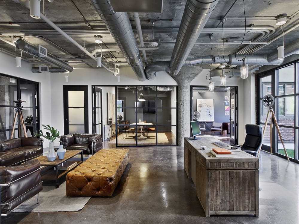
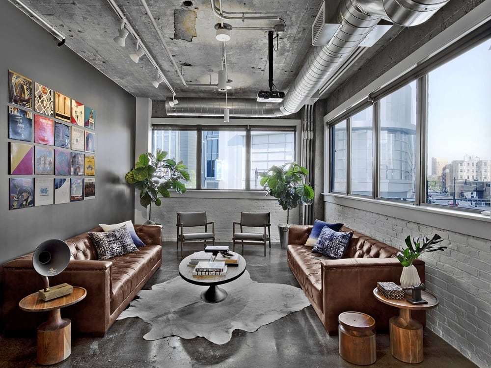
Located in a former automotive garage in Boston’s Fenway neighborhood, Samuels & Associates’ new headquarters exemplifies urban adaptive re-use. Red brick walls painted white; open, sandblasted ceilings; and stained and polished original concrete floors celebrate the existing urban space.
In its new Fenway headquarters, Samuels & Associates establishes its presence in the heart of the neighborhood. With retail establishments on the ground floor and Samuels & Associates’ corporate offices on the two upper floors, the building’s redesign exemplifies urban adaptive re-use that seeks to save and find new uses for an existing building, rather than tearing it down, reflecting the same approach Samuels & Associates takes in many of its projects. The building at 136 Brookline Avenue was built to contain the heavy machinery and vehicles of an auto service and repair business, so its sound structure made it a good candidate for a new use.
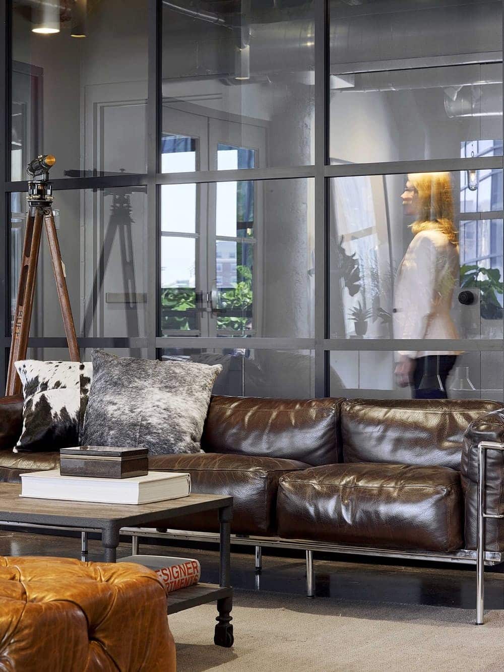
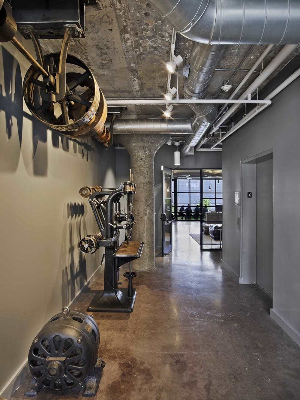
Collected by the company founder and chairman, Steve Samuels, the antique machining tools in the elevator lobby reflect his wide-ranging interests as well as the three-generation history of the company.
Overall Project Challenges
– Open spaces supported by concrete mushroom columns required separation and definition by function.
– Meeting spaces needed to allow for separate private meetings to occur concurrently.
– Confidentiality concerns dictated that guests exiting meetings not go back through the common waiting area at reception.
– Event space was needed where projects could be celebrated and clients entertained.
– The design should reflect the unique personality of company founder and chairman Steve Samuels, a third-generation real estate developer, whose interests and activities outside the company include film production and music.
– While capturing the entrepreneurial leadership of Steve Samuels, the design also needed to provide functional and comfortable workspace for the company’s approximately 50 corporate employees.
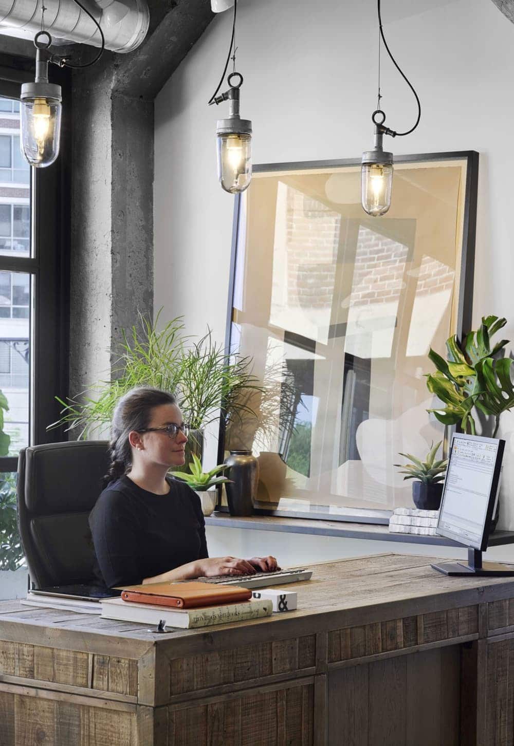
Located on the floor above the reception area and conference center is the workspace, as well as a staff kitchen and café lounge. Exterior walls are ringed by private offices with floor-to-ceiling glass walls to allow daylight to reach all areas of the space. Workstations and high-top meeting/layout tables are set side-by-side, designed to allow for spontaneous collaborative work.
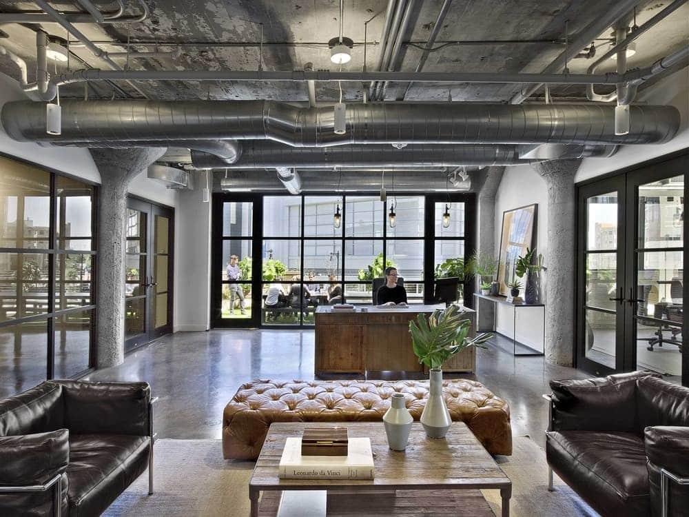
Comfortable leather seating and raw industrial elements in the lobby seating area create a club-like feel, reflecting the entrepreneurial, eclectic personality of company founder and chairman Steve Samuels.
Design Solutions
– The existing footprint of the building’s second and third floors was divided into public and private workspaces, with new walls creating a reception area and conference center on the second floor and offices plus a communal kitchen on the third floor.
– Red brick walls were painted white; ceilings retained their original raw concrete and were sandblasted to remove dirt and old paint. The original concrete floors were stained and polished.
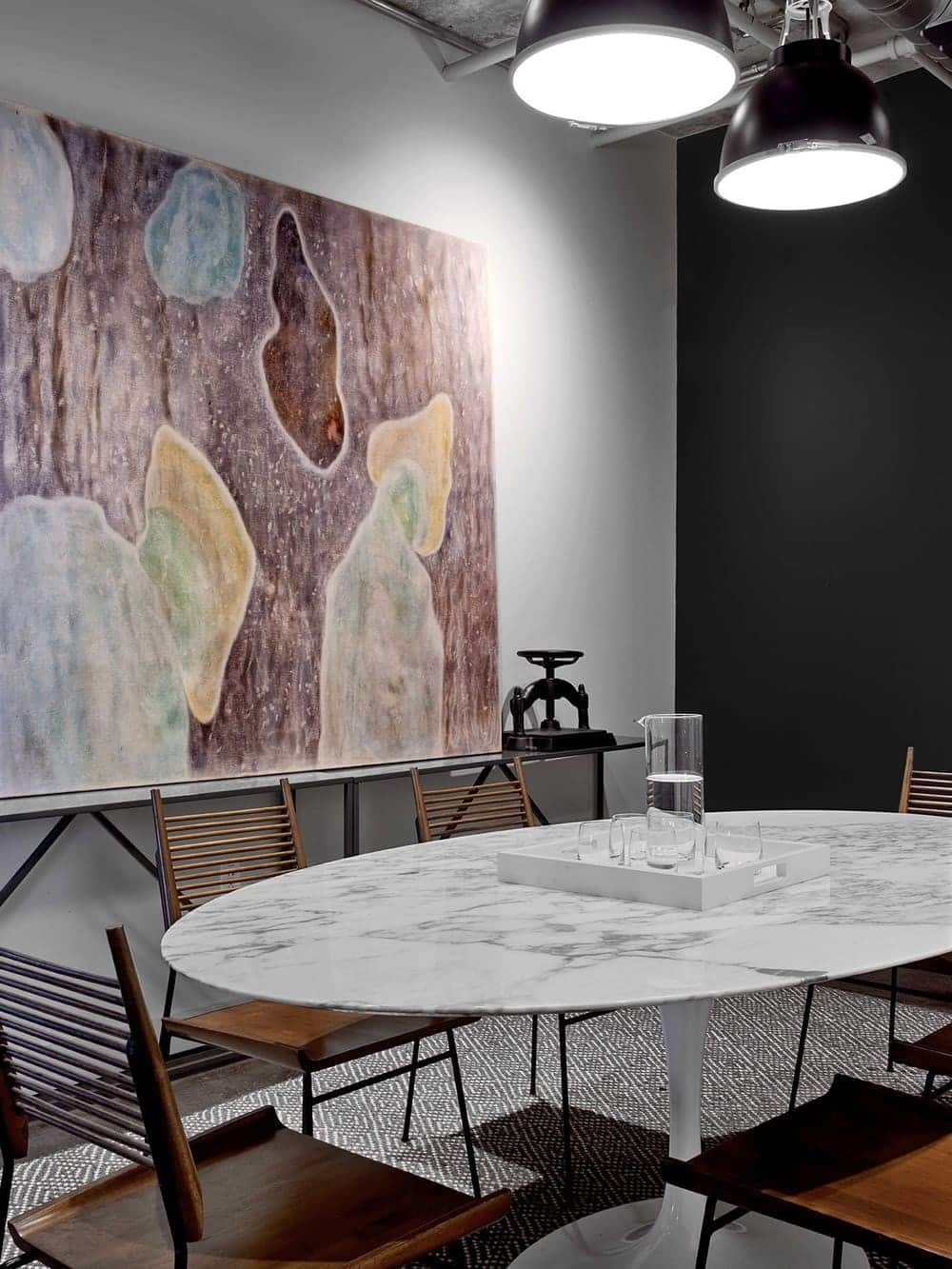
– The second floor features a central reception area surrounded by glass-fronted conference rooms.
– Behind the reception desk, glass doors open to a rooftop deck that serves as an open-air entertainment and employee relaxation area.
– Third-floor office space encompasses cubicles surrounded by glass-fronted offices. The third-floor communal kitchen/breakroom is anchored by a long wall of clerestory windows that introduce natural light and views.
– At the second-floor entry opposite the elevator doors, a collection of historic machining tools evoke the building’s industrial history.
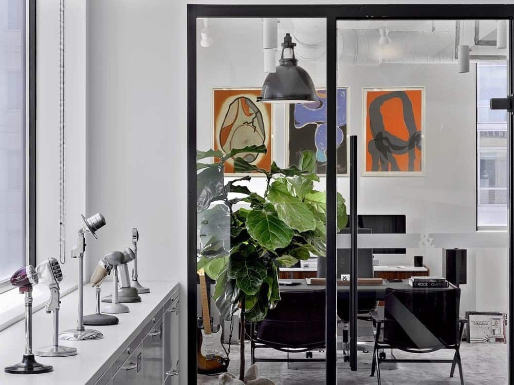
– The hall leading to Steve Samuels’ office celebrates his music passion and film-production career with framed movie posters and a collection of antique microphones.
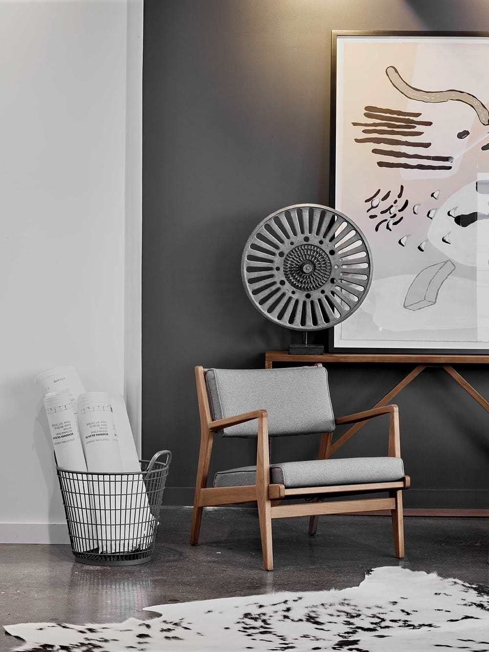
– The stairway landings are decorated with hand drawings of company projects printed on metal, including a drawing of The Verb Hotel.
– At the second-floor elevator lobby, a collection of historic machining tools evokes the building’s industrial history.
A comfortable, personal, functional feel reflects the authentic, creative culture of the company and its commitment to bringing overlooked urban environments back to life.

