Project: Shades of Gray Apartment
Architects: Alexey Rozenberg
Location: Moscow, Russia
Area: 160.0 m2
Project Year 2018
Photographer: Michail Stepanov, Vladilen Razgulin
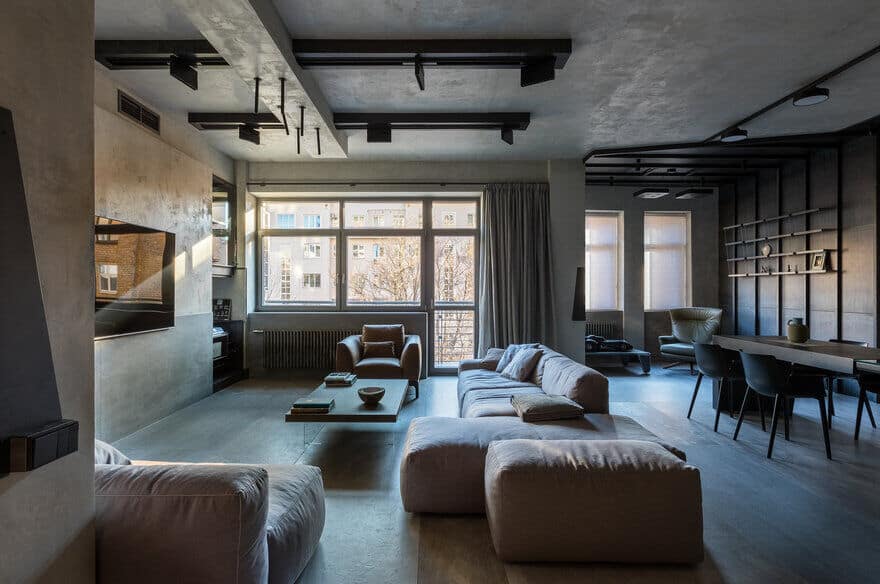
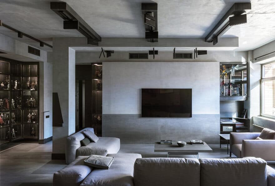
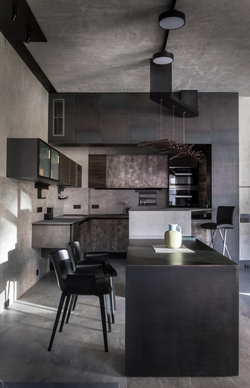
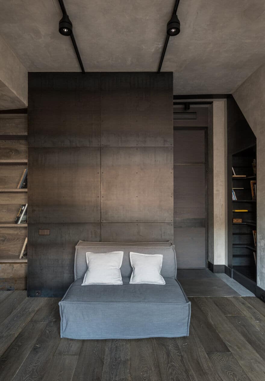
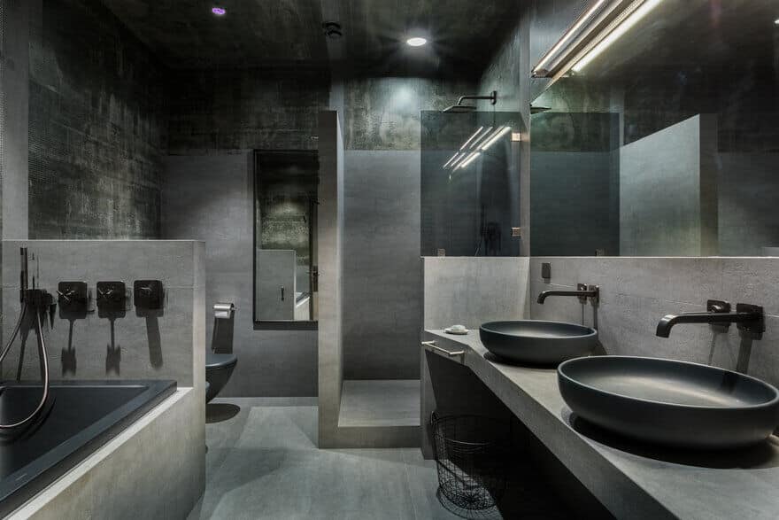
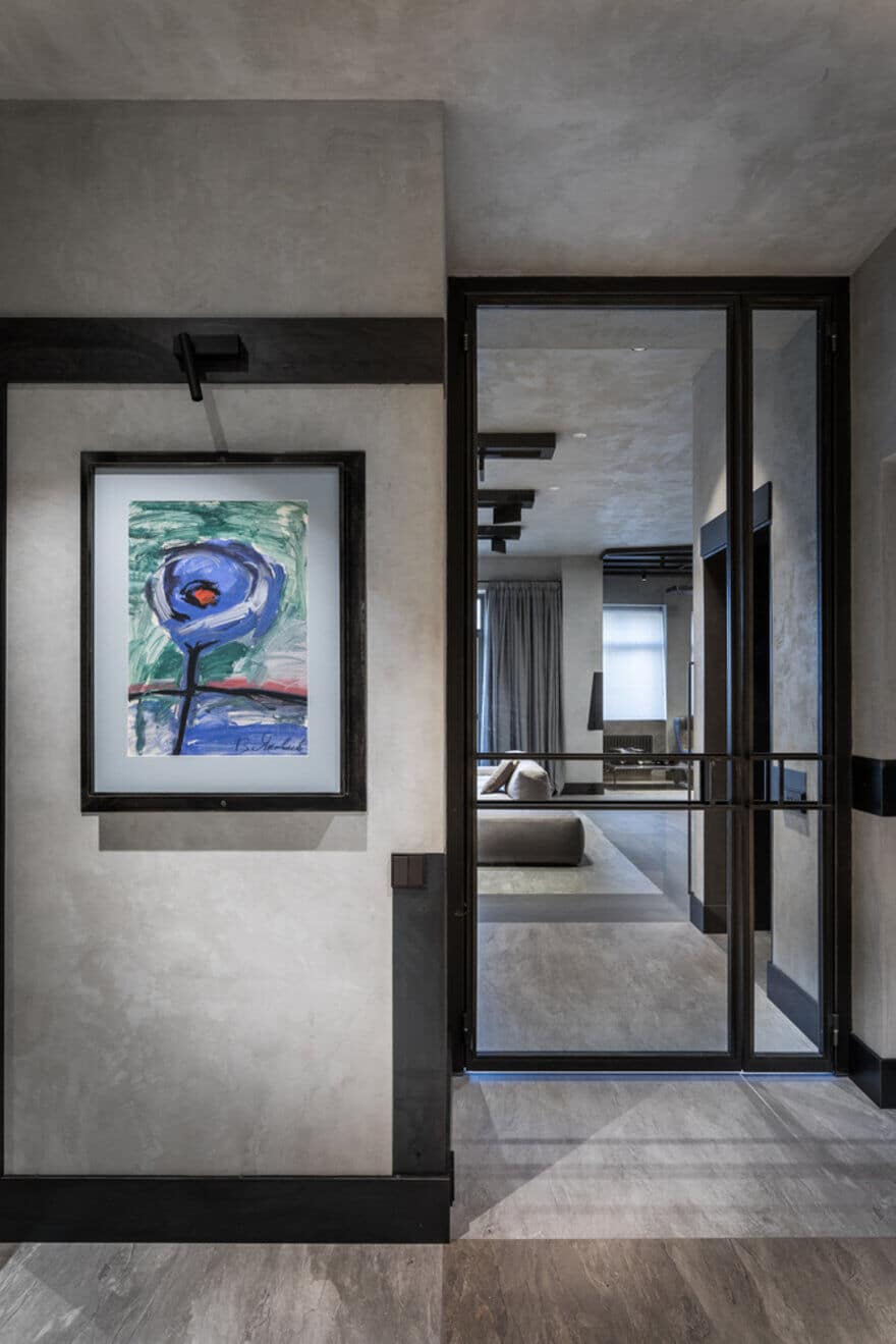
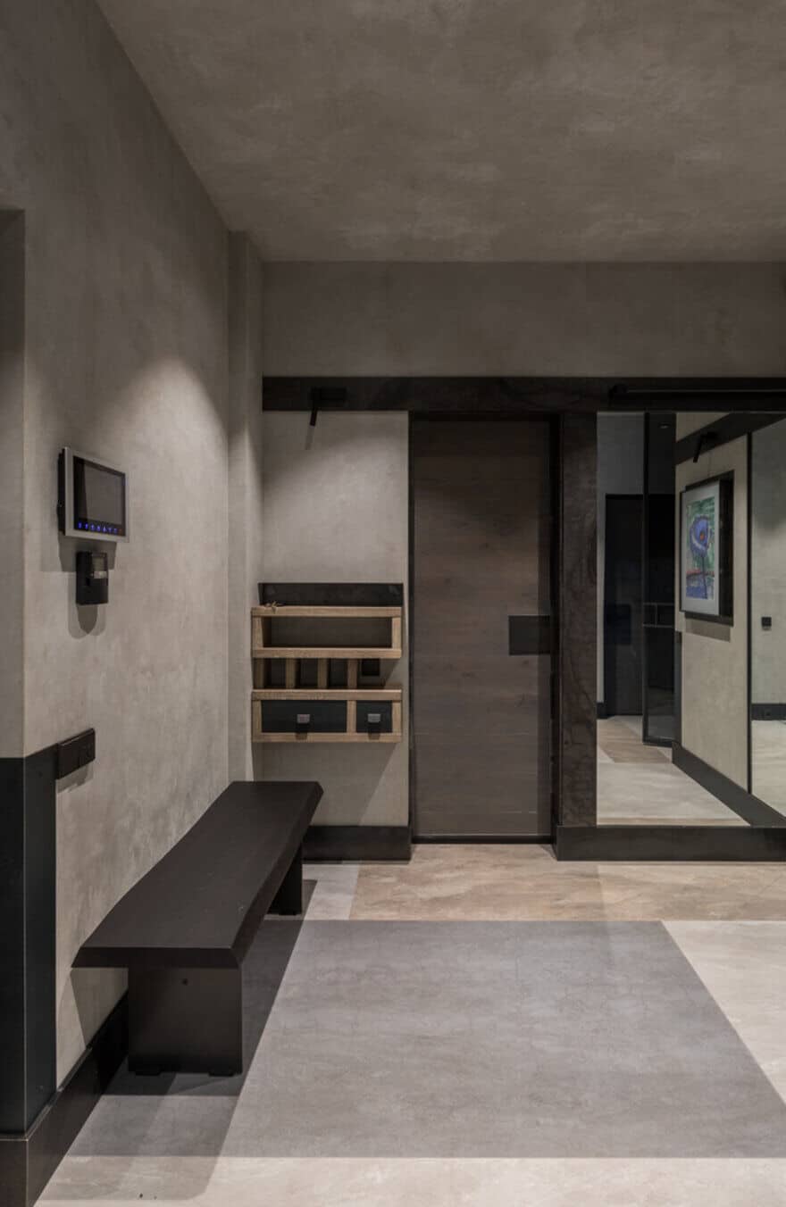
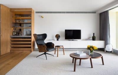
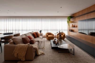
The interior design of Shades of Gray Apartment is built on brutal materials: textured plaster and ceramic slabs mimicking concrete, ferrous metal, however, thanks to a careful finishing technique, they acquire here a new quality – smoothness, gloss, feeling of a high cost. A collection of three-dimensional models of film characters, which the owner, a 3D designer by profession, collects, became an important factor in interior design. The collection, bright and varied in color, required to make the colors of the interior very muted.
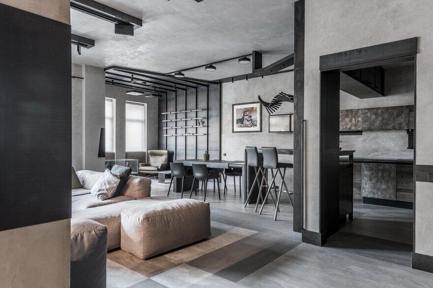
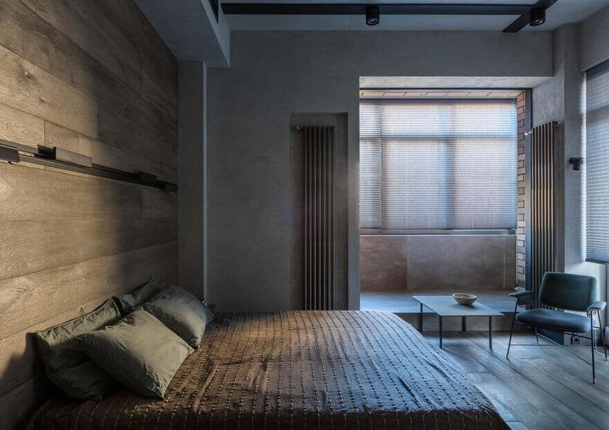
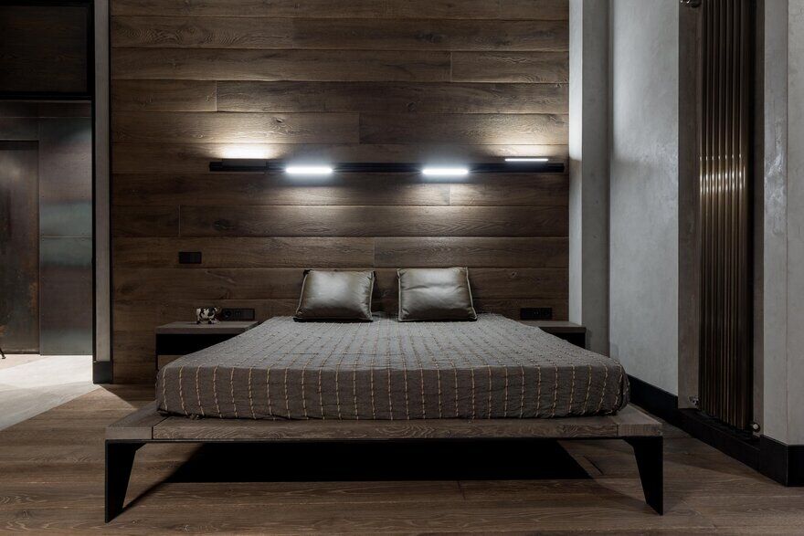
The color scheme of the interior is built on shades of gray from dark graphite to light concrete. Wooden surfaces arise as large fragments in private rooms. Cool gray tones of the frames demanded to focus on finding methods to compensate this coldness. The combinatorics within the same surface of different finishing materials: plastic walls, niches, as well as numerous elements and details – various metal shapes on the plaster surface, shelves of different sizes and designs became such a solution.
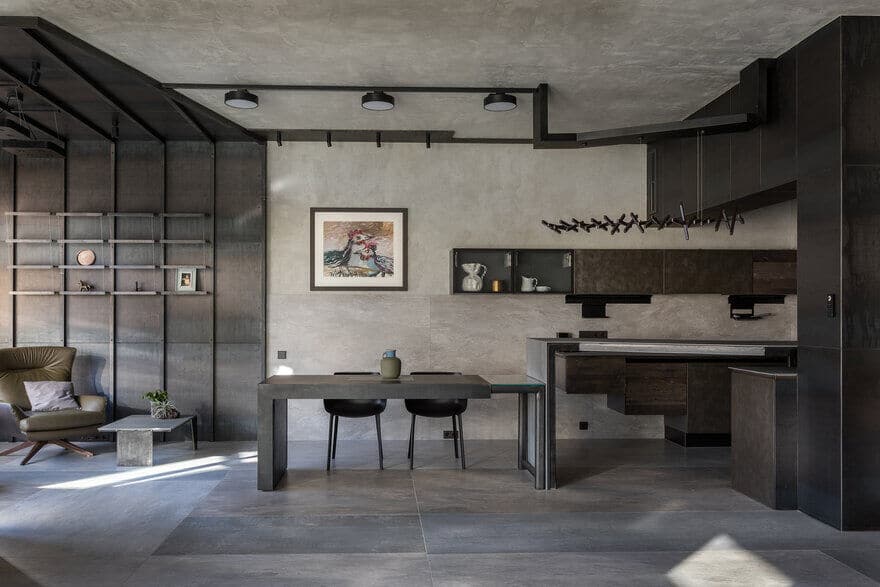
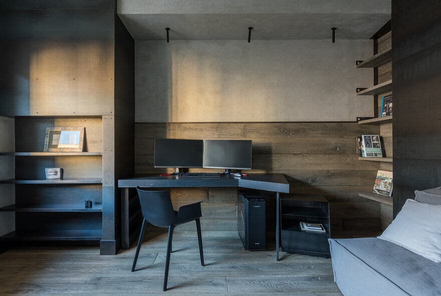
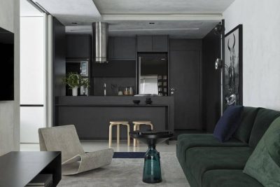
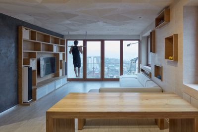
A number of furniture objects have been designed by the author specifically for this project and are part of his architectural design: a kitchen counter and a dining table, cabinets for the collection, a desk, a dressing table, coffee tables, and a bed. The dining table is intricate engineering design. It consists of metal and glass parts that are connected without additional support, and this connection is mobile, it allows you to change the length of the table from 1.7 to 3.6 meters. An individual configuration of the support system was designed for each of the coffee tables.
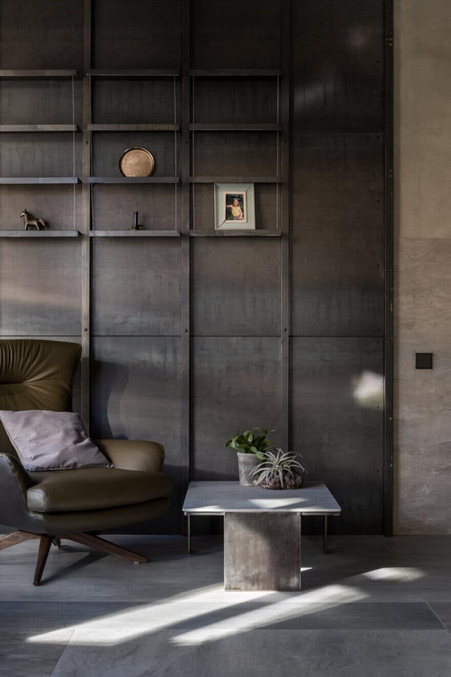
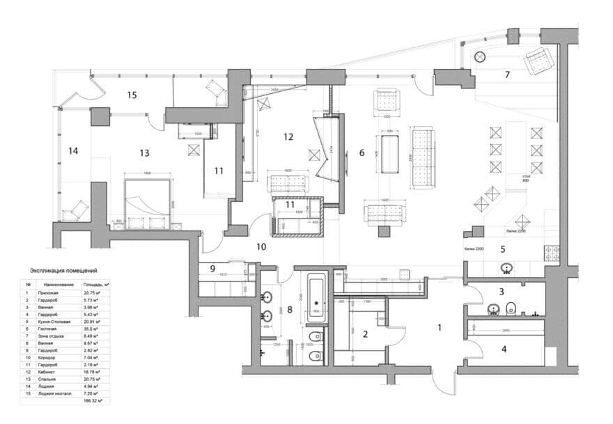
The shelves, that change in depth, in the living room are fixed with a metal string, which emphasizes the lightness of the design. In the office, a metal niche with g-shaped shelves creates the effect of unexpected deep space. Built from ceramic sheets on a metal frame, the Z-shaped bar stand sets the direction of the space of the kitchen-dining area. The interior space is visually expanded with the help of the anti-gravity distribution of materials across the surfaces of the floor, walls, and ceiling; for example, the surface finish of the floor flows onto the walls, and metal baseboards are present not only at the junction of the floor with the walls but also on the ceiling.

