Project: Simplistic Aesthetics with Industrial Elements
Designer: HAO Design
Location: Kaohsiung City, Taiwan
Photography: Hey!Cheese Photography
Text by HAO Design
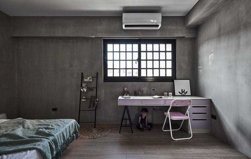
This project is located in a residential area in Xiaogang, Kaohsiung, and was commissioned by a couple with a daughter in elementary school. The couple had vastly different expectations for the style of their home. The husband is a steel engineer, and is very interested in metallic pieces and a rough industrial style; the wife is a flight attendant with a sensitive mind who loves to experience different cultures and new experiences. She hoped for a simplistic and bright Japanese style with Nordic cultural craftsmanship quality.
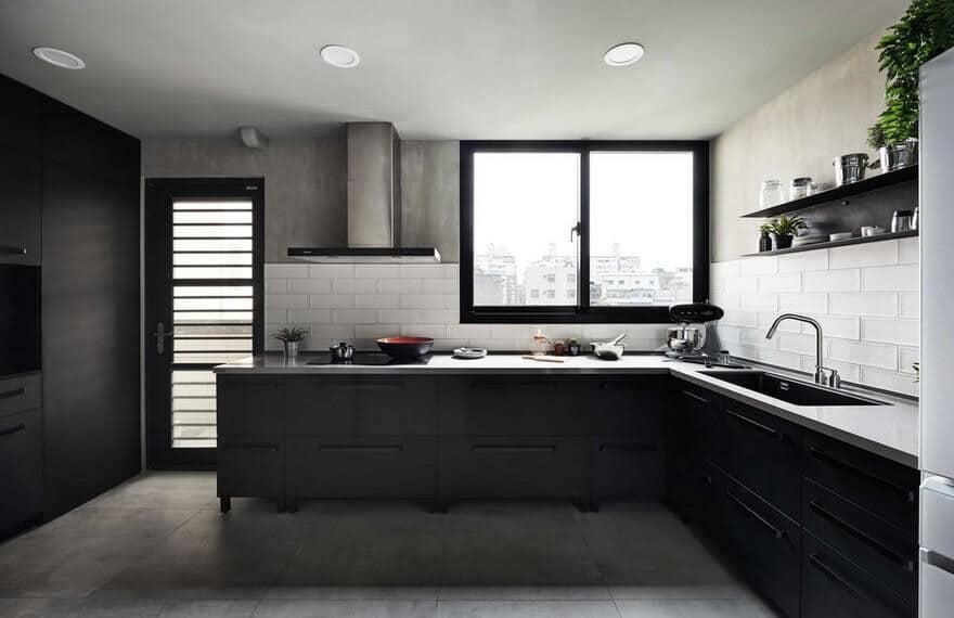
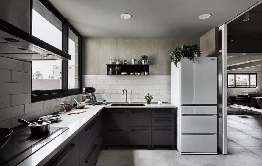
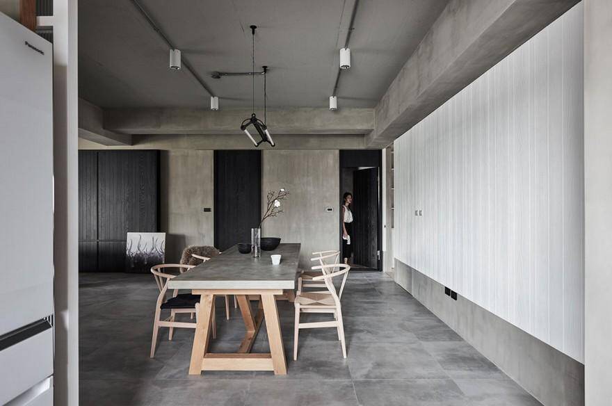
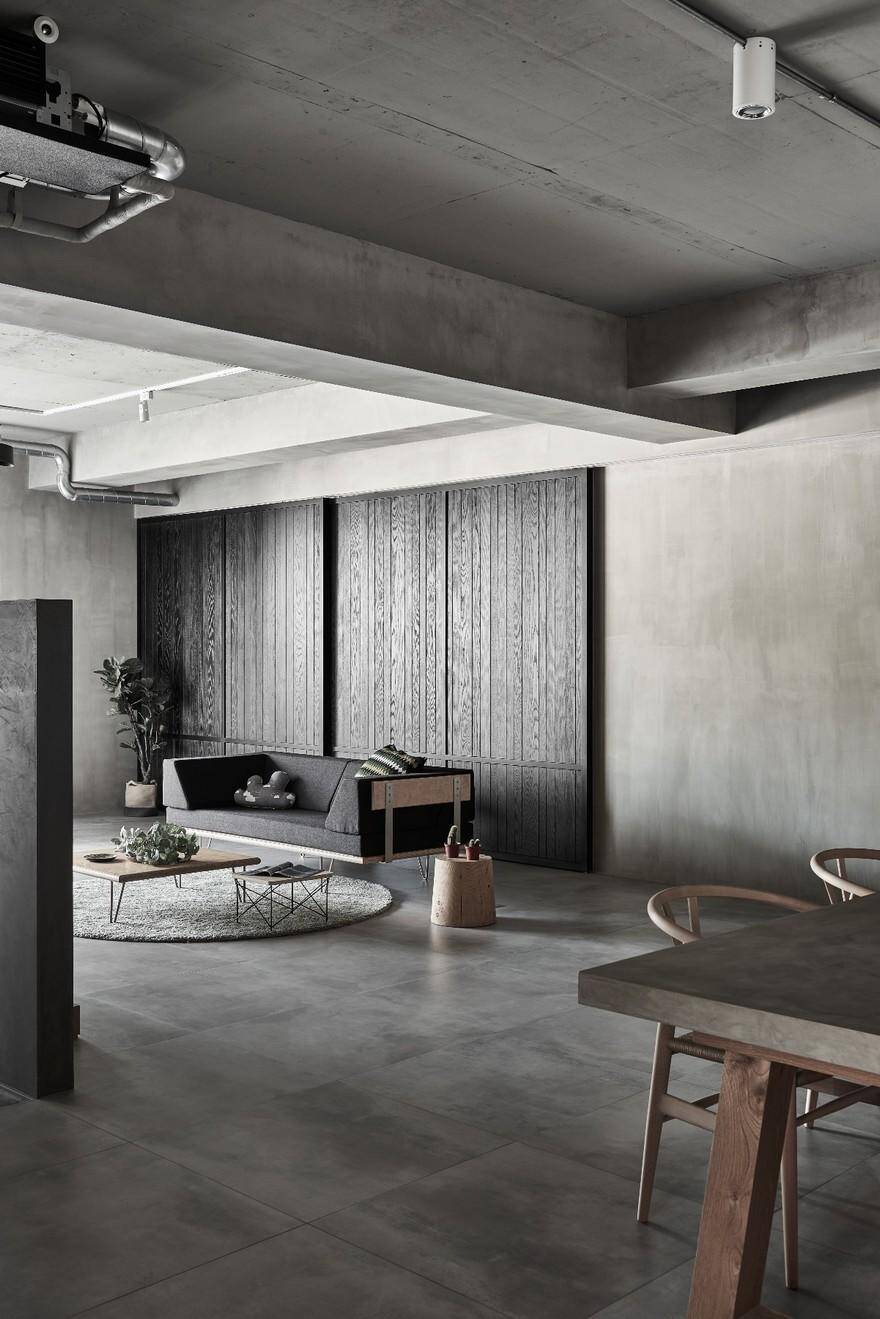
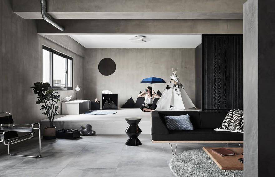
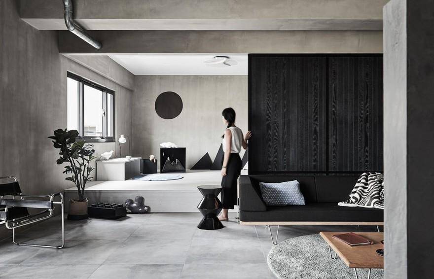
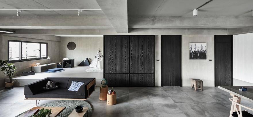
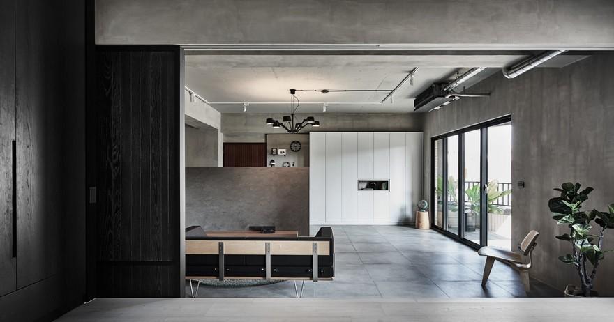
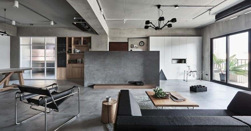
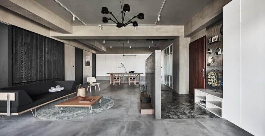
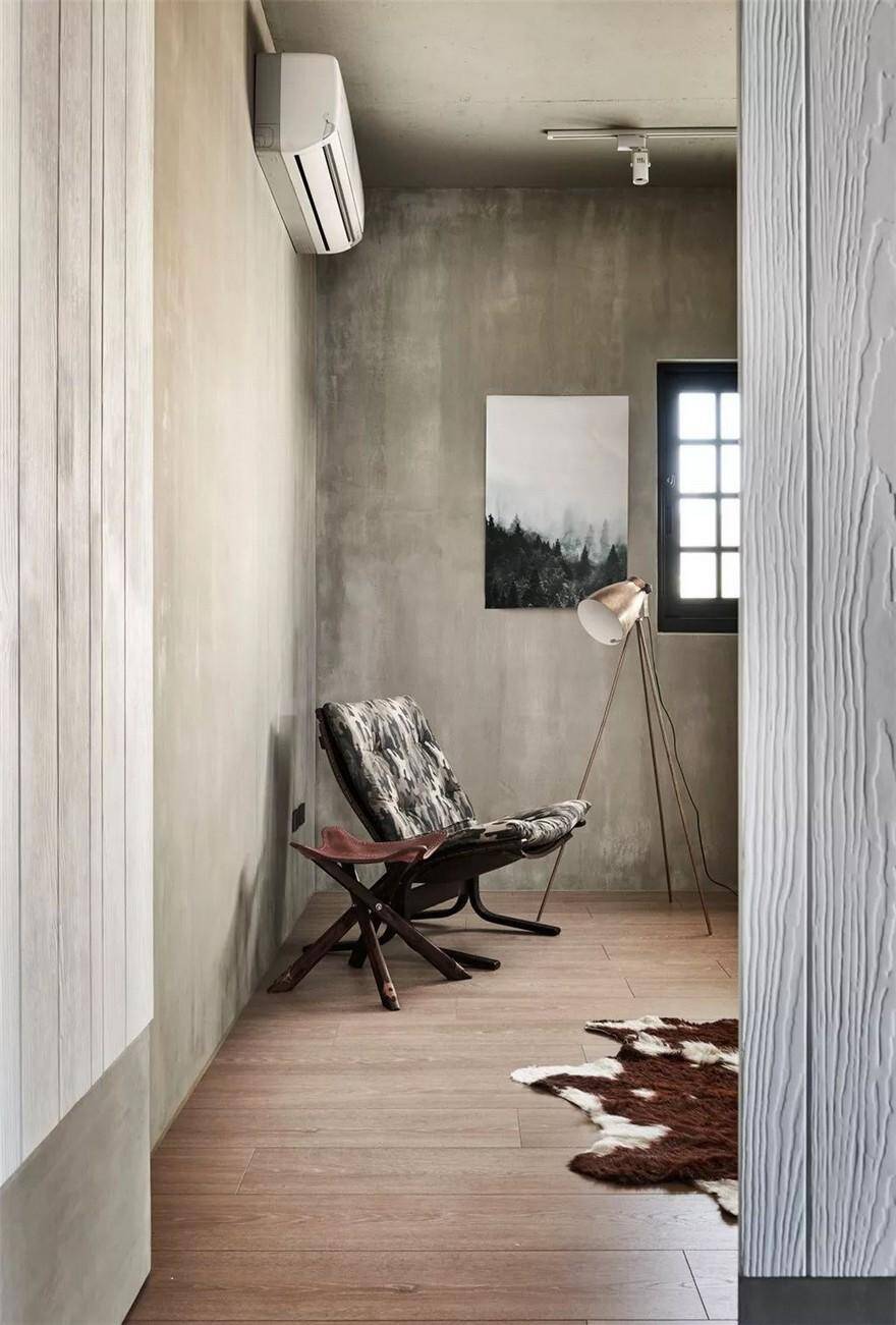
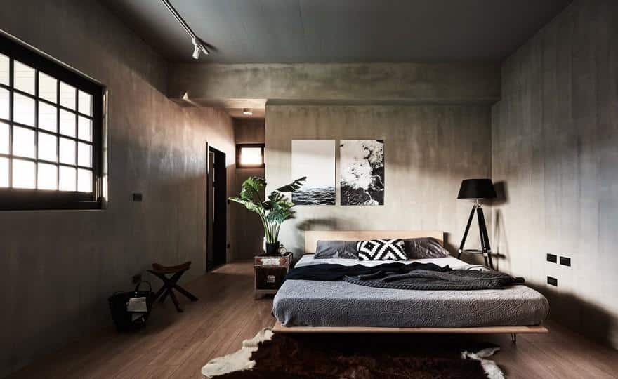
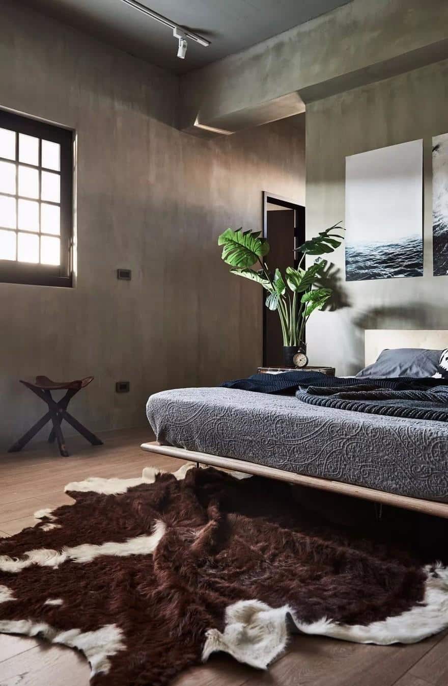
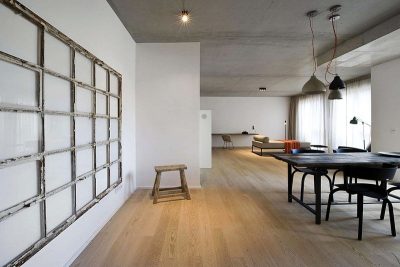
After a series of discussions, we decided to employ a colorless gray industrial undertone, using a Lotos cement wall surface, mock-cement tiles, kiln colored patterned tiles, and steel wool stained wood veneer to create a gray and black base. The metallic pieces commonly used in industrial designs would be incorporated through exposed pipes on the ceiling, stainless steel holed plating and furniture, and metal elements. White wood grain cement boards, natural solid oak veneer, and wood colored furniture were selected to create the bright Japanese style favored by the wife.
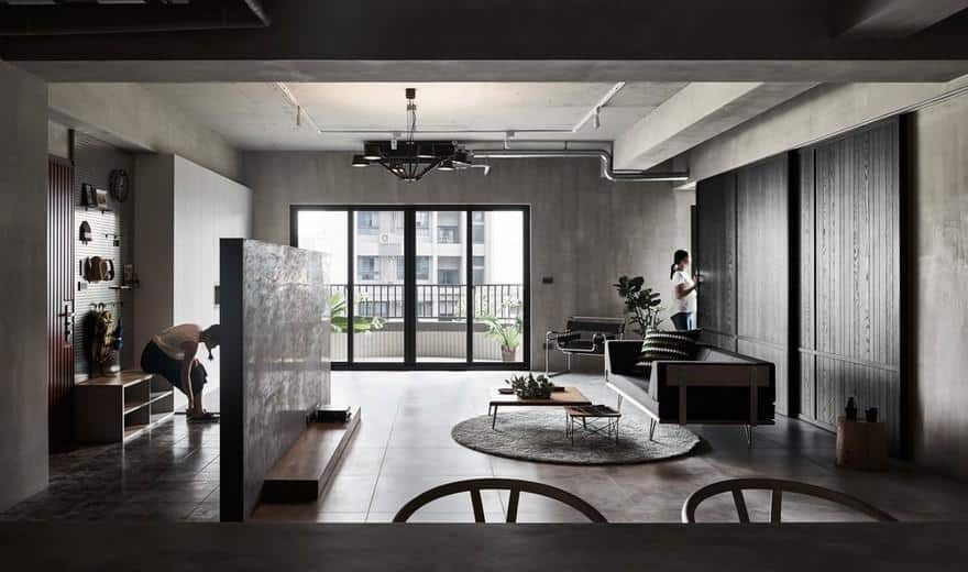
While planning the layout, the primary concern was openness and visual penetrability, to allow natural light to enter the indoor space and creating different shades and rhythms on the gray space throughout the day. The sliding door in the multi-functional Japanese- styled chamber allows flexible adjustment of the connection between the chamber and living room, making the space more functional, and improving the light and air flow.
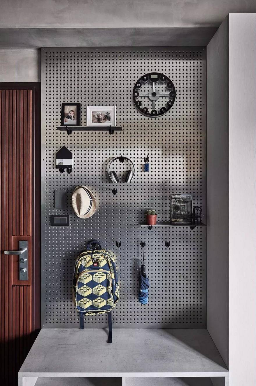
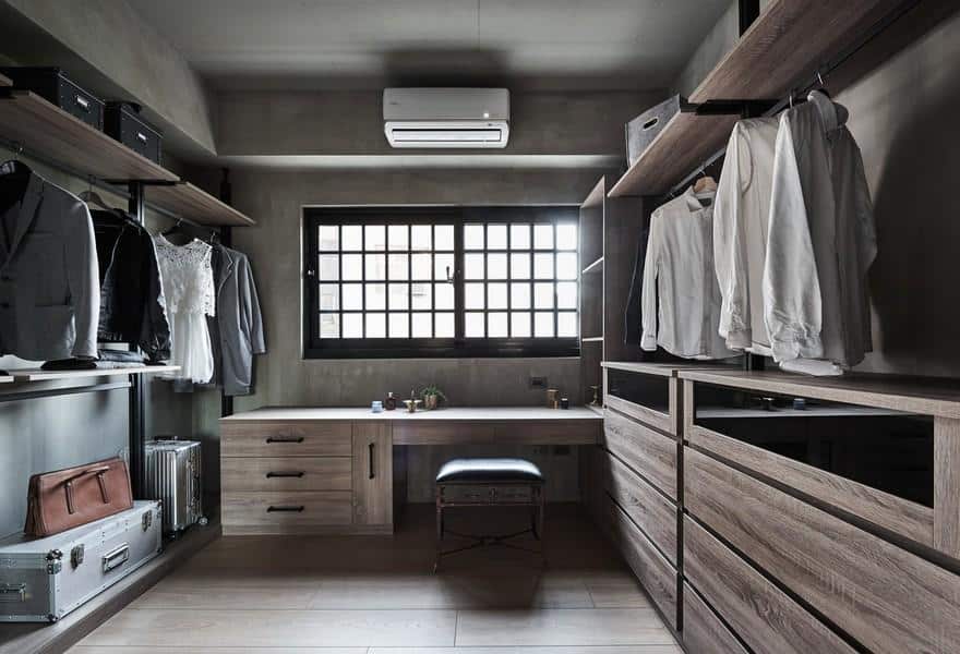
Simplistic aesthetics is not about enforcing strict restraints on material desires. On the contrary, it is about training ourselves to internally reflect on what we really need and care about, and getting rid of the excess to achieve ideal practicality. We fully embraced the spirit of simplistic design. Storage is designed with “planned exhibition” in mind, for example, using stainless steel boards with holes to hang items. This not only makes it easy to find and retrieve things, it also displays the designs of the objects. Closets are also removed from the bedroom, and replaced with a separate, larger walk-in closet where clothing, shoes, and handbags are kept. Space is saved by not using too many cabinets, and a closed-off storage room can give the open space a cleaner visual effect.
The more simplistic and spacious the space, the more crucial the furniture choice and coordination becomes. The color, silhouette, materials, and craftsmanship all affect the functionality and overall style of the space. For example, in the living room, we chose the Case Study® Daybed pull-out bed and table from the Modernica collection. The V-shaped foot can lighten the visual load, while the 1.5 inch wooden frame displays the elegance of simplistic Japanese design. The RH dining table was made with recycled pine wood and concrete, creating a contrast of textures and ages. The Danish classic Y-Chair combines eastern and western elements by incorporating the designs of traditional armchairs from the Ming Dynasty to create a modern silhouette with classic undertones. The steel and aluminum hanging lamp from Tonone’s BOLT collection is made up of 6 arms with adjustable angles, displaying the mechanic beauty of a world of technology, while also adding to the metallic element of industrial styles. This stylish furniture elegantly occupies their own space, coordinating and intertwining within their industrial tones to create an enthralling spatial dialog in the home.

