Project: Spider House
Architects: ITN Architects
Architect: Nigel Grigg
Interior Designer: Emma Dwyer
Location: Melbourne, Australia
Year 2017
Photography: Courtesy of ITN Architects
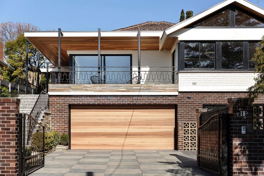
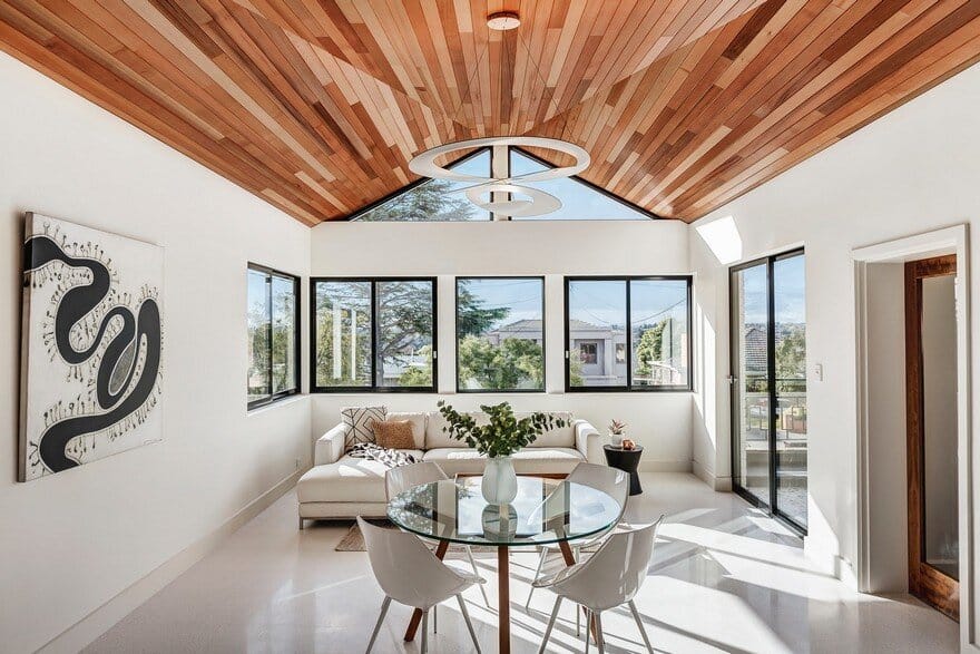
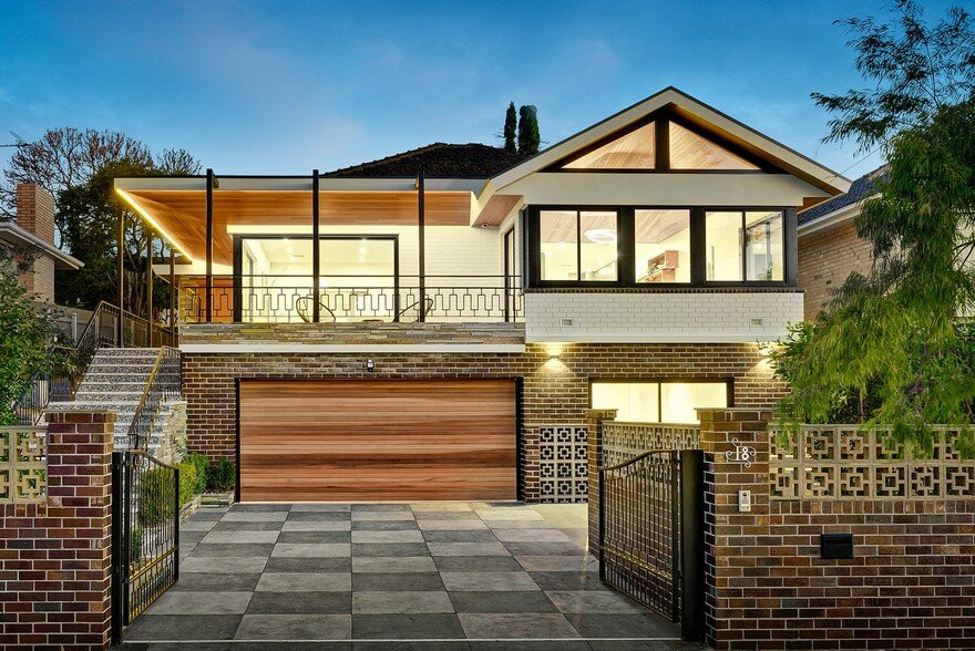
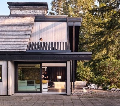
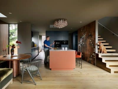
The Spider House is an extension and renovation to a mid century solid brick suburban two level house, involving a complete aesthetic renewal of the entire house. This was achieved with a series of infill additions, new verandah structure, reconfiguring some internal walls and part deconstruction of the front tiled hip roof to form a dramatic internal ceiling, as well as a complete renovation throughout.
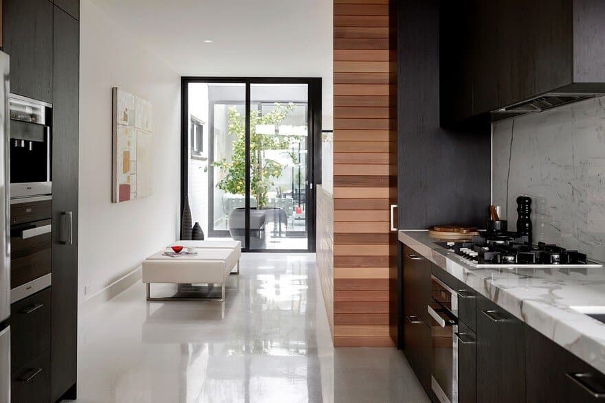
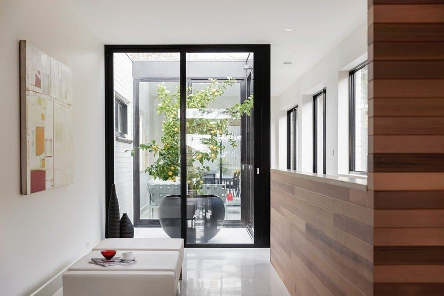
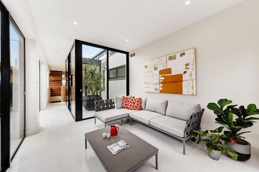
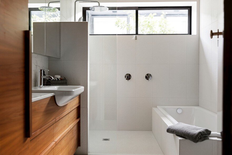
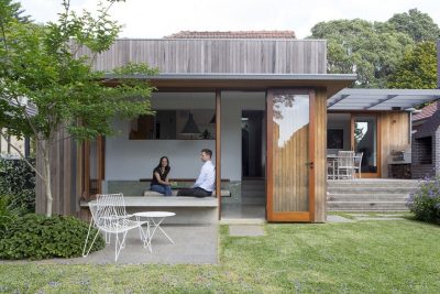
The idea was to bring the solid but tired suburban brick house into the 21st Century and redesign it to suit contemporary needs and standards including passive solar design elements such as deep verandahs, light filled internal courtyards and study areas as well as ensuites and new additional bathrooms. A separate studio apartment on the lower level was also created, and the gardens excavated and landscaped to form private courtyards.
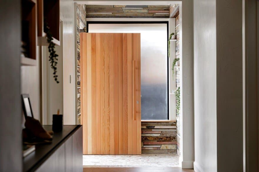
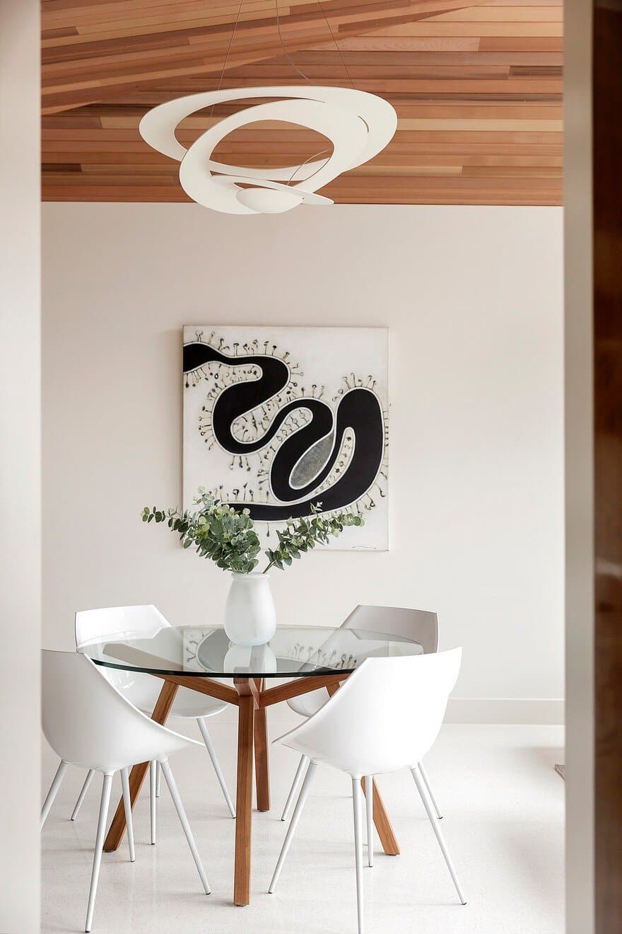
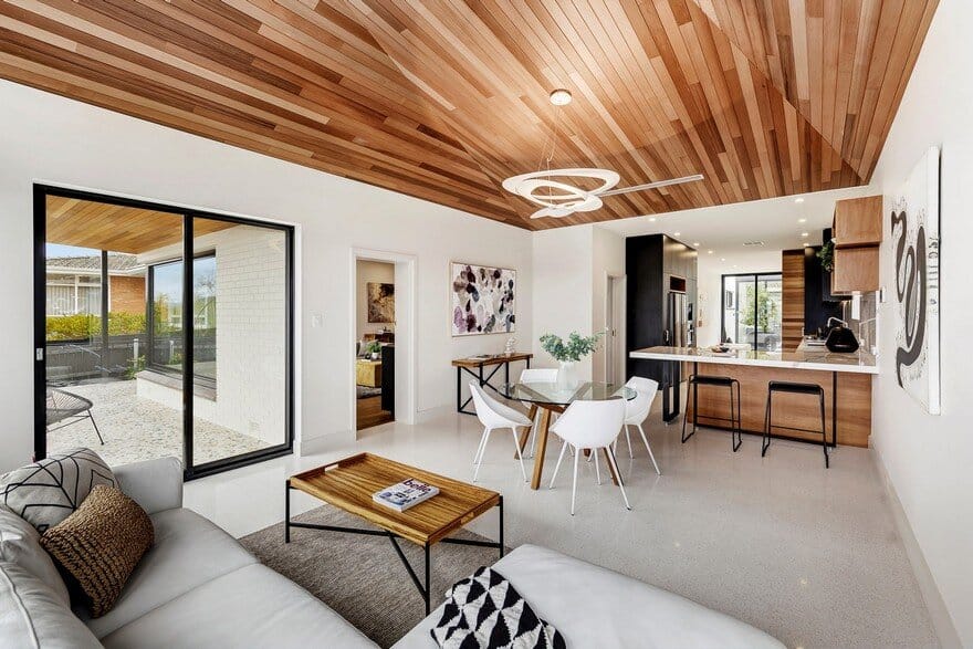
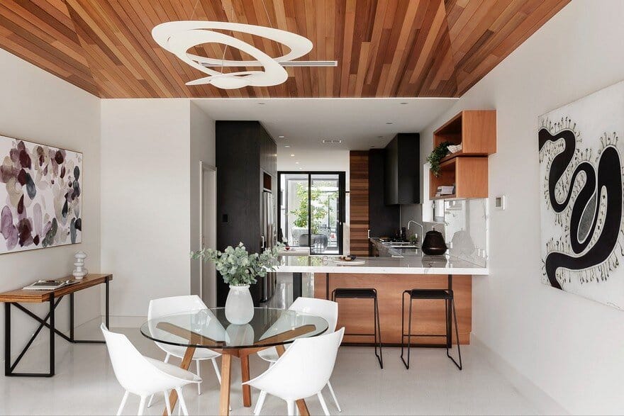
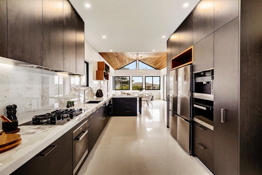
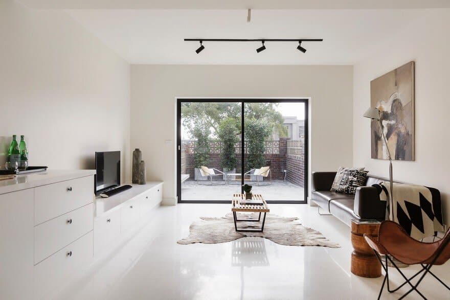
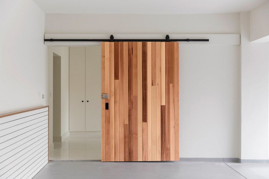
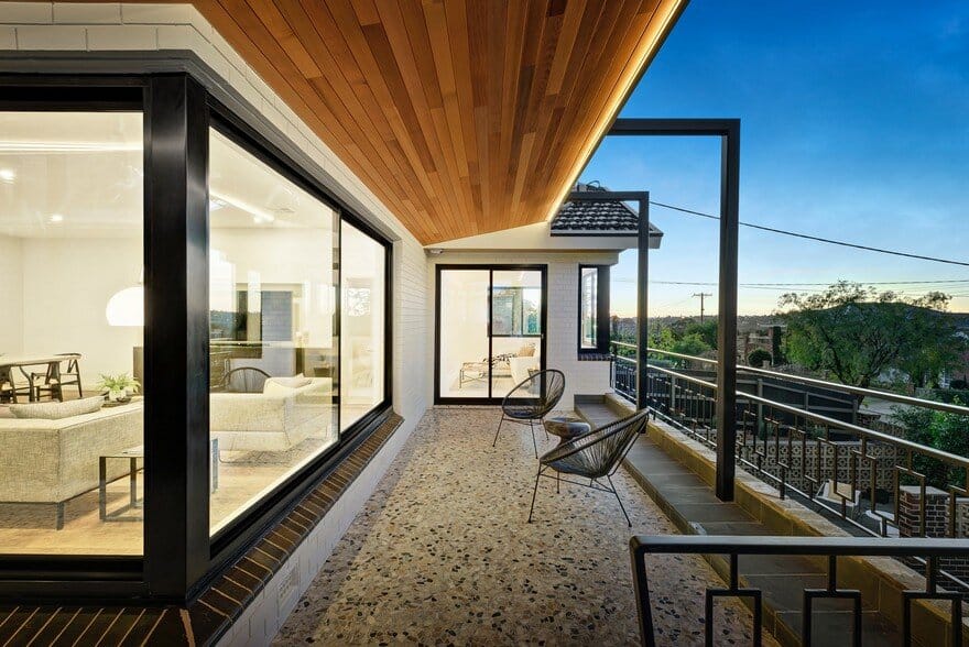
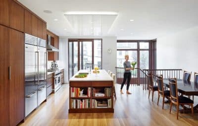
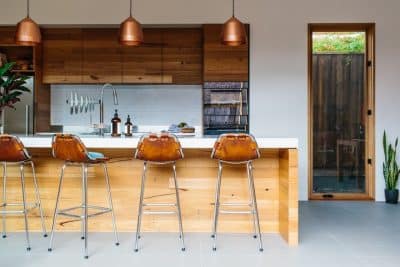
The interior palette and materials were kept simple and consistent and also continue externally on the building reflecting the outside within, using cedar panelling ceilings, white terrazzo flooring, white walls and brickwork and black steel trim and window frames.
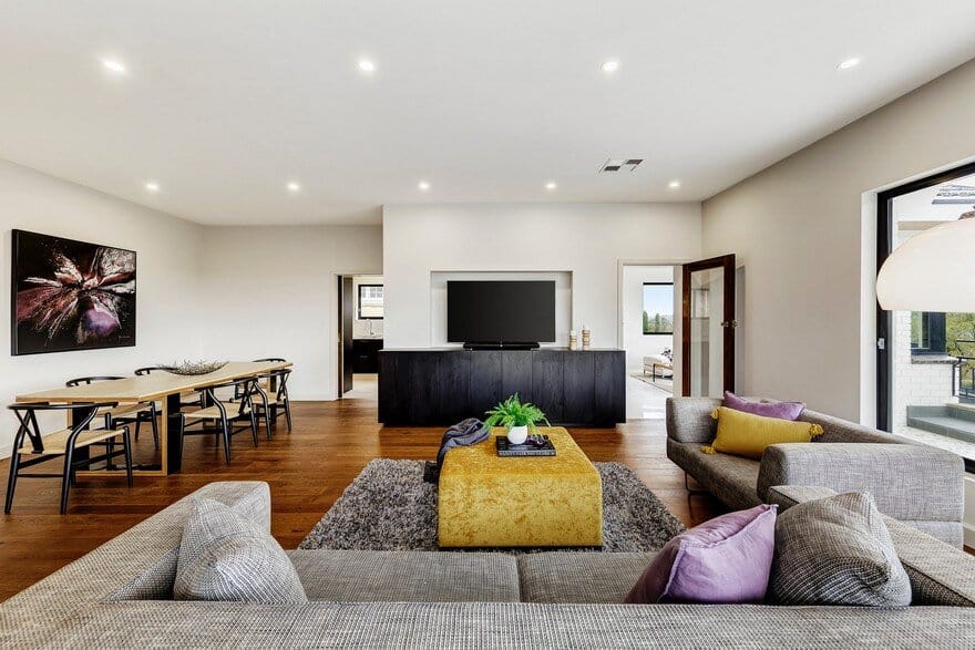
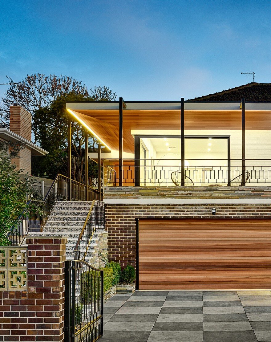
The existing heavy tiled hipped roof at the front was altered to form a windowed gable and to provide a dramatic ceiling within the living area below, bringing northerly light within to the kitchen area of the house. A verandah was added at the front to provide shade to the north and over the upper deck and entry, and to in part disguise the buildings former life as a classic suburban modern brick and tiled house.
This project was a collaboration involving the architect, interior designer Emma Dwyer and the builder Matthew Dwyer from MMD Constructions, all contributing equally in all areas of design.
It’s a risky undertaking to try to dramatically alter the aesthetics of suburban houses like these both internally and externally and emerge with a successful project.
Fortunately this building had solid bones and a rational layout and as such could handle these dramatic alterations in part without becoming confused, awkward or clumsy. By keeping the colours and materials simple and natural yet strong, the existing house doesn’t become overwhelmed with newness and consequently remains strong and deliberate. This is why the internal materials are reflected externally using similar cedar timber, white terrazzo stone, black steel trim and white bricks.

