Project: Tel-Aviv triplex apartment
Planning and design: Studio Dulu
Owners: A couple + 3 children
Landscape architecture: Kfir Fisher
Kitchen: Habitat Israel
Sanitary product: Mody
Lighting: Yair Doram
Location: Tel Aviv, Israel
Styling and photography: @Verbalit
This young family has decided to upgrade their lifestyle in a new dream home, whilst staying loyal to the same north Tel Aviv neighborhood in which they have lived for many years. The owners limited their property search to a few neighboring streets and ended up purchasing their dream home in the form of a Tel-Aviv triplex apartment.
This young family, a couple and their three children, have lived in the same neighborhood in north Tel Aviv for many years. The neighborhood is home to apartment buildings interconnected by green spaces, it is close to the beachfront, has good access to primary routes, and enjoys a very rich community life. When the owners decided to make their dream come true and move to an apartment with a rooftop terrace, their preference was to stay locally and so their property search focused on the streets surrounding their existing property at the time.
The owners chose Studio Dulu to plan and design their newly purchased Tel-Aviv triplex apartment, located on the 12th floor of an old 13-story building.
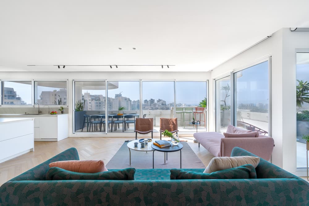
The space’s characteristics were evident from the design team’s first visit to the property, primarily the breathtaking view of the Mediterranean Sea to the west and the urban Tel Aviv skyline to the south.
In its original layout, the Tel-Aviv triplex apartment was partitioned into many small rooms reminiscent of a labyrinth. Curved and diagonal spaces, dictated by the architectural shape of the building, posed a challenge for the designers that wished to conceal these and create clean square spaces. “During our first visit to the property, we walked around and absorbed its atmosphere. We visualized ways in which we could redesign the existing spaces so that they perfectly met our clients’ needs”, recalls interior designer and studio owner Adi Klein.
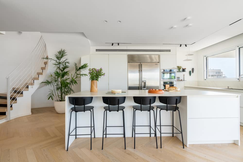
Prior to the planning stage, the designers ran a series of discovery meetings with the clients who emphasized their desire for a practical, clean, and well-organized home. They wanted the new design to support their lifestyle and allow them to maintain order with a focus on ample storage. The designers factored the clients’ requests into the creative process and provided them with three alternatives. The plan that was chosen was the one that most practically suited the clients’ lifestyle approach. “It is incredibly rewarding to work with clients that have a clear vision. The clearer the client is, the easier it is for us to create the optimal solution for them. The result, on this occasion, was a cozy and minimalist apartment”, says Klein.
The owners love to entertain and do so frequently. In the meetings with the Studio’s design team, the clients shared information about their socializing preferences: extended family, families with children of similar ages to theirs, and entertaining other couples in the evenings. The clients expressed their desire to have multiple seating areas around the entrance level and rooftop that would be practical for a variety of formal and informal entertaining yet rejected the idea of a traditional dining area.
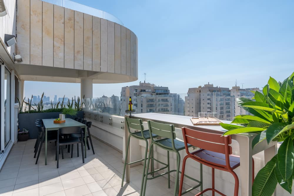
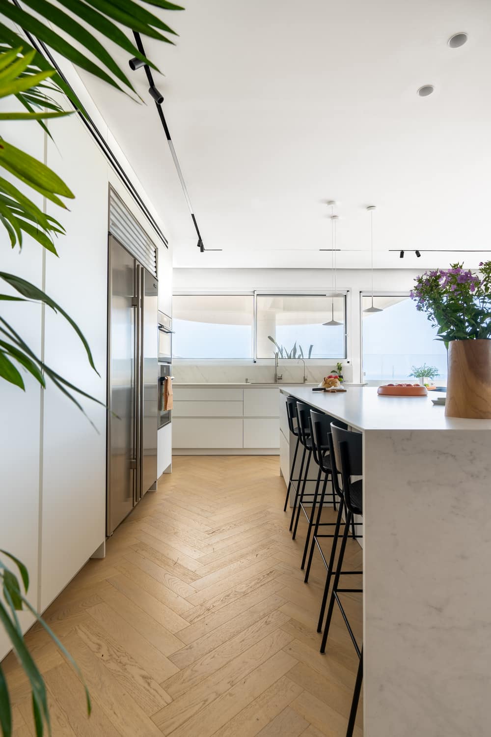
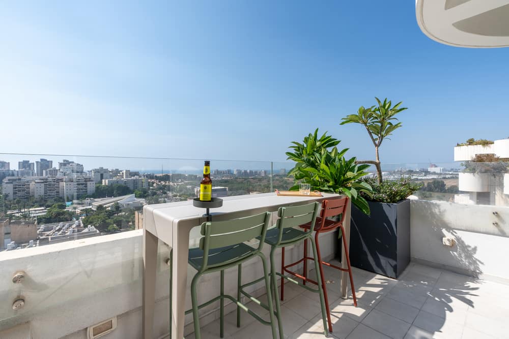
The clients preferred to have a spacious kitchen for cooking, with a spacious island in its center that would serve as an informal daily dining area as well as an entertaining area. An additional dining area was planned on the roof terrace adjacent to the kitchen, which can be enjoyed throughout most of the year, thanks to the Mediterranean climate.
The owners, who love to cook and bake, spend a considerable amount of time in the kitchen. As such, all the kitchen tools and equipment were designed to be easily accessible, whilst ensuring the space was kept uncluttered and tidy.
The kitchen extends towards the balcony and includes two cupboard units; one low unit facing west and one tall unit fitted against the southern wall. Two doors in the tall unit can be closed to conceal the various kitchen appliances, maintaining a tidy appearance.
The 3.6m long island includes a set of narrow drawers on one side, whilst the rest of the space is dedicated to seating and can accommodate up to eight diners. The worktop is fitted with an invisible induction cooktop, allowing it to be used as a workspace when the cooktop is not in use.
Another element that influenced the new layout was the clients’ request to locate their master bedroom on the 90 sqm entrance level, with the view of creating a separation between the parents’ and the children’s bedrooms and catering for future needs throughout the children’s teenage years.
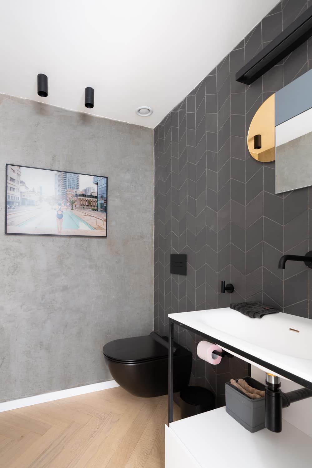
The entrance door opens up onto a corridor that is used as an entrance hall. The parents’ ensuite is located to the right and concealed by a carpentry unit. One of the unit’s walls defines the entrance hall and conceals a guest toilet and storage space. The entrance to the unit is embedded into the facade that faces the living room (where the kitchen was originally located).
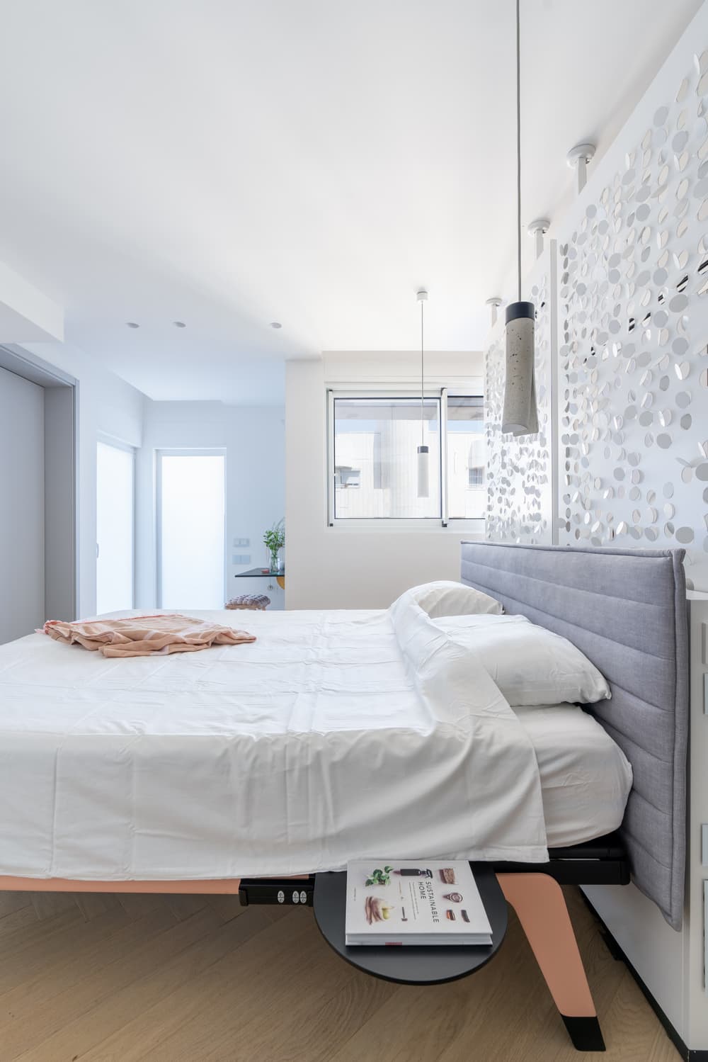
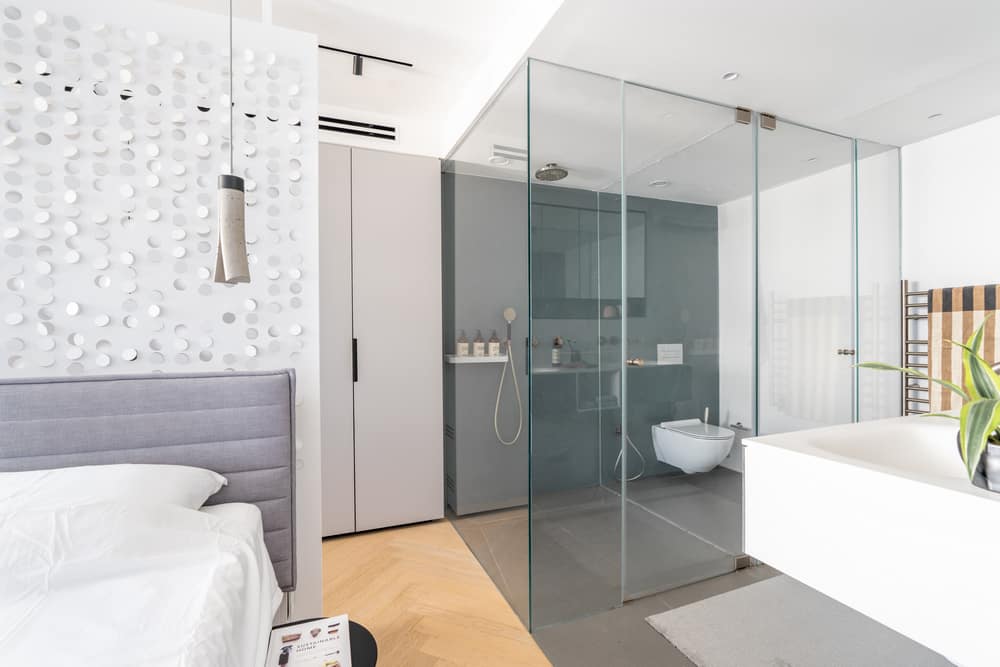
“The planning was done during the Covid pandemic, and we learned that the clients enjoy spending a significant amount of time in the bedroom. They enjoy working on their laptops in bed as well as chatting and reading. The clients mentioned that they were happy for their bedroom to be compact, but that it was important for them to have a large spacious bed”, explains Klein. The free-standing bed was positioned in the center of the room with light fixtures hanging from the ceiling on either side. A Studio Fe light metal partition was positioned behind the bed concealing a wardrobe that includes a hidden door leading to another enclosed storage space.
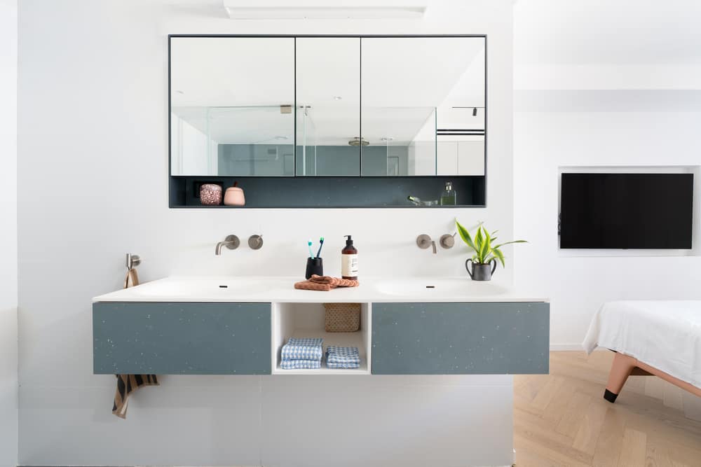
The transparent bathroom is separated from the sleeping area with the use of a variety of materials. A floating counter and sink were positioned across from the toilet and shower cubicles. “The bedroom space is limited, and thus we had to make use of functional design tricks that created a sense of space, such as the open bathroom”, says Klein. “A floating-shelf dressing table and stool were positioned next to a large window in the corner of the room”, she adds.
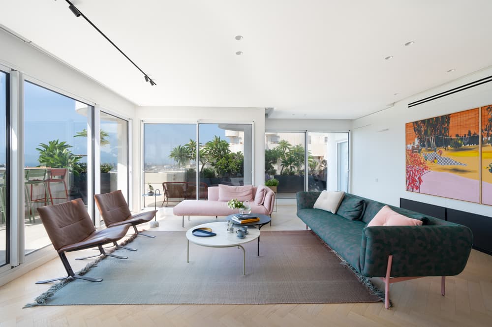
Three sofas, surrounded by windows, create a dynamic socializing circle, and artwork by Anat Rozenson Ben-hur was hung on the carpentry unit wall in the living room. “We knew this was where the owners planned to display artwork, so we planned for the lounge-facing side of the carpentry unit to double as a white canvas, devoid of storage space from the get-go. The ceiling was designed to be detached from the unit with suitable dedicated light fixtures”, explains Klein.
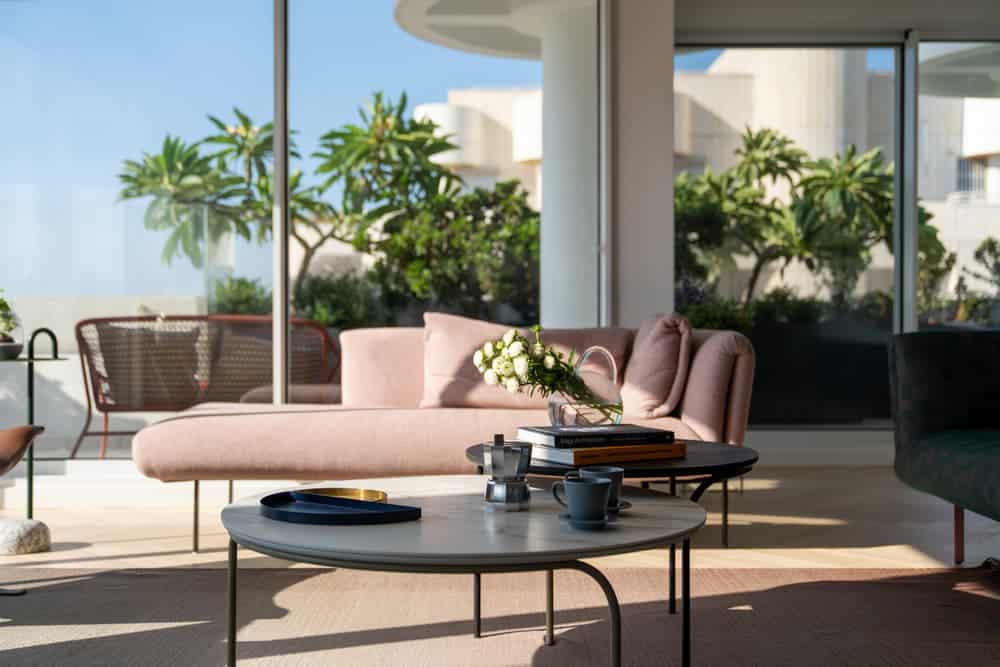
The artwork contributes to the overall look of the space. The upholstery fabric chosen for the sofas is unusual, with green and pink tones that blend with brown leather armchairs. The furniture on the balcony is also colorful and can be seen from the lounge, completing the look and emphasizing the clean white carpentry unit and kitchen.
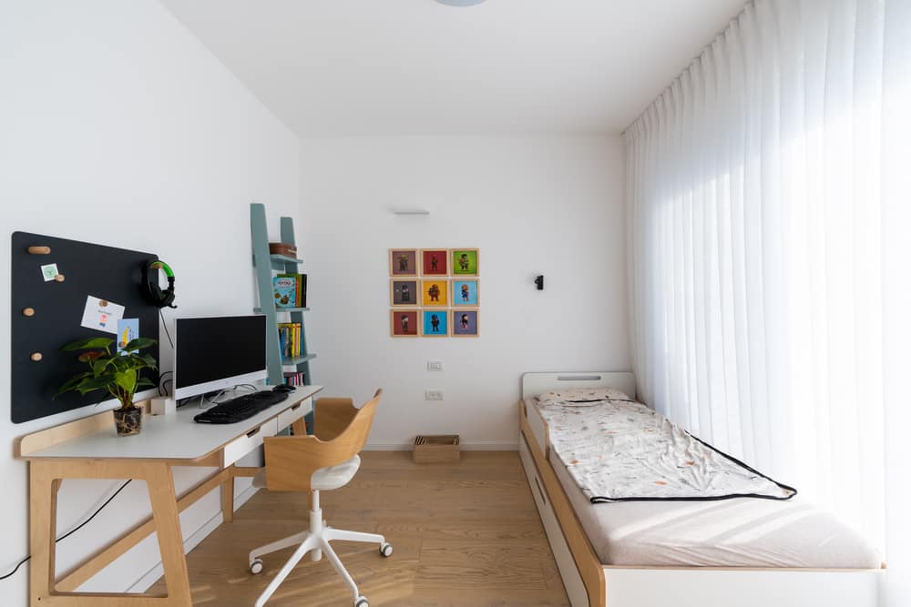
The walls on the children’s level were taken down, and the 70 sqm space was replanned. A mini suite was designed for the eldest daughter and includes a bathroom and fitted wardrobe. The two younger boys share one large space on the west side of the level, following the owners’ request. The designers planned for the potential future partitioning of the space into two separate bedrooms and incorporated all the required infrastructure to allow for quick and easy separation with a day’s work and a plaster wall.
The boys’ bathroom is located further along the level next to the utility room. Light and airy furniture pieces in shades of white, natural wood, and touches of pastel were chosen for the bedrooms.
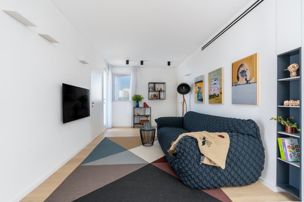
A family corner was created in the center of the level, separating the rooms but acting as a central hub for the children to spend time together. The level is surrounded by balconies that can be directly accessed from the mini-suite, the family corner, and the boys’ bedroom. Once the children grow older, it would be easy to create sea-facing lounging corners on the balconies.
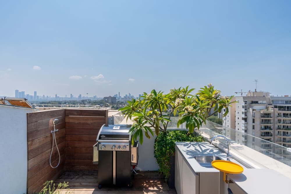
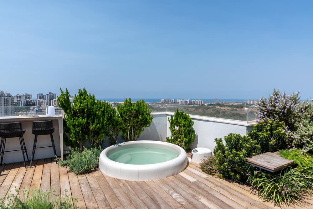
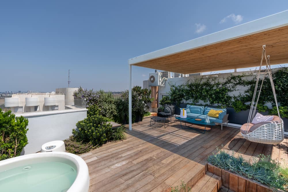
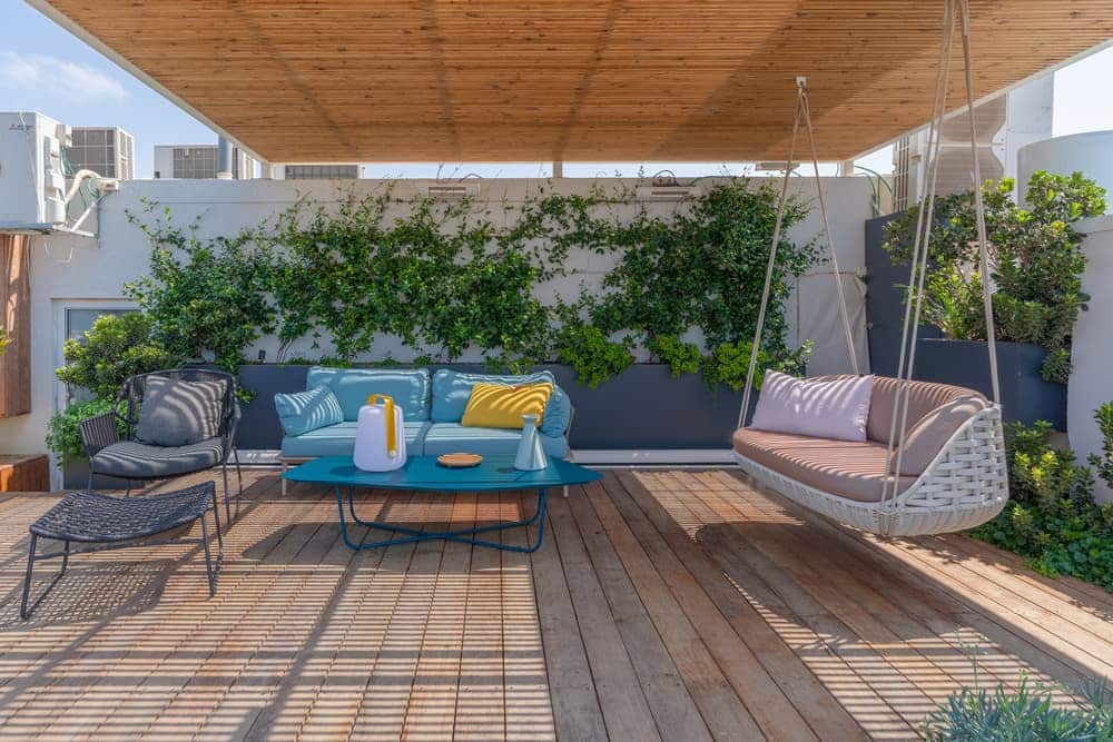
It was the dream of living in a penthouse that led the owners to look for a new property. To make the dream come true, considerable attention was given to outdoor planning on the top level, which includes one room used as an office. The space was laid with a deck in a play of heights giving it a dynamic sense of movement. The majority of the outdoor space was dedicated to a spacious outdoor lounge covered by a floating pergola. A bar was designed across from it with an optimal view of the sea as well as an external kitchen, shower, and a bench concealed with plants. The rooftop is surrounded by plants and bushes that conceal the walls and add a sense of privacy. Climbing plants were planted, which will eventually hide the building cladding.
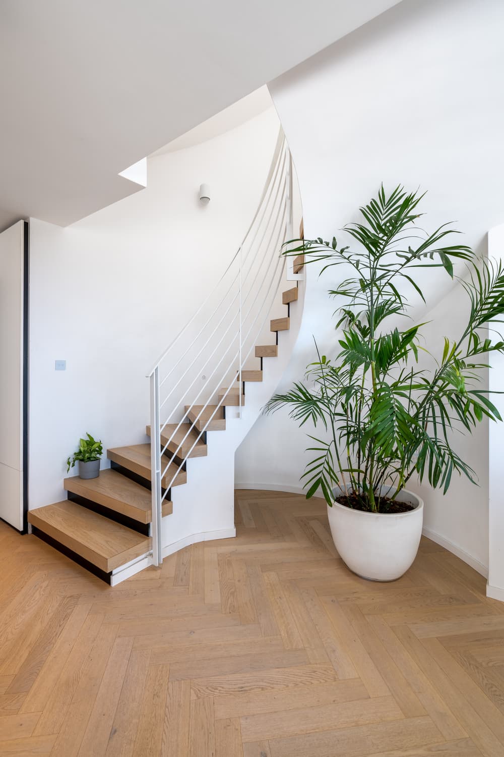
The Dulu Studio design team recommended a replacement of the existing staircase with a lighter more sculptural piece, but due to budget, the owners decided to keep the existing one. “The staircase was a constraint, but the correct design can bring wonderful results. The stairs were fitted with the same light parquet treads used throughout the property and the risers that were painted black create a sense of floating stairs. The handrail was replaced with a light white steel handrail”, summarizes Klein. The skylight above the staircase was renewed, allowing for natural daylight to wash all the levels, and in particular, the family corner on the children’s level.
