LLI Design have recently completed a total redesign of the ground floor of a newly built (c. 5 year old) detached house in Buckinghamshire, United Kingdom. The clients, a young professional couple with 2 children, wanted a modern look that wasn’t cold and clinical, they wanted their home to be somewhere they could relax and entertain, but at the same time would function as a practical family home.
The Brief, space planning, layout and flow
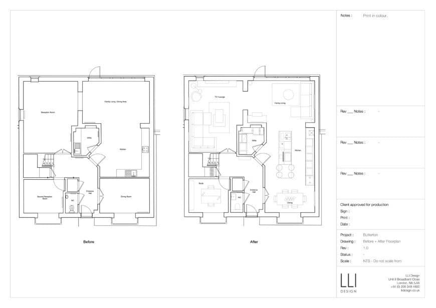
The family had bought the house new and over time had come to recognise that it did not fulfil their wishes as to how they wanted to live. The original layout was fairly traditional, with a family / kitchen room at the back of the house looking onto the garden, a separate dining room at the front was seldom used – mainly because it was difficult to access from the kitchen. There were two further reception rooms, one of which, whilst large, was also under used as the layout, lighting and decor combined to make it an uncomfortable space. It was calculated that up to 40% of the space was very seldom used, which was an important factor in the redesign. The house in general, needed to be taken to a new level of design and quality, LLI Design proposed that more open plan living would suit the family’s lifestyle. The wall between the kitchen and dining room was removed in order to create one large area divided into a family living space, new kitchen and dining area. This approach changed the whole dynamic and truly placed the kitchen at the heart of the home whilst at the same time having the added benefit of flooding the space with natural light from front and rear aspects. One of the reception rooms was redefined as a TV / lounge and the other as a study.
Statement frosted glass kitchen
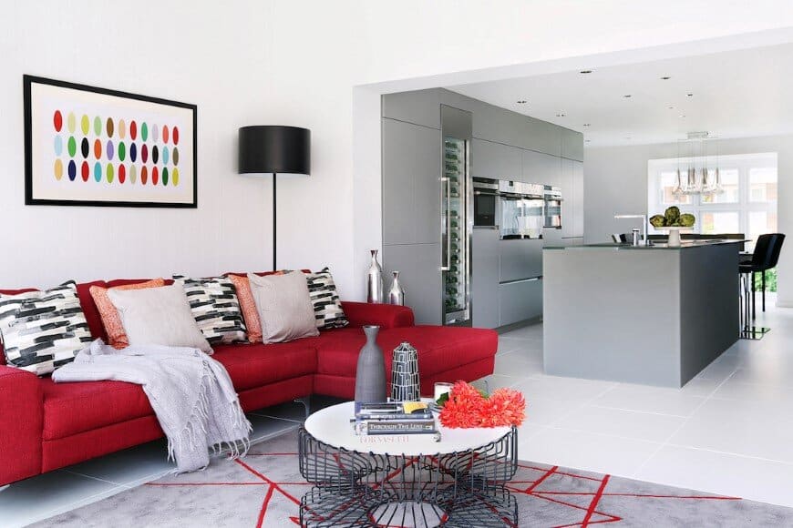
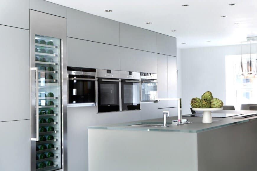
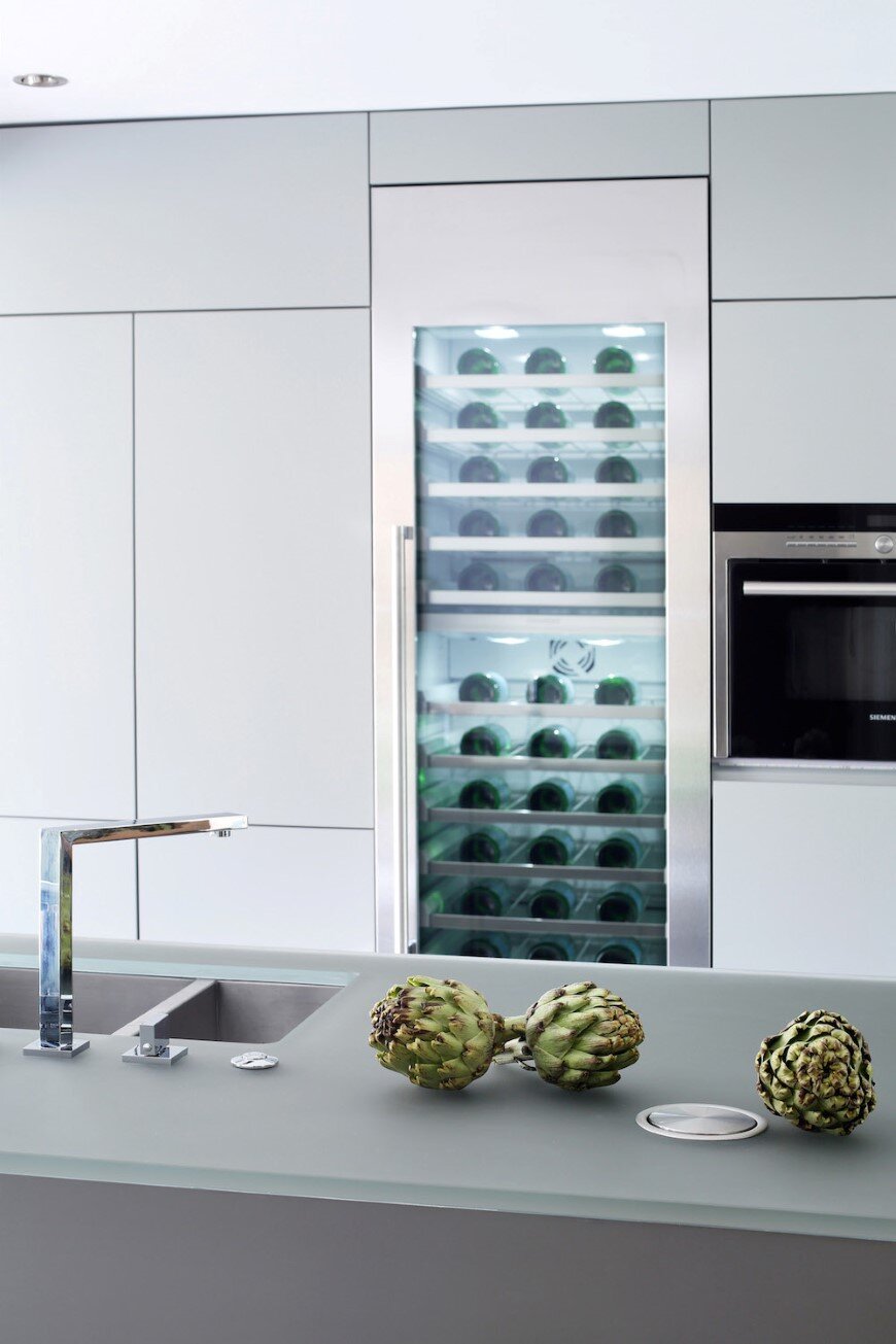
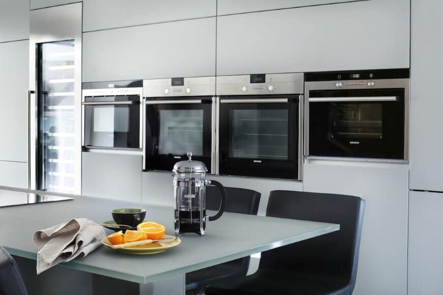
The kitchen was designed to give a real wow factor. A dramatic 3.7m long central island wrapped in statement dove grey frosted glass was installed and under lit with LED strips. The island houses the double sink, with waste disposer, water softener, pop up sockets, induction hob with downdraft extractor and a breakfast bar at one end. An impressive bank of tall units sits against the back wall with 2 ovens, microwave, steam oven and a large wine fridge. At one end there are pocket doors that fold back to reveal, toaster, mixer and all paraphernalia that usually clutter the worktop. This can be closed when not required, keeping the look sleek and visually pure. The existing utility room was stripped out and the space was re-designed. New units were specified including a full height pull out pantry. Overall providing increased storage and also making it a practical room for laundry.
Family & Dining Areas
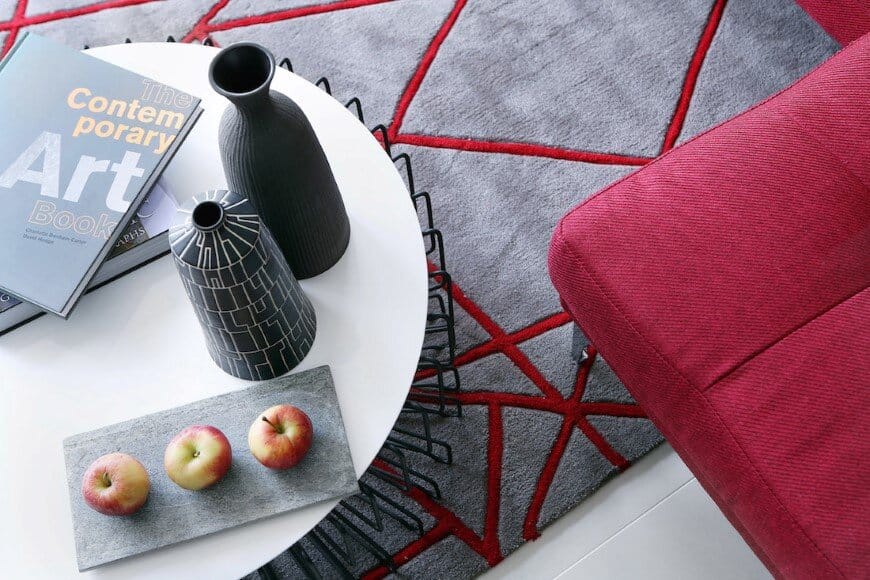
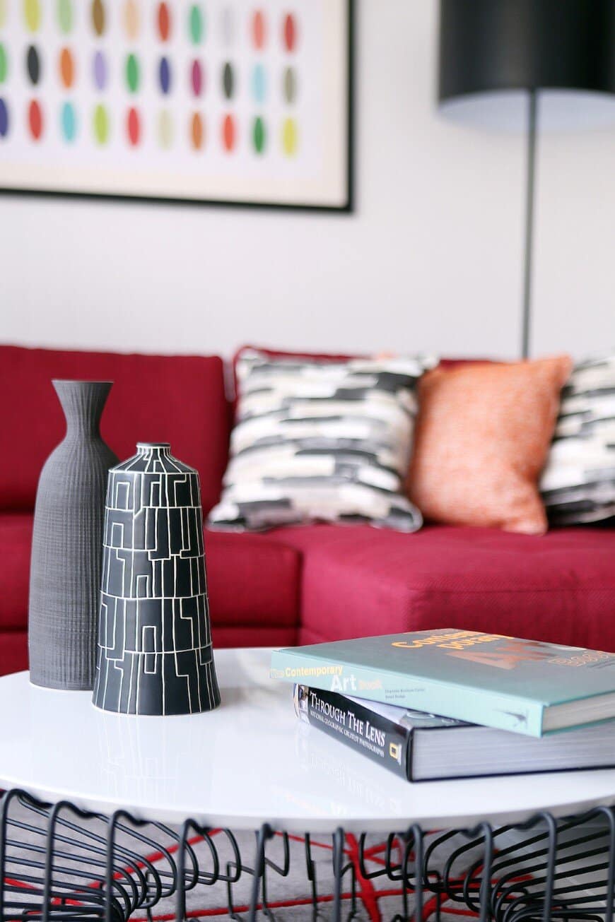
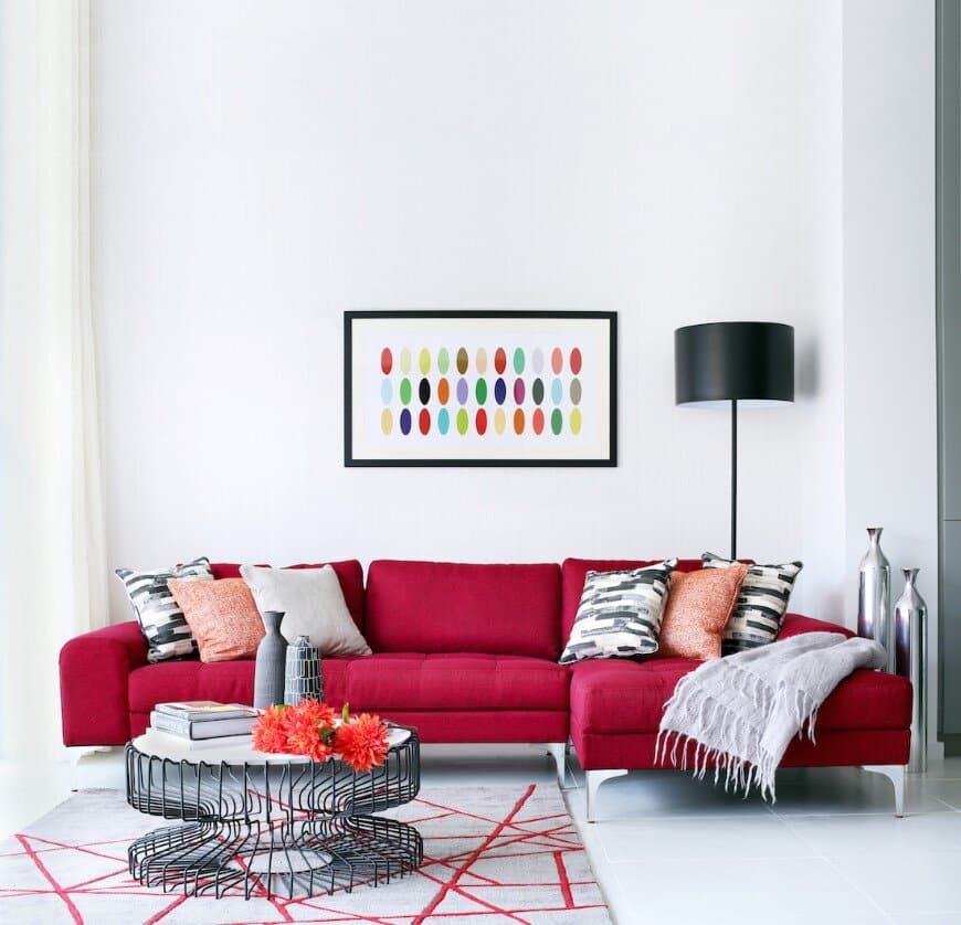
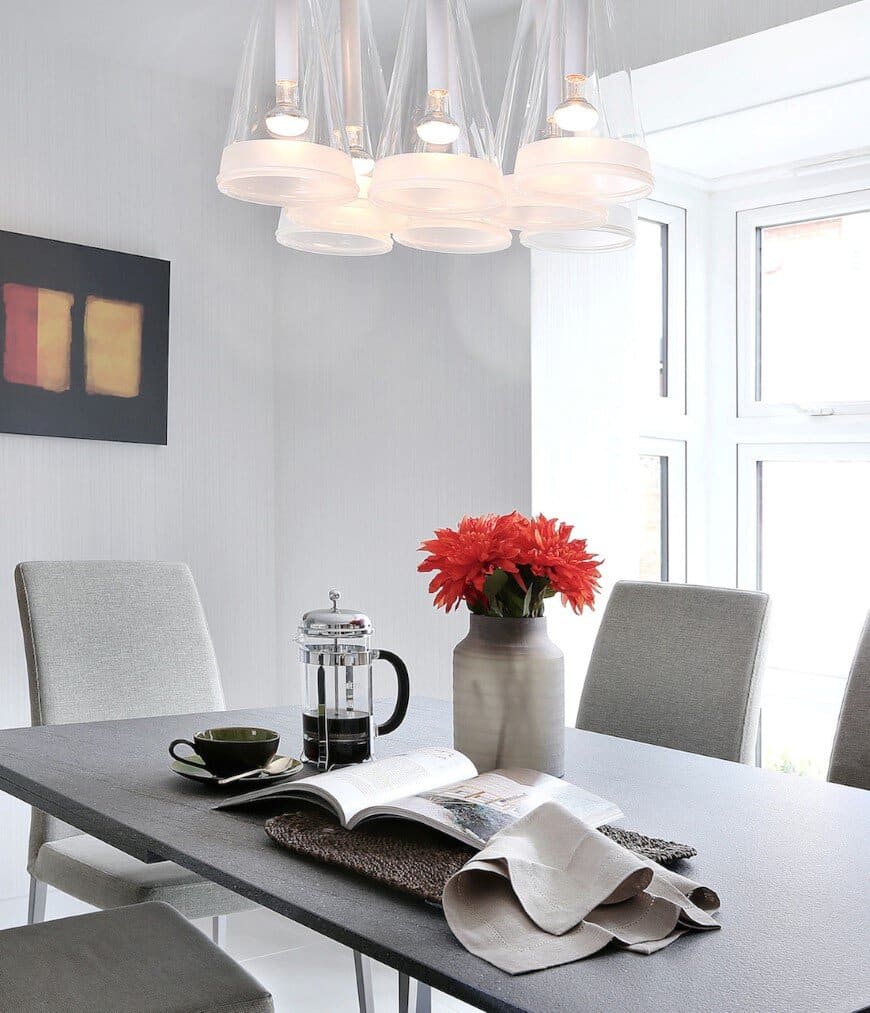
In the family area, furnishings were kept simple but with strong styling lines, a bright red retro styled sofa with chaise end and a rug together with a statement Flos spun floor lamp and bright artworks, warm up the area. A limited palette of greys, creams, blacks and reds added drama to the space. In the dining area the Flos spun floor lamp was repeated and a honed granite table with upholstered slimline dining chairs were specified to inject texture and as a contrast to the block of Flos Fuschia glass hanging ceiling lights above.
TV / Lounge
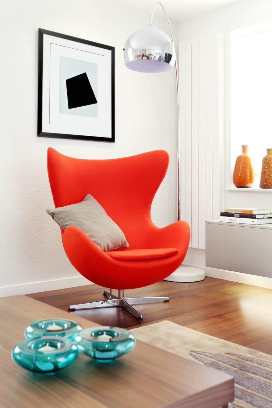
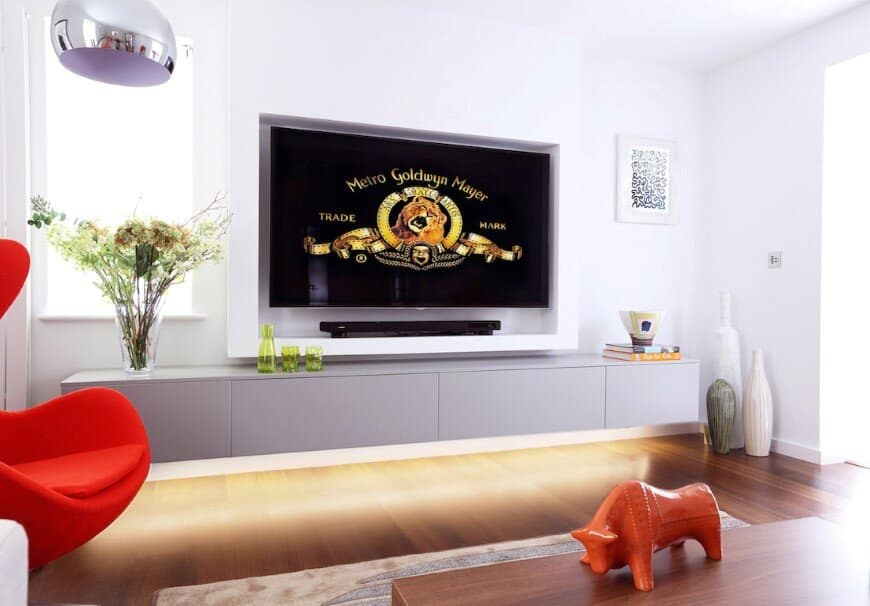
The larger reception room was repurposed as a TV / lounge due to it’s lack of natural light. It was important to make this room warm, welcoming and cosy especially as it had been so under used in the past. The palette was kept to oranges, taupes and greys, together with a walnut floor. This progresses harmoniously from the open plan area adjacent to it. A sizeable and comfy L shaped sofa along with an orange accent Arne Jacobsen Egg Chair and a large textured rug were specified. An oversized classic arc lamp finishes the space, along with dramatic artworks that complete the room. A full width, bespoke lacquer wall hung unit was specified, under lit with a warm hum of LED. The 65” TV was set flush into a bespoke stud partition, so, although large it didn’t dominate the room.
Interior Architectural Details & Intelligent Lighting Scheme
All the painted panelled joinery doors were removed and new flush walnut veneered doors were specified, to create a contemporary feel. Some doors were specified with glazed panels to maximise light levels. New door furniture was specified throughout including projection hinges to allow for 180 degree opening doors to the new dining area. Engineered American Black walnut flooring was specified in the TV / lounge, study and hallway and large format porcelain tiles in the open plan areas. The entire open plan area was underfloor heated and new contemporary radiators installed elsewhere. A new lighting scheme was designed and specified including new fittings and garden lighting. An Intelligent Lighting system was installed in order to create moods, ambience and timed events internally and externally, controlled from wall mounted keypads and also by iPads / iPhones.
Study & WC
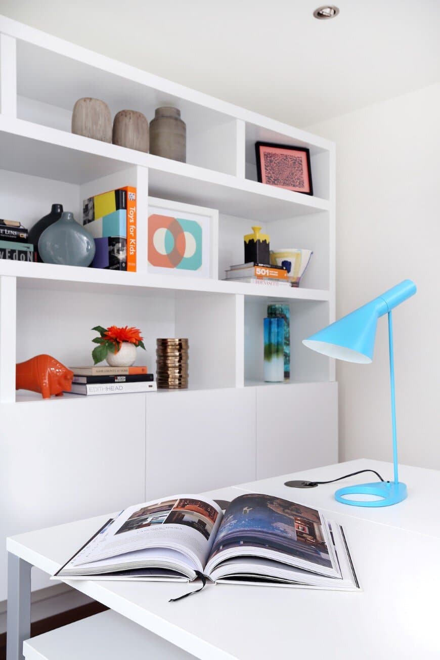
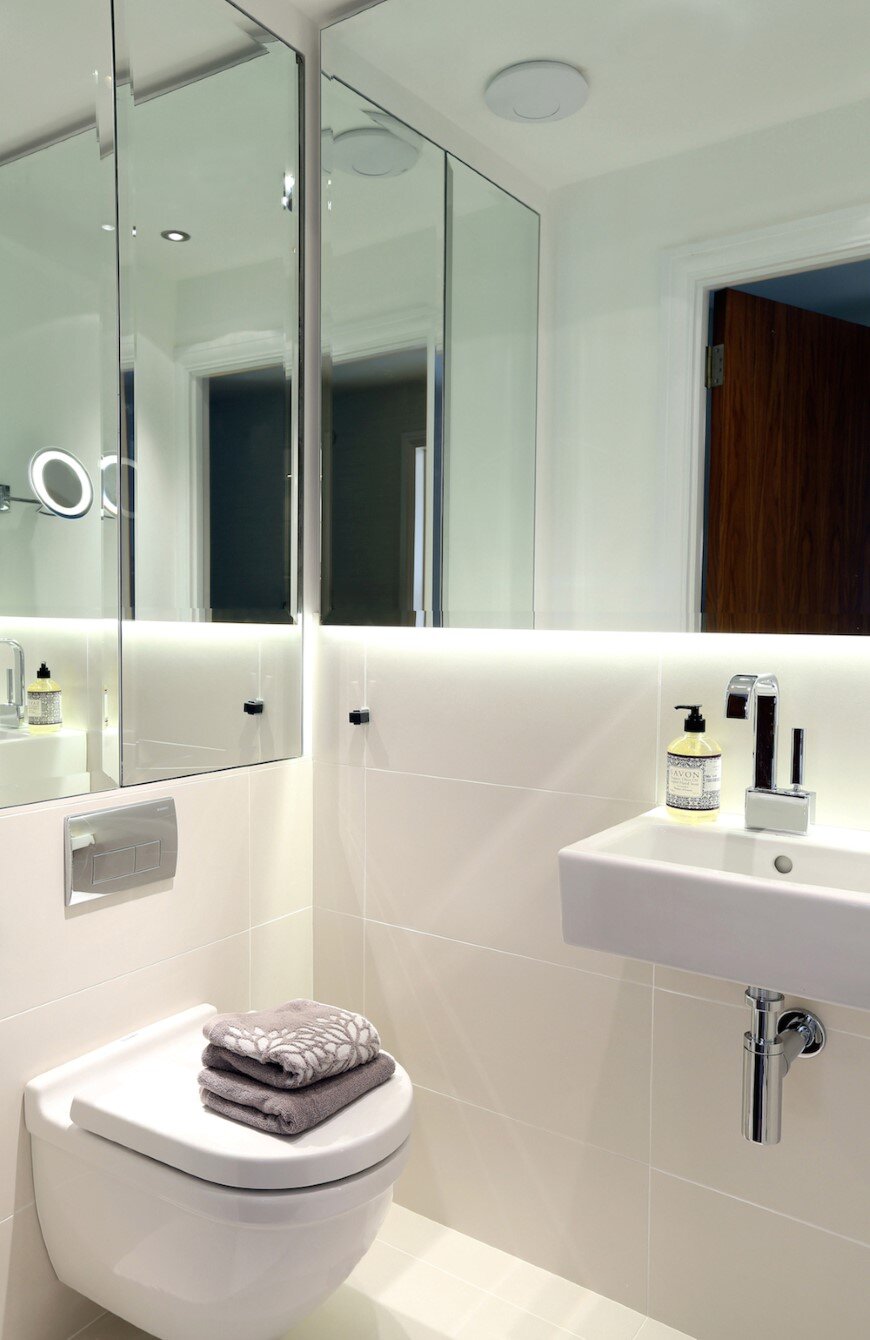
The second reception room became a bright Study for the couple’s two children. A bespoke wall hung unit with LED lighting allows for ample storage and 2no. back to back desks with classic Eames EA108 chairs in bright yellow and turquoise Arne Jacobsen AJ table lamps complete the look, making it an uplifting space to study. The small downstairs WC was transformed with sleek floor and wall tiles. On one wall a full size mirror was installed with led strip below. New lighting and a wall hung WC and basin completed the revitalisation of the space.
Summary & Awards
By changing the dynamics of the spaces involved and re-thinking how the family wanted to use their home LLI Design have not only maximised the available space, but created an uplifting and comfortable home which the owners can proudly display to their guests. The project recently received a Highly Commended award for the Interior Design Private Residence, South East, UK category in the International Property Awards – in association with Gaggenau & Rolls Royce Motor Cars.
Butterton Project by LLI Design
For further information visit the LLI Design
Styling / Photography : LLI Design / Alex Maguire Photography

