Project: Tunbridge Wells Victorian Villa
Architects: The Vawdrey House
Location: Tunbridge Wells, Kent, United Kingdom
Photo Credits: Siobhan Doran
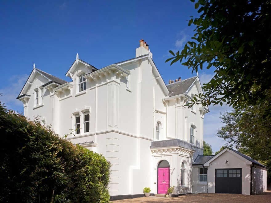
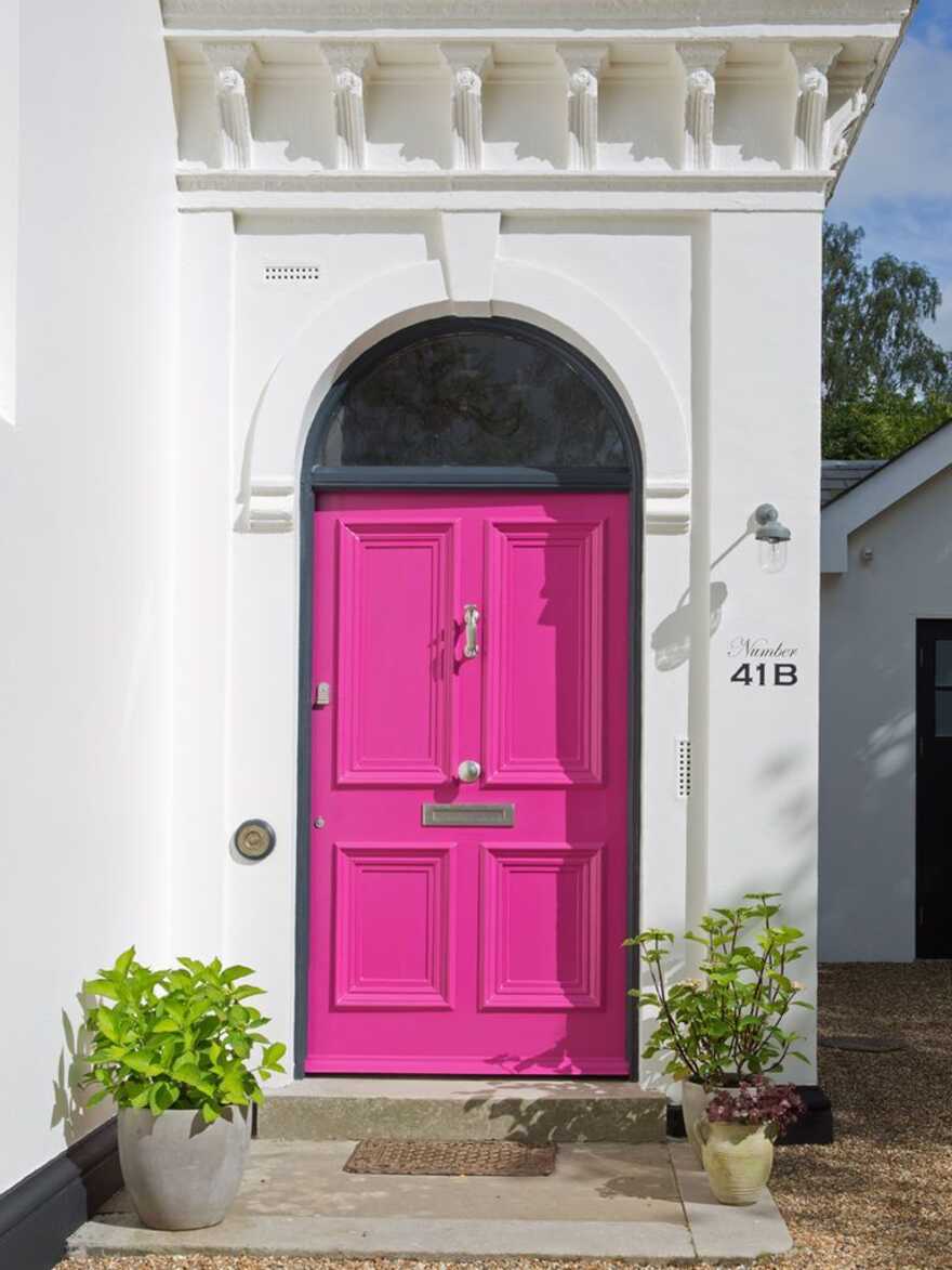
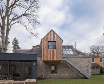
Tempted by its large grounds, stately rooms and kerb appeal, our clients fell in love with this striking Tunbridge Wells Victorian villa, and made their move from London in 2014.
Divided into two dwellings in the 1950s, the house presented significant design challenges. The stairs and circulation spaces had been compromised, while the kitchen sat in a cold lean-to extension at the rear, and the entombed cellar was often under several inches of water.
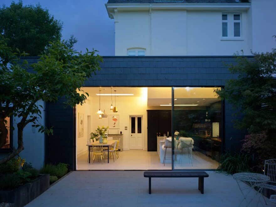
This award-winning refurbishment now provides two grand receptions rooms; a large kitchen and dining space, which opens onto the garden; plus a study, a utility room and a garage. Upstairs, there are five bedrooms and three bathrooms all accessed from a light-filled stairwell. The cellar has become a playroom, wine store, occasional bedroom and plantroom.
We were proud to be winner of the Interior Design category at The Sunday Times British Homes Awards in 2017.
The main hall was marred by the awkward overhanging boxed-in staircase, which was added when the house was divided, and while walking upstairs visitors had to duck in and out of the main supporting wall via several low ceilinged ‘doorways’ – clearly this was not how such a grand house should feel.
Our clients initially asked us to help them design a rear extension to provide a kitchen and large entertaining space. At that point they felt the stairs represented an unavoidable compromise inherent in the way the house had been split – but they loved the rest of the house enough to live with this.
We soon saw that if we solved the issues with the circulation spaces we could give the house back the grandeur it deserved, and thereby lift its value – meaning every penny spent on extending and renovating would go that bit further on resale.
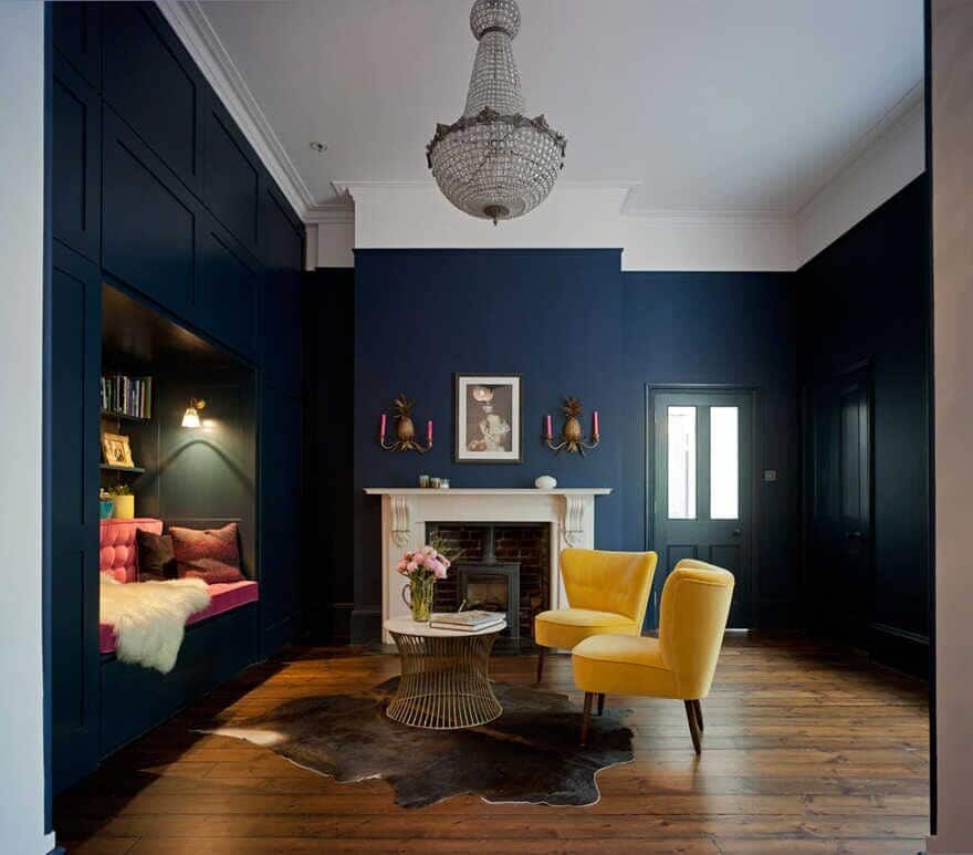
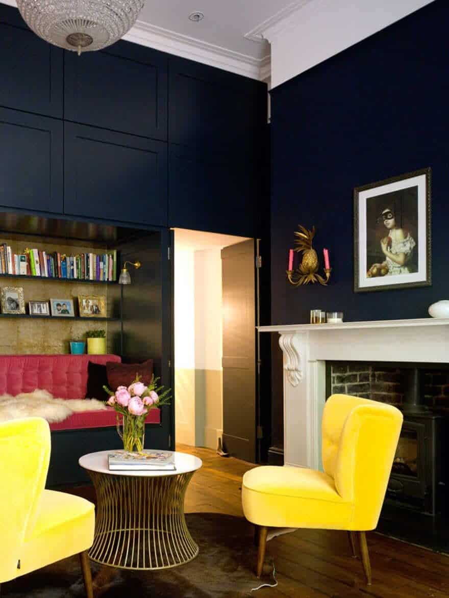
In the main hall the boxed stairs have now been concealed within joinery panelling. This also houses a mirrored drinks cabinet, a door to the cellar and masses of storage. Set into this panelling is a recessed day bed and bookshelf. This has transformed the space, restoring its grand proportions, while creating the perfect winter sitting room, with log fire, dramatic dark paintwork and huge chandelier. More crucially the hall now works as a room, rather than just a circulation space.
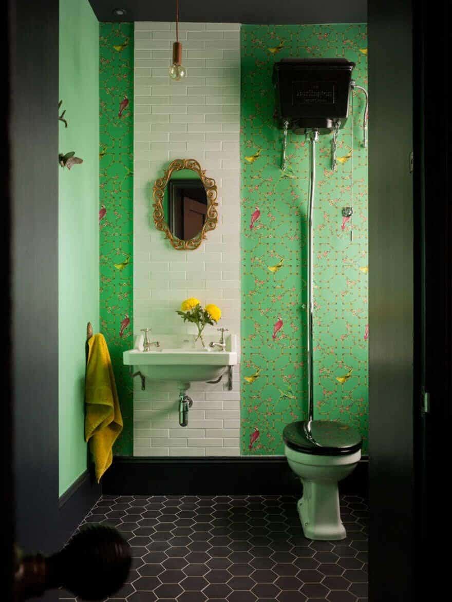
The cloakroom also glows out through its dark doorway, and is a treat for every guest in turquoise and charcoal.
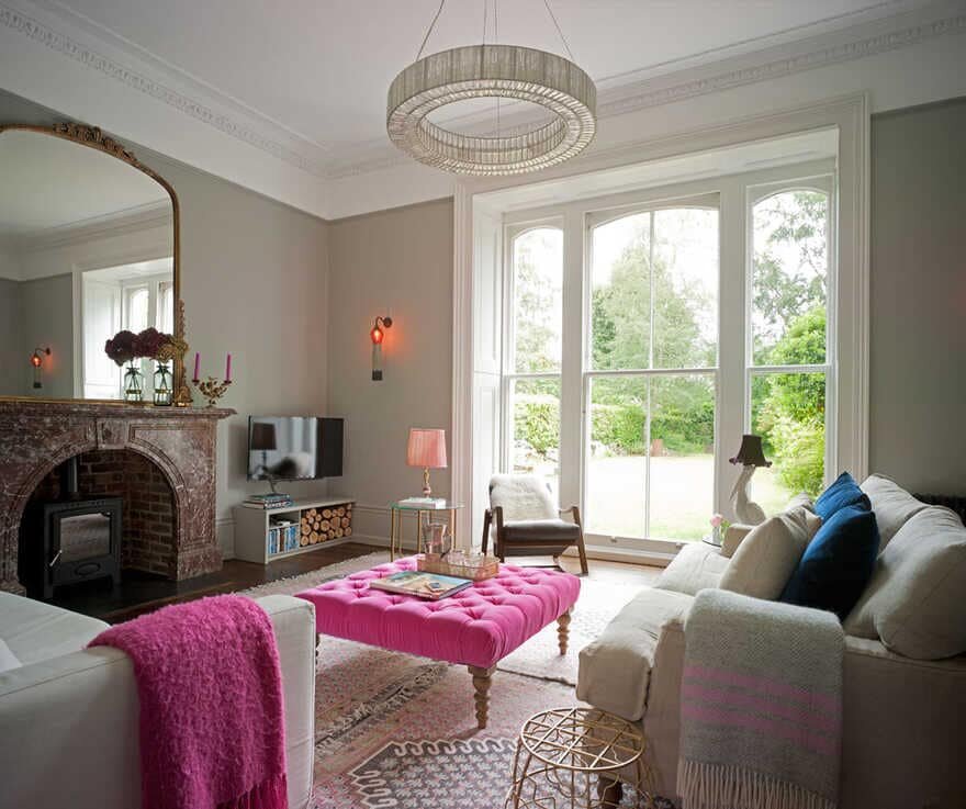
At the front of the house, the main living room overlooks the garden through enormous floor-to-ceiling sash windows. The original marble fireplace has been restored and the room is now tailored to its proportions, changing what was an overwhelming space, into a homely, welcoming room.
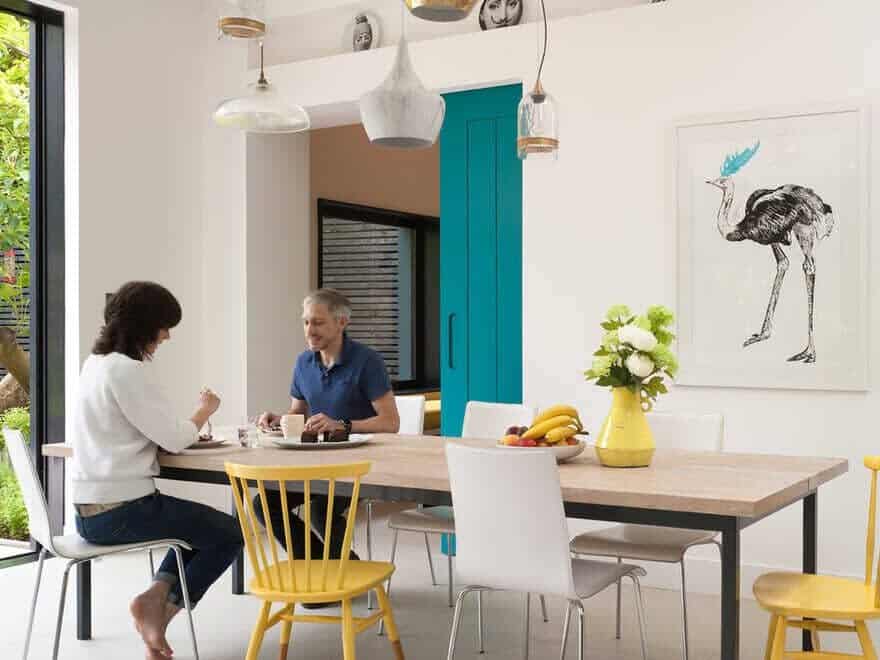
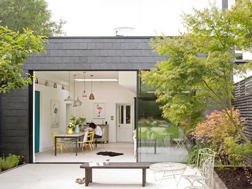
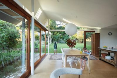
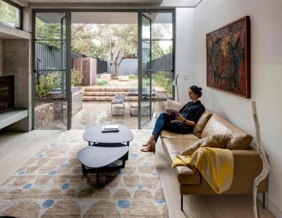
Passing from the hall into the new extension the space continues to open up with floor-to-ceiling sliding doors bringing the garden right in. This area is delineated by the ceiling, which is lower over the kitchen, rising to 3m over the dining area.
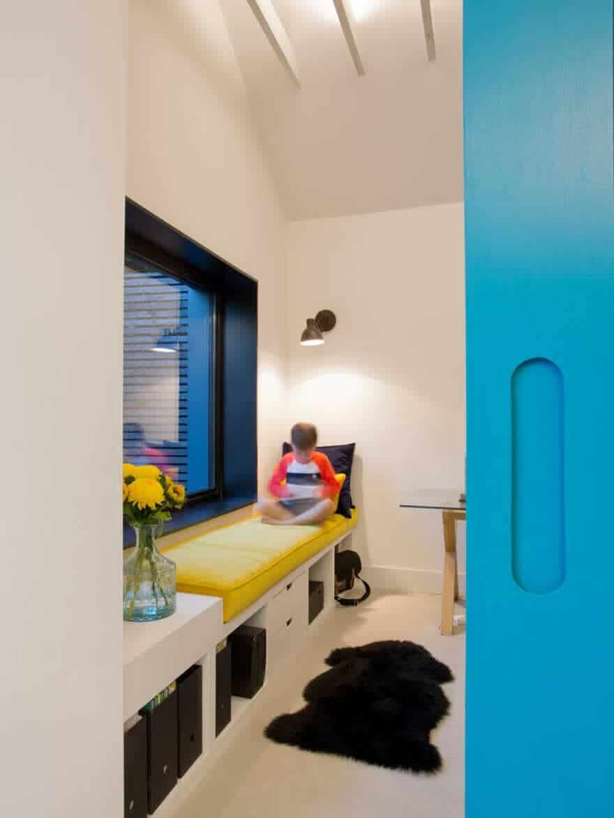
A turquoise pocket sliding door closes off a separate study beyond, featuring a pitched roof and picture-window seat looking onto the garden.
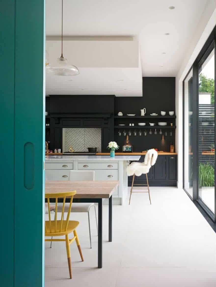
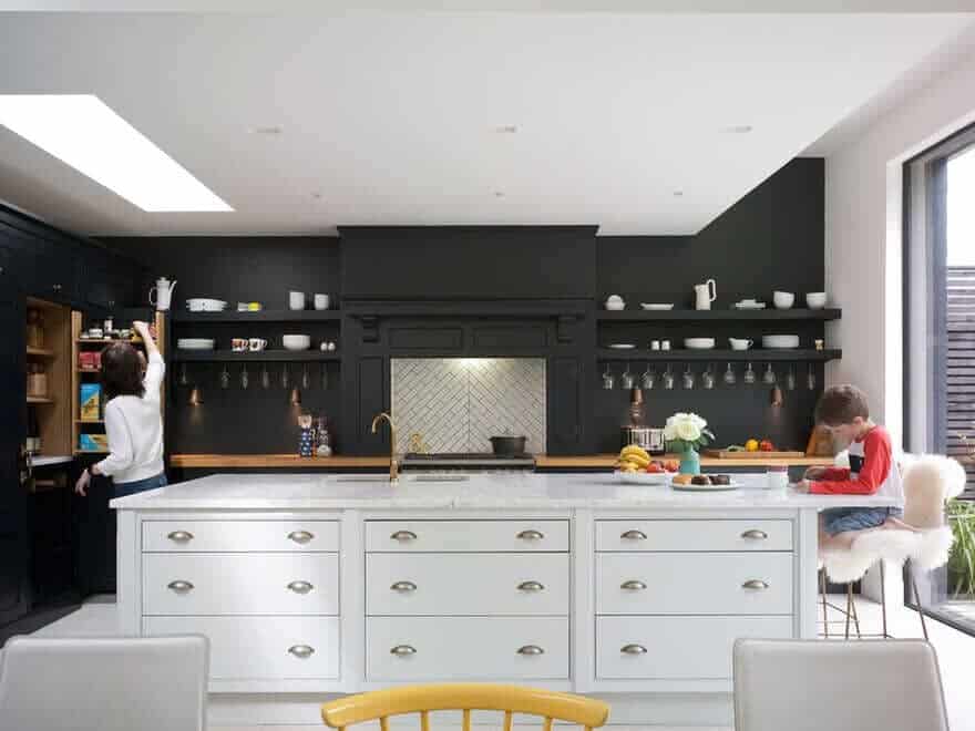
To save on budget, the stunning blue-black panelled kitchen was cleverly adapted, remodelled and added to from the traditional Wedgewood-blue kitchen previously in the lean-to. This was high quality but dated and poorly laid out, without an island. The clients had hated it – but in its new form the kitchen now commands a dramatic presence over the entertaining space.
A garage/store/utility room has also been added, in the form of a new ‘garage’ extension to the house. This area can be opened up and used for cars in future should this be required.
Below, the cellar was dried out and tanked, and the original light well and windows restored (these had previously been concreted up). The cellar space now offers a fantastic playroom, a brick vaulted spare bedroom and wine store, plus other back-of-house functions.
The study offers a flexible space, for adult working, children’s homework or piano practice and can be opened up or separated off accordingly.
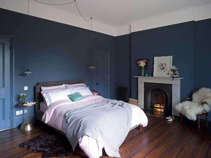
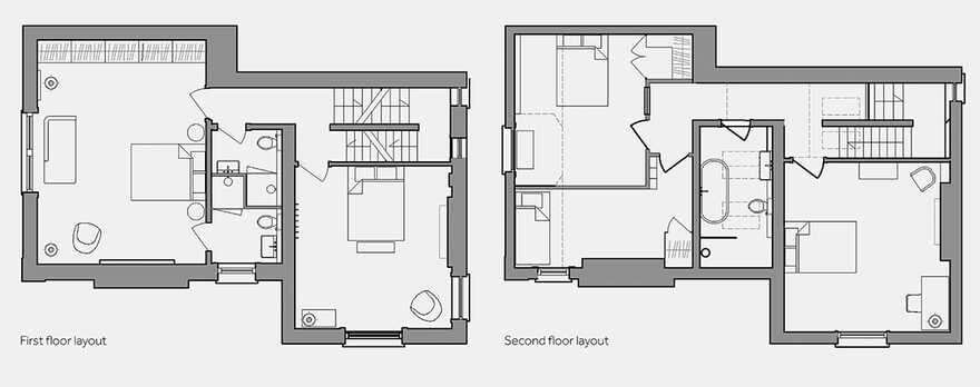
On the first floor a larger bathroom was divided to create two glamorous ensuites, and both bedrooms were renovated to enhance their dramatic proportions.
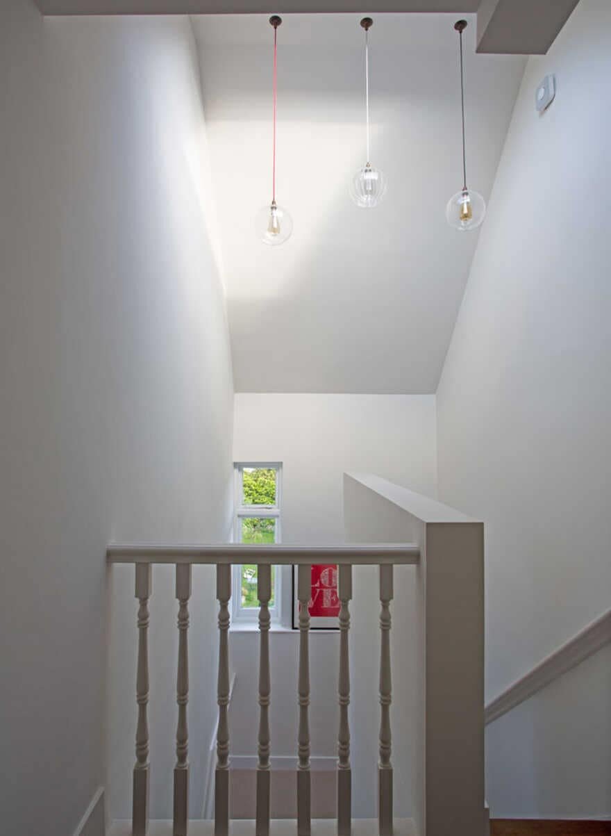
On the top-floor we removed the dividing wall within the stairwell and opened the roof up to the pitch, adding a roof light to flood the stairs with daylight. Further openings at first floor level mean the stairwell feels dramatically improved.
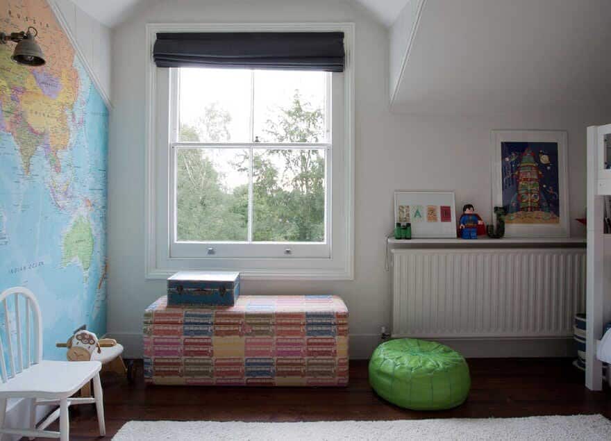
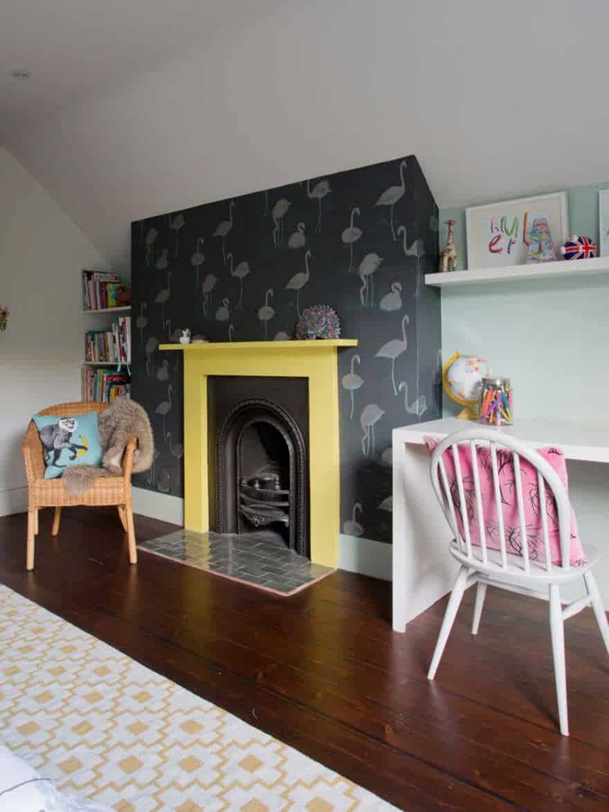
The two large top floor bedrooms became three, without losing their lofty period feel, and the long thin bathroom was redesigned as a family bathroom offering luxury with bath and walk-in shower.

