Project: Extension and Internal Alterations
Architects: Rees Architects
Location: Aldersbrook, London
Project Year: 2020
Photo Credits: Chris Snook
Scope of works
Rees Architects designed the extension and internal alterations to this Victorian terrace house in Aldersbrook, London. We were also responsible for planning, building regulations, interior design and kitchen design for the build. This included:
- Upgrading the whole ground floor to better integrate the rear extension and garden, creating a cohesive living space.
- Installing a shower in the current downstairs loo plus creating a separate cloakroom.
- Making the loft extension more functional through reconfiguration, particularly the shower room.
- Updating the style of the first-floor bathroom.
- Refreshing and touching up the front-facing façade.
Updating and extension in a conservation area
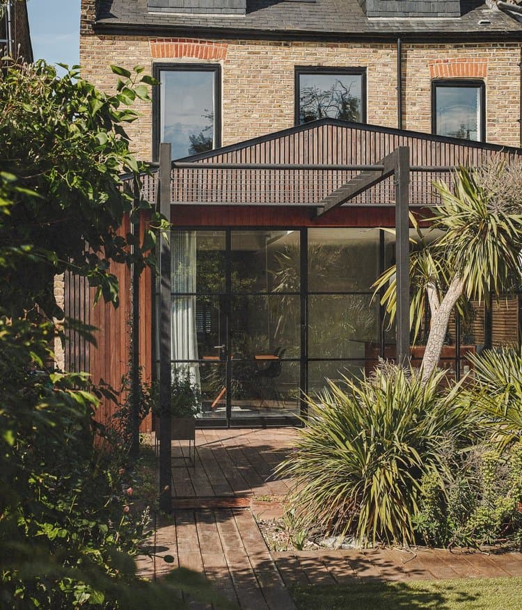
This three-story home in Aldersbrook was in need of some adjustments to unimaginative extensions both at the rear and of the loft. The extension at the rear was a regular rectangular kitchen-dining area which didn’t allow full appreciation of the view into the garden due to the placement of the windows. The loft extension was feeling cramped due to the eaves, particularly in the bathroom where the configuration made it difficult to manoeuvre. Since the property is in a conservation area, we had to be mindful of the aesthetics of any updates to ensure that they were granted planning permission.
A light touch
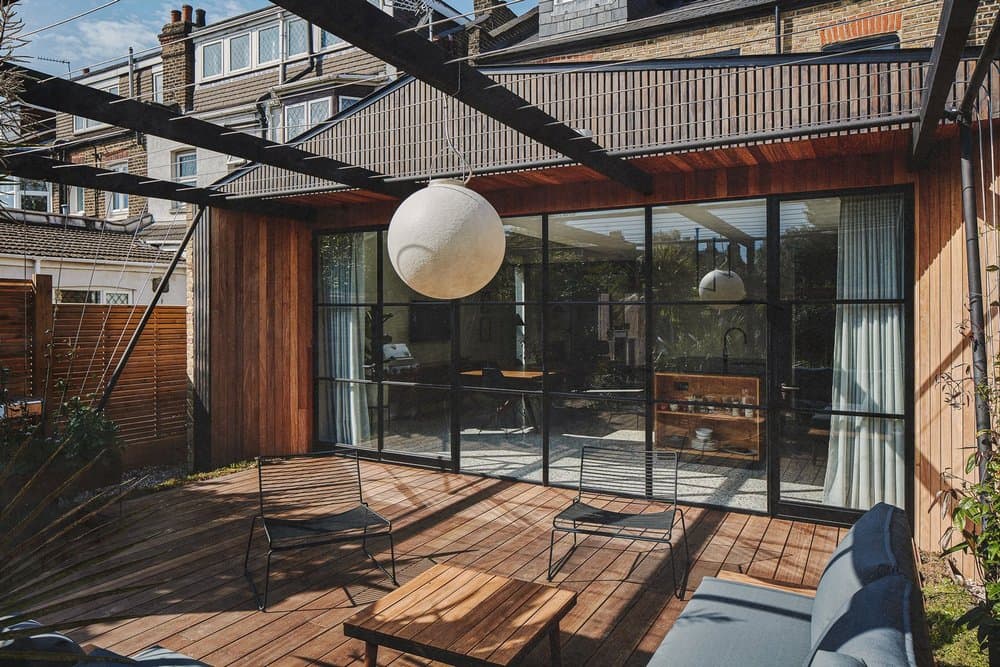
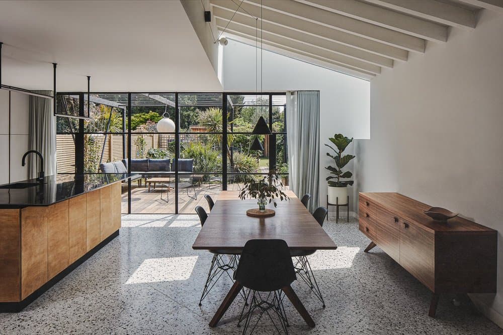
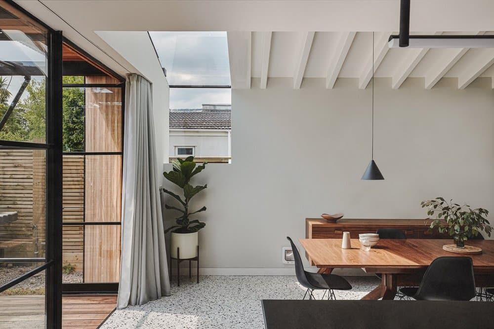
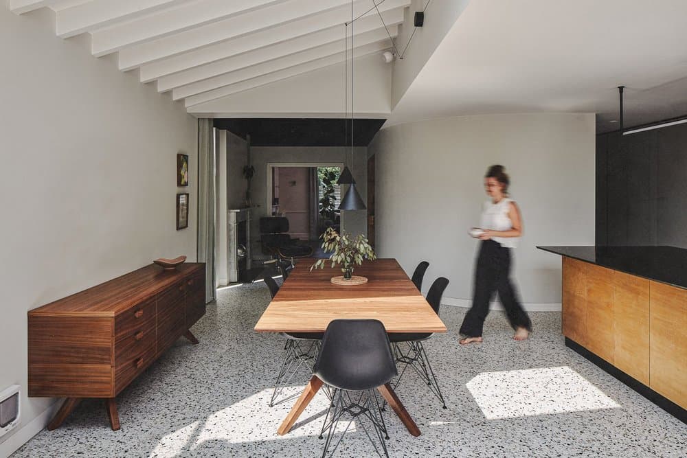
Since the back of the property faces south, the space at the rear quickly heated up during the day and yet, the area which is now the study, didn’t receive much light. Fitting Crittall doors across the entire length of the back wall meant that it was lighter and there was a sense of connection with the garden, but we needed to control the temperature. We used 3D modelling to understand how we might be able to balance the amount of sunlight hitting the glass according to the sun’s path without blocking it. The solution was to create a 500mm overhang on the exterior that planning permission allowed. The overhang provides the right amount of protection from harsh rays in the summer, when the sun is highest in the sky, but lets in gentle winter light and warmth when the sun’s arc is lower. The west-facing window in the dining area was also extended into a rooflight offering a golden, more diffuse light from sunsets.
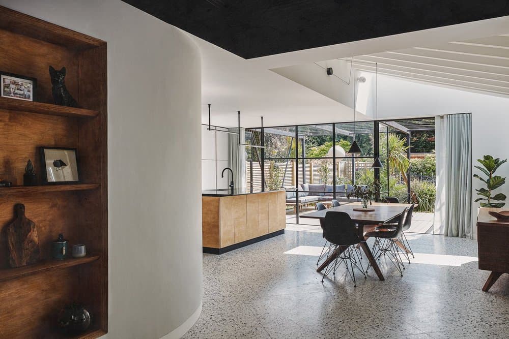
Throwing a curve wall
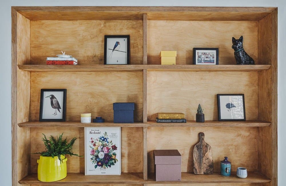
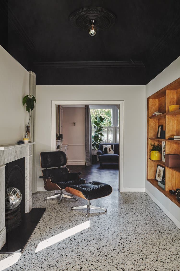
The curved wall we built in the heart of the open-plan space creates a sense of depth in which the study can sit, but also allows light to bounce off it and radiate throughout. It makes the study feel secluded and slightly hidden from the kitchen, yet still connected. To help brighten the study, we also fitted floor to ceiling windows into the side wall. We built in bespoke shelving where the curvature of the wall begins to run in parallel with the exterior wall. Again, this creates the feeling of a nook as the original fireplace sits opposite. With its original rose and mouldings intact, the ceiling was painted black, drawing the eye further in and creating intimacy. The pocket door into the sitting room means the study can be closed off or opened out and light is also drawn in from the windows at the front of the house, creating a line of sight from front to back.
Utility that’s actually useful
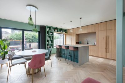
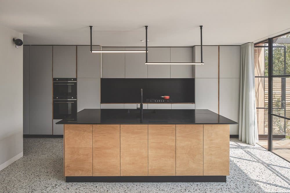
The utility room was previously between the kitchen and the entrance hallway, in a narrow space in the darkest central part of the ground floor. We opened out the space so it connected with the kitchen and could receive light from the hallway by using a pocket door. This can be drawn back completely to create an archway, but also can act as a fire door (a requirement with the loft extension). Floor-to-ceiling utility cupboards along the exterior wall connect the space with the kitchen worktops which run the length of the wall to the Crittall doors. This means the washing machine and tumble dryer can be neatly hidden away in what essentially becomes a corridor. We added recessed spotlights into the ceiling in front of the cupboards to provide extra illumination when in use. The kitchen was designed to be as clutter-free as possible, so the façades of the cupboards hide the fridge, freezer, microwave, and dishwasher. The sink is built into the island and includes a boiling water tap so there’s no need for a kettle on the worktop.
Harmonious color schemes
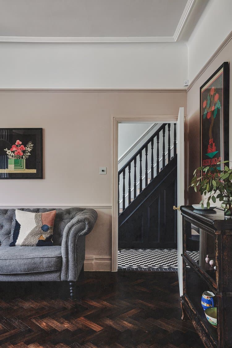
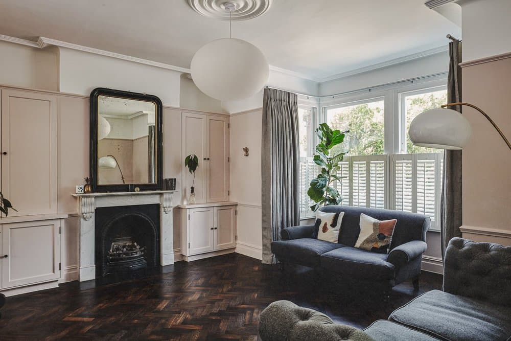
A minimalist monochrome theme tied together different elements of the home – from the original black and white chequerboard tiles in the hallway to the artful touches of black paint on ceilings, fireplaces, and stairways to create depth and coherence. The matte terrazzo flooring in the kitchen-dining area was created using one-metre and two-metre tiles which were laid on the diagonal to break up the space. This was a great cost-saving alternative to pouring the floor. We then used the same terrazzo in the first-floor bathroom.
Dusky pink walls in the living room paired with the dark parquet flooring, which was sanded, polished, and oiled, give warmth to this relaxed space. Similarly, a soft grey palette was used in the master bedroom. Brass accents provide another thread throughout the home from door handles to bathroom taps.
Bathrooms: A not-so-tall order
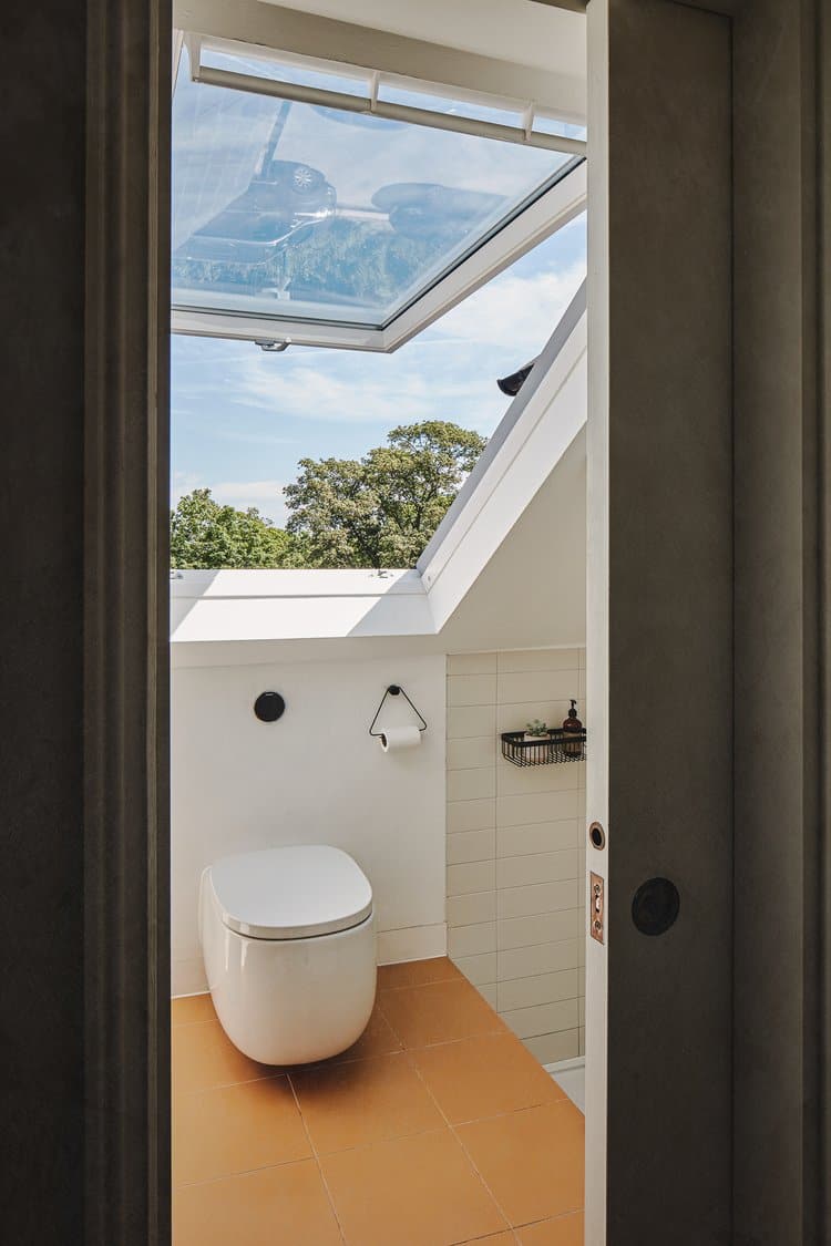
The loft bathroom was the real challenge on this project as the entrance to the shower was shortened by the eaves. Our solution was to sink the floor slightly so that by stepping down into the shower, you have more headroom. A Velux window in front of the sink and above the loo also allows for more standing space and less of a sense of being hemmed in.
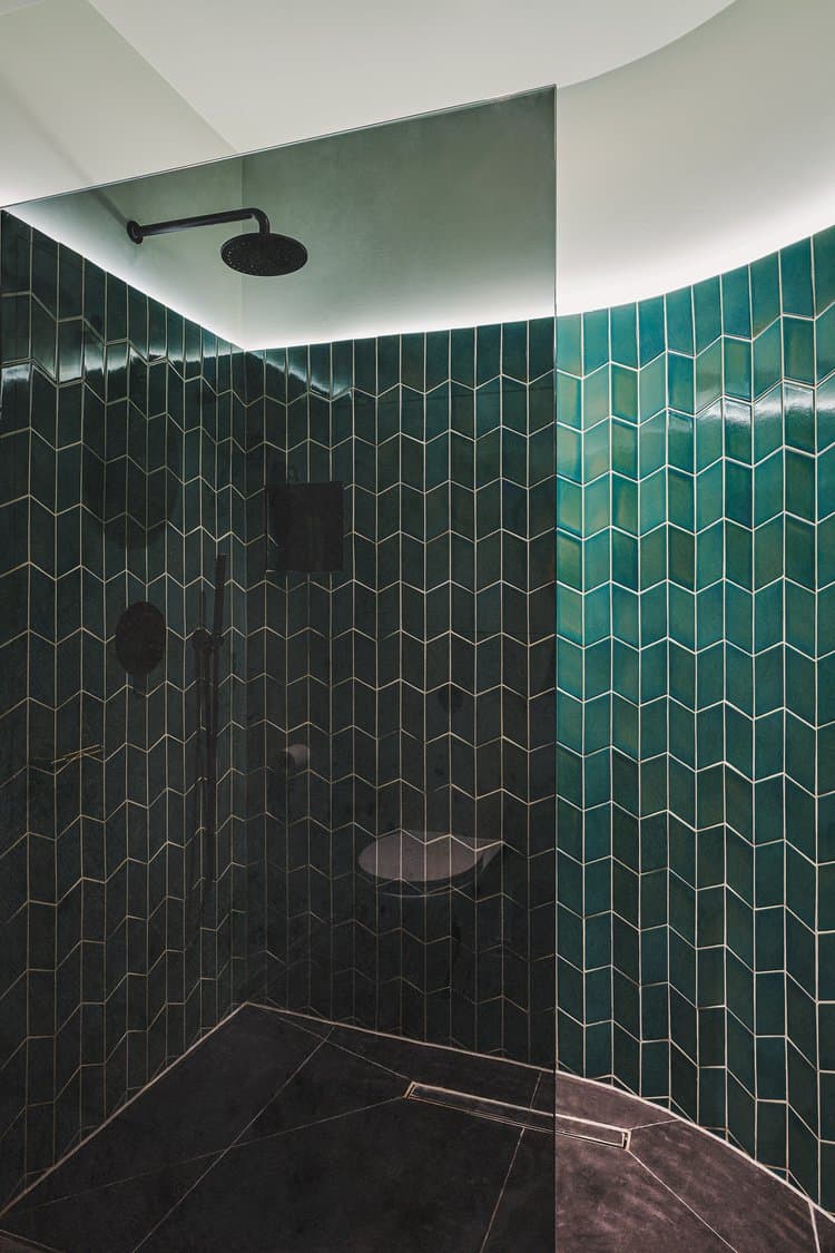
Previously, there was just a loo on the ground floor next to what was the utility room. Our new configuration which included the curved wall, meant we could create a third bathroom for the owners by installing a shower. The curvature makes the space feel less boxy and more like a wet room. We used tiles in an uplifting shade of jade and LED lights above the tiling rather than overhead, which add to the sense of expansiveness. Next door, we had enough room to create a cloakroom. We added a bit of fun to the functional with a botanical wallpaper behind which are storage cupboards for the boiler and shoe racks. A coat rail and sculptural hooks provide more storage options.
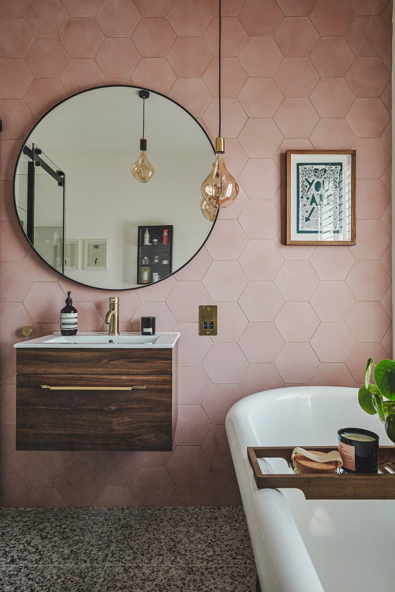
The first-floor bathroom simply needed an update through decorating as it already contained a beautiful standalone bath. Hexagonal encaustic tiles in blush pink bring a variation in shade that complements the amber filaments (2500k) in the pendulum lights, making it feel romantic but modern.
Outdoor life
The roof on the rear extension needed to be sloping on the boundary in line with conservation area regulations. However, on the interior side, we could use the flat surface to create a green roof. Filled with succulents, this makes a lovely feature framed by the landing window as you come down from the loft. It also acts as insulation, keeping the space below warm in winter and cool in summer.
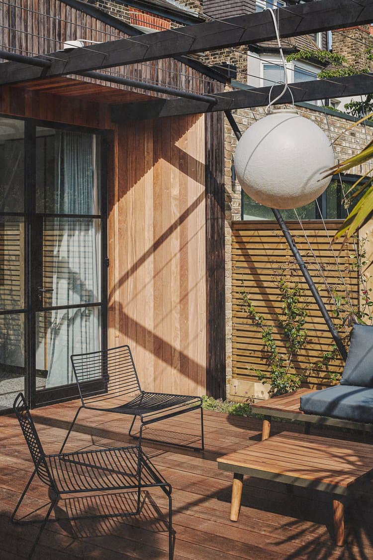
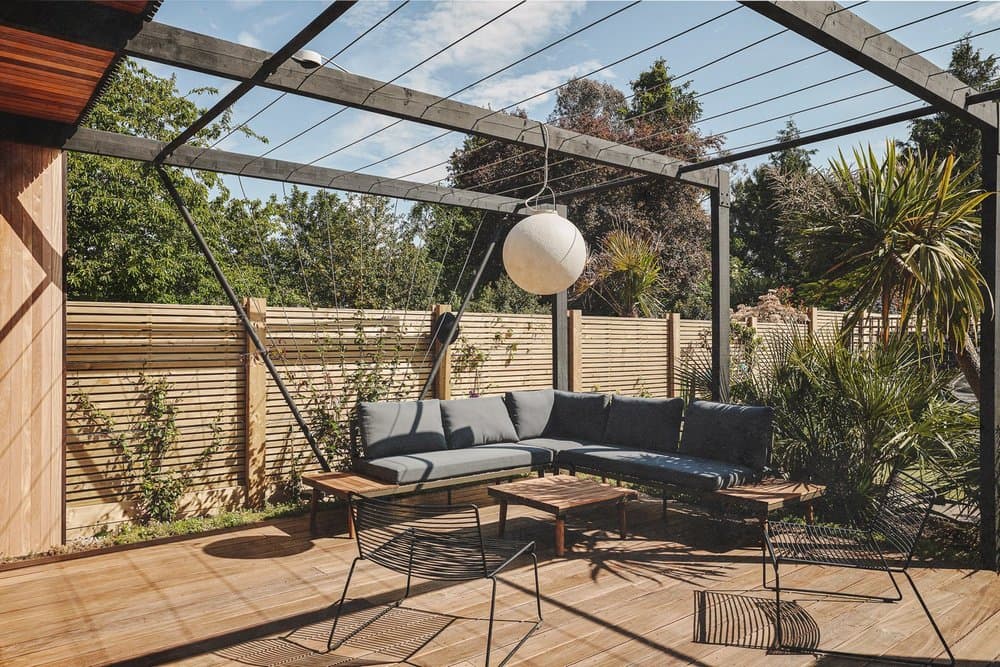
Our aim was to make the outside space feel like an extension of the home and so we built a wooden pergola structure with cable railing, across which vines can be trained. Once the vines have grown, this will make the sitting area feel like a room that’s not completely exposed to the elements and yet enjoys open air and sunlight. We made sure that the decking was raised so that there wasn’t a drop from the kitchen-dining space when you step through the Crittall doors, but a sense of continuity. A moon-like globe light makes this sitting area usable even after sunset. Existing plants and shrubs screen the decking from the lawn (used for play) as well as the home office cabin at the end of the garden.
The finer details
- One of the things that often gets forgotten when glass doors are fitted is where the cat flap will go. We fitted one discreetly into the side wall near the sideboard in the dining room.
- In keeping with the clean lines and uncluttered feeling of the space, all wiring from the wall-mounted TV was fed under the floor to the kitchen island where the digital box can be hidden.
- As the roof on the rear extension had to be sloping on the boundary, we decided to make a feature of the exposed joists beneath. This gives some dimension and shadow to the all-white walls and ceiling.
- The curtain runner for the drapes that cover the Crittall doors is built into the ceiling for a seamless effect.
- Sonos speakers were fitted in the dining area and in the garden so when the doors are opened out for entertaining or summer evenings, music can be continuously heard through the space.