Project Name: Wanwei Roast Duck Wangfujing Branch
Interior Design: IN•X Design Co., Ltd.
Design Lead: Wu Wei
Design Team: Li Weiju, Jia Qifeng, Qu Zheng
Interior Furnishings: Song Jiangli, Ying Zheguang
Lighting Design: Uniimport by Elementech
Project Location: Beijing, China
Project Area: 630 sqm
Completion Time: 12.2023
Project Photography: Zheng Yan
Project Copywriting: NARJEELING
Project Planning: LE Brand Strategy Agency
Elevating the brand image to resonate with the target audience, making the space a vessel for memories, embracing a contemporary sensibility, and imbuing it with spirituality. Navigating the market currents by flowing with the stream, while retaining a distinct and authentic identity.
“The traditional taste serves as a spiritual bond, and young people are enthusiastic about weaving it into the fabric of the new world.”
In June 2023, Wanwei teamed up with IN.X, and together they completed the design of the Wanwei Roast Duck & Beijing Cuisine restaurant at the Wangfujing Department Store in Beijing. From Chengdu to Beijing, from regional delicacies to a century-old shopping street, this marks another exploration of how the ancient and the contemporary, Chengdu and the capital, tradition and passion can blend. This time, Wu Wei believes that it is the blending of culture and ambiance that gives rise to stories. And thus, Wanwei Roast Duck & Beijing Cuisine comes to life.
Spiritual Essence of Space
/Incorporating Modernity and a Sense of Time
Preserving what grounds us while infusing the passion we aspire to.
At Wanwei, what we preserve is the essence, and what we aspire to is the vibrant urban life. Thus, a balance between warmth and coolness, passion and precision, smoothness and ruggedness, the contemporary and the past is achieved with space as the pivot. The space continuously poses questions and, in turn, provides answers. The narrative quality is the underlying design thread woven into the space.
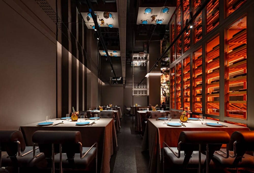
The space is established against the urban backdrop of Beijing, while its brand originates from Chengdu. Within the space, the ambience of Chengdu, the “City of Heavenly Abundance,” subtly emerges. To portray this intangible quality that cannot be built, the designer indirectly extracts it from urban life, much like a flower growing from a seed. Chengdu has been a city of immigrants since ancient times, and the inclusive, carefree, and vibrant spirit of the city is incorporated into the space. The contemporary urban characteristics of the brand’s DNA are delineated through interwoven architectural elements, glossy metallic surfaces, and the ethereal warmth of floating hues.
On the flip side of modernity is the sense of time that the space imparts to diners.
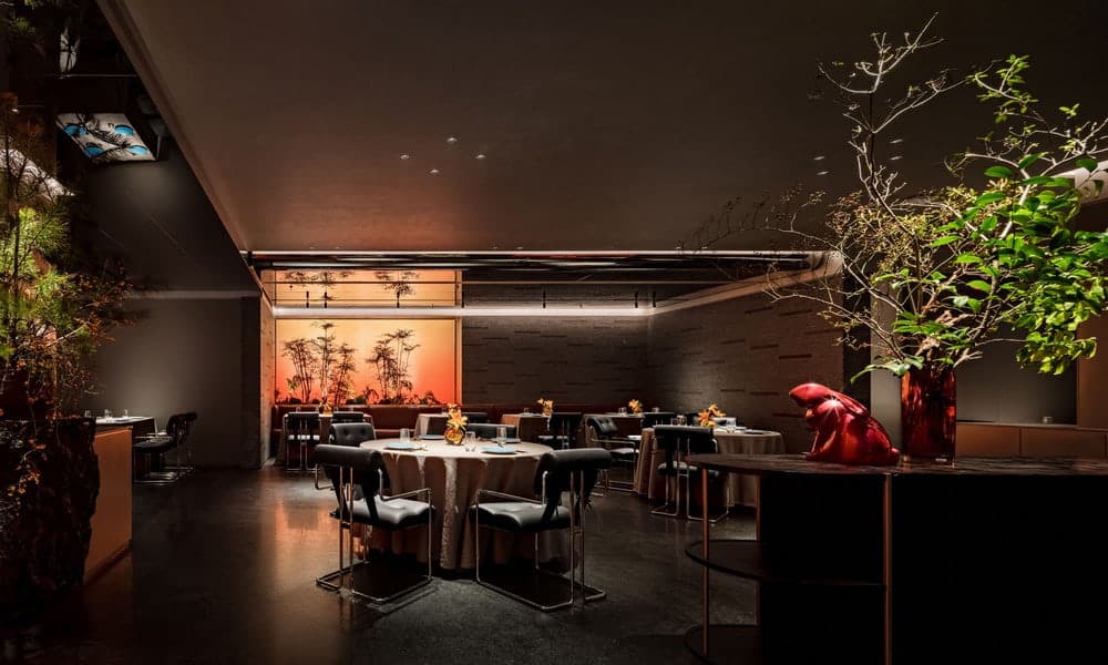
Taste always connects us to time and tradition, so everyone harbors an inherent obsession with certain flavors: Peking duck, Beijing cuisine, the old city, hutongs, and the imperial city. Memories continuously emerge entwined with flavors—before the gray-blue stone walls, beside beams and columns covered in cracks, in the shadows of pine, bamboo, and stones. Time and space are firmly locked together, and taste blends seamlessly with the present moment, creating a precious experience: a sense of existence. In the rapidly evolving landscape of commercial spaces and experiential scenes, this is the treasure we are most likely to lose.
Lifting with Ease
/Unfolding the Details of Space
Above the profound homage to cultural significance in the design, the specific expression of space is handled with an effortless touch, aiming for accuracy and relaxation.
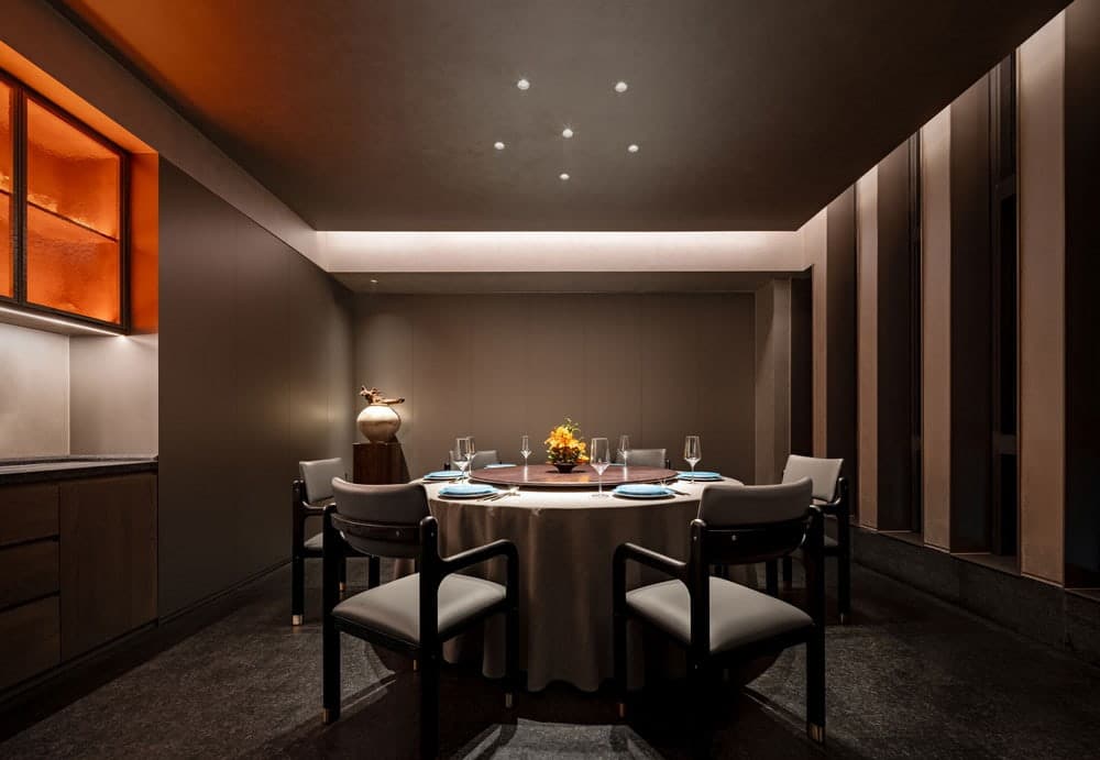
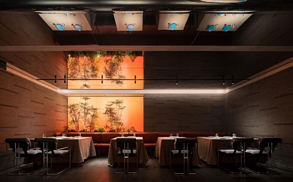
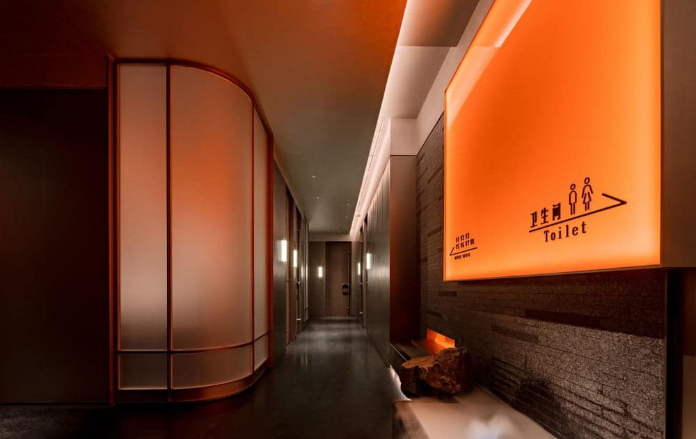
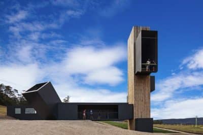
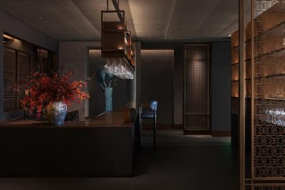
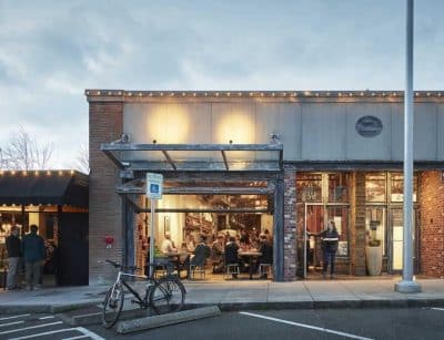
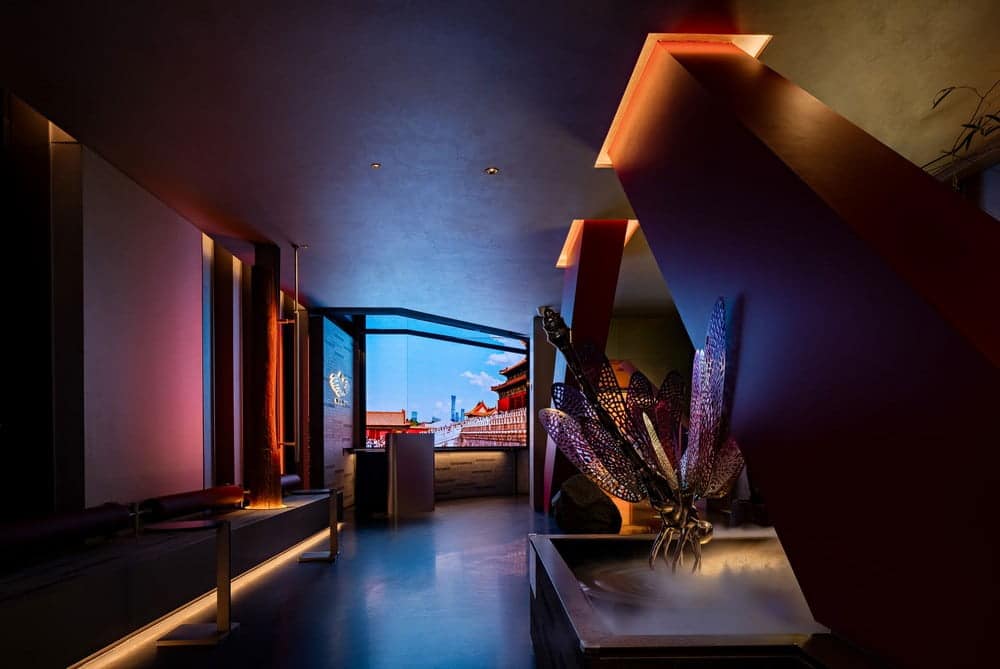
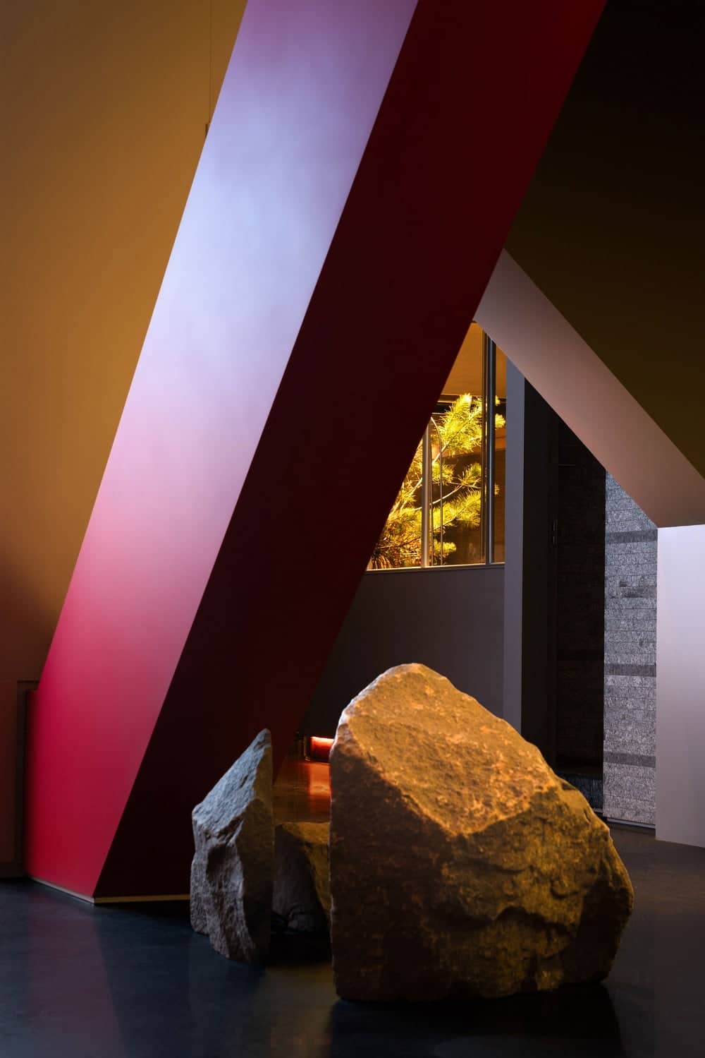
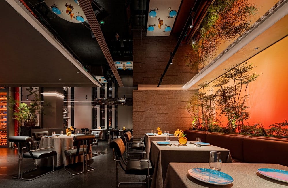
From the entrance to the open seating area through a folded corridor, with the urban imagery of old and new Beijing before you, ancient wooden beams and a contemporary inclined structure coexist—one representing the past, the other the present. The addition of sleek and lightweight metallic materials injects a modern touch into the details. The waiting area is also unpretentious, continuing the interplay of architectural elements in this region while fully meeting practical needs. The representation of rocks and water features predominates, breaking away from traditional spatial compositions and providing more viewing angles for these natural elements.
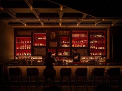
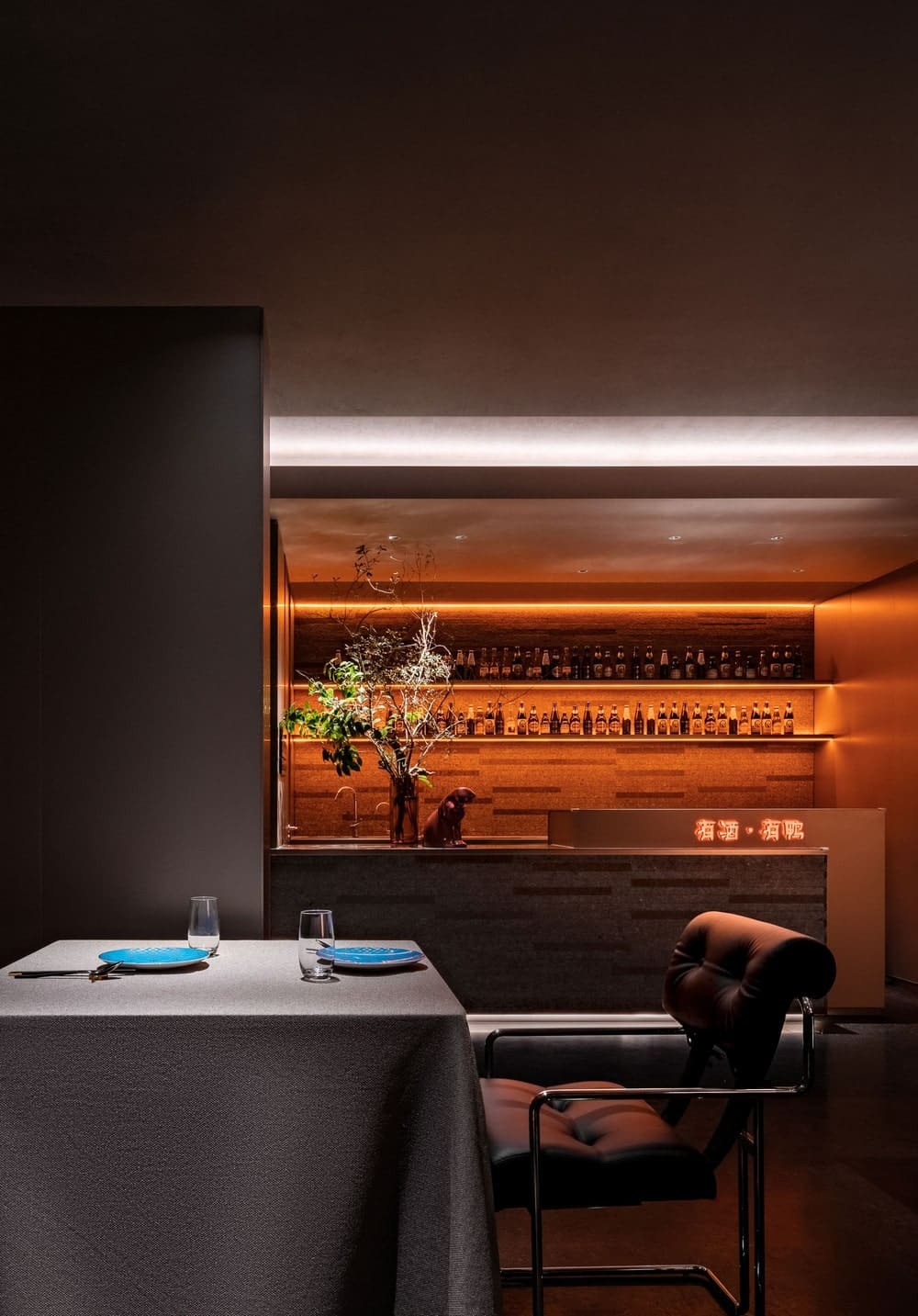
The old shadows of Beijing’s architecture are captured simultaneously from the gray-blue stone surface, allowing the light and simple modern materials to integrate seamlessly into the entire space. These materials, with varying levels of gloss, complete multiple visual layers. The red color is drawn from the convergence of ancient and modern, reflecting the flavors of human sentiment, and is the most representative color in the spiritual consciousness of the Chinese people. The improved Ming-style dining chairs also seamlessly inherit the blended characteristics of the space, akin to a casual stroke in a painting, further enriching the cultural inclusiveness of the space.
Strategy First, Design Follows
A dish passed down through the ages inherently carries multiple flavors bestowed by the river of time, and it is not confined to absolute tradition or avant-garde. This aligns perfectly with the traits embedded in the brand’s DNA. Such qualities connect the region, business district, products, and diners, firmly opening up the market in fiercely competitive areas.
Simultaneously, the brand image is effectively established. Amidst numerous similar brands that bridge the gap between antiquity and modernity, the designer adjusts the spatial image to resonate with the target diners: looking back at tradition before incorporating contemporary trends, finding a comfortable balance between nostalgia and innovation.
Ultimately, the designer aims for the space and the food to form an inseparable impression complex that captivates diners, turning each experience into a vivid encounter that engages all five senses. This approach enables the establishment to adapt to market changes while maintaining its unique attributes, significantly enhancing market awareness.
