Project: Mintz Law Office
Interior Architecture: Elkus Manfredi Architects
Workplace Strategy: Elkus Manfredi Architects
General Contractor: Suffolk
MEP: Vanderweil
Structural: Thornton Tomasetti
Lighting: Lam Partners
Acoustics: Cavanaugh Tocci Associates
AV: ACT
Location: Boston, Massachusetts
Size: 216,900 square feet on seven and a half floors
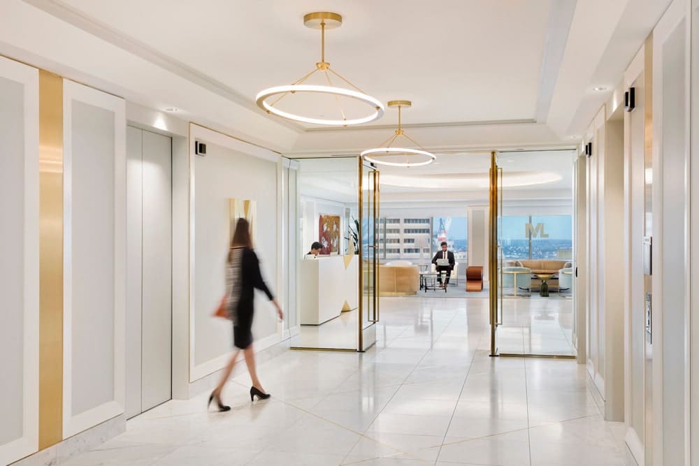
Elkus Manfredi Architects transforms the existing office of leading law firm Mintz into a light-filled, contemporary, and high-functioning workspace blending hospitality, residential, and high-tech design
Project Overview
Mintz selected Elkus Manfredi Architects to create the new design for its flagship office at One Financial Center in Boston, which has been the firm’s home since 1984. While this workplace project was conceived and completed prior to the Covid-19 pandemic, its design was grounded in health and wellness, so it lends itself well to new health-focused workspace parameters as people begin to return to the office.
Mintz’s leadership asked for a design that would:
- Help employees feel supported and cared for – the well-being of the firm’s workforce was a top priority.
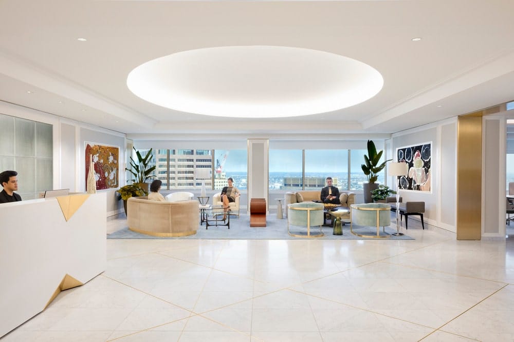
- Create a sense of spaciousness although total square footage was being reduced.
- Have the built-in flexibility to evolve as the firm’s business needs respond to changing priorities.
- Feel fresh, light-filled, personal, and eclectic, while also being highly efficient.
- Be aesthetically understated and unpretentious, while using timeless, top-quality materials.
- Create a serene home base for their attorneys and support staff to offset the stress of their high-powered law practice.
- Demonstrate the superior client service that Mintz is known for in every part of the new workspace.
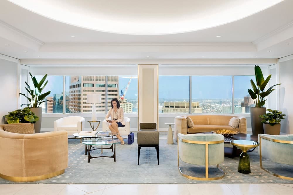
To transform the office space, Elkus Manfredi drew upon its signature cross-industry design approach, combining techniques from such diverse project types as hospitality, residential, and high-tech design with the firm’s extensive experience in designing for large law practices. Beautiful and high-functioning, the sophisticated new offices provide increased operational efficiency for Mintz’s law practice and a serene, grounding design that feels like home for the firm’s employees.
Co-Creation Process
A unique aspect of the new workspace is that it was designed through a co-creation engagement process with Mintz employees. Managing the co-creation process is the responsibility of the design firm, so after establishing the goals for the redesigned workspace, the design team’s workplace strategists led the process.

The co-creation process is an inclusive methodology that enlists every project stakeholder as a creative contributor without hierarchical limits to their input – the most junior employees as well as the most senior executives provide key insights. Process facilitators ask, “What do you need to do your job? What are your roadblocks?”

The co-creation process demonstrates that it is no longer sufficient for designers to have great ideas or lots of data. The overarching role of the designer today is to discover and merge the right data, architecture, and engineering with the client’s narrative and culture to create an authentic, inviting, and high-functioning environment unique to that client.

Mock-ups
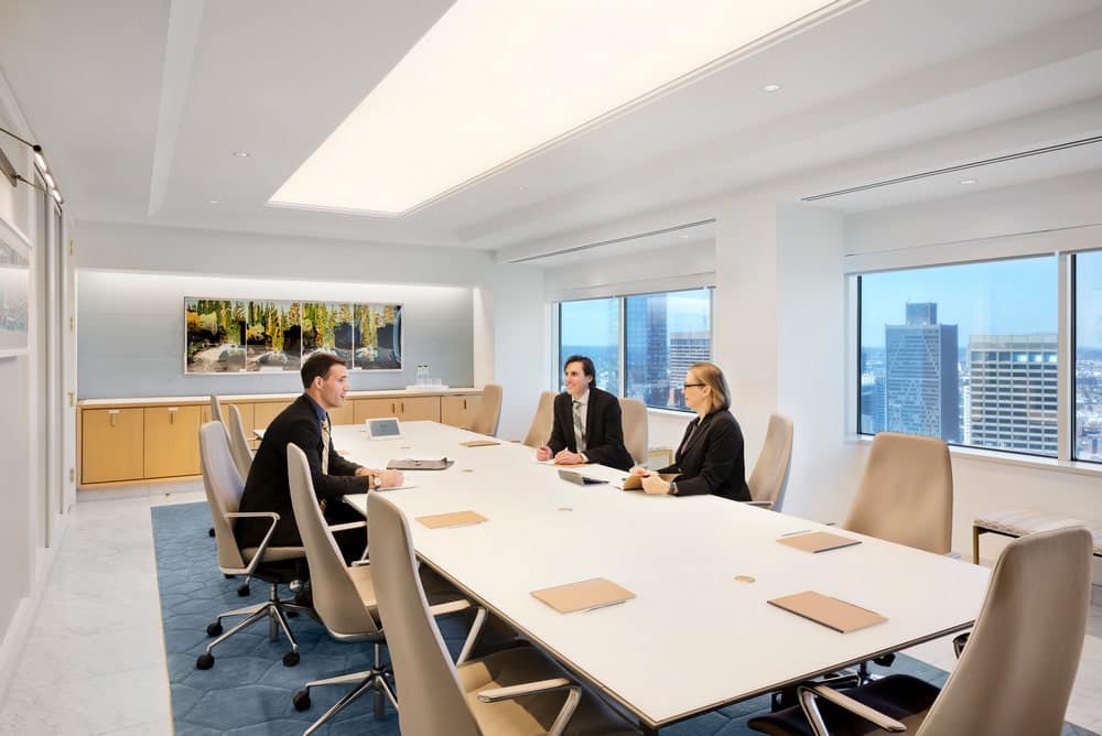
In addition, Mintz opted to create fully built-out mock-ups, so that partners, associates, and other staff members could work with designers to establish a set of options for offices that maintain a feel consistent with the rest of the workplace while also providing individual choice for office layout, furniture, and finishes. The mock-ups enabled the client to have confidence in its own decision-making, build consensus within the organization, and avoid unnecessary costs due to unforeseen problems.
Design Challenges
- The design brief was to maximize efficiency and density/square foot while creating an overall feeling of airy spaciousness. While the firm was reducing its physical space, it did not downsize its staff.
- The architecture of the building was sound but neither flexible nor conducive to what the client wanted in a workplace that would meet present and future needs. For example, the building featured low 8’6” ceilings, ribbon windows that were not full-height, and uneven floor plates. Additionally, the shape of the building – an asymmetrical six-sided box with two 90-degree and four 45-degree corners – challenged designers; once perimeter offices were planned, many internal areas became oddly-shaped wedges that required creative design problem-solving.
- Updated HVAC systems were required to remedy inconsistent airflow and ambient temperatures throughout the workspace.
- Ease of maintenance of the new offices was also a concern of the firm’s leadership.
- Because the practice floors were on higher floors and the administrative floor was located separately on a lower floor, it was a challenge to draw firm activity to the lower floor so that staff located there would not feel isolated.
Design Solutions
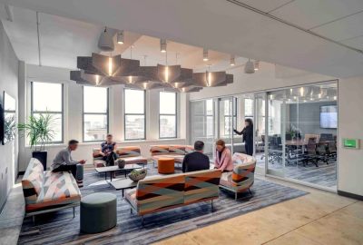
The concept for the new office draws upon Elkus Manfredi’s signature cross-industry design approach, combining techniques from diverse project types such as hospitality, residential, and high-tech design with extensive experience in designing for large law practices. The new office provides a flexible, collaborative, and welcoming environment for staff, clients, and visitors, with the highest standard of materials and finishes and sophisticated ergonomics utilized throughout. Advanced systems were designed for important environmental functions such as lighting, acoustics, and air quality to maximize comfort. A sense of ease and tranquility – enhanced with warm, low-contrast color schemes and access to daylight at every seat – permeates the entire workplace.
- Adjacencies were carefully considered to optimize efficiency; meeting spaces – generous and varied to support different collaborative needs – are balanced with numerous private spots for quiet focused work.
- Because law firms need to combine confidential work with open information-sharing, the design located private offices, collaboration spaces, and social spaces in clusters with acoustic separation between offices, offices and corridors, and in the conference center. Individual focus spaces are the most serene, while collaborative meeting and social spaces include invigorating design accents. Collaboration and gathering spaces are consistently located in the most active zones on all floors for intuitive wayfinding.
- The sense of ease carries through to the functionality of the workspace. Technology is seamlessly integrated throughout, creating a highly functional user experience by giving employees the ability to maintain connectivity and access as they move through the office and between floors.
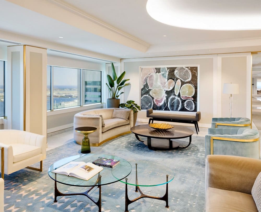
- Materials evoke a natural, timeless feel while being easily maintainable. Examples include lobby chairs upholstered in beige mohair and conference room walls covered in ultra-suede that offers high-performance acoustics and durability.
-
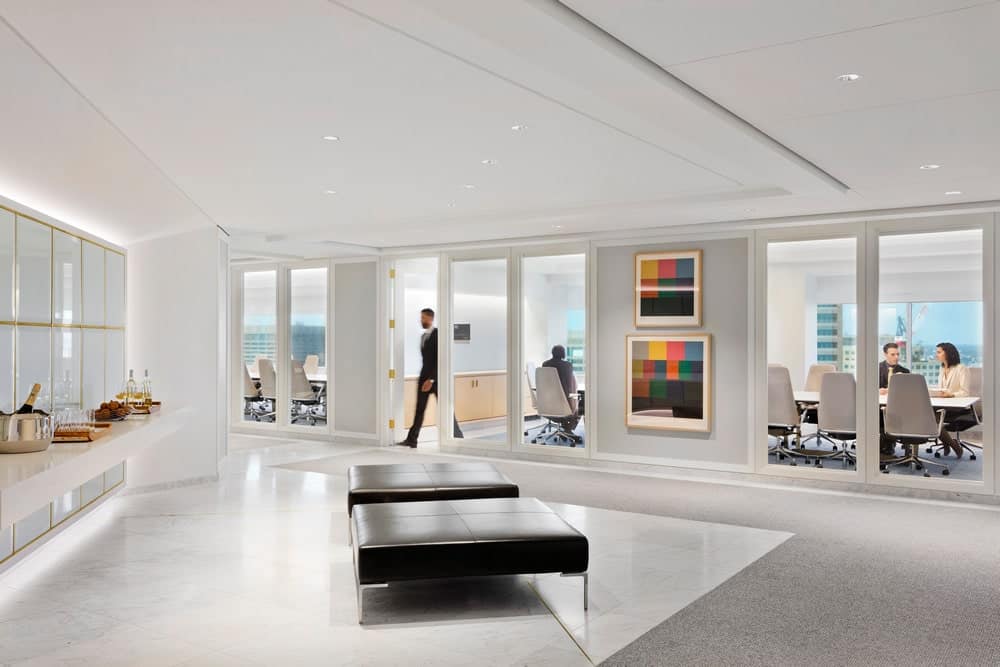
- To allow as much natural light as possible to reach deep into the workspace, office and meeting room fronts are floor-to-ceiling glass, with automated shades when confidentiality is required. Glazing of the interior fronts of offices located at the exterior perimeter as well as at the core was designed to ensure that natural light is able to reach into the corners of inner offices. Clerestory windows were also employed to allow daylight to reach into the workspaces at the inner core. Windows were located at the ends of the main corridors on each floor to allow more daylight to reach into the space, orient occupants, maximize views, and enhance the sense of openness throughout the workspace. Indirect lighting sources were used throughout to soften the ambiance, avoid glare, and be reflective.
- Accessed directly from the reception lobby and wrapping around one side of the building, the conference center contains three large conference rooms, several smaller meeting rooms, a large dividable multi-purpose room, and a dividable training center. The focus in the conference center is designed with the guest experience top of mind, down to where and how they hang their coat.
- Modularity of floor plans provides flexibility as the firm evolves. For example, partner and associate offices are planned so that two partner offices equal three associate offices, so conversion is easily accomplished.
- The HVAC systems were fully redesigned to meet today’s standards for sustainability, efficiency, and effectiveness.
- All millwork was designed to be either flush or recessed so that maintenance equipment would not be interfered with.
Design Details
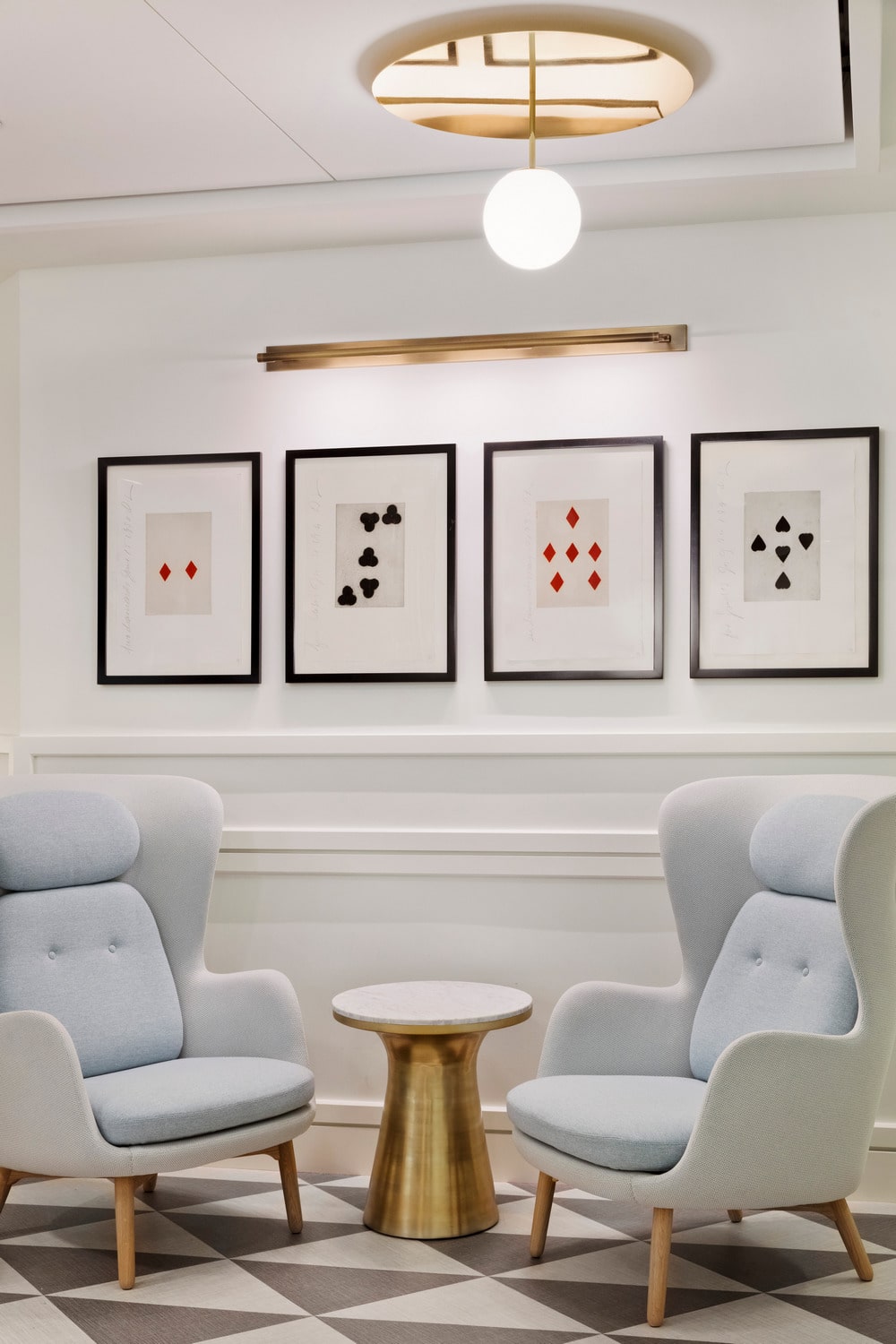
- In a subtle nod to the 1930s, which was the era of the firm’s founding, the design for the interiors features Art Deco-inspired details such as bold but simple millwork profiles, brass details, and geometric patterns that feel simultaneously modern and timeless.
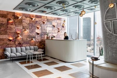
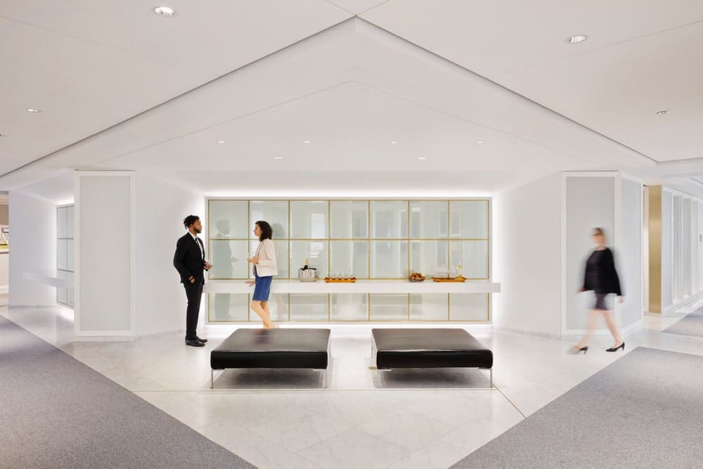
- The lobby floor material, a white Carrara marble with subtle gray veins called “Gioia Venatino,” was chosen to enhance the light, clean quality of the space. The white floor reflects the abundant natural light, while the gray pattern adds texture to the palette. Linear brass insets in the floor echo other brass details. The geometry of the brass insets also reflects the changing shadow lines of natural light in order to frame the light as it moves across the floor.
- The faceted, angled geometry of the new workspace references the building’s shape. Mitered 45-degree angles are found in window frames, brass floor insets, and many other spots throughout the space.
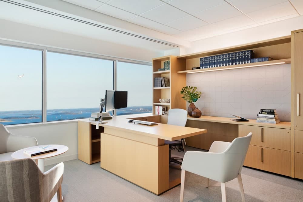
- Rift-cut white oak wood accents are utilized throughout the space. Naturally light in color with a warm tone, an open grain, and an ultra-matte finish, the oak creates a soft visual and tactile experience.
- Mintz leadership is focused on employees’ well-being. Numerous spaces were designed to support that focus, including shower rooms, meditation and wellness rooms, and mothers’ rooms. All these spaces, along with restrooms, were detailed cohesively with high-end hospitality-inspired materials and furnishings.
- All desks include sit-to-stand functionality that is fully integrated with the furniture and virtually invisible.
- Inside offices, all lighting is indirect and light levels are controlled by the user; the three light sources in each office are separately circuited so occupants can personalize lighting according to their own preferences.
- The original HVAC systems were redesigned to include all-new series fan-powered terminal boxes that deliver the air supply through low-pressure ductwork. New diffusers distribute air toward both windows and interior spaces, as opposed to only toward windows, thereby distributing air more evenly throughout the entire space in order to better regulate temperatures.
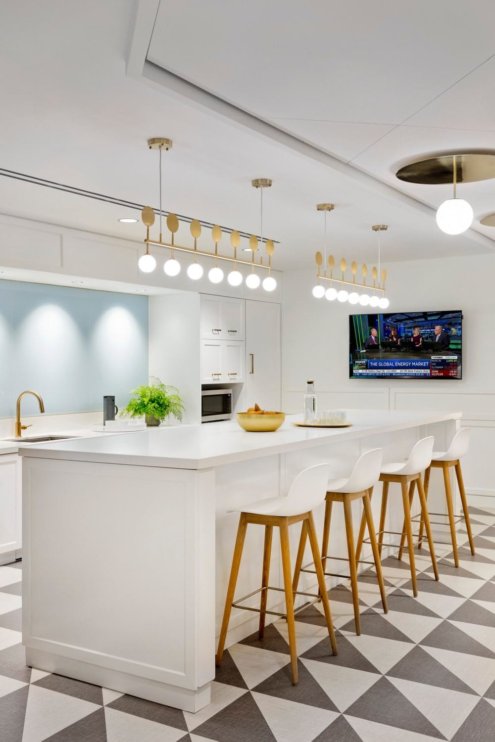
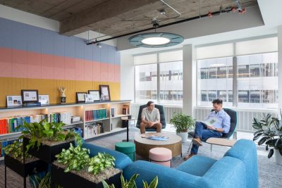
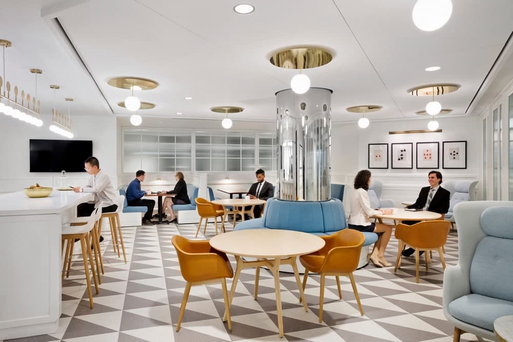
- Designed with a decidedly un-corporate feel, two unique hospitality-inspired cafés offer inviting spots for employee interaction. One café is designed in the style of a 1930s pub; the other is contemporary with a European aesthetic. One of the two cafés is located on the lower administrative floor and given the best outdoor views and natural light to draw staff to that level.
- Power and data access for conference tables is built into the sides of the tables, with wires fed through table legs and no visible power sources on the tabletop or the floor beneath.
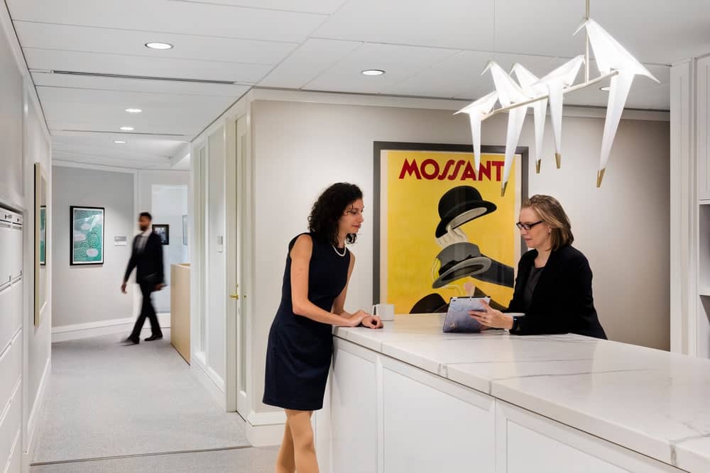
- Mintz has a large original art collection and leadership wanted to showcase the art, so flexibility was key to accommodate ongoing rotation of the artwork on display. In corridors, glass office and meeting-room fronts were punctuated with drywall spaces in between to provide spots to display art. The central recessed ceiling channel in the corridors allows gallery-inspired lighting that can be adjusted as needed.
- An elegantly appointed, multi-purpose internal hospitality corridor is located behind the conference center. The corridor houses oversized coat closets with mirrors and offers a pleasing journey to the restrooms for visitors to the conference center. The focus in the conference center is all about the guest experience.
- To avoid unsightly ceiling access panels in corridors, all lighting devices are located in a central ceiling channel. This allows any one of the large 2’ x 4’ and 2’ x 5’ ceiling tiles to be popped out as needed to access what is above.
