Project: Brutalist Apartment
Architects: Killing Matt Woods
Location: Camperdown NSW 2050, Australia
Area 73.0 m2
Project Year 2019
Photographer: Katherine Lu
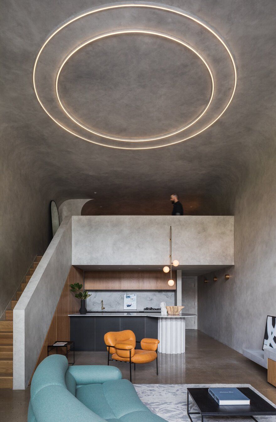
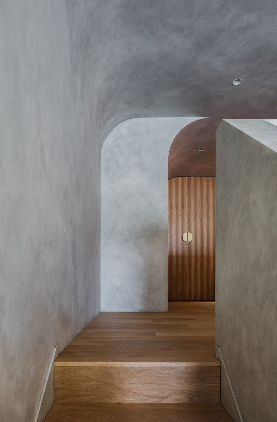
The Brutalist apartment project brief called for the re-design of an inner city warehouse conversion in Camperdown, for a couple seeking a minimalist lifestyle with an interior to match. The clients, who work in design-related disciplines, sought to shed their home of unimportant accumulation and create a space free of clutter and visual pollution. Conceived of as a “concrete bunker”, the shell of the apartment has been informed by the designer’s penchant for Brutalist architecture. The principal intent was the creation of a pared back, geometric interior and a celebration of the neighborhood’s industrial heritage.
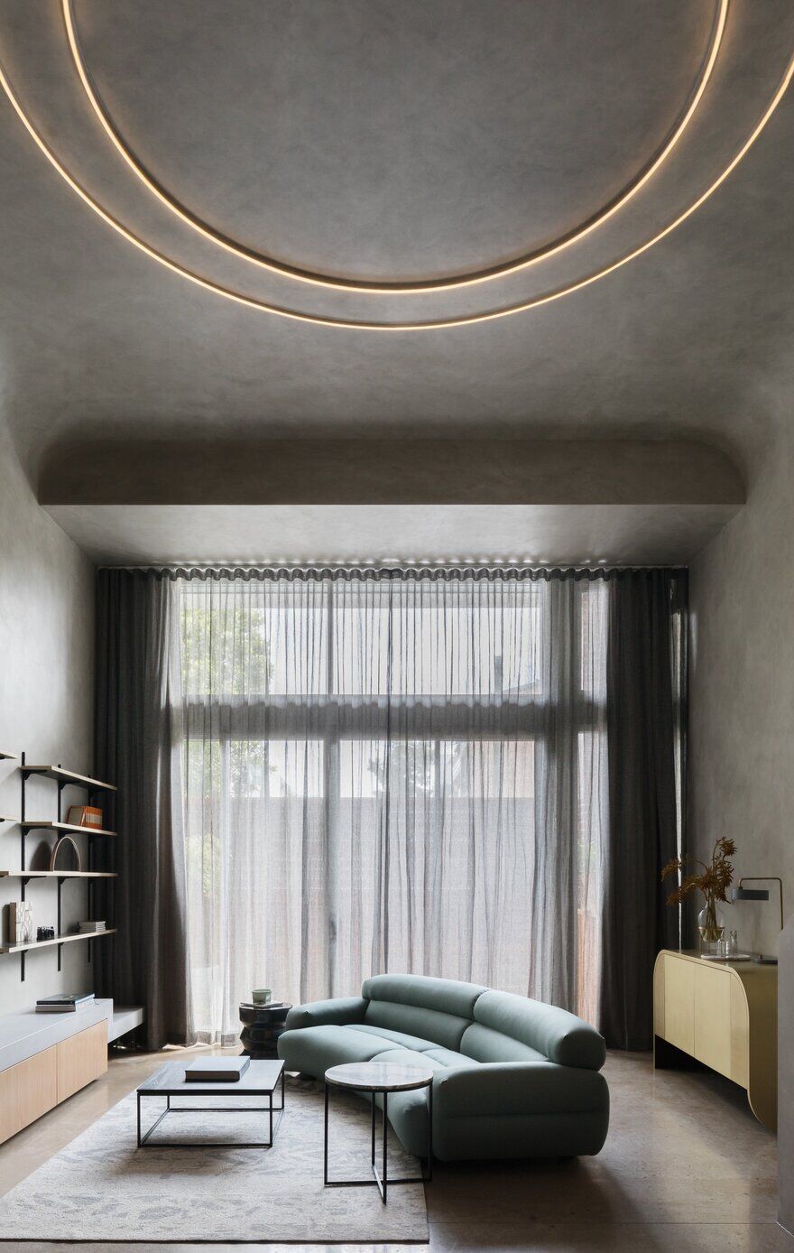
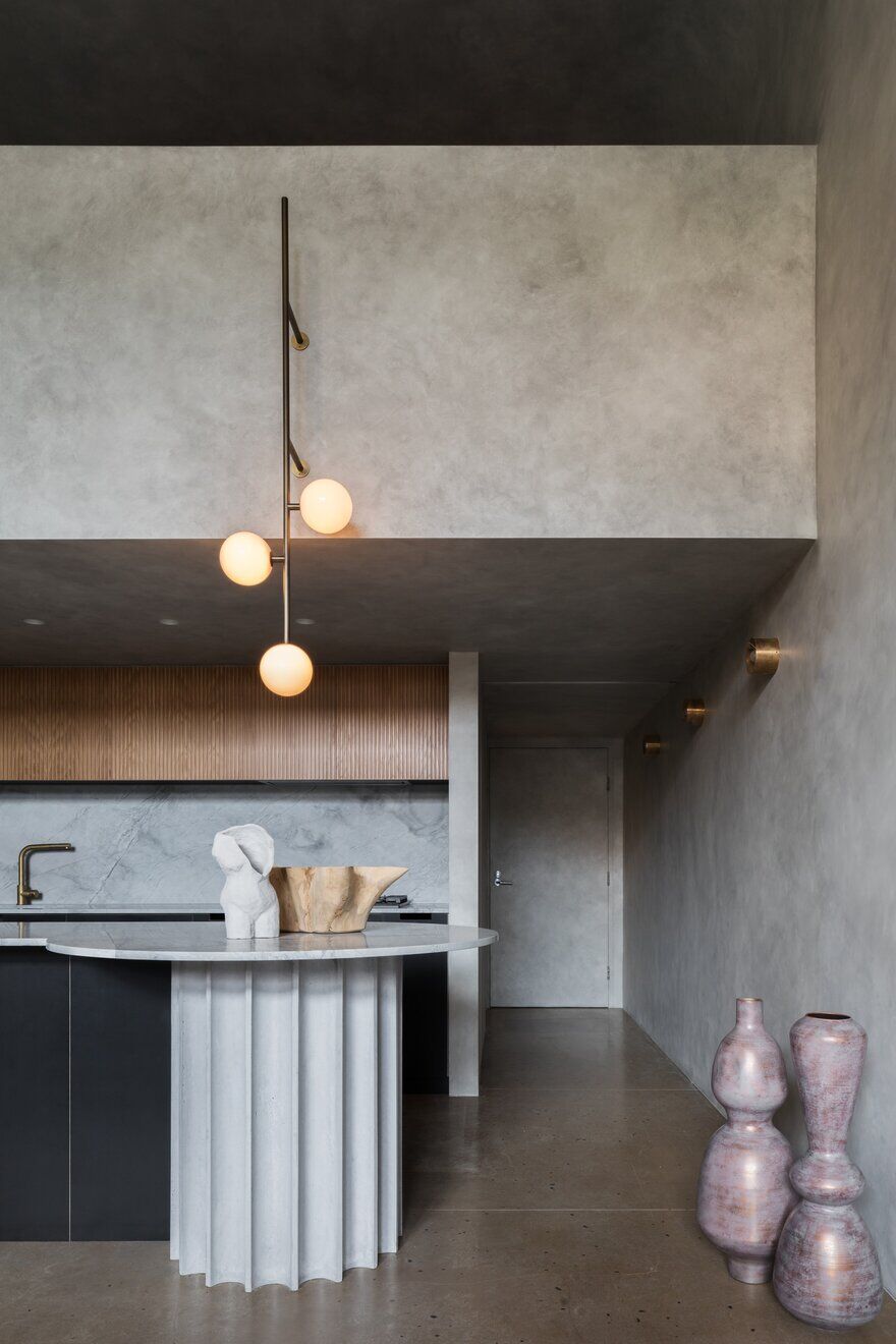
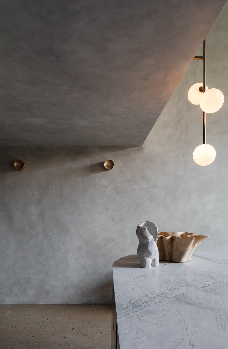
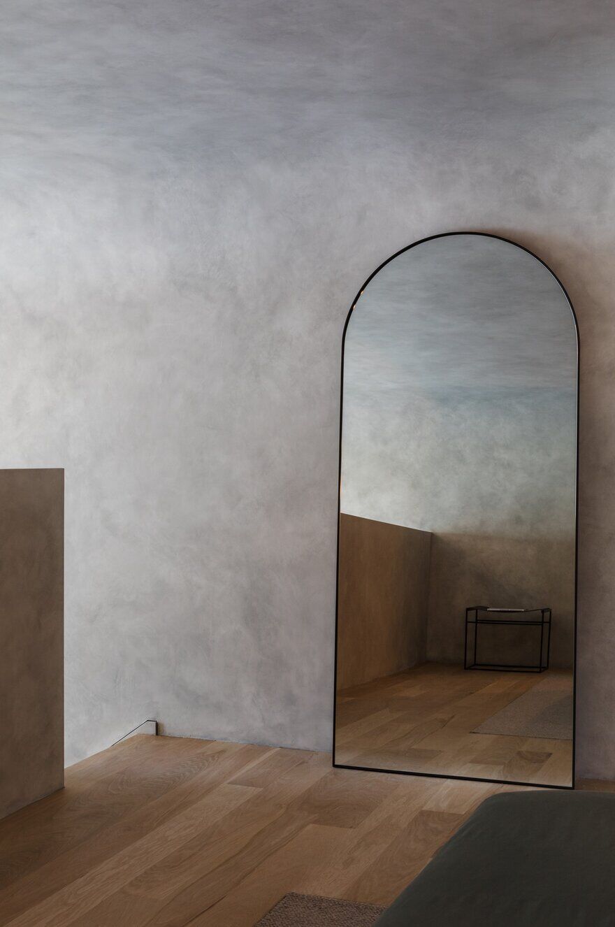
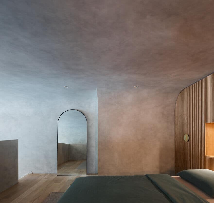
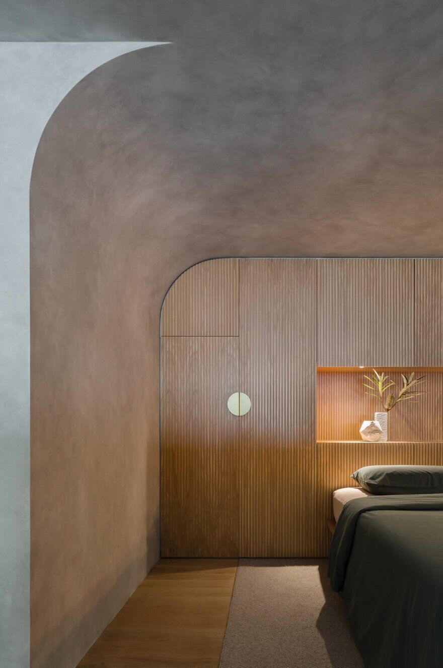
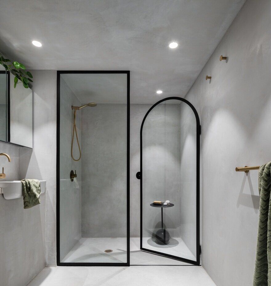
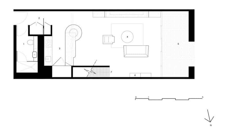
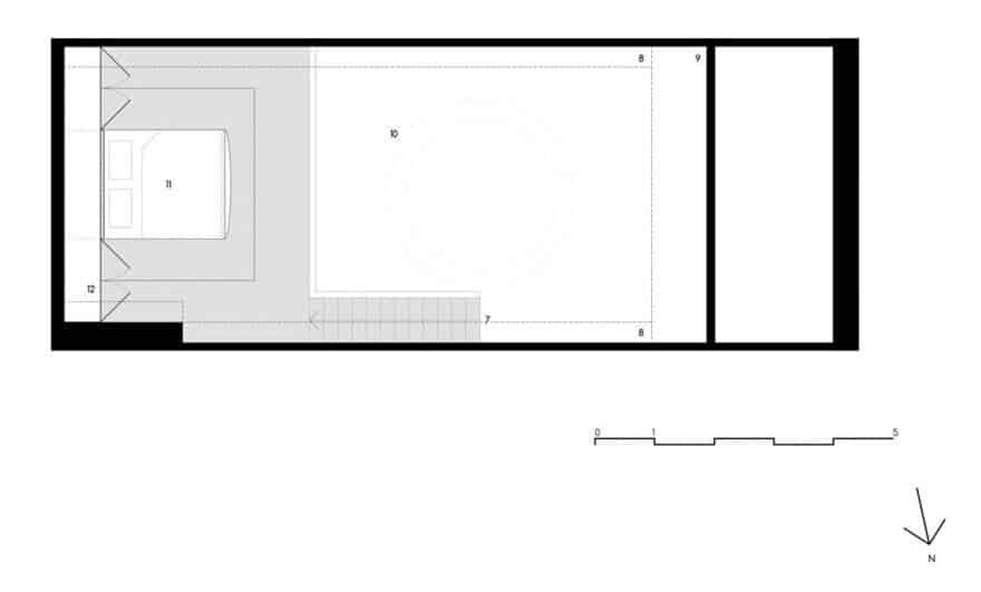
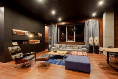
The west-facing open plan apartment features a custom kitchen and a mezzanine bedroom, which overlooks the living room space and a small terrace. The Brutalist loft is flooded with light from a full height, glazed wall, counterbalancing the interior mood, which is intentionally dark and brooding. All interior elements have been created as “raw and extruded concrete monoliths”, as seen in the fluted kitchen joinery, curved ceiling forms, and the cement-rendered bathroom. A homely “mid-century” touch has been introduced in the form of film-faced plywood and American Oak joinery, brass accents, and statement lighting. The furniture selection features geometric forms and a muted palette, underscoring the overall concept.
This interior eschews the cliched “industrial” warehouse aesthetic and ubiquitous “Sydney” design approach (read: natural/seaside/light, bright and airy), offering a fresh, yet site-specific take on the warehouse conversion category. Great lengths were taken to synthesize client direction and the specificity of the brief with a bold design approach. As a result, de-materialization is at the core of the concept, and all elements have been reduced to their bare essentials, resulting in a utilitarian, cave-like sanctuary that is also intimate, light-filled and homely.
Each design decision has been rooted in a practice of sustainability, resulting in a materials palette that is environmentally responsible (eg VOC-free finishes, strict use of FSC timbers, reduced use of chrome and cement) paired with a construction process that was streamlined to minimize waste. Given the project context of a residential warehouse conversion, it would have been natural to emulate any of the well-articulated examples in the genre. However, the designer has chosen to ignore the whims of a trend, opting for a unique approach that perfectly underscores the clients’ vision.
Design innovation is evident in the skillful reduction of the functional components into simple geometric forms that are evocative. In addition, although the brief was a concrete box – remarkably very little cement has been used in its creation. The “solid” concrete elements are Glass Reinforced Cement (GRC) – which has far less weight and cement than traditional concrete techniques – and the “concrete finish”, has been achieved with a French Wash Porter’s Paint. This interior offers a probing look at the level of creativity and execution that can be achieved within a particularly restrained and pragmatic design approach.

