Project: Central Office of GloraX
Architects: Archpoint bureau
Authors: Valery Lizunov, Ekaterina Ageeva, Denis Sorokin
Location: 55 Nevsky Prospect, Saint Petersburg, Russia
Area: 290 m2
Completed 2021-2022
Photo Credits: Olga Melekestseva
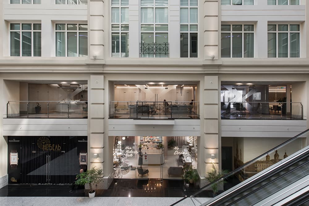
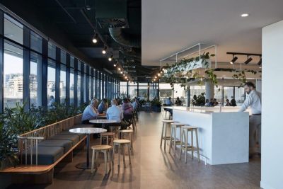
The new central office of GloraX, located in a historic building on Nevsky Prospect, is the company’s key space for meeting with clients and solving work challenges. The developers entrusted the Archpoint bureau with design of a new space – its creation from scratch, in fact. The architects faced with the task of creating an innovative, technological (while also being cosy and spacious) interior, that would combine Japanese minimalism and homely atmosphere. The architects kept in mind the main request – their task was to show that GloraX is a company that takes its job seriously and at the same time pays attention to the future, in some ways being far ahead of its time. The concept that was eventually developed was able to reflect both aspects.
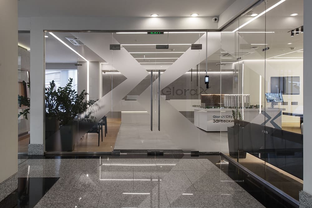
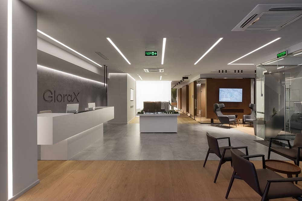
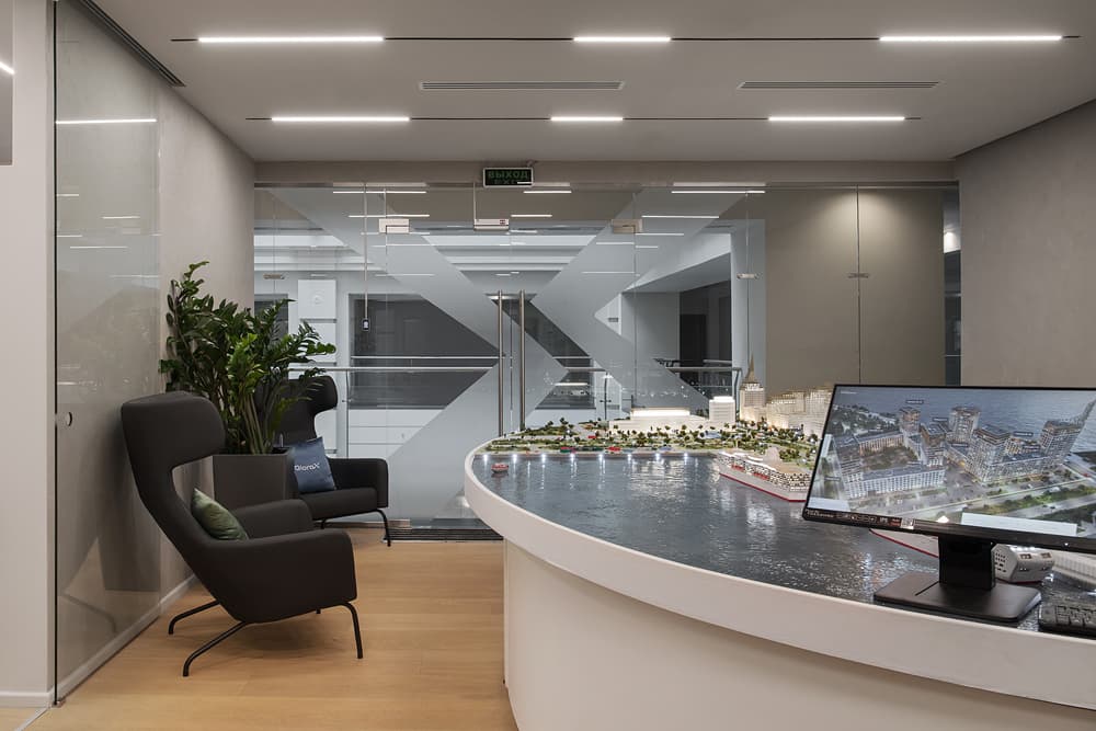
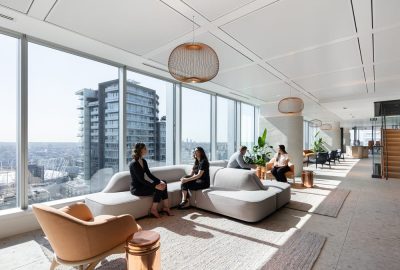
One of the main ideas of the project was to create a sensation among potential customers of not just coming to an ordinary office, but finding themselves in a modern, expensive and comfortable apartment with sophisticated interior. The kind that clients can buy from GloraX and the kind they wouldn’t want to leave, a space where nothing disturbs or distracts. In order to achieve this goal, the architects decided to decorate the premises in a minimalist style with clean shapes, warm light, pleasant textures and materials.
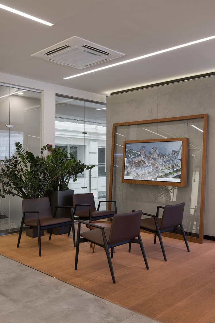
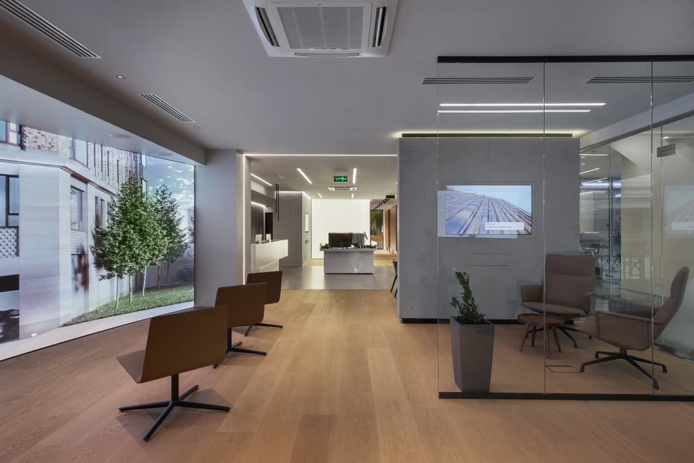
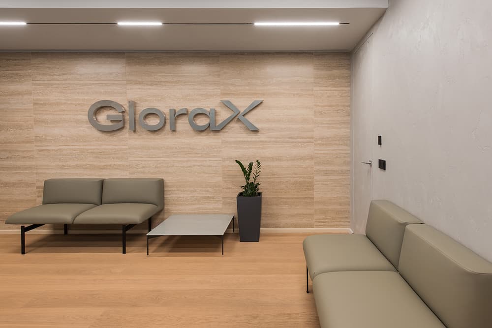
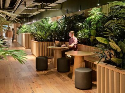
When designing the interior, the emphasis was made on natural materials. Its rooms have natural leather furniture, and the floor is made of parquet strips. Installations of live and artificial plants create the feeling of unity with nature. The artificial ones were chosen for areas lacking in natural light.
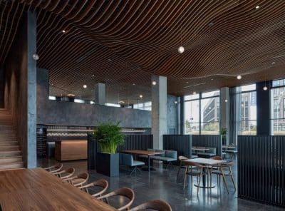
The colors were chosen according to the shades of natural materials: they are muted and don’t catch the eye too much with their gray-brown color scheme. There were no bright color accents used, this choice helping to achieve a feeling of gloss and a look of premium interior. Designer pieces of furniture create a relaxed and cozy environment. At the same time, the interior space includes a combination of “indoor” and “outdoor” elements. Thus, customers get a visual idea of thoughtful laconic interiors, which they can implement in their future apartments.
Another unusual decision made by the architects is the choice of location for a coffee point. It is elegantly hidden near the reception area. It allows administrators to quickly prepare hot drinks for customers, and creates a delicate coffee aroma at the entrance, allowing guests to immediately feel at home.
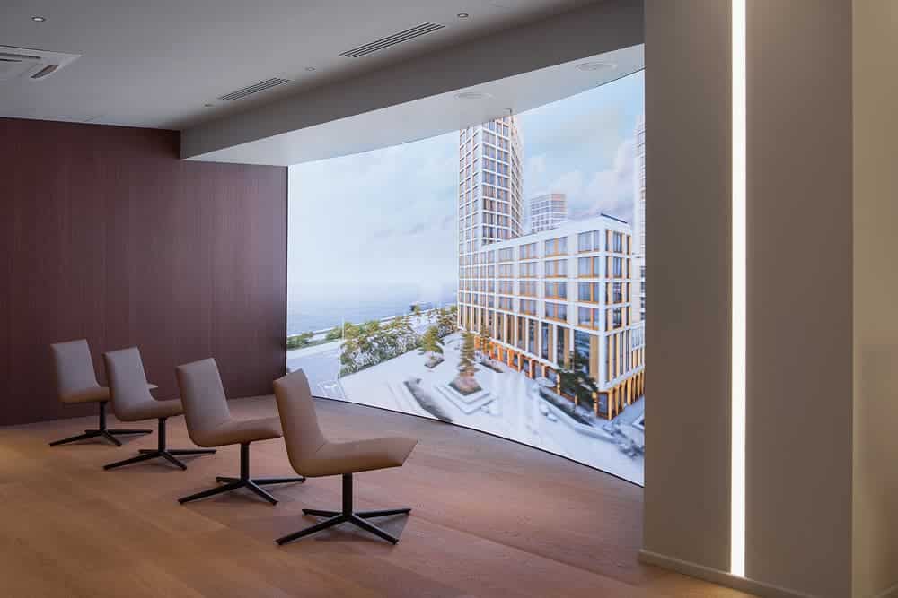
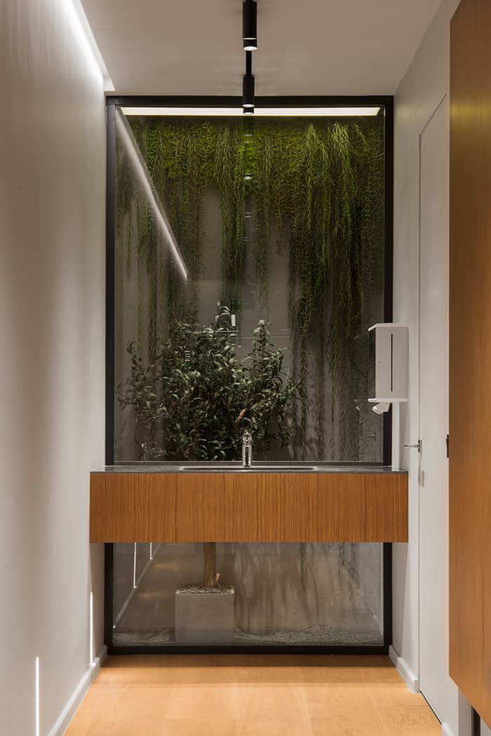
It is worth mentioning two interesting points of attraction of the office. The first is a huge media screen, which is convenient for broadcasting. The second is an elegant sink for guests, placed in front of glass, behind which stands an olive tree, plants descend from the ceiling against a concrete background, and black sand is poured on the floor.
Another important goal of the project was in rational use of the relatively small office area. The architects made the most efficient use of all 300 square meters allocated for multifunctional office space.
For the useful use of each meter, it was decided to divide the space into administrative and client zones. The latter consists of two parts. The first one is for new visitors. Here they can settle down in anticipation of negotiations or the signing of documents. In addition, there is a children’s play area with game consoles and a unique VR zone where one can envision your future apartment with the use of virtual reality technologies.
The second part of the client area is designed for clients who have some disputes or difficulties. it was decided to organize this zone in the opposite wing so that emotional conversations would not embarrass other visitors and would not distract anyone from their work.
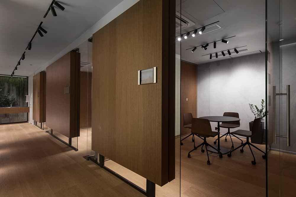
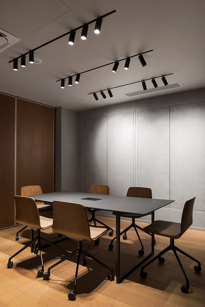
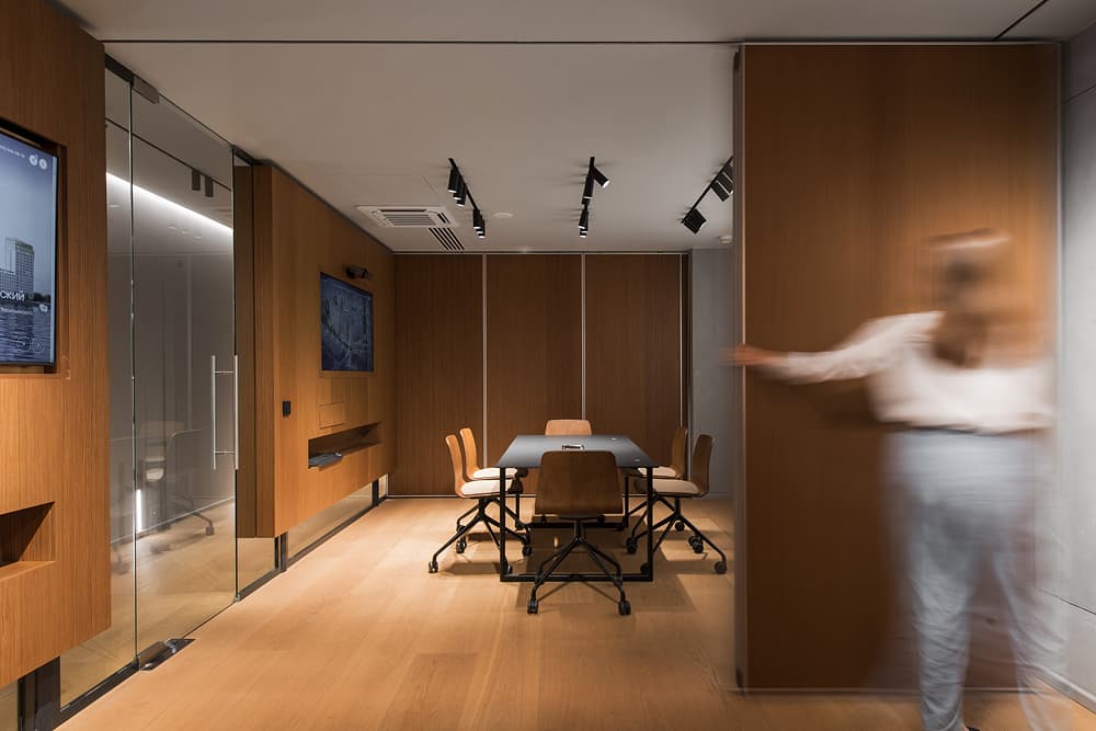
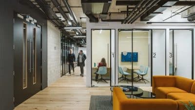
The main feature of the client area is the presence of three open and three closed meeting rooms. Each open meeting room is decorated in its unique style, and the closed ones are made in such a way that they can be easily transformed. For example, one can make two rooms out of three or combine them into one in order to comfortably house presentations and important speeches there. The walls of the meeting rooms are finished with natural veneer wood panels and are accentuated by well-thought-out lighting.
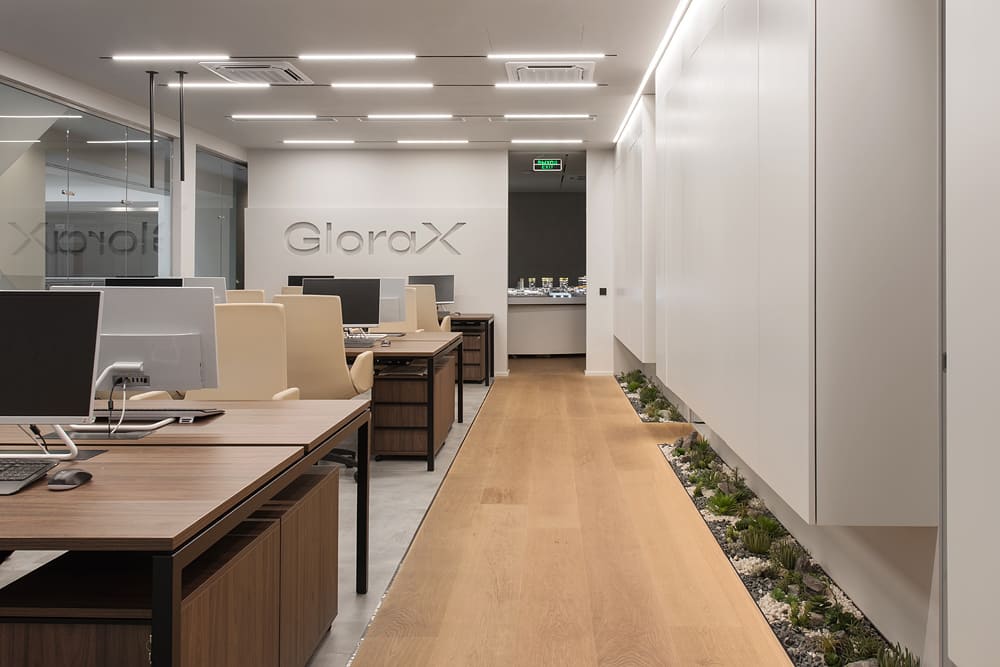
In its turn, the administrative zone has everything for the efficient organization of the workflow. Among other things, there is a comfortable open workspace for ten people with its own small wardrobe and kitchen.
The interior of the office has turned out to be of premium quality. On the one hand, it is conducive to making important decisions and focusing on work, while on the other hand, it imitates an aesthetically pleasing apartment that you potentially would want to buy. This combination made it possible to make the space multifunctional. Now employees of the company will be able to work here with pleasure and hold business meetings with customers.

