Project: Duplex Apartment in Sharon
Planning & design: Noa Kuperman
Location: Sharon region, Israel
Owners: A young couple and their three children
Property: 138 sqm + 94 sqm balcony (with planning permission for 40 sqm loft extension)
Project duration: 18 months
Photo Credits: Oded Smadar
This property, designed by Interior Designer Noa Kuperman, could have easily been featured on the cover of some of the top international design magazines. The perfect balance between spaces, textures, materials, and colors, creates a home that is organic, embracing, and aesthetic. The magnificent skylight designed by Kuperman, drenches the apartment in soft natural daylight. This is a glimpse into a truly unique project.
Welcome to the duplex apartment you would probably never want to leave. This is the home of a young couple and their three children, who chose to purchase the property from Kedar Mivnim and turn it into a unique home.
“During the property hunting, the management at Kedar understood they were dealing with a couple that was looking for a unique home. As a result, and since I have worked with them previously on a successful project, they put the clients in touch with me”, explains interior designer Noa Kuperman, who was responsible for this impressive project.
“It was clear from the offset that we would need to make some planning changes that were non-trivial, especially since we were dealing with a new building that had already received all its building permits”, Says the designer. “When I assessed the ceiling height and the original furniture layout plan, it was evident that to create something unique, one that met the needs and preferences of the owners, we would need to create another level. This is exactly what I did – I contacted the project architect and, together, we submitted a plan that was approved and enabled us to build a skylight and a loft conversion”. According to Kuperman, this is a rare procedure that is often rejected by developers and investors – however, it was made possible thanks to Kedar’s management being supportive of the family’s wish to create the home of their dreams, as well as the couple’s determination to embark on a journey to create a one-of-a-kind home.
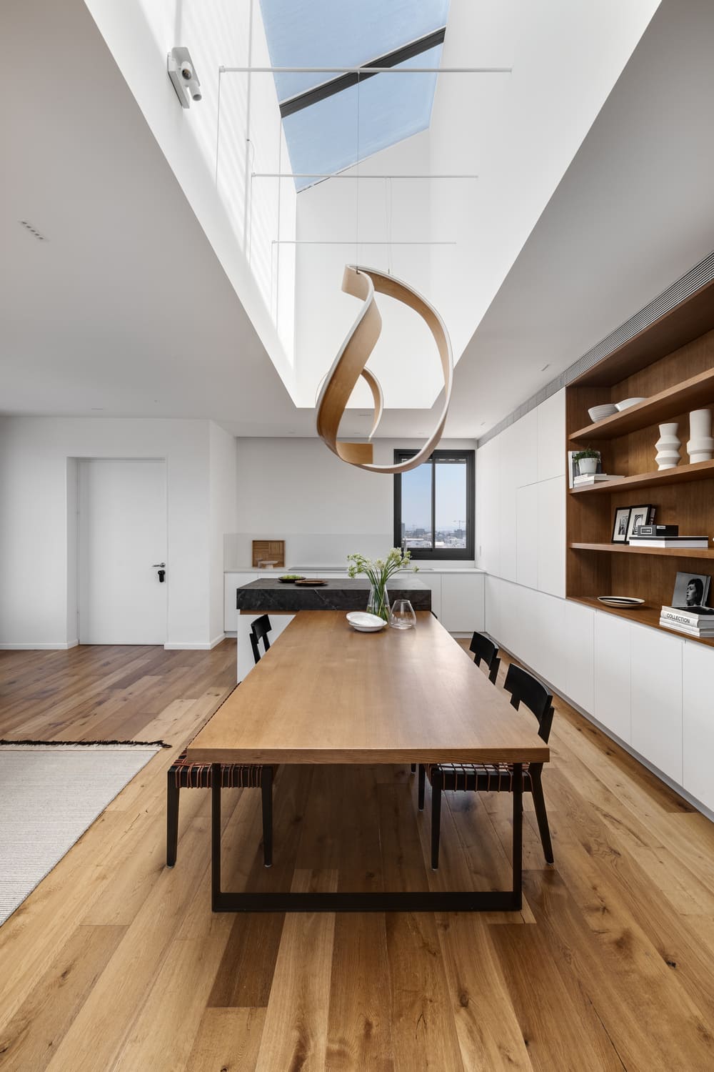
Since the planning restrictions in the relevant neighborhood require sloping tile roofs, Kuperman decided to create a skylight, raising the sloping ceiling considerably to the height of six meters, allowing for natural daylight to wash the space. “I took advantage of the height and instead of using the space as a secondary storage space, I created a 6.5m long over 1.3m wide glass ceiling”, says the designer.
And so, the original penthouse apartment turned into a duplex apartment. The entry level is a well-lit, impressive open space that includes a family/reading corner, and a new staircase leads to the second level that includes a home office and a master bedroom.
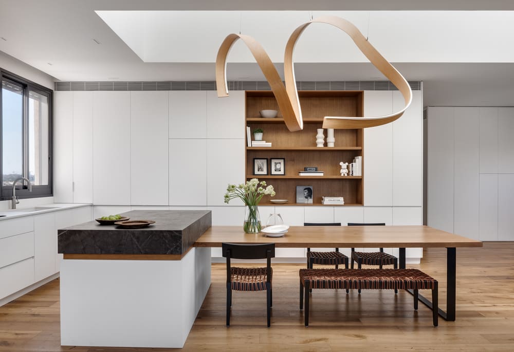
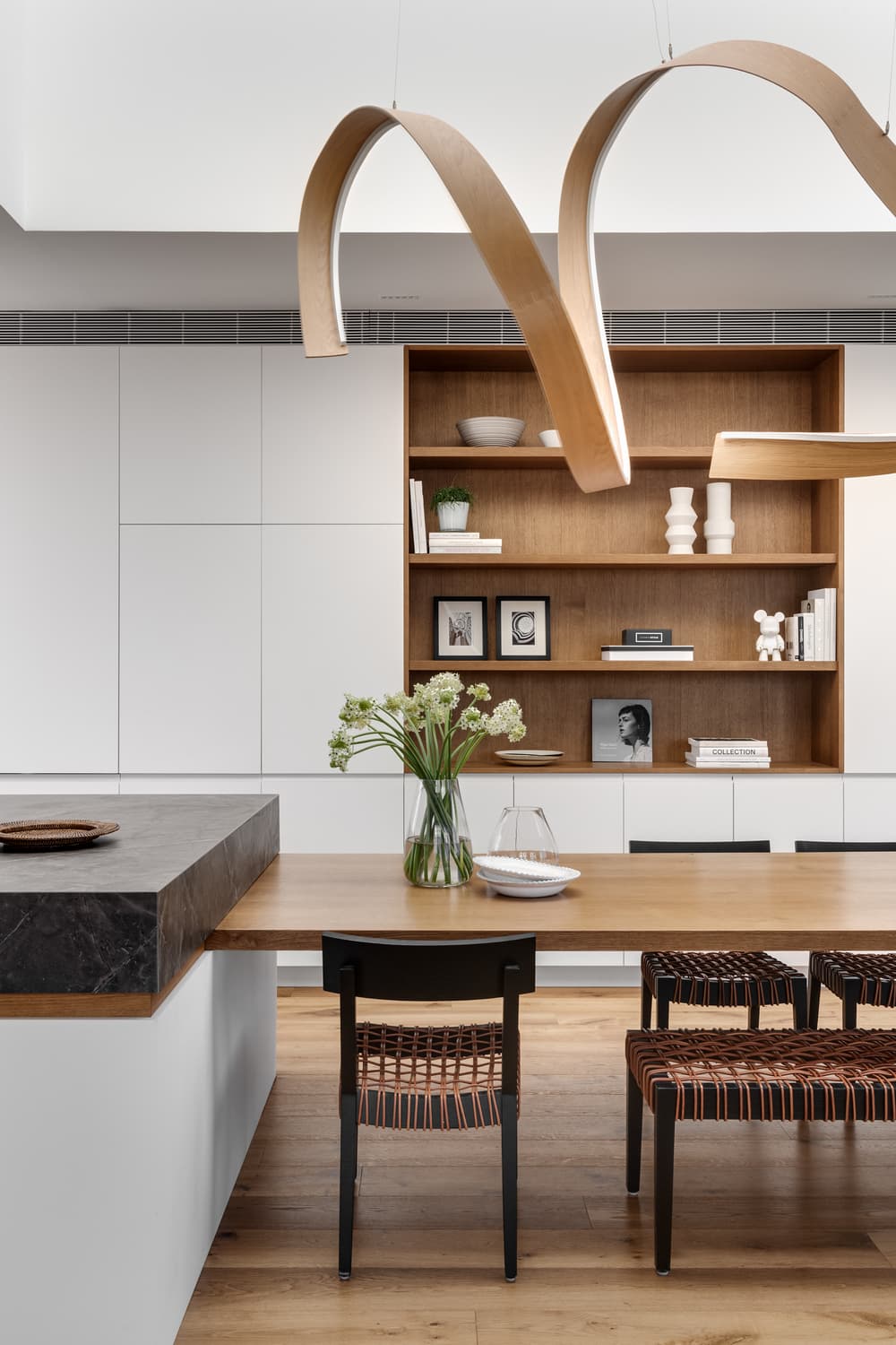
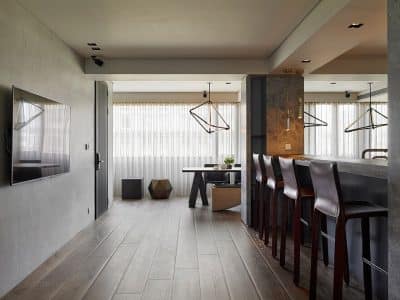
The new plan included several unique features that give the property a luxurious high-end feel. “When I studied the original furniture layout plan, I realized there was not enough space for a formal dining area”, shares Kuperman. “As a result, I decided to create a wide kitchen with a large island and dining table combination in its center. The island and dining table are connected in a way that looks as though it is sprouting from the island. I designed an elegant ‘seam’ that creates natural continuity between the two functions”, she explains.
Like many of the designer’s other projects, this project also incorporated a kitchen that doesn’t look like a typical one, but rather like a piece of elegant furniture that allows the space to stay organized and clean at any given moment. The kitchen includes two integral fridge/freezer units and a Concepta cupboard that conceals the kitchen appliances with built-in sockets.
“We concealed everything behind a facade that creates the perfect backdrop for the dining area and the light fixture fitted above it, allowing the stars to be viewed in the night sky”, adds the designer. “In addition, I created oak shelving in the space that displays the family’s story – a space that is dotted with family photos and items of sentimental value, which the family has collected over the years”. According to her, the unit creates a sentimental pause, and breaks the mass of the light kitchen, adding warmth to the space.
Kuperman used white Dekton for the worktop, and gray Dekton for the island, which creates a sense of luxury in the space. “The dining table is made of 5cm thick oak with an iron base for sturdiness and stability. The wooden bench and chairs, with leather straps stretched across the back, were purchased from designer Arik Ben-Simhon”, shares the designer. She placed them facing the lounge, for an enhanced sense of space.
One of the most impressive elements in the space, giving it a unique and fluid feel, is the sizable amorphic light fixture designed by COZZI – a collective of young artists that create sculptures and unique light fixtures, renowned for their ability to make design dreams come true. “I was in search of a sculpture that could be hung above the skylight, float in the space and draw attention to the dining area”, recalls Kuperman. “I was looking for a light fixture that would answer this need and I realized that no matter what piece I sourced, it would be practically impossible to hang it on a glass ceiling. This light fixture was custom-made for me by COZZI. It was originally designed as a curved oak sculpture, which we converted into a lamp by concealing led strips in its inner circumference. The piece was hung in the skylight shaft with transparent cables and so it looks like it is floating in space”, she adds. The three-layer parquet floors fitted throughout the level are the same shade as the light fixture, adding a sense of warmth to the space.
As a whole, all the elements in the open space work in understated unison. With the use of advanced tech systems, Kuperman created a space free of lowered ceilings, keeping the space elegant and clean. For example, the VRF technology air conditioning system was fitted into a carpentry unit in the top section of the kitchen and a decorative aircon grille that runs along the ceiling allows for good air distribution throughout the lounge and kitchen.
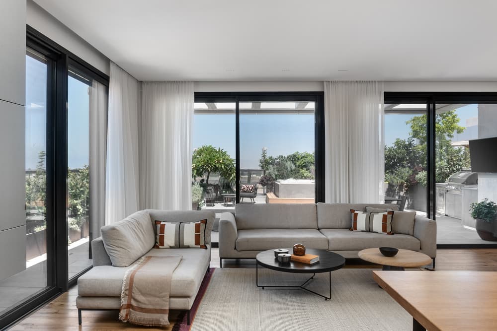
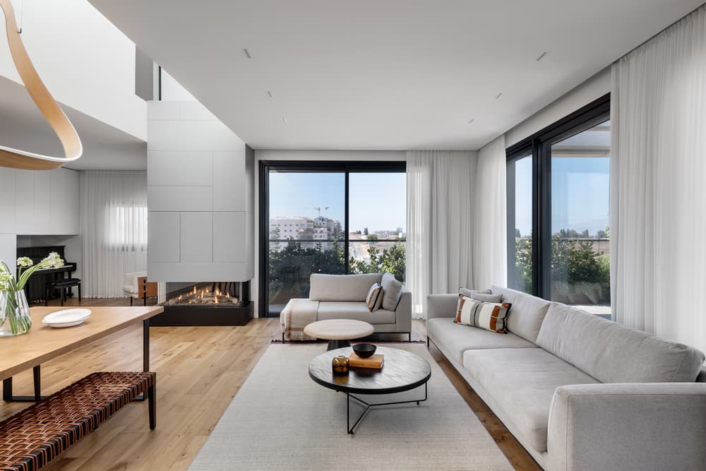
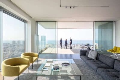
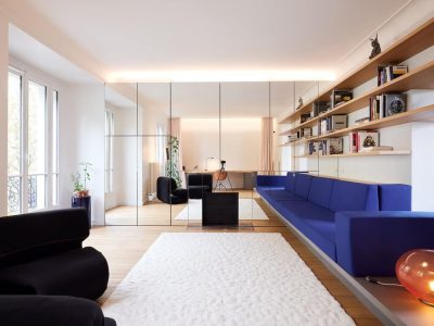
The open space includes a lounge that leads onto a balcony overlooking the surrounding open urban view. “The sofa we chose is clean and simple and upgraded by Ella Decor custom-made decorative cushions in a variety of chic fabrics imported from Europe”, states the designer. Since the family doesn’t watch much tv, according to Kuperman the lounge is usually used on weekends when the grandparents come to visit. The sofa is partly concealed by a concrete-looking fireproof carpentry unit that emphasizes the height of the skylight shaft. A glass fireplace was fitted into the unit making the fire visible from all corners of the space.
A kids’ play area is located further along the level and doubles as a quiet area and reading corner. “I used the unutilized corner under the staircase to create an integral carpentry unit, in the same color as the wall, for toy storage”, explains Kuperman. “I also created a niche for the mother’s piano”.
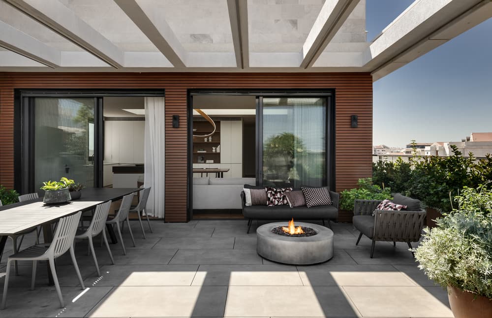
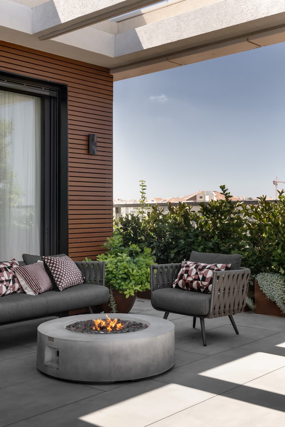
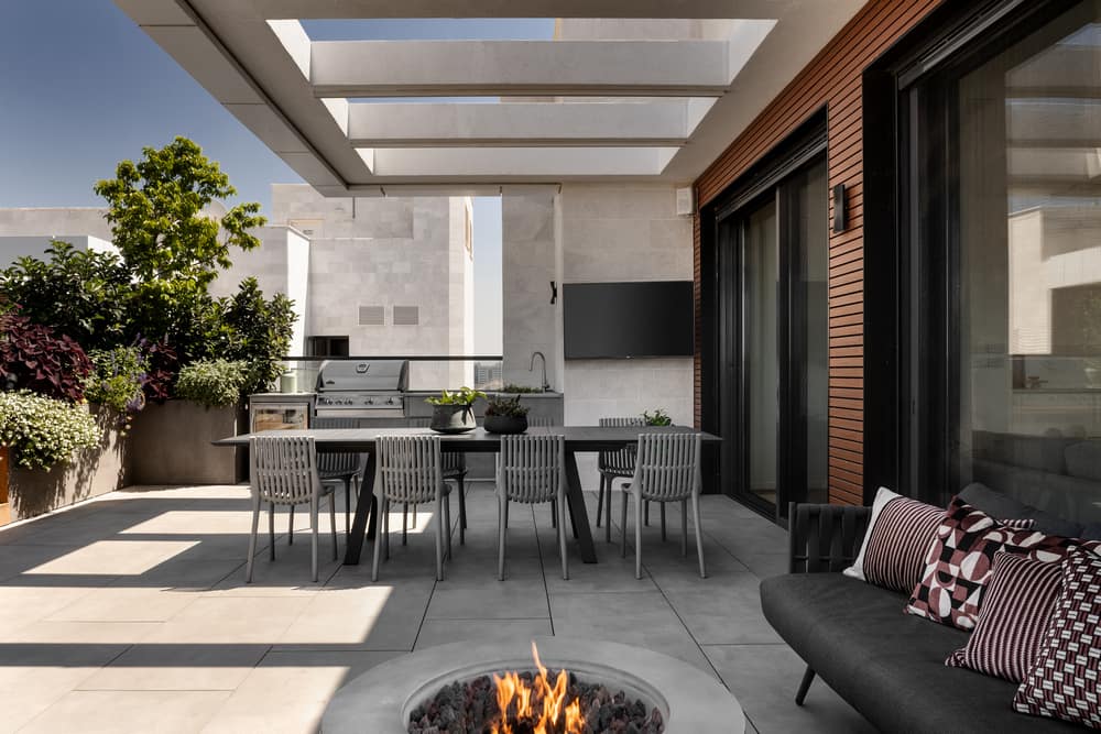
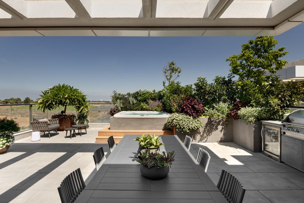
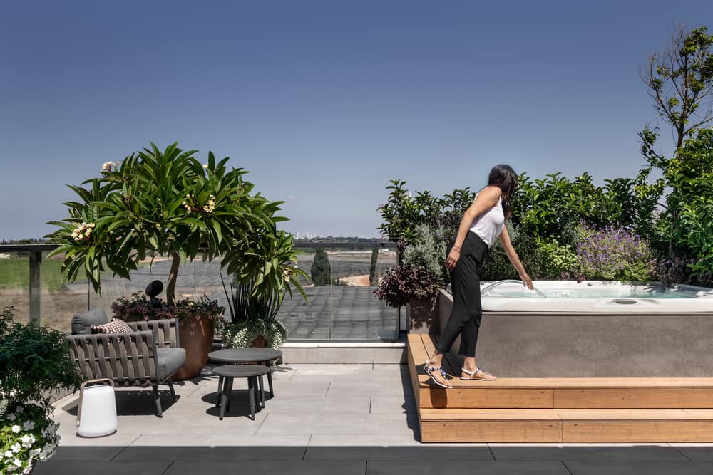
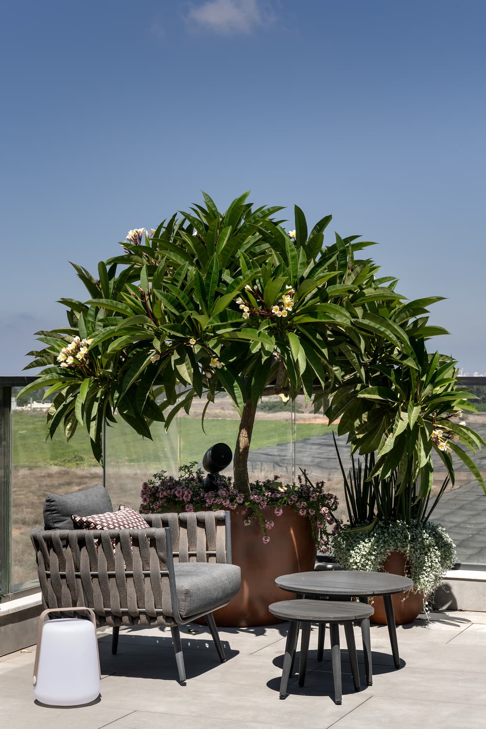
The balcony on this level is very big, and as such, all the balcony gutters were easily seen. However, Kuperman fitted a 3cm granite porcelain floating floor throughout, allowing the water to seep through narrow 0.5cm cracks and maintaining a sense of smooth and harmonious flooring. “I wanted to create a floating garden for the family and did so by surrounding the balcony with large, lush plants. Some of the plants also create a natural partition between the property and neighboring balconies”, she says. Thus, the family and their guests can enjoy an outdoor dining area, kitchen, and lounging area with a fireplace that provides warmth in the winter and can be used as a table during the summer. The pièce de résistance of the balcony is the jacuzzi. Its external walls were tiled in the same color as the floor, and the steps leading into it were made in wood, and the end result blends harmoniously in its surroundings.
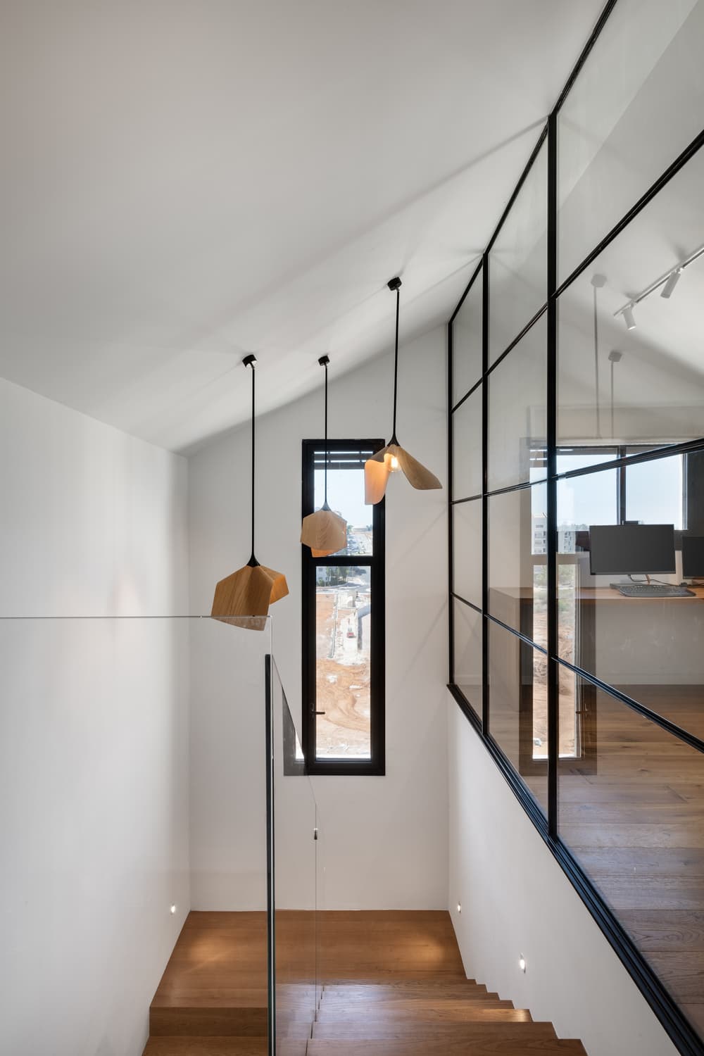
A concrete staircase with oak treads leads to the loft. Kuperman masterfully created a unique item, a profile embedded in concrete that allows the glass partition to be fitted into the wood as though it was its natural extension. COZZI light fixtures were fitted above the staircase in Random composition, and the home office can be seen through the glass partition, allowing its users to maintain interaction with the rest of the family, as well as allowing natural light from the skylight to wash the home office and corridor.
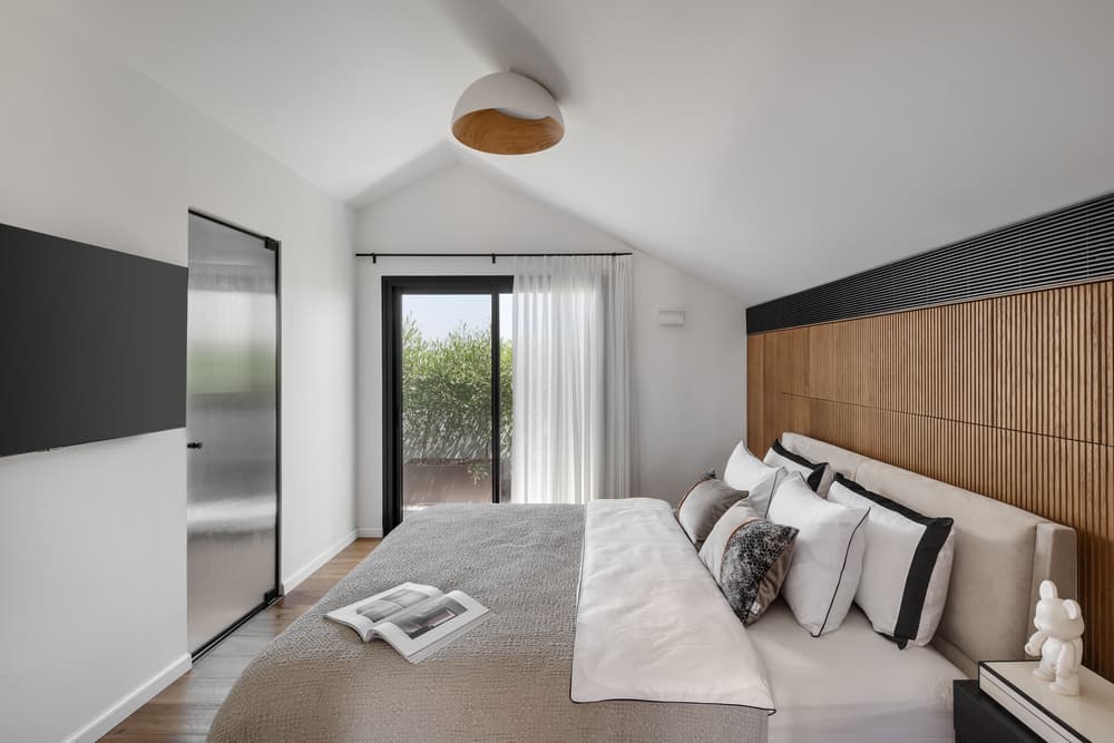
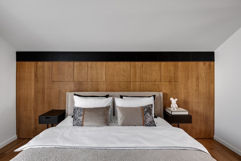
The couple’s bedroom has a sloping ceiling and thus, the space had to be meticulously planned to utilize the space most efficiently. For example, the wall behind the bed was fitted with an air conditioning unit and a cupboard in addition to the adjacent walk-in wardrobe. Kuperman used grooved oak facades to conceal the cupboard doors and used a variety of textiles, including Egyptian cotton, to give the room a cozy and warm feel. The couple enjoys a luxurious walk-in wardrobe, a well-equipped bathroom, and an intimate balcony adorned with plants where they can take time out for themselves at the end of a long busy day.

