Project: Girona St. Apartment
Architects: Raul Sanchez Architects
Project Team: Valentina Barberio, Paolo Burattini, Flavia Thalisa Gütermann, Dimitris Louizos, Albert Montilla
Structure: Diagonal Arquitectura
Enginnering: Marés ingenieros
Location: Dreta de l’Eixample, Barcelona, Spain
Area: 170 sqm
Year: 2023
Photographs: José Hevia
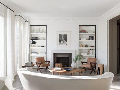
The spacious and large apartment is located in a noble estate from the end of the 19th century, and enjoys a privileged position facing both Girona street and a large interior courtyard typical of the Barcelona ‘eixample’, additionally, the apartment enjoys extra ventilation and lighting through a beautiful interior patio with wooden carpentry and tinted glass.
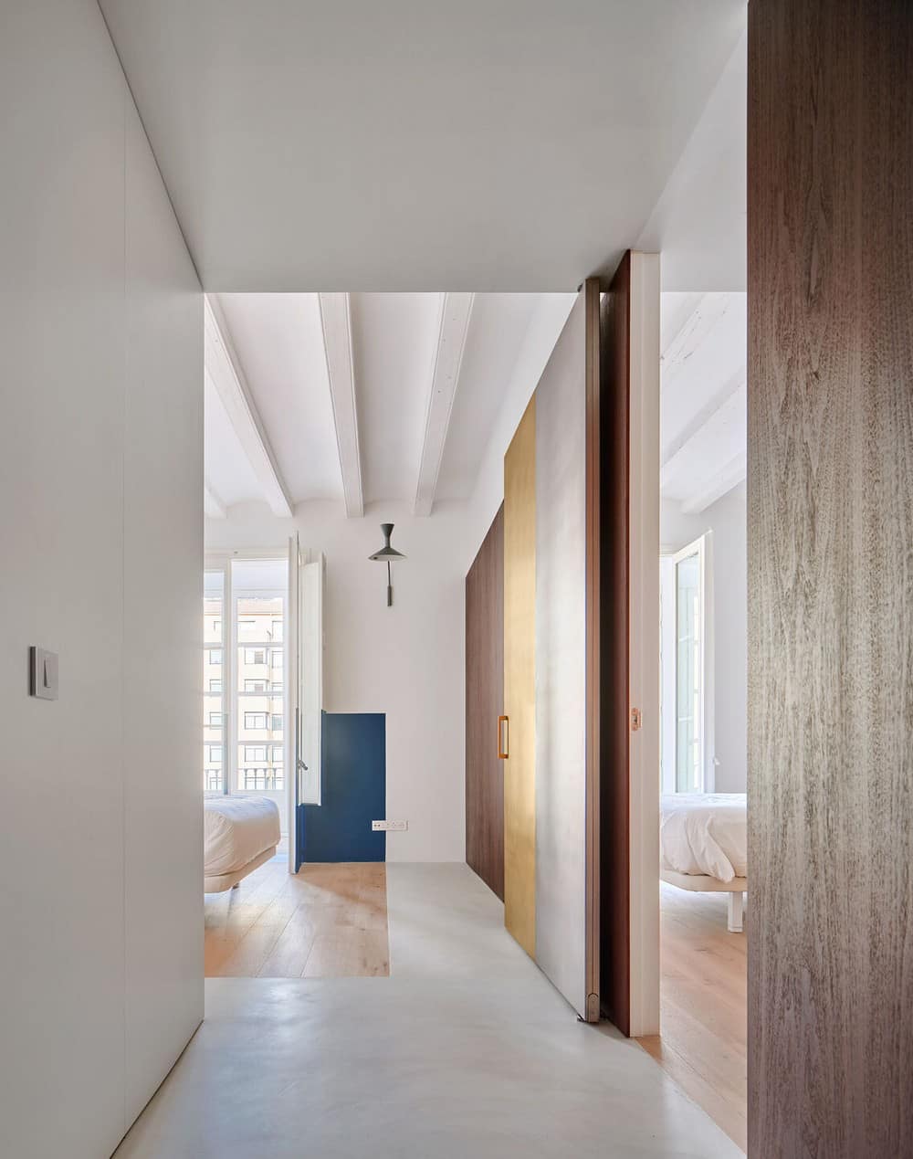
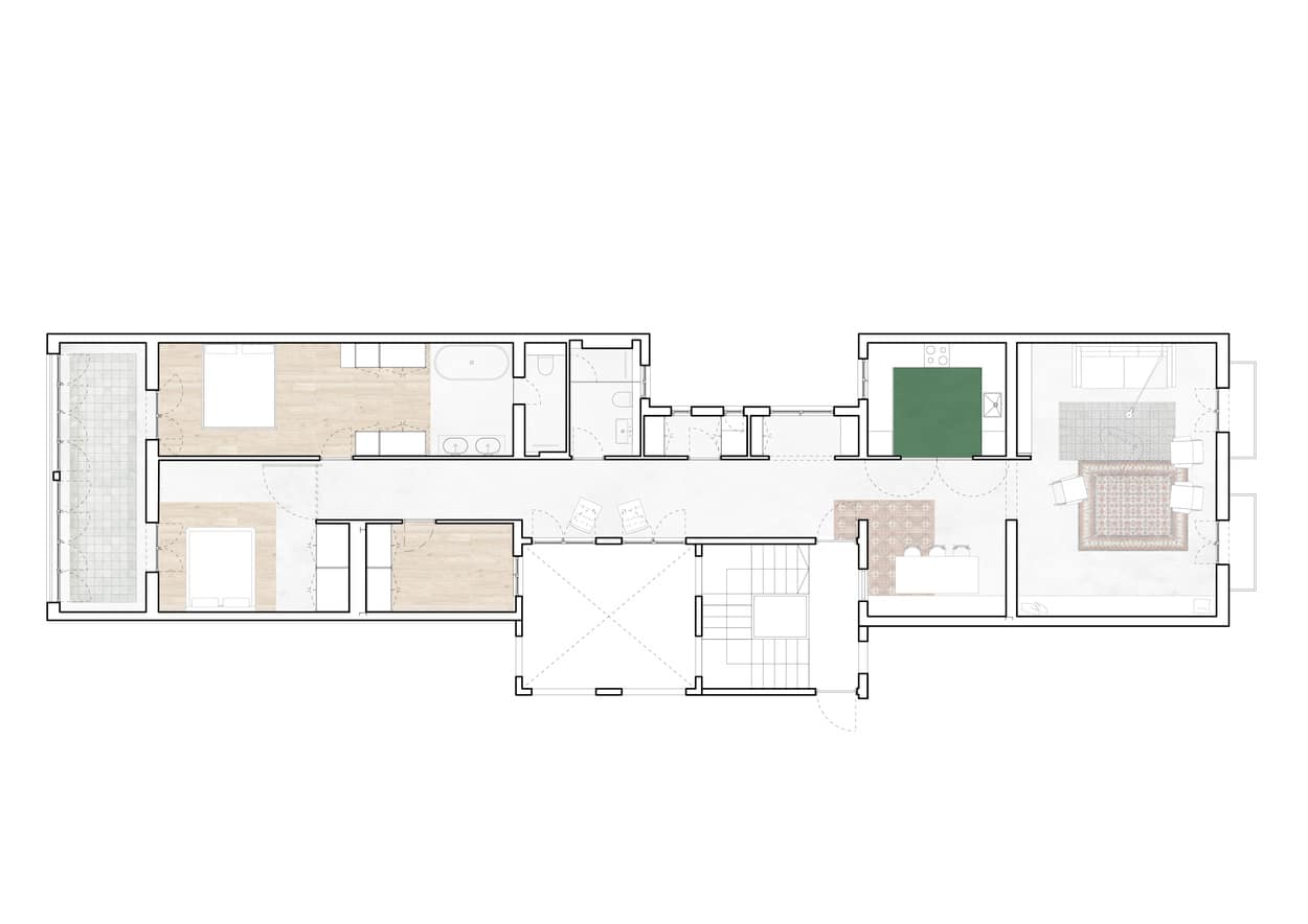
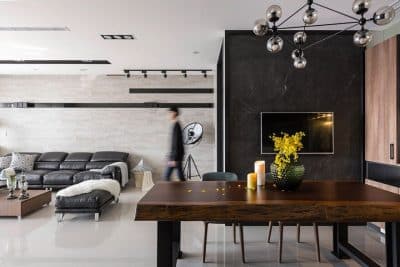
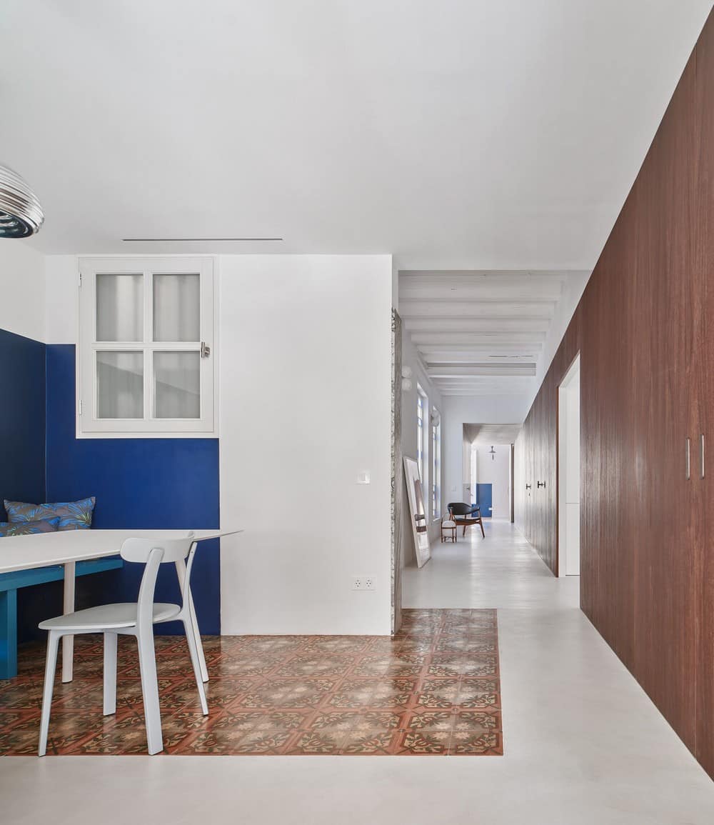
This condition of the Girona St. apartment is precisely what dictated its transformation and refurbishment: a long walnut wood front, dark and elegant, with an open pore, starts from the living room next to Girona street, and runs the entire length of the apartment, 21 meters, until it reaches the gallery that leads to the inner courtyard of the block.
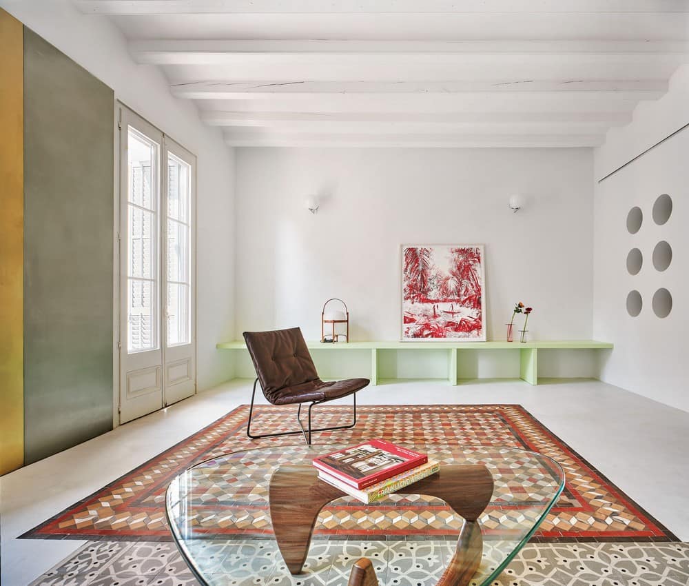
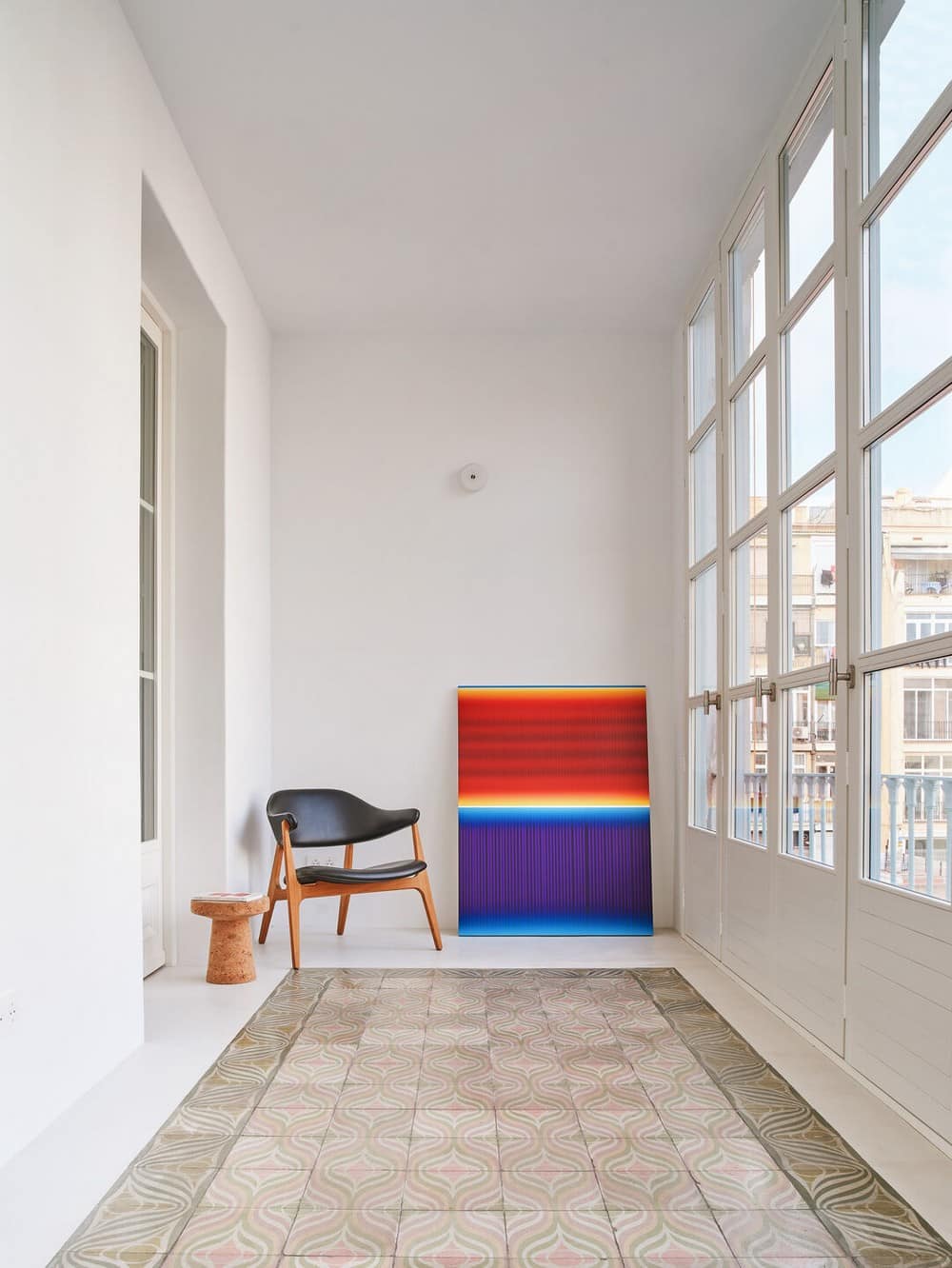
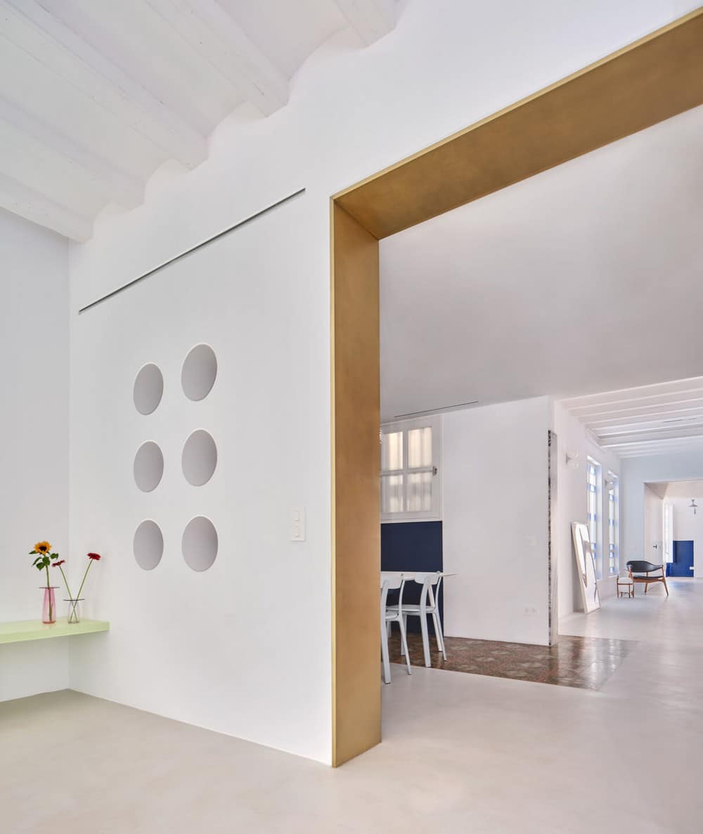
Along this interior wooden façade, spaces with a more collective use follow one another, and their width is always oversized, to be living spaces, not just passing-through, mixing rooms with a more defined use, such as the living room or the dining room, with other more ambiguous ones, such as the cozy space next to the interior patio, which receives light through the original blue-tinted windows.
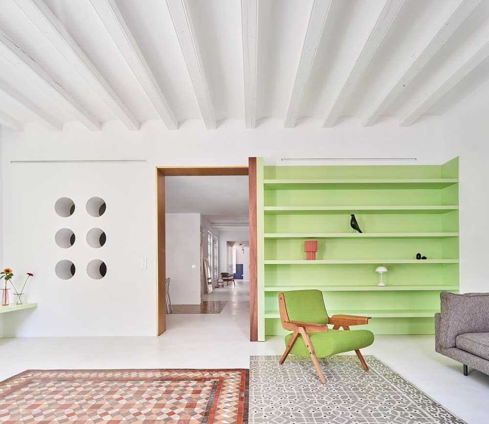
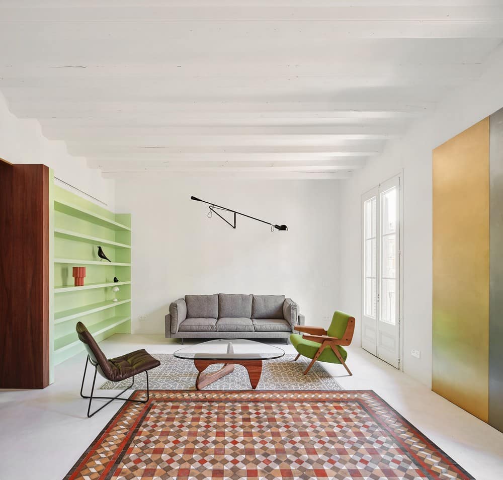
The importance of this interior cutting plane/facade is reinforced by providing it with a beginning and an end: in the living room, a ‘picture’ of brass and stainless steel finishes it off; towards the gallery, a pivot door of the same dimensions receives the same materials, but this time it changes position, insinuating an immaterial union of these two metal fronts at each end of the plan. Beyond this pivot door, the wooden front slips into the room to indicate that this space has a hybrid label, being able to be both a bedroom and a room for common use.
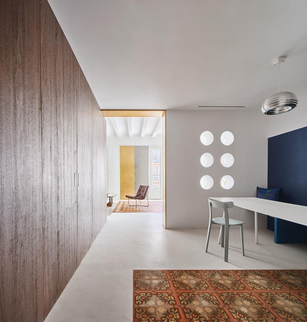
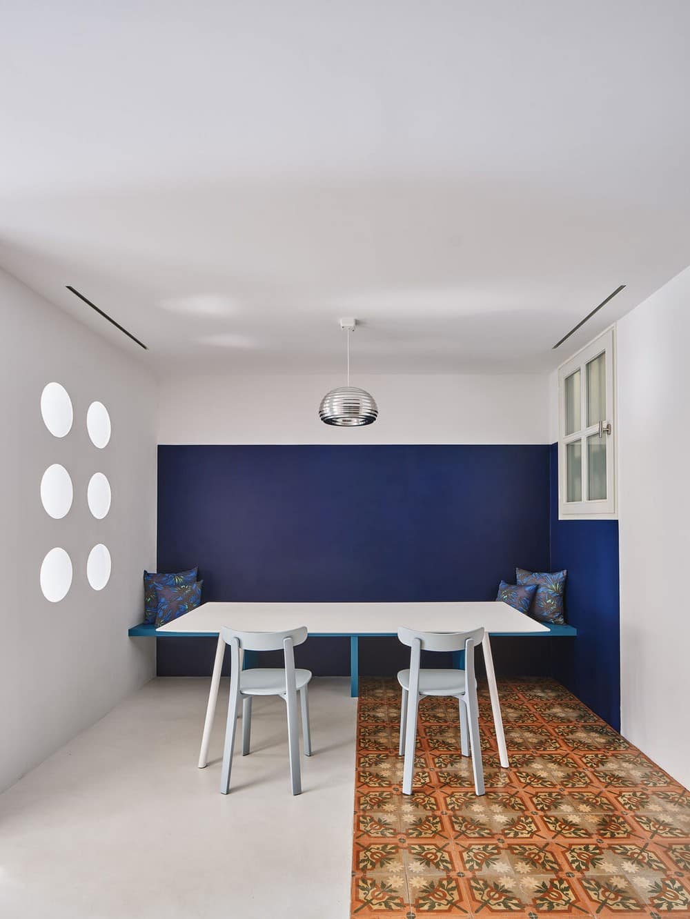
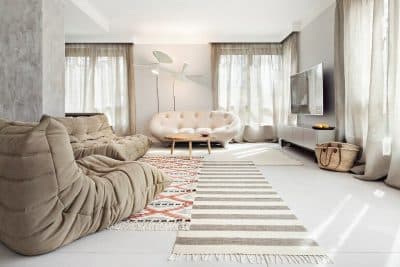
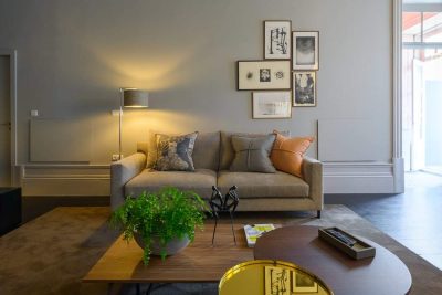
All the common spaces are united by the same white microcement flooring, while recovered hydraulic mosaic floors are arranged in strategic places; continuing the axis of the wooden plane towards the living room by means of two types of mosaic sliding between each other, or welcoming in the access and directing the steps towards the dining room. For the rest, different pieces of integrated furniture, all designed specifically, use color tones intentionally far from the colors of the mosaics or wood, adding counterpoints of color to a mostly calm interior.
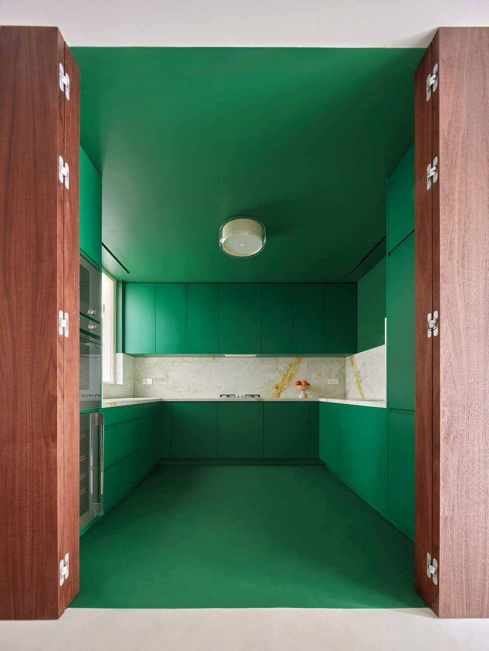
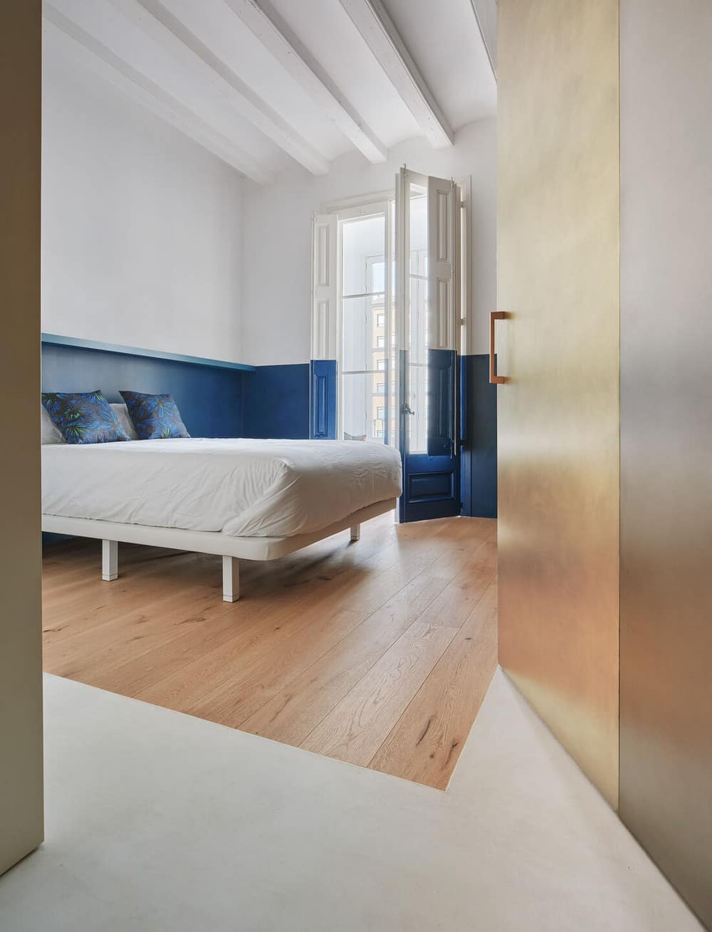
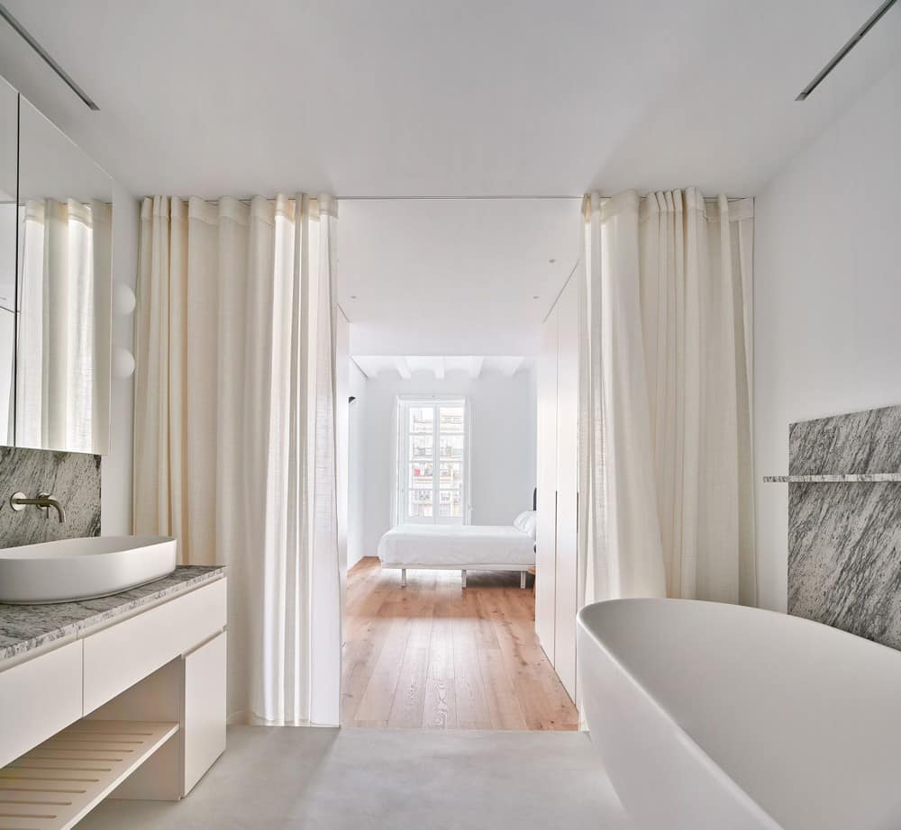
On the other side of the walnut façade, are the rooms that are more private or in need of privacy. Their entrances are hidden from the front, with all the flush doors, and each of these spaces follows its own law, as if they were independent rooms that share the same access street: the kitchen opens onto the dining room like a green world with a white and yellowish band on the marble front; the shared bathroom plays with different niches and shades of green and yellow, matt and shiny, while the bedrooms are calmer environments with oak wood floors and accents in blue through wall coverings or textile designs by Catalina Montaña, made expressly for this project.
Last not least, there is a vague intention of leaving the spaces somehow unfinished, with a subtle incomplete character, opening up the different options for occupying and using them.
