Project: Graphite Apartment in Poznan
Architects: ZONA Architekci
Architects in Charge: Anna Topolska, Dominik Kolenda
Collaborators: Paulina Wieczorek, Magdalena Sawicka
Location: Poznań, Poland
Area: 80.0 m2
Project Year 2016
Photography: Krzysztof Strażyński
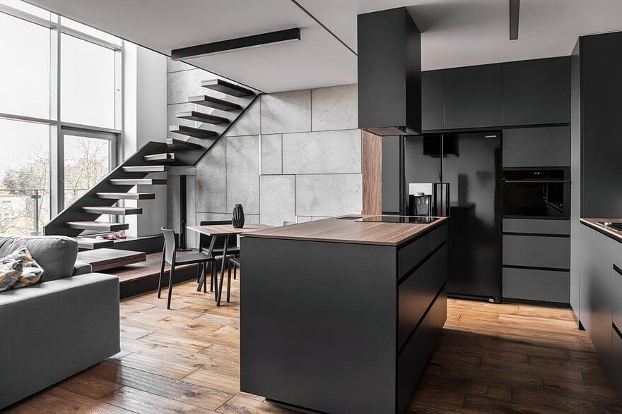
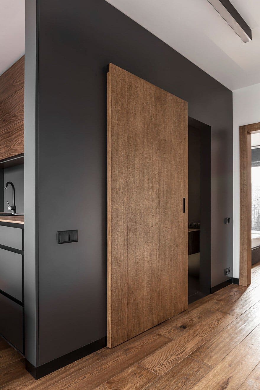
In this world everything is clear – a simple form, minimalistic colors selection, natural materials. This concept of design has been dictated by the male point of view from the very beginning. The apartment was purchased in the fall and when the architects entered it, they noticed an exceptional view of the old trees in the neighborhood. Yellow, red and brown colors were the perfect background.
The first step was to demolish the walls at the entrance of the apartment. This provided maximum open space. In this way, while taking the first step in the apartment you can enjoy the sunshine through the big windows.
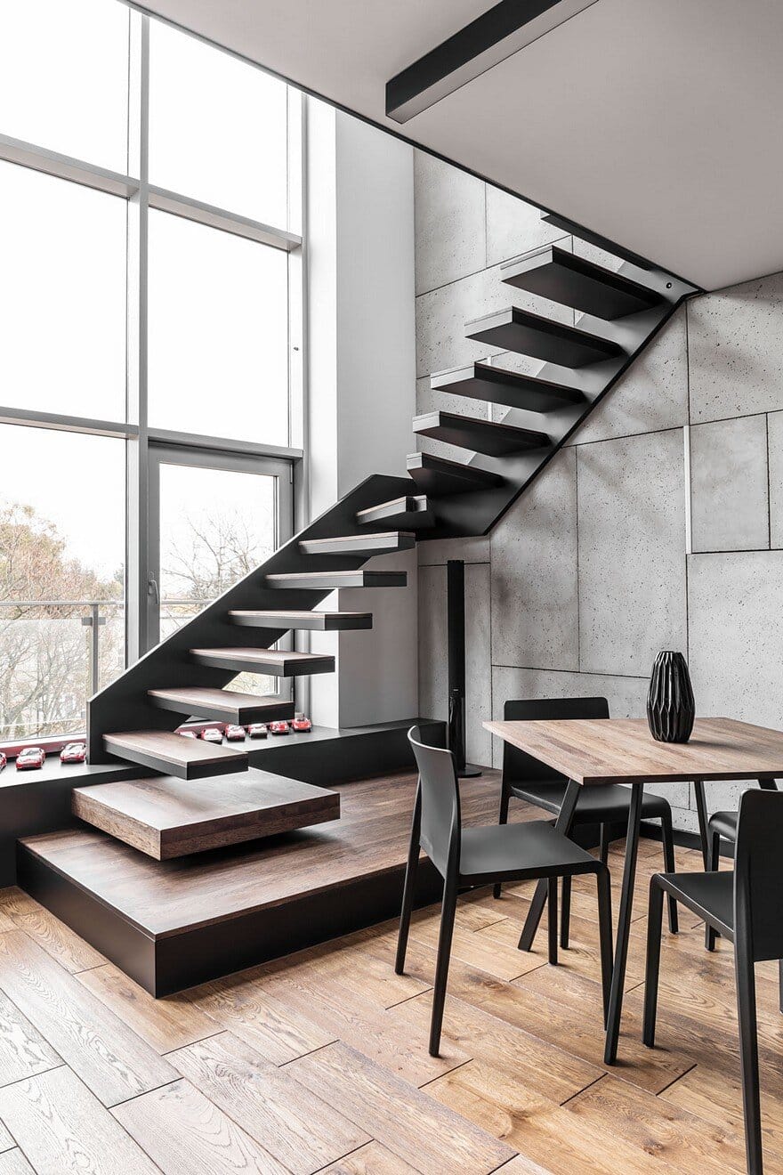
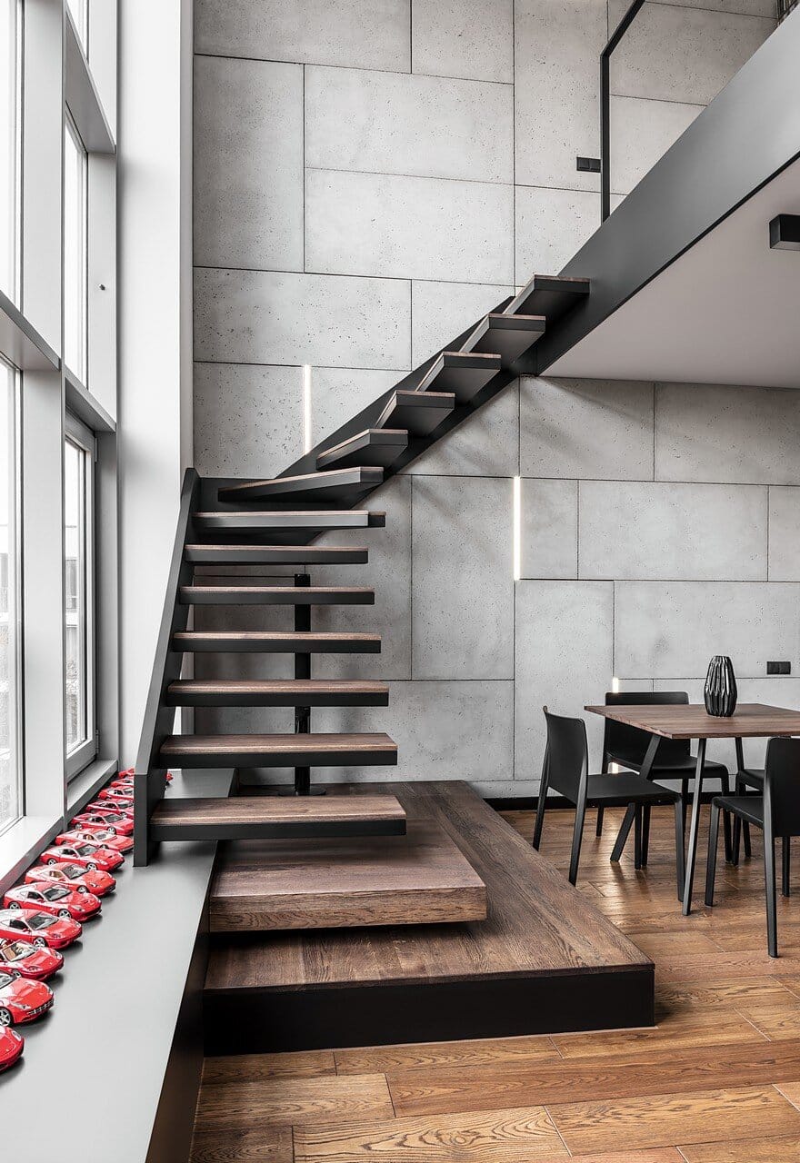
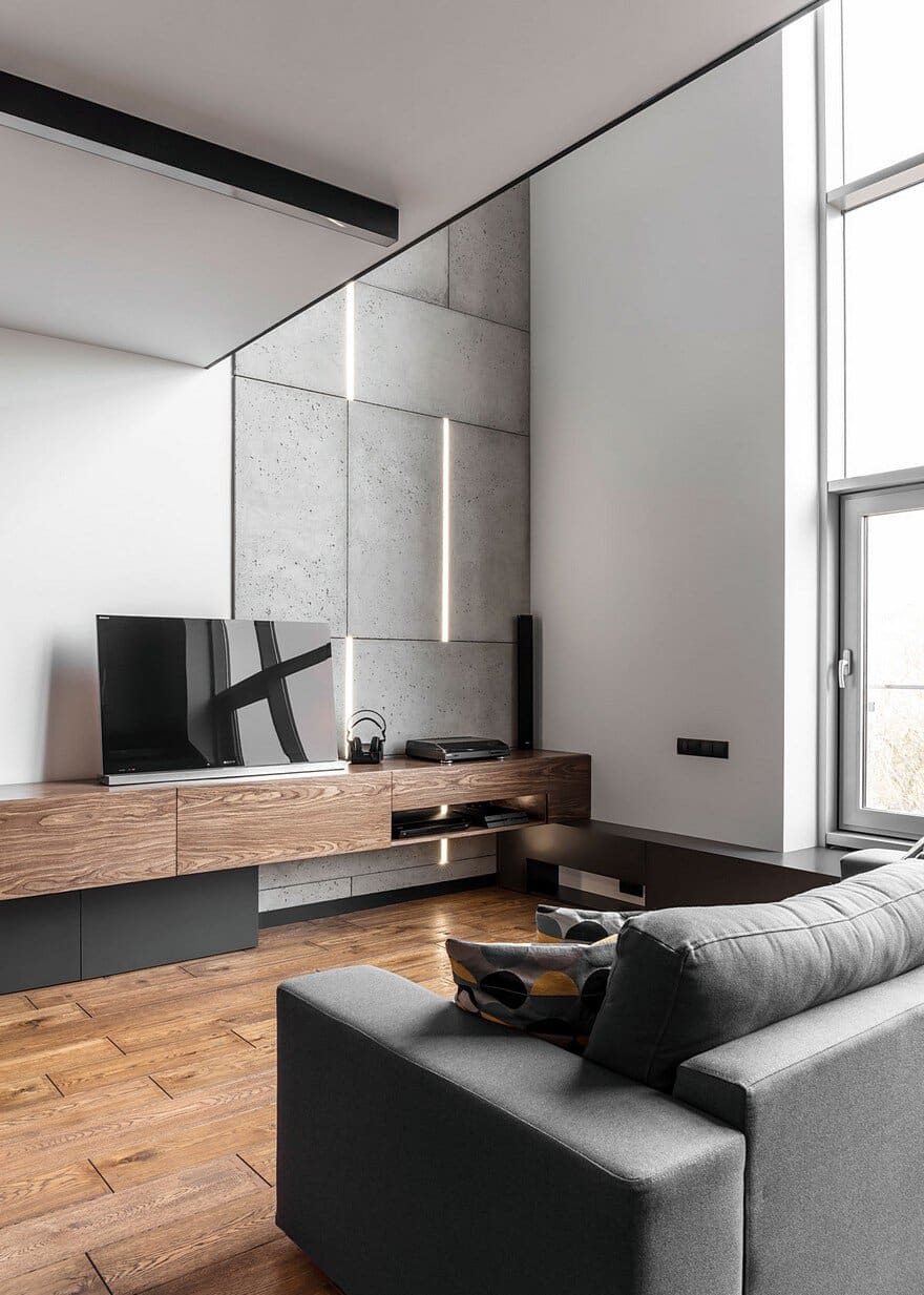
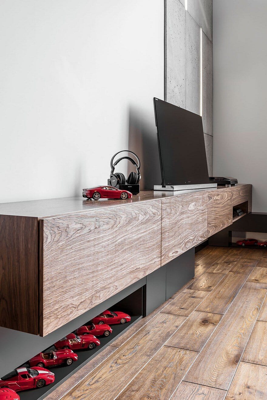
Another spatial change was the modification of originally provided by the developer curved stairs leading to the mezzanine. The architects have proposed winder stairs led partly along the glass façade, which helped to better arrange the space of the living room. The stairs stringer joins the heater casing and this is the backing for the TV cabinet. Furniture units in the Graphite apartment are designed so that the whole creates a coherent body.
The challenge for ZONA Architekci designers was to combine the spatial needs of both Investors. One of them is the collector of red Ferrari cars, the other one – music disks. The exposition of these collections has enriched the interior with interesting details. The project features a mezzanine-level work area. The great advantage of the latter one is the fact that it is placed next to a spacious roof terrace on the building. The width of the mezzanine did not allow for the comfortable placement of the classic desk. Therefore, the architects have proposed a desk in the form of a raised cubicle on a metal rack, extending beyond the mezzanine and increasing the work space.
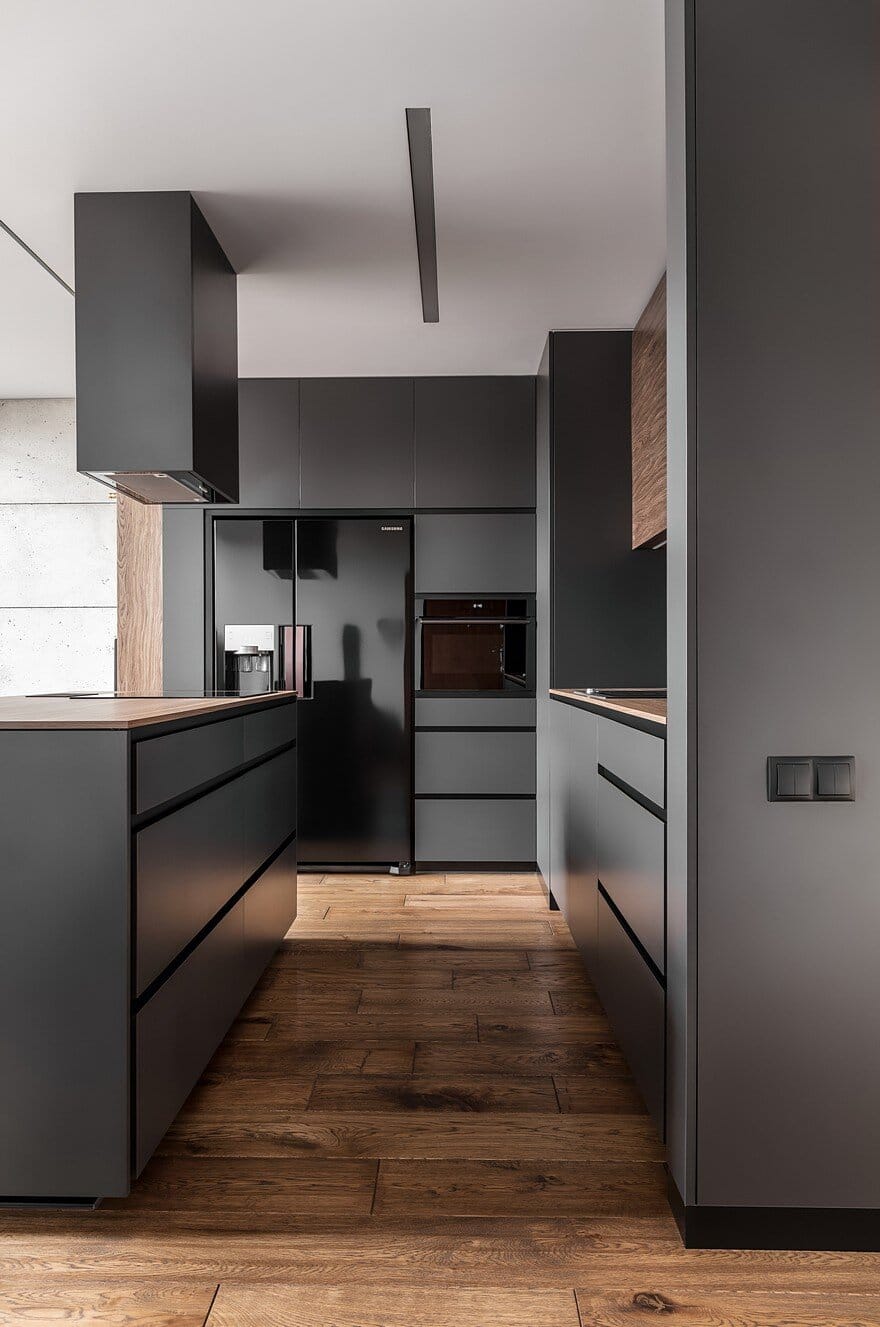
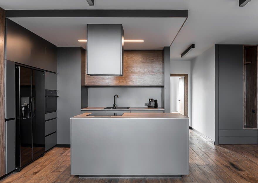
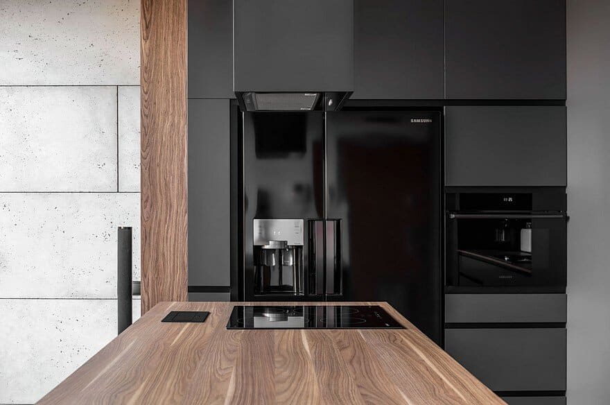
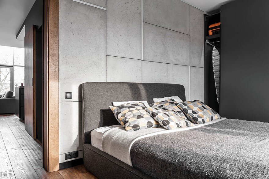
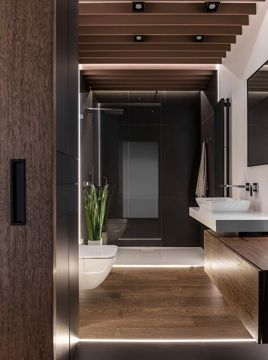
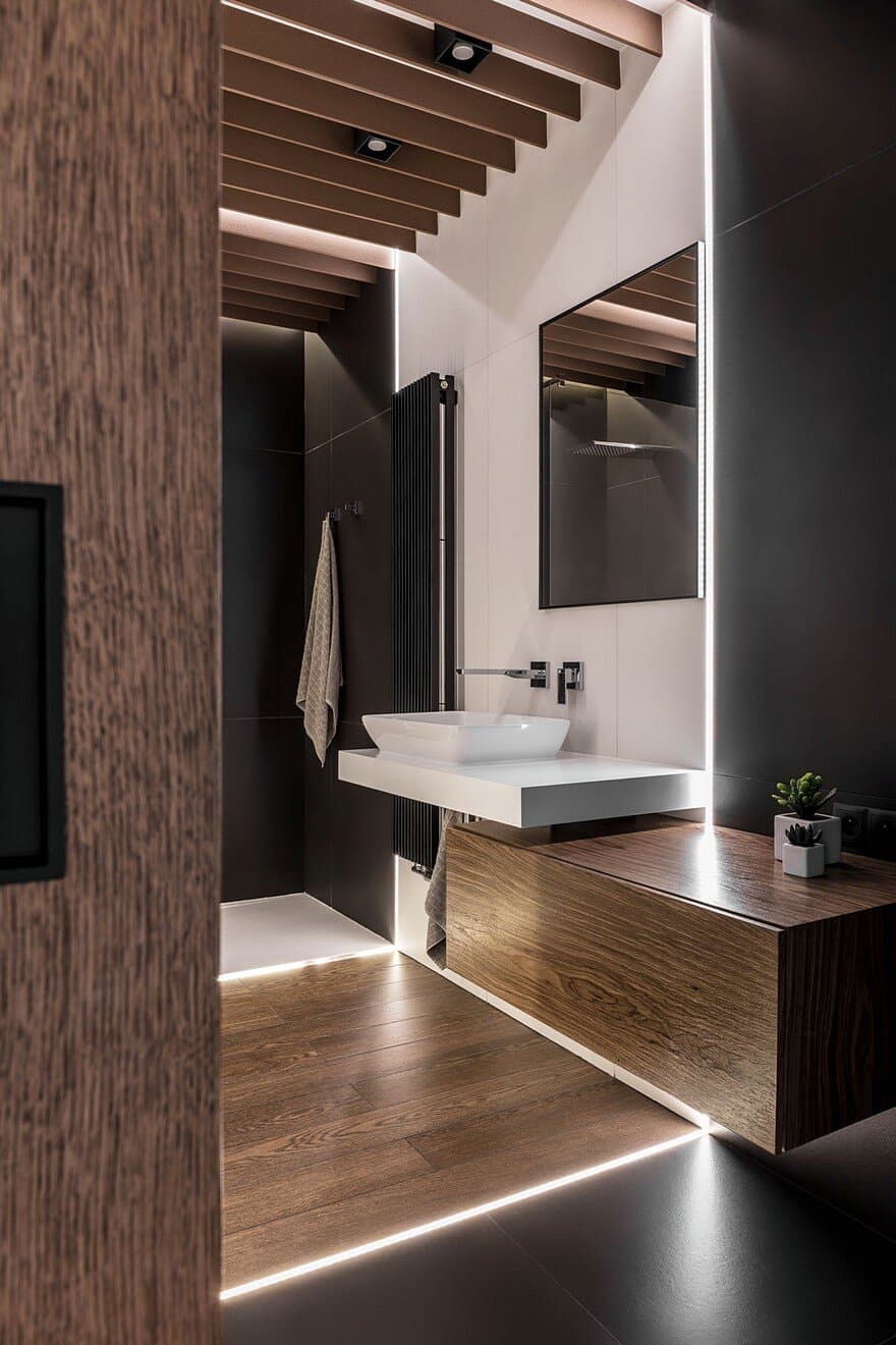
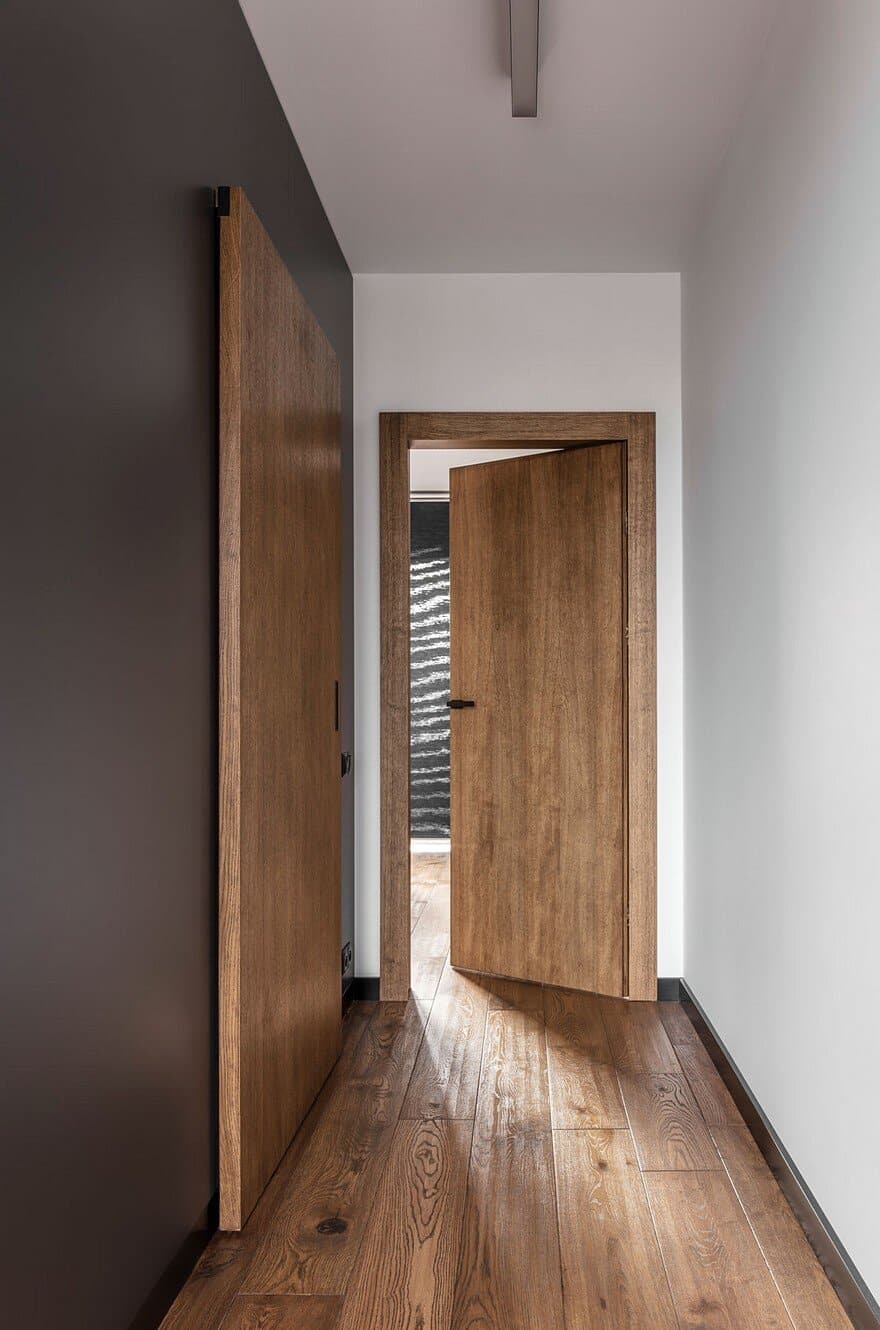
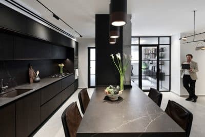
The solutions applied in the Graphite apartment meet the needs of its residents. The male point of view has imposed the economy of materials and colors. Industrial metal, concrete materials together with graphite construction, appearing in all rooms, have been warmed up with floral wood. The icing on the cake is a dark blue featuring on soft items.
Male means here: simple and expressive, but not cold and raw. Thanks to the exposed and personalized details, the interior is its residents` character showcase.

