Project: Juno Club House
Construction: Construcciones Ponte-Arosa
Architecture: BCArquitectura
Project Management: TRT Arquitectura Técnica
Interior Design and Decoration: The Room Studio
Location: Barcelona, Spain
Photography: Mauricio Fuertes
Courtesy of The Room Studio
Juno Club House is a female members’ club, for today’s women. Initially it was a new concept, non-existent in Spain until then, and with a very specific programme of needs.
It had to be ready in record time; the creative concept and its development were presented in two months. It required us to be very strict in defining the programme of use, in a totally empty space, with a specific volumetry, and which maintained the sensitivity and softness that the brand wanted to transmit.
The Nave and the Farinera are two spaces with different needs but balanced and with the same aesthetic language.
Project part I: The Nave
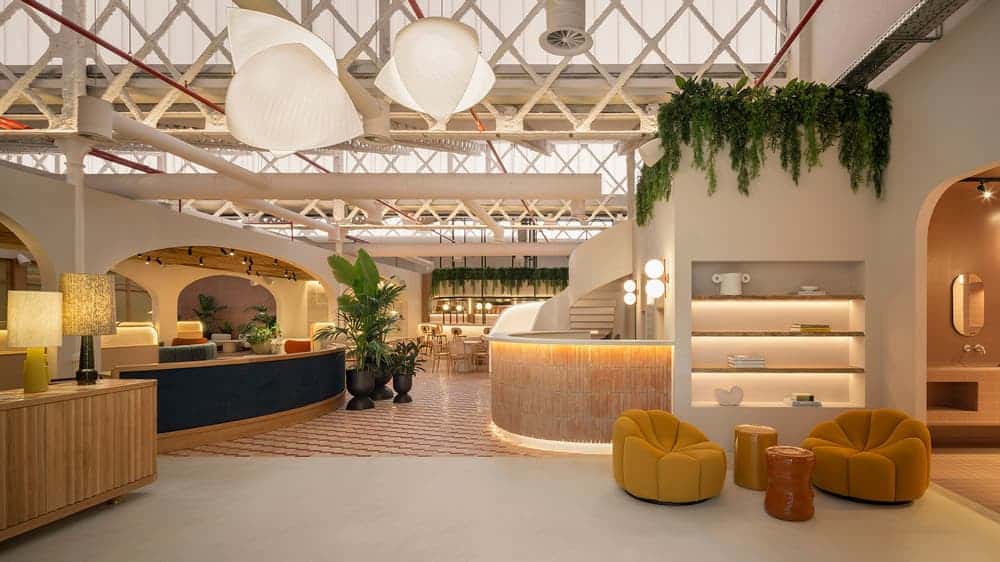
The Nave was a large empty space, totally bare, without segmentations, and with a very marked industrial style of an old workshop. We had to give it a more feminine, sweeter aesthetic, without forgetting the soul of what it had been. It was intended to be a social space and also a place to work.
It is divided into 3 differentiated areas through the change of flooring and segmentation of spaces with a strong central axis in terms of form and use. At the entrance there is the reception, the shop and the restaurant. In the central area, more for leisure, there is the stage, a sofa area and, at the end, the zoom boxes or recording rooms. The nave ends with conference rooms, a library and chill out areas.
They are spaces with very different activities, but at the same time, they all had to speak the same language. This common thread is defined, on one hand, by the chromatic palette -which is given by the brand’s corporate raspberry colour-, and on the other, the use of natural materials, as the philosophy of the studio, which recovers the most artisan trades.
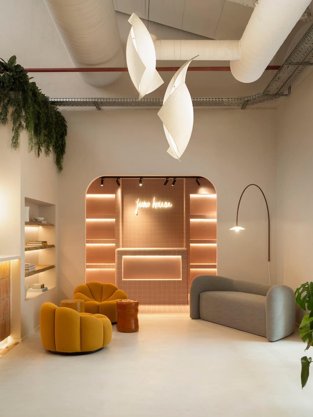
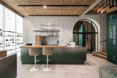
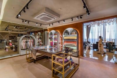
On entering the Nave, the reception area contains a waiting room and a shop, essential for the development of business between members and is also a display space for merchandising. It seeks to look like a box, and achieves this by using the chromatic palette studied for the project, with a homogeneous nude colour in the tiles on the walls and surfaces. Ornamental finishes are introduced with round, sinuous shapes, thinking of the sensuality of women.
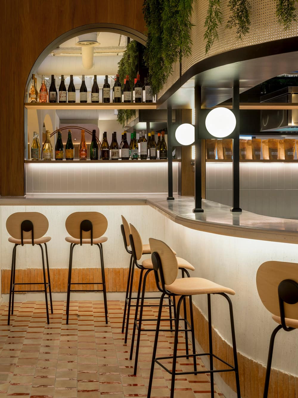
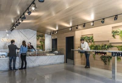
At the back, a restaurant with signature cuisine is designed with a wider bar for show cooking, with tables and furniture tailor-made.
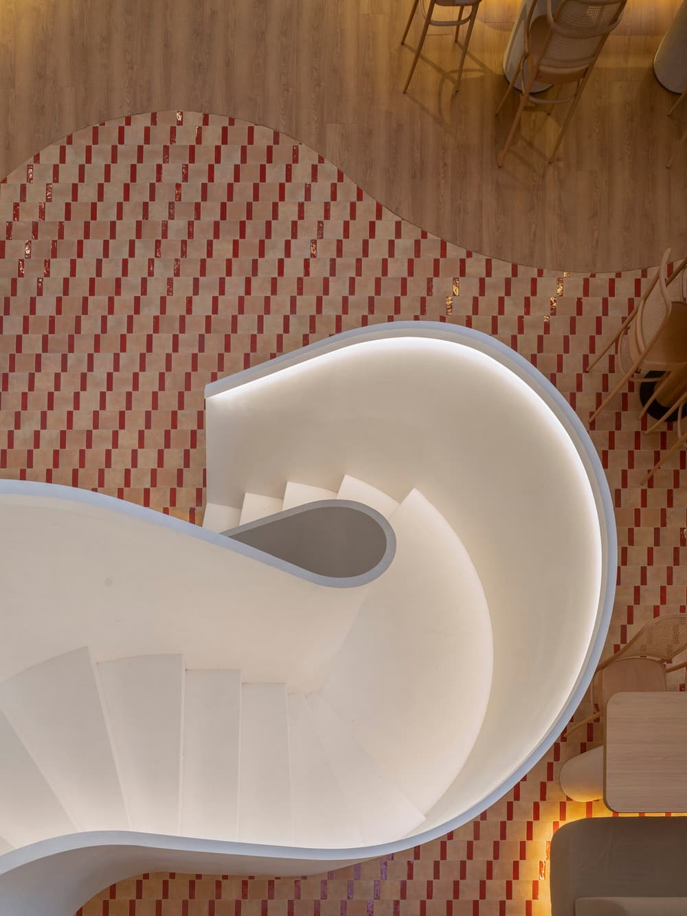
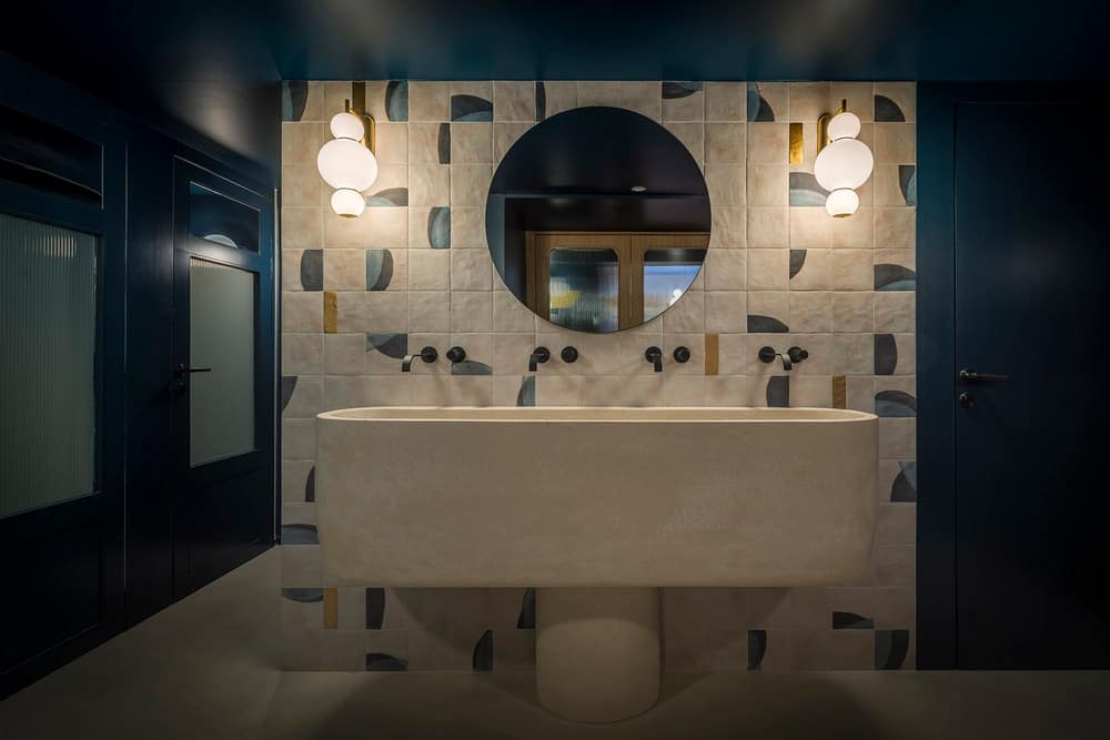
The two spaces are divided by a sculptural iron staircase, made from a single piece and clad in white. The bathrooms, located next door, introduce the colour navy blue with touches of gold, and are custommade for the space.
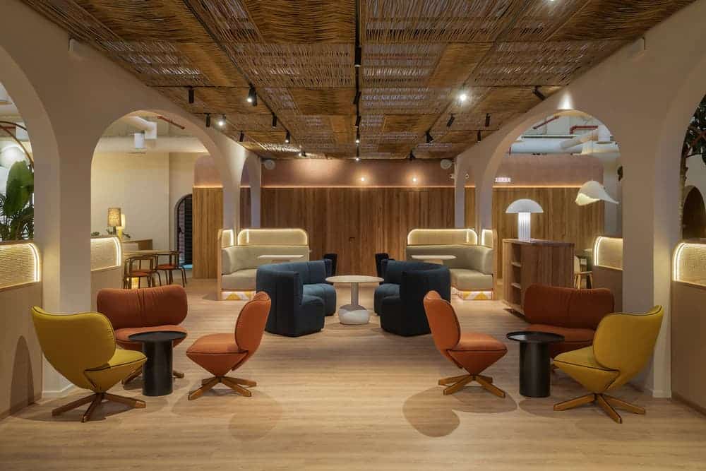
In the central part of Juno there is a seating area, with a multi-purpose central stage with furniture that can be relocated and used for different events, presentations, conferences or concerts. Behind the stage, a bespoke mural designed exclusively for Juno nods to the soft, rounded shapes of the space. On the opposite side there is an enclosure made of oak slats and a roof that is very particular both in its shape and in its cladding, using the clay mortar that will later cover some of the walls.
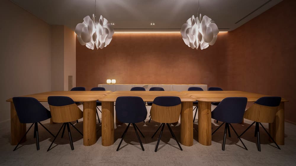
In the third division there is a chill out area with a variety of vegetation and clay mortar cladding, which enters the walls of the various conference rooms. This creates a visual relationship between the three rooms and acts as a counterpoint to the walls of the shop, balancing the space.
These rooms are separated by large doors in oak wood and glass with natural linen interiors, creating a play of shadows and a filter of light that avoids the opaque enclosure, but at the same time does not leave it bare and allows a glimpse of the rest of the space.
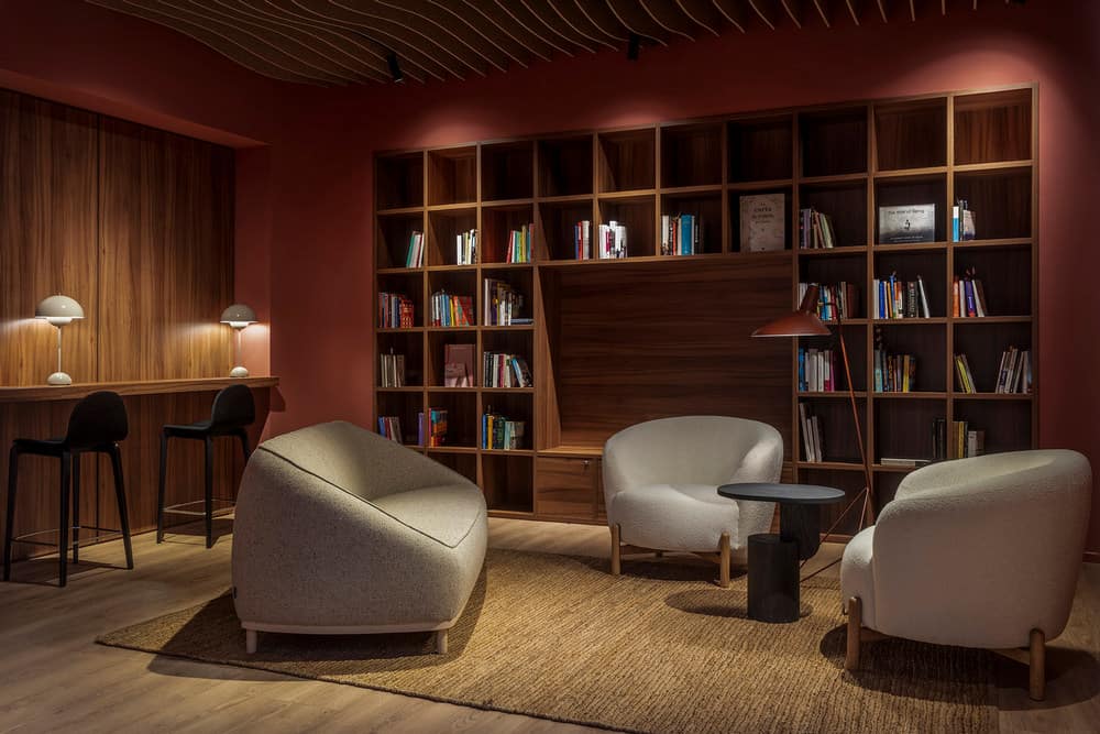
The last room is the Juno library, whose walls are the most intense colour of the palette, the same as the façade of the Farinera. The entrance through an arched doorway makes the transition to this space different, but without losing the vision of the project. The wave-shaped acoustic ceiling and its indirect lighting create a contrasting and refined visual perspective.
Project part II: The Farinera
In the Farinera, each floor has a specific use and its own line of design, but they are based on a common language and philosophy in the project.
Access is through a hallway with a mirrored ceiling to show the inverted walnut wooden arches.
The first thing we find is the Club House, intended for leisure. It is represented by a contrasting decoration with New York touches, made with a lot of custom-made furniture and a well thought-out lighting project to create different atmospheres throughout the night. The bar, at the end, is designed with walnut wood and a set of mirrors magnify the space. The carefully studied lighting makes this space a perfect setting for different events.
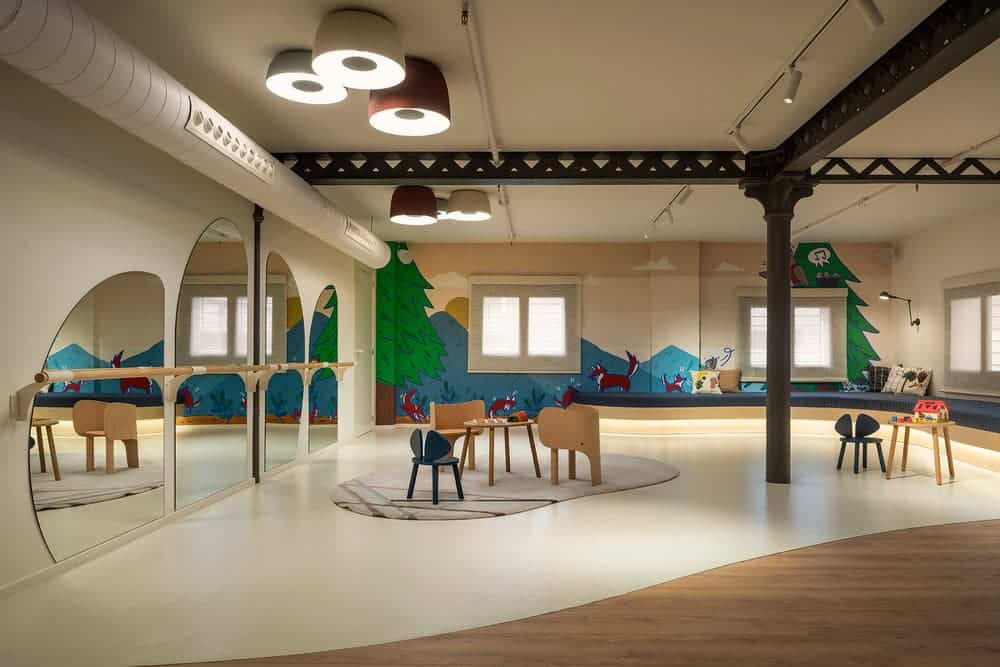
On the second floor is Little Juno, a space created for the little ones and not so little ones. There are two distinct areas with a large sofa and custom-made furniture, designed exclusively for the little ones. On the wall there are mirrors with sweet shapes and a ballet bar for different activities. There is also a space for breastfeeding and baby care. The bathroom is adapted to different heights, and all the decorative details are designed for children.
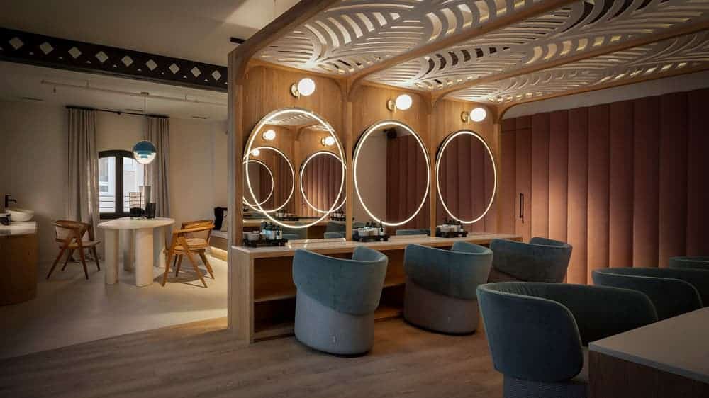
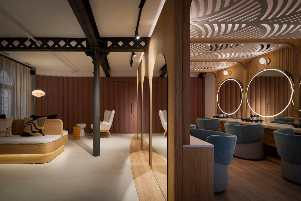
On the next floor there is the Beauty area, which is used for the care of the members. Made to measure with oak wood and nude coloured panelling. Decorative acoustic ceilings are thought to attenuate the noise of hairdryers and other utensils. The area is divided in two in terms of flooring and aesthetics for different uses. The panelled wall divides the dressing area and massage room.
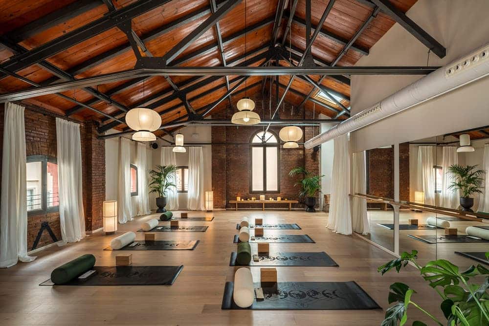
On the top floor is the Wellness, a multi-purpose space for activities such as yoga or meditation. The room is presided over by a large mirror, which can be covered with curtains that allow it to be adapted to each activity, and a relaxation area for moments of disconnection. The lighting is well thought out in the space to create different moments.
Juno Club House is a project that required a very marked distributive vision in order to respond to very different needs, while at the same time using axes that harmonise the whole. For this reason, it was also necessary to be totally immersed in the philosophy of the project and to believe in it.

