Project: LiveRamp’s San Francisco headquarters
Design: Studio O+A
Team: Joseph Rodriguez, Kaylen Parker, Paulina McFarland, Emily Cano
Location: City San Francisco, California
Year 2019
Size: 21,000 Sq Ft
Photography: Garrett Rowland
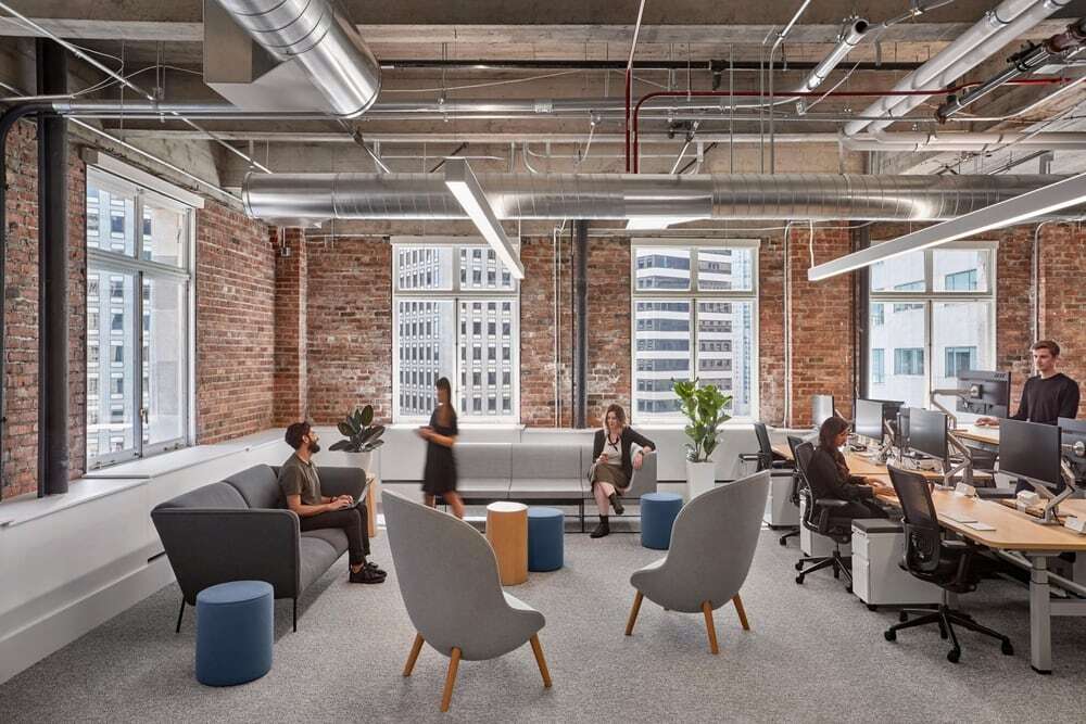
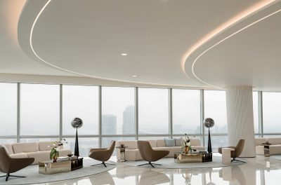
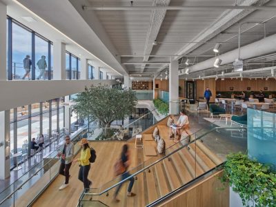
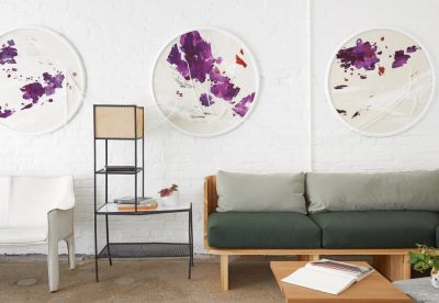
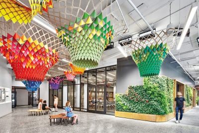
After designing two floors for LiveRamp’s San Francisco headquarters in the iconic Standard Oil Building, Studio O+A came back at LiveRamp’s invitation to design a third. While the two previous floors were conceived to mirror each other in the way they juxtaposed highly finished contemporary design with the rawness of the building’s original infrastructure, the third reached for a larger continuity, bringing all three floors together in a single narrative of unity, clarity and vitality. The result is a new space that, with a few adjustments to the earlier floors, gives LiveRamp a home for its rapid growth and a work environment its employees and customers can navigate with ease—and pride.
Same High Ceilings, Same Good Bones
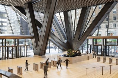
LiveRamp’s San Francisco headquarters has always enjoyed the advantages of its existing conditions. The tallest tower in San Francisco when it was built in 1922, the Standard Oil Building continues to stand tall in design terms not least for its ability to frame modern spaces. Interior brick and big windows give to LiveRamp’s 21st century workplace a classic subtext of endurance and vitality—and a subtle link to its predecessor tenants. If information is the wealth generator of our age, it’s appropriate that a data company now occupies a place once claimed by the wealth generator of another: Big Oil.
A Palette Drawn from Diversity
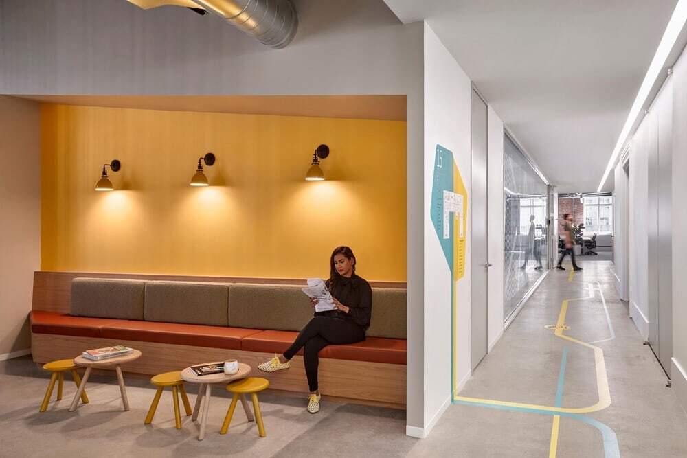
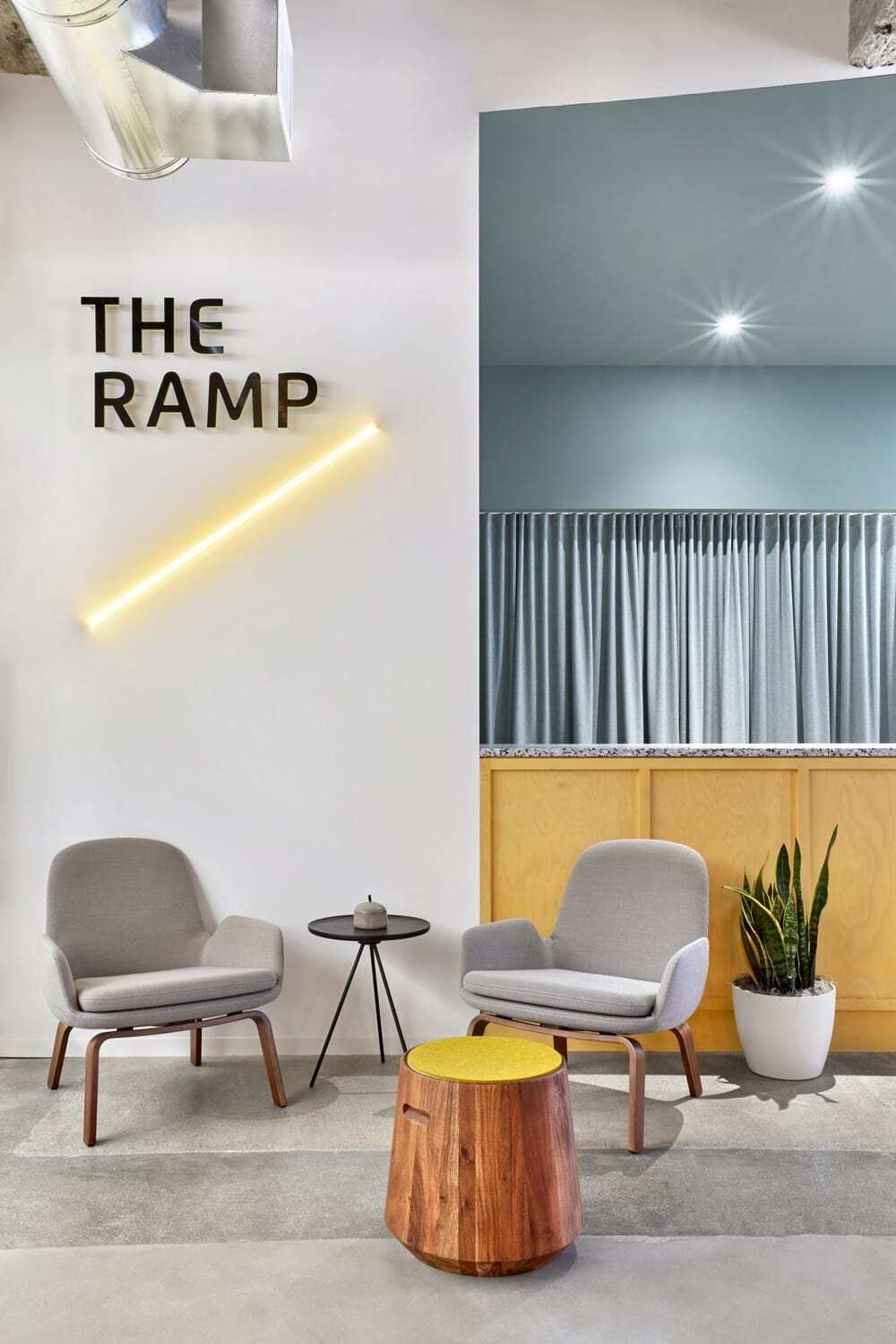
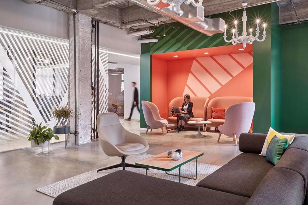
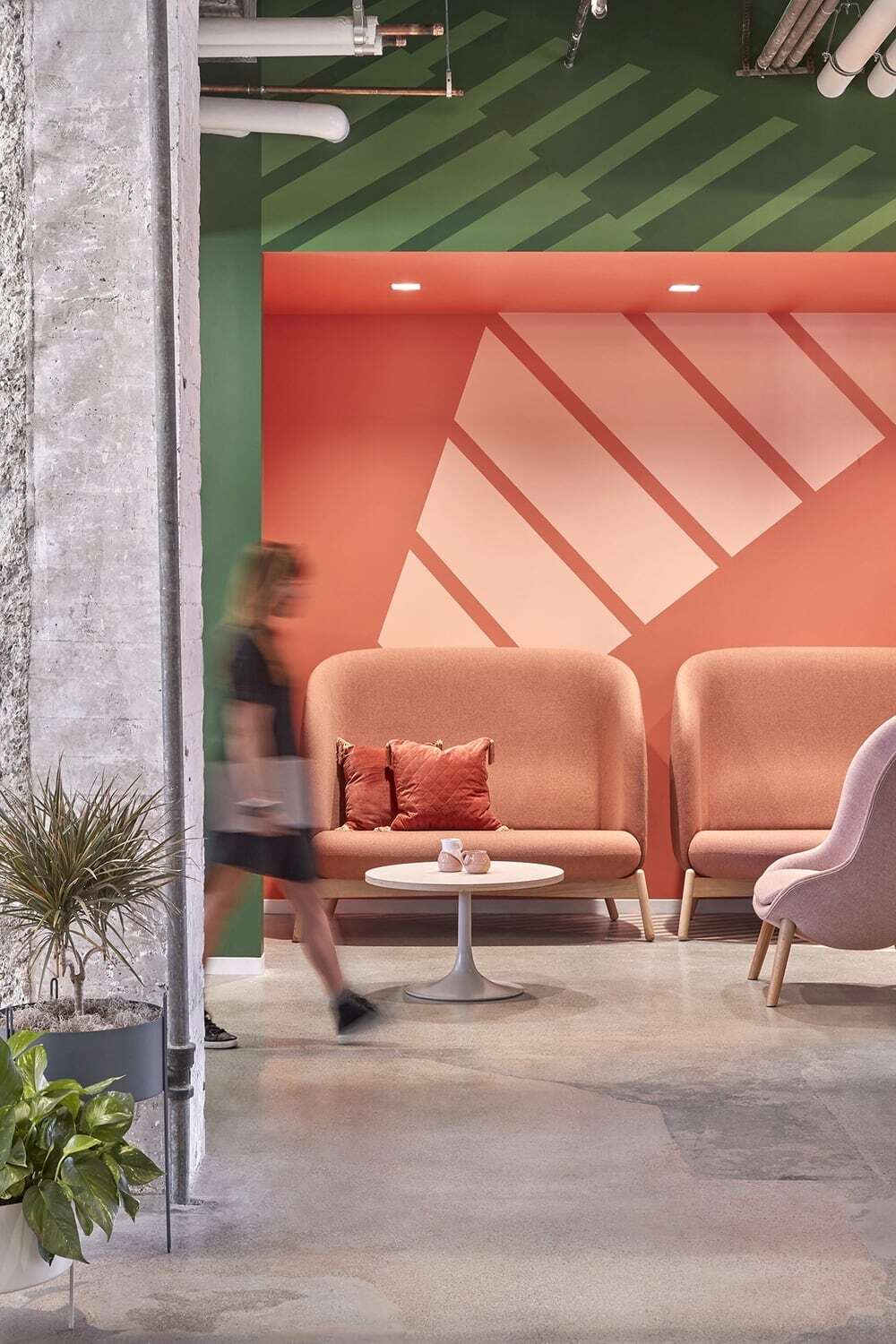
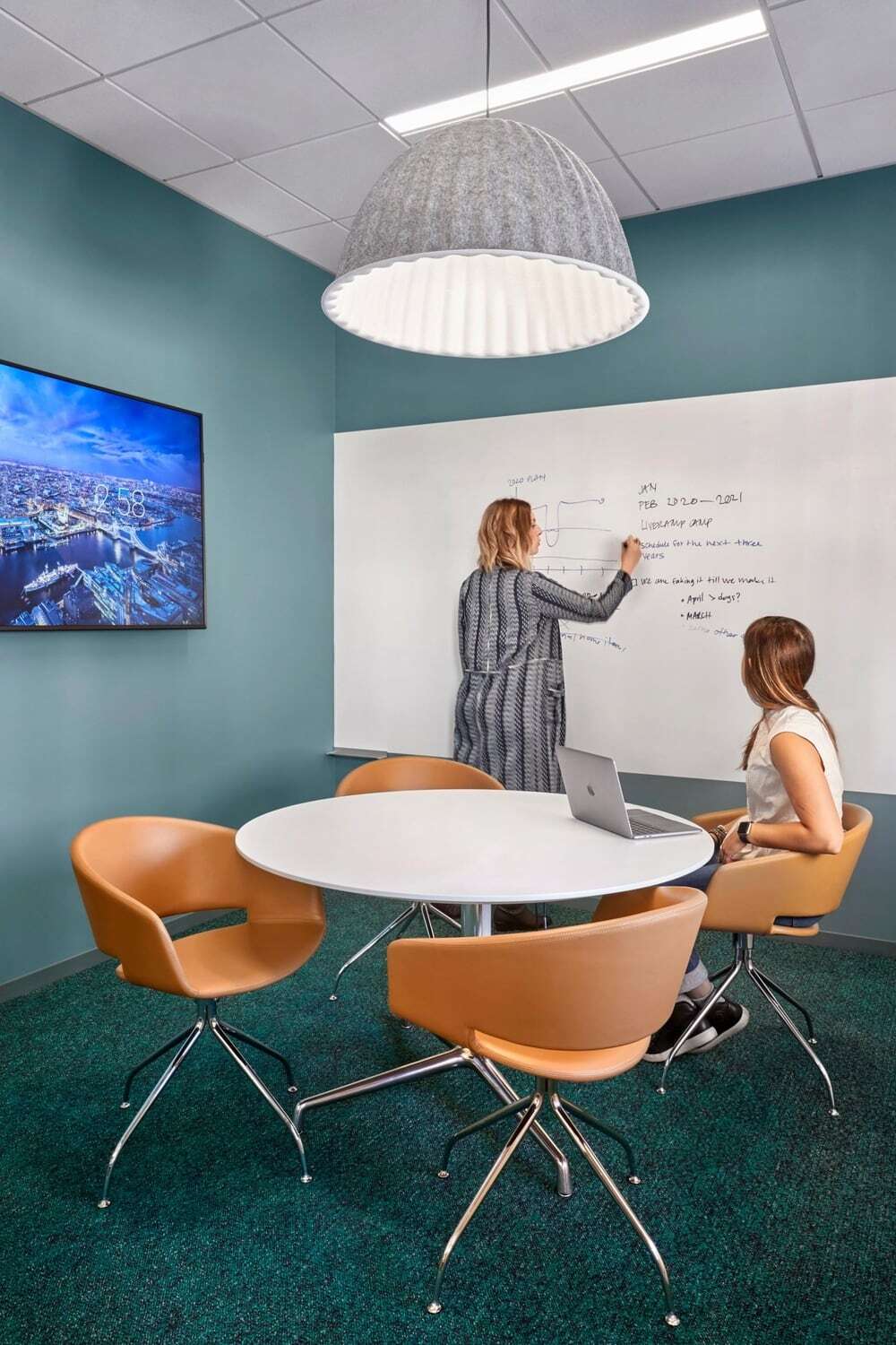
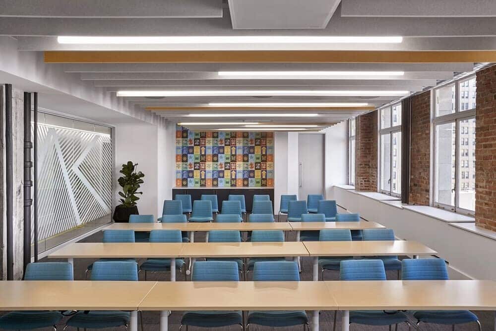
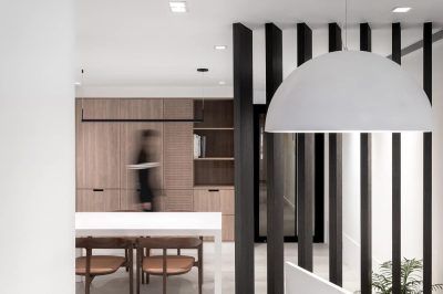
Working with LiveRamp’s team, O+A designers employed color as a practical orientation aid and more keenly as an expression of the company’s youthful spirit. Because one of the design team’s client partners hails from South Africa, robust color and bold graphics were definitely on the table. “We don’t usually have clients tell us, I don’t want it to be boring,” says O+A Design Director Joseph Rodriguez. LiveRamp took a specific interest in the refinements of O+A’s color choices: not a neon yellow; but something with an earthy tone to it. Not just any green, but a green with meaning particular to LiveRamp.
All Together Now
When you design for a successful client’s growth over a series of floors and a period of years what you learn about the design aligns with what the client learns about his business. O+A’s initial work for LiveRamp embraced the raw energy of the company’s beginnings and the “Swiss Army Knife” utility of its workplace philosophy. The new design provides a more fully integrated environment for a maturing, but still growing company. Better circulation, better space alignment, a more versatile range of work options—the three floors now convey the energy and optimism of a confident LiveRamp on its way to new discoveries.

