Project: Flat to Rent
Designer: Egue y Seta, Daniel Pérez + Felipe Araujo in collaboration with Pérez family, Luisa, Sandra and Mario
Styling: Gaila González
Construction company: GRUPO L&L 2009
Location: A Coruña, Galicia, Spain
Completed date: 2015
Area: 55m2
Photographer: Vicugo Foto
A Coruña Flat For Rent is a recently completed project by Spanish studio Egue y Seta. The apartment with an area of 55 square meters is located in A Coruña, Galicia, and was renovated in order to be rented.
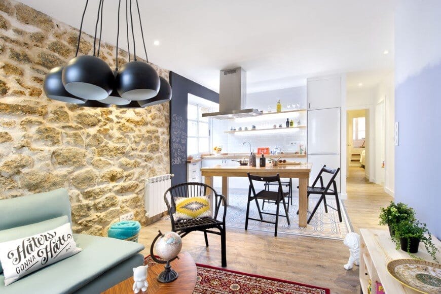
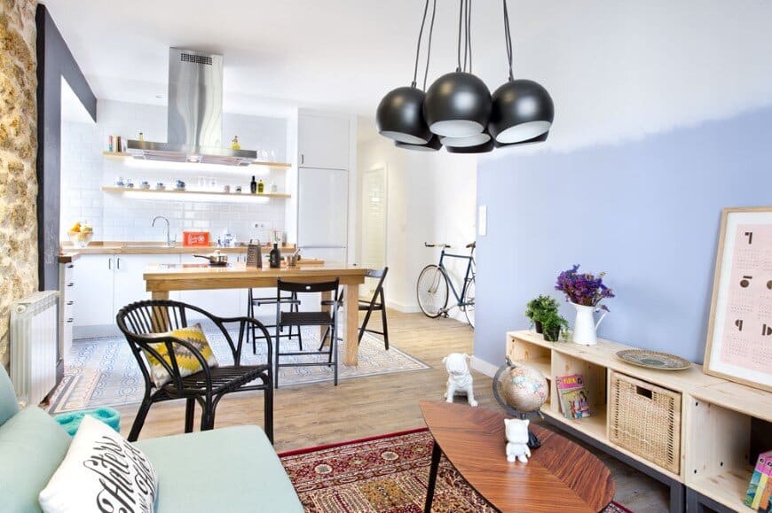
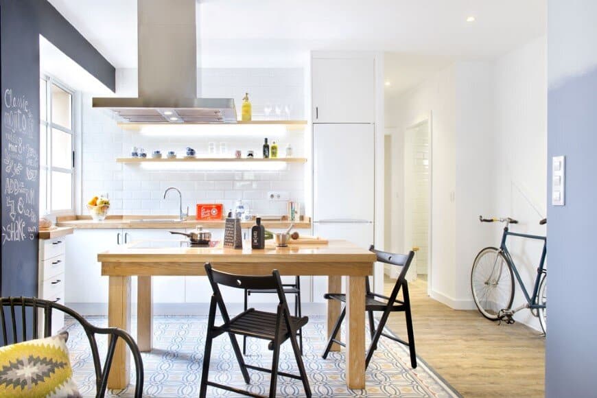
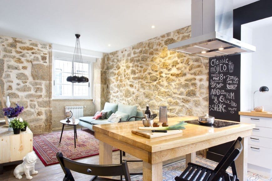
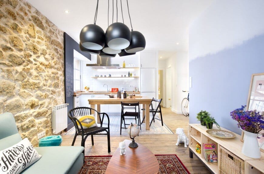
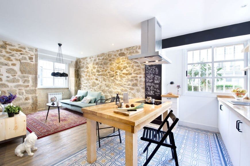
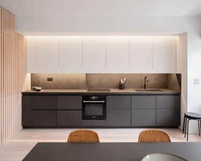
Flat to Rent – From the designer: We enter the house through a social area that integrates living room and kitchen in a few square meters. In order to revert the feeling of overly restricted space unnecessary partitions have been demolished opting for a delimitation strategy that has more to do with flooring and furniture than walls. Thus the kitchen is placed over a hydraulic mosaic imitation porcelain tile, which aims to evoke the long architectural heritage of the house, while offering a durable and low maintenance floor but also introducing a colour palette that was used later on other gradient painted vertical surfaces present in the bedrooms and lounge.
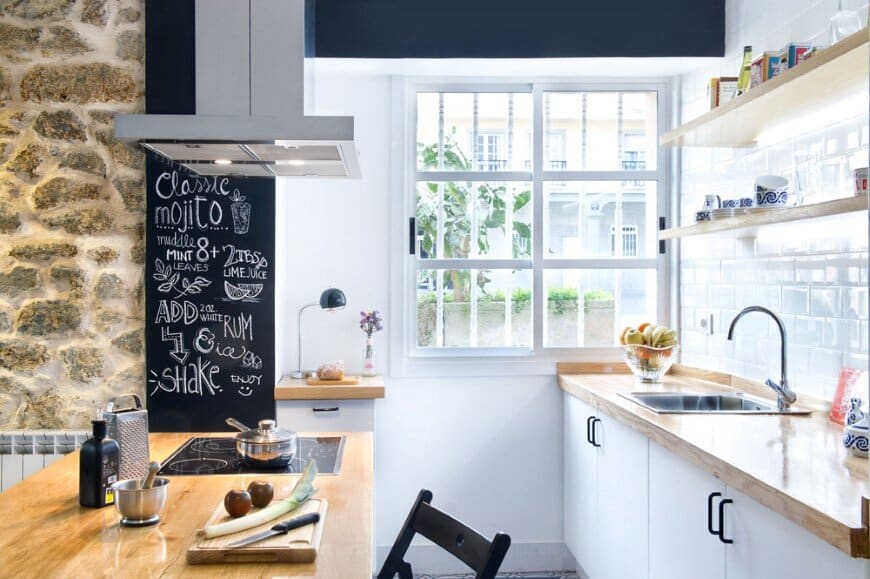
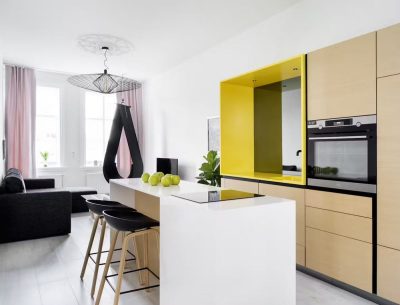
A solid wood table, which is both kitchen isle and dining area, integrates a vitro-ceramic hob and seats around itself four diners: this dining room is proposed as a boundary or interface between the two areas (kitchen and living room), facing a blackboard paint coated wall that becomes the informal agenda and graphical guest´s book of a very expressive home.
Under the extraction hood, which is also a decorative pendant lamp, you can taste dishes cooked a few centimetres away, while going to the fridge for a beer is a matter of stretching out an arm. It wouldn´t be wrong to say this kitchen, the place where all pleasant meetings and conversations end or begin, has been entirely designed to accommodate routine and pleasure at convenience, from the more practical and less ceremonial point of view.
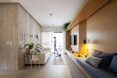
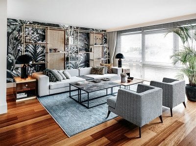
On the opposite side of the dining room we find a living lounge arranged over an aged oak effect vinyl floor that dialogues in perfect harmony with the original stone wall on its right and a greyish blue gradient wall on the left that brings on the other hand, modernity and stylistic vanguard to the whole. Over such flooring a Persian-style area rug attempts to delineate an area of comfort where arm chairs, sofas, tables and audio-visual console are arranged so to allow entertainment for two, solitary reading, or meeting with friends and music on the background. Decorative eclecticism is key here, incorporating varied textures and patterns, giving hints of textile colour that find all the necessary buffer in the more neutral wood, stone or the trendiest wicker splashing the surroundings.
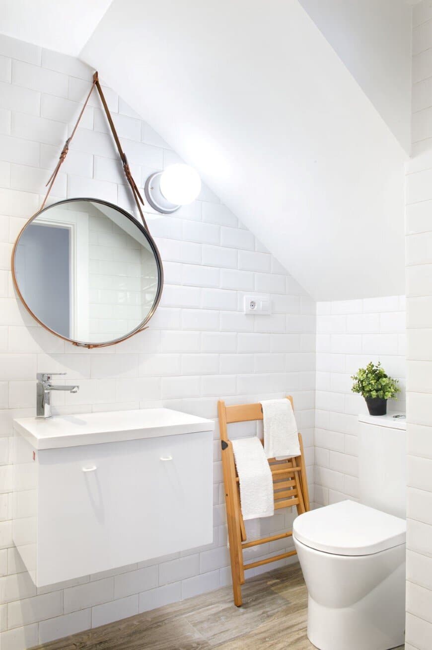
Turning to the private area of the house, we find in the first place a unique bathroom that serves both bedrooms and the social area. Its location on the floorplan corresponds to that of the bottom of the staircase, which implies maximum use of the available square centimeters, but also a potential feeling of confinement imposed by the low ceiling.
Therefore, and with the intention of promoting instead a feeling of spaciousness, designers opted for finishing the space with an expansive, super white, suitable for wet room’s tile which linear grouting would promote, through perspective, a perception greater depth. Along with suspended sanitary furniture, a hanging mirror and a transparent glass shower screen tries to make the whole an arrangement of great lightness, cleanliness and neutrality.
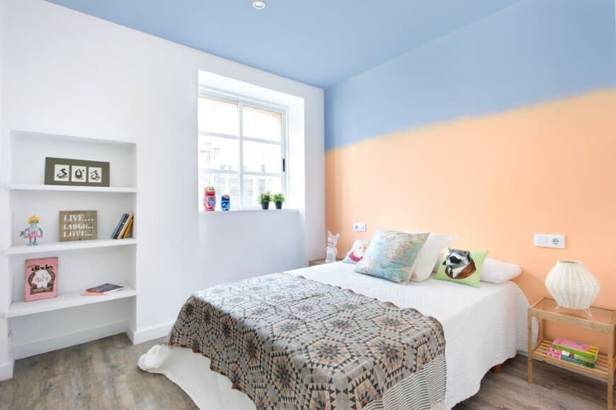
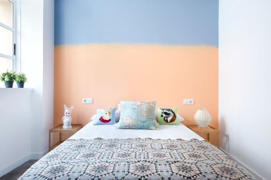
Immediately adjacent to the bathroom we´ll the master bedroom, whose dimensions allow for the placement of a double bed under a colourful headboard wall with a gradient going from a dim orange (Pantone 2015 Earth Gold) to a bluish grey that connect the floor with ceilings. Facing the bed a great matt white laminate wardrobe camouflages itself with the surrounding walls with, while hiding inside the much bolder, colourful and trendier clothes that these young tenants surely have. Flanking one side of the bed, additional open storage space for the exhibition of decorative objects that provide warmth and individual personality to the space, along with a generous window with reclaimed wood joinery painted in white differentiates itself from those made of aluminium that have become the standard while letting in an enormous deal of the vital and always welcomed natural light.
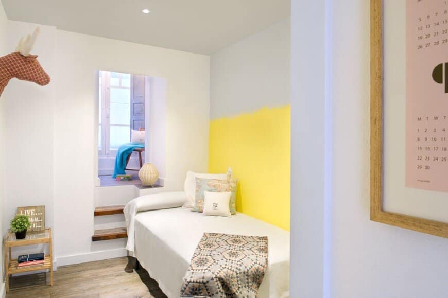
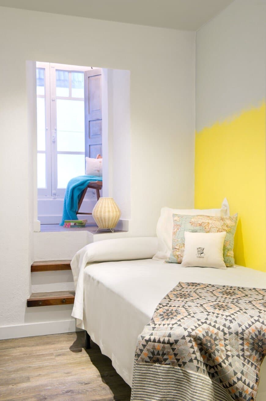
In this single room the colour scheme is repeated, this time starting from a deep yellow and affecting in this case side wall located in the right hand side of the bed. In the opposite side and functioning also as nightstand, we´ll find a couple of steps that lead to a small dressing room and study area with a veranda that standing on a slightly higher level unfolds as the surprise feature of this small room of maximum use.

