Project: Material Lab Office
Interior Design: Jmarvel Interior Design
Designer: Jeff Yu (Chieh Teng Yu)
Type: office + art space
Location: Taipei, Taiwan
Area: 119m2
Layout: office area, director office, meeting area, kitchen area, master bathroom, bathroom, discussion area and exhibition booth, storage, garden, balcony
Material: dyed veneer, copper strips, iron, paint, porcelain, glass, floor timber, casting copper
Completed: 2019
Photographer: Hey!Cheese
Text and photos: Courtesy of Jmarvel Interior Design
An outstanding design is the manifestation of the multi-level relationships between people’s lives and their surrounding environments. –Japanese industrial designer Naoto Fukasawa
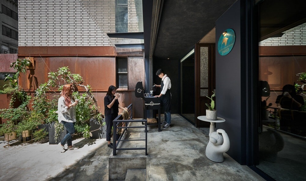
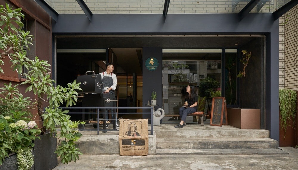
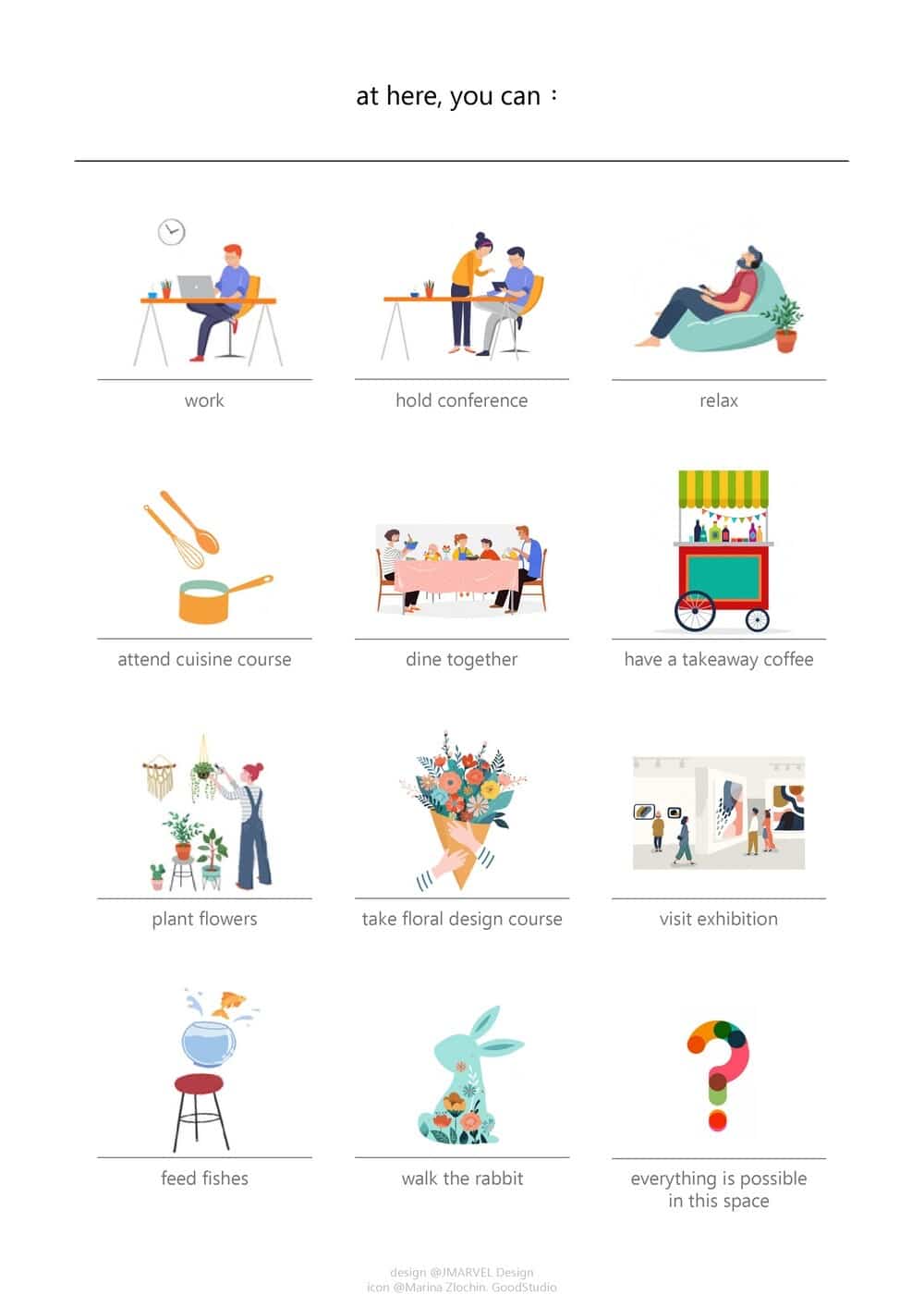
We apply this multi-level relationship to the office space, and extend the practical aspect of the design with the concept of “Material Lab”. This space is beyond the use as an office, and the possibilities extend as a complex place. You can regard this space as a design resource studio and materials library. To link the emotions of the community, we continue to hold a number of experimental courses on life and aesthetics, such as floral workshops, cooking classrooms, clothing design exhibitions and sales, coffee diners, etc.
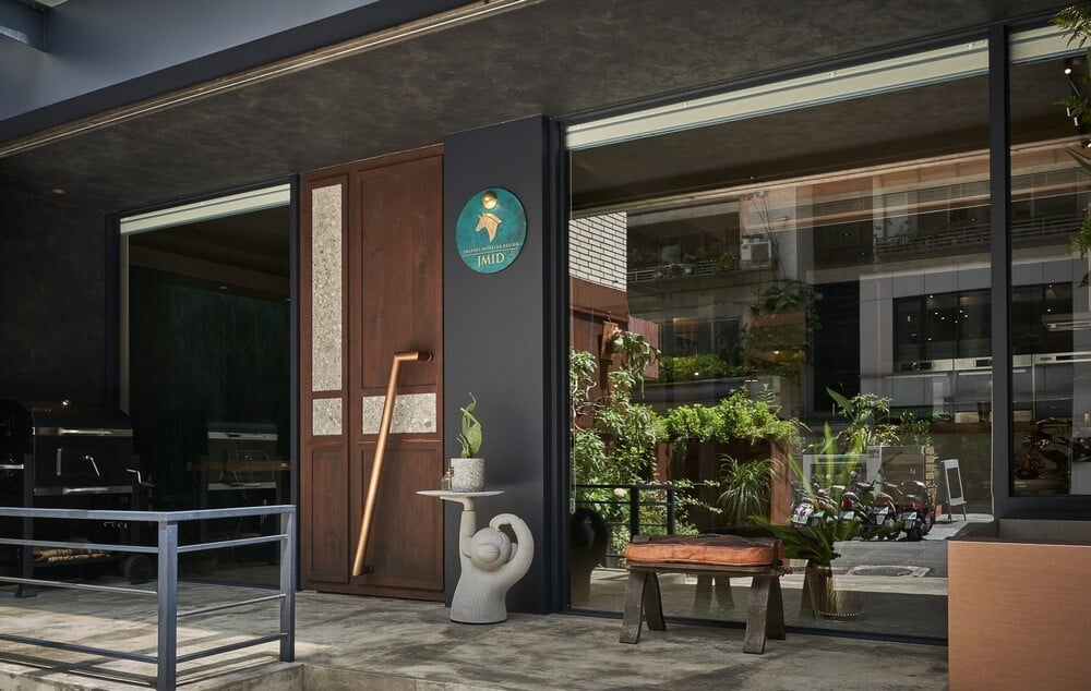
Through an open space, piling up the style of life culture with beautiful things, it may become a place for the spread of daily beauty. This “Material Lab” not only belongs to company members, but also belongs to every participant of all kinds of activities. Therefore, when we started naming this project, we did not deliberately add a corporate office sign to this space, but adopted a neutral name, which reflects the local emotions and defines this place belonging to “everyone”.
The Sense of Life is the Flowing Trace of Time
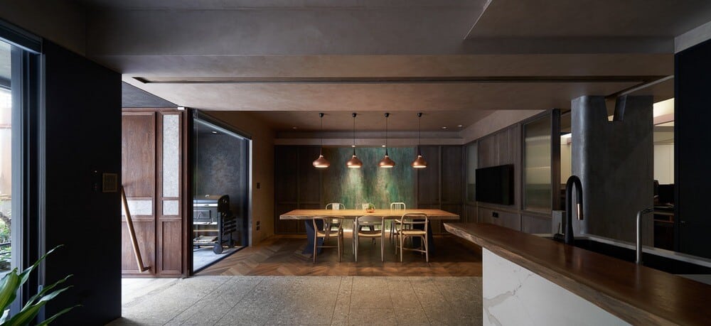
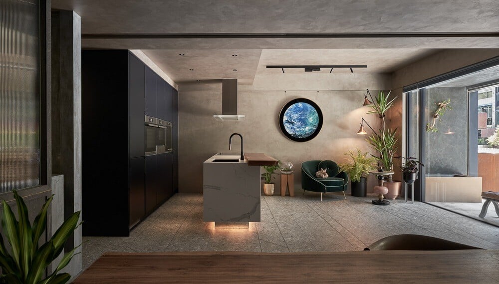
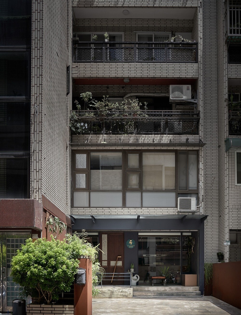
In the first half of the site, the plane is divided into two parts by the entrance, and two moving lines are divided to provide different space requirements. The designer has changed the entrance of the old house, moved the gate to the center, and separated the meeting space and the open space invisibly with two types of ground materials: terrazzo floor tiles and wooden floors. They replace the traditional configuration of physical screens. Sunlight shines indoors and sprinkles the trail on the walls, lighting up the interesting texture of the space, and laying out the imprints of time. The keynote of the sense of life spreads in places which are deliberately created like the family dining room. Imagine that we can not only carry out all the daily activities of official business, but also we are all invited to participate in it… We believe that the background color of design is time. Therefore, an interesting artistic experiment was carried out in the front yard. The designer made two iron plate partitions. In the days with no deadline, with the change of temperature, humidity and the base, it deteriorates slowly. Finally, it was embroidered into a natural organism. The remained “trace of time” has become the leading language of the interior space. The word “time” is clearly confirmed on the back wall of the conference room. The designer used special lacquer paint and washed it layer by layer with chemicals. Over time, it is superimposed and scraped to create an unpredictable texture that is naturally developed. The overall space uses a neutral background color, covered with hand-feeling creases flowing on the ceiling and walls, like a silent time and space, allowing the traces to show the most touching things in life.
The Demonstration Process of a Material Experiment
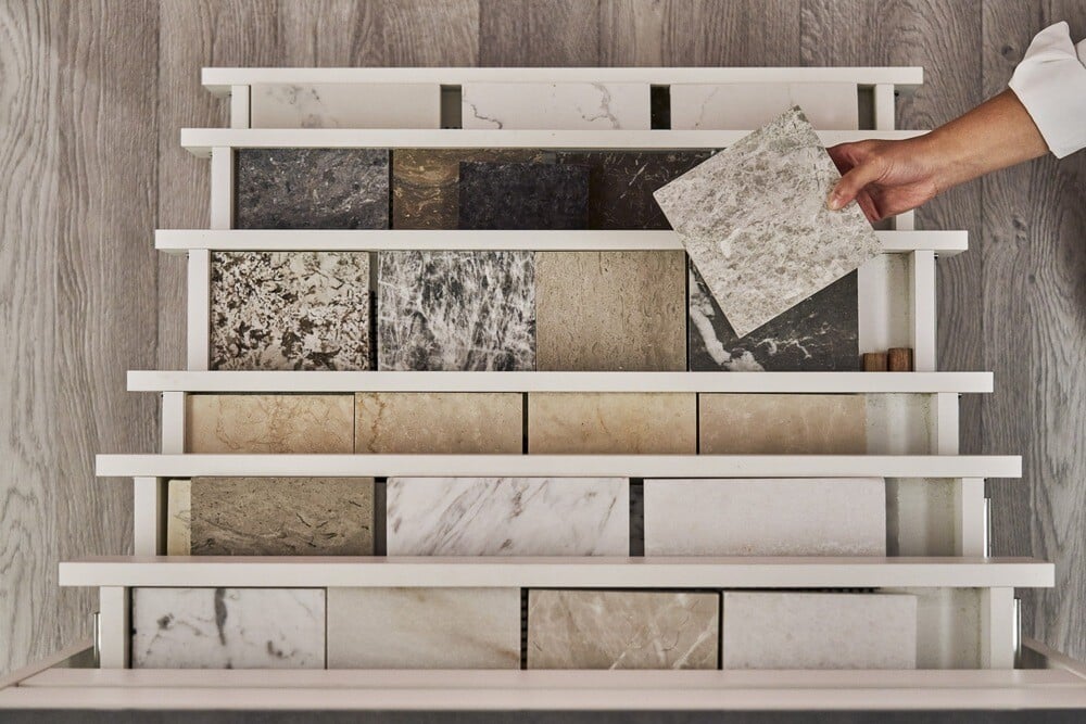
Practical aspect is the design tenet of this project. We chose a variety of different materials and lay them out in the interior in an intuitive and revealing way. Its purpose is to hope that when the customers participate in the meeting, it is like visiting the material exhibition room. Through discussing the configuration or material with the designer, they can touch and evaluate the actual effect and application of the material, not just limited to the vague imagination.
In order to fit the space with the concept of the “Material Lab”, we have summarized and sorted out the demonstration of four major functional aspects as the basis of the space design of this project:
(1) Different tastes brought about by “different construction methods”. For example, the various coatings of the porch wall, the indoor ceiling wall and the meeting space wallboard have adopted different techniques to present different visual impression.
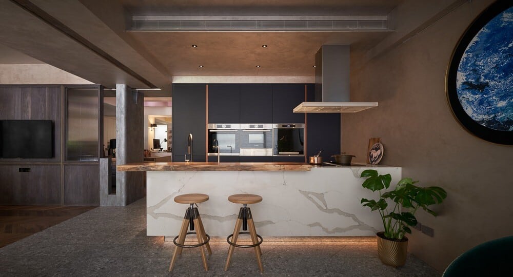
(2) The diversification of “different types” of a single item. For example, in terms of lamps alone, there are different lamp types in the space: a variety of products such as exposed lamps or embedded lamps, imported lamps or domestically produced lamps are in contrast.
(3) The same item exhibits “different functions”. For example, the door of the storage cabinet is thoughtfully installed so that both sides can be pushed and pulled. The difference in the use of sliding doors allows customers to evaluate which type can meet their own needs or habits.
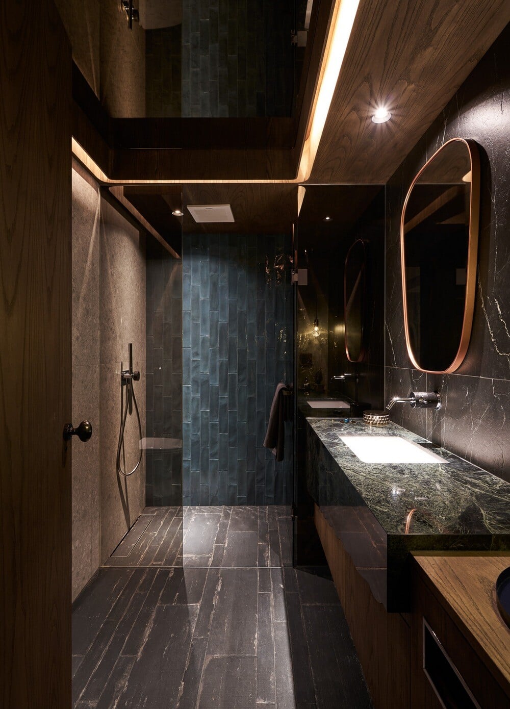
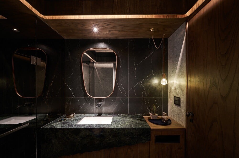
(4) The presentation of the “material conversion” of composite materials. For example, a small bathroom space uses different materials to create a place that is both practical and aesthetic. Or, the copper strips embedded in the indoor terrazzo floor tiles add visual segmentation rhythm, continue the gold and copper elements in the space, and shape the aesthetics of the overall space. Or, the combination of different materials of terrazzo and wooden doors conceives an extension from indoor floor tiles, and emphasize the environmental protection concept of materials by recycling waste materials. From entering the gate, it is a process of material experiment.
From the perspective of the plane configuration, the moving lines of the space follows the central axis of the gate to expand toward left and right, and finally extends to the private office area at the back.
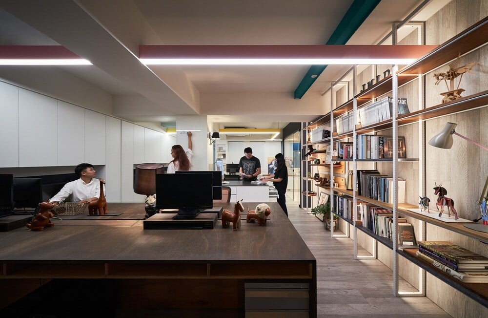
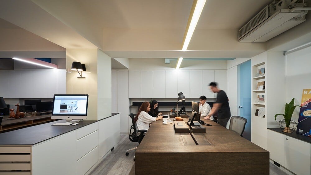
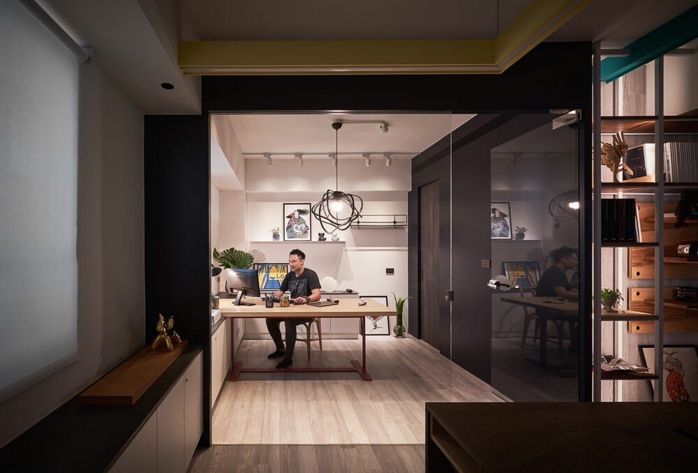
The division of public and private areas does not have the closed partition wall, but it is straightforward. Differing from a lot of special lacquer used in the front area to create a sense of ritual of life, the office space in the back area is bright and simple in warm colors. It does not use the suspended ceiling, thus maintaining the indoor height. Therefore, even if you work here for a long time, you will not feel pressured.
Strip lights of various colors become colorful and lively visual elements in the back area. Lines of various colors travel in a straight line or turn around the ceiling, just like the daily jumping thoughts of designers, with unexpected creativity and inspiration.
However, we hope that in our space, in addition to simple exhibition and practicality, it can better reflect the appearance of local life and combine life + live + lab, so as to provide a complex place that can connect neighbours, communicate the emotions of the community, enhance the aesthetics of life, and can be used as a practical office at the same time. In this way, the existence of space will be able to go beyond pure design. Just like the name of the “Material Lab”, infinite possibilities will happen right here in the future…

