Project name: A Minimalist Geometric Home
Design firm: AD Architecture
Chief designer: Xie Peihe
Location: Shantou, Guangdong, China
Area: 300 m2
Main materials: Moorgen Smart Home, marble, KD board, OIKOS special-effect paint, Beamy wooden flooring, stainless steel, ultra-clear glass
Furniture brands: B&B, Cappellini, Minotti, Molteni & C
Completion time: April 2020
Photos: Sean
A large single-storey home features a restrained aesthetic
“I’ve always been trying to apply the principle of subtraction to design practices, so as to accentuate people’s sensory experiences in the space. I seek pleasure in architectural practices, and work to create minimalist art.”— Xie Peihe
Background
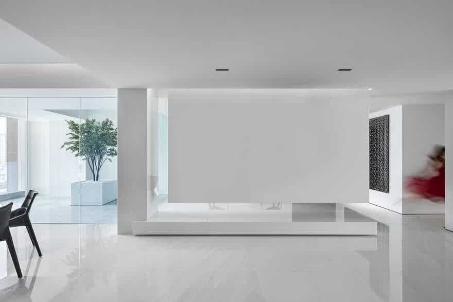
Situated at the CBD of Shantou, this single-storey luxury residence embraces the river view outside. Spanning 300 square meters, the space is like a piece of white curtain, which opens up a free field for people to experience.
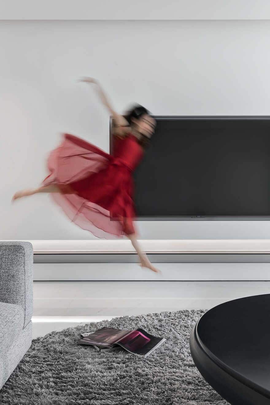
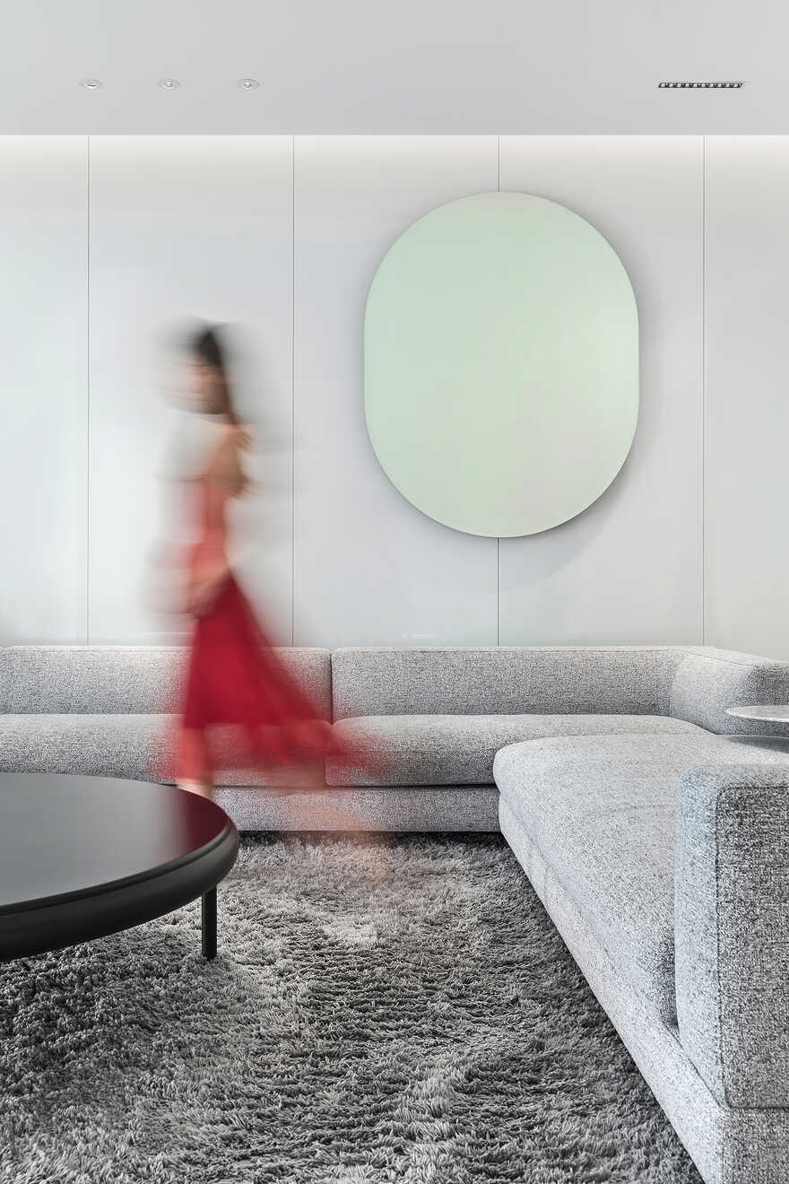
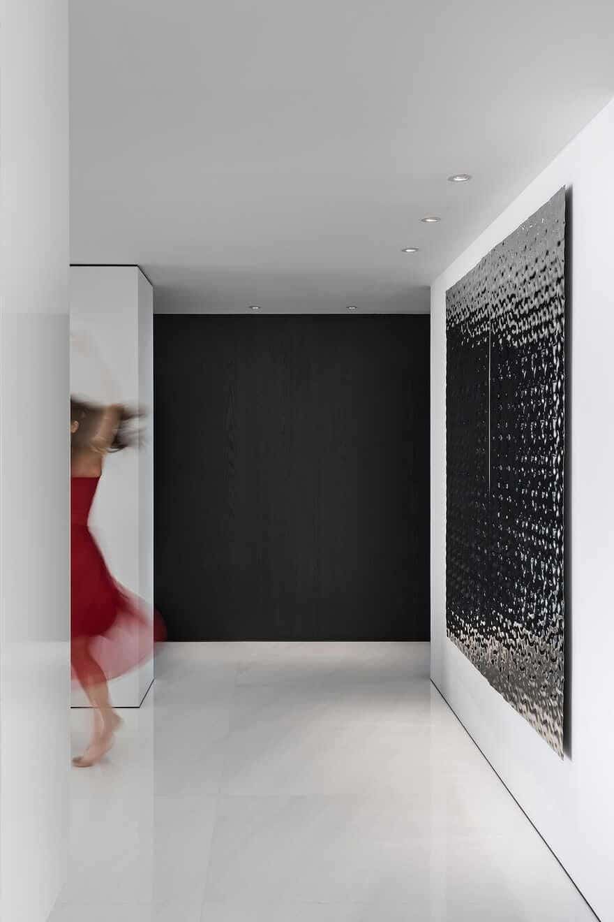
This Minimalist Geometric Home draws inspiration from the visual presentation of performances on stage. We turned the white space into a serene backdrop and stage for the occupants, with the details and dotted bright colors generating dramatic visual effects, which showcase the stylish character of contemporary luxury homes.
1 Breaking boundaries
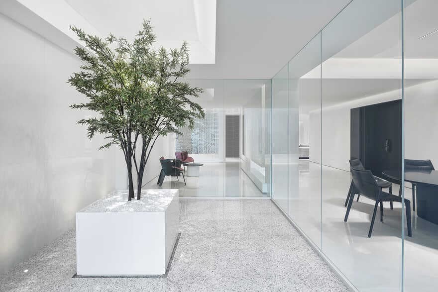
The passageway near the foyer was originally dark and cramped, since it was flanked by two rooms on both sides. We opened up the enclosed space to let natural light filter into every corner, thereby creating a bright and cozy life stage. Meanwhile, each corner of the interior space offers an open view to the outside. Through tearing the formerly closed space and blurring the boundaries, we created a relationship of “stage” and “backstage”, which adds playfulness to the space. Different areas are separate yet connected to each other.
2 Eclectic
The word “eclectic” is derived from the Greek words eklegein and eklegesthai, meaning “to choose, make a selection”.
At the early design phase, I thought about how to present this space, either by formalism or functionalism? Apparently, merely highlighting the deconstruction and form of this home is not we wanted to. Instead, we needed to incorporate storage and other functions into the space in a hidden manner, so as to reveal its most simplistic state, which well fits into the occupants’ meticulous attitude towards life. The free plane and geometric shapes generate different space combinations, to showcase the occupants’ personalities. The design seeks to evoke the interaction between people and the space, and convey the fundamental spiritual core of the residence via a minimalist approach.
3 Restrained
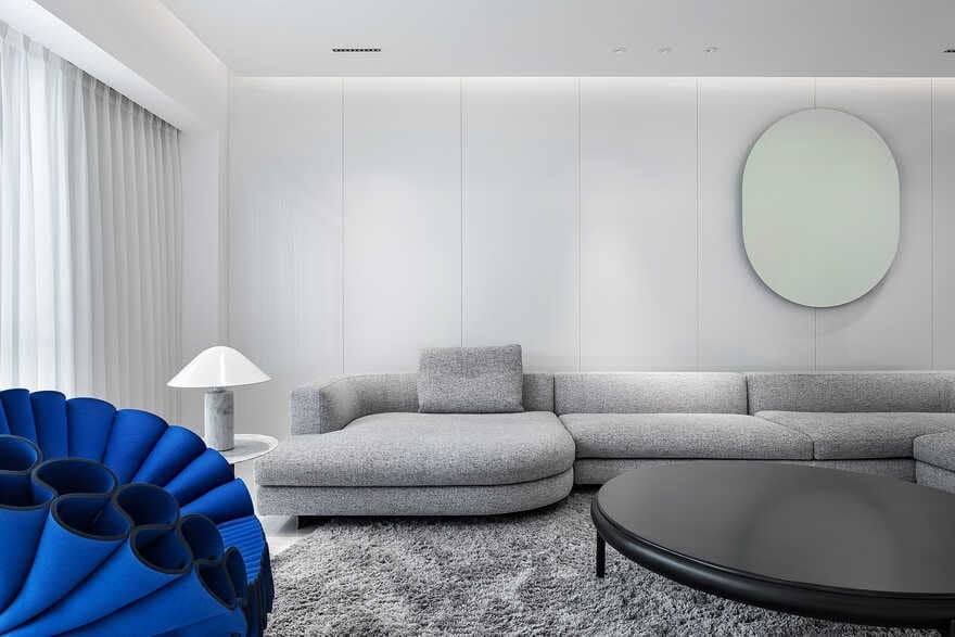
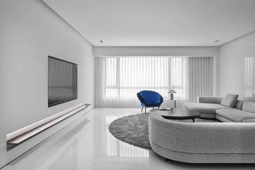
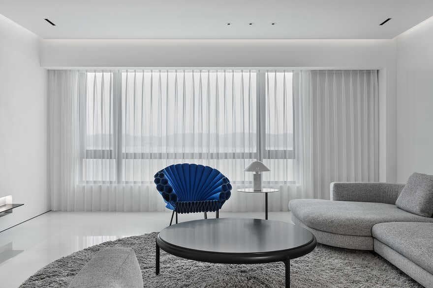
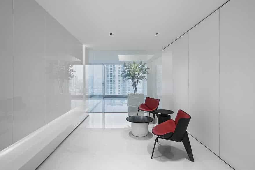
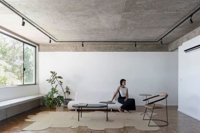
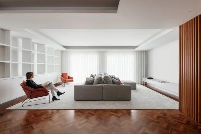
The simplistic color palette, which mainly consists of black and white, fully embodies a restrained aesthetic. Large areas of the space are “blank”, which generate a tranquil and inclusive atmosphere. In this space dominated by calming hues, the red B&B chair and the blue Cappellini Peacock Armchair appear serene and elegant. Restrained as it looks, there is something extremely powerful, which reminds us to restrain lust and emotion, keep the soul pure and live a minimalist life.
4 Rational
Rational design promoted by Bauhaus in the 20th century has been influencing us. We adopted minimalist functionalism, while emphasizing people’s sensory experiences in the space.
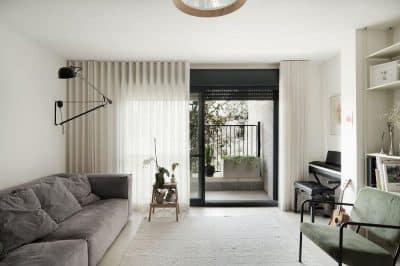
The overall design of the living room sticks to the logic of minimalism. Characterized by lightweight textures and light gray hues, the carpet marks off a relatively converged area, which coordinates the relatively loose state of the space. The Minotti fabric sofa echoes with the carpet with a similar hue. Together they enhance the cozy and static characters of the space, in which people can feel calm and relaxed.
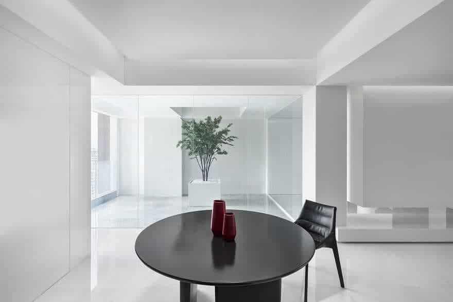
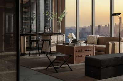
In order to create a cheerful dining environment, we turned the original wall into floor-to-ceiling glass, to connect the interior to the outside world. A lightweight ultra-clear glass cabinet hangs in the air, which combines functionality and aesthetics. In addition, Molteni & C dining chairs provide a comfortable dining experience.
The room facing the old urban district was opened up and turned into an outdoor leisure area. Here, the occupants see the integration of the city’s old and new built landscape, feel the evolution of living environment, and enjoy a peaceful lifestyle. The leisure area links the interior to the outside, and provides a perfect place for the hostess to read books. The customized metal decorations on the wall are artistic, which highlights the style of the space.
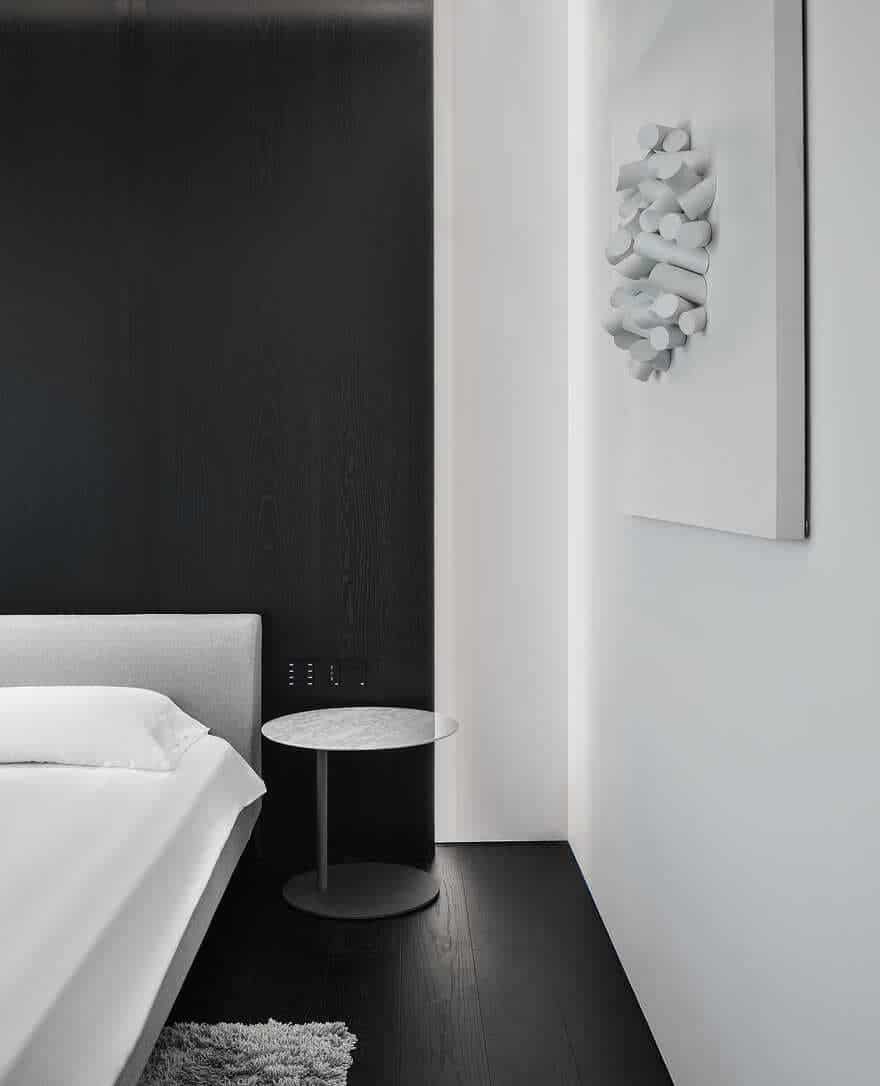
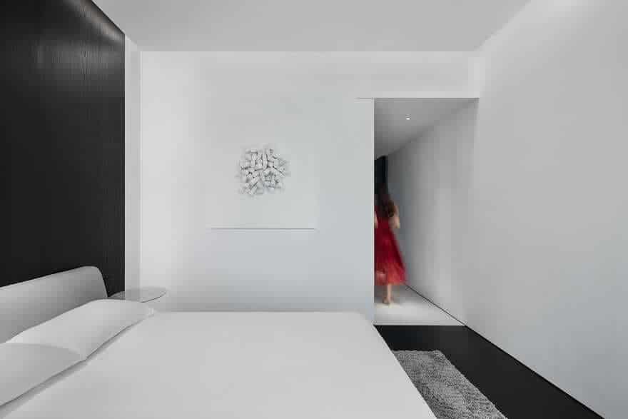
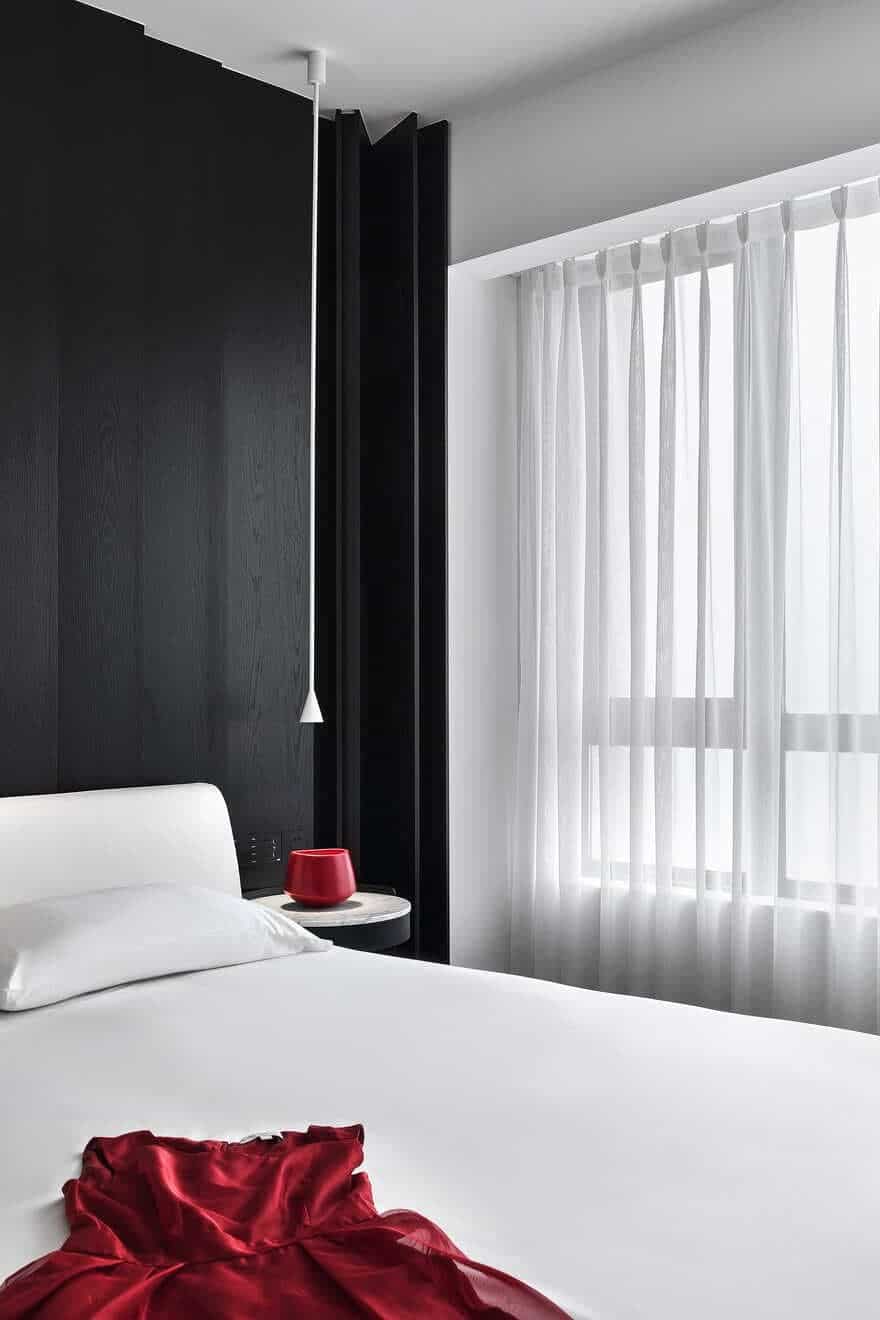
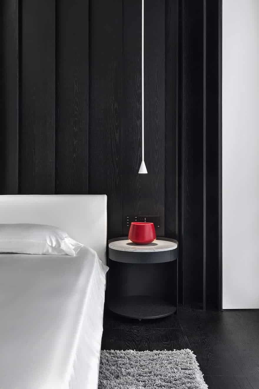
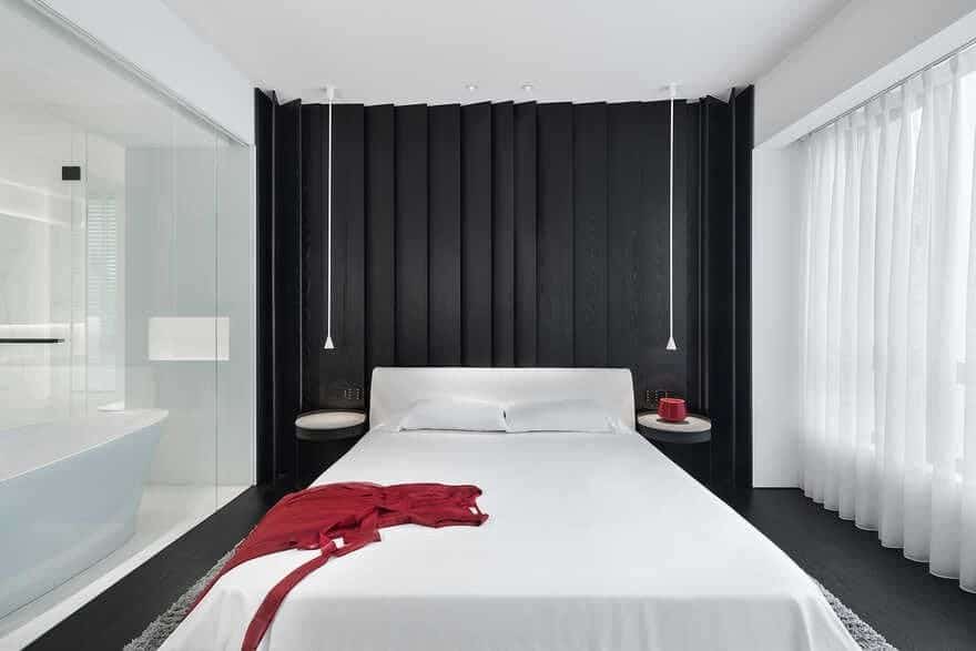
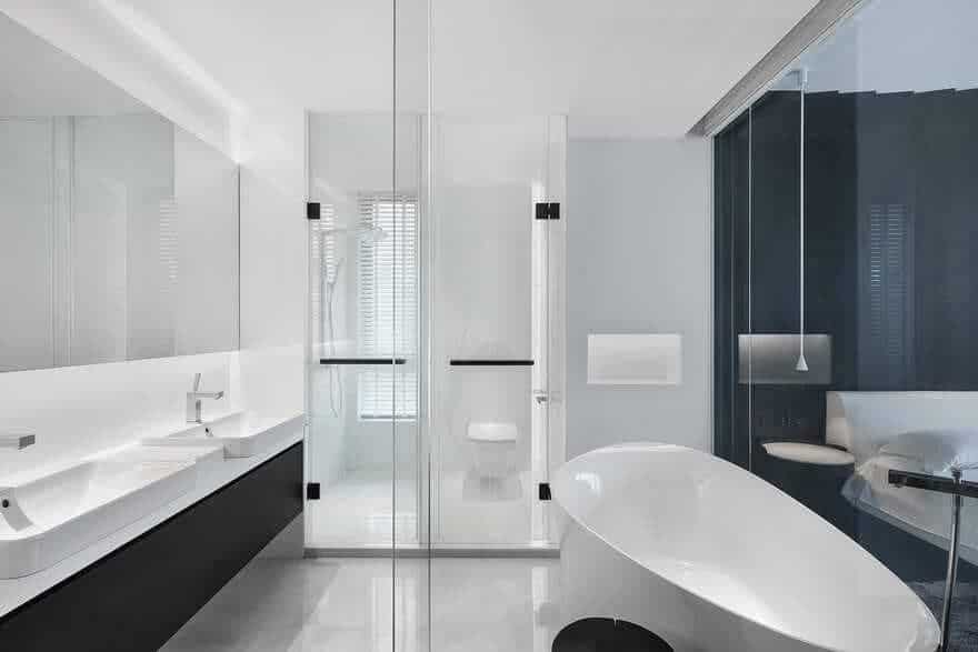
In the bedroom, white walls and the black floor are perfectly combined, which shows contrast while at the same time generating a simplistic visual impression and a cozy ambience. When gentle music plays and the curtain opens automatically in the morning, the occupants will embrace the outdoor river view and start a new day with a pleasant mood. The bathroom and bedroom are connected into a whole, which appears expansive and clean.
This Minimalist Geometric Home breaks spatial boundaries, incorporates eclectic thinking, restrained aesthetics and rational logic, and evokes emotions, which creates an intimate stage for its occupants.

