Architect: Branch Studio Architects
Project: Modern Pavilion
Lead architect: Nicholas Russo
Location: Balnarring, Australia
Area: 85 m2
Year 2017
Photography: Peter Clarke
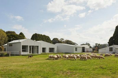
When presented with the opportunity to design this modern pavilion like a small addition to an existing residence, it was exciting to discover a number of established and significant trees sporadically arranged across the proposed site immediately to the west of the existing building.
The brief for a new master-suite consisting of a bedroom, an ensuite and incorporated robes/ancillary spaces also asked for a strong connection to the landscape and the contextual surrounds of the various garden areas.
The existing dwelling itself – a 1990’s owner-build that our client’s inherited with the purchase of the property – posed little architectural significance and interacted poorly with its context. The strategy for dealing with the existing building was for the additions to be ‘semi-detached’ from the existing residence… this creates a separation from the main house, giving the pavilion it’s own identity amongst the landscape, while also providing the private spaces contained within ‘room to breathe’ and a sense of calm, intimacy away from the large open plan family home.
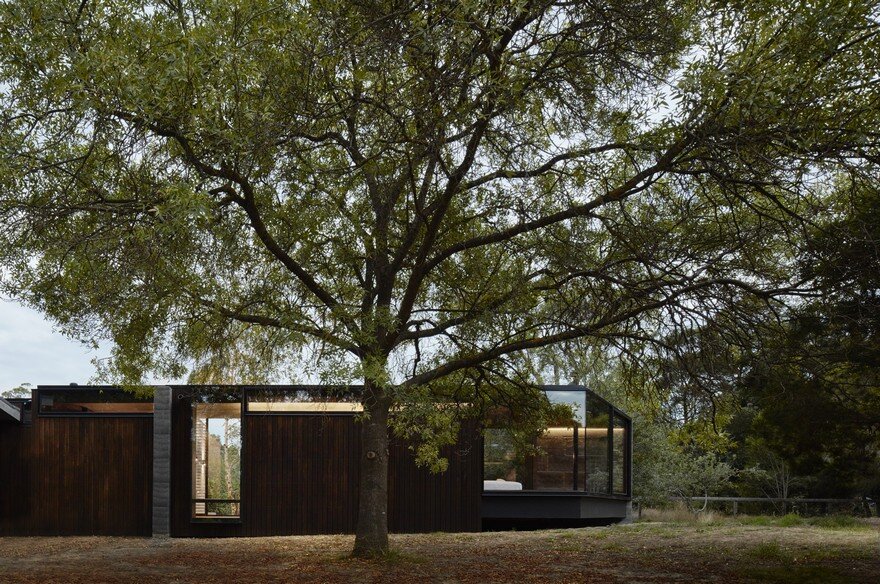
It was resolved early on that the trees on the site would not make way for the new building – and in fact the concept would explore the opposite – as a more meaningful connection with the landscape could be achieved with the building giving way to, and interacting with, the trees.
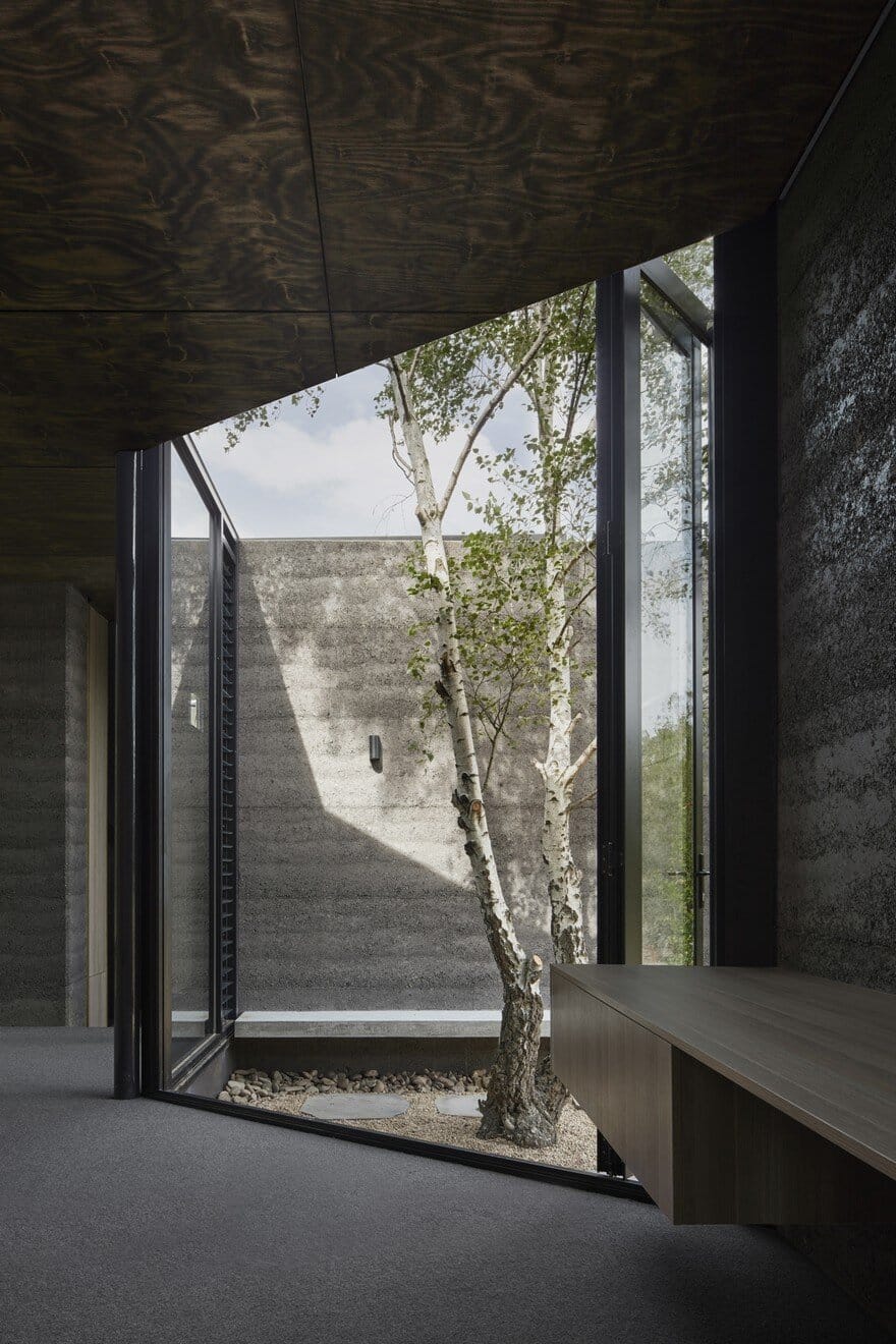
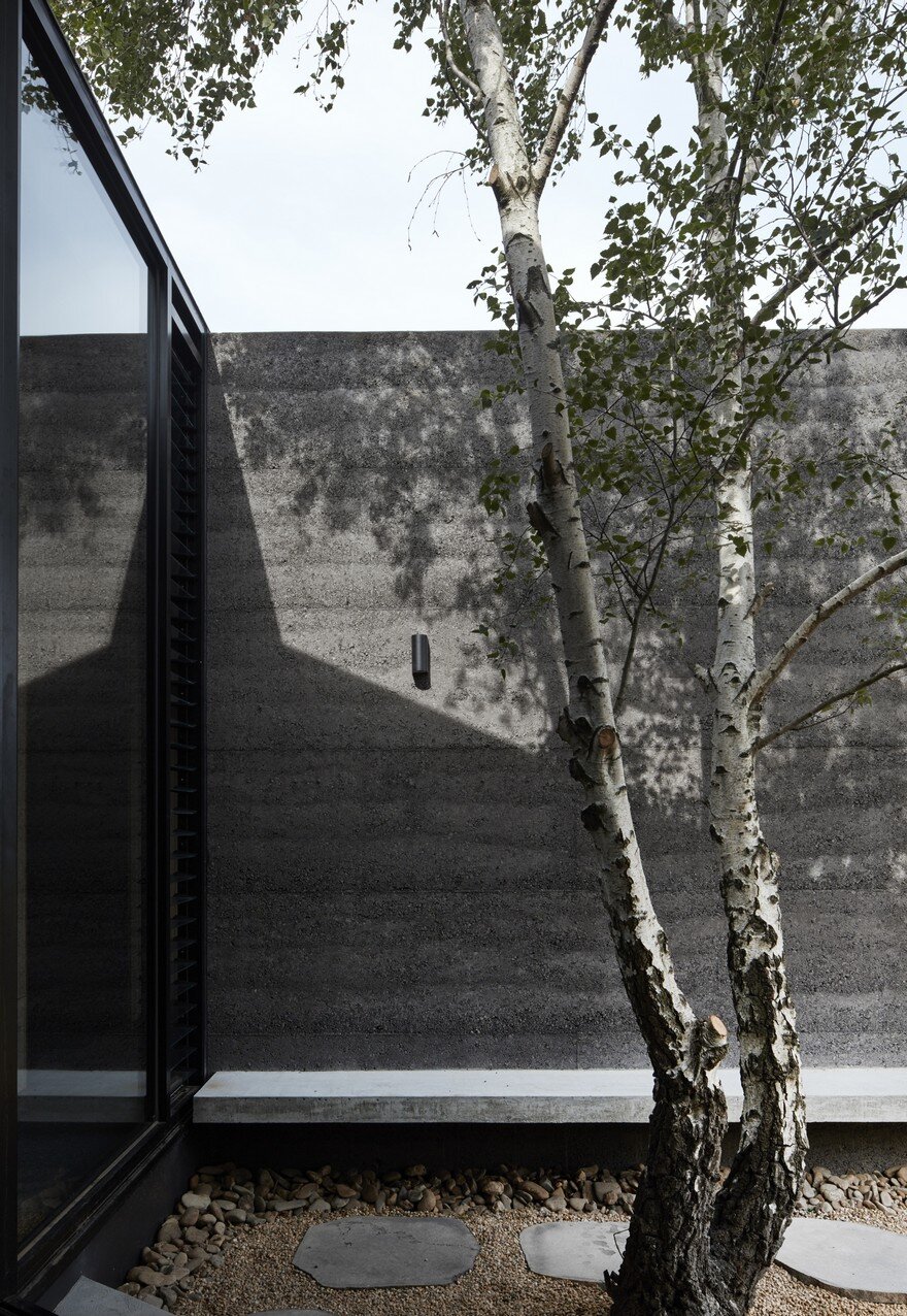
The result of this approach is a slender form to fit between the existing trees linking the three distinct programmatic areas in a linear fashion and arranged with an overall modernist logic & aesthetic. Starting as a simple rectangle, the plan evolved through a series of restrained but deliberate formal gestures to directly reference the existing context. A small gouge was made, creating a courtyard space to house an existing silver birch tree to the south. This courtyard acts as the threshold between the bathroom areas and the rest of the modern pavilion providing separation between the ensuite and the main bedroom spaces. External and internal seating is arranged around the courtyard providing opportunities for contemplation, rest and relaxation.
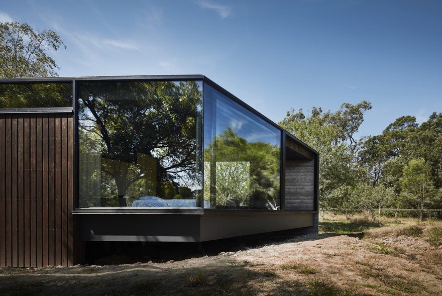
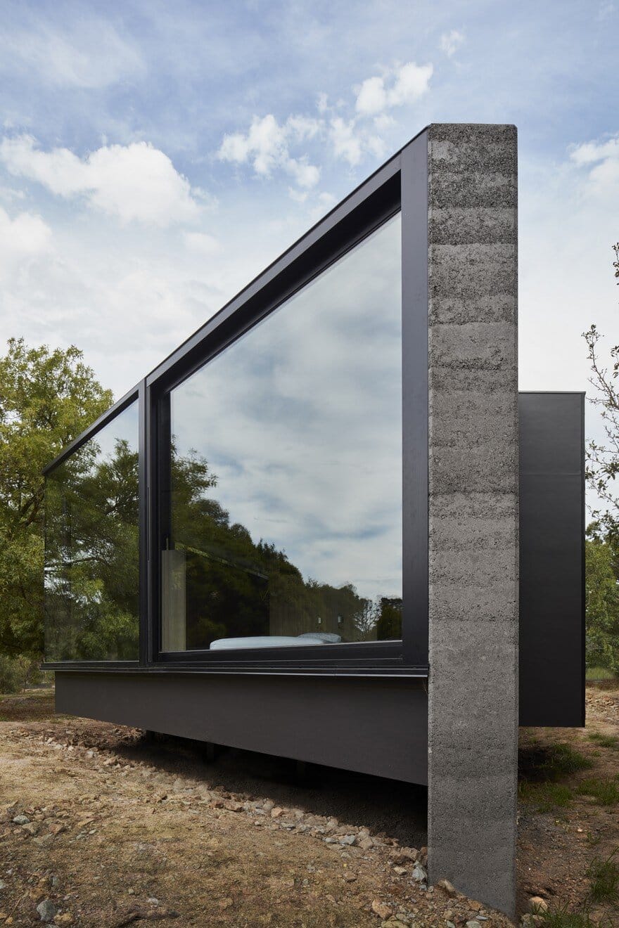
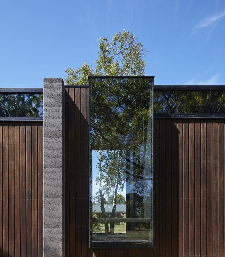
The other formal interventions consist of two extruded window boxes that are pulled out to directly interact with the existing trees adjacent, and, the angular slice to the end of the modern pavilion to orientate the space towards a view corridor through existing vegetation, towards the setting sun to the west.
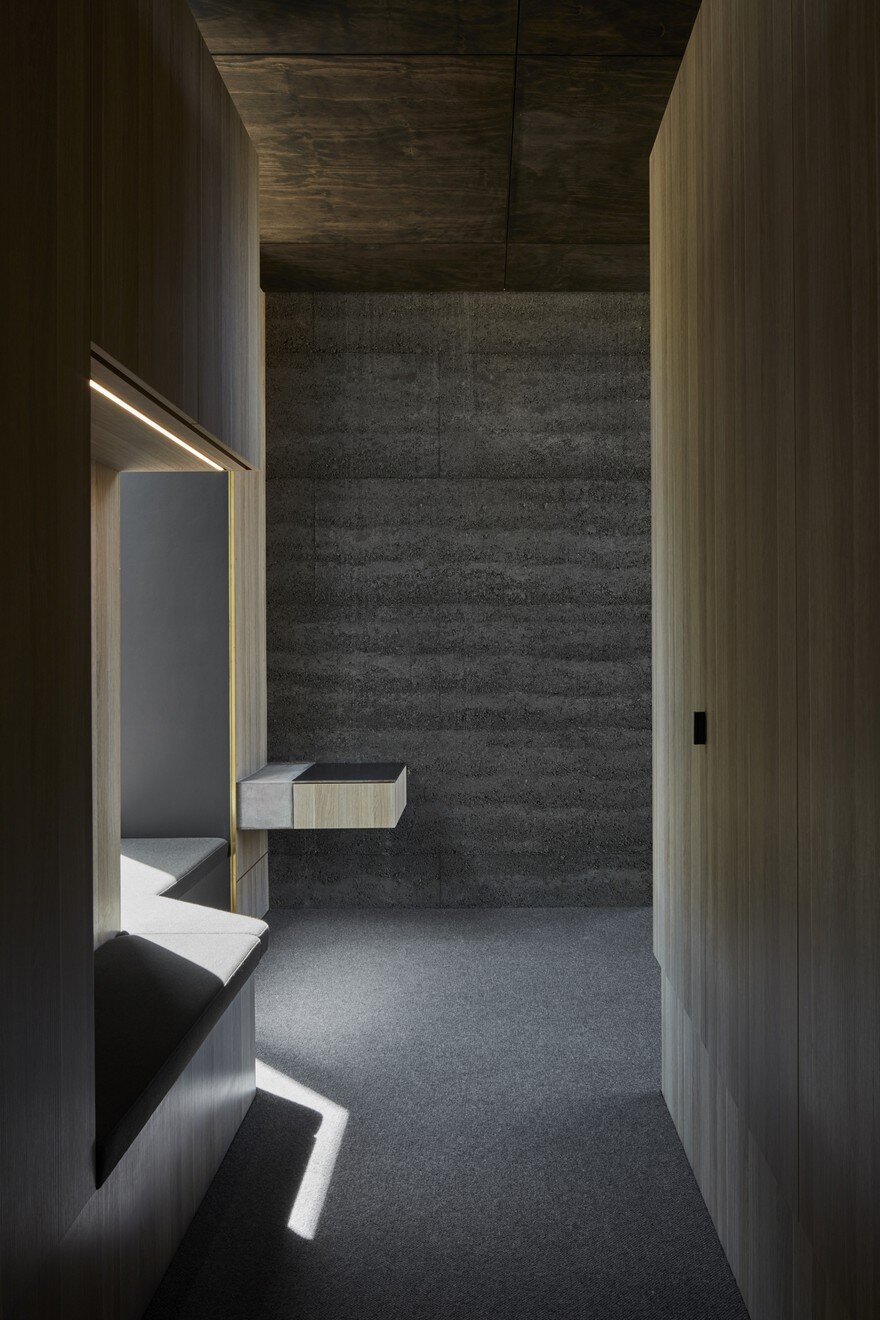
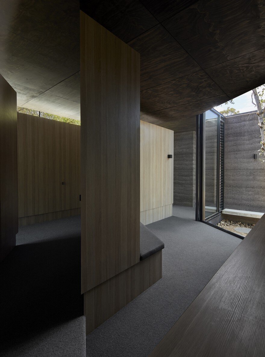
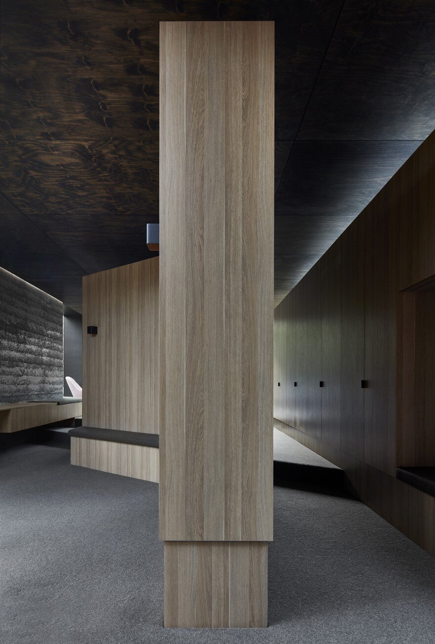
Entry to the modern pavilion is provided via the extension of an exiting central corridor from the main house. This central ‘boardwalk’ splits the ensuite areas into two distinct spaces before peeling away into two circulation paths around a central arrangement of joinery dividing and defining the robes. As the spaces unfold the floor level rises gradually (to about 1m above ground level) via a series of platforms that subtly ascend and divide the spaces across the length of the building. With the rise of the building, each programme internally possesses a different relationship with the garden context;
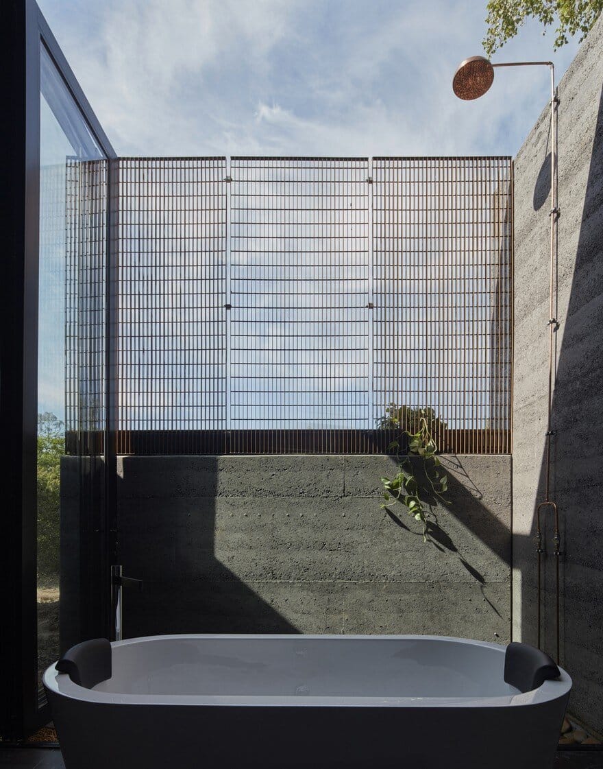
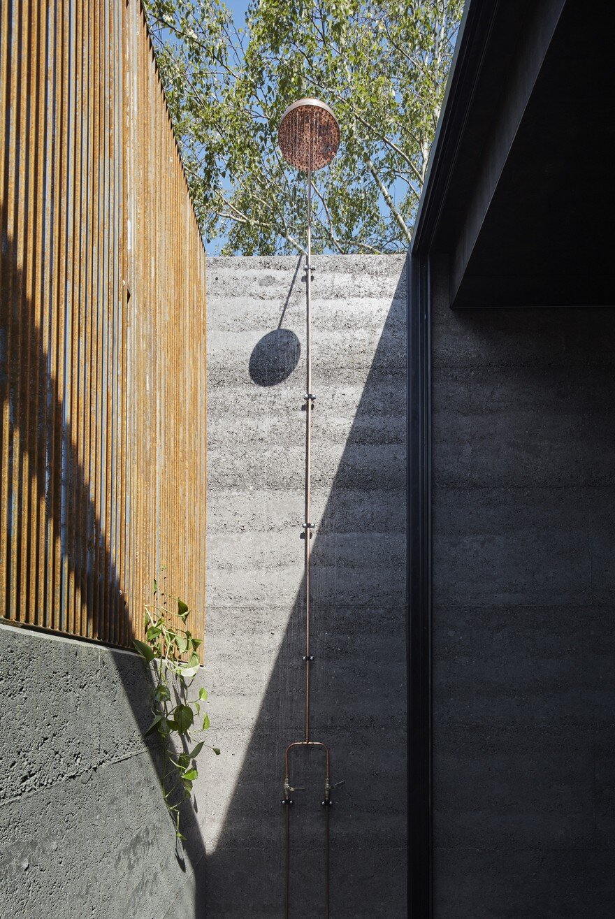
– The ‘bathing’ area of the ensuite incorporates both an indoor & outdoor shower and a bath on the threshold of the internal-external building line. Large full height folding glass doors open to include the narrow external courtyard as part of the bathroom space giving it a direct connection with the garden. A half height rammed earth wall and a steel mesh screen provide privacy from the expansive property beyond without interrupting the views of the treetops and sky from the bath and outdoor shower.
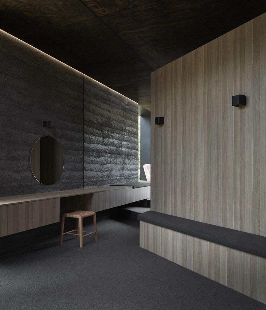
– The robes float just above ground level and both sides have a direct link to the landscape. The south side (Georgina’s Robe) incorporates built-in seating arranged around the aforementioned silver birch tree/courtyard moment which internally provides the most literal example of the building giving over to the existing landscape. A long integrated seat, come side-board, come dresser extends the length of the southern side of the pavilion anchoring itself to the rammed earth wall while taking on different functions as the floor level falls away beneath.
The north side (Adrian’s Robe) is more subtle in it’s relationship to the landscape. Large canopy trees provide filtered northern sunlight through highlight windows above the joinery which also provide a visual connection from inside to the leafy green canopy above. An extruded window box projects out under the canopy of the larger trees providing an open and transparent seating space within what is otherwise a private ‘locker room’ type robe space.
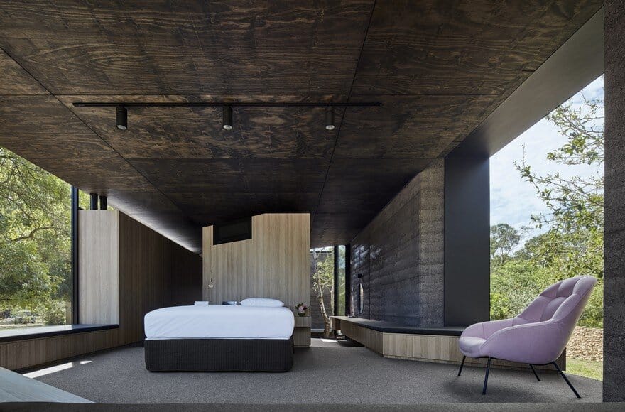
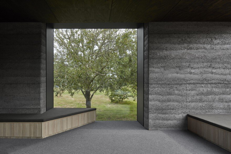
– While the robes and bathroom areas are split into separate portions for function and privacy, the bedroom – where the building reaches maximum elevation above the ground – is the area where the previously individual zones come together as one space. The central joinery ‘forrest’ that previously divided the ‘his’ and ‘hers’ robe zones morphs into a low height bed head joining the space as one. Built-in cabinetry skirts the perimeter of the bedroom enclosing the area with a series of informal seating and day-bed areas. A second and larger window box extrudes out from the solid rammed earth wall framing views of the fruit tees and stables beyond. The connection to the trees from the bedroom is more about being amongst the branches than beneath them and this is most apparent when standing in the large suspended window box or siting at the very point of the space, where the full height ‘cut end’ glazing slides open to the outdoors as you hang well above the ground and gaze towards the greenery beyond.
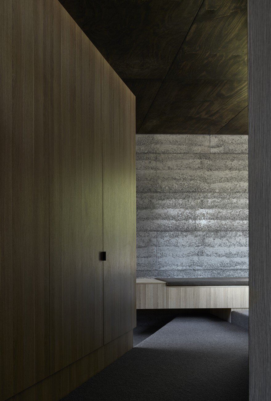
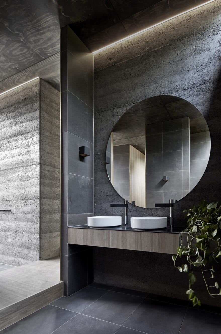
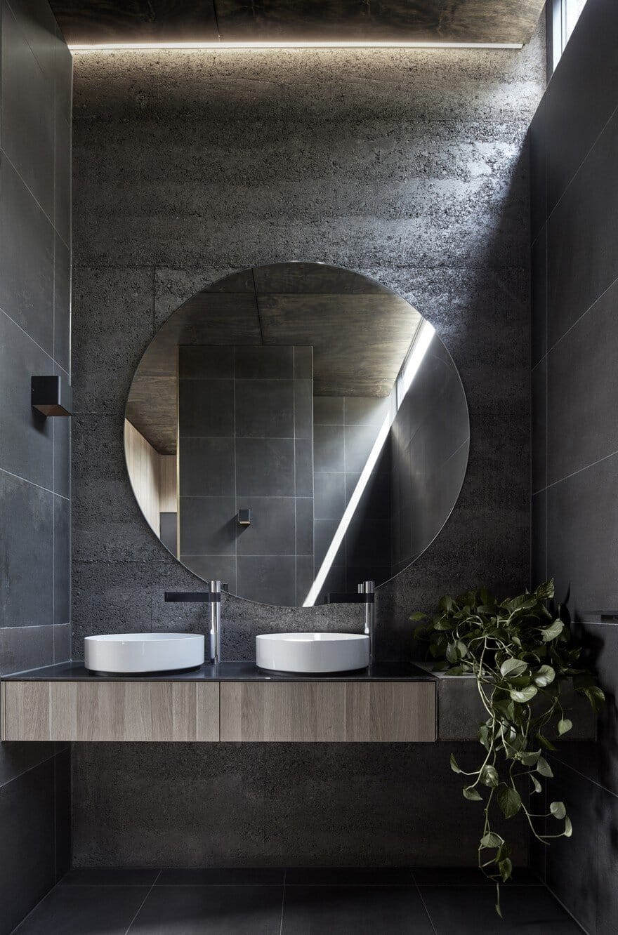
The external material palette of charcoal rammed earth, timber, steel and glass is purposefully natural and raw in response to the rural context, designed to weather and patina naturally, the building will continue to embed itself into its surrounds over time. Internally the materials are of a similar aesthetic although the detailing is treated with a preciousness which gives the unpretentious materiality a sense of finery. Charcoal rammed earth, timber and honed bluestone are the predominant internal materials with concrete and steel also used for some of the joinery. Brass trims accentuate material junctions, celebrating these intersections and expressing the construction methodologies.
Creating the right atmosphere was a major focus internally. Given that bedroom areas are habited predominantly at the beginning and end of each day, it was important to adequately capture the moods of these times (waking-up/unwinding, washing and dressing) within the space. This master-suite pavilion aims to provide its occupants with a space away from the influences of excessive artificial light and create a more natural atmosphere in which to begin and end the day. This is achieved through the use of indirect lighting which ensures that the rooms are not over lit and thus provides the apparent quietness and intimacy appropriate for such spaces.
The discrete, earthly approach to the lighting also allows the tones and textures of the individual materials to reflect the ambience of the current external climate at any given time; A moody grey day outside will impart those connotations over the internal spaces, the rammed earth will feel darker and heavier, the timber will reflect a monochromatic grey light and the bathroom areas will feel cave-like with the stone floors and walls. Alternatively, a bright, sunny day will cast dappled light across the spaces through the tree canopies above, the warmer tones of the earth and timber will be uncovered and the rich textures of the raw materials will be highlighted by the vibrancy of the natural light.
There is no attempt to block out the external environment and create a ‘synthetic’ interior, instead, this building aims to preserve the sensory qualities that we enjoyed before the days of alarm clocks and electricity, when we went to sleep when it got dark and woke up with the sun.


