Project: Modern Two Bedroom Apartment
Architects: Bronstein Bracha Architecture & Design
Location: Tel Aviv, Israel
Area: 80sqm
Year 2018
Photography: Shai Epstein
A retired couple, who spent most of their lives living in Berlin, Germany, decided to immigrate to Israel. For most of their adult life, he has been venturing in real estate while she was an executive in the field of advertising. Both are “city folk”, infatuated with the fast paced urban lifestyle, accustomed to the hustle & bustle that only city centers can provide. While Searching for their new home, there was no doubt, location won’t be an issue for compromise. The city of Tel Aviv was a natural choice for their retirement.
On the other hand, Tel Aviv’s real estate booming market, in the last decade, made record breaking numbers which made it difficult to find a reasonable space-cost ratio. As result, the compromise came in the form of a much smaller living space than the couple was used to.
After a long search, the couple fell in love with a modern two bedroom apartment (80 sqm) located in the heart of the city, on the first floor of a new residential building with a small balcony overlooking an adjacent palm tree and a sunny southern front.
Immediately after purchasing the apartment, the couple contacted the Tel-Aviv based architecture & design firm Bronstein-Bracha Architecture & Design. Briefing the design team, the designers were asked to incorporate a very ambitious program to their 80 sqm wall partition plan.
Since the couple’s children and grandchildren, who still live in Germany, visit quite often, it was crucial that the program include a separate bedroom & bathroom for exclusive use by the guests.
During the initial stage of planning and through long meetings discussing the couple’s wants’ needs & dreams, the designers where exposed to their vibrant & adventurous life story. These meetings inspired the design team and helped crystalize the conceptual design language.
A juxtaposition between the clear, clean & crisp lines of the international movement (which Tel aviv has embraced thought it’s short existence) in one hand, and the 60’s- 70’s ‘hip’ advertising world in Berlin, where “Mad Man” style offices and rough underground smoky clubs dominate the scene’ on the other.
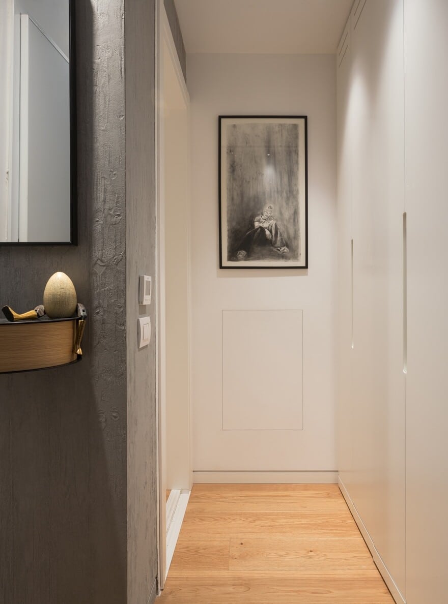
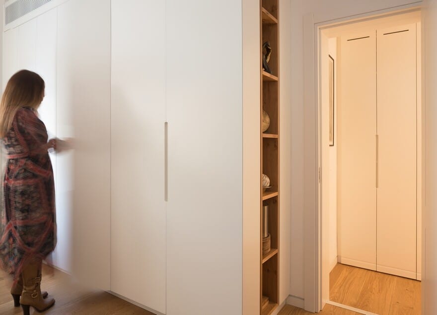
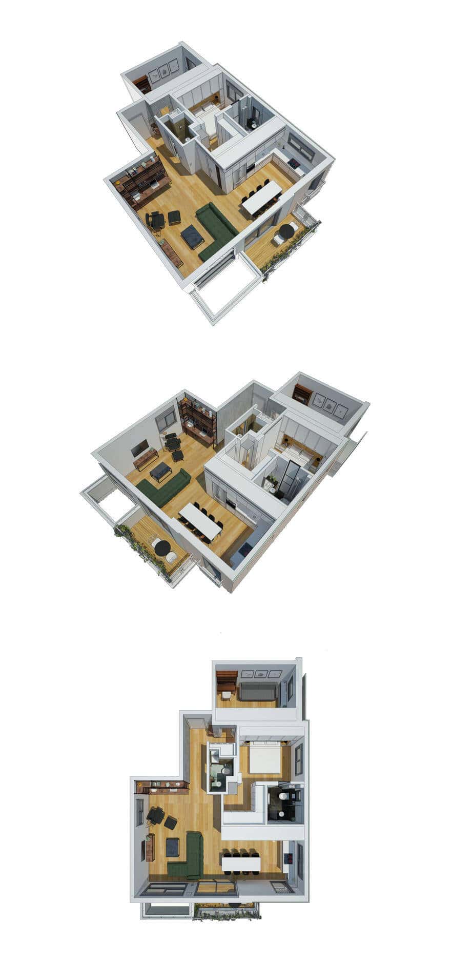
Entering the apartment, a dark concrete wall accompanies the visitor towards the living room and kitchen area, as a reminder of the roughness that characterizes the city and as a conceptual path to a much peaceful and intimate space. On the right side of the entrance door a small service space was designed with a minimalist in-built washer/dryer closet that leads to the guest bedroom. This bedroom is also used as a room for reading and writing whenever it is not used by guests and visitors.
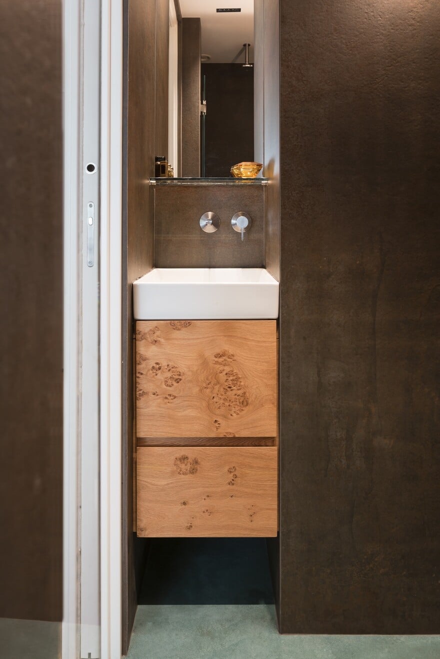
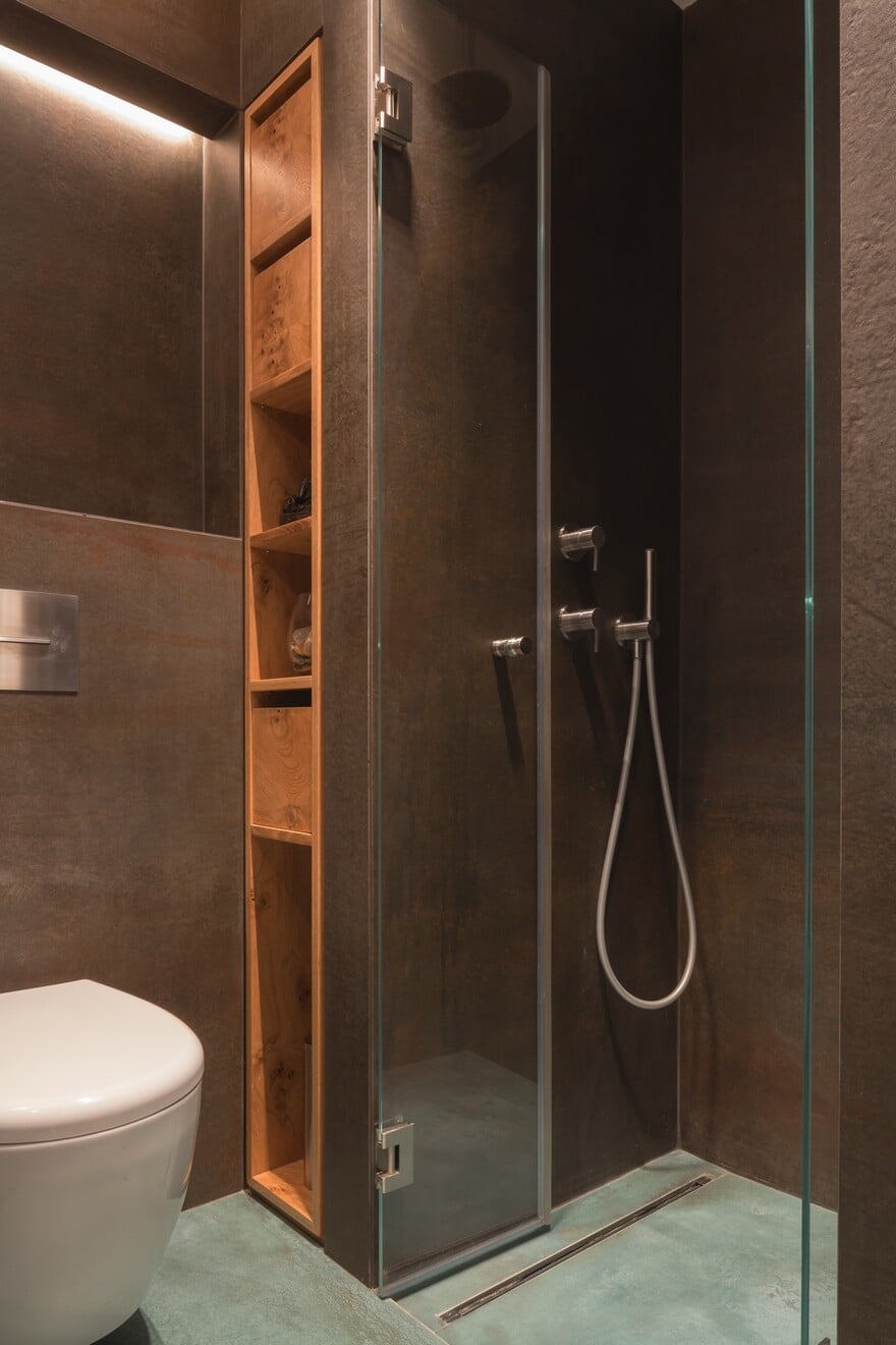
Going back to the entrance, half way, on the left side of the corridor, a guest bathroom was planned. The narrow space includes a tight but sufficient toilet-sink-shower composition. This constellation allows a separate and independent use of the guests in a manner that does not interfere with the day-to-day conduct of the couple. Taking into consideration that this space serves only the guests and despite its narrow proportions, the designers choose to cover the bathroom’s walls with dark shades of rust and aquamarine tiles, whilst using dim dramatic lighting. This grungy space comes as an unpredictable surprise in the least expected place, echoing the underground atmosphere the couple & designers wanted to incorporate in the design.
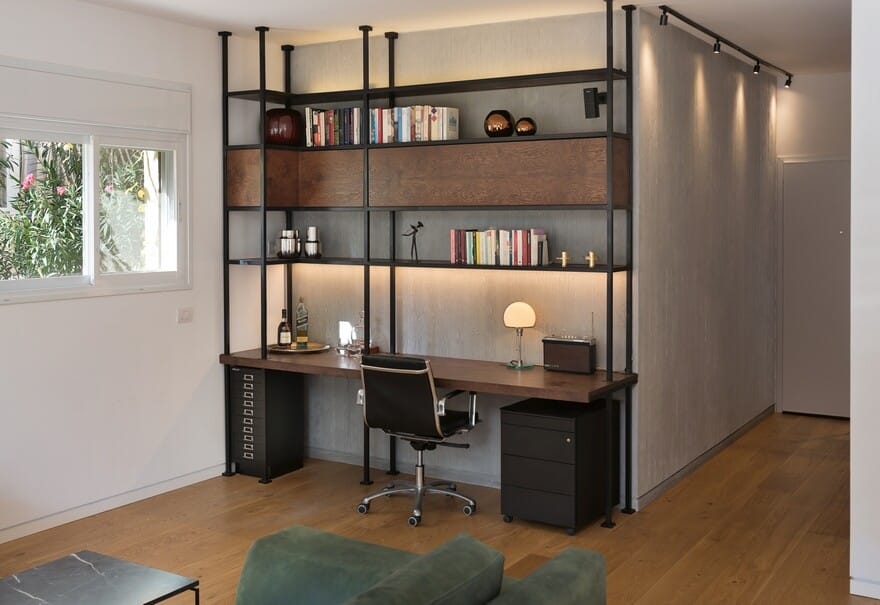
Further down the corridor, on the right side entering the living room space, a library with an in-built desk is peeking around the corner. The library is made out of black metal with incorporated American walnut root shelves and storage boxes, influenced by construction scaffoldings. The corridor’s concrete wall folds and continues as its background.
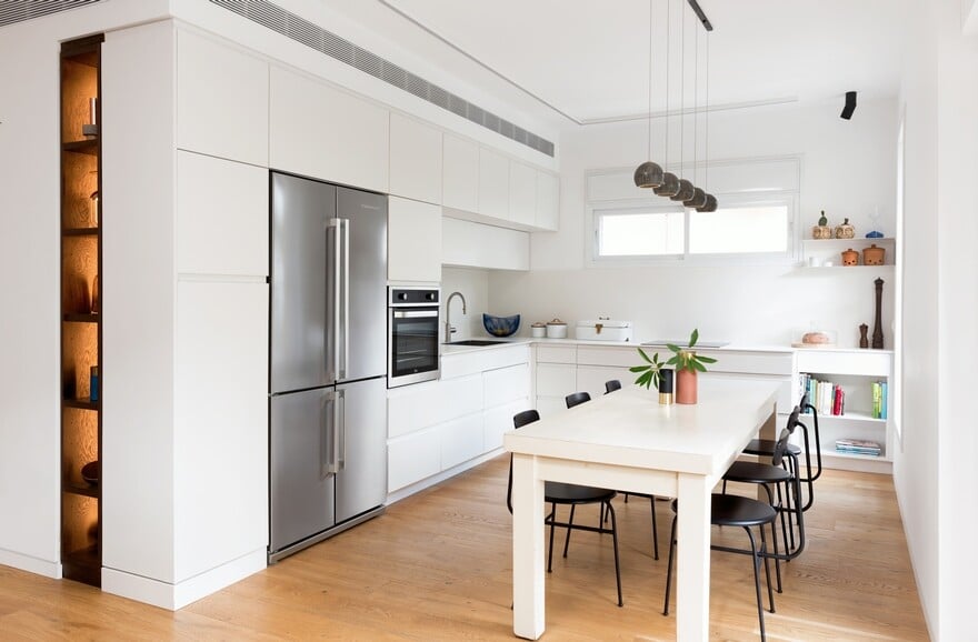
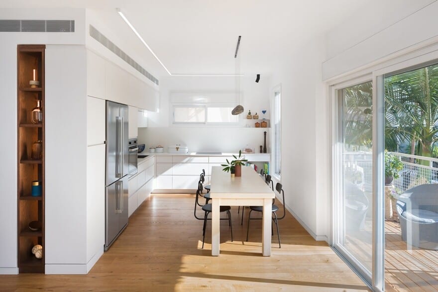
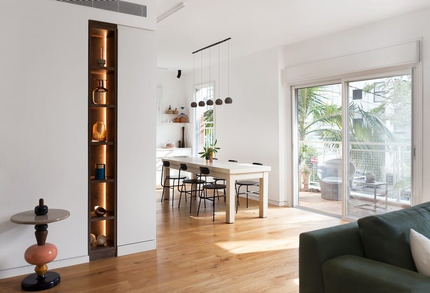
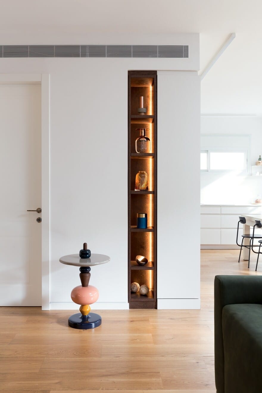
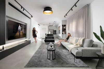
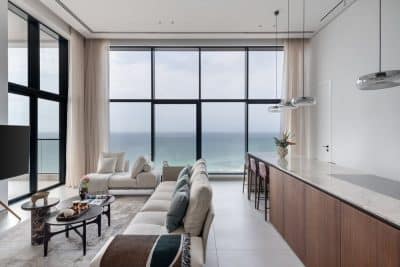
The living room and it’s continuation as an open dining & kitchen space are both parallel to the southern sunny façade and the cantilevered balcony. This area is characterized by white gentle tones, which accentuate the contrast with the dark shades coming from the entrance area and the dark shelves niche located on the kitchen’s side.
Right next to the niche, the designers located an entrance door leading to the main bedroom.
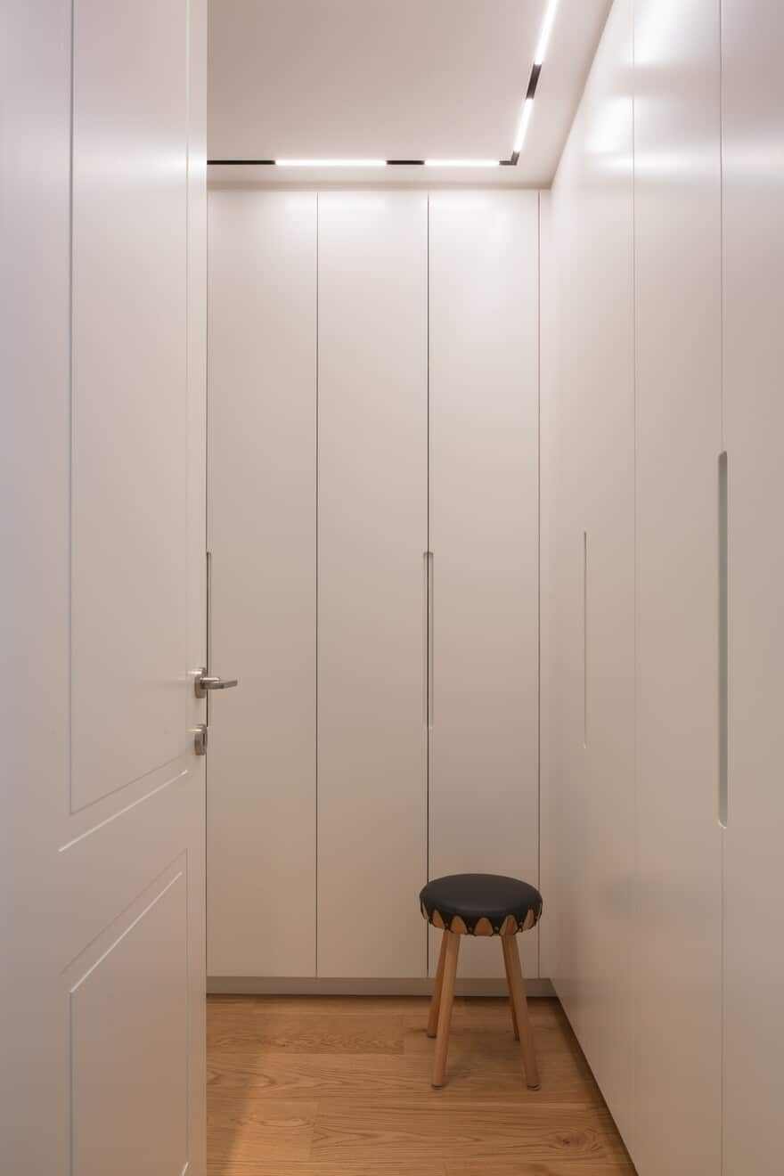
The cornered passageway was designed as an inbuilt closet for the couple’s use.
Floor to ceiling Mirror doors where located around the corner, aiming to enlarge the narrow space.
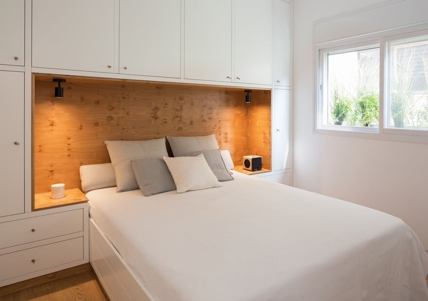
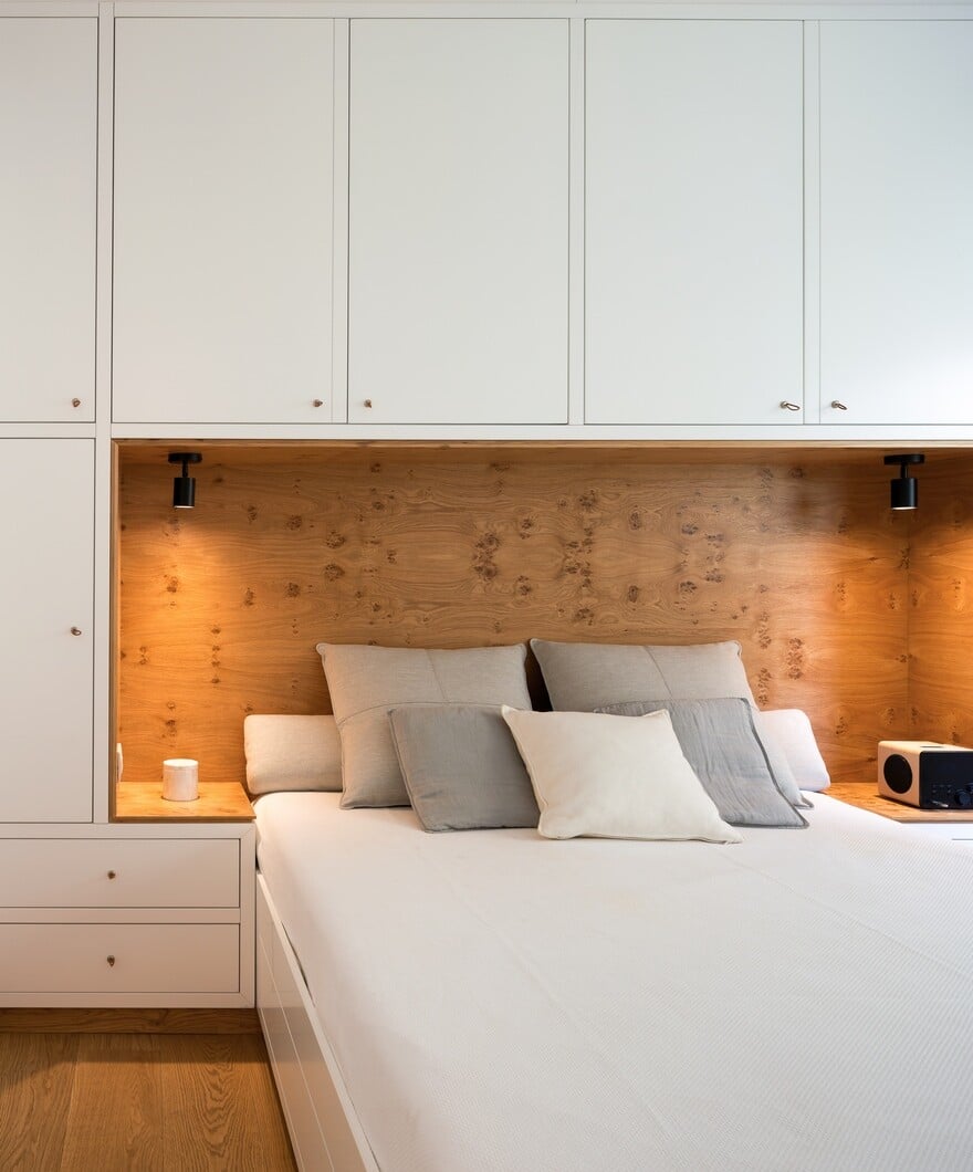
Due to lack of storage space, a large inbuilt cabinet was designed, covering the bed from both its sides and from above.
Aiming to emphasize the “heart” of the room, as its most intimate place, A large oak root wood board was designed to cover the headboard.
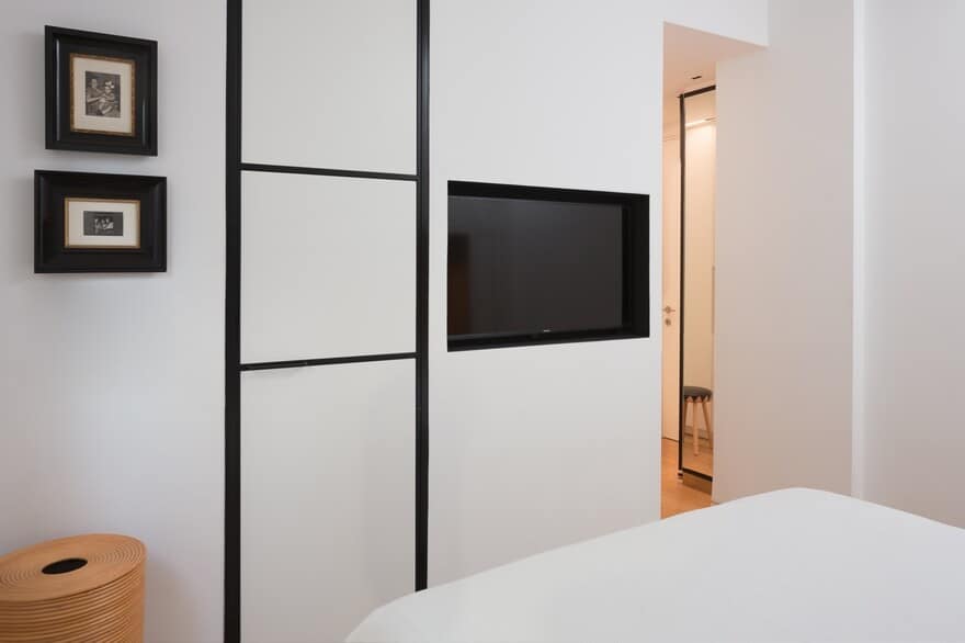
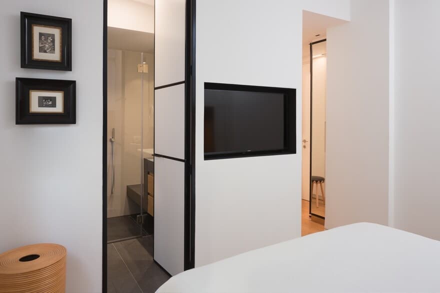
On the other side, A composition of the TV niche and a black iron paneled wooden door lead towards the master bathroom. In contrary to the guest bathroom, the walls of this space were characterized by a refined, lighter and brighter surfaces and coverings. While The oak wood drawers, the floor and the folding shower bench keep the edgy contrast with their dark tones.

