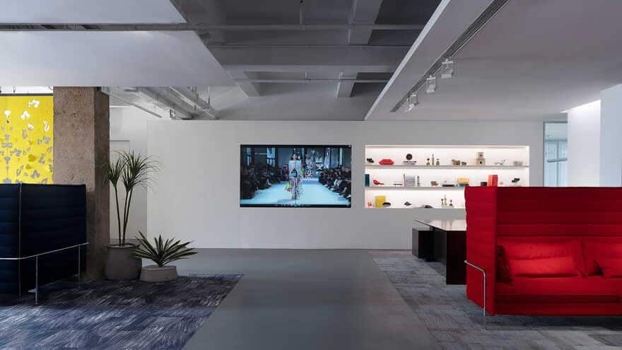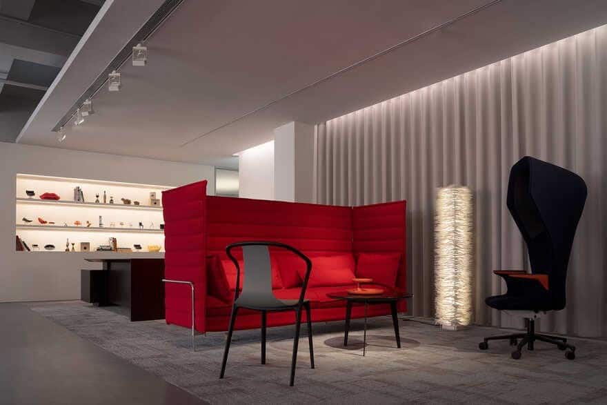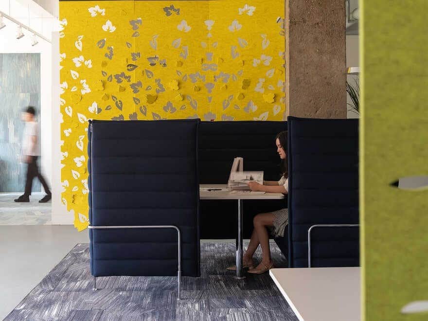
Project name: NET OFFICE FURNITURE SHOWROOM
Spatial design: Shenzhen Super Normal Design Co., Ltd.
Location: Shenzhen, China
Design directors: Yang Jianxun, Wu Minwen
Chief designer: Wang Chuangzhe
Design team: Guan Tianda, Yang Mei, Zou Jingwei, Li Min, Xie Huang
Area: 1,100 m2
Completion time: August 2019
Furniture: Vitra, USM
Lighting fixtures: Belux, Kreon
Main materials: fair-faced concrete, steel, wood, paint
Construction firm / team: Yicheng Engineering Co., Ltd. / Jin Chen, Lao Jingyang, Xie Qide
Photographer: You Hongxiang
Client: Shenzhen NET Office Furniture Co., Ltd.
I. Inheritance of Brand Spirit
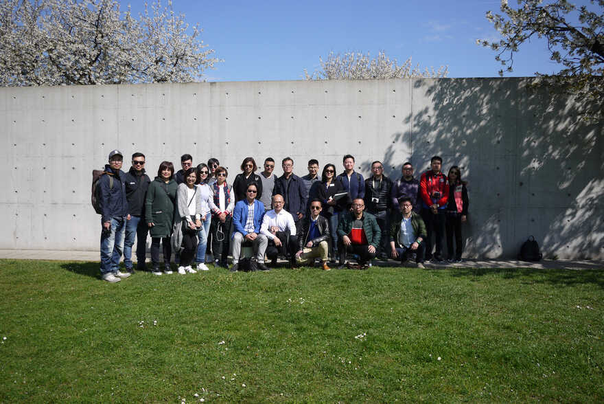
In April 2016, a group of designers came to Vitra’s factory in Germany. Standing in front of the Vitra Fire Station designed by Zaha Hadid, our feelings were complicated. The great architect has left us, but the solid concrete and sharp lines of the building are vigorous and carry forward her design ideas.
Vitra is quite influential in the design community. Pritzker Prize winners including Frank O.Gehry, Alvaro Siza, Zaha Hadid, Tadao Ando, Herzog & de Meuron and SANAA have conceived buildings for the brand, while design masters such as Charles and Ray Eames, George Nelson and Antonio Citterio have worked with it and create lots of classic furniture, making it a legend.
NET OFFICE FURNITURE is a Shenzhen-based furniture supplier, which sells products of various well-known brands such as Vitra, Milliken, Boss, etc. It entrusted Super Normal to transform and upgrade a showroom that displays Vitra’s products.
Situated at OCT LOFT, a cultural and creative park in Shenzhen, China, the old showroom of NET Office Furniture had been put in use for several years and required adjustments, in order to bring brand new experiences to customers. As conceiving the design, we tried to figure out how to pay tribute to previous generations of design masters and how to tell the stories of the brand.
Vitra’s brand spirit is in line with the cultural and creative ambience of the site. Taking this as the starting point, we intended to create something different, with the space serving products whilst incorporating product concepts into the spatial design. Just like the long-lasting design of Vitra’s products, this space doesn’t chase fashion, but seeks for classic eternity and ingenuity.
Hanns-Peter Cohn, Vitra’s the Chief Executive Officer, once said that Vitra sells not only design, but also long-lasting spirit and value.
II. Foyer Story
The old exhibition hall was a closed space. In order to fit into the Vitra’s design spirit, we introduced daylight into the space to produce a natural and comfortable ambience. The color rendering quality of natural light is almost perfect, which is indispensable for enhancing people’s experience of the architectural space and products. Bringing in natural light is the most crucial step, which breaks the previous closed spatial pattern and hence helps to present the original properties of the products in a perfect manner.
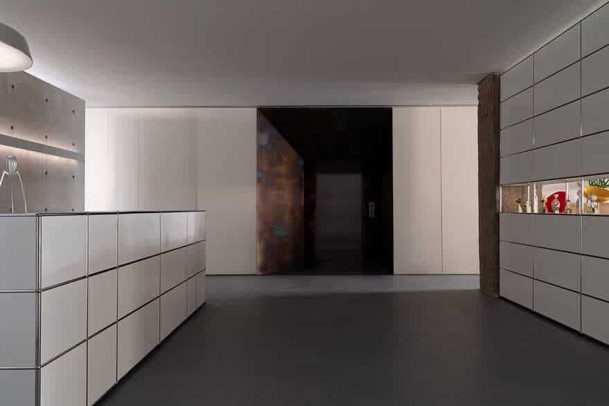
The design concept of the elevator hall pays tribute to the museum that Herzog designed for Vitra in Switzerland. The overall color palette of the hall is in stark contrast with the foyer. It is worth noting that the conventional sense of humbleness of the access control system has been abandoned, as the system is integrated into a small black “house” on the wall, which is quite unique.
Meanwhile, an umbrella holder is set at the elevator hall, which can catch the remaining water dripping from umbrellas in rainy days.
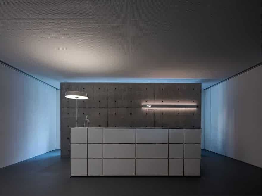
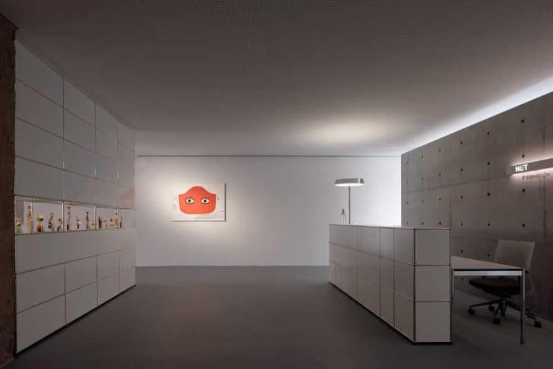
If the elevator hall is a prologue, the foyer would be the beginning of the story. Here, we want to tell a story. The ample natural light brought in by the north-facing windows becomes the protagonist of the drama, which, however, must keep a low profile at the moment. Starting from the back of the fair-faced concrete wall, the light travels along the edges of this wall to the surrounding walls and ceilings, and eventually wraps the whole wall system.
The fair-faced concrete was cast in situ. The formwork was not prepared until the parting lines and the position of split bolts were confirmed after meticulous measurement, calculation and consideration. Brackets were distributed evenly to ensure vertical flatness and uniform force-bearing capacity, after which the grouting and vibration work were carried out. By feeling the temperature change on the surface of the formwork by hand during the condensation process, we were expecting the next step.
No matter how meticulous the process was, there would always be some defects after demoulding. These defects, however, will gradually fade away and turn into exciting presence with the passage of time and oxidation effect. This perhaps shows a fascinating part of fair-faced concrete, which, like the process of life, is endowed with oriental wisdom. A USM reception desk is placed in front of the wall. The wall presents nodes featuring perfect craftsmanship, which embodies the essence of Swiss manufacturing and at the same time generates a playful dialogue with the fair-faced concrete. The metaphor at the levels of nature, oriental wisdom and industrial spirit, constitutes the connotation of the story which we expect to express.
The traditional concrete casting process may cause problems such as honeycomb and pitted surface, and holes. Considering that the concrete surface must meet the stringent requirements of smoothness, no noticeable color difference, free of common defects as well as smooth lines, we attached great importance to the casting techniques. To vibrate the concrete to reach higher compactness and eliminate the bubbles attached on the surface of the formwork, we utilized rubber hammers to obtain better effects, in addition to using vibrators.
Since the traditional way for fair-faced concrete maintenance by watering may lead to the efflorescence of alkali, we adopted another approach instead. We sealed the concrete by plastic film to sustain its humidity and guarantee enough moisture for cement hydration, hence to overcome the pollution of the concrete surface caused by alkali efflorescence.
III. Design Details of NET Office Furniture
Classics are constantly being renewed, by either the introduction of new environment or innovative design. The foyer is characterized by a fair-faced concrete wall and a piece of furniture from USM — a Swiss brand with a history of over 50 years, which is known for rationality, modularity, confidence and user friendliness. With infinite possibilities for configuration, the furniture is like a Lego toy, which can present variable forms.
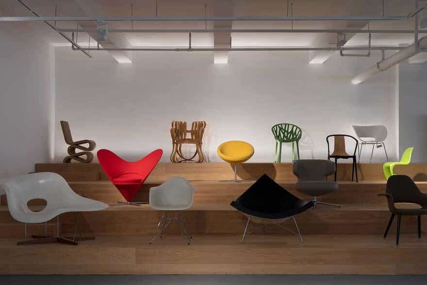
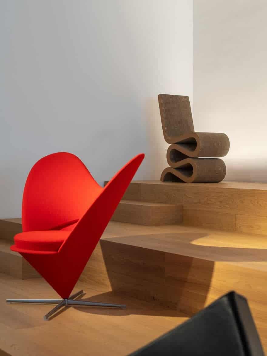
Vitra’s most iconic designs are showcased at the entrance. Among Vitra’s classic products, chairs are most representative. Design masters such as Charles and Ray Eames, Verner Panton, George Nelson and Sori Yanagi have worked with the brand and created plenty of masterpieces. The steps serve as a medium for product display, while also providing an event venue when necessary.
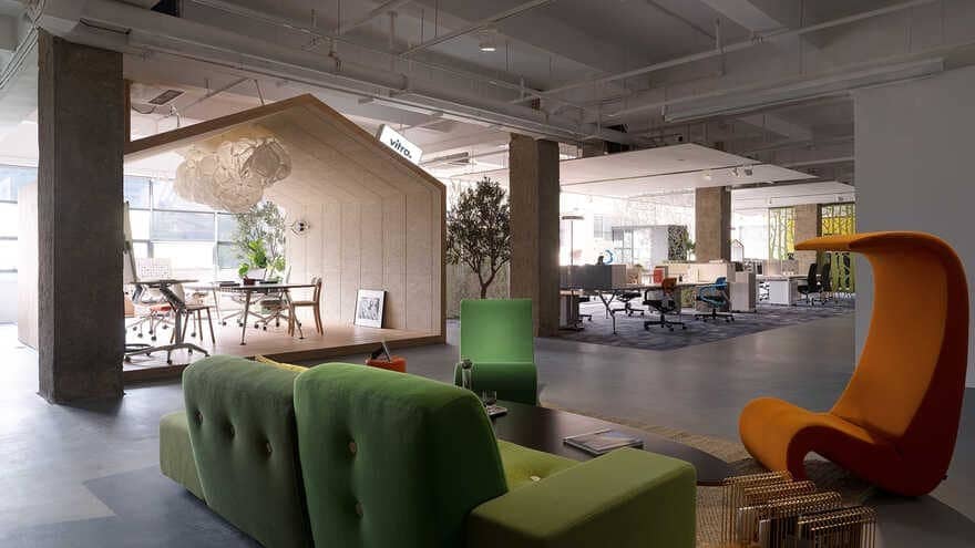
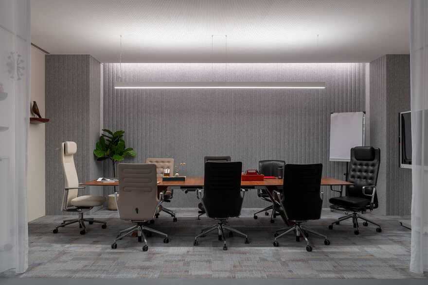
The visual highlight in the cabin-like meeting room is the large pendant lamp called “Mama Cloud”, which was designed by Frank Gehry for Belux. Gehry is hailed as “Picasso in architecture” for his grotesque and novel design style. Many of the buildings and furniture he created feature a shape resembling crumpled paper. The great designer once said that when looking at the history of art we would find that almost all great paintings are relevant to folds.”
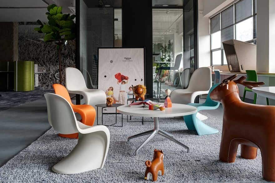
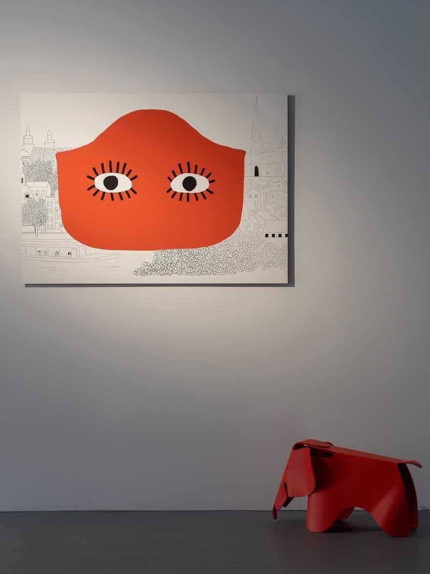
The corner between the office area and the exhibition hall reveals a group of “elephants”, which seem to be playing together. Speaking of children’s furniture, the Elephant Chair designed by Charles and Ray Eames for their daughter in 1954 is undoubtedly the brightest star. Smooth lines depict the elephants’ large round ears and chubby body. In contrast, the eyes were made small to show innocence. Painted in delicate hues, the elephants warm people’s mind upon seeing them.
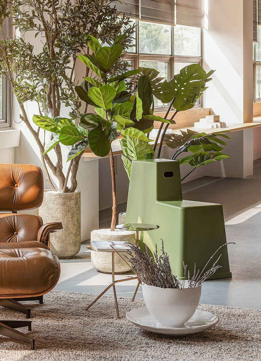
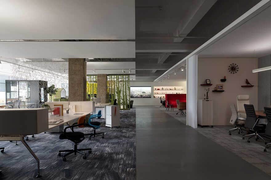
The door buckles inherit the shape of Vitra’s best-selling product — Stool-tool. The furniture is an integration of chair and desk, which together render a step-like form and offers many combinations and options for seating.
The design of Stool-tool advocates a modern office concept, which conveys that office is no longer restricted to desks and meeting rooms. Instead, it can be anywhere, from open public space to narrow corners, from outdoors to warehouses.
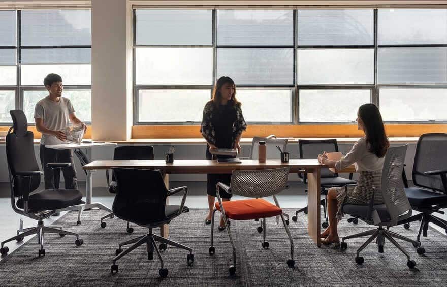
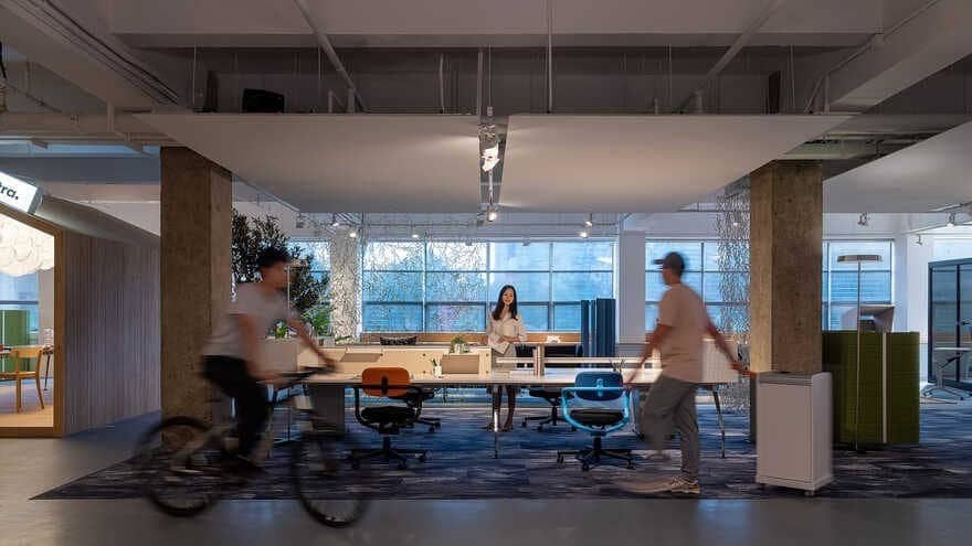
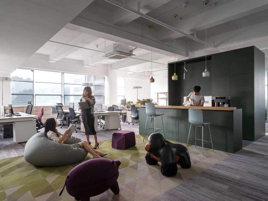
The independent offices may not need a thorough transformation. At the time of re-imaging those offices, they had been put in use for more than a year and hence carried personalities and habits of the users. For this reason, it’s necessary to preserve the memories of previous users while addressing the real problems that existed in the space, in order to create a more comfortable atmosphere, enhance daylighting and improve working efficiency. A good space is not merely reflected in cool design. More importantly, it needs to be user-oriented, i.e. taking user’s feelings into consideration.
The logos in the washroom are amusing, which extract the elements of Vitra products including Panton Chair and Eames House Birds. Panton Chair is a classic product, also called “beauty chair”. Viewing from the side, it shows the shape of “S”, just like the body curves of a beautiful woman. Eames House Bird was often seen in the home of Charles and Ray Eames. It is not only a classic of Vitra, but also has become a symbol in the design field.
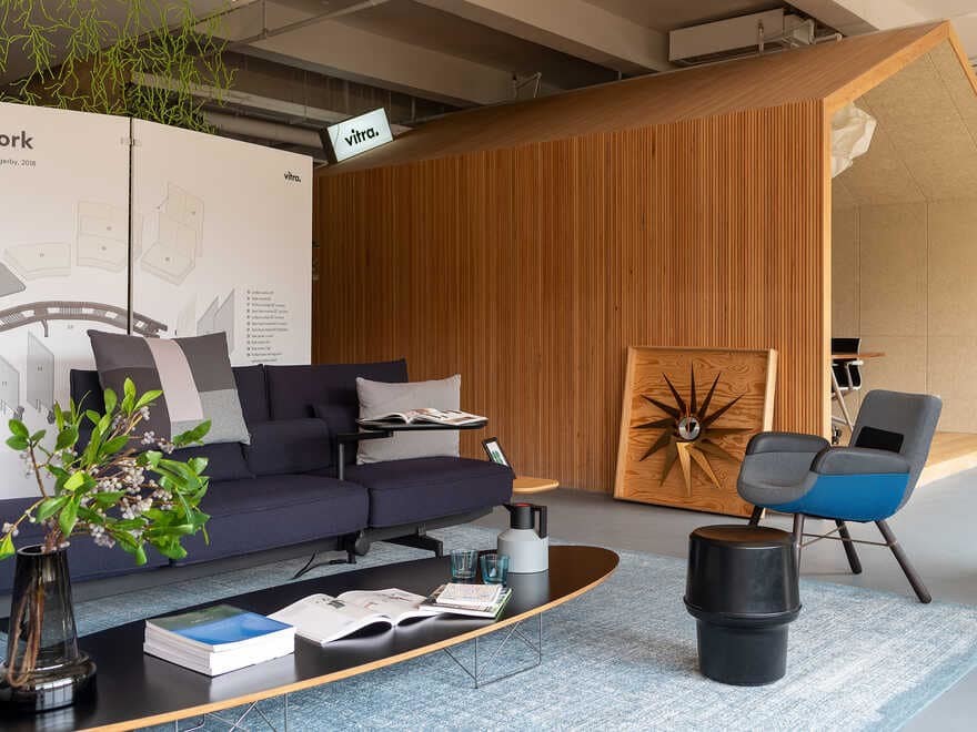
The copper wall adornment “Metal Wall Relief” inherits Alexander Girard’s iconic sun pattern, which echoes with the light on its side, like two celestial bodies surrounding each other. With polished and clear surface, it can be used as a mirror as well. Alexander’s works are known for childlike playfulness, which are vigorous, colorful and are ideal embellishments for a simple environment.
IV. An Aside
We incorporated the portraits of our designers and the client team into the paintings hung on the wall at the foyer.

