Project: Prince-Phillip House
Architects: MXMA Architecture & Design
Location: Outremont, Quebec, Canada
Type of project: Renovation + Addition
Year of completion: 2021
Original building: 1960
Surface area: 2400 ft2 / 223 m2
Photo credits: Doublespace Photography
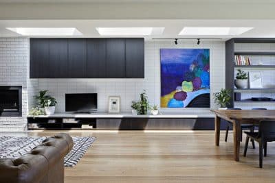
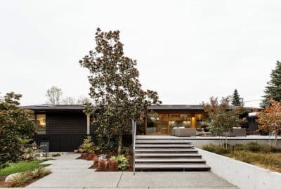
MXMA Architecture & Design completed a renovation of the Prince-Phillip House, a typical 1960s house that had already been enhanced by a contemporary addition. The main challenge of this project was to blend the architectural languages of two different eras in order to create a coherent, elegant, and well-integrated ensemble in its environment.
Located on an exceptional site – a wooded lot of nearly 1,600 square metres (17,000 sq. ft.) – this home in the Outremont district is only minutes from downtown Montreal. The owners first renovated in 2012 when their family was growing. Nearly a decade later, as the children have grown, the family’s needs continue to evolve.
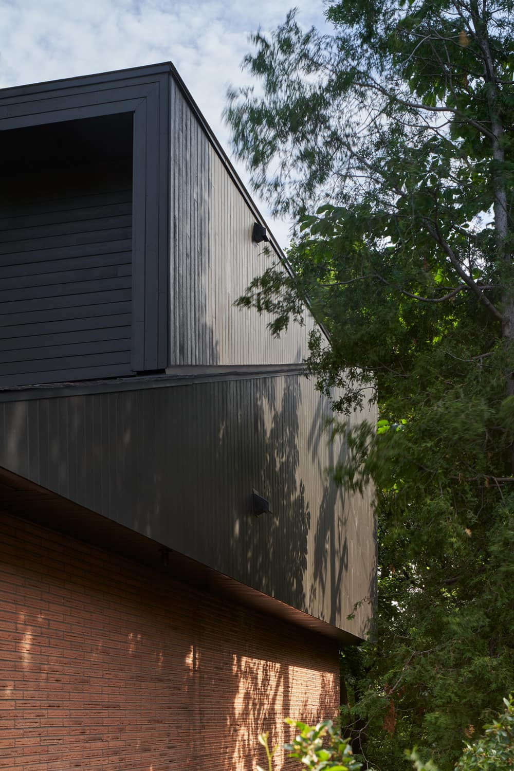
The parents wanted a quiet, private space of their own, while providing their three children with their own dedicated spaces. The project entrusted to MXMA consisted of adding a partial second storey to the residence in order to create a new wing for the parents, and to redefine the role of the existing rooms.
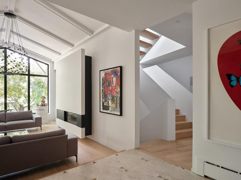
2012: left wing of the residence
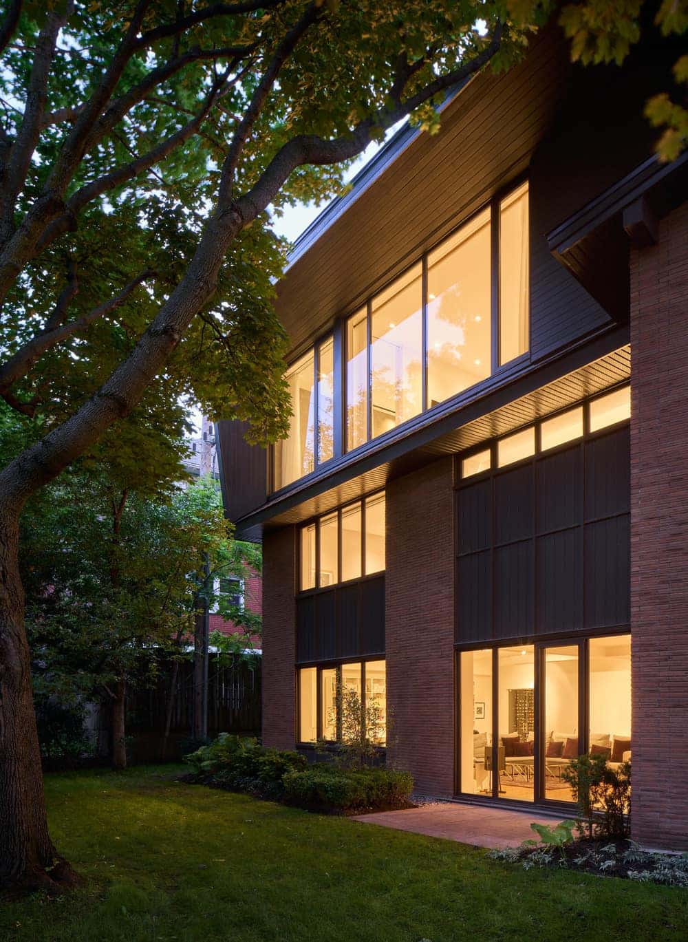
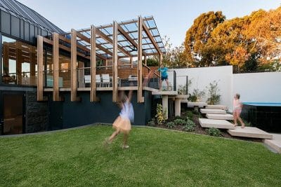
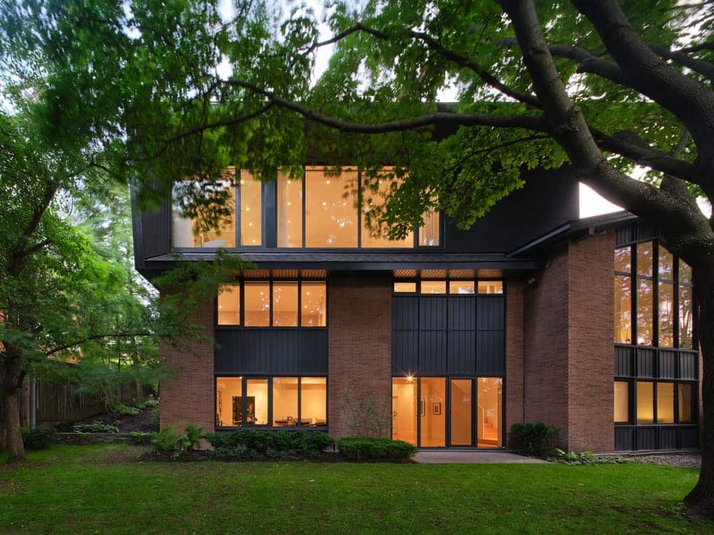
Due to its volumetric space and materials, this first addition expressed a contemporary architectural language quite distinct from that of the original house. At the time, the architects created a two-storey addition at the back of the house to accommodate a large living room, a deck, and a gym. This new wing now has generous fenestration offering views of the yard, where a pool has been installed.
2021: renovation of the right wing and addition of another storey
For the second round of renovations, MXMA’s architects made use of the right wing of the house by adding a 93 m2 (1,000 ft2) storey to this new section.
“We wanted this second extension to respect the horizontality of the house and its modern character, while remaining as discreet as possible from a street level perspective,” explains architect Maxime Moreau.
In order to combine the new extension with the existing house, MXMA was inspired by the concept of a spiralling ribbon, originally developed in 2012. This continuity allowed for a thoughtful integration with the house.
Gaining volume with subdued elegance
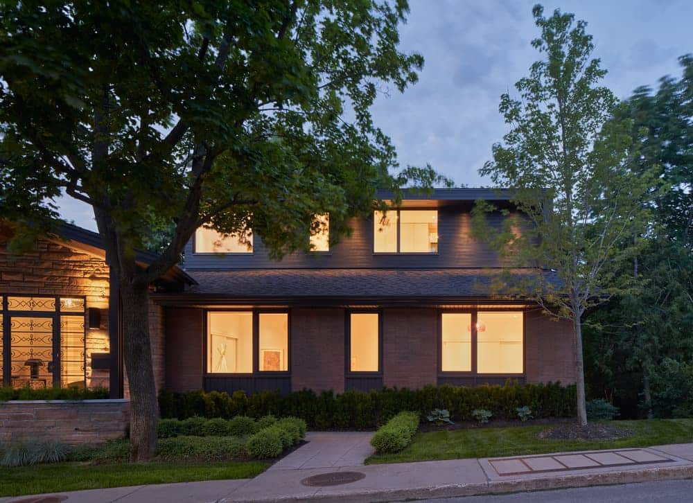
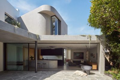
The facade of the new volume is set back to respect the proportions of the roof overhang of the original house, as well as to avoid being overly imposing. Thanks to some structural gymnastics, this addition was recessed and blended into the original roof. From the outside, what appears to be a half-storey elevation is actually a volume that is 3m (10 ft) in height. Despite this increase in volume, no undesirable shadows encroach upon the immediate neighbors, ensuring a natural and respectful integration into the surrounding environment.
In order to achieve this integration, MXMA’s architects took inspiration from the materials and formal layout of the original house. For example, the new fenestration mirrors the shape of the house’s original narrow windows.
Open to nature
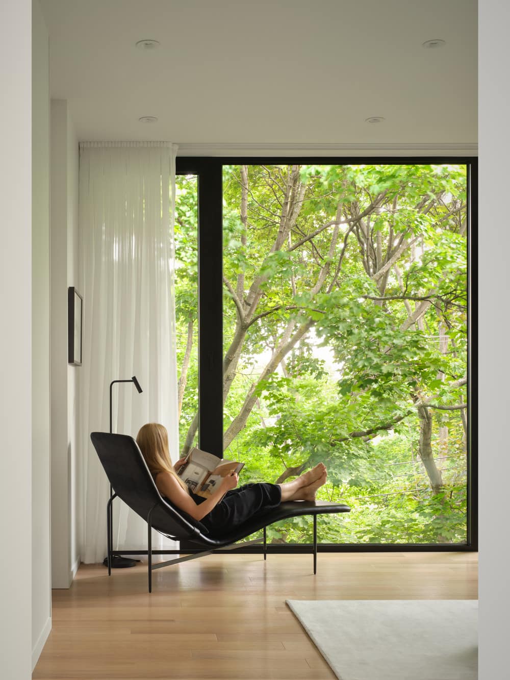
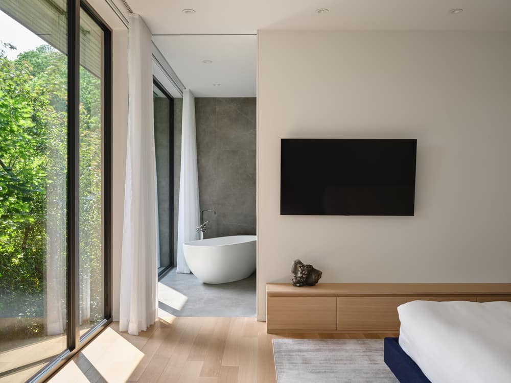
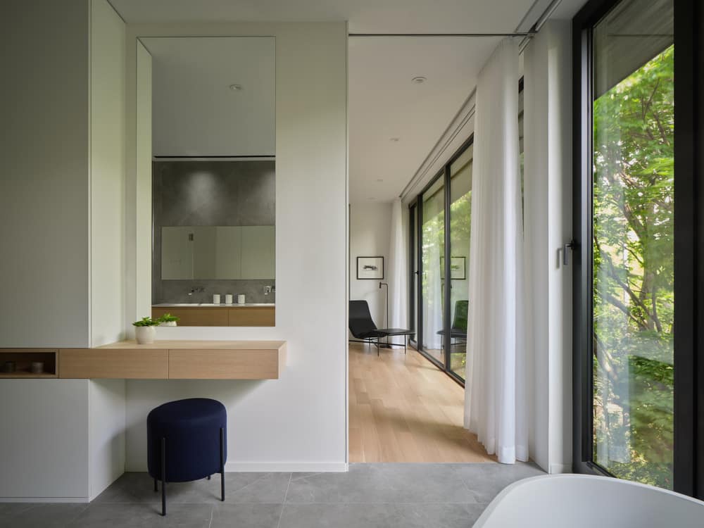
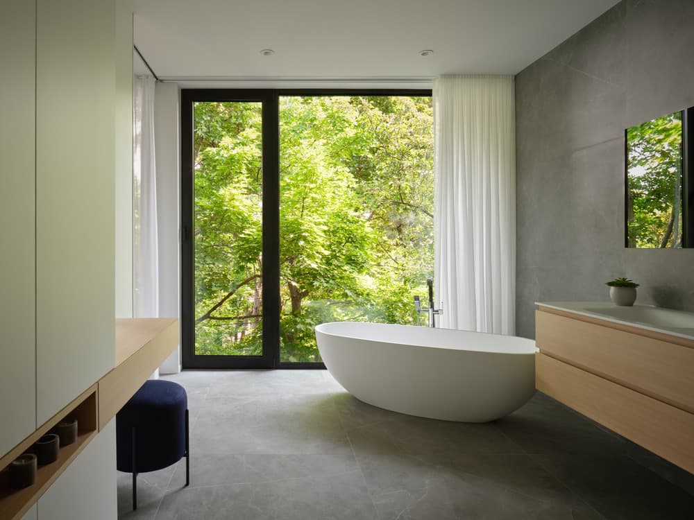
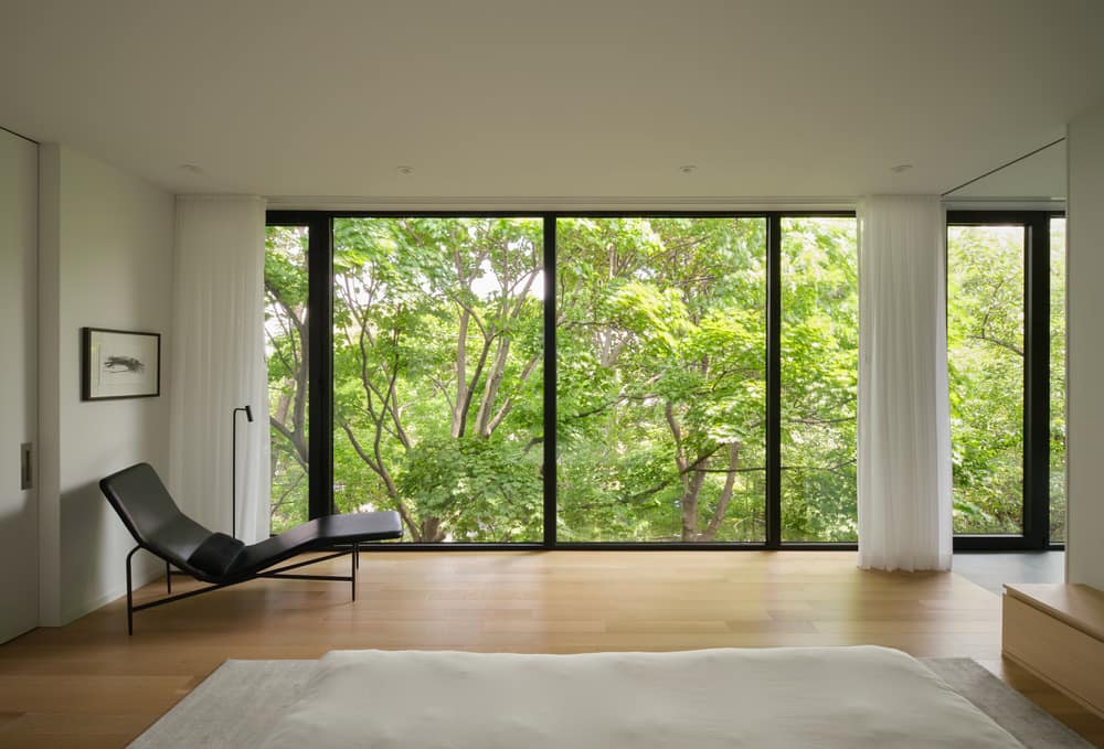
The more contemporary rear facade gains in volume, while also incorporating the idea of the ribbon developed during the first renovations. Like its counterpart in the left wing, it has large windows at canopy level. Upstairs, from the primary suite, the urban landscape is invisible, giving the owners the impression of living in a “tree house,” far from the hustle and bustle of the city.
The first floor of the new wing now houses bedrooms for the couple’s three teenagers. They enjoy more space than before and have two bathrooms, one for the two girls and one for the boy. A large, sliding door provides private access to “their wing, their apartments.”
Light as a guiding principle
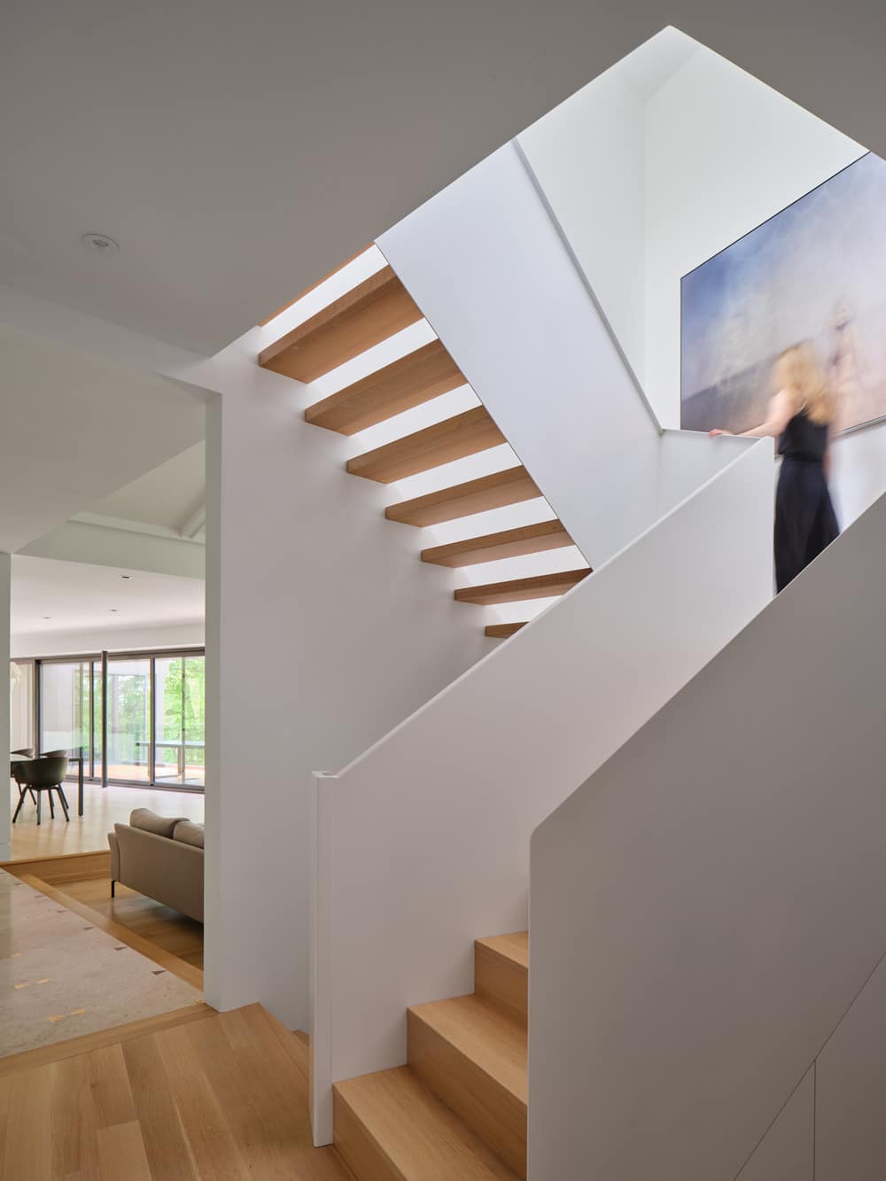
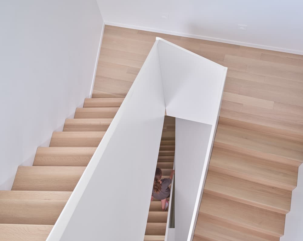
The expansion was also an opportunity to re-evaluate the vertical circulation in the house. The original staircase, which linked the central part of the house, the garden level, and the bedroom wing, was dark and narrow.
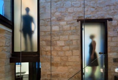
The new staircase now unfolds like a continuous ribbon of steel in a brighter space thanks to increased focus on light that permeates the first-floor openings. It is also notable for its open structure and slightly asymmetrical shape.
“Renovating is a way to make your home your own so that it resembles you and your interests,” says the owner, an architecture enthusiast. “The result still feels like an extended honeymoon. Walking up the stairs to my room is like entering a sanctuary. It’s a moment all my own.”
Awards
The Prince-Phillip House received three nominations at the 15th edition of the GRANDS PRIX DU DESIGN Awards, including two Gold certifications in the Private House and Special Awards / Architecture + Stairs categories, and a Silver certification in the Residential Building / Prestige House category.
