Project: Residence BONH
Architects: CAS Architecten
Location: Bonheiden, Antwerp, Belgium
Completed: 2020
Photo Credits: Tim Van de Velde
Architecture does not always have to be very complicated. A good design, respecting logic of location and orientation, can even be very simple. This light-footed villa proves that such honest architecture without bells or whistles, can nevertheless result in beautiful projects.
The client adhered a specific architecture and ended up – via various references – at CAS. The parcel they had acquired was big and specific. Admittedly, at the front at busy road, but at the back tranquility prevails. There the lot is about 100 meter long and at the end you can see grazing sheep in the meadow behind. The lot was completely overgrown, including also some beautiful mature trees that gave CAS the necessary breathing space. The location had even more trumps and these were optimally played by Pieter-Jan Leenknecht in his design.
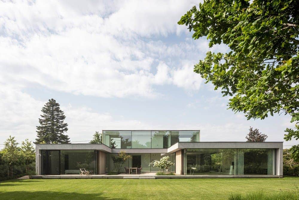
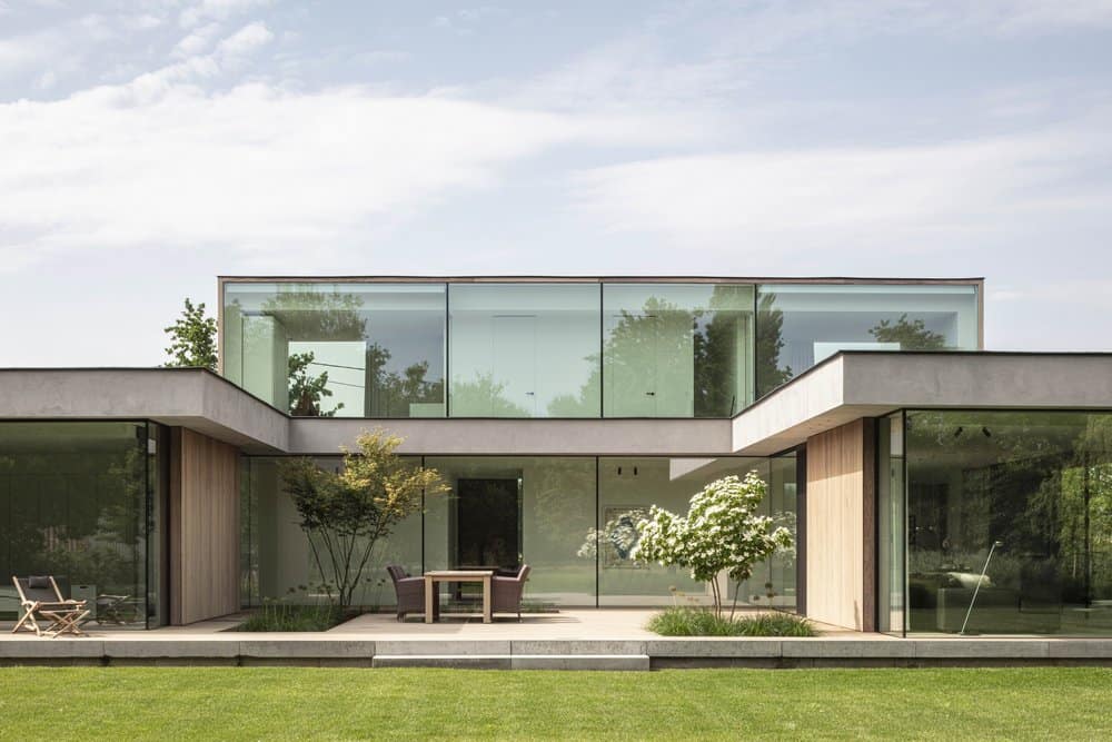
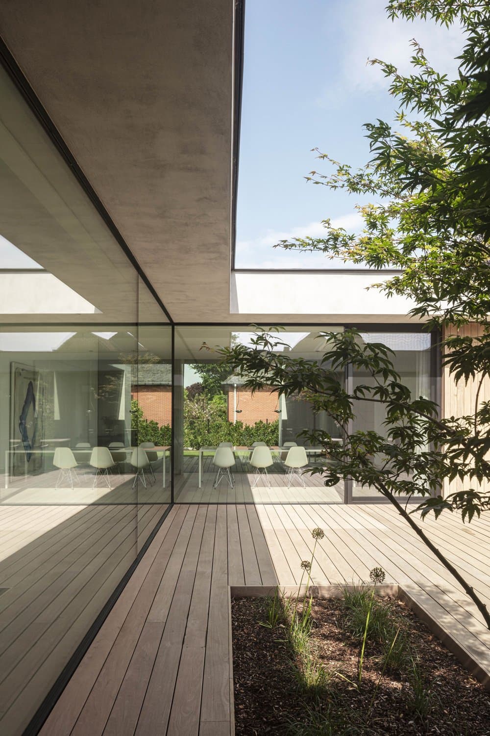
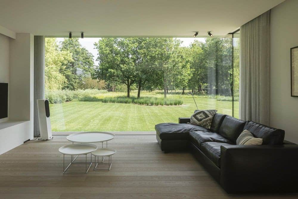
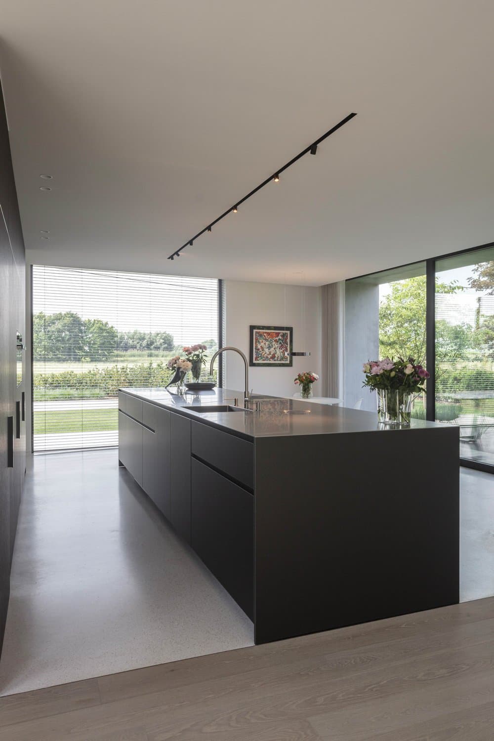
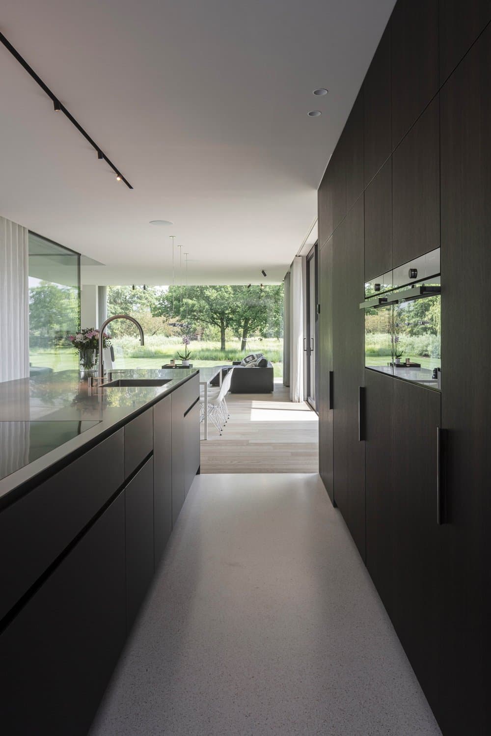
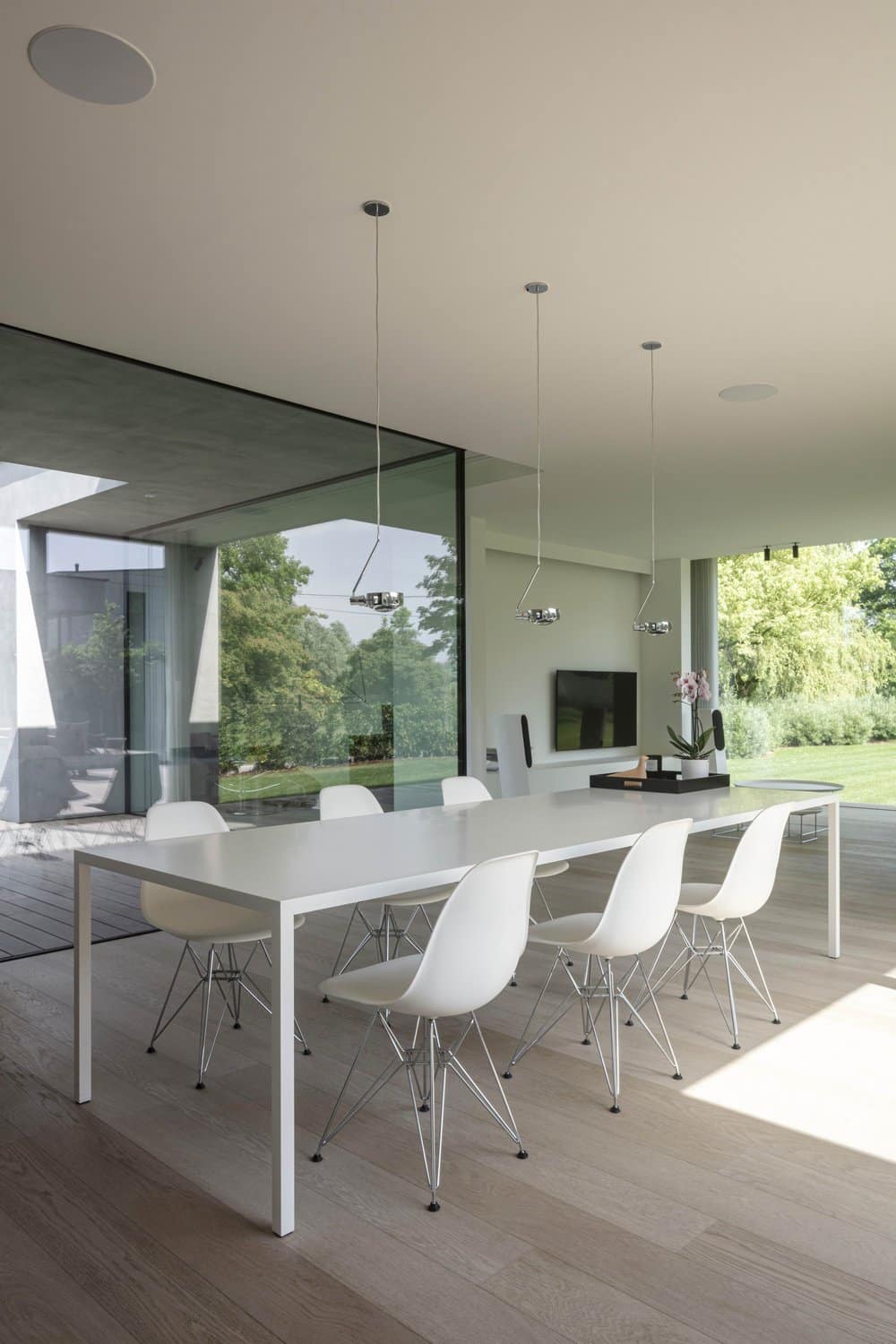
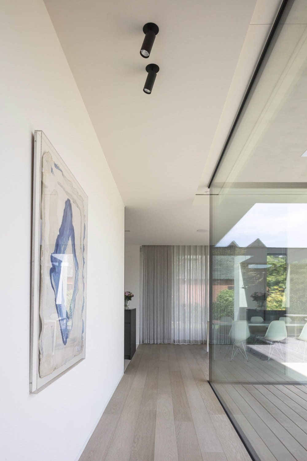
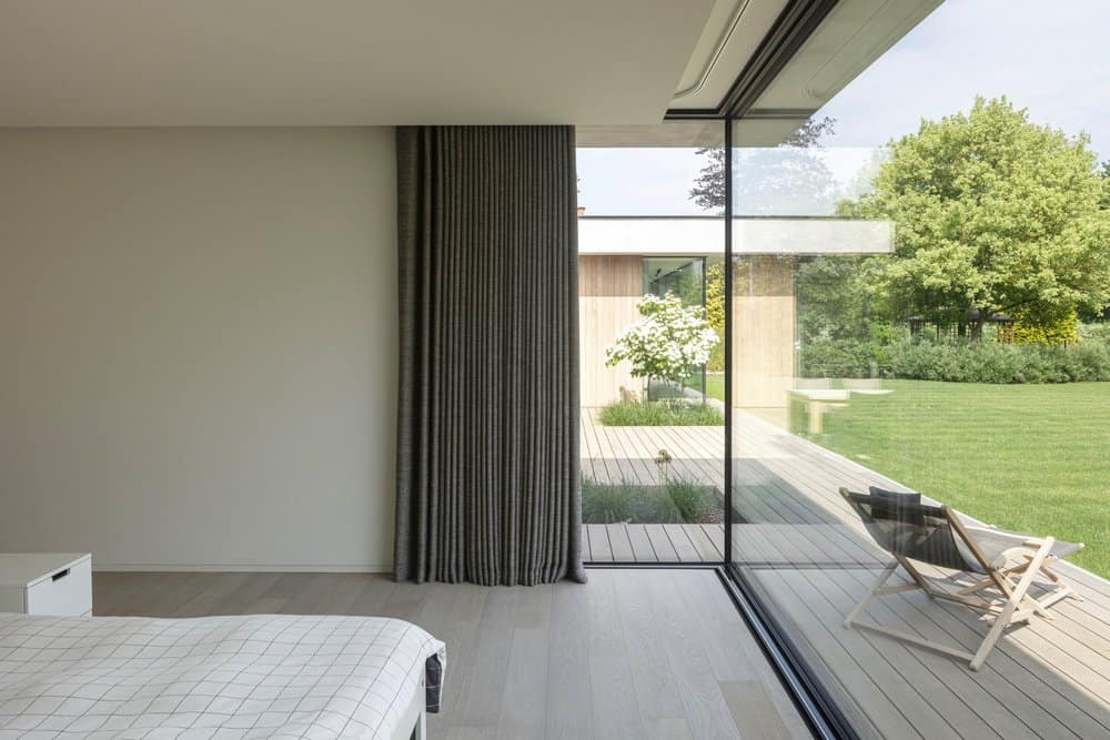
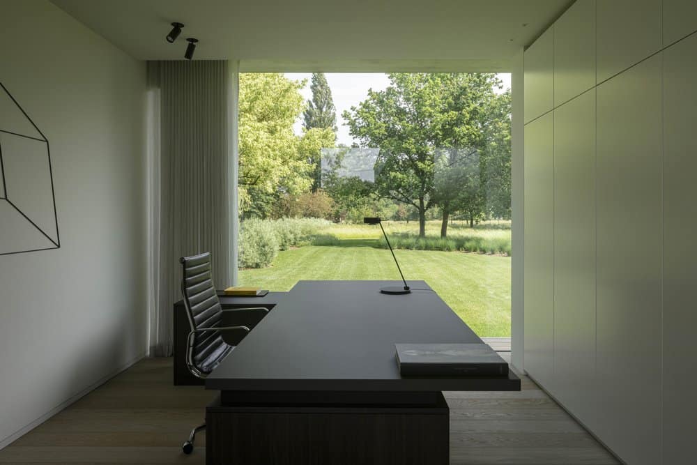
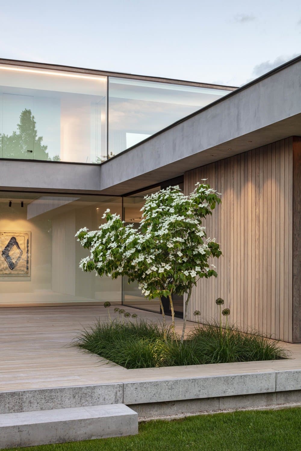
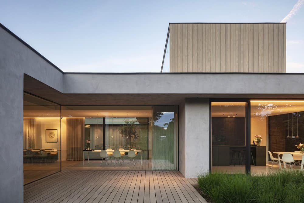
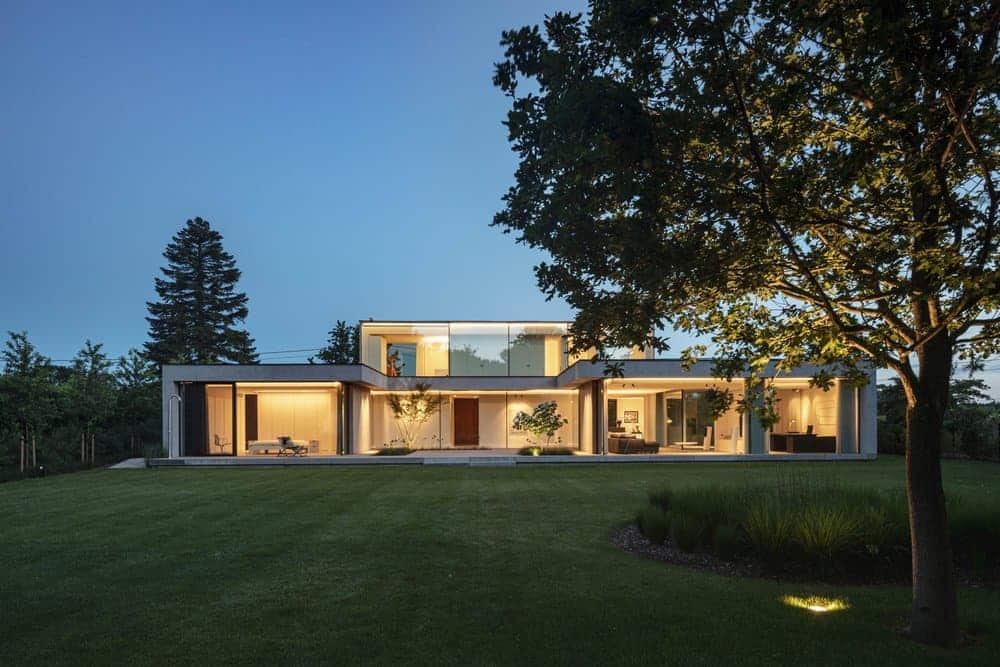
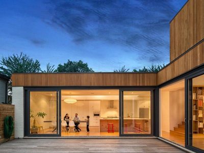
“Location determines a lot, if not everything. It goes without saying that this was the case here. By its specific north facing orientation, the open landscape at the back and the request of the client to be able to enjoy this to the most, a completely glazed rear façade was an opportunity we could not neglect. We opted for a u-shaped floor plan with an open terrace between living and sleeping area as a result. A practical corridor connects both functions, which, despite the courtyard garden, don’t interfere much. A few walls are strategically placed, so that from the living area you don’t see the sleeping area. In fact, the owners live for the greater part around the courtyard garden. This results everywhere – on the ground floor as well as on the upper floor where the children sleep – in beautiful views.”
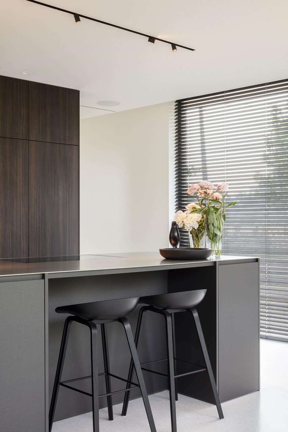
Although the front borders a pretty busy connecting road and the parcel makes a turnover there, it was for CAS no option to choose for a completely closed façade. On the contrary, next to the kitchen there is a cosy morning terrace, from where you can enjoy a nice view on the other side of street. CAS wanted to make the upper volume as light as possible through which the load distribution optimal yields.
The oblique line of the plot could be an external factor helping to define the design, but CAS stuck to their perfect u-shape, by which it slightly shifted with the upper volume right on top of it.
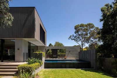
The light-footedness, as if it were a stacking of two volumes, is also reflected in the materiality. The supporting base of the ground floor is accentuated by a flat plaster with concrete look. The smaller volume on top of that was realised in wooden cabinetwork and cladding. However, the difference in materialization of the two volumes doesn’t seem hard of contrasting. After all, the plaster, carried out in a light grey colour, also has a warm tone by its ocher subsoil and the use of a special sweeping technique. In doing so, certain gradations appear which make the whole seem less flat and more natural. This, in combination with the big windows, results in a beautiful harmony.
In order to create more perception in the front garden, CAS decided to relocate the drive: not straight but via a meandering movement. A few terraces, deep in the back garden, bring atmosphere and in the evening, they offer a marvellous sight on their illuminated house.
“It is architecture without complexes, no need to argue. Except for the fine details and a good composition, it simply follows the logic of the location and orientation. For me, this is an example of honest architecture and a project in which our hobbyhorse – light, space, views… in a contemporary fashion – is beautifully expressed.”

