Project: Rocky House
Architects: Base Architecture
Lead Architects: Shawn Godwin, Chris Kolka
Builder: CGH Construction
Structural Engineer: Westera Partners
Area: 470 m²
Year: 2016
Location: Queensland, Australia
Photo Credits: Christopher Frederick Jones
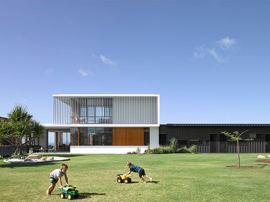
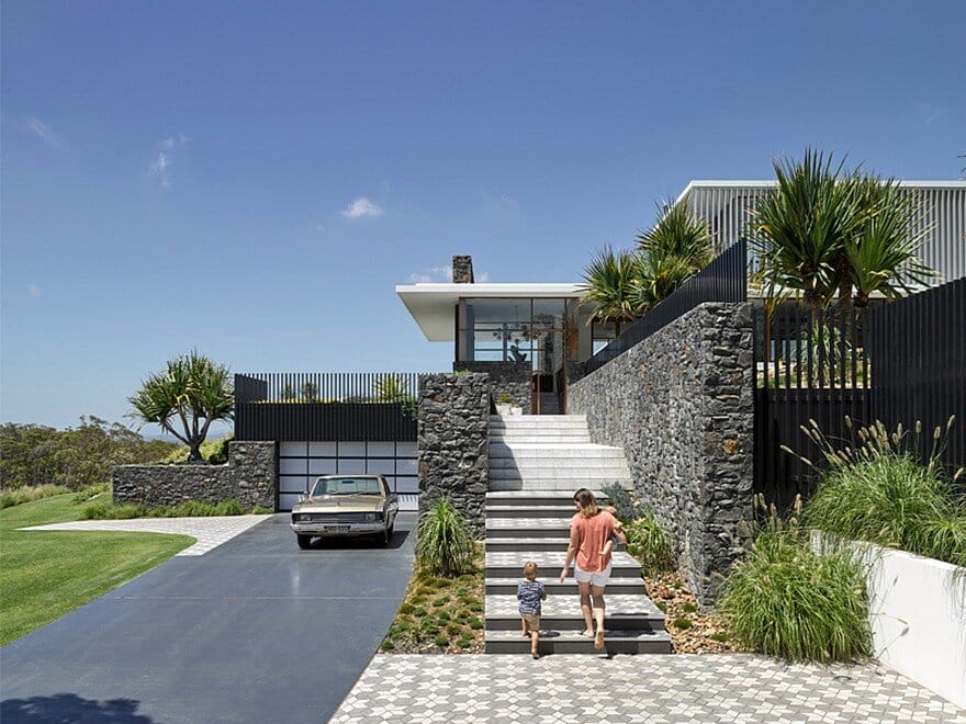
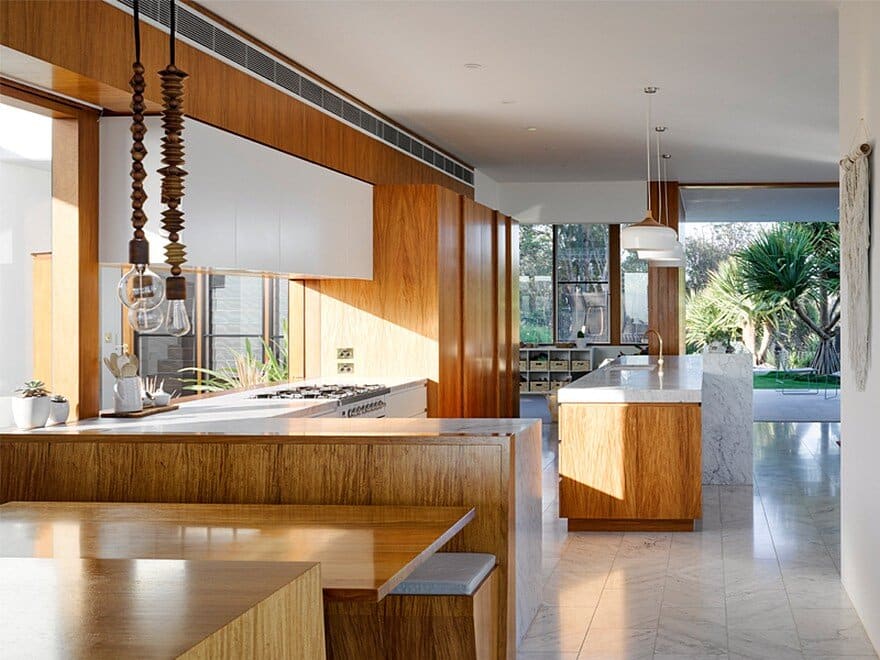
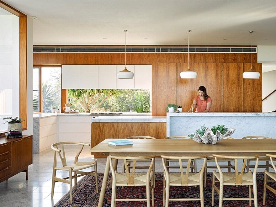
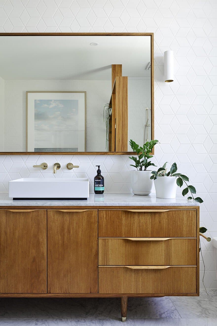
Rocky House represents the clients appreciation for clean simple designs, with a close connection to the landscape. Natural materials of quarried bluestone, cararra marble and rosewood represent a minimal palette that unifies all spaces throughout the house, providing a backdrop for unique experiences throughout the design.
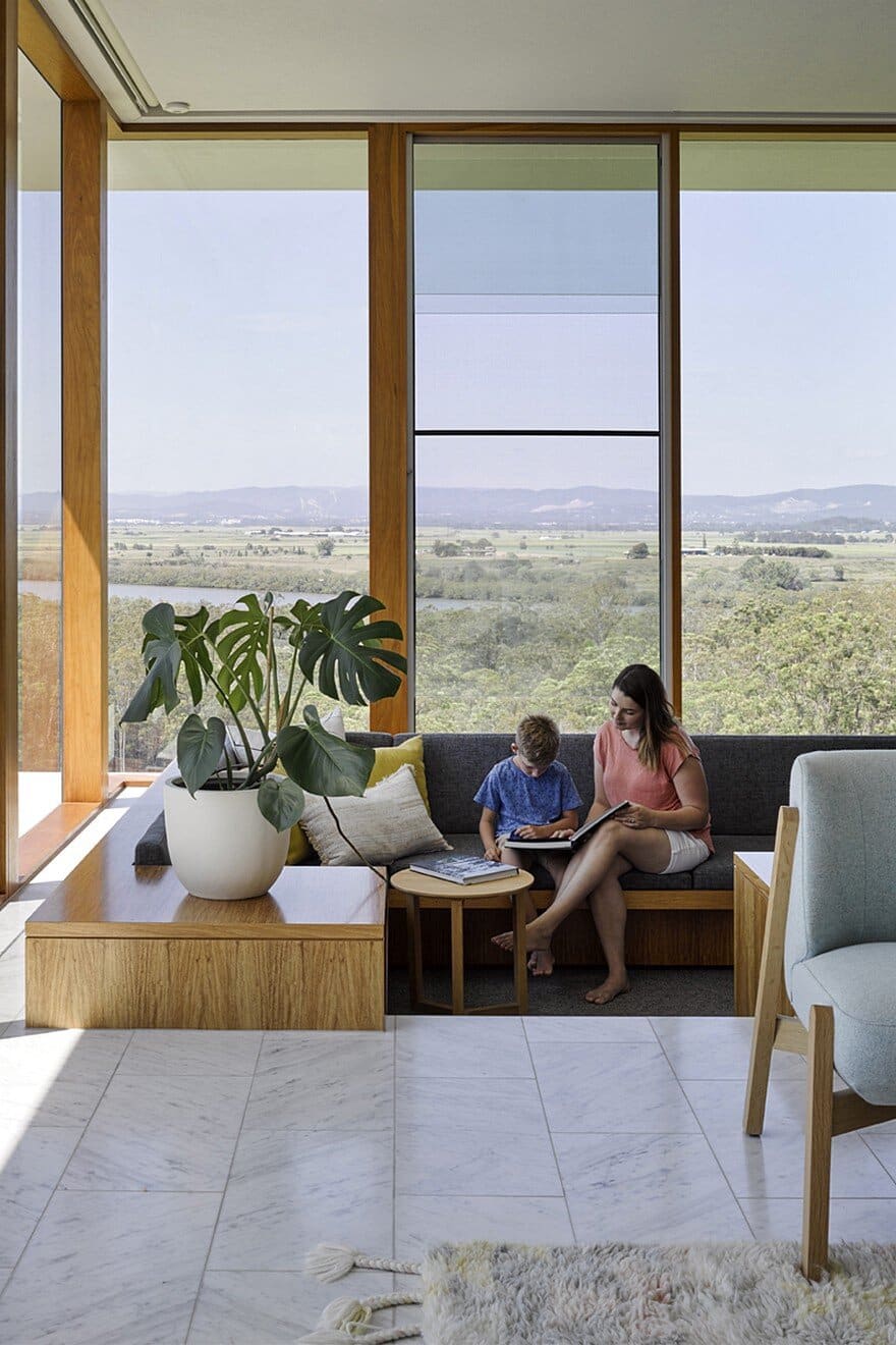
Initially the brief was for a unique family home that focused on a clean simple design, with a close connection to outdoor spaces. The desire was for a home that was bright and open, with generous rooms that naturally flowed into each other and into the landscape. This brief was predominantly communicated by the client through images of mid-century modernist buildings.
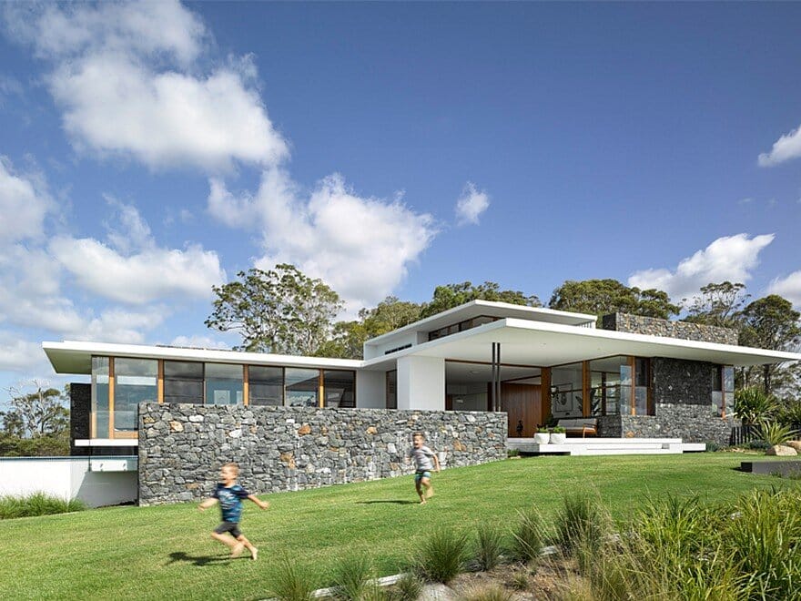
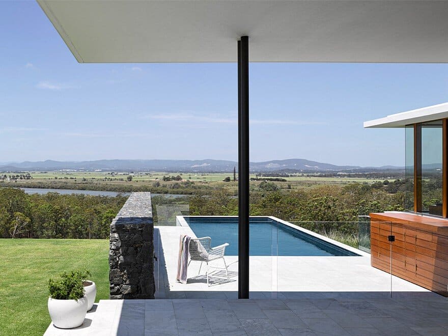
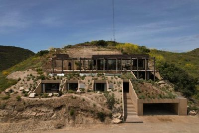
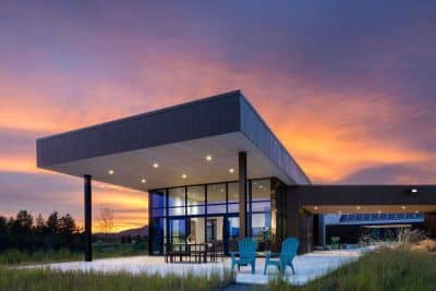
Perched on top of a hill exposed to some strong prevailing winds, an L-shaped plan pushes living spaces out to the extremities to sit within the view while bedrooms are flanked along the crest of the hill to shelter a northern courtyard. Given the expansive site and location of the house, each elevation needed to be understood as a having its own character without there being a 'back of house' to hide away. While there are so many longer vistas to take in around the site, there also needed to be key connections within the dwelling itself and to the immediate outdoor spaces.
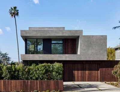
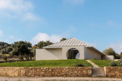
Monolithic bluestone spine walls rise up out of the ground, only to be intersected by floating concrete planes. All that separates the hovering plane and the Carrara marble clad floor are full height timber framed glazing which provides minimal delineation between inside and out, while white rendered walls fade into the background. The material palette is simple and consistent both inside and out. The only variation to this is the bedroom wing of the house, where the shift in colours, materials and even the openness of the design is a cue to the change in the level of privacy inside.
The home was always considered as a long term family home, which dictated several planning considerations. For the current family with young children, the bedrooms are all on one level. As the family matures, the parents will be able to retreat upstairs, leaving a guest bedroom with two way ensuite for future flexibility. A rumpus space for the kids will also evolve soon into a space for home schooling. Due to the client being heavily involved in a booming business it also needed to have the functionality of a home office without that space feeling like it takes anything away from the feeling of a family home. The response to this was to sneak a study behind a heavy stone door, so visitors are hidden from this dual purpose.

