Project: Sand Dune Sanctuary
Architects: Hindley & Co – Architecture | Interior Design
Landscape Designer: Fiona Brockhoff Design
Location: Melbourne, Australia
Project size: 400 m2
Completion date: 2019
Photo Credits: Tatjana Plitt
Text and photos – Courtesy of Hindley & Co
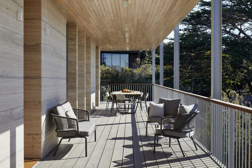
Our Clients came to us with a book of midcentury classics, in which, much to our delight, they had earmarked a photograph of the deep verandah of the Farnsworth House by Mies Van de Rohe, which, along with the qualities of the location and site, gave us our starting point.
We gently referenced the modernity of Mies, Neutra, Seidler and Utzon to place this Sorrento project, like its worldly owners, in an international context of design awareness.
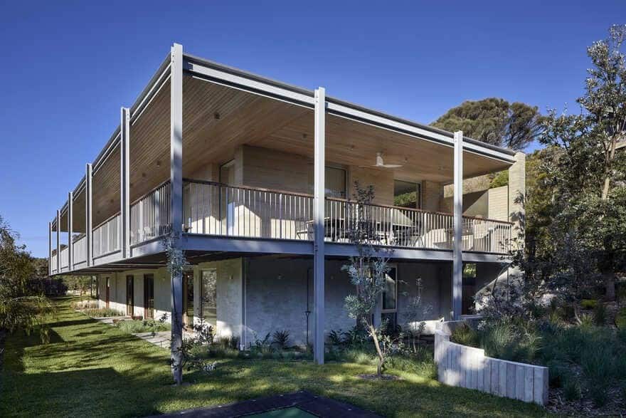
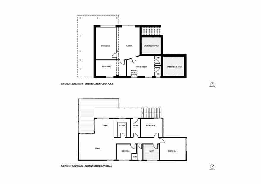
A Seidleresque ramp leads to a luxurious self-contained upper floor for easier future access, whilst the lower ground floor houses the new laundry and quarters specifically for guests. Underfloor space was reclaimed to create a man cave and occasional storage for a special car.
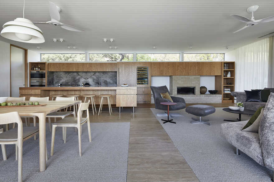
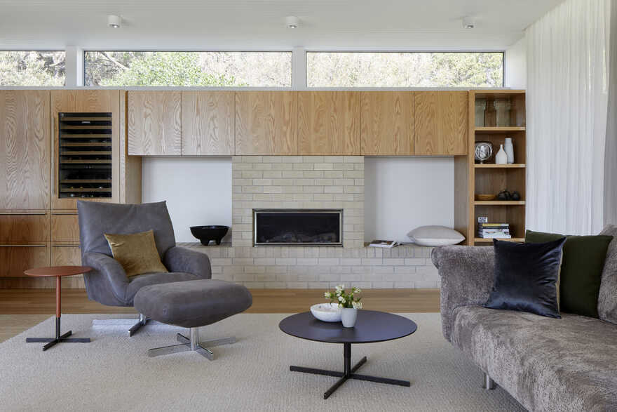
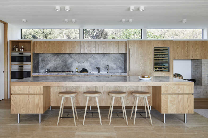
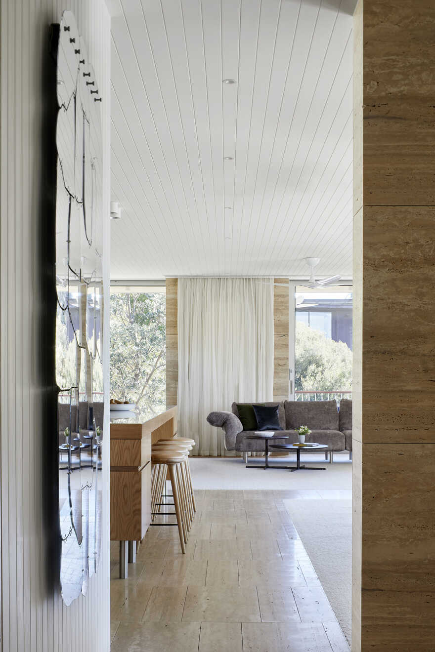
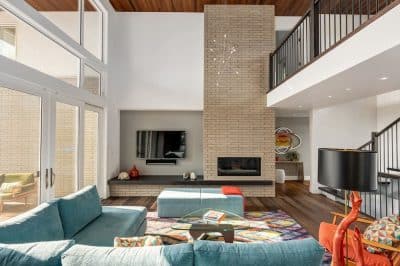
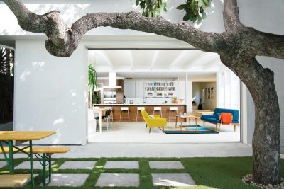
The arrangement of the family, kitchen and dining space is designed to be social, true to the modernist ethos. The open plan living, walls of custom joinery, fireplace, high overhead windows, and floor to ceiling glass sliders all pay respect to successful and appropriate techniques of modernity. Almost architectural natural linen sheer curtains and Japanese style sliding screens give control over privacy, light and views.
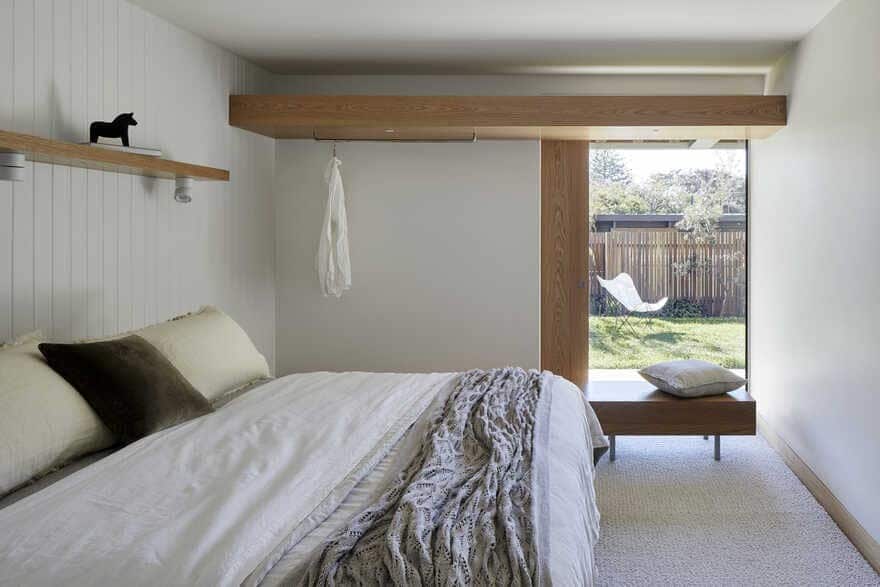
Joinery is multi-functional and spaces are flexible in function and level of privacy.
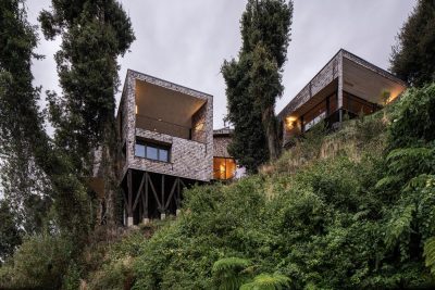
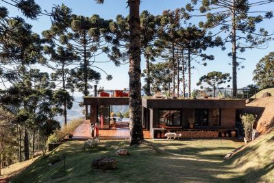
Mies van der Rohe’s Farnsworth House and Barcelona Pavilion provided ample inspiration for our clients in the early design phase, and we have referenced key details from this Modernist classic in the project’s deep, cantilevered verandah. The double storey form achieves the illusion of a single-storey home when viewed from the street. This is just one of the many “less is more” features we were keen to highlight when choosing mid-century influences for this home.
How is the Sand Dune Sanctuary project unique?
The innovative aspects are the deft use of contrasting techniques and materials, the seamless interior design and architecture, and the flexibility and future proofing of the spaces.
Sophisticated, yet relaxed, beachy
Simple, but educated and highly referenced
Contemporary, yet modernist
Australian, yet European
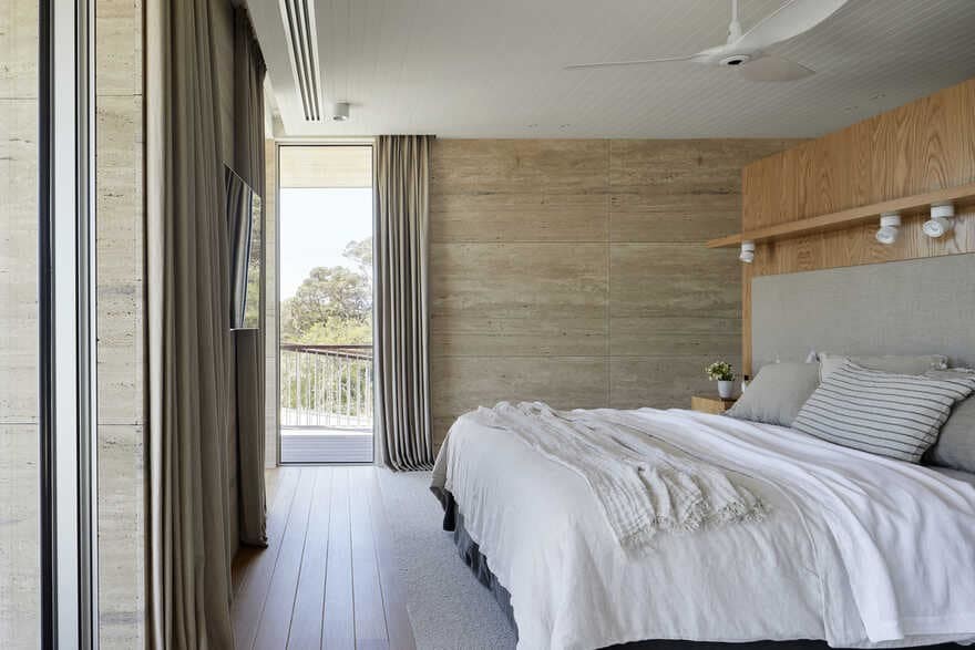
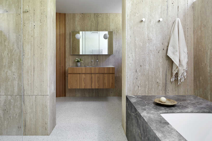
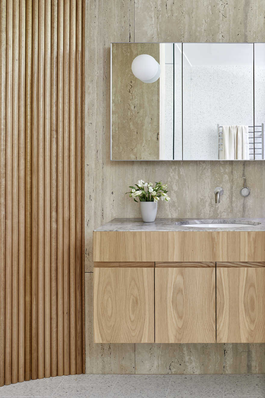
Italian stone contrasted with local Victorian beige bricks, Tasmanian oak flooring, terrazzo tiles
Fully recessed sliders allow Master bedroom and Bedroom 2 to change form and function
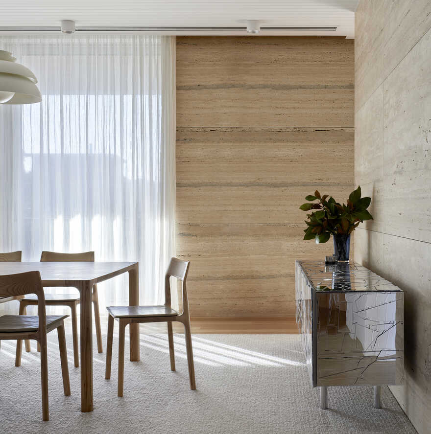
Curtains behave architecturally – light, views, privacy
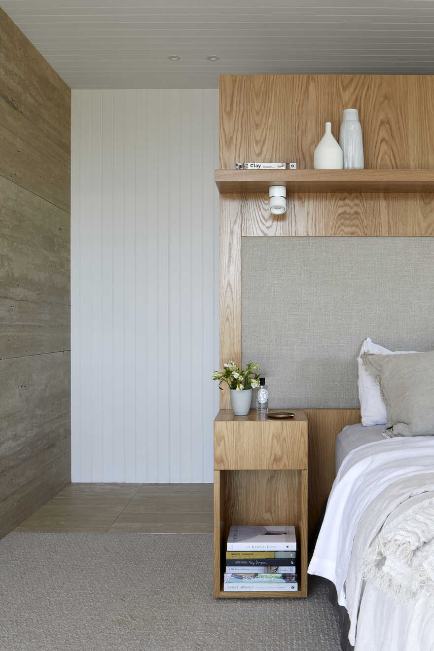
Very little loose furniture is required. eg the master bedhead, the joinery is the architecture
Use of mirrors at the end of corridors
What are the sustainability features?
Classic design and high quality materials will provide longevity. The original slabs and masonry were incorporated into the new design, and toxic asbestos removed. Solar cells cover the north facing roof and wiring for future batteries is provided. Structural steel, masonry and Australian hardwoods were required to protect the house from bushfire attack. under BAL29. Deep verandahs, thermal mass, double glazing and energy efficient lighting and appliances were used.


