Project: Sant Antoni Apartment Complete Rehabilitation
Architects: Colombo and Serboli Architecture (CaSA)
Team: Andrea Serboli, Matteo Colombo
Location: Barcelona, Spain
Area: 50m2
Year 2017
Photography: Roberto Ruiz
Courtesy of Colombo and Serboli Architecture
The Commission:
This small apartment is located on a top floor in hip Sant Antoni neighborhood, Barcelona. The brief was to take the empty, irregular floor plan (demolitions had already been carried out) and transform it into the perfect home for a young professional Italian woman. The client’s wishes were an open-plan day area, a clean-lines project, loads of light, a big kitchen unit, one double bedroom that could be minimal and a bathroom, as big as possible, with natural light and ventilation, serving the bedroom but open to guests. The Sant Antoni apartment had to provide plenty of storage in order to keep the spaces tidy, be very practical, while contemporary and cozy.
Floorplan
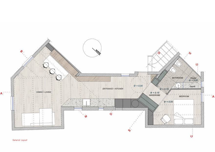
The floor plan is a narrow central body with two peak-shaped spaces at each end, an awkwardly shaped property. A lot of thinking had to go into ways of providing space for everything. The entrance and corridor-like central space was clearly to be used as a linear kitchen space. The wider area overlooking the street, with the two balcony windows facing south was to become an open dining and living area. More complicated was to define the use and layout of bathroom, bedroom, and storage area, wedged tightly and strangely between entrance and the back of the property.
The architects’ aim was to create spaces that felt as wide and comfortable as possible, dissimulating the reduced dimensions of the Sant Antoni apartment. For these reasons they chose to work with a concept that enhances the diagonal lines of the apartment’s contour, not working against them but seconding the shape of the walls, slicing portions at an angle to amplify the feeling of width. Architects first defined different intersecting areas based on these diagonal lines, creating two wedge shaped volumes with different functions, covered in a rugged paste, then carving voids within them and filling the remaining spaces with colors. For these areas, they opted for a neutral palette of muted, undertone colors (a wine red in the entrance, a sage grey for wardrobe and bathroom an ash pink for the dining table niche), playing with different textures, seeking an atmosphere that softens the light.
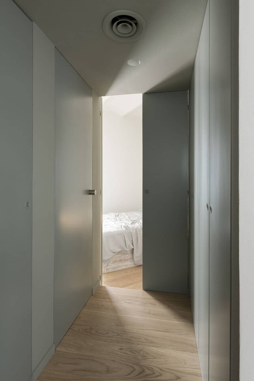
The chosen layout creates a filter between entrance and the private night-area: a rough-textured volume, with a cut-through, sage color-block passage. This two-sided walk-through wardrobe has room enough for all the client’s clothes, shoes and accessories and also conceals the bathroom access. A tactile, coarse, ivory-colored paste covers the outside of the bathroom and wardrobe block, as well as the other angle-cut volume around dining and kitchen, helping defining subtly those two concept-generating blocks. The same coating (an effective thermal and acoustic insulation system by Weber) covers all the Catalan vaults of the ceiling, keeping the heat and noises of the rooftop from passing into the apartment, softening the light, and covers tactilely some of the bespoke furniture.
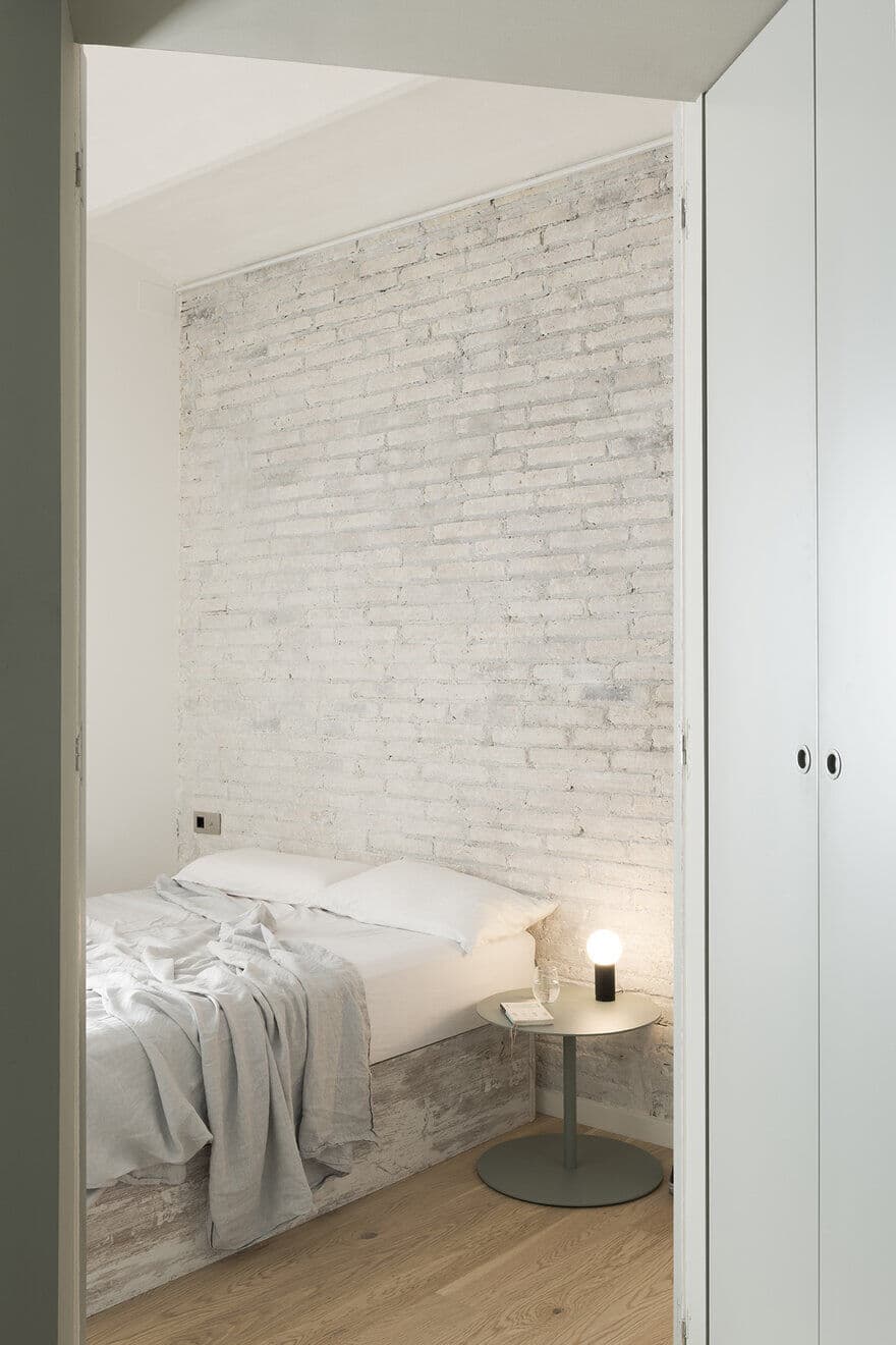
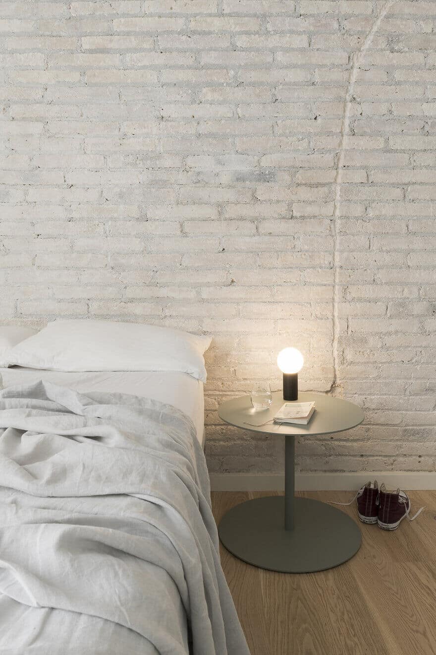
The bedroom is entered through double doors, lacquered on one side with the same sage color, but rough as the wall on the other. A very simple and quiet space by client’s will, with textured walls: the inner side of the block and the brick wall that has been exposed and layered with a semi transparent whitish paint. The upper part of the bathroom and wardrobe volume disguises doors (in dark grey) giving access to a storage mezzanine as well as the air conditioning ducts and machines.
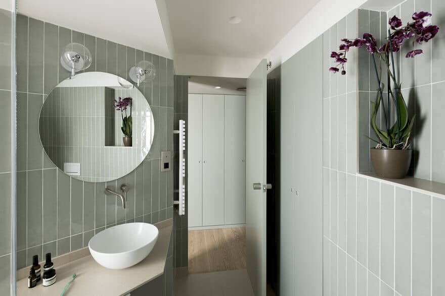
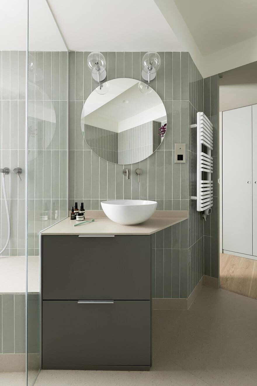
The bathroom is lined with vertical tiles, in the same sage grey/green color as the wardrobe and it’s designed to take advantage of irregularities. It features a wide, prism-shaped shower complete with a built-in seat, whose transparent glass let the light in the restroom. All furniture is bespoke, including the wall closet lacquered in the same color as the rest of the bathroom. Floors and the angle shaped counter are made in thin, large-format porcelain in a cream color, micro-textured. Two globe lamps, especially finished in brushed nickel are placed on each side of the circular mirror.
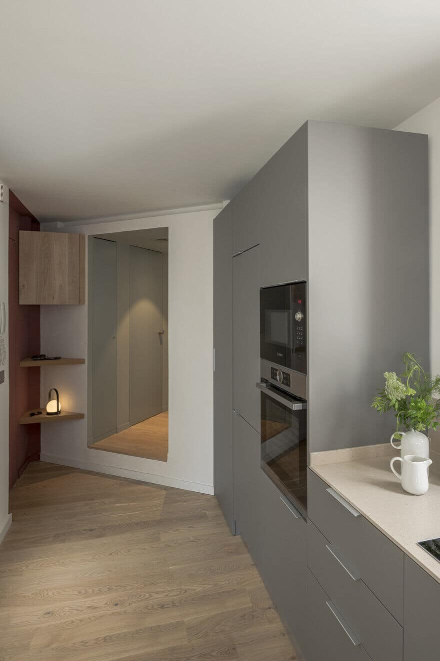
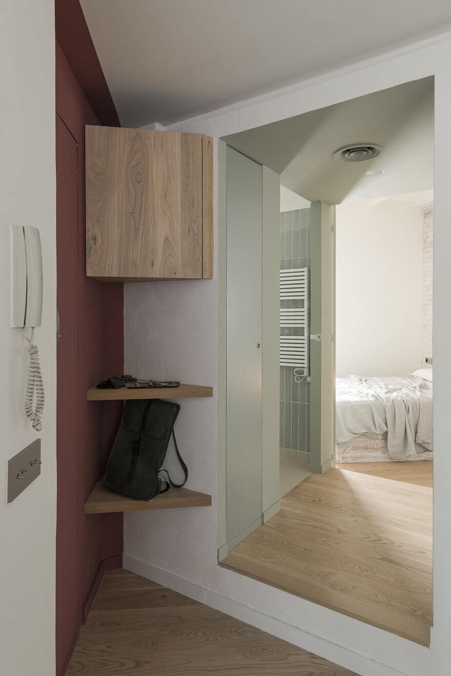
Passed the old entry door, the entrance’s recess area is defined by a dark red. Three bespoke oak elements, a box hiding the electric meter and two shelves designed for keys and accessories, are wedged in the acute angle between the door and the wardrobe block.
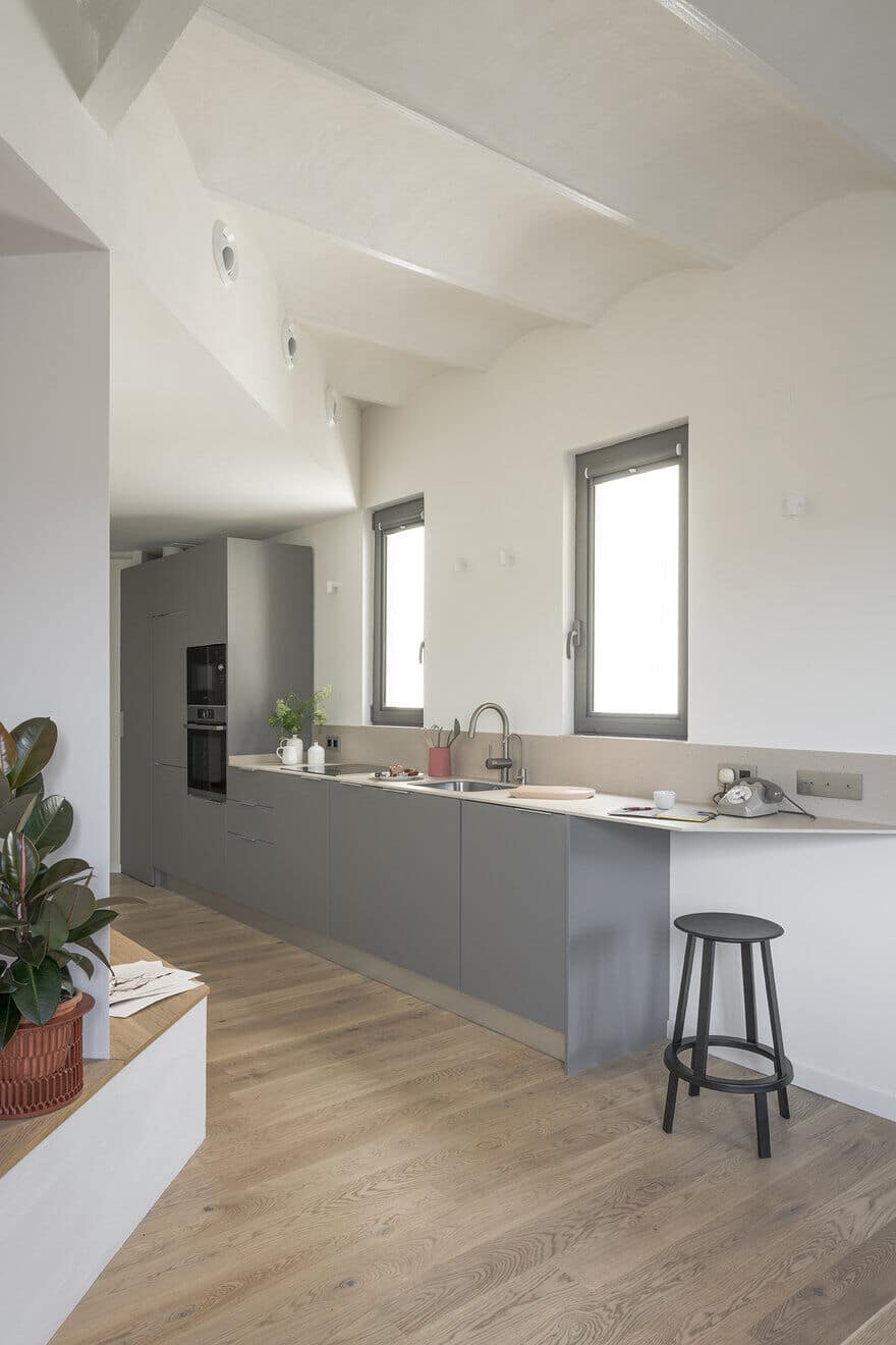
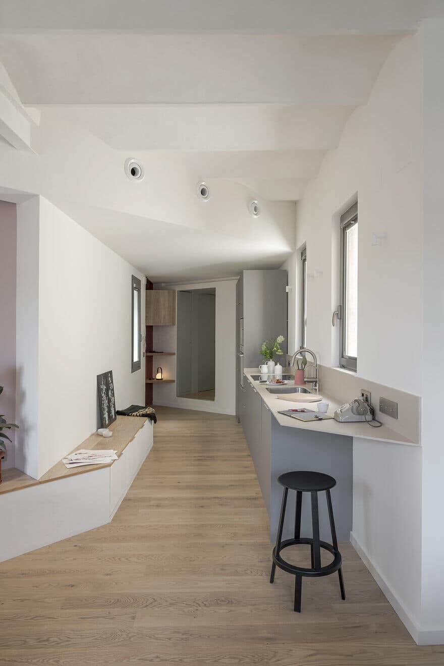
The kitchen was thought to be capacious and its counter is higher then standard measures, to make it comfortable for the tall resident. For the same reason, oven and microwave have been incorporated into the higher cabinets, rather then under the hobs. All appliances (washing machine, dishwasher, fridge) are concealed behind the warm grey panels. The counter (in the same porcelain material used in bathroom floors and counter) ends with a small floating area, cut at an angle, to fulfill the client’s desire to have a small breakfast peninsula. Its porcelain rises to create a backsplash, cladding the windowsills. To light the worktop, four Micro Scoop directional wall lamps, with textured white finish.
The kitchen’s linear development was bound by the long and narrow space, but the bespoke units opposed to the kitchen cabinets also host part of the kitchen goods and materials. A number of deep drawers is hidden within his low, bench-like furniture, clad in rough paste and topped in the same oak as the floors.
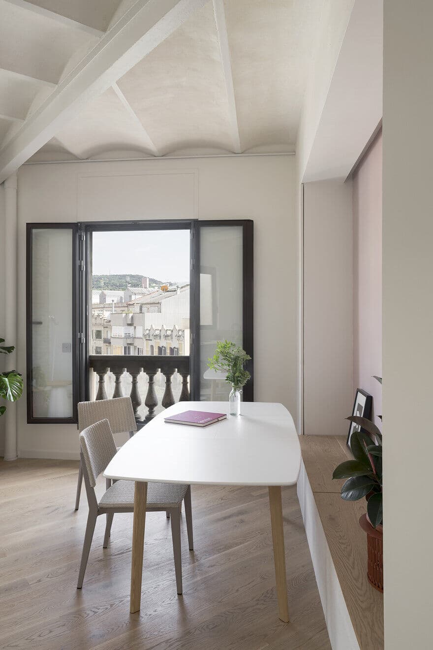
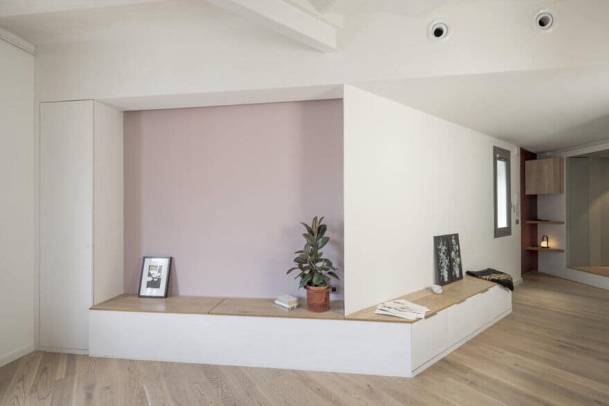
The samelow cabinet turns into a bench that serves the table, once bent the corner to the dining area. This seat also doubles as storage, thanks to its tilting, trunk-like oak top. The dining zone is defined by the muted pink painted niche, and lit by a LED light line concealed above it. This recess is carved within an oblique plane that reaches the kitchen at its other end, holds the air-conditioned diffusers, all covered in textured paste.
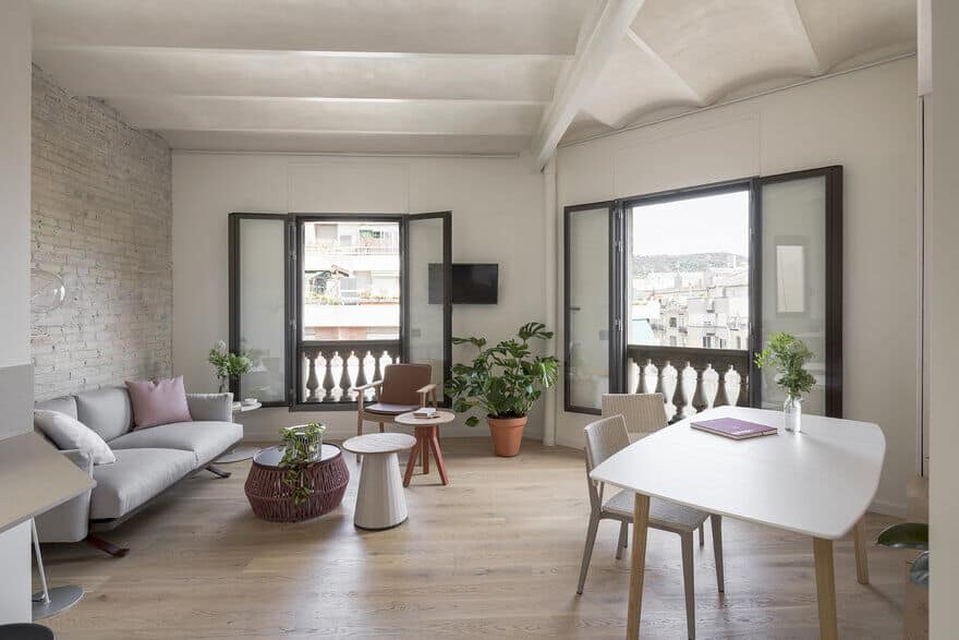
The two big outdoor window openings of theliving room were recovered, its windows renewed like all the others in the apartment. All of the apartment’s windows are equipped with Foscurit fabric roller blinds, except these two who have roller shutters.
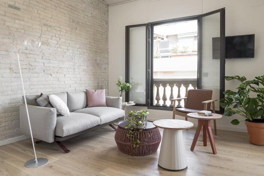
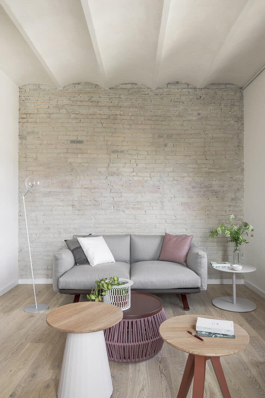
The original brick wall behind the sitting area was first retrieved, and then mitigated through a whitish paint (the same process used on the bed head wall).
A line of indirect LED lights runs above the outer wall.
The living room is furnished with pieces by Kettal: The Riva armchair was picked for the beautiful, natural texture of its solid teak planks and for the tan leather cushions; The Boma sofa matches the subtle color tones of the spaces with its mink colored fabric and its angled, dark red legs; A group of side tables livens up the center of the living room with pieces by collections like Zigzag, Vieques, Cala and Object, and Mesh planters.
An Atom floor lamp by Aromas, especially finished in brushed nickel, is placed on the side of the sofa.
The dining area features an extendible Cream Table by Calligaris and woven wicker chairs Riba by Triconfort
A black and white geometric artwork by artist Rodrigo Schiavoni is on the bench.
A black Revolver stool by Hay completes the kitchen counter.
In the entrance, on one of the bespoke shelves, a Carrie LED portable lamp by Menu.

