Project: Suite for ten – Flat in Barcelona’s Eixample
Designers: Egue y Seta
Collaborators: Daniel Pérez, Felipe Araujo, Gaia Trotta, Szymon Keller y Covadonga Díaz
Styling: Egue y Seta in collaboration with Camila and Mariana Lellis
Technical architect: Pere Roig Casanovas
Location: Eixample, Barcelona, Spain
Area: 172m2
Photographer: Vicugo Foto
“Suite for ten” project was completed in 2016 by Spanish studio Egue y Seta.
There are those who travel to escape and those who do it to meet again. Those who gather with family for vacation thousands of kilometers away from home and those who like to host even when in a foreign country. For customers like them we have created ” Suite for ten ” a privately owned residence designed to accommodate a family of ten used to vacation ” in style” , combining the comfort of the best “urban chic” hotels with the flexibility of one´s own home. It is finally time to say goodbye to suppletory beds and undercounter fridges!
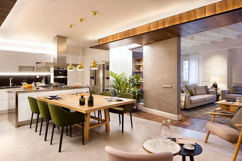
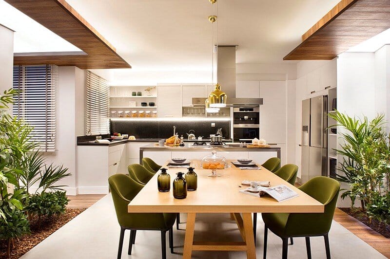
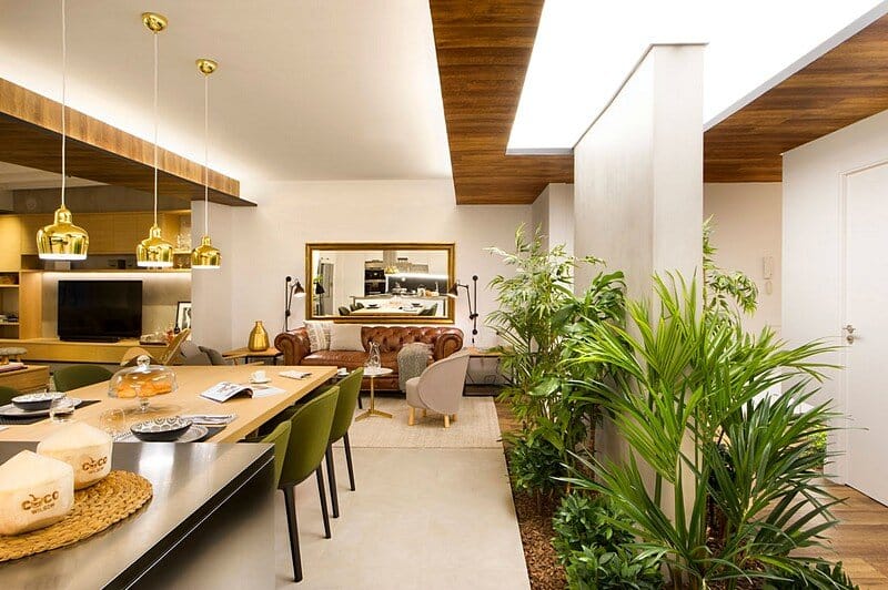
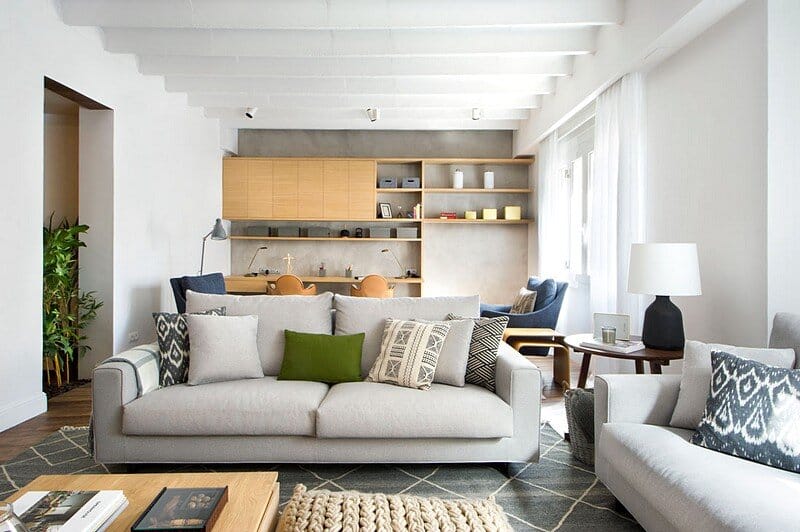
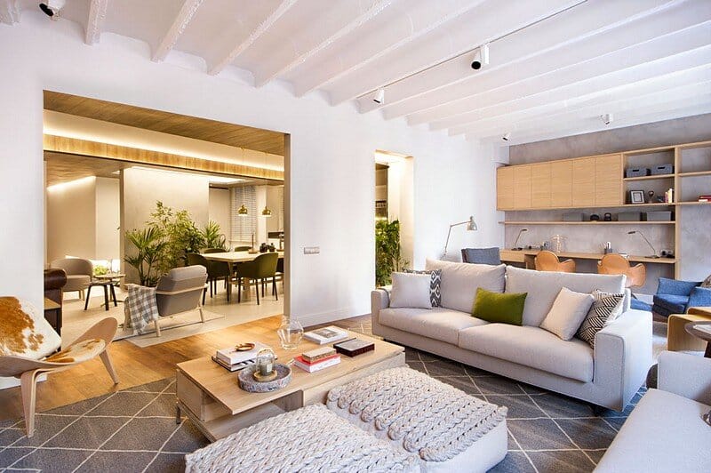
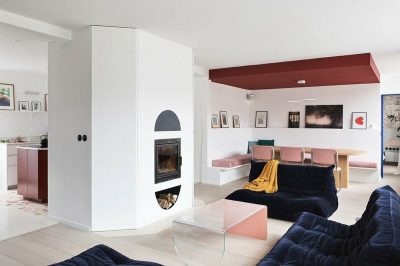
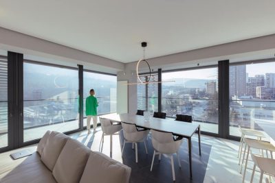
This flat in Barcelona’s Eixample neighbourhood can get accommodate up to ten without requiring a single sleeping bag; other ten can eat at a time, and if we´re talking about mere snacks and humorous chat, then another ten are more than welcome. Its broad social area organized into three contiguous living areas annexed to a large open kitchen well allows such density while promoting distended sharing.
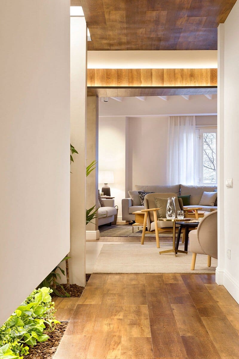
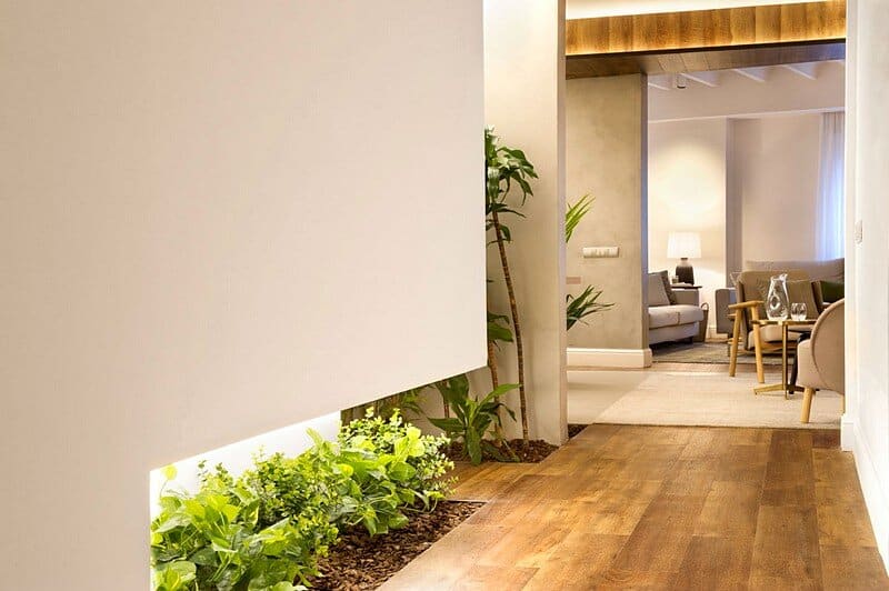
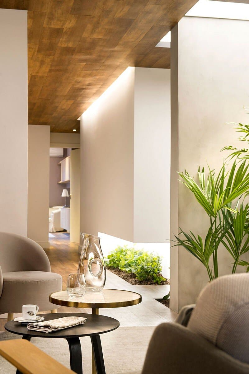
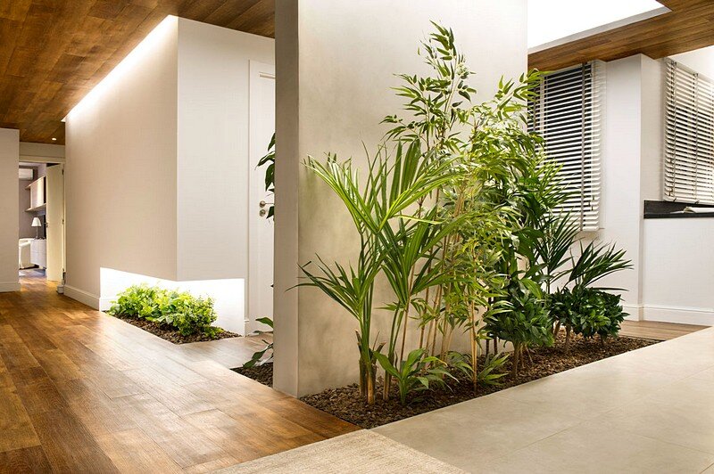
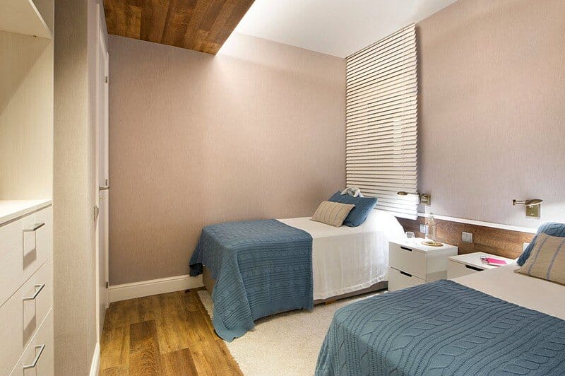
Meanwhile, in its more private half, are three “en suite” bedrooms each with their own walk-in closet bathroom to which we access through an entrance hall that stands (again) as the “green” oasis in the very heart of this family suite which reconciles seemingly opposites: elegance and practicality; neutrality and distinct personality; the indoors and the outdoors; and the metallic sheen with the freshness of vegetation. All under an interior scheme that aims to bring light where there is little, amplitude where it is scarce, to communicate the previously disjointed and, above all, to provide comfort.
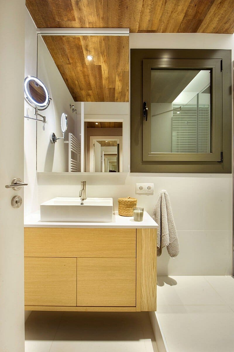
Comfort is key, both in hotel rooms and in this multiple suite. However, what perhaps distinguishes more the later from the first is its actual storage capacity: generous dressing rooms flanked by cabinets made in textile laminates while visually connected to their respective spacious bathrooms cladded in a sober combination of ceramic finishes and porcelain sanitary ware in the whitest of porcelains; concrete effect micro-cement, glass partitions, polished mirrors over wooden vanity tops.
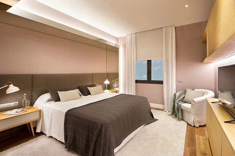
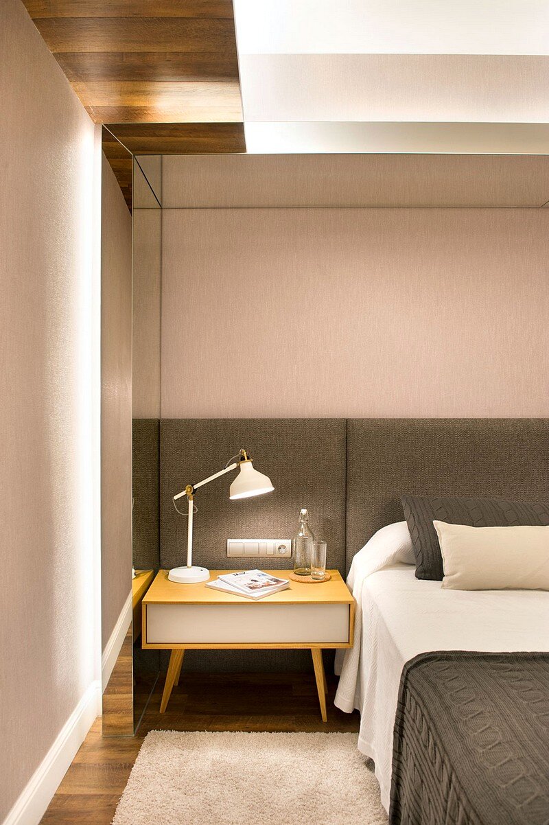
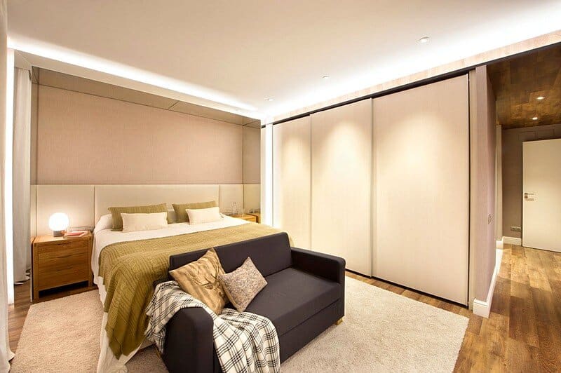
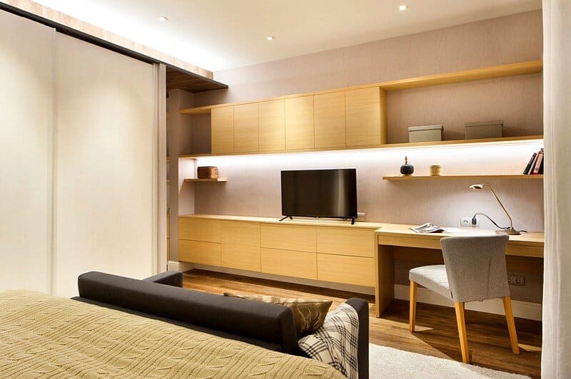
Once clean and half-dressed we go to bed but before we read, the last four pages of a book, the back of our head resting against a fabric headboard framed in a backlit threshold mirror that manages to blur the edges of the room. Meanwhile our partner, sitting on the couch at the foot of the bed, watches the TV embedded in a thin wall cabinet made of oak that offers extra storage capacity. Because as you may well know: light traveling implies the possibility to store at destination, and when such destination is recurrent and shared by many, access to our own stuff becomes a necessary and enjoyable luxury.
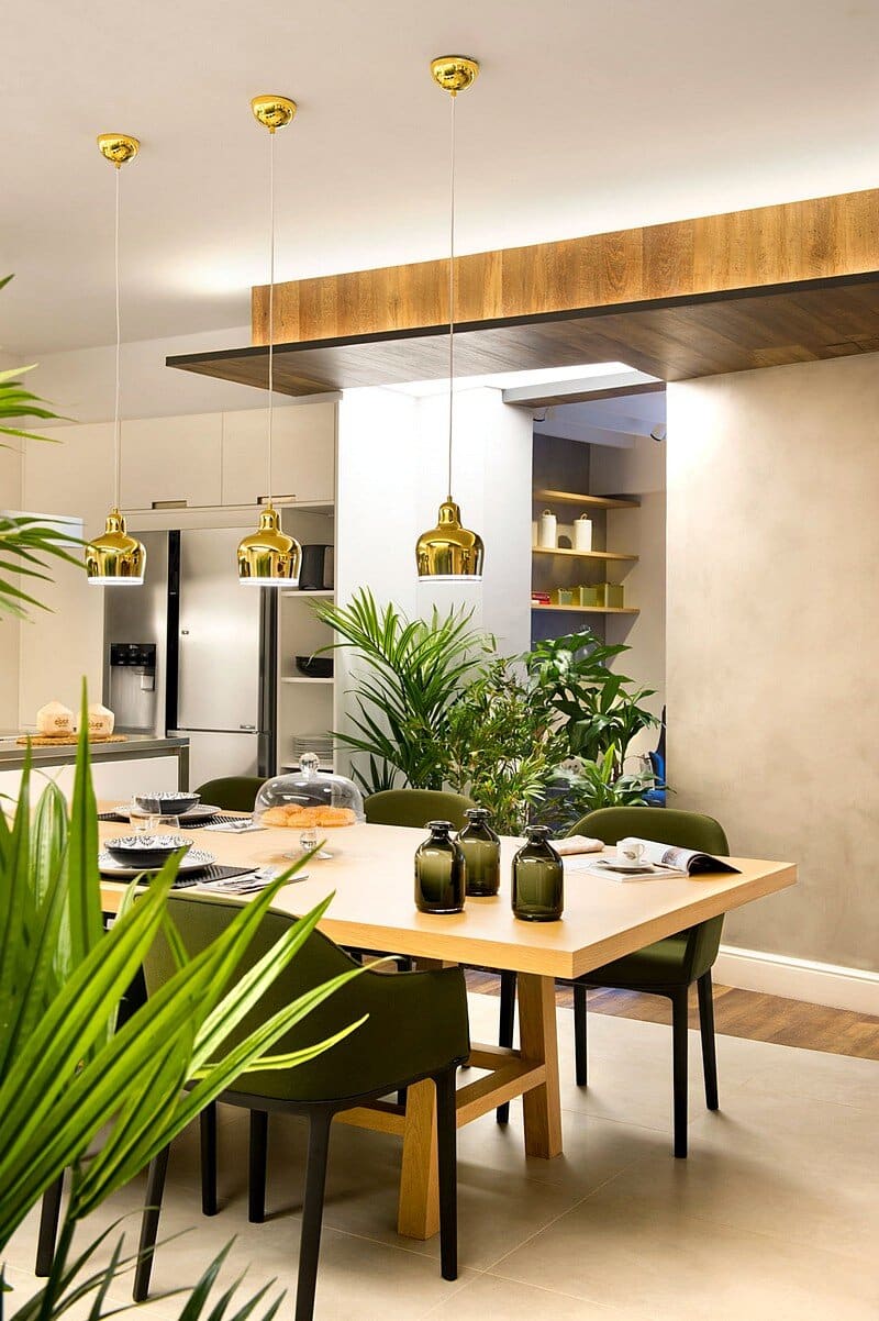
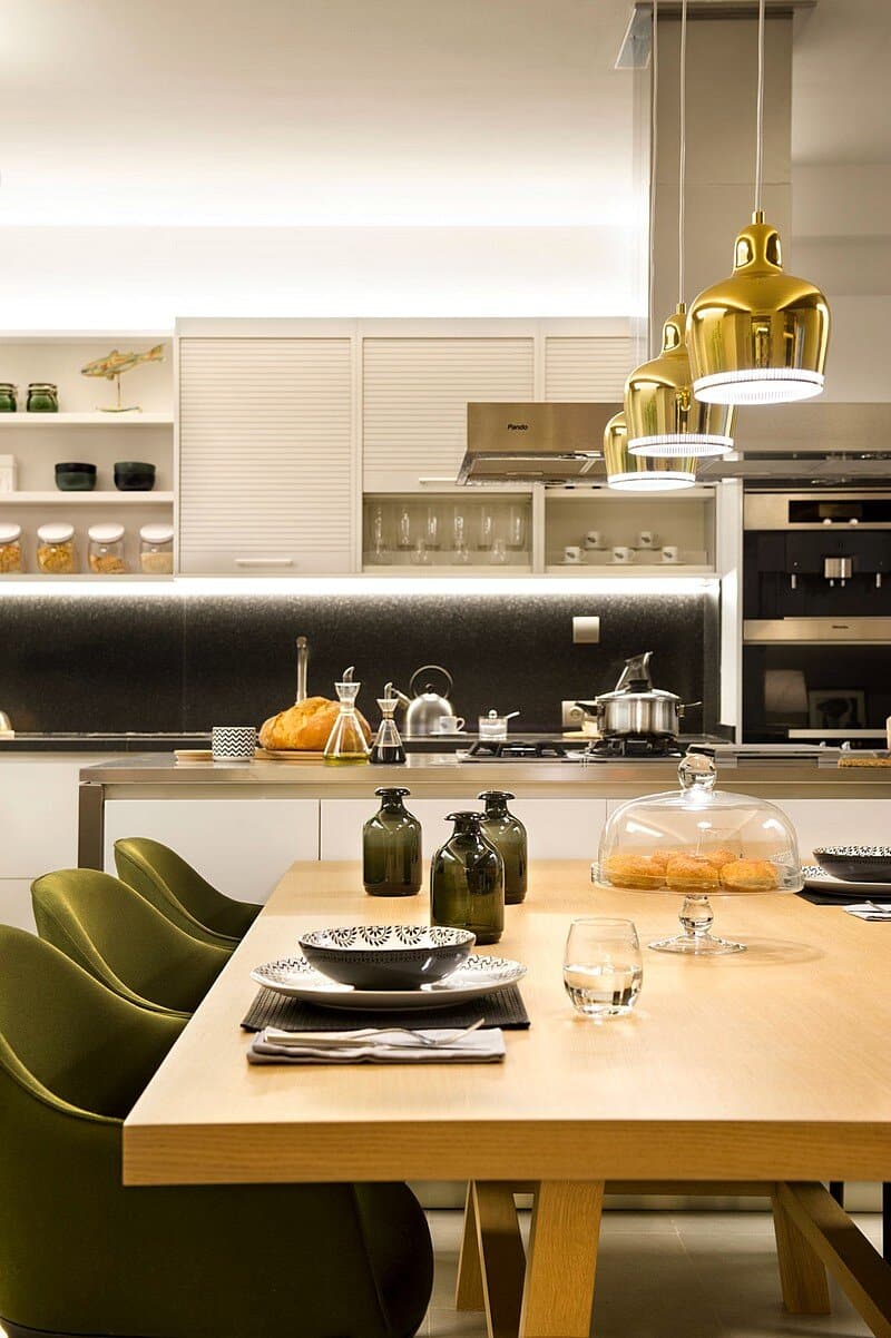
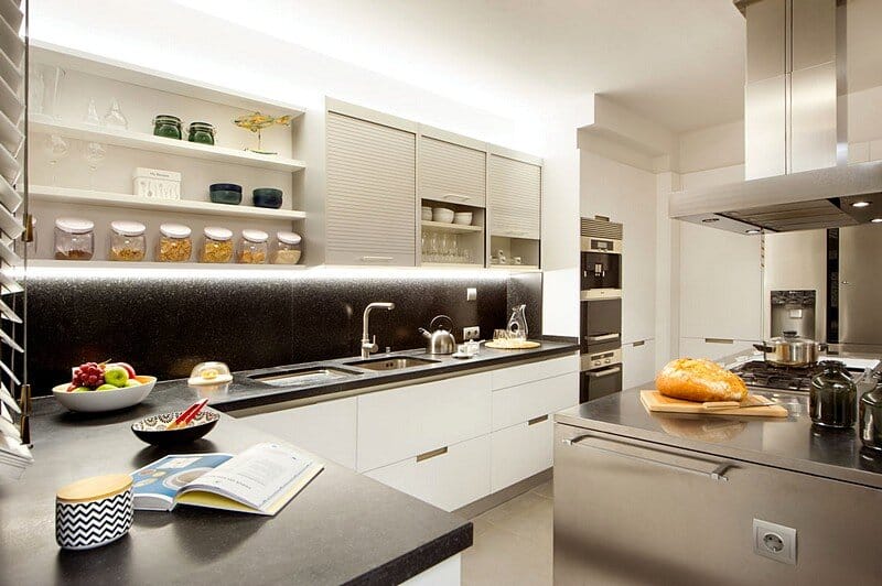
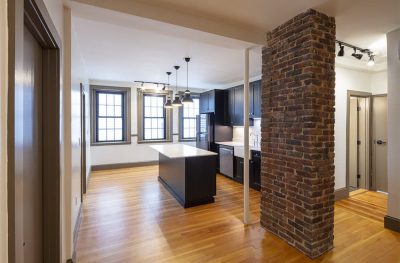
For this very reason the kitchen has been equipped with a wide variety of high-end appliances, ranging from the inevitable induction cook top to a plate warming drawer, through a wok stove, a teriyaki grill, a built-in coffee maker or a wine cellar integrated into the refrigerator. Around a preparation and consumption double height two arm isle, this kitchen / dining area is presented as the ideal place to cook, eat and share in close connection with the indoor gardens that separate the area from the courtesy toilet and laundry; and, on the other end, from the living and home office rooms.
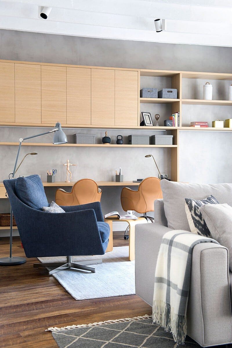
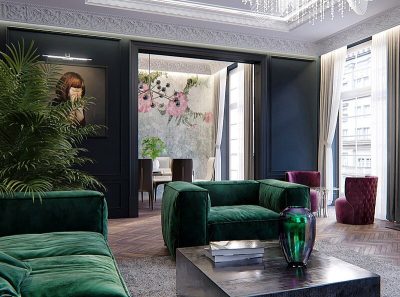
Here, the furniture repertoire expands itself to accommodate the most diverse forms of recreation and socialization, combining benches, stools, ottomans, sofas and armchairs with side tables, desks and libraries, all under an adjustable and sensual lighting scheme composed of technical ceiling mounted lights, architectural lighting strips and a series of decorative accent desk and floor lamps that manage to make the transition between day and night, or that from breakfast to party time as easy and natural as the need to continue to be all together.
Gather, collect and combine, these seem to be the keys to this new project by Egue and Seta in which the classics of contemporary furniture alternate with pieces of the latest trend, while the neutral tones of their textile or leather upholsteries; the natural and unvarnished wooden sheeting; and the organic fibre rugs and curtains harmonize with the worn out bronze lamps, the stainless steel from the kitchen and the wall mirrors.
All this earthy warmth and the softness of its touch, works as stylistic wildcard and amalgam, though deep down it really aims to provide the home, along with the vegetation placed amidst the indoor gardens under the false skylights, with an undeniable decorative appeal that will easily withstand aging and trends change. Meanwhile, hard coatings on their part, made up of wood faux oak, concrete effect porcelain and micro-cement, matt ivory plastic paints and fabric like wallpapers further underpin the aforementioned extended stylistic validity of the set, while facilitating maintenance and providing variety.
And what don´t we do for variety´s sake? Do we not travel, read, and browse everywhere in search of just that? Can we continue to travel kilometres in order to sleep in a hotel so similar to the one next door it may seem that we haven’t gone anywhere? Do we have to prepare our coffee in a coffee maker by the sink in our next hotel room? Wouldn´t it be nice to meet you all next summer in Rio or Istanbul? You choose the spot and we´ll do you the next “Suite for ten″.
Thank you for reading this article!

