Project Name: The Mini-shop of Cosmetic Contact Lenses
Design Company: Oft Interiors Ltd.
Project team: CM Jao & Ken Cheung(Design Director、Yoyo Au(Design Team)
Project images: Dick Liu
Project location: 18 Salisbury Rd, Tsim Sha Tsui, Hong Kong
Completion Date: 2020
Text and photos: courtesy of Oft Interiors
In recent years, variation in the consumer market has been the subject of much discussion and research across all industries, and as a result, the form of the experience of terminal stores has undergone significant transformation. In K11 musea, a world-class art mall, OFT Designs has provided the best example of the the future cinema. They will continue to challenge a very different project from K11 Art House this time.
This is a small store of 36 square meters. In the limited area of the store, it is necessary to meet the functions of display, exhibition, warehousing and sales, as well as to combine the scenario design with the living condition of the consumers and strengthen experience for consumers. How will OFT handle such a micro commercial space?
Design focus: extract colors of products, and enhance brand recognition
Scene design has long been known as a powerful tool to identify innovation opportunities, and OFT is an expert in integrating scene design into the new retail experience to enhance the experience of customers and, through co-branding, transform consuming behavior into a sustainable business strategy that helps consumers realize their aspirations.
The mini-shop of cosmetic contact lenses is mainly targeted at young and fashionable women between 18 and 35, who are in pursuit of a sophisticated lifestyle and a perfect and flawless appearance. The contacts are precisely the products that help them become “more beautiful”.
“Eyes are the index of the mind”. Whether they are dull or radiant, they are always reflecting people’s inner feeling. Eyes don’t speak, but they’re better than any voice or words. Therefore, the design team used “Bright Eyes” as the theme to create a clear commercial space.
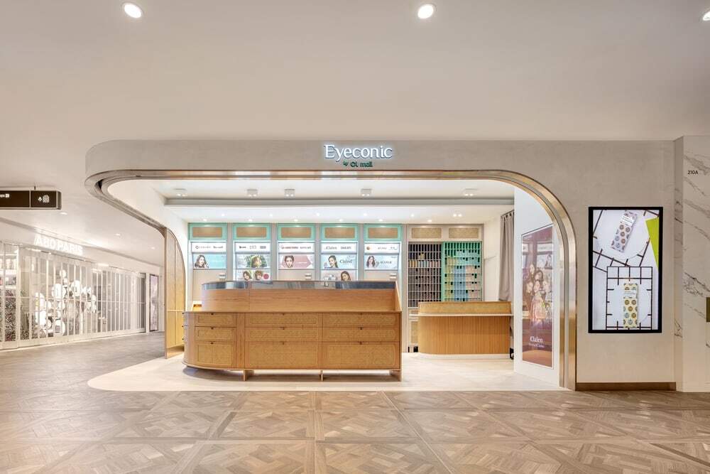
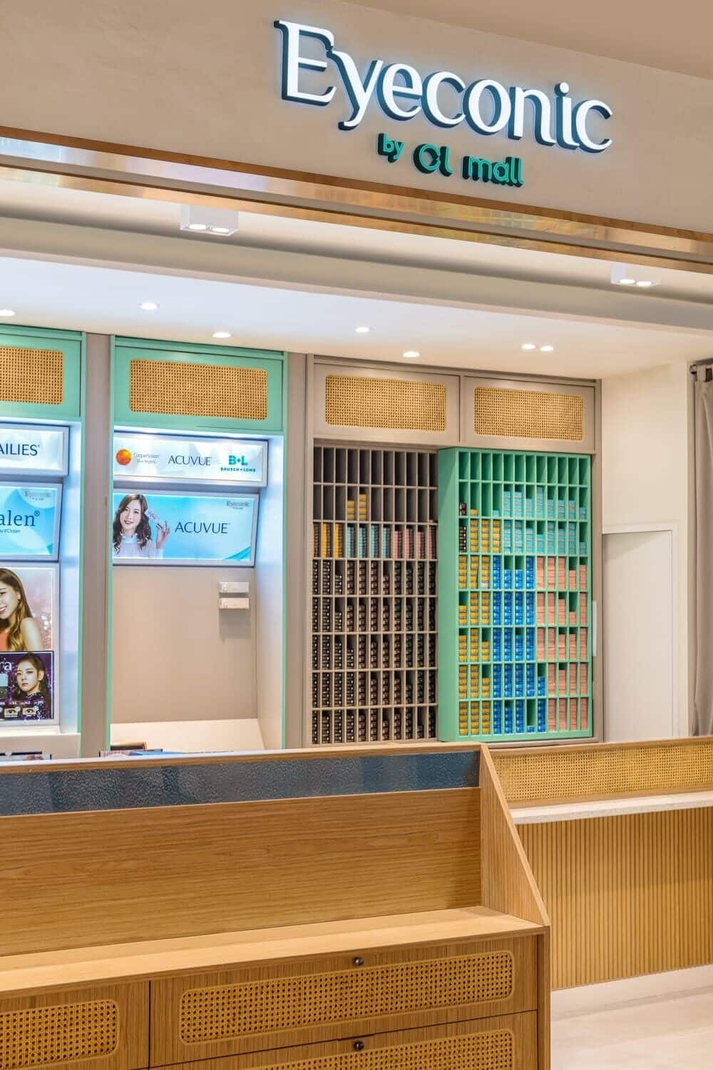
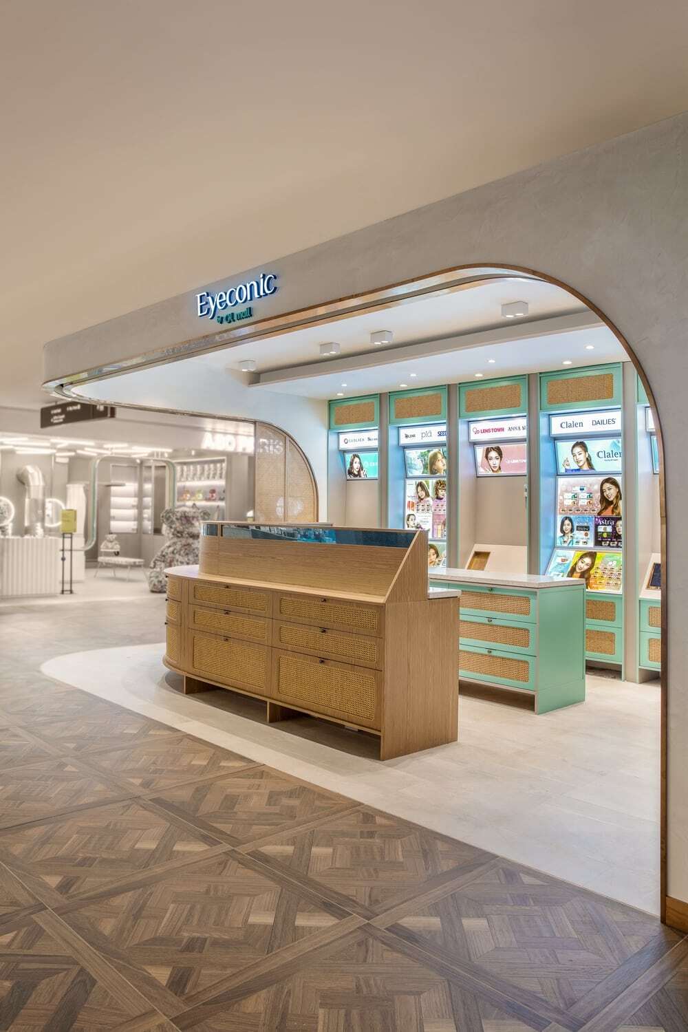
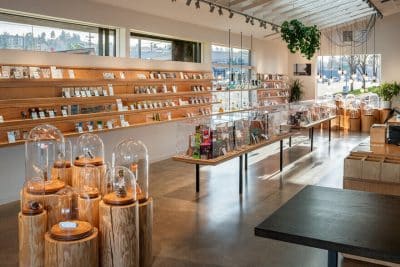
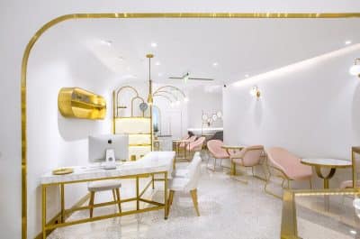
The open entrance and the streamlined layout make the space come into plain view, and the different colors and styles of contact lenses are arranged in an orderly manner. With the color of the product’s appearance itself to build color system of the mini-shop, it can not only make the brand’s DNA be deeply rooted among the customers, but also further control the cost of hardcover.
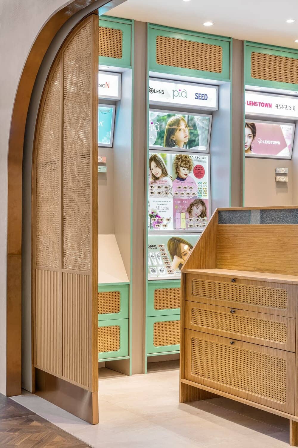
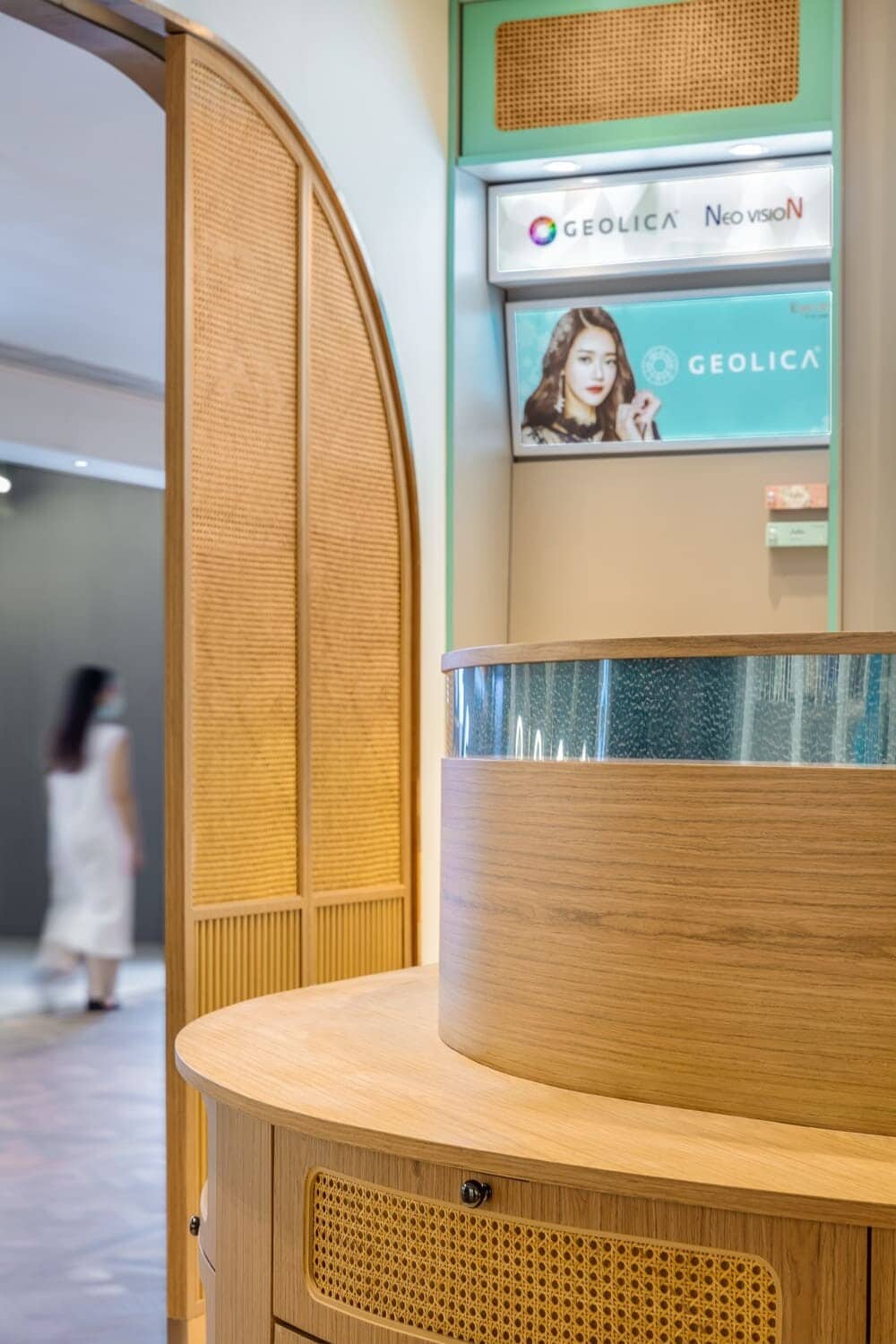
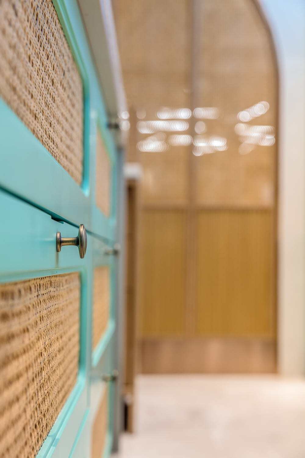
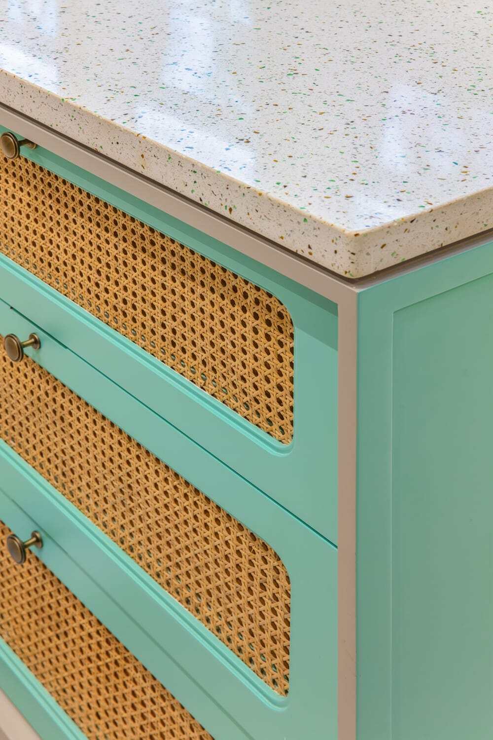
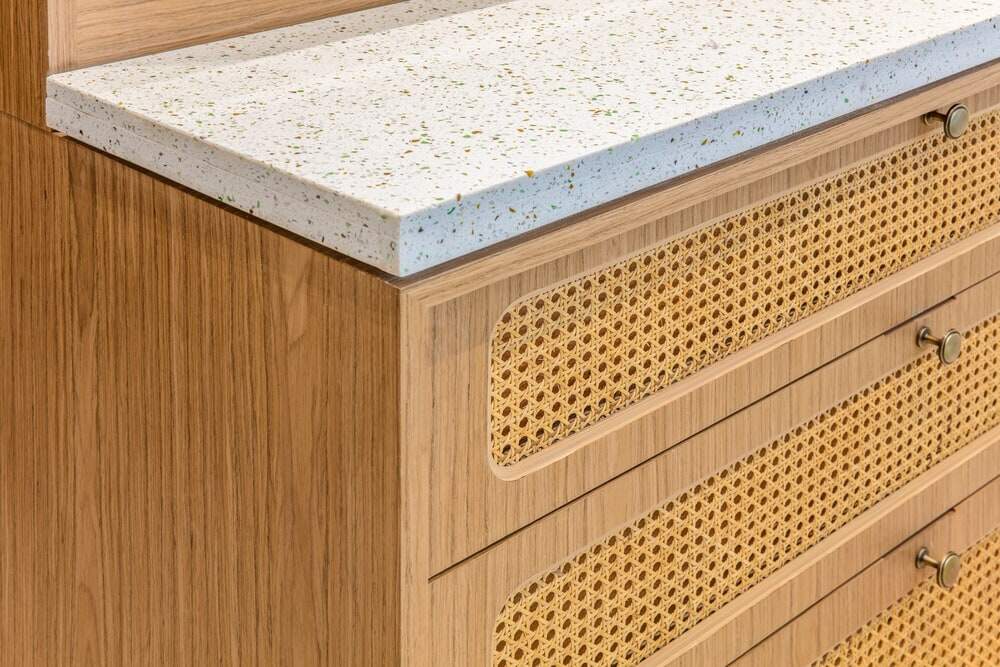
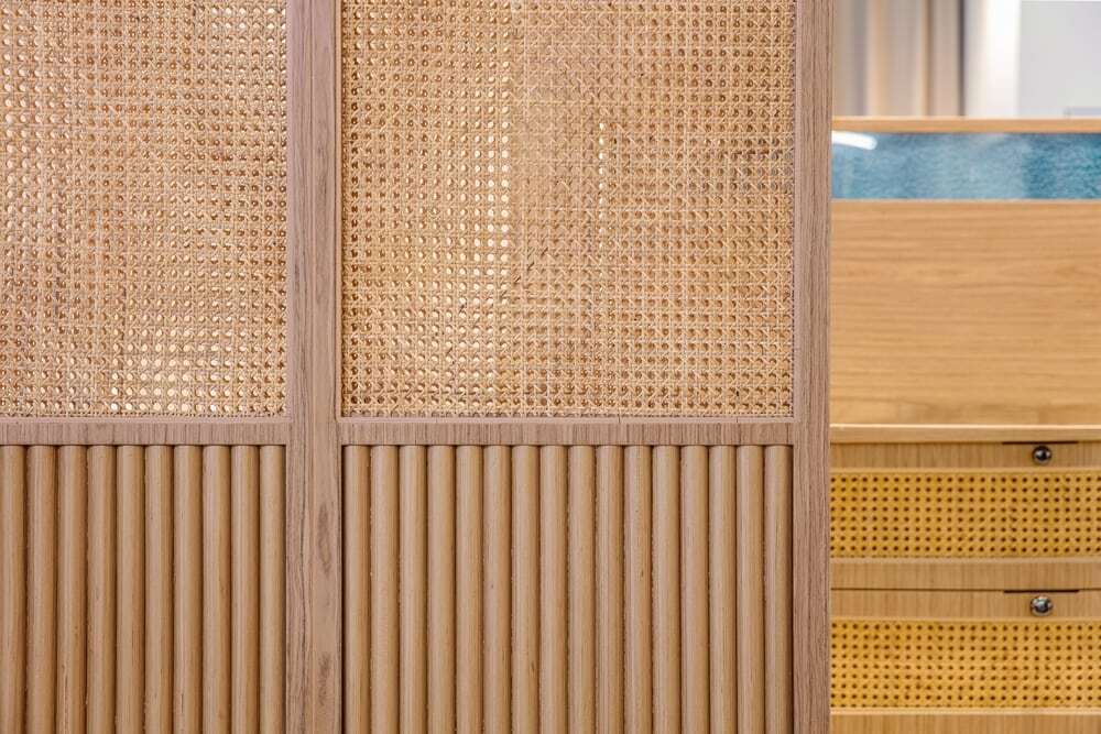
For enabling consumers to recognize the beauty signal immediately, the designer chose the highly recognizable but unobtrusive light green as the main color of the space, while the display cases are made of wood and bamboo, which are closer to nature, making the small space transparent and light, and creating a sense of relaxation and pleasure in the summer forest for consumers.
At the same time, the designer digs into the existing elements of the brand’s products to find new vitality and a spatial expression that fits in with them. The designer believes in the role of “generality”, so the combination of fresh colors and materials without cliches collides with a fresh and natural visual experience, which is playful and sophisticated.
This is also the brand image that the brand wants to convey to consumers: freshness and nature can easily be extended to the imagination of free breathing, echoing the attributes and characteristics of the product itself. It uses the visual presentation of space to suggest and guide consumers: this is a product that allows your eyes to breathe freely without burden, letting consumers to enhance the sense of substitution when shopping for products, and turning the act of shopping into a process of wish fulfillment.
Design focus: the use of vertical space and unconstrained display methods
The area of 36 square meters seems to restrict the design, but in fact, in this micro shop, the commercial space has all the scenes, dynamic lines, displays, and warehouses, creating a free and comfortable shop. The designer has transformed the great expectation that consumers have for the contacts into a kind of figurative beauty, forming a unique design language.
A successful commercial space requires consumption, experience and products. While the space is attractive, the product itself should not be overshadowed by the main attraction. How should the product be appreciated and experienced by users?
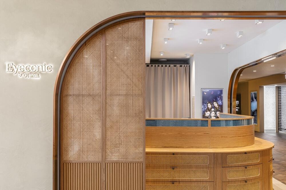
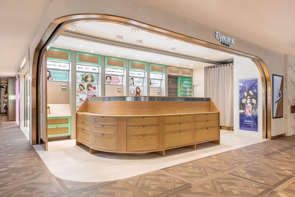
Although the space in the mini-shop is small, it happens to be located at the corner. The designer opens the corner position, and directly connects it with the public corridor of the shopping mall instead of a conventional glass door, forming a wide open space. The corner of the wall is curved to ease the rigidity of straight lines, to enhance the integrity of the space.
It brings more aspects of showing the store and allows consumers to buy products directly without paying more behavioral and action cost, thus improving customer acquisition ability.
An island is set up in the center of the store sets up as a dynamic diversion, highlighting products with a clean and concise visual performance. It allows products to be better presented and makes it easier for customers to see what they need so that they can be timely provided with help and service. The commercial consumption gets more humane.
The two sliding doors of the top of the cashier’s closet, where products of different colors are classified and neatly displayed, can strengthen the brand colors, attracting consumers to explore and generating more interactions among them.
Conclusion: This mini-shop project is a typical new retail store. The design team helps the brand to improve its overall image by understanding the product itself. A space for consumers to communicate with the brand is established, and the reconstruction of the brand culture is completed by using space order. This set of visual system can be applied to more chain stores in the future. With unified and repetitive visual symbols, it is able to ultimately achieve consumers’ awareness and memorizing of the brand, hence build a stable and high-quality image for the brand.

