Project: Renovation of a 1950’s Austin Ranch
Interior Design: Mark Ashby Design
Architect: Furman + Keil Architects
Builder: AR Lucas Construction
Landscaping: Shademaker Studio
Location: Austin, Texas, United States
Photo Credits: Clay Grier
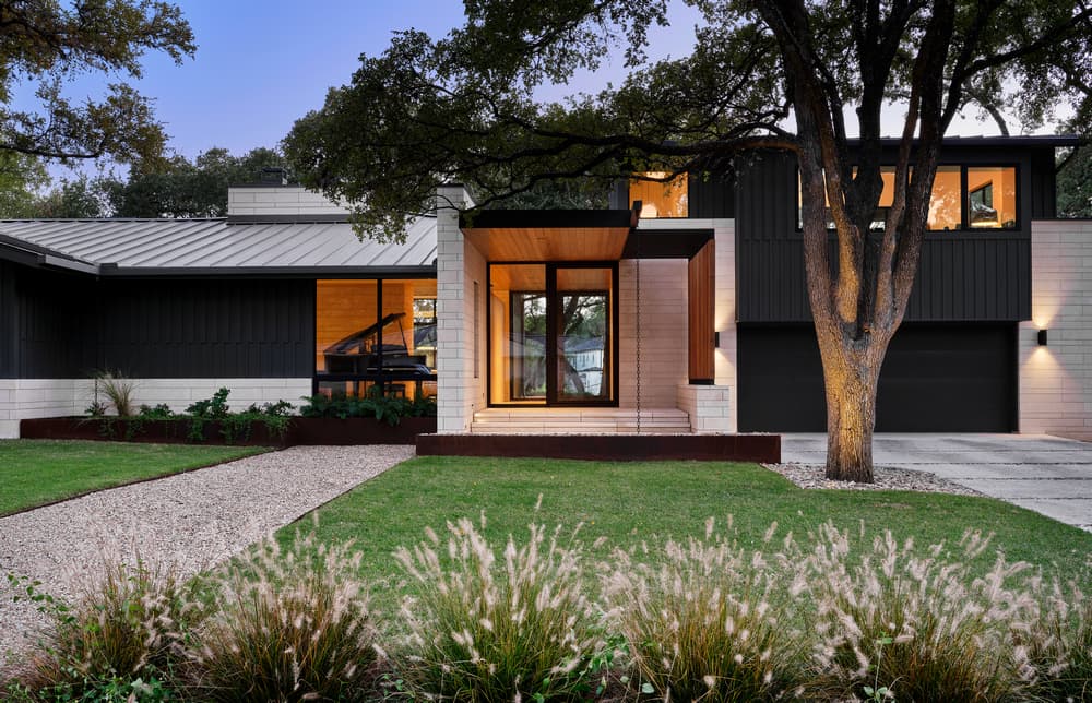
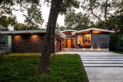
Mark Ashby Design and Furman + Keil Architects gives a traditional ranch home, circa 1954, an updated midcentury design. The home had undergone a previous remodel in 2001 that resulted in disjointed spaces, poor circulation, and awkwardly proportioned rooms. The new homeowners challenged the architecture and design team to create a design that captured the midcentury esthetic with a sense of cohesiveness and order. The result is an airy home with natural light, warmth of materials, and contemporary spaces for daily living and favorite activities.
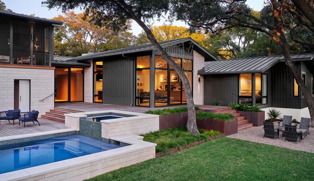
The homeowners were looking for overall value and wanted to keep most of the unique architectural elements that made the home elegant in design and function. The team’s design strategy maintained the majority of the existing structure with a second floor addition stacked directly over the existing garage. The new plan reorganizes the circulation around kitchen – making it the hub — while improving the flow of the house. Careful consideration was given to creating separate groupings for TV viewing, a music room, and entertaining. A new screened-in porch was added for year round outdoor living.
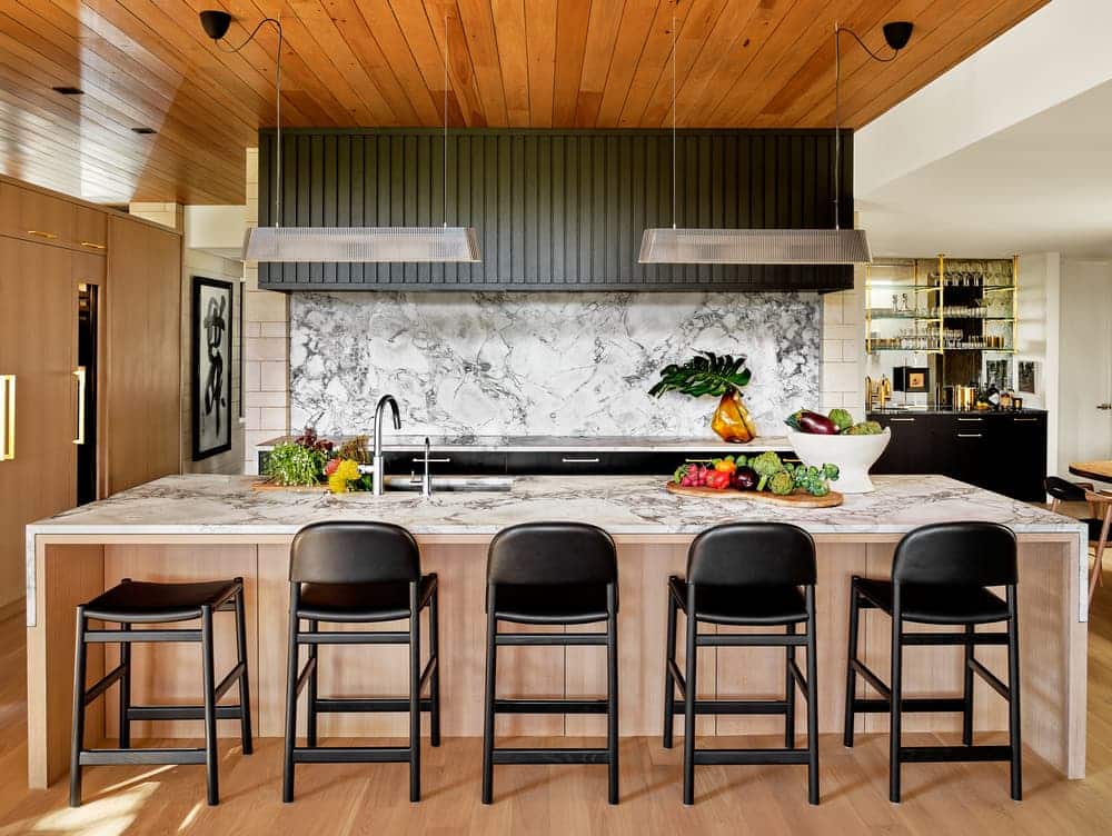
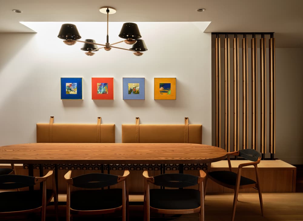
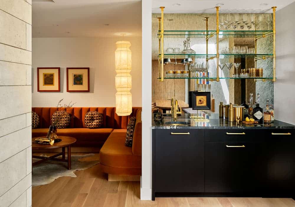
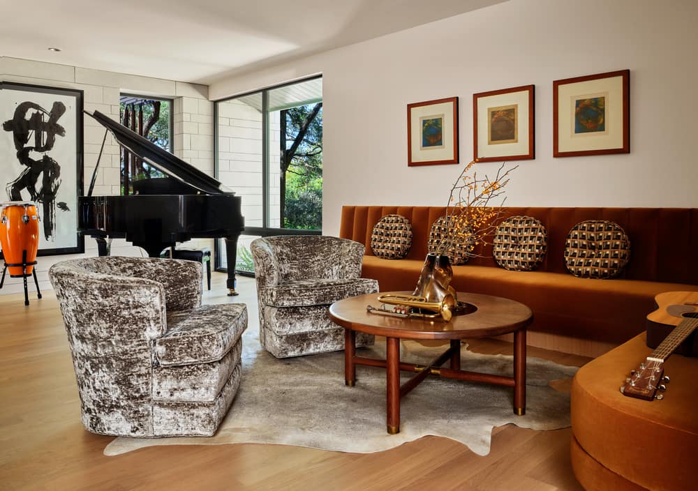
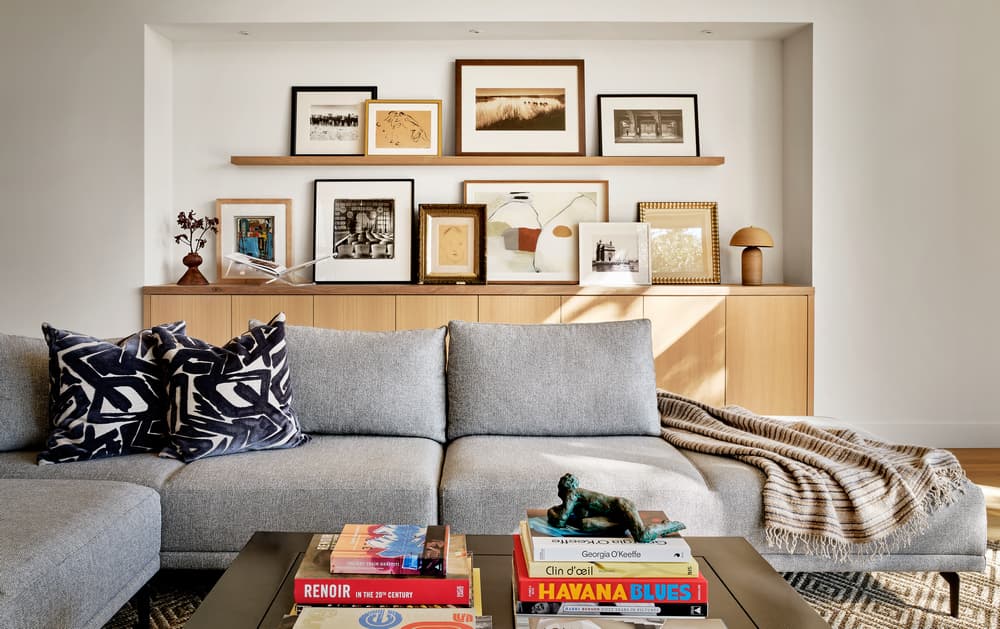
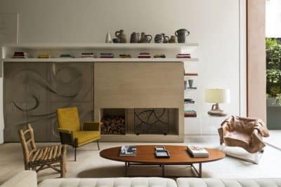
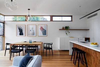
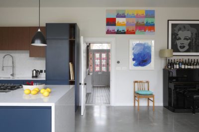
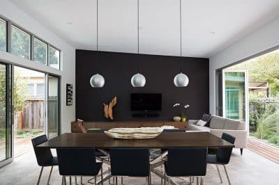
The dining room, kitchen and living room are all connected, each room flowing into the other. “The design of this home invokes a sense of ease and relaxation, nothing is too staged,” says interior designer Michele Lorenz, Mark Ashby Design. Michele choose Arabesco marble, honed and polished, for the kitchen Island and counter tops. She custom designed the dining room wall bolsters for comfortable large group seating. The dining table was made by local Austin artisans, Mockingbird Domestic, designed in a fun racetrack shape with soft edges. The fantastic music room features a vintage coffee table and swivel chairs sourced from Round Top, Michele designed the custom built-in sofa, upholstered in a fabulous retro gold velvet. The living room’s art wall is filled with the homeowners’ own collection.
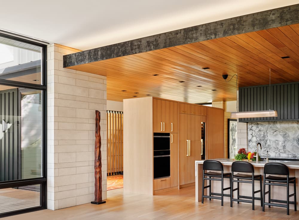
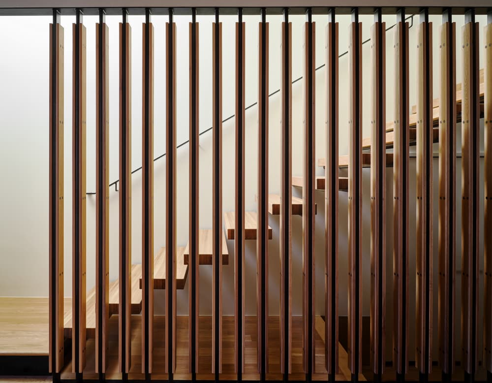
A wood ceiling plane was utilized as an organizing device in the design; connecting lower ceilings at the front of the house which make for more intimate gathering areas, and taller ceilings with differentiated materials in the rear of the house that strengthen the physical connection to the back yard, pool, and views to the south. Most of the house has relatively modest detailing, but more intensive detailing was used to selectively emphasize certain connections. White oak millwork and honed limestone walls define the core of the house, while steel and white oak screens at the dining room, entry and stairwell emphasize movement and filter light into the heart of the Austin Ranch.
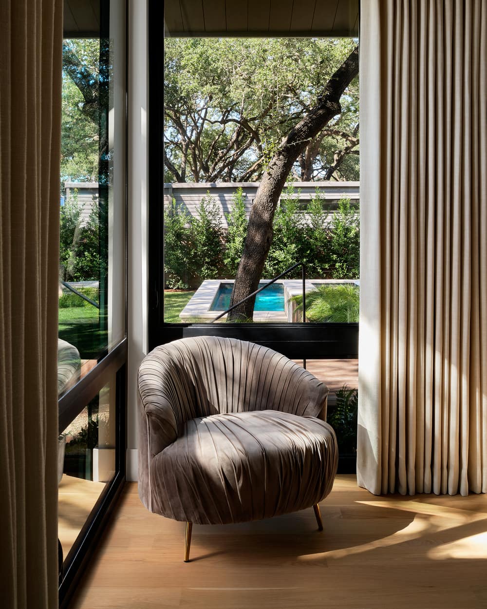
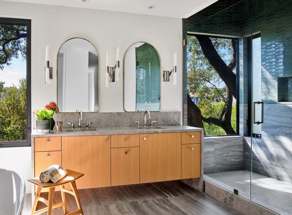
Honed limestone walls and porches anchor the home to the ground, while the existing tree canopy allows for diffused light throughout the day and gives privacy. It was important to capture and preserve the home’s views of Taylor Slough Creek – which evokes the sense of being immersed in the natural wooded setting of this central west Austin property. Pictured above and below: Front and back exterior before and after.

