Project: American Style in an Israeli Location
Interior Design: Karen Maimon
Scope: the renovation of a private house in central Israel
Owners: A couple and their two young children
Plot: 250 sqm
Built property: 200 sqm
Photo Credits: Eran Turgeman
After many years of living in America, the owners, a hi-tech professional and a shoe designer, purchased a house in a central Israeli city and designed it in true American style. The results exceeded everyone’s expectations.
When the couple bought this property in a city in central Israel, they knew exactly what it would look like once renovated. “The clients wanted a property that would remind them of their life in America”, explains Interior Designer Karen Maimon. “They wanted a cozy and inviting home that was practical with plenty of American-style storage. The result is a property characterized by American elements while simultaneously exuding a unique “boutique” feel.
The property was stripped down to the wall studs and completely renovated. “We gutted and replaced the entire interior. We also added a loft and upgraded the basement that is now used as an office and a guest room”, explains Maimon. “In addition, we completely redesigned the garden, where we created little beauty spots as well as a tree house”.
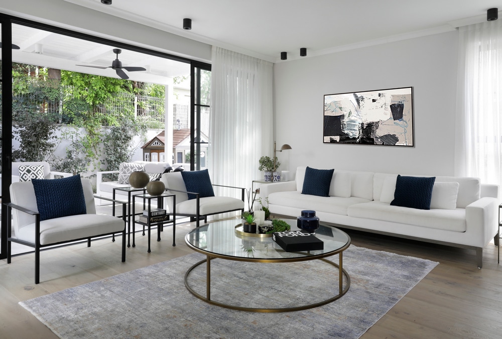
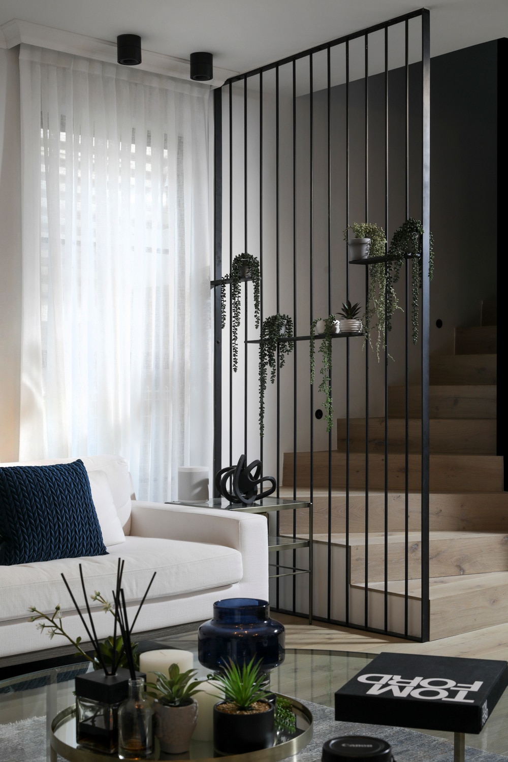
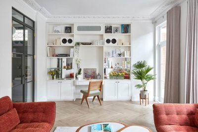
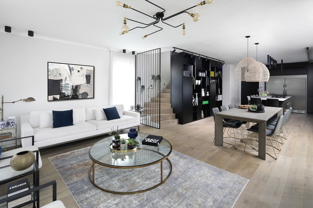
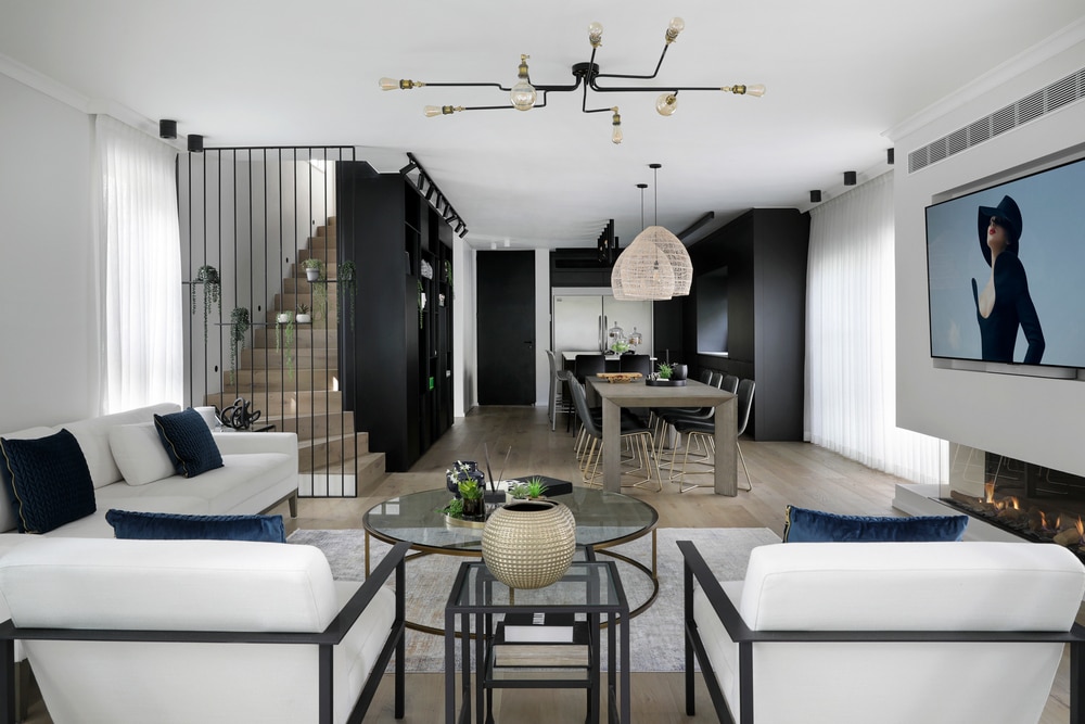
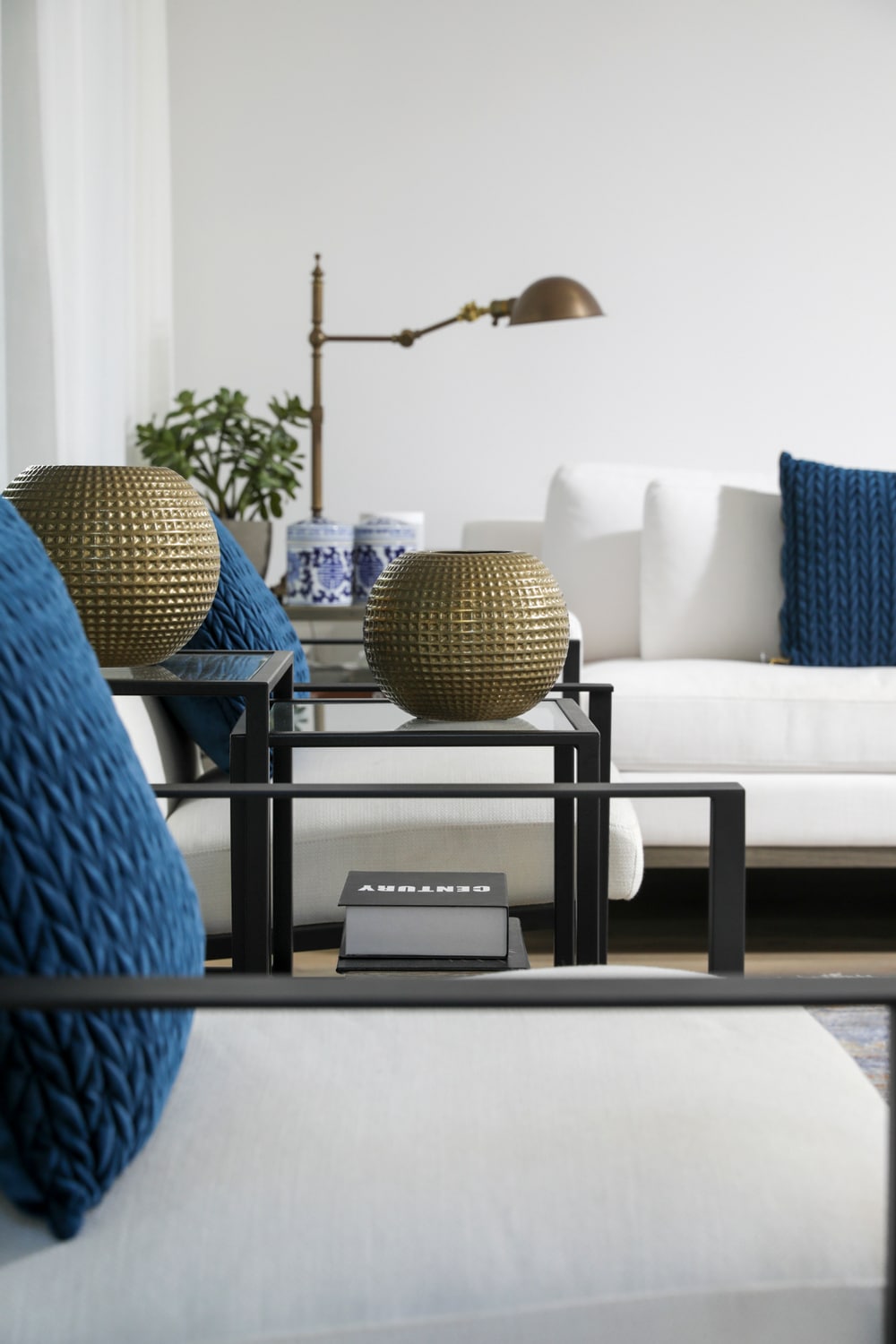
As per the common style in America, light oak parquet was used for the floors. A plaster wall that conceals an a/c unit was erected in the lounge and is home to a gas fireplace and large mounted TV. The seating corner consisting of a white sofa, and an armchair dotted with deep blue scatter cushions, creates a serene seating area. The ceiling was fitted with a custom-made light fixture that fans out like octopus tentacles and adds a fascinating touch to the living space.
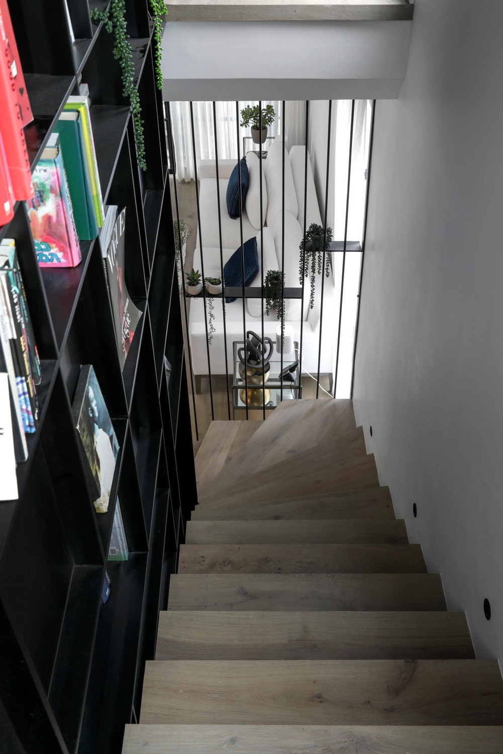
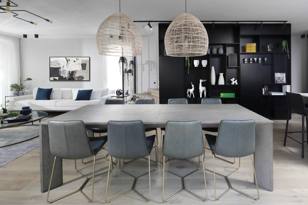
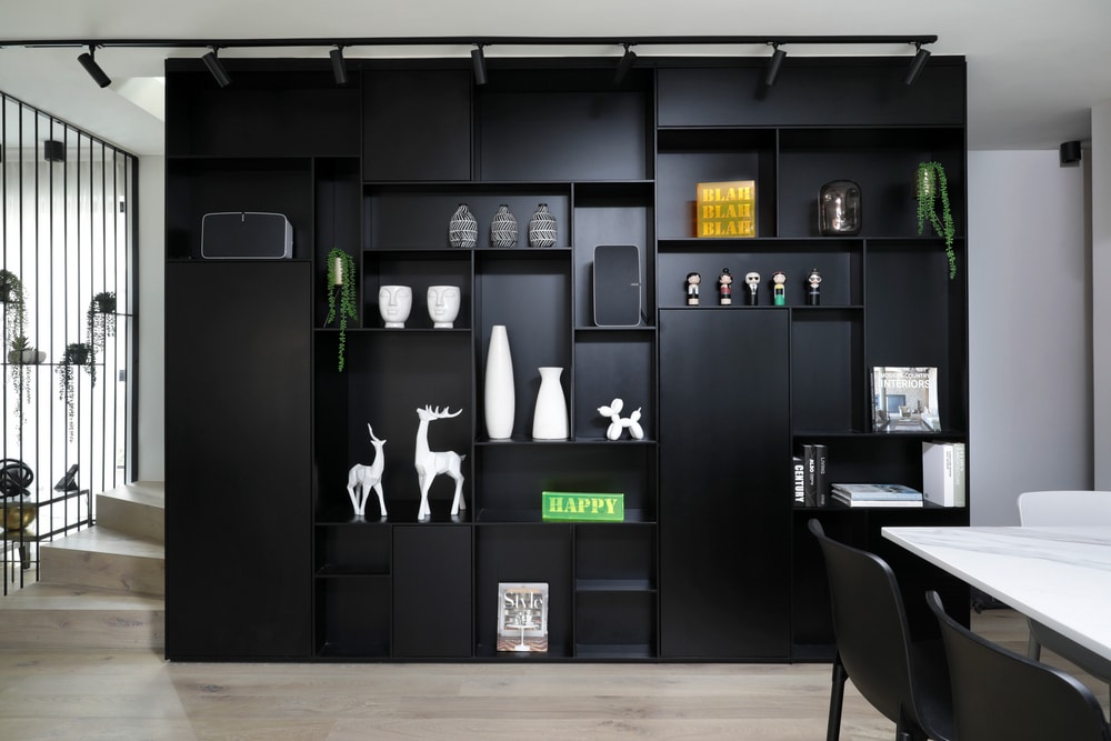
One of the dominant elements in the property is a large black library that starts in the family space and continues up to the bedroom level. A piece that is the result of a meticulously custom-made design. “The library is a very complex structure that runs across two different spaces”, explains the designer. “It is a double-sided library that runs along the staircase up to the second level and is used as a banister as well as for storage”.
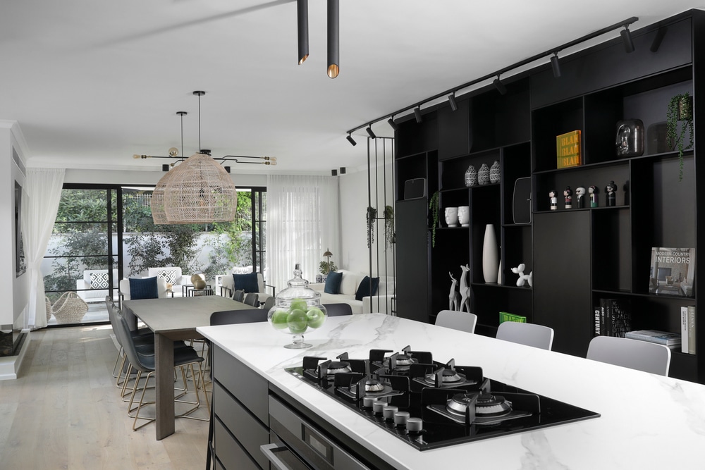
The kitchen is adjacent to the library and was painted in shades of granite gray. According to the designer, the couple loves to entertain, and as such, the entire space was designed in clean lines with plenty of seating. The precision in the carpentry work is evident here too, with all the electrical appliances easily accessible behind cupboard doors, creating a clean and tidy look. A sliding cabinet with a Concepta mechanism was fitted to the right of the sink and includes a hidden coffee corner. Six light gray and black chairs surround the island above which cylinder light fixtures, in a variety of lengths and angles, create very interesting lighting.
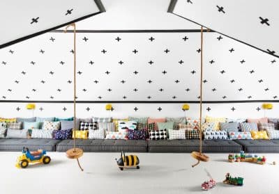
The basement renovation, where the home office and play area are located, was a major part of the project. “It was important for the clients to create a home office that was quiet and intimate yet accessible”, explains Maimon. “Allowing them to maintain eye contact with the children at all times”.
To achieve this, the designer defined the office space with black Belgian profile glass partitions that create privacy whilst blending harmoniously with the play area. White parquet was used for the floors to lighten up the space, which is darker than the rest of the property.
Black, gray, and white were chosen as the main color palette throughout the property and used in the bathrooms too. “3-meter black stone-like slabs were chosen for the en-suite, to create a harmonious sense of continuity”, states the designer.
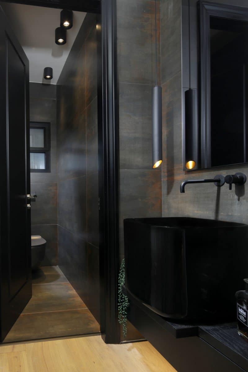
The guest toilets were dramatically designed, and in order to overcome the challenge of a small space, the designer chose to move the sink to an alcove outside the toilet.
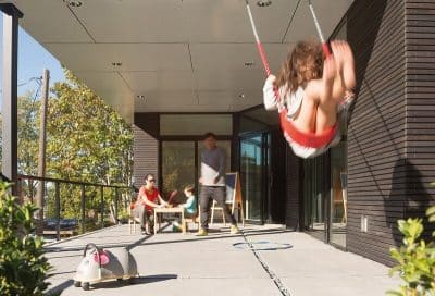
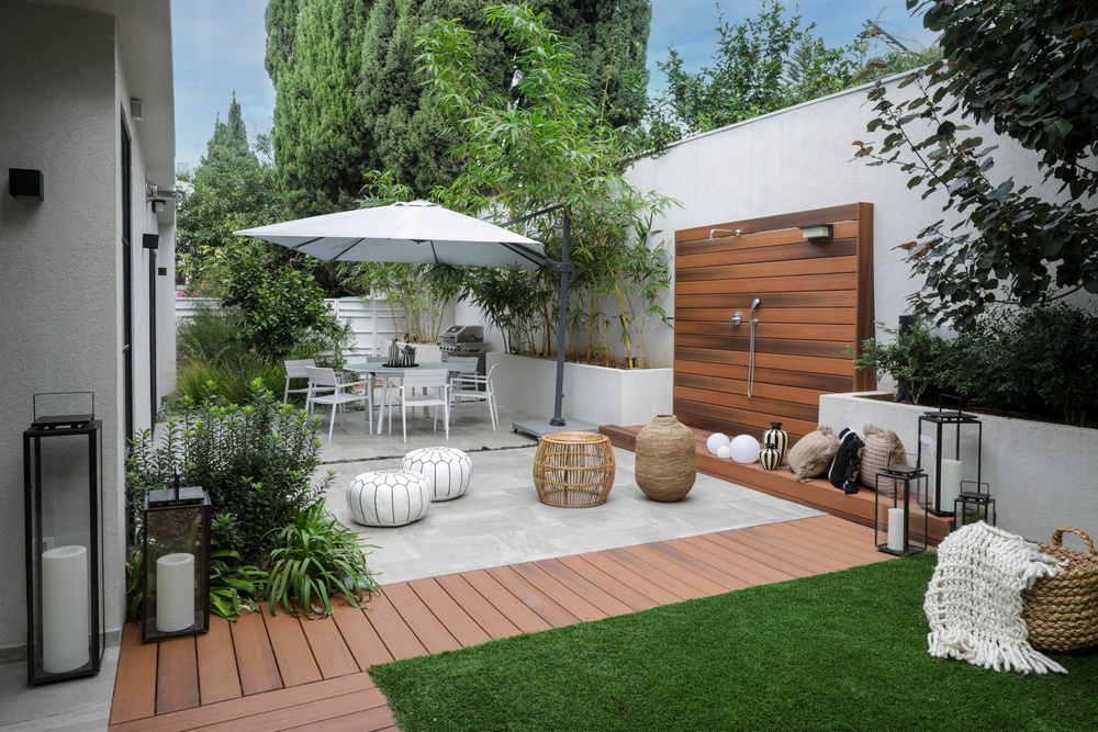
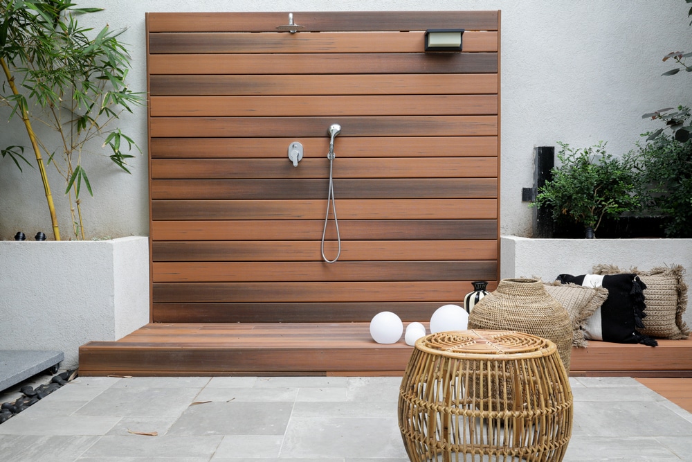
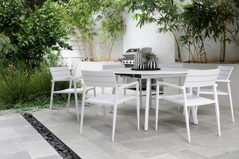
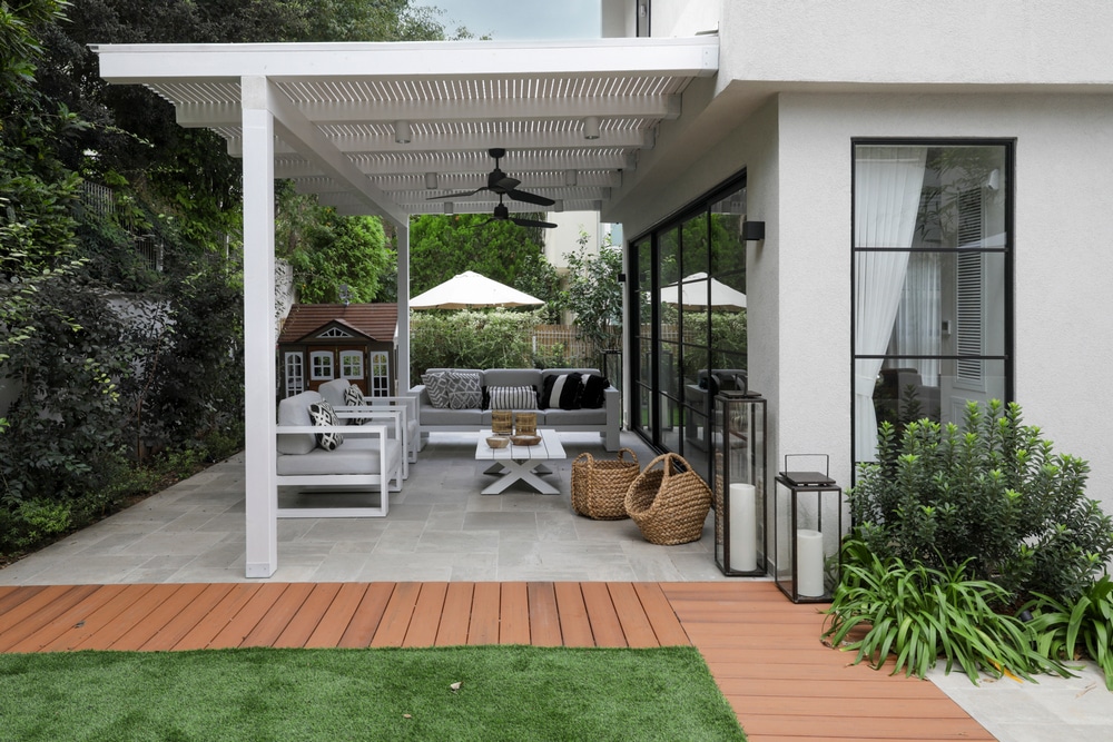
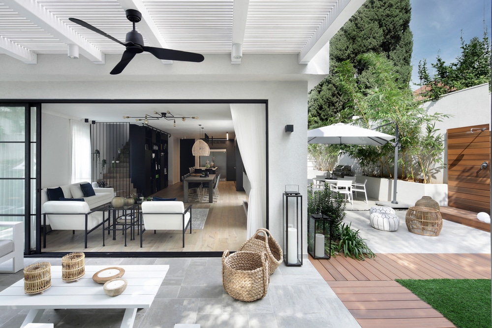
The garden was completely redone and can be accessed through Bauhaus-style windows with a Belgian profile, creating continuity and bringing the outdoors in. A play of granite, decking, and grass creates interesting flooring. A wooden outdoor shower and a small tree house were built for the kids, the latter being a standard American feature. “There are many elements around the property that were influenced by the American style, such as custom-made rugs, golden light fixtures, and rattan – all with modern touches”, summarizes the designer.
