Project: Beehive House
Architects: Windust Architecture x Interiors
Styling: Origami Solutions
Location: Coburg, Victoria, Australia
Project Year: 2019
Photographer: Christine Francis
Welcome to the Beehive House. An extension and renovation of a small, two-bedroom weatherboard Californian Bungalow house in Coburg. This project is about finding the joy in tweaking a rational box on the back into something more exciting.
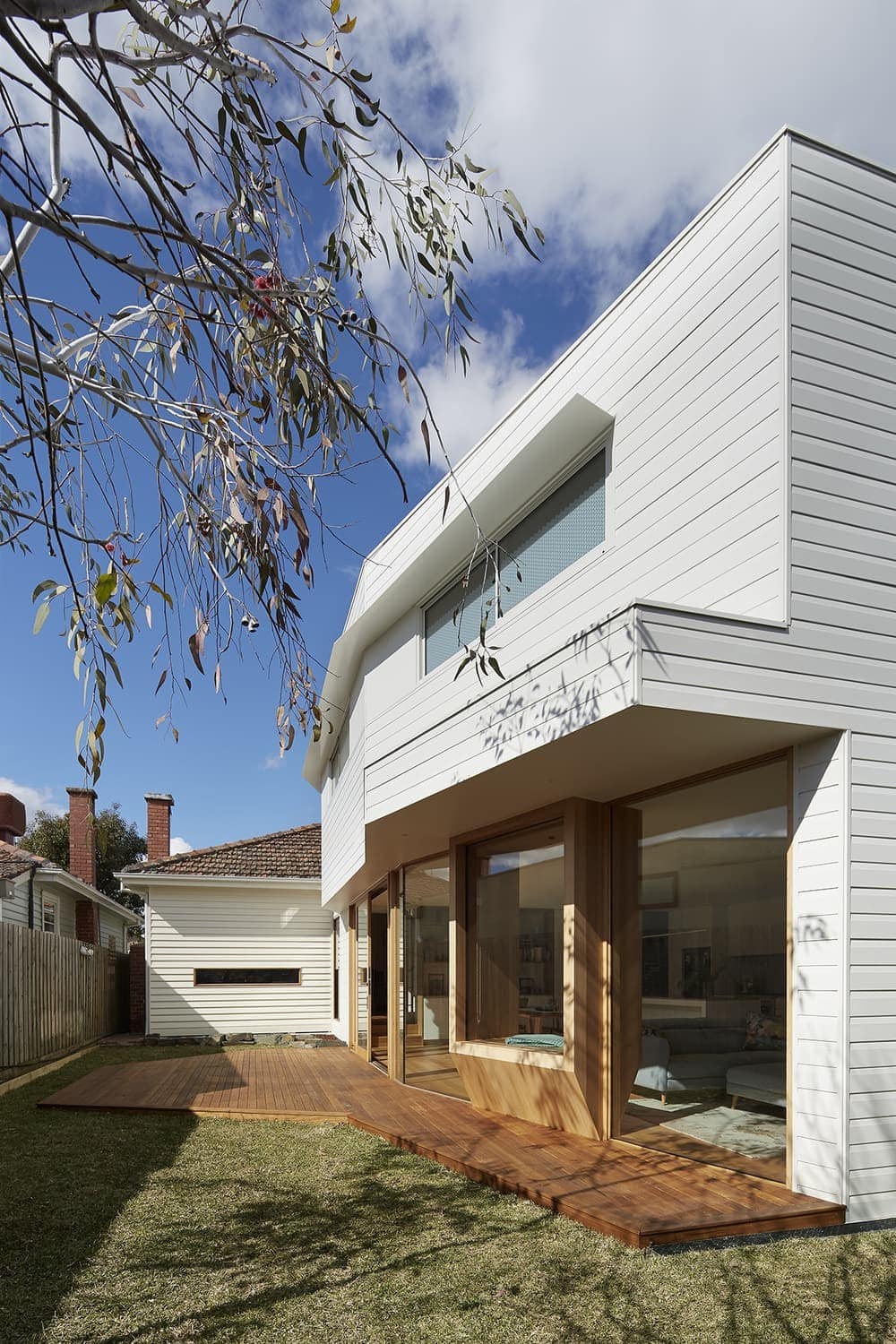
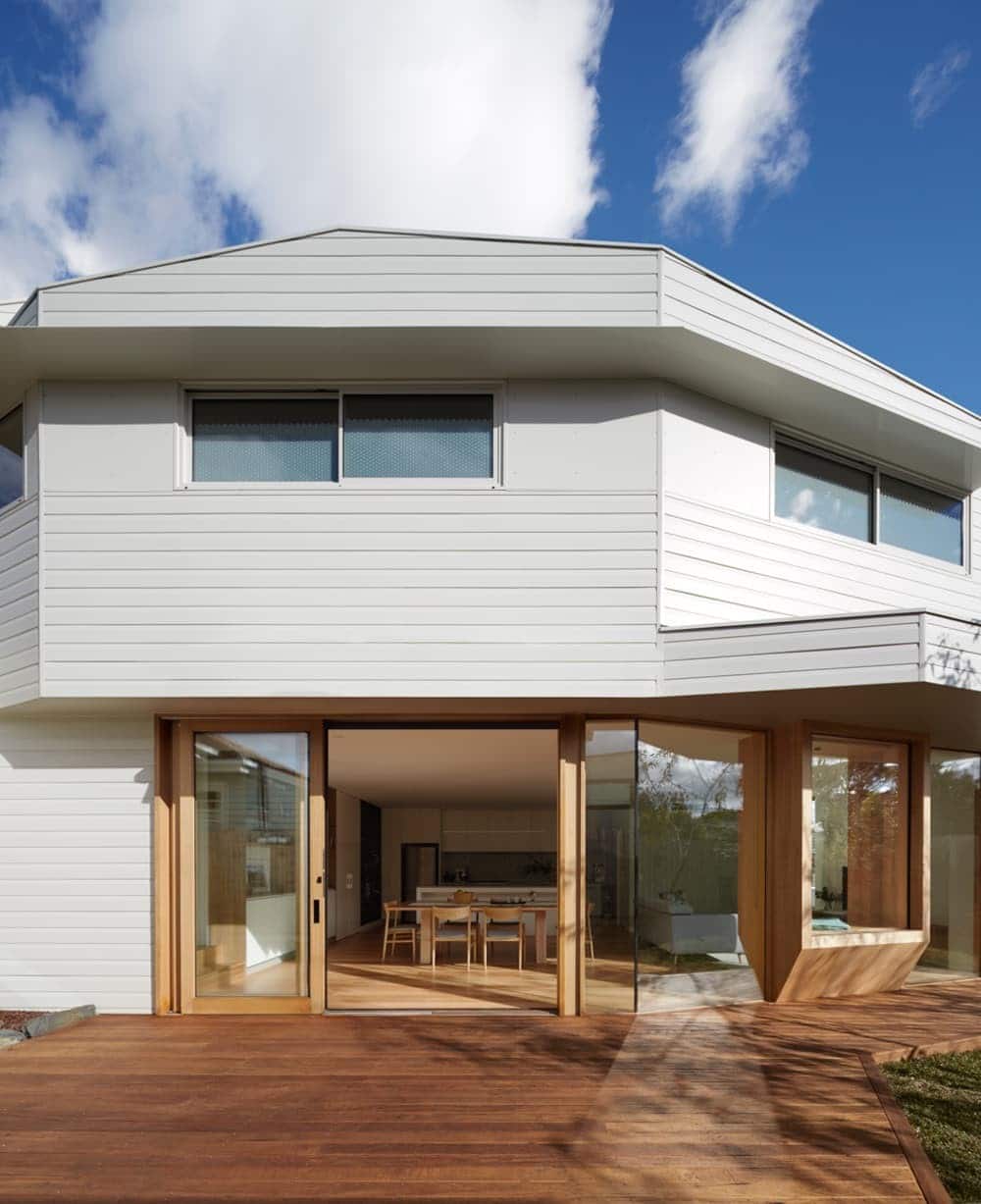
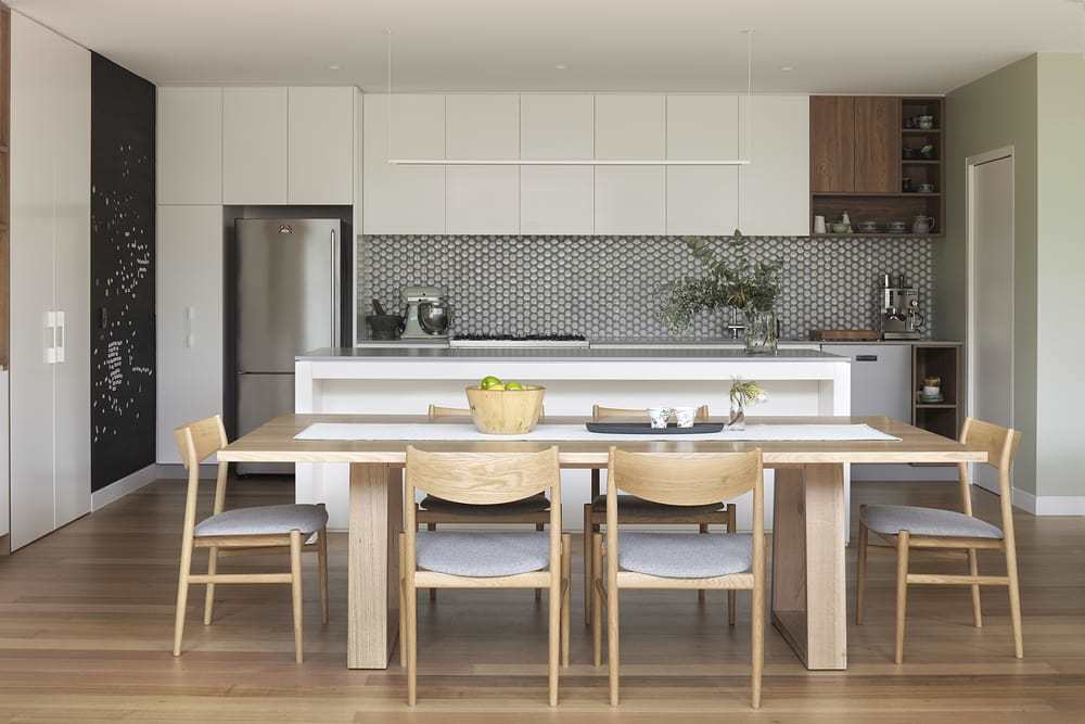
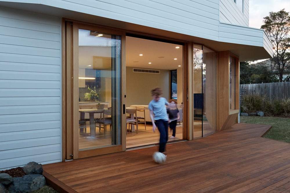
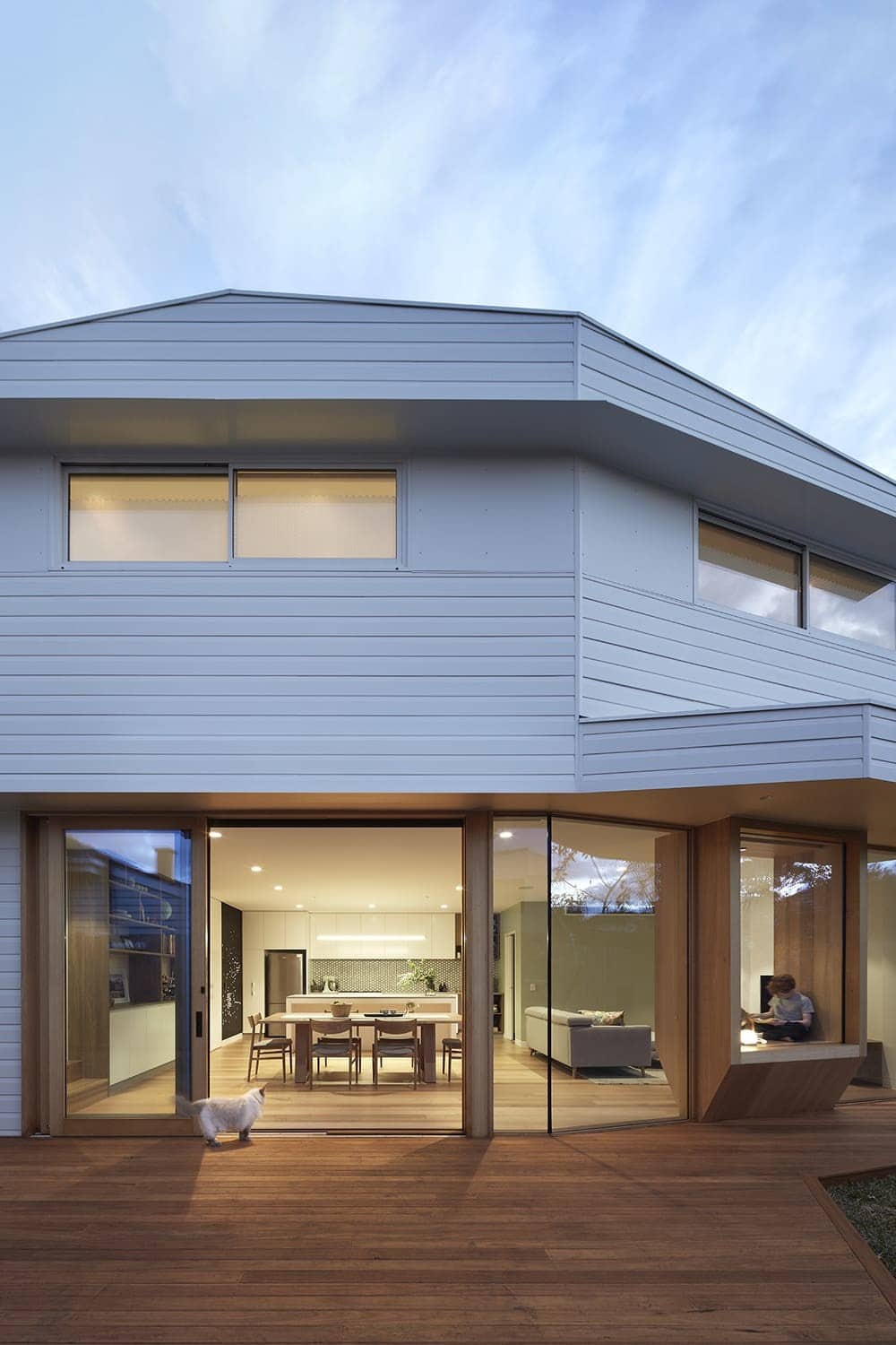
The clients, who work in science education and mathematics, wanted a good working home for their family of three robust boys. Their professions prompted us to explore ‘morphogenesis’ – the biological beginning of an organism’s shape – providing an opportunity to relate science and mathematics to the new building’s form and composition. But which shape? While sketching the plans, we literally ‘cut the corner’ off the proposed box on the ground level, which created an organic part hexagonal shape. We likened this to the natural habitat of bees (the beehive), with its hexagonal honeycomb and beautiful array of pattern and strong structural qualities. That first morphogenesis informed other ‘twists in the tail’, tucks and folds, which cleverly capture the sun’s best parts, allowing for deep access for light in winter and control of heat in summer, as well as provide sneaky garden vistas – all geared to create a beautiful living environment. Hexagons are also used in the tiling, and on glazing, with the overall effect as if the form is almost moving. The open north-facing deck is chamfered in a hexagonal pattern to connect to the landscaping and existing trees, while the canopy has a twisted chamfer to provide sun protection, and the upper levels project out to exclude the summer sun and heat from the west. The resulting form looks full of potential and ready to spring to life.
Rational and efficient, each space is offset from a central axis circulation expressed as a long east-west corridor along the large glazed wall. We reworked two existing front rooms into a study and lounge, and chopped off two old lean-tos for the extension. The glazed ground floor comprises kitchen, dining, living and outdoor area, and the upper level cantilevered over it features two bedrooms and a bathroom. The key constraints were the required boundary setback and height limit. To gain the best northern aspect, we pushed the programme to the southern fence, but this conflicted with the required upper level setback. Conveniently, the lower level could straddle the fence line, enabling a secondary axis along the southern boundary where the laundry, kitchen and bathroom are accommodated. The Beehive House had to be pushed down to preclude overshadowing to the neighbour, but the raking roof and twisting form allowed us to still double the house’s programme and create drama and dynamic interest without compromising sustainability.
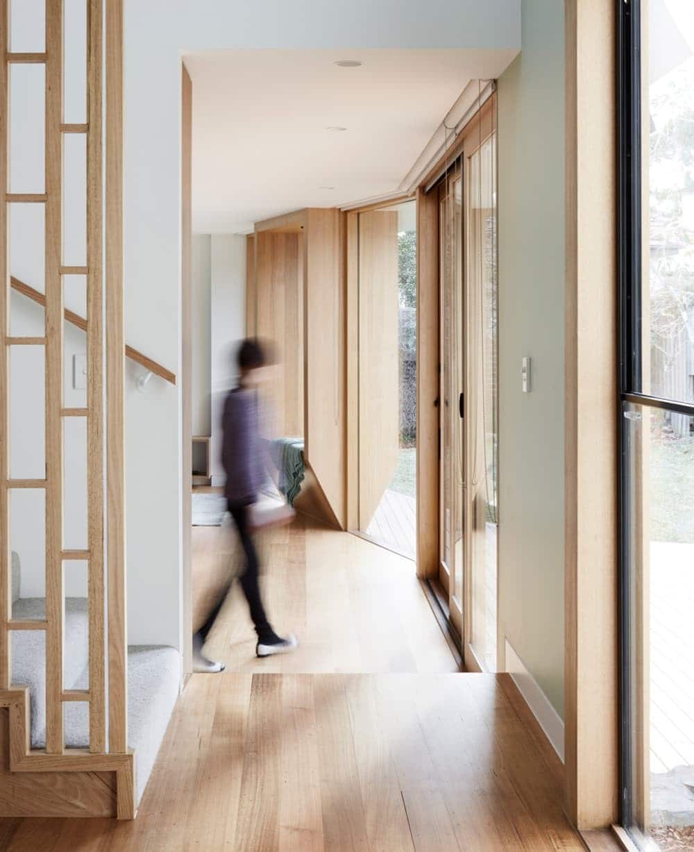
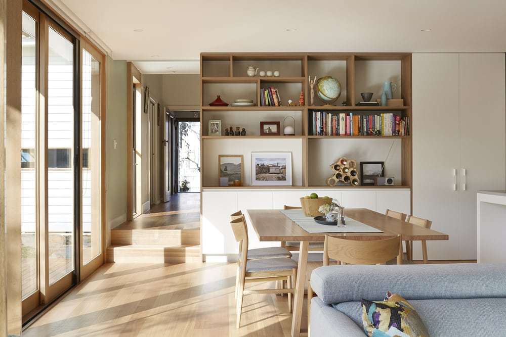
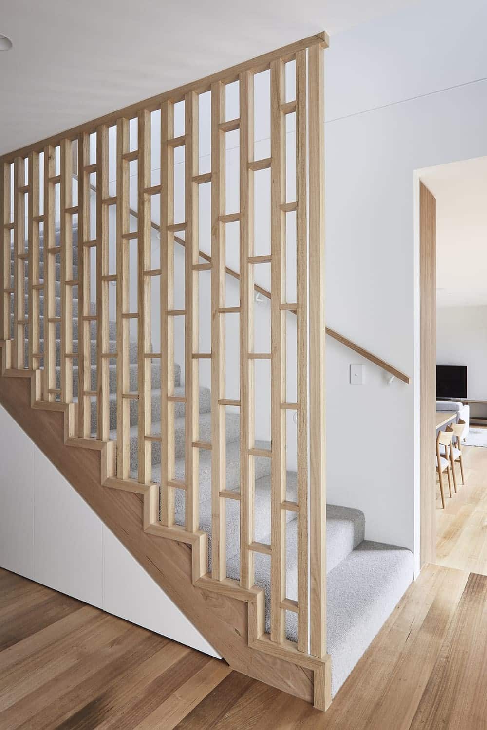
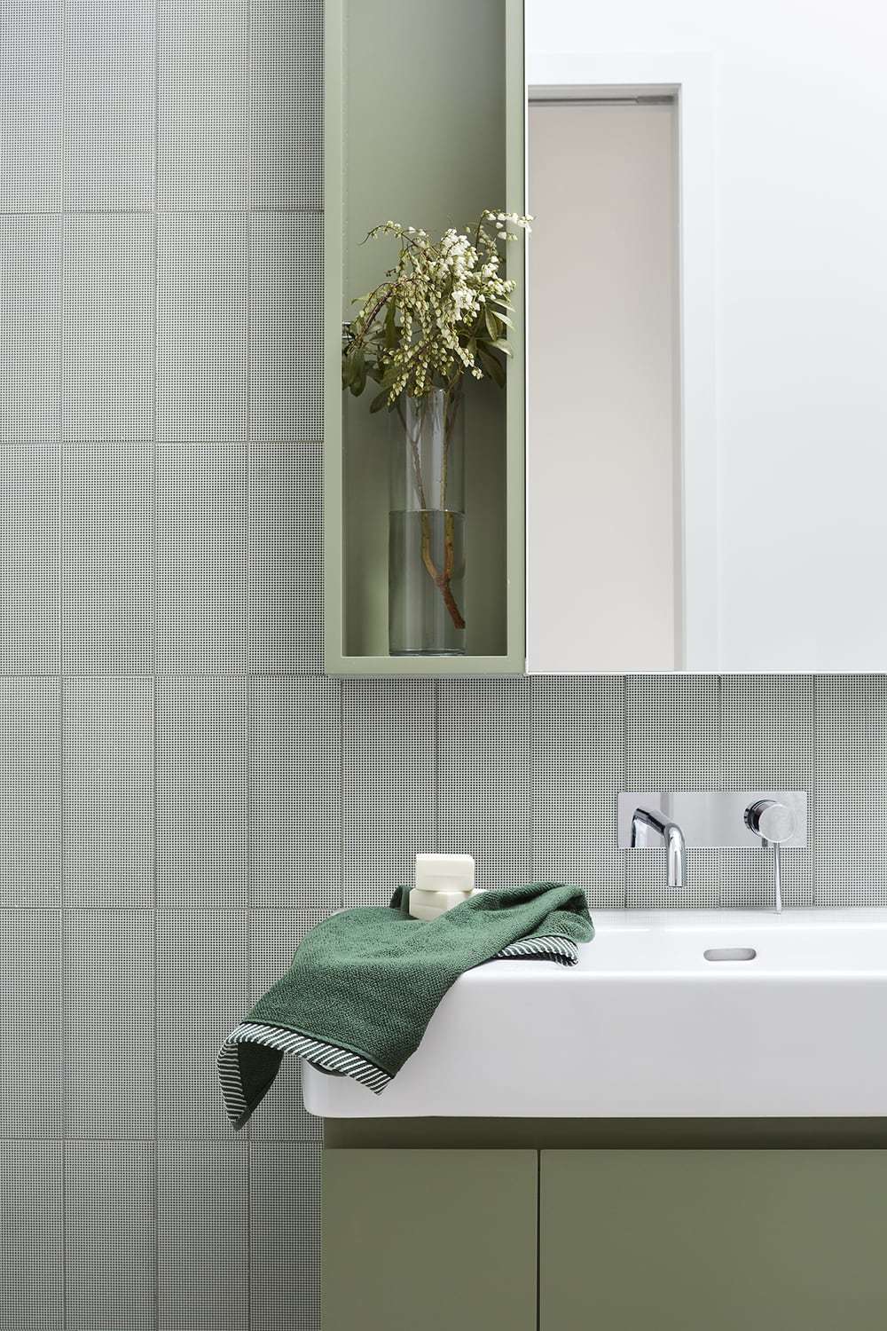
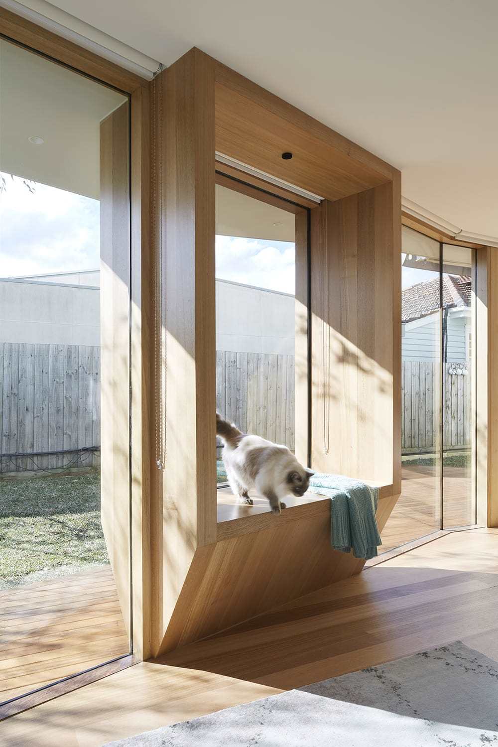
The materiality is lightweight throughout; the palette modest but applied to a lovely design. The external cladding ‘folds’ use a white pre-finished reconstituted timber board, which creates a seamless connection with the existing house, which was extremely important to our clients. Their love for modernism was also important, and they asked us to imbue new joinery with the same optimistic spirit of an existing modernist bookshelf. We played this out in the geometric staircase screen and in the dining room shelving joinery, creating dynamic visual interest. To create a connection to the grass and trees, we used light green in the bathrooms, also respecting the owner’s wishes to work around their existing vegetable garden during the entire process. The cut off corner is now the house’s standout – a crafted timber daybed – within the extension’s light-filled living space. Known as owner ‘Vic’s Perch’, the daybed is visually positioned at the end of the corridor and can be seen from any part of the lower level plan. With cost restraints, we proudly delivered a high performing house including a small complex array of steel to capture the upper level overhang above the double glazing below, photovoltaic panels to the roof, reverse cycle heating/cooling of a heat exchanger. Our fantastic clients had great respect for, and positive engagement with the design process, resulting in a realistic grasp of what was achievable and a high level of satisfaction with the completed work.

