Project: Boulder Mountain Cabin
Interior Design: HMH Architecture + Interiors
Location: Boulder, Colorado, United States
Year 2018
Photographer: David Lauer Photography
Text by HMH Architecture + Interiors
Awards: AIA – 2019 Interior Architecture
ASID – 2019 Residential Merit Award
Renovation < 4,000 SF
Kitchen Remodel
LUXE RED AWARD – 2020 Renovation
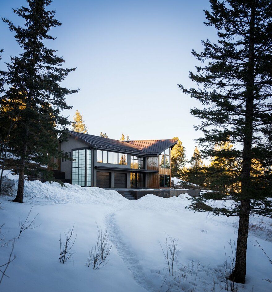
Bear Peak, a picturesque summit in the Front Range Mountains, has long been a fresh-air getaway for Boulderites. Its location is close enough to downtown Boulder for commuting and removed enough to enjoy some peace and quiet after a day at work. But many of the homes in the area resemble cheap timber lodges—and that worn-out look wasn’t what this tech industry, start-up couple had in mind for themselves.
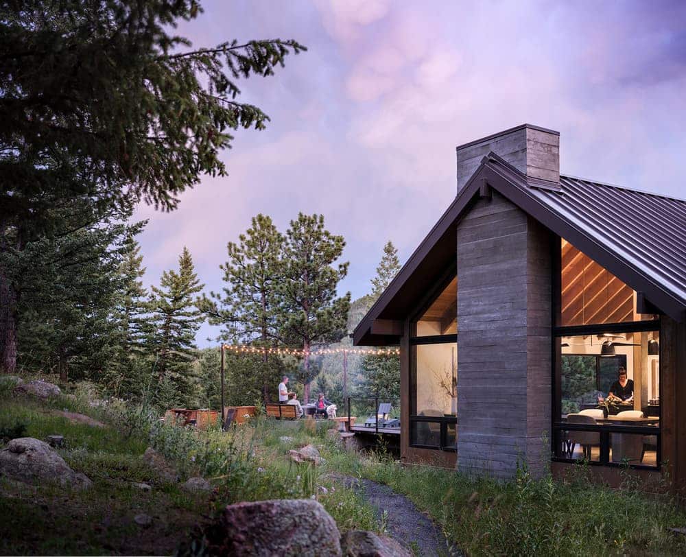
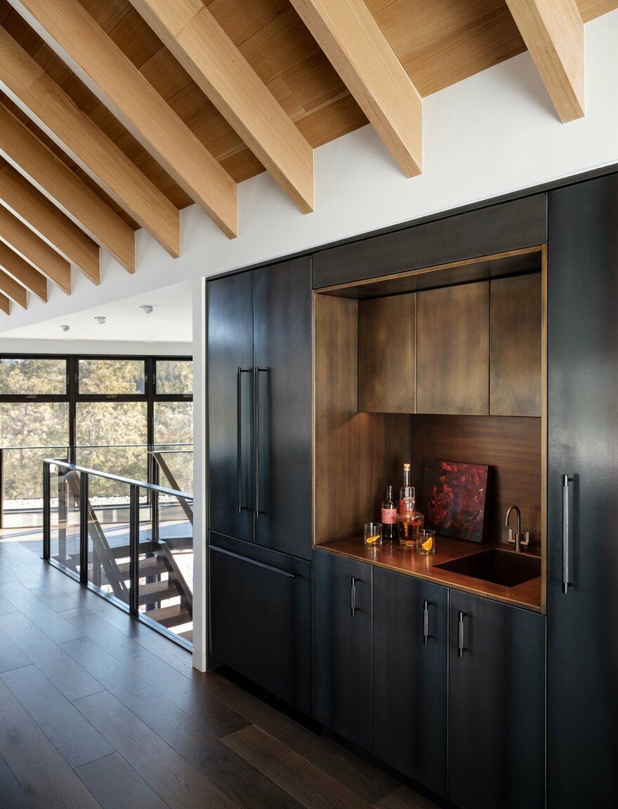
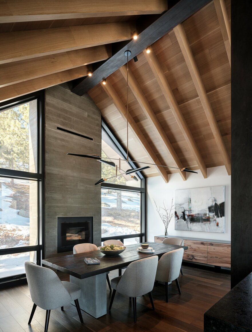
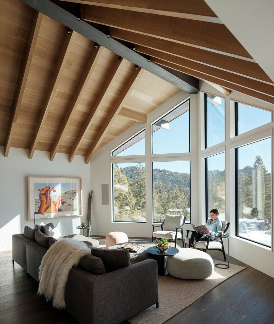
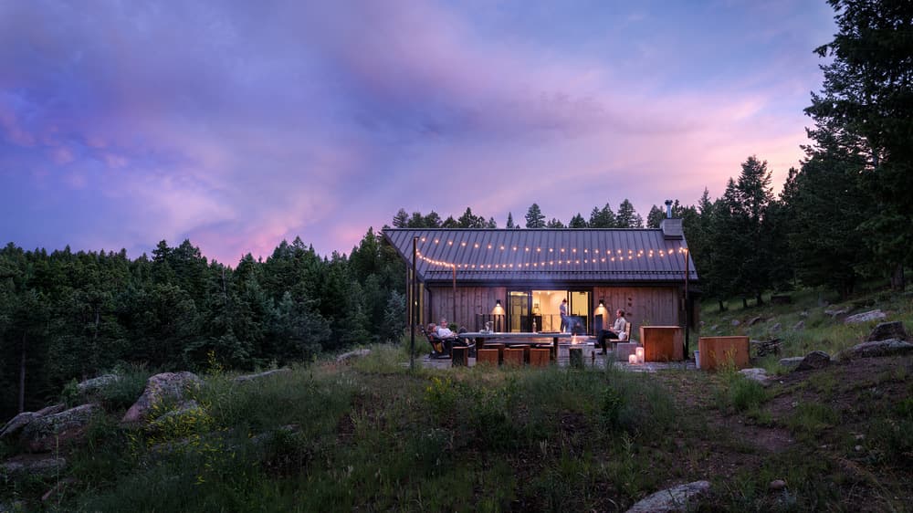
The HMH team transformed this ”funky 70s timber lodge” to the mountain-modern home the tech industry start-up couple always wanted. This Boulder Mountain Cabin reflects a harmonious flow between indoors and out that makes it perfectly in tune with its surrounding natural environment. The architecture and design are characterized by a rustic-modern aesthetic that meshes beautifully with the site. Every detail was well planned and articulated, celebrating the mountain lifestyle.
Project Goals & Challenges
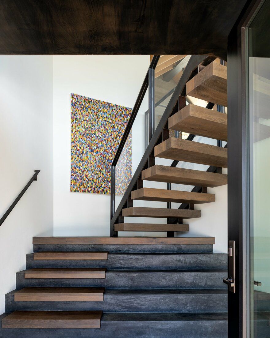
1. Redesign an open floor plan, including the stair location, to open up the house. An outdated floor plan took creativity and an open mind to resolve.
2. Design spaces that are modern, functional and inviting. Finding the right balance of colors, textures and built-ins to take the home from ‘80s-mountain-hunting-lodge’ to modern-mountain-chic
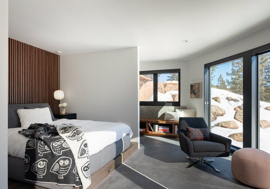
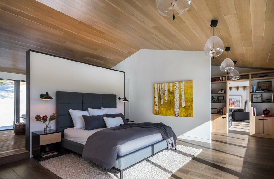
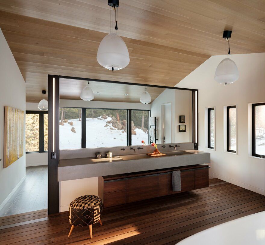
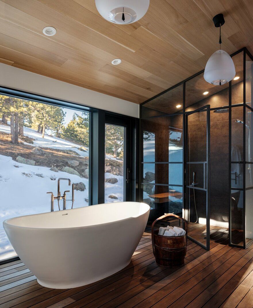
3. Design a master suite that is unique, modern and luxurious
4. A budget and desire to keep all of the existing exterior structure
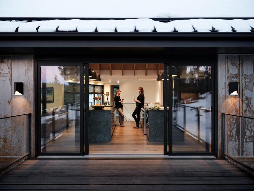
5. Establish a strong connection between internal and external spaces
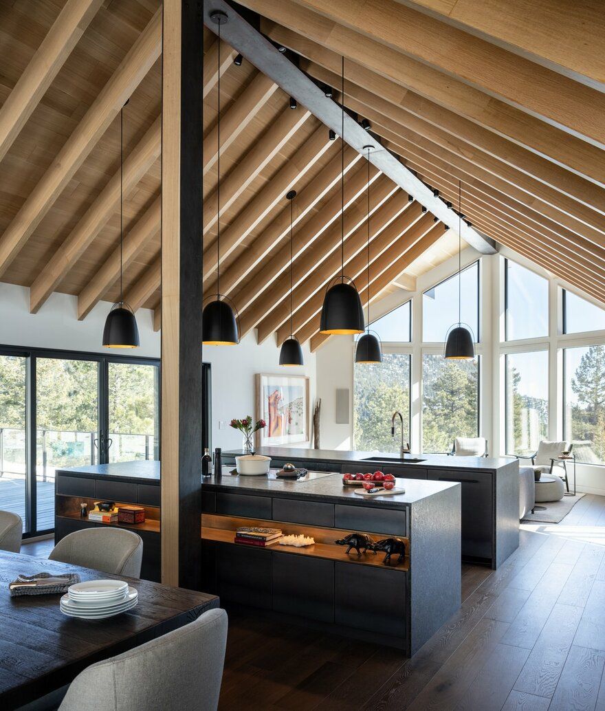
The biggest challenge was opening up the divided spaces and creating an interior that matches today’s lifestyle. The house had honey-oak cabinetry, popcorn ceilings and was worn and dilapidated. The rooms were compartmentalized into a sequence of inefficient spaces. The entryway lacked presence and the kitchen was dark and dated.
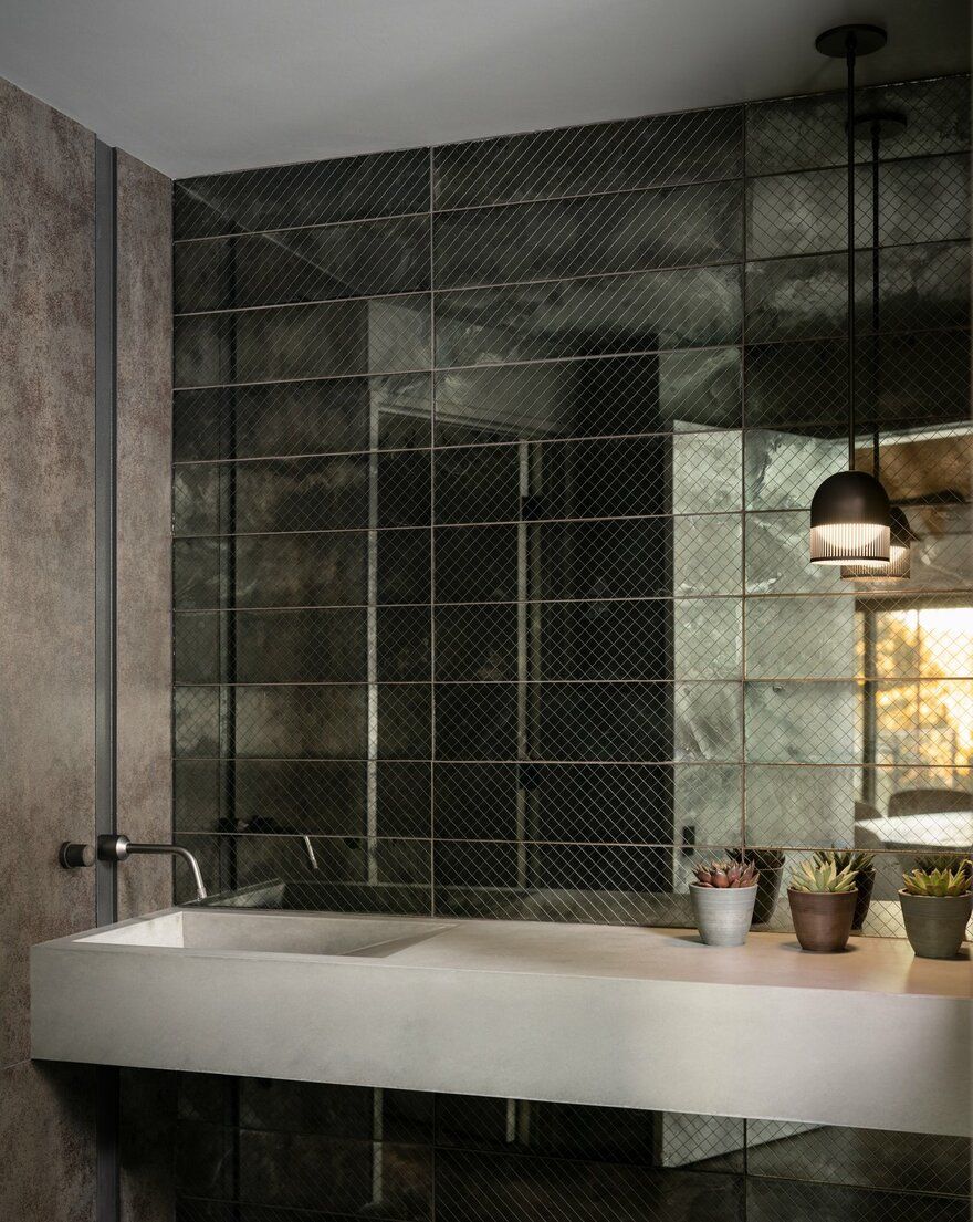
The new design included rearranging the entry sequence, kitchen flow and bedrooms to open up the home and create dual-use spaces. No single room follows norms of the past, or present. Wood and steel are used throughout and the updated color palette incorporates dark tones to give weight and depth.
The new design addresses the context of the mountain setting and respects it’s 1980s origin. The spaces feel relaxed, comfortable and at peace with the surrounding landscape. By collaborating with the homeowner, we were able to bounce ideas off one another; resulting in a space we are all proud of.

