Project: Cobble Hill Row House and Carriage House
Architects: CWB Architects (CWB is now The Brooklyn Studio)
Design Lead: Brendan Coburn
Design Partners: Jason Boutin and Ward Welch
Project Team: Abdou Ndoye, Paula Sherr, Stephen Sullivan
Structural Engineer: Dominick R. Pilla Associates, PC
Location: Cobble Hill Historic District, Brooklyn, New York City
Size: 5600 SF
Year: 2018
Photography: Francis Dzikowski
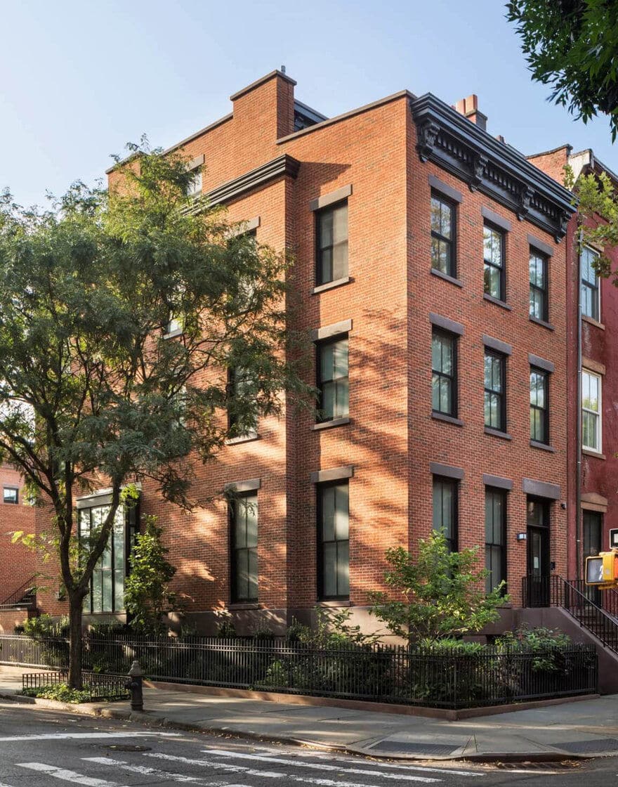
This rowhouse was one of two commissions on a single zoning parcel encompassing the end of a block between Strong Place and Henry Street in the Cobble Hill Historic District. We were first hired to design four rowhouses for a developer who was dedicated to upholding the traditional aesthetic of the neighborhood. Though Cobble Hill remains the most intact 19th century neighborhood in New York City, the clients for this second commission were a family wanting a more modern residence. As the end house on the block, our challenge was to design this fifth building to contribute to, and be integral with, the historic neighborhood fabric while exhibiting modern aesthetics on its three visible facades. We accomplished this in two principle ways.
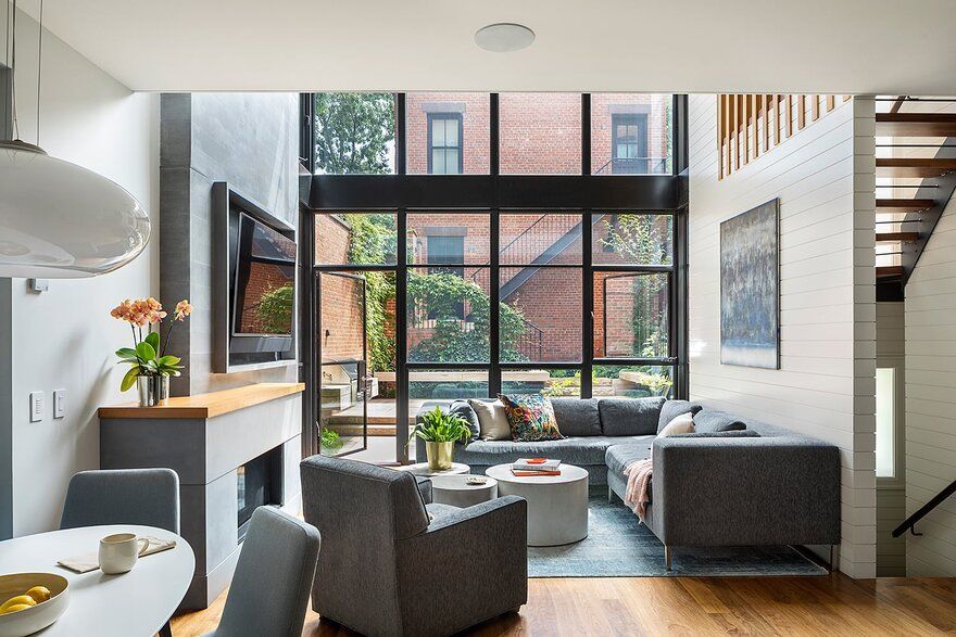
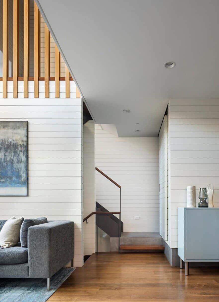
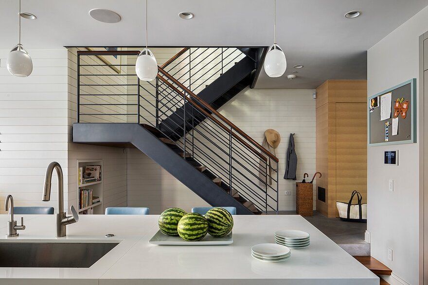
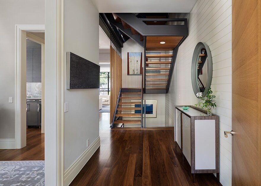
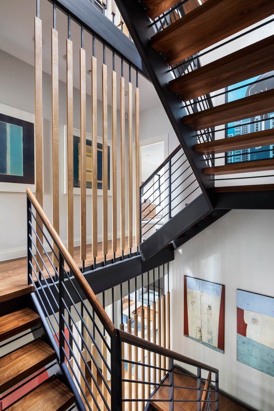
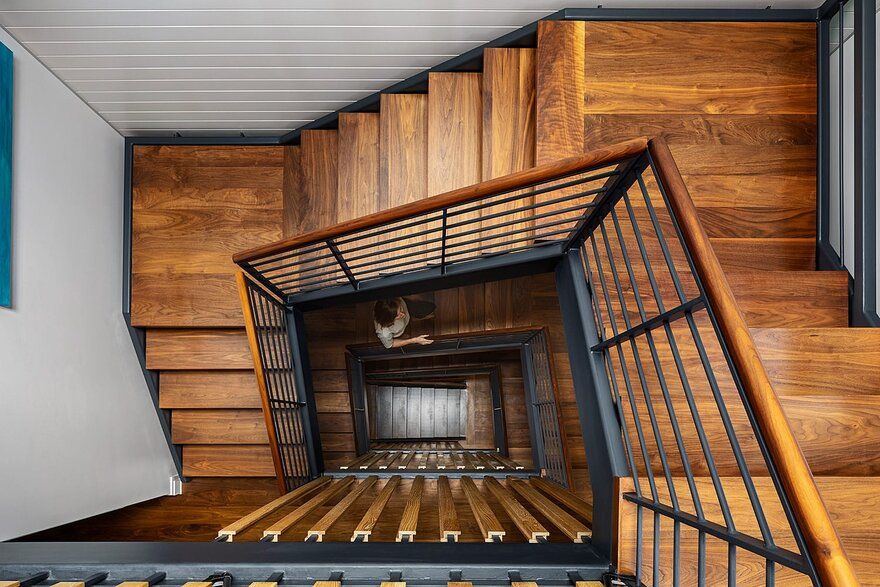
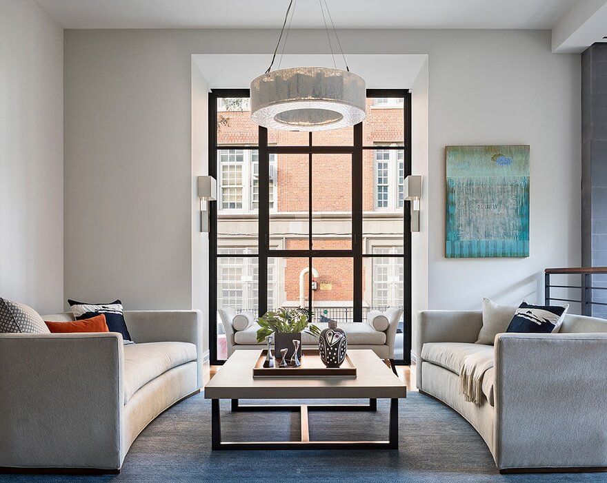
The interior plan arrangements, the Cobble Hill Row House section, and the staircase configuration are modern in their design. Our intent was to allow the major communal areas of the home to overlap both vertically and horizontally. Double-height space is unique in townhouses, but it is employed here to vertically connect rooms on the garden and parlor floors,and to horizontally increase the visual connection of both floors to the rear garden. The design of the main stair funnels light from a roof top skylight down through the house’s five stories and celebrates the mundane act of vertical circulation so integral to life in a townhouse. Fully open from top to bottom, it connects the home’s garden, family room and kitchen to a top floor TV room with views of New York Harbor and downtown Manhattan.
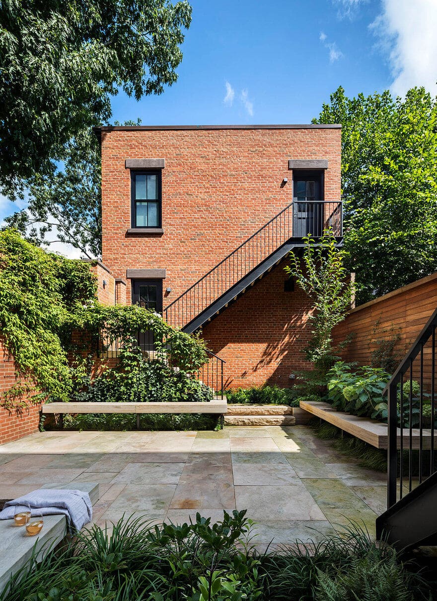
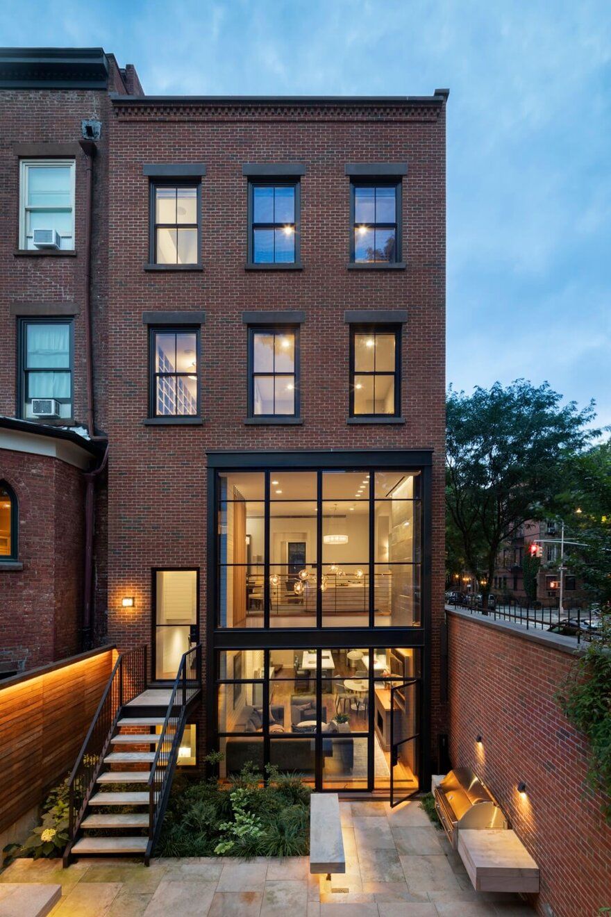
On the exterior, we manipulated the massing and detailing of the façades such that their traditional design belies the modern volumes within. We also tweaked exterior details to reflect a more modern sensibility. The oversized central projection on the Kane Street façade serves to maximize the footprint of the building on its irregularly shaped lot, and to conceal the brick control joints. The rear bay and the oriel window are steel and glass – taut and more transparent than those typically seen on a traditional project. The exterior finishes, basic fenestration, and general massing work together with the modern design elements to complete an elegant statement rooted in a deep knowledge of the local vernacular and the neighborhood’s scale and materiality.

