Project: Contemporary Family House #3
Architects: Studio2 Architects
Location: Auckland, New Zealand
Project Complection: 2019
Photo Credits: Simon Devitt
Text by Studio2 Architects
2020 Winner Auckland Architecture Award
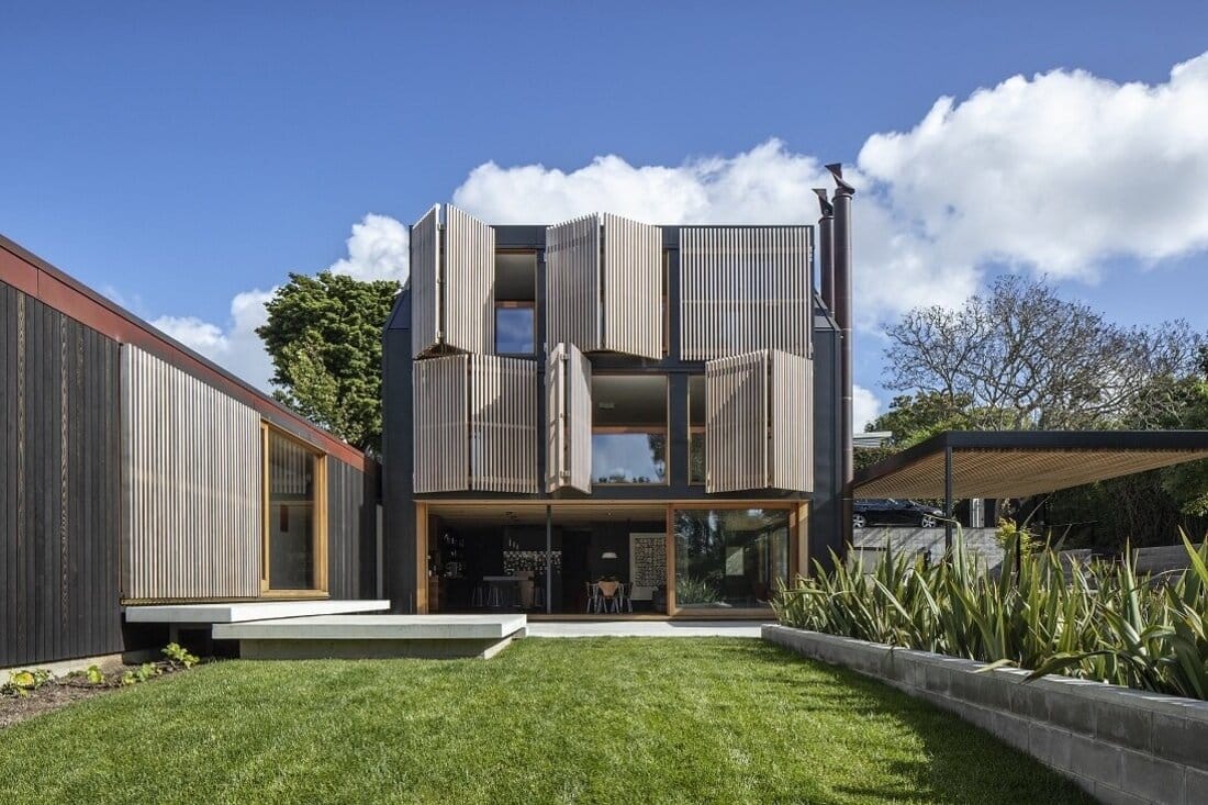
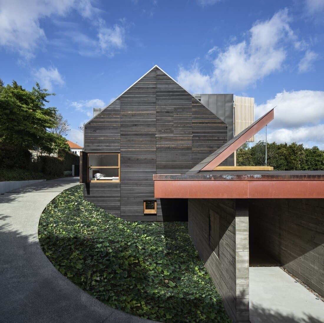
The main footprint of the old house has been respected and the new contemporary family house takes on the memory of its original form while, refining the detail and layout of the spaces. The new layout has been designed into modules that create meaning and purpose to each of the spaces taking into consideration composition, scale, proportion and craft.
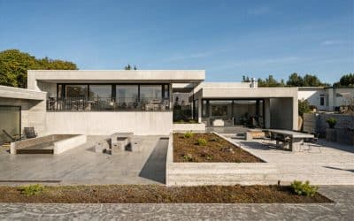
The journey to the entry allows for the appreciation of the building unveiling scale but allowing for an intrigue and a way to experience the home in its transition between its forms. As you walk down the drive the #3 concrete emblem is a tribute to the architect’s family – his wife and two boys and also reference to the street address – 3.
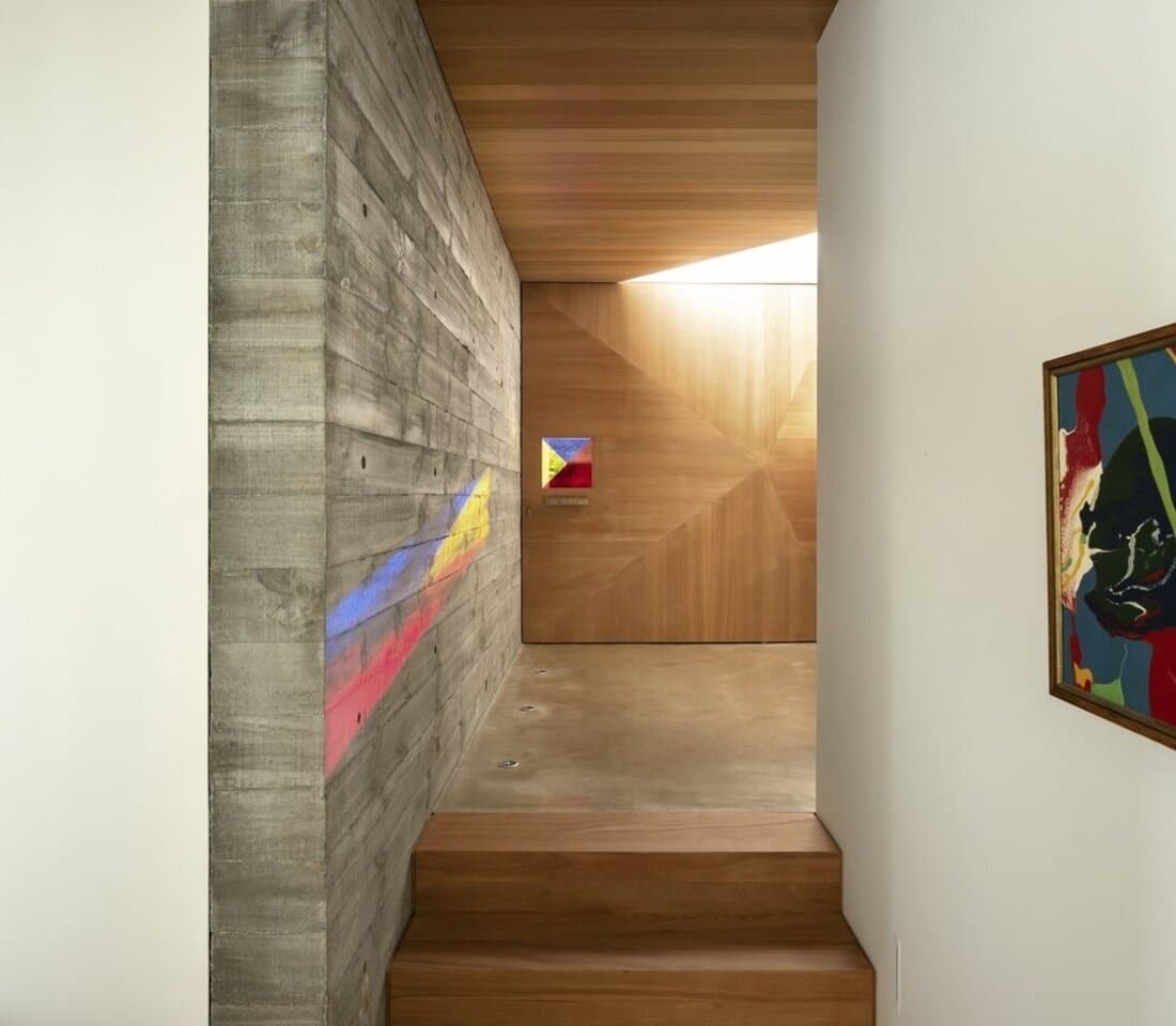
Once you arrive at the entry and car court you enter through crafted in-situ concrete walls that nod back to the memory of the cedar weatherboards of the old house. The door representing the architectural symbolism for a pivot door and it is three dimensionally in section. The coloured glass captures the primary colours – the starting point for any artist in the production of an artwork. Additionally, this coloured glass is reminiscent of a previous house we owned and altered designed by Graeme Murray in 1975 that had coloured glass in the gable ends – like an artwork. The in-situ wall holes have been filled with coloured perspex extending and playing on the theme of colour.
Upon entering, light delights from above through a sculptured skylight a request from Deb for the main bedroom to see the sky. Repeating this idea in the entry provides an interesting light quality that changes and allows an interaction with the natural light of the day or night and changing seasons.
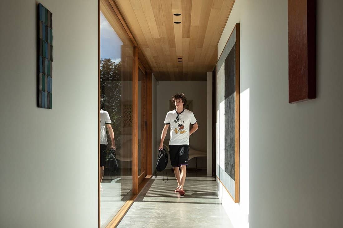
The transition into the main part of the home is created through a change in material from a concrete polished floor in the entry to Matai timber steps (again nodding to the memory of the old house which also had Matai timber flooring) before coming back to concrete and, like an Escher 3D artwork, meeting another set of steps that take you in another direction.
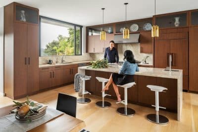
A glazed link between the two building forms creates a flash of transferal into another zone. It is at this point that you arrive into the kitchen, dining, and family area which is the heart of the home – the family hub!
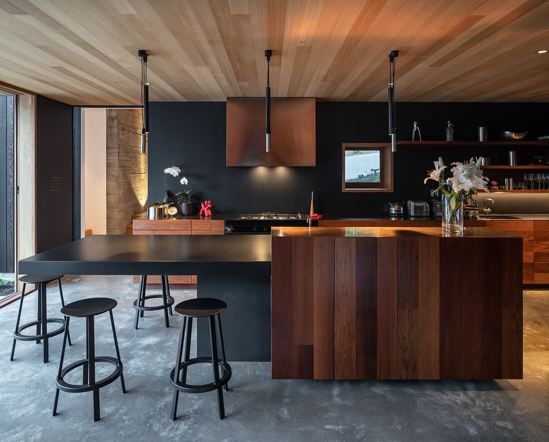
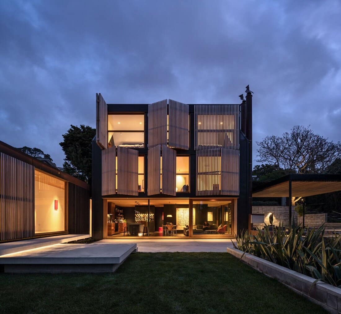
Timber joinery, cedar ceilings, recycled timber (reused cedar weatherboards of the previous house), and black walls provide a dramatic, refined but homely simplicity. A black blackboard paint magnetic wall offsets drama and art with playfulness and frivolity. Glazing to the north allows you to connect and be part of the landscape connecting you to the outdoors with established trees many of which were planted in the early 1940’s.
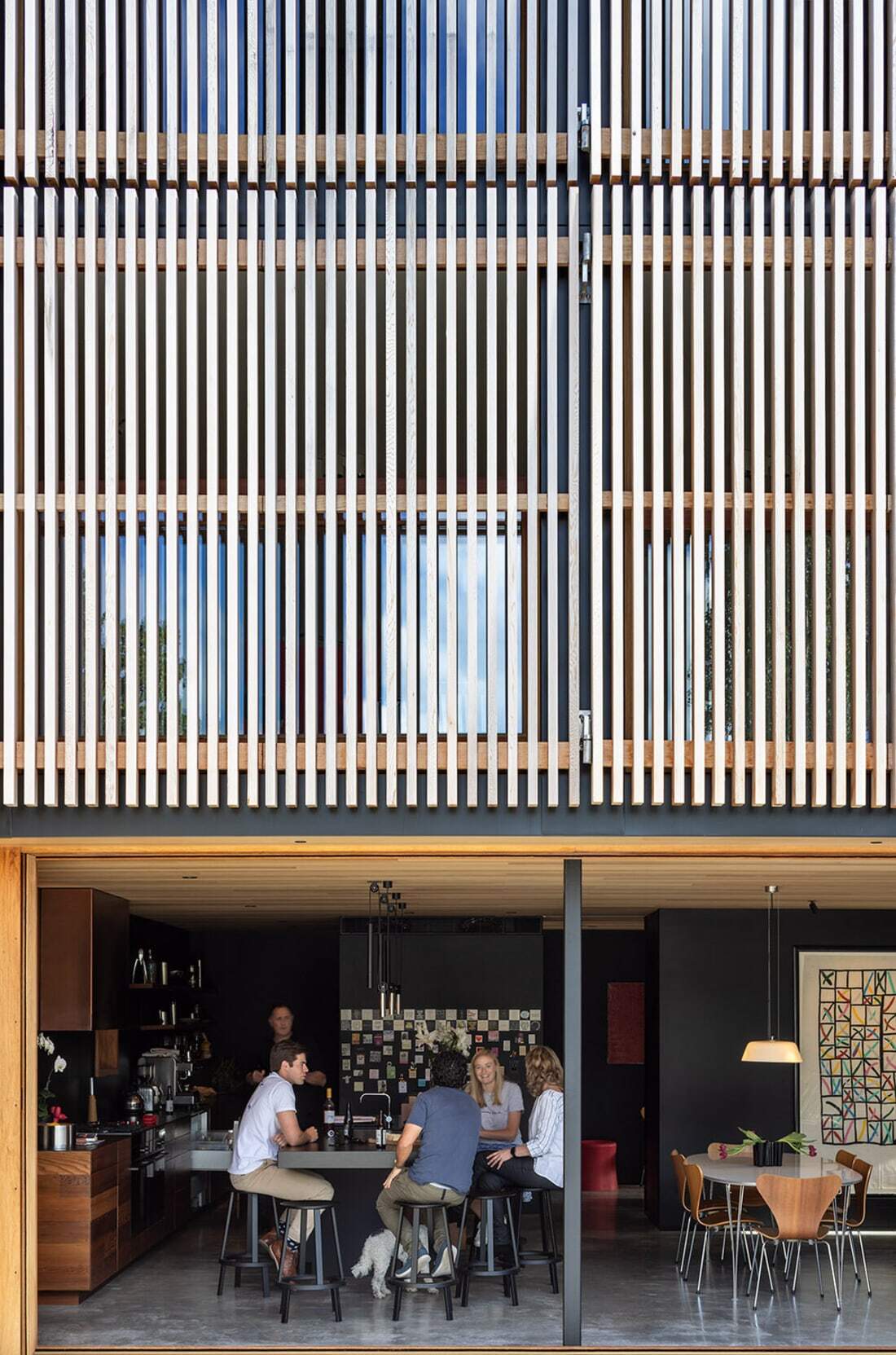
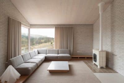
A simple palate of natural materials in the family room and adjoining library contain a collection of art, objects, and books that all have meaning and memories for us as a couple and a family. The kitchen is a central aspect of the home where enjoyment of food, beer, wine, family and friends creates memories daily. There are several different zones within the kitchen – cooking, coffee, prep, baking, storage and cleaning.
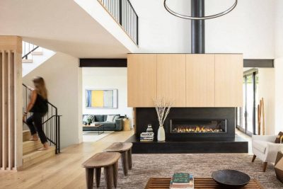
The stair is in the same position as the stairwell in the previous home establishing a memory of place while also providing a sense of privacy to the transition of the floor above.
Matai stairs and sculptured handrail lead you to the floor above containing the guest bathroom, guest bedroom, a study and a family lounge which provides a connection looking over the land offering a different visual experience of the site. The floor level relates to the previous house and the ceilings are set at 2550mm also reminiscent of the old home. A white gallery style space showcases the art and the movable shutters allow the manipulation of light and cooling in the summer. The shutters use the European idea of keeping the sun out but allowing ventilation. Double hung windows crafted with stainless steel weights are filled with lead gunshot allowing the windows to fully open creating a balustrade and the feeling of an outdoor room.
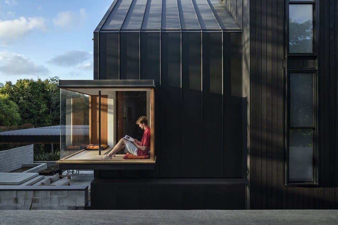
A study perched in the southwestern corner has a bay window for the dog to nap and family conversations. It has been named the “control tower” as it is the viewing space for people coming and going from the property. Upstairs is the BOYS zone, containing 2 bedrooms, a studio, storage and a multifunctional bathroom space. The ceilings craft the cross section of the building form creating a volume celebrating the sense of space, air movement and the feeling of floating in the trees – private, intriguing and relaxed.
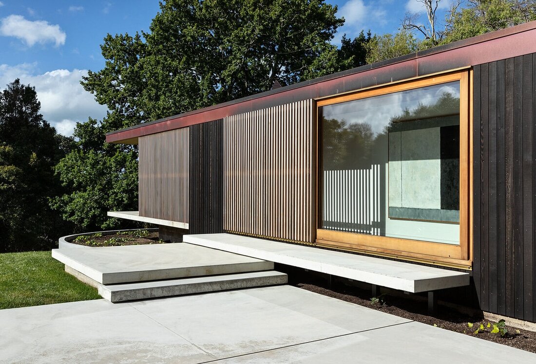
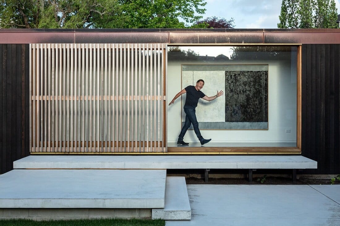
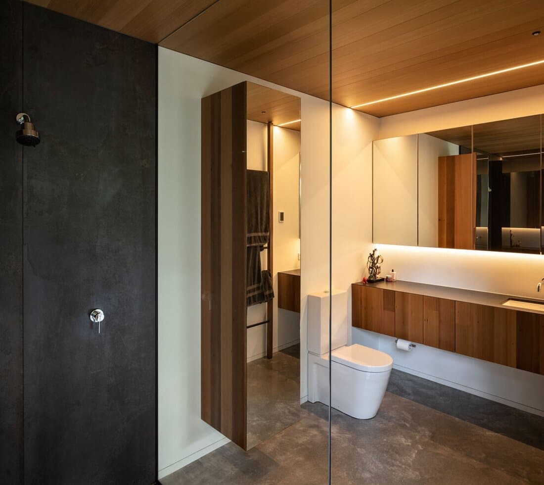
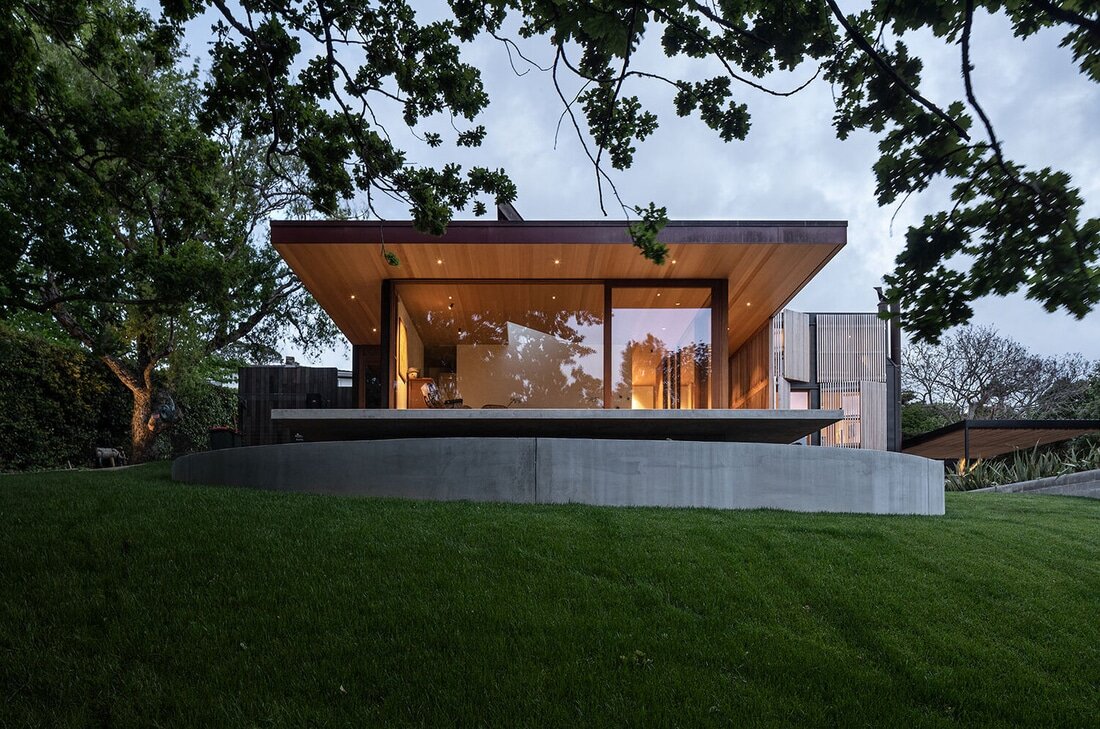
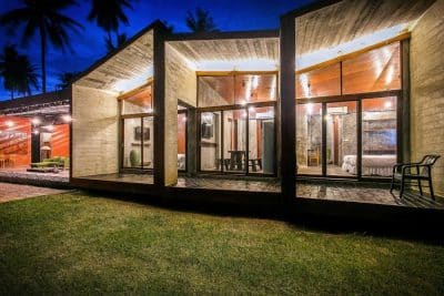
Back down at ground level, the other zone connecting from the entry is a multipurpose garage for car storage or a games room with table tennis and a sliding wall/door for connection to the outdoor areas – an easy, adaptable space. This wing contains the laundry/mudroom, main bedroom, wardrobing and en-suite. The main bedroom is suspended out into the garden to the north surrounded by trees with a beautiful Oak tree (around 70 years old) to the northeast and a connection to the lawn. The floor to ceiling windows allows filtered light to shine through the trees, a moveable shutter screen is available for privacy or sun shielding, and the skylight above the bed allows for a feeling of yearlong camping – capturing the changes from day to night and the opportunity to sleep with the stars and the moon.
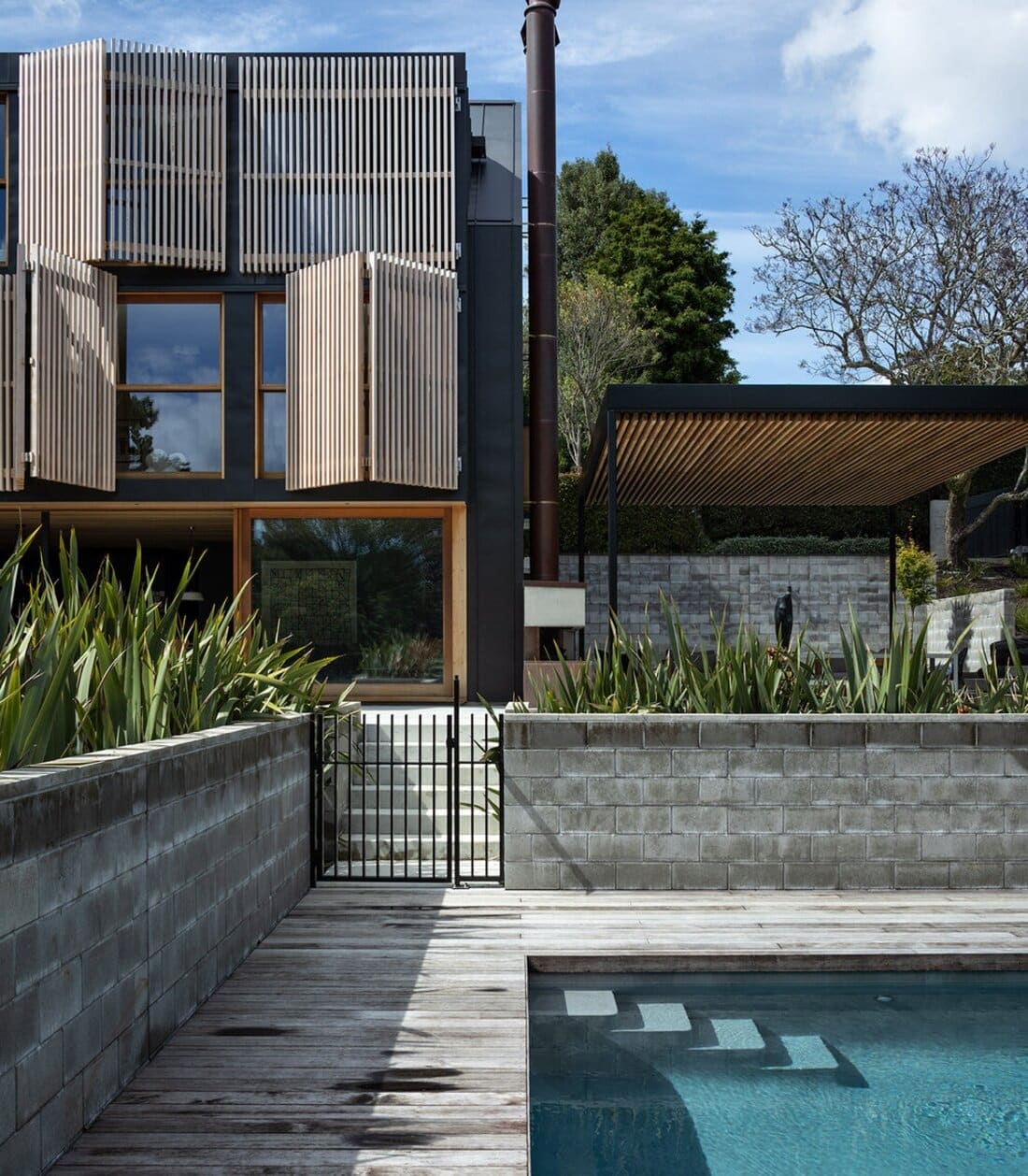
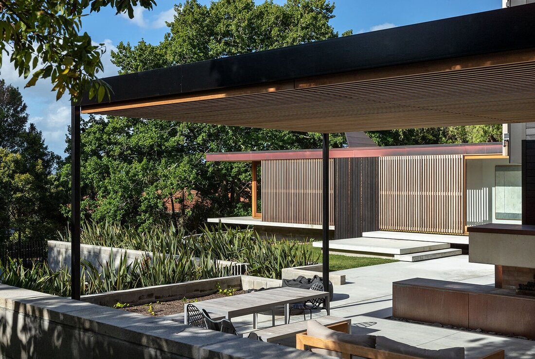
Outside the pool area is set down for shelter with walls for water sport rebounds. The outdoor living area with covered openable roof, dinning, lounging and fireplace creates a space for enjoyment throughout the year. Each of the different zones and spaces of this contemporary family house allow for new memories, connection, adaptability and JOY!

