Project: Electra Sea Penthouse
Planning and Interior Design: Orly Silber
Coverings and Surfaces: Laminam – Israel
Location: One of the central cities of Israel
For: A family with two young children
Property: A 190 square meter penthouse apartment with a 75 square meter terrace
Photo Credits: Oded Smadar
Across the length and breadth of Israel, in recent years, many inspiring apartments and homes have been designed. However, only a few of them hold a unique concept woven as a thread throughout the spaces. An example of this is a family penthouse apartment designed by interior designer Orly Silber, who succeeded in combining a conceptual idea that adds visual dimension and a lot of interest. This is how the Electra Sea Penthouse looks from the inside –
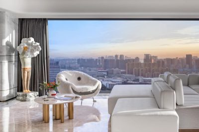
The Electra Sea penthouse is located in one of the central cities in Israel, in a new tower on the front line facing the sea. It’s conceptual, meticulous, and crafted, with its large windows revealing a panoramic view of the abundant waters. The mind behind its planning and design is Orly Silber, owner of an interior design studio, who shares her process:
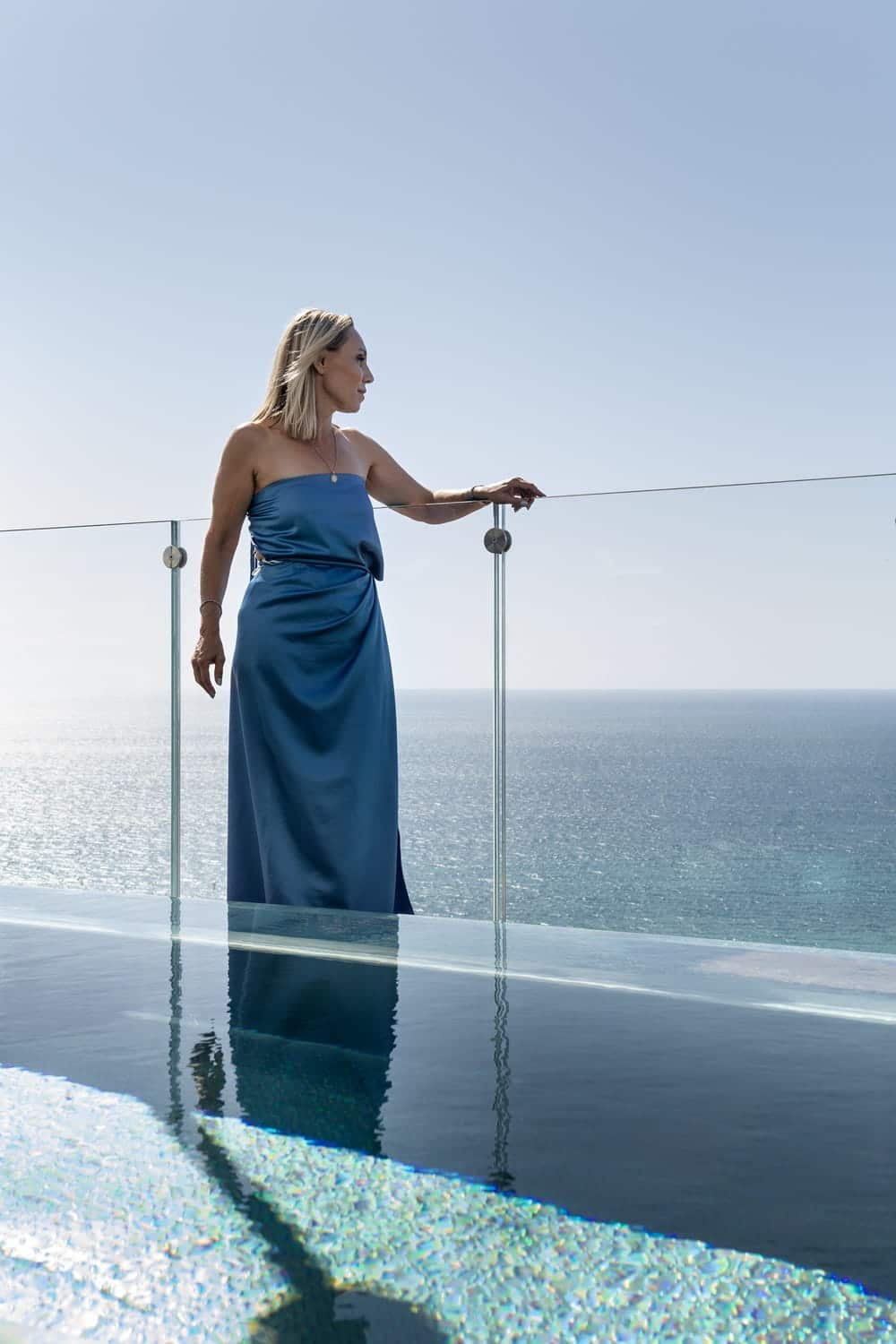
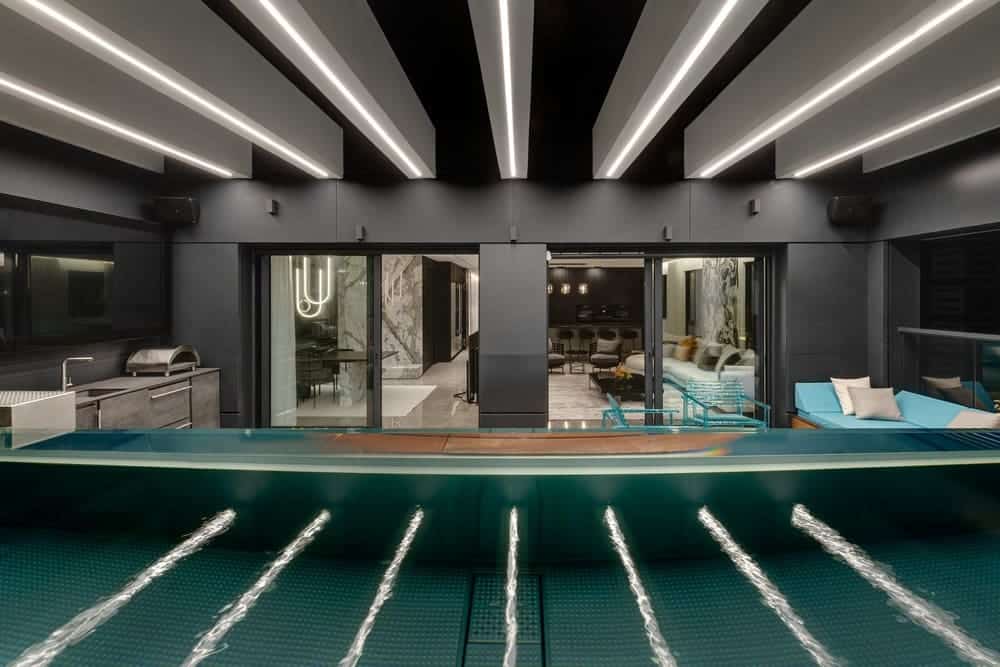
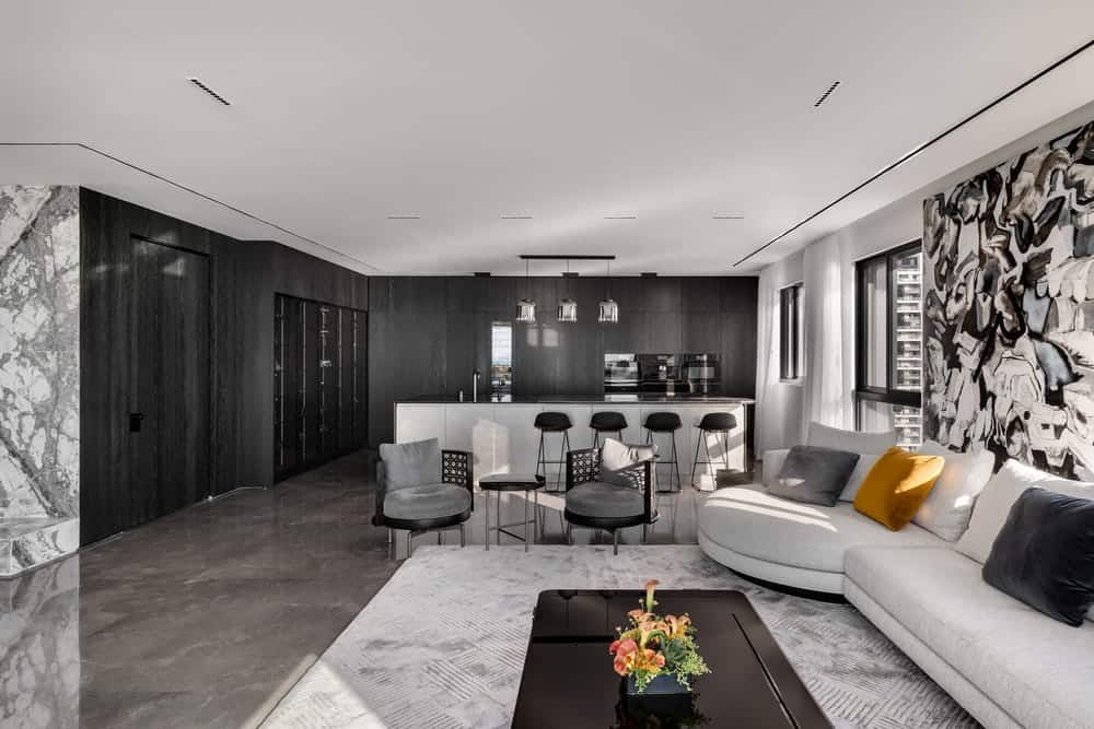
“We received the apartment in a basic state, and as such, it provided numerous planning options. We divided it in a way that suits the concept and the family’s needs – creating a clear separation between the hospitality wing and the living area, connected by a hidden door that’s an integral part of the kitchen facades. When opened, it reveals a corridor leading to the bedrooms. Inside, it was important for us that the kitchen, dining area, and living room enjoy an open view of the sea and the terrace where an infinity pool was planned, with a transparent wall, so it seems as if the entire apartment seamlessly merges with the sea.”
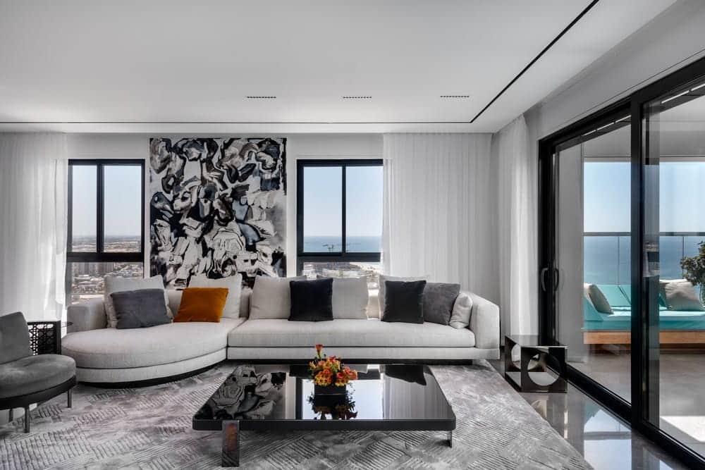
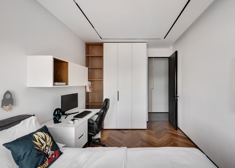
The meticulous planning doesn’t stop there; Silber chose to create an intriguing dimension in the apartment: “We opted for a unique concept that links the spaces – elements carrying broken line shapes that weave through different parts of the house. They create movement and add another dimensional aspect. For example, in the fireplace wall in the dining area, in the carpentry connecting the public and private areas, in the master bedroom, and even in one of the children’s bedrooms, where we integrated the concept of broken lines into the bedframe.”
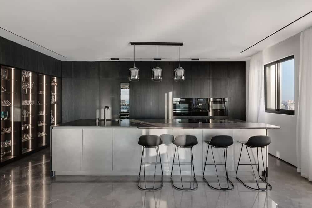
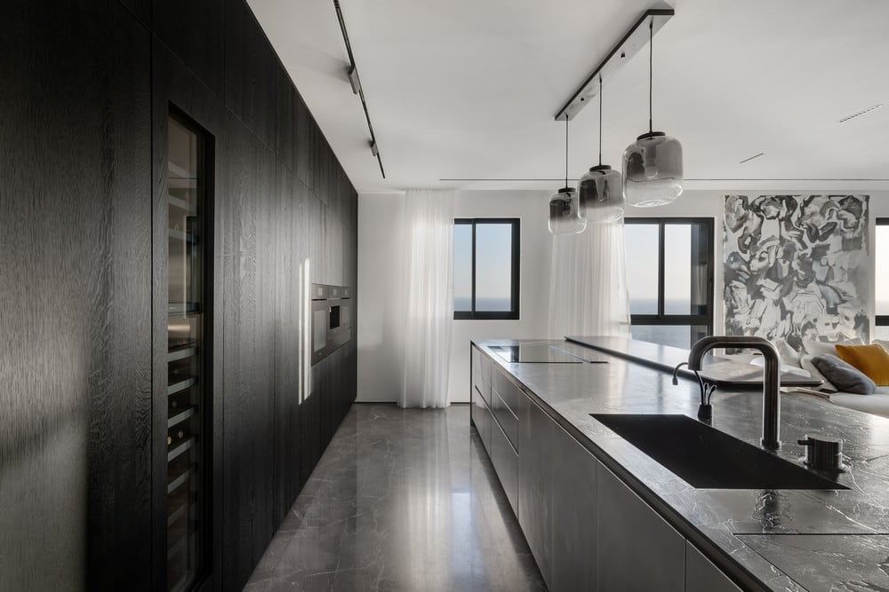
It’s hard not to be impressed by the minimalist and crafted approach, focusing on every detail: “We extensively used coverings: one of them is the ‘invisible gray’ tile that we used to cover walls in the living room and dining area, and in high-quality surfaces by ‘ Laminam’ that allowed us to create a look of organic and natural stone while remaining optimal in terms of maintenance and cleaning. The color scheme is monochromatic, a decision made beforehand to give the right stage for the pool and the sea. We also integrated reflective elements that bring in space and light, introducing the landscape inside.”
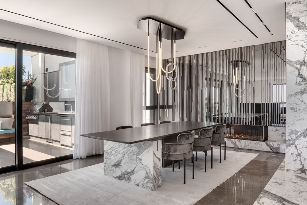
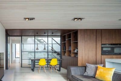
As you enter the apartment, the kitchen, the living room, and the impressive view are revealed. The dining area is located near the living room, in a cozy and intimate corner yet still enjoying the exterior views. “The broken lines concept is more pronounced in the dining area,” explains the designer. “The fireplace wall has a textured appearance and serves as a storage cabinet. We incorporated aluminum rods on the glass, painted in a silver iron hue, creating interest and rhythm while also serving as furniture handles.”
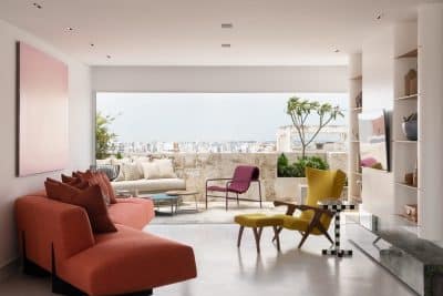
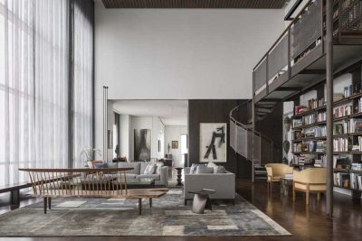
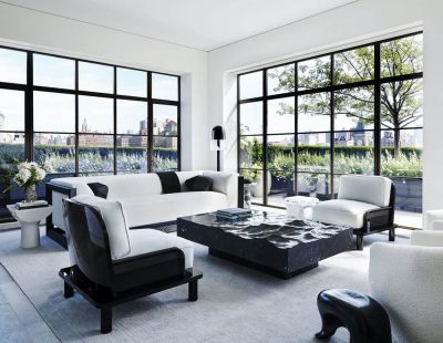
“For the living room, I chose seating arrangements with rounded silhouettes and dynamic art pieces that break and soften the geometric mass. A special television screen serves as a subtle division between the living room and the dining area, sitting on a rotating base, allowing the background to be shifted according to both spaces.”
“It was important to me that anyone working or spending time in the kitchen enjoys the view, so I created an L-shaped space, with an angled view from the corridor, lined with tall cabinets and black glass vitrines that amplify the dramatic effect. The fronts are coated with darkened veneer, enhancing the wood’s fiber appearance. At the center stands a stainless steel island, beneath which a Nero Marquina marble slab emerges, housing a TV when needed, which ascends from below using a mechanism within the furniture.”
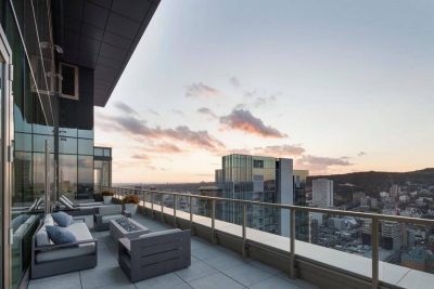
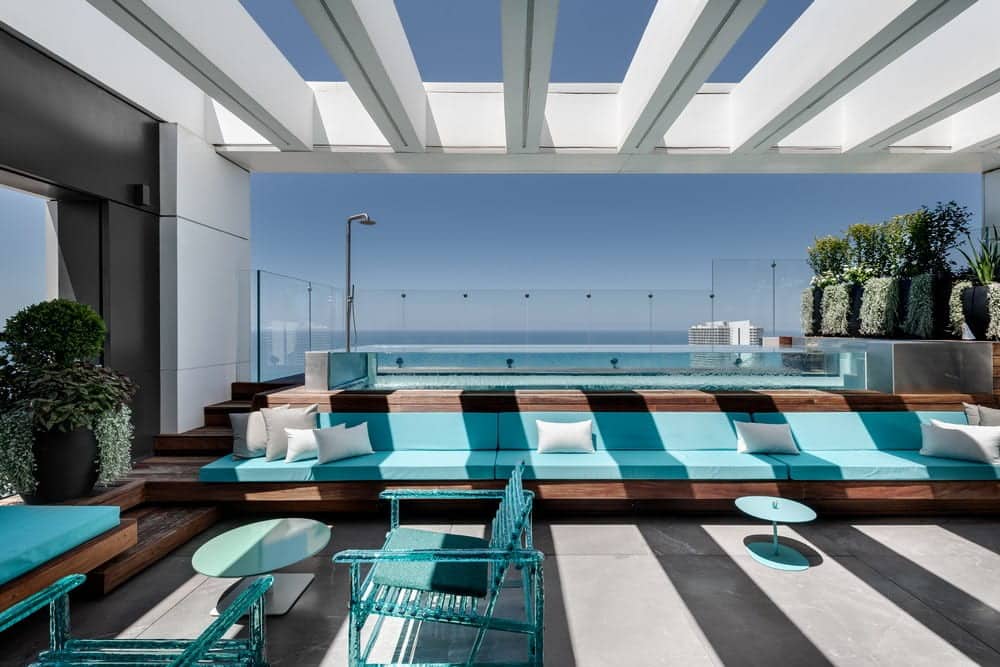
“The terrace is undoubtedly one of the highlights of this apartment: besides the pool that occupies a significant portion, I wanted to integrate additional hosting functions while preserving space and flow. Thus, for example, family members and guests enjoy a fully equipped outdoor kitchen and a giant TV; comfortable chairs made of luxurious transparent perspex in a clear turquoise shade that adds an airy and transparent dimension; and a built-in bench, refurbished in shades of clear blue and turquoise, acting as a sort of slide that doesn’t obstruct the view. In practice, we created a wonderful space for entertainment and events, maintaining a light texture, so even when looking from the apartment towards the view, there are almost no barriers obstructing the sight.”
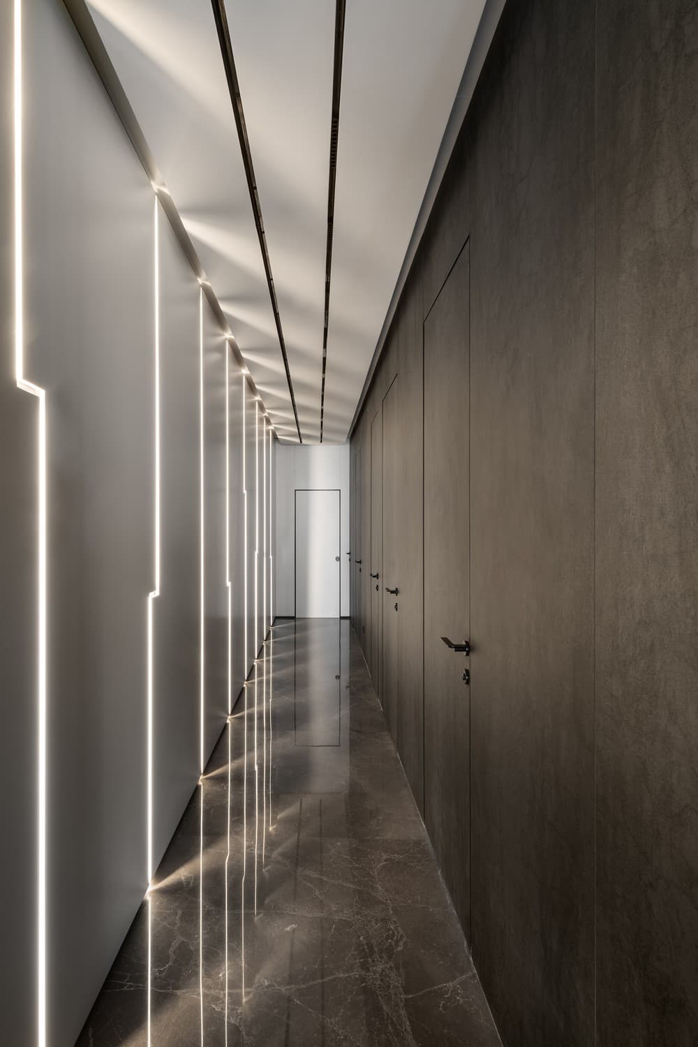
From the public to the private: in the transition between the kitchen and the bedrooms, Silber created a robust wall of carpentry with light streaks that stay true to the broken lines concept, creating movement in the given space. She covered the opposite wall, where the entrance doors to the children’s rooms are located, with meticulously patterned surfaces by ‘Laminam’ in a dark gray natural stone tone. The opposing side of the doors was covered with brighter surfaces also bu ‘Laminam’.
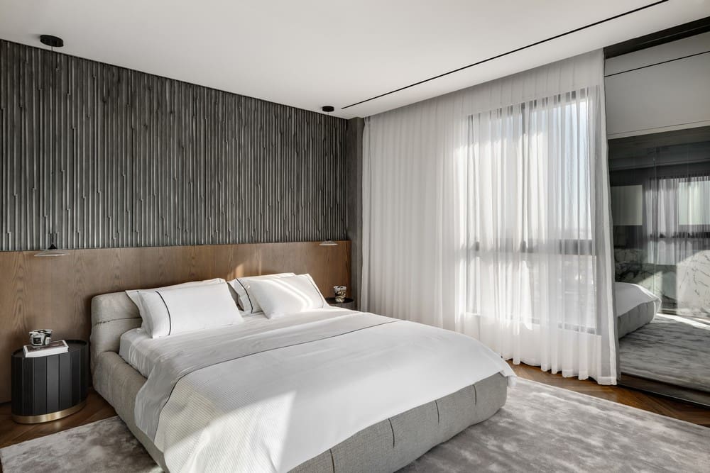
“In the bedroom wing, we aimed to create a warm atmosphere. The floor is adorned with oak parquet laid in a herringbone pattern. In the children’s bedrooms, we incorporated warm color elements without disrupting the precise and crafted look.”
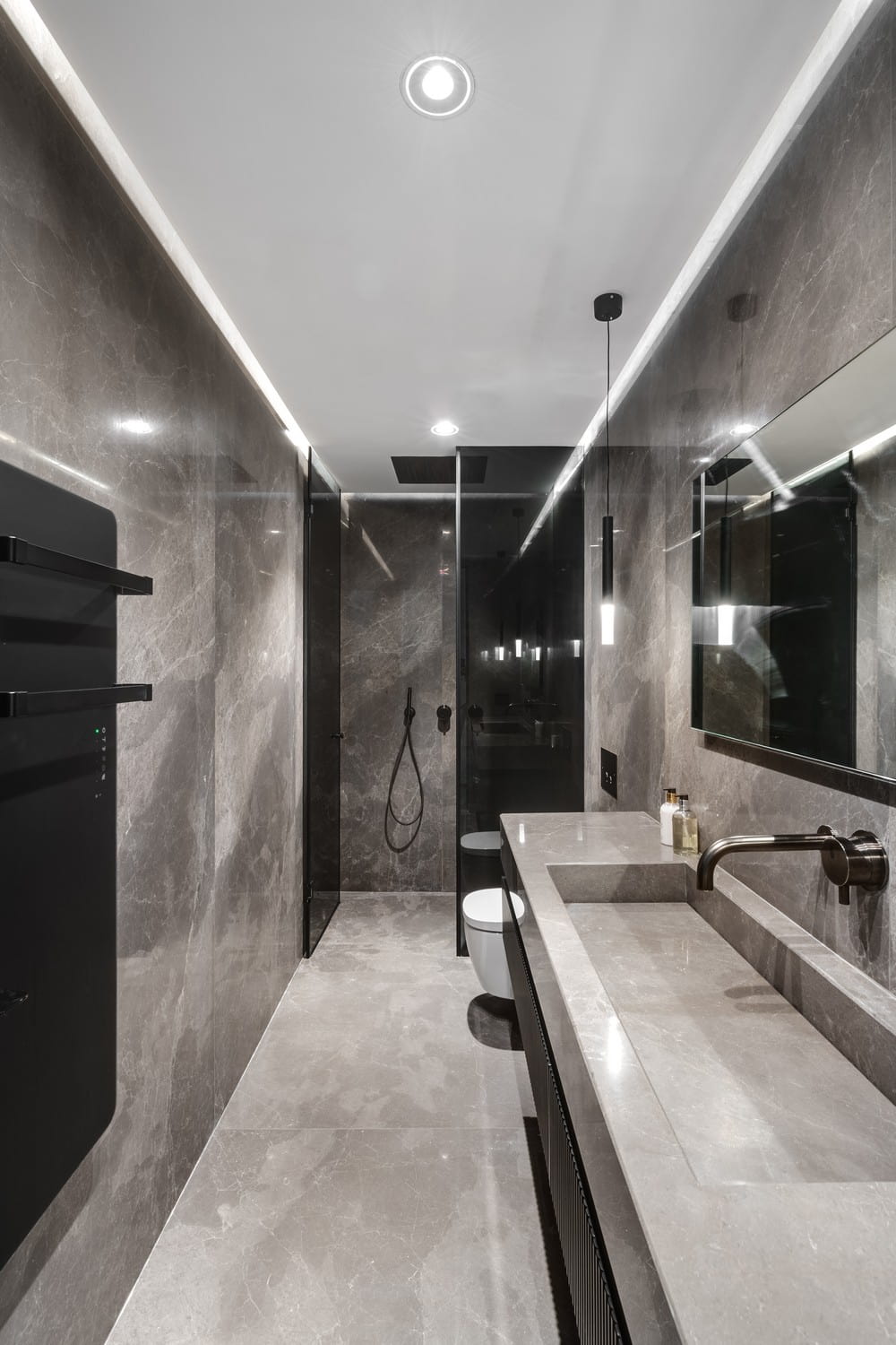
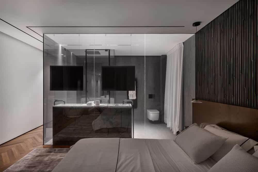
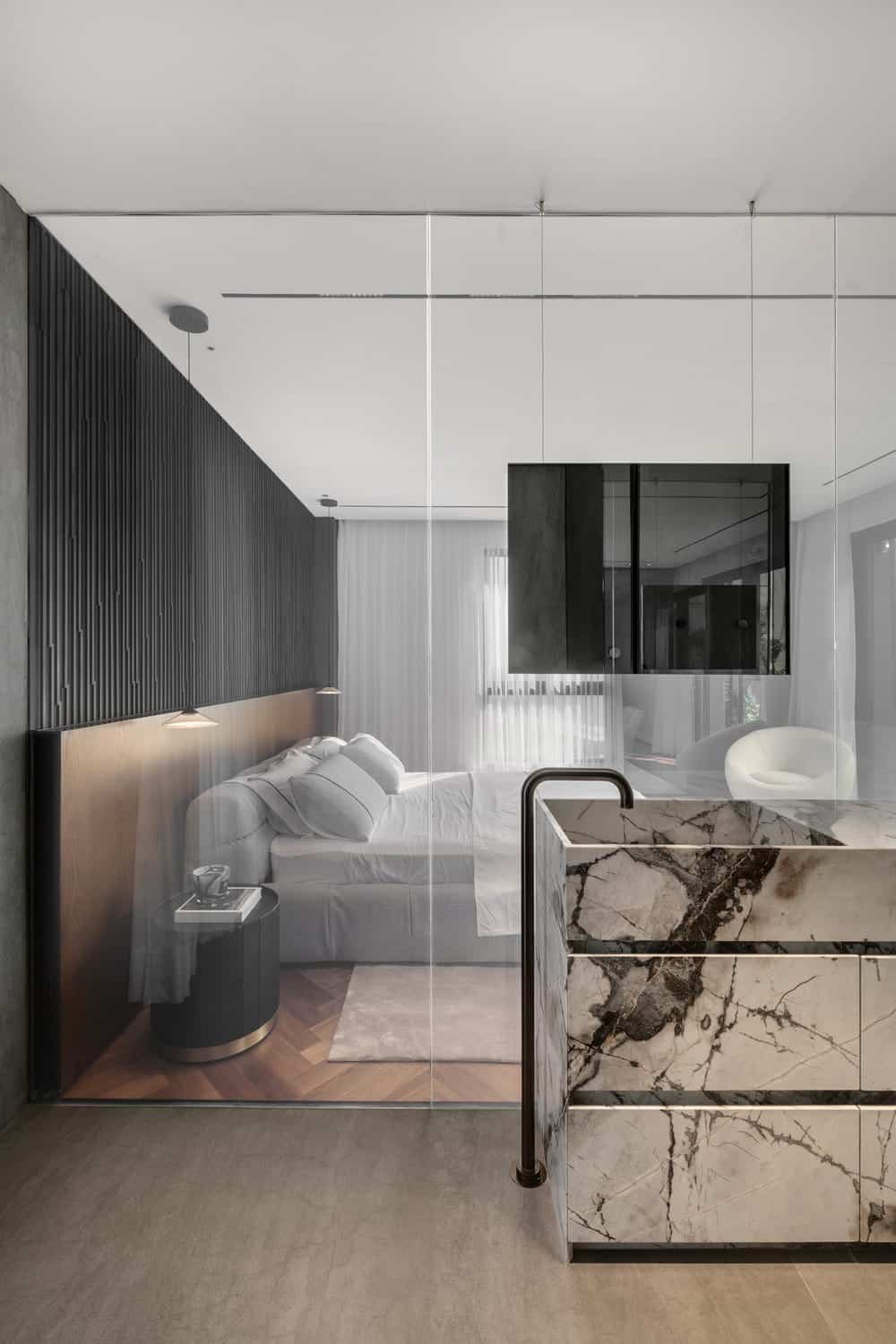
Upon entering the master bedroom, there’s a hallway leading to the spacious and airy walk-in closet, also coated with surfaces by ‘Laminam’, this time in a slightly different shade. We created a spacious and airy space with transparency plays. For instance, the bathroom, completely transparent and facing towards the bedroom, led us to use on-demand opaque glass, providing privacy when needed. Within this concept, we chose two-way mirrors descending from the ceiling, and in the large shower, apart from jets, we added a sauna system, much like in a Turkish hammam. The bathroom cabinet is entirely made of marble, and for the walls and floor, we opted for surfaces, this time in a light gray shade complementing the colorful palette of the space. The broken lines concept recurs in the bedhead wall, where its lower part is covered with black veneers, above which dark and dramatic rods are added.”
