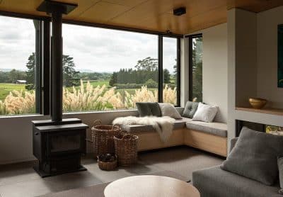
Project: Irwin Caplan Midcentury House
Architects: SHED Architecture & Design
Contractor: YS Development
Structural Engineer: Todd Perbix
Location: Seattle, Washington, United States
Year 2019
Photo Credits: Rafael Soldi
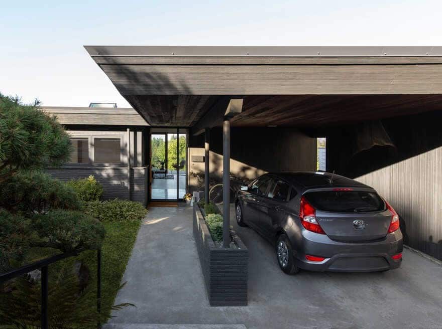
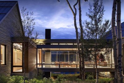
Originally designed for Irwin Caplan, the illustrator who designed the poster for the 1962 Seattle World’s Fair and cartoonist renowned for his “Famous Last Words” comic strip in The Saturday Evening Post, this mid-century home was both humble and grand–a modest one-story street facade harboring floor-to-ceiling windows with territorial views.
The new owners bought the home directly from Caplan’s estate in hopes of settling their growing family into the residence conveniently located near public transportation and the Burke Gilman bike trail. But in order to accommodate the family, the mid-century home needed updating, remodeling, and fortifying–Seattle-based SHED Architecture & Design was selected to tackle the project.
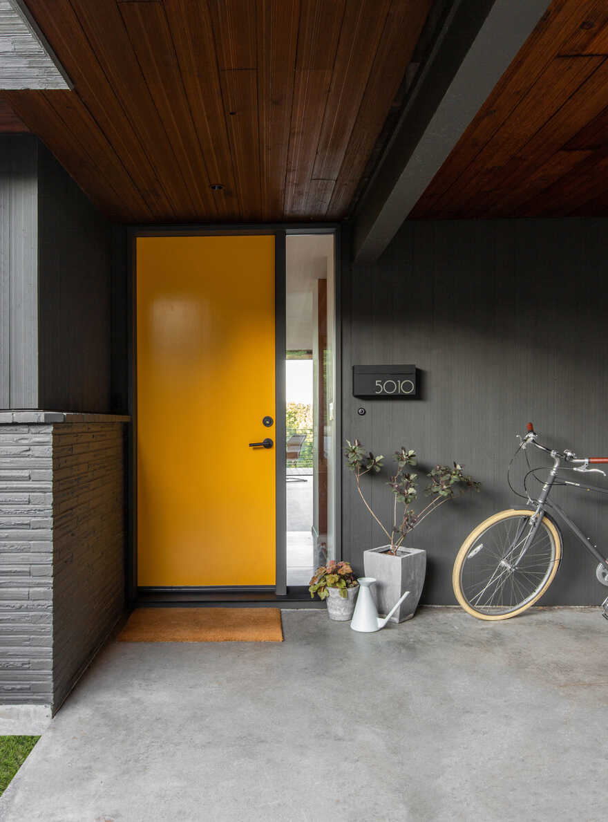
Although the Irwin Caplan Midcentury home had strong bones and a clear floor plan, the home showed signs of deferred maintenance, inefficient and outdated systems and had a number of layout deficiencies. On the main level, a proper entry and mudroom was non-existent and the master suite felt cramped, offering little closet space. Although the original fireplace had character, an addition in 1958 left the hearth ill-placed in the living room, and in the way of opening the small, landlocked kitchen. On the lower level, various rooms were worn out from years of use and shut off from the outside. In addition to re-imagining both levels, the owners wanted to take care of deferred maintenance, upgrade all systems, and wire for future PV-panels.
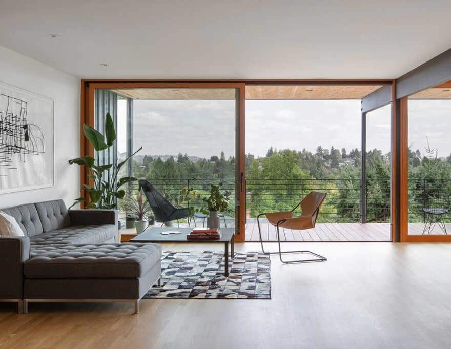
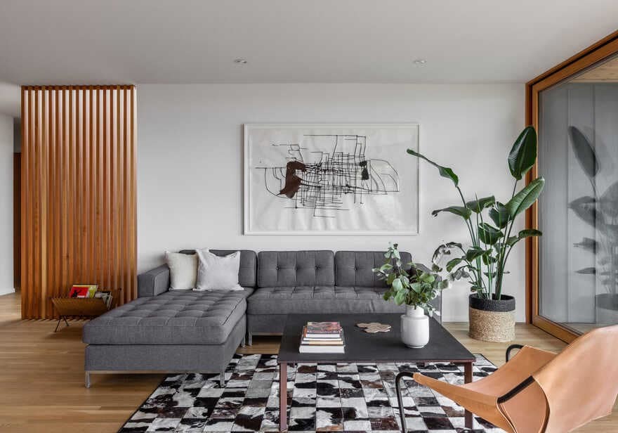
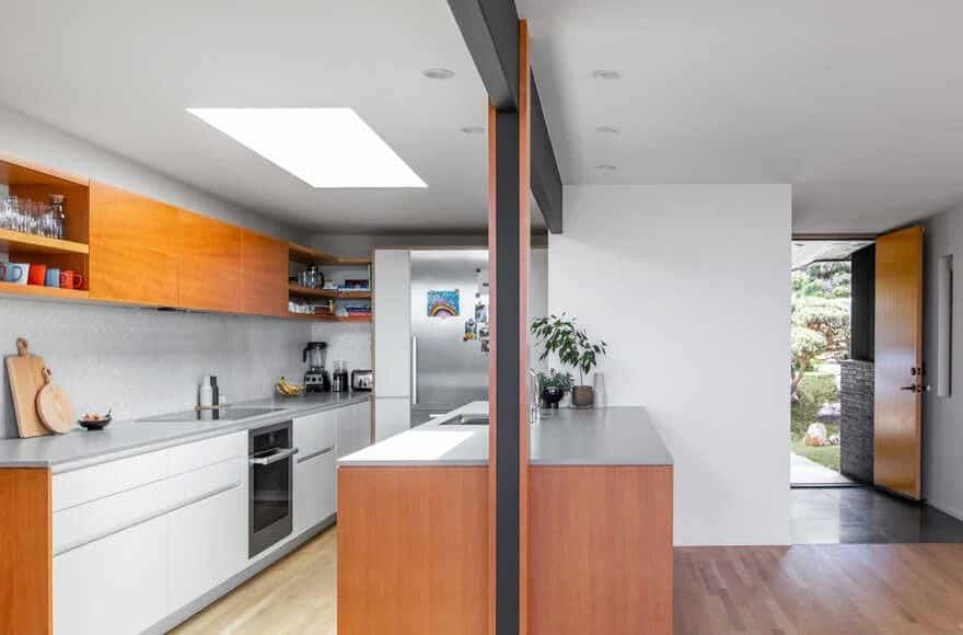
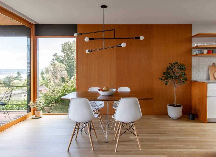
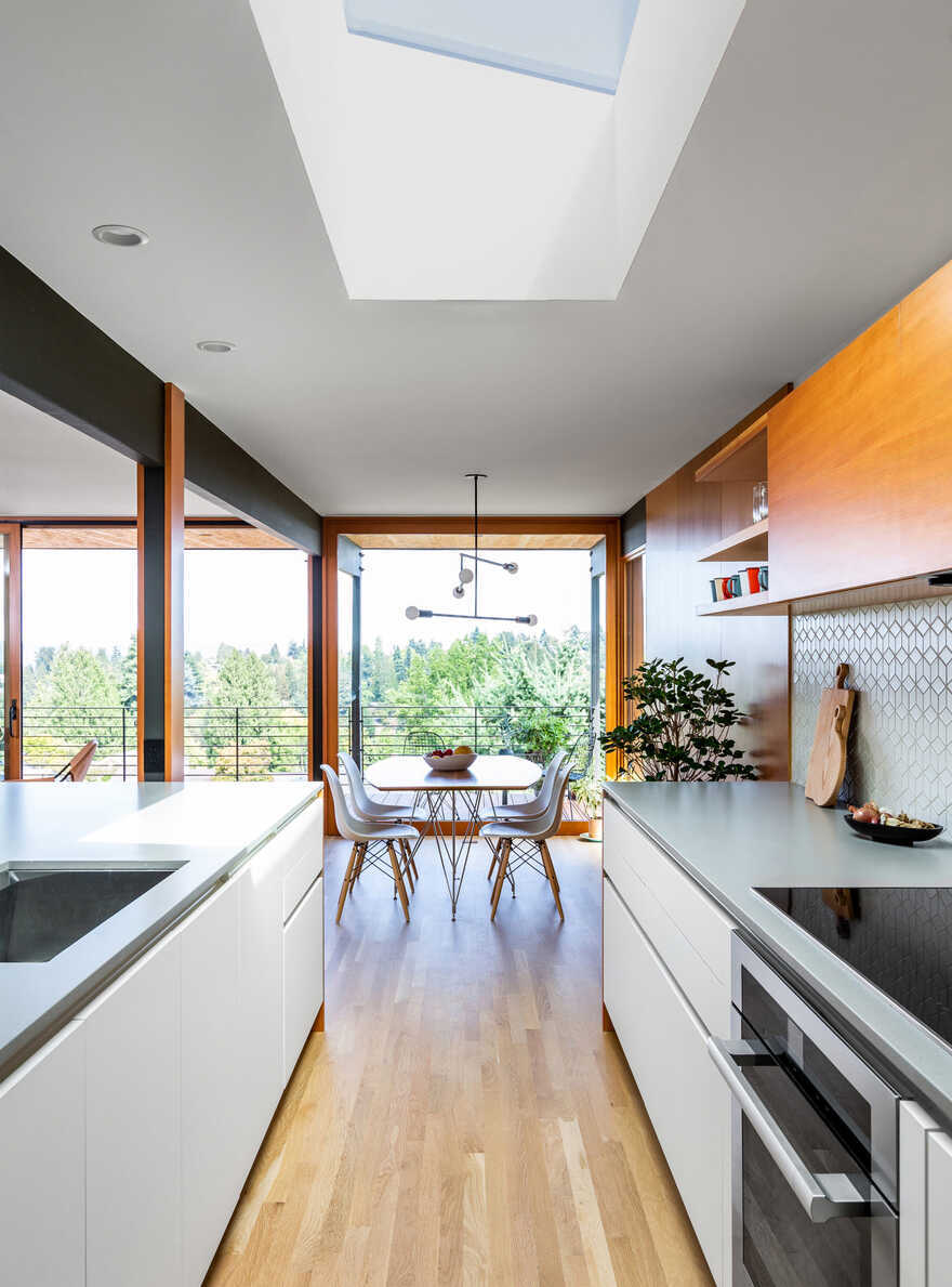
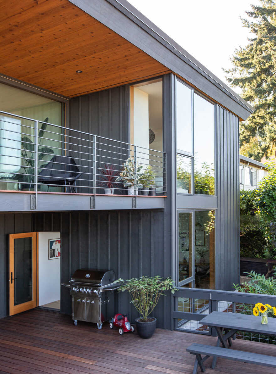
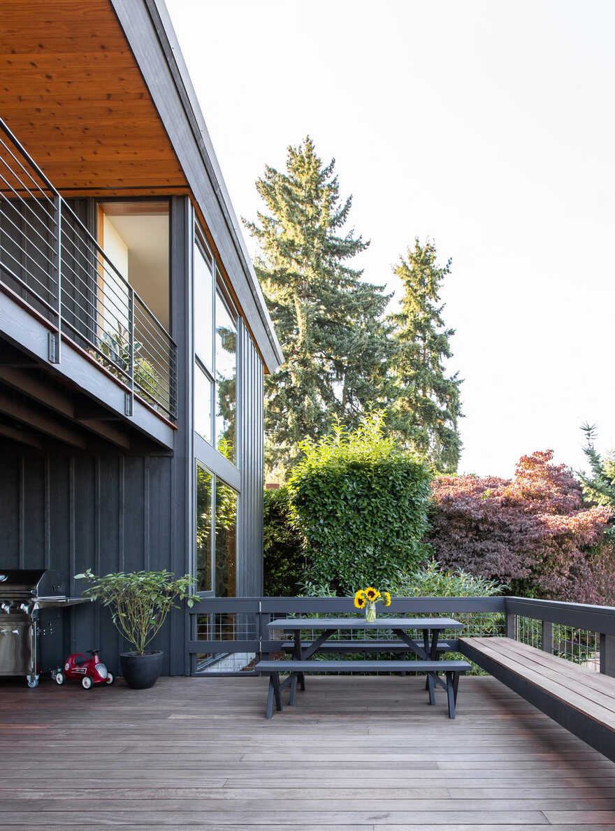
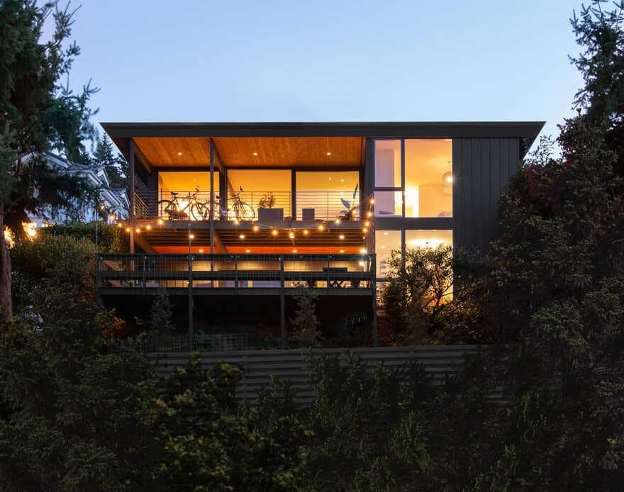
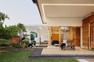
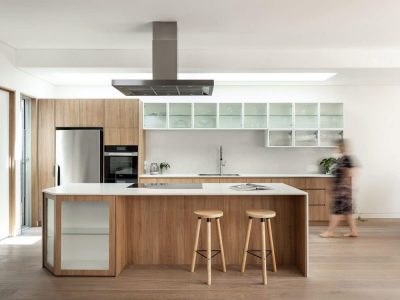
On the main level, SHED’s design solution removed the original fireplace to free the kitchen and create the scene for social interaction between spaces. In place of the chimney, a large peninsula set between building structure forms a new hearth, anchoring the living and dining areas in the open, flexible floor plan. SHED also simplified and reconfigured the narrow, L-shaped deck into a rectangle running parallel to the living and dining areas. Accessible via a large sliding door, this broad, flexible space extends the main level into an outdoor room. To bring natural light into the home, a skylight was placed over the peninsula, creating a bright space despite being surrounded by both the carport and an adjacent house.
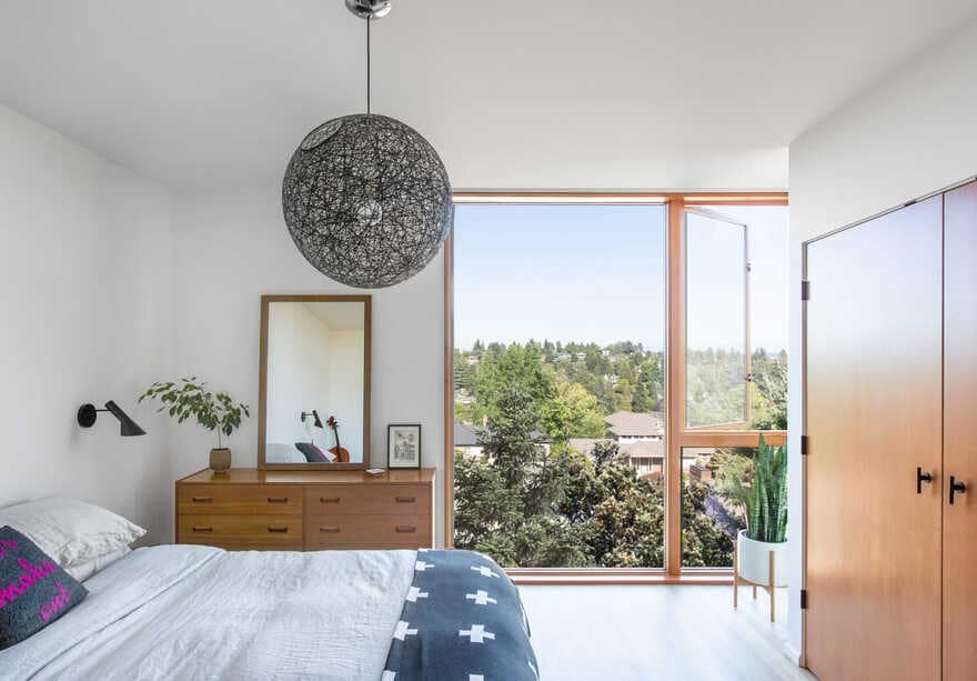
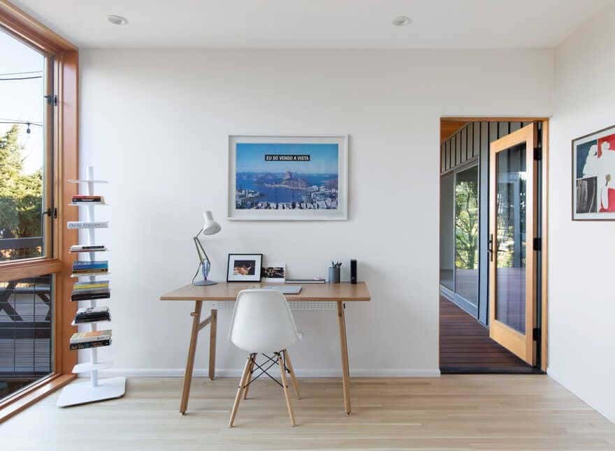
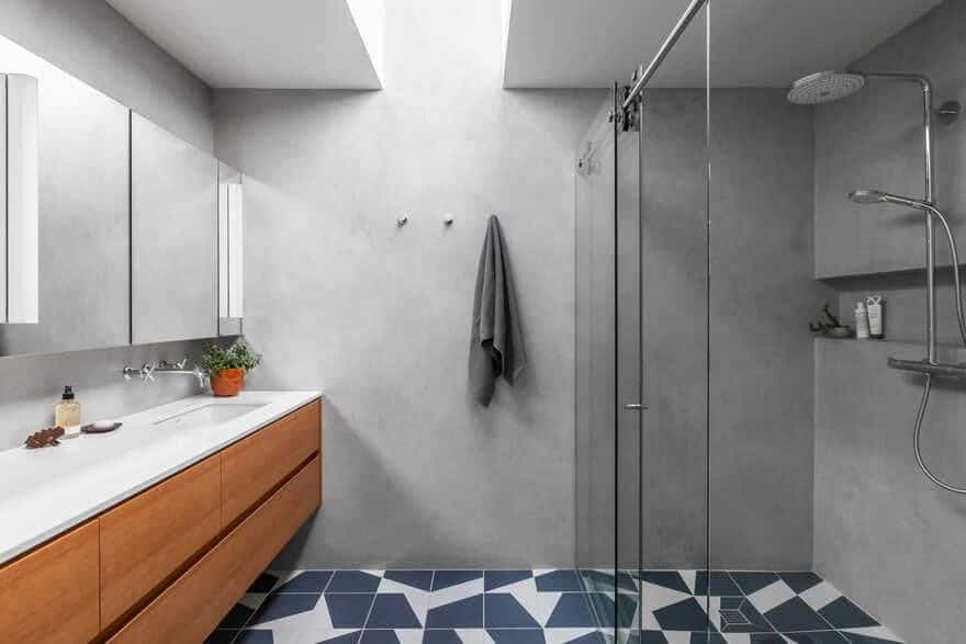
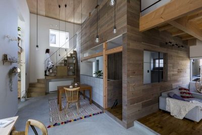
To expand the master suite, a small addition was added on both levels to the furthest extent of the roof. This bump out added volume to both the master bedroom and bath, while simultaneously allowing for an office space on the lower level. Because the owners also hoped to improve connectivity between floor levels, SHED demolished the walls that concealed the central stair. To make the experience of moving between floors memorable as well as functional, SHED placed a large, operable skylight at the top of the stair to bring light down through house levels while allowing warm air to escape and passively cool the house. The vertical wood screen is another functional and aesthetic element that serves, at once, as guardrail and light filter to heighten the daily experience of light and shadow while moving through the home.
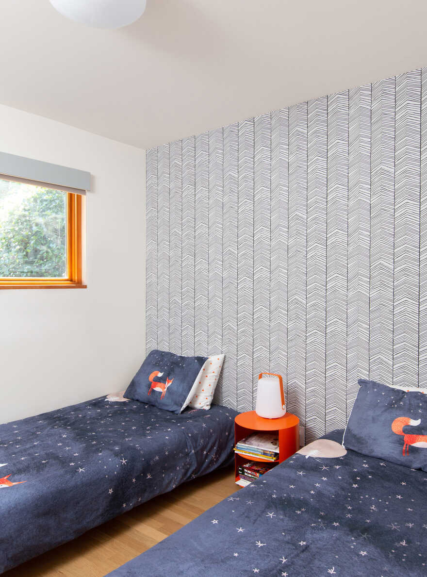
The lower level of Irwin Caplan Midcentury was transformed from a collection of utility and work rooms into a multi-purpose level for media, entertaining and hosting house guests. Because the families of both partners live abroad, setting up the basement to comfortably accommodate longer stays was paramount. Comprised of two bedrooms with a shared bathroom, ample laundry and storage rooms as well as a family room with a direct connection to the large, re-built deck, the lower level was completely transformed. The renewed relationship between the upper and lower floors combined with a direct indoor/outdoor connection creates space tailored for entertaining large gatherings of family and friends.
SHED’s significant interior transformation was essential, but targeted–a central design goal was to keep the home’s original character intact. The architecture team accomplished this by blending old and new seamlessly and applying minimal pressure to the original footprint–despite the addition of a bump out, the roof size was not extended. In the process of amplifying the integrity of the house, the team replaced all systems, upgraded the building envelope and fortified its structure. The result is a modernized Irwin Caplan Midcentury home that pays effortless homage to its rich history while getting ready for a new era of family life.
Irwin Caplan’s graphic style had a clean, distinctive simplicity that could adapt to elaborate detail and evoke atmospheric qualities. SHED’s renewal of the cartoonist’s home hopes to reflect that–returning to the home’s midcentury bones, reconnecting the structure to the surrounding nature effortlessly, and with deliberate consequence.

