Project: KY Apartment
Architects: Bernardo Amaral Arquitectura e Urbanismo
Lead Architect: Bernardo Amaral
Team Project: Gonçalo Maçães, Rita Vieira da Silva
General Construction Company: Topdomus
Location: Porto, Portugal
Area: 85 m2
Photographs: Attilio Fiumarella
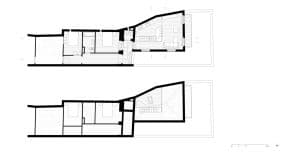
This nineteenth-century townhouse placed in Porto’s historical center was recently transformed by a real estate developer into a collective housing building with 8 apartments (studios, one and two-bedroom apartments). Having kept the existing central staircase and its lightwell, each apartment has one sole front, either facing the street or the backyard. The refurbishment project focuses on one of these apartments, located on the penultimate floor and facing South. Despite its narrow lot and irregular shape, we tried to re-organize the interior space taking advantage of it’s potential for a two-bedroom apartment.
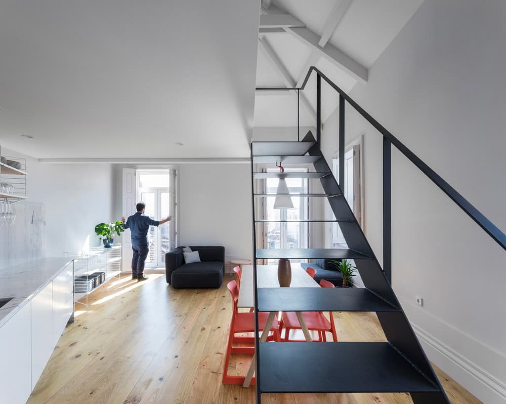
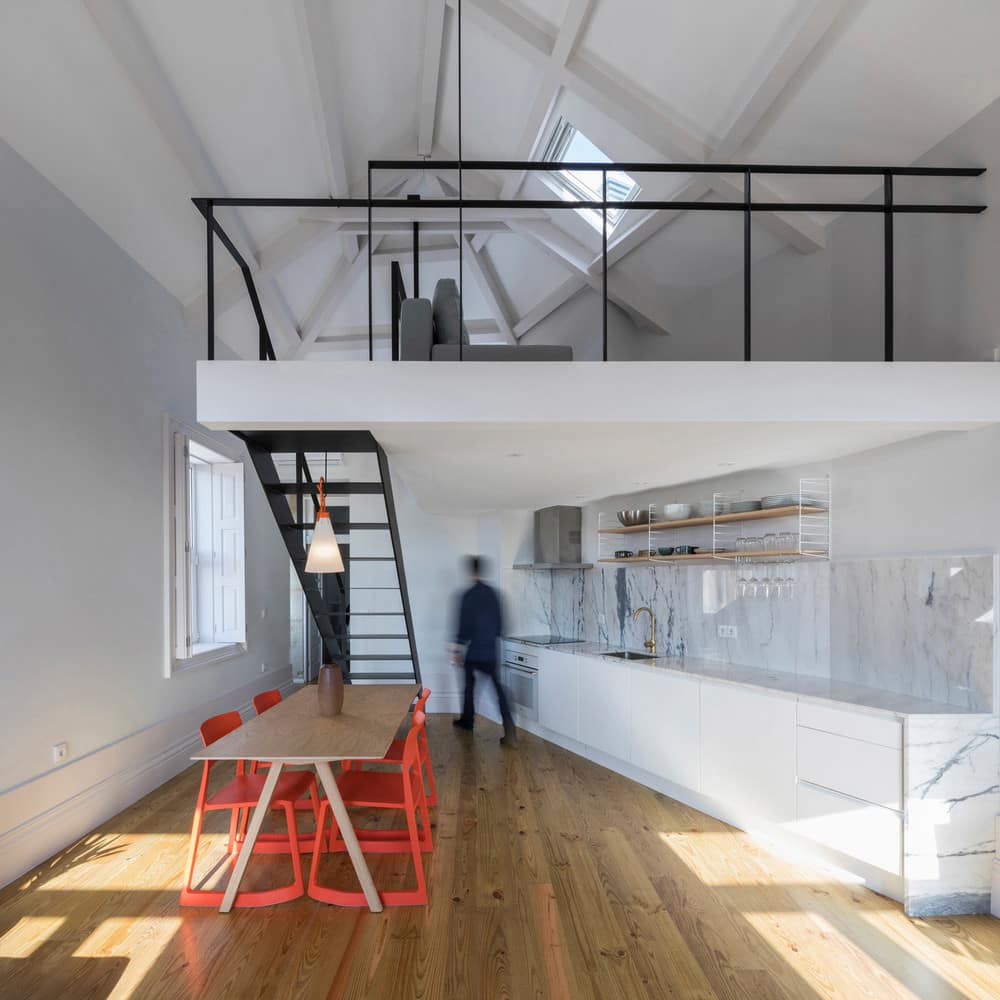
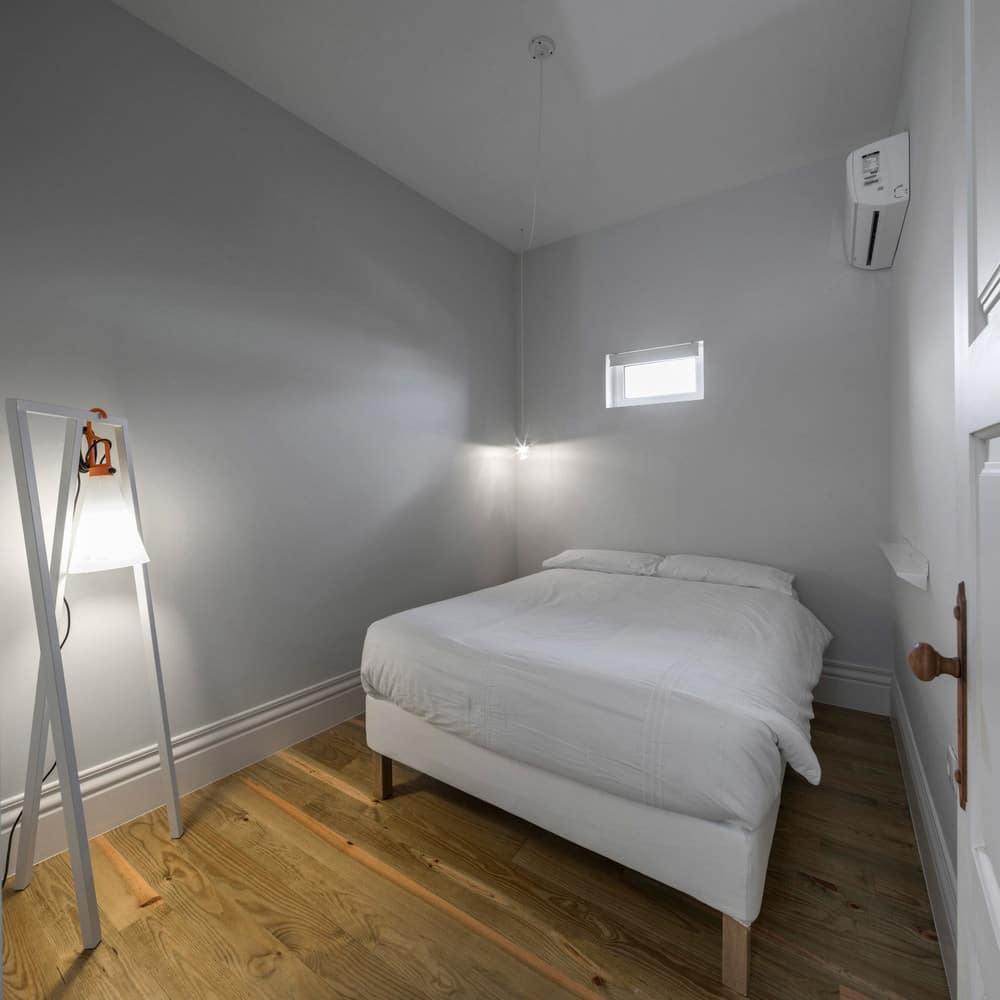
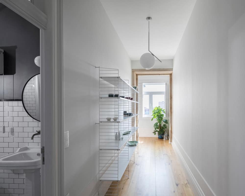
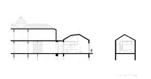
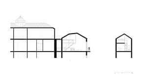
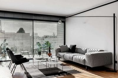
Two small bedrooms with a central bathroom are placed along a corridor that connects the entrance with the living room and kitchen. The second bedroom has its entrance from the living room hall, allowing the entrance of sunlight from the South. The open space where the living room and kitchen were placed benefit from two lightfronts, a panoramic balcony, and ample ceiling height. As a response to the client’s wishes, we managed to introduce a mezzanine, defining both a lower ceiling area for cooking and dining and an elevated space looking over the living room.
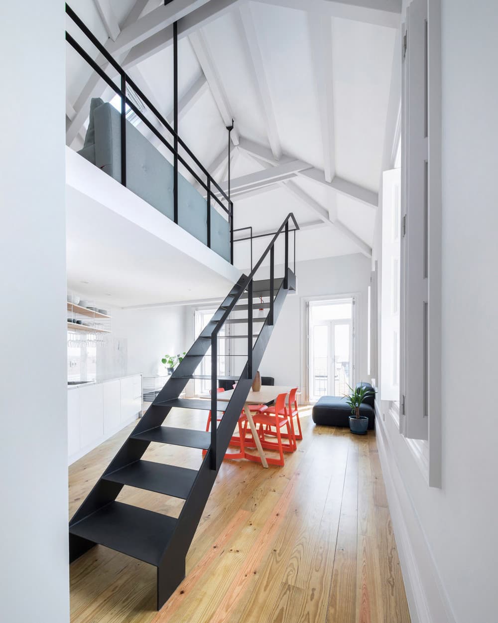
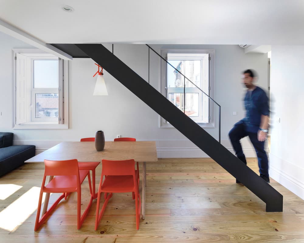
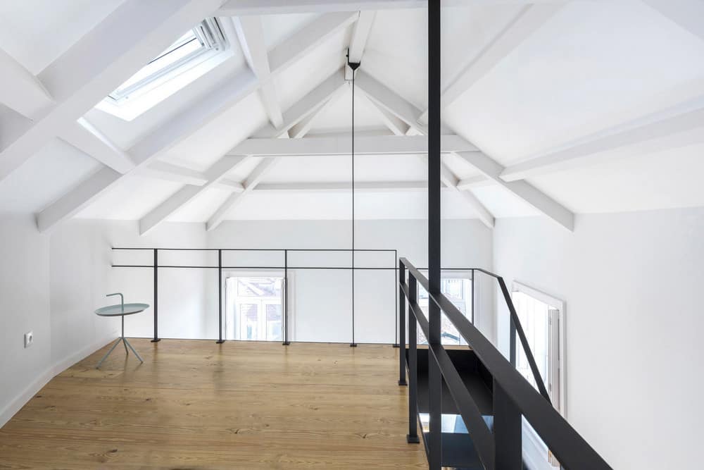
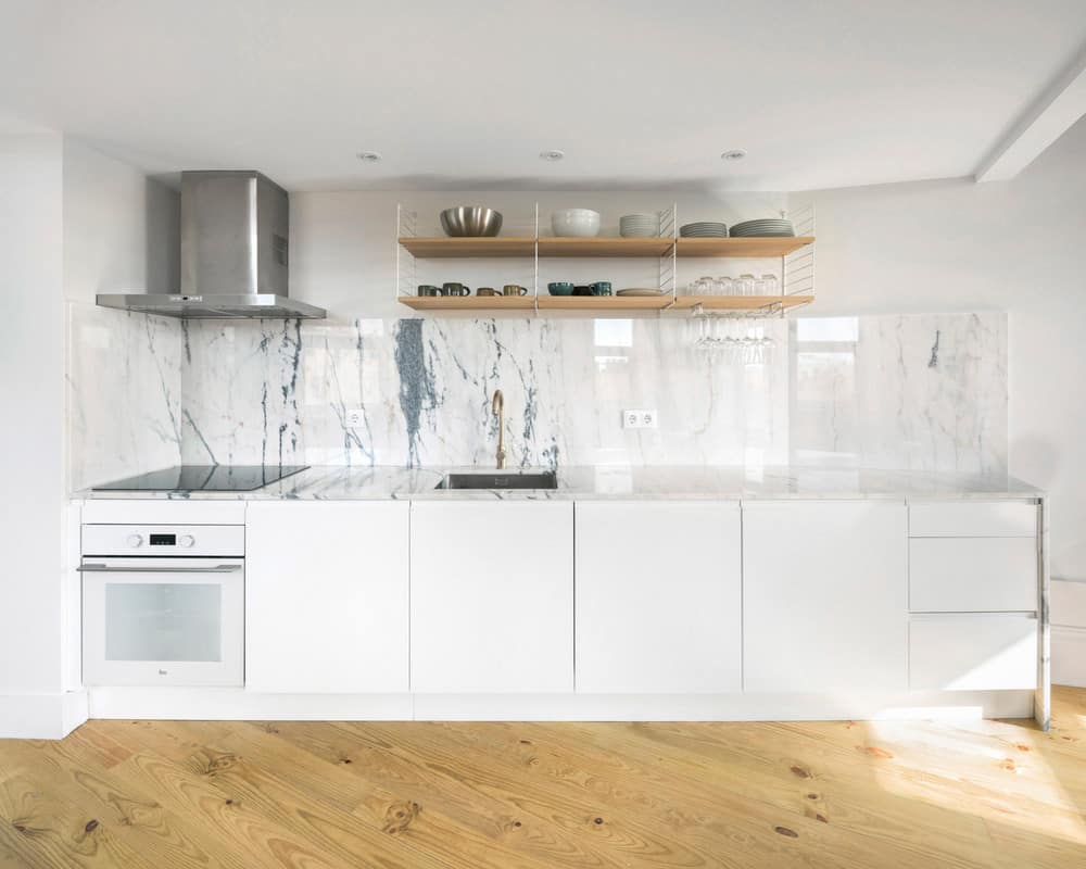
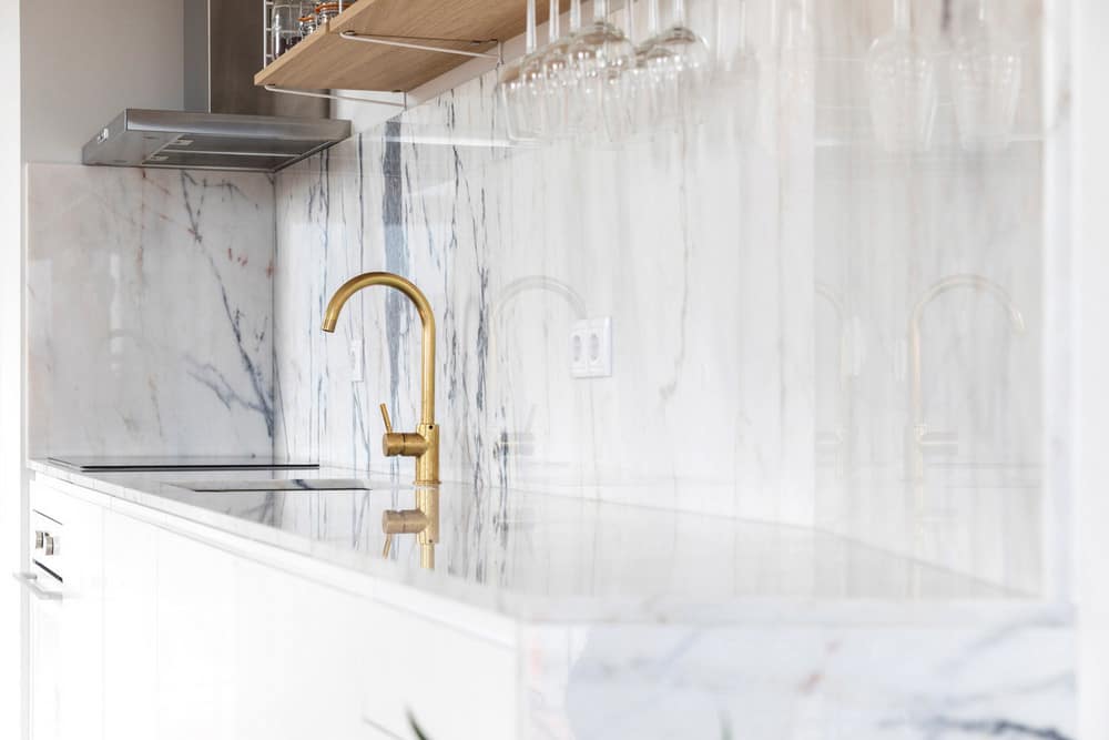
The mezzanine is hanging on the roof beams through two steel bars and is accessed through a steel staircase. Considering the prevalence of white tones, we chose to highlight the mezzanine structural elements, as well as the guardrails and staircase with a black matt painting. By doing this we intend to express the idea of black line drawings on the white space, and for the same reason, the roof structure is visible, painted in white. The kitchen cabinet, also white, is topped by a traditional Portuguese marble stone counter (Estremoz).
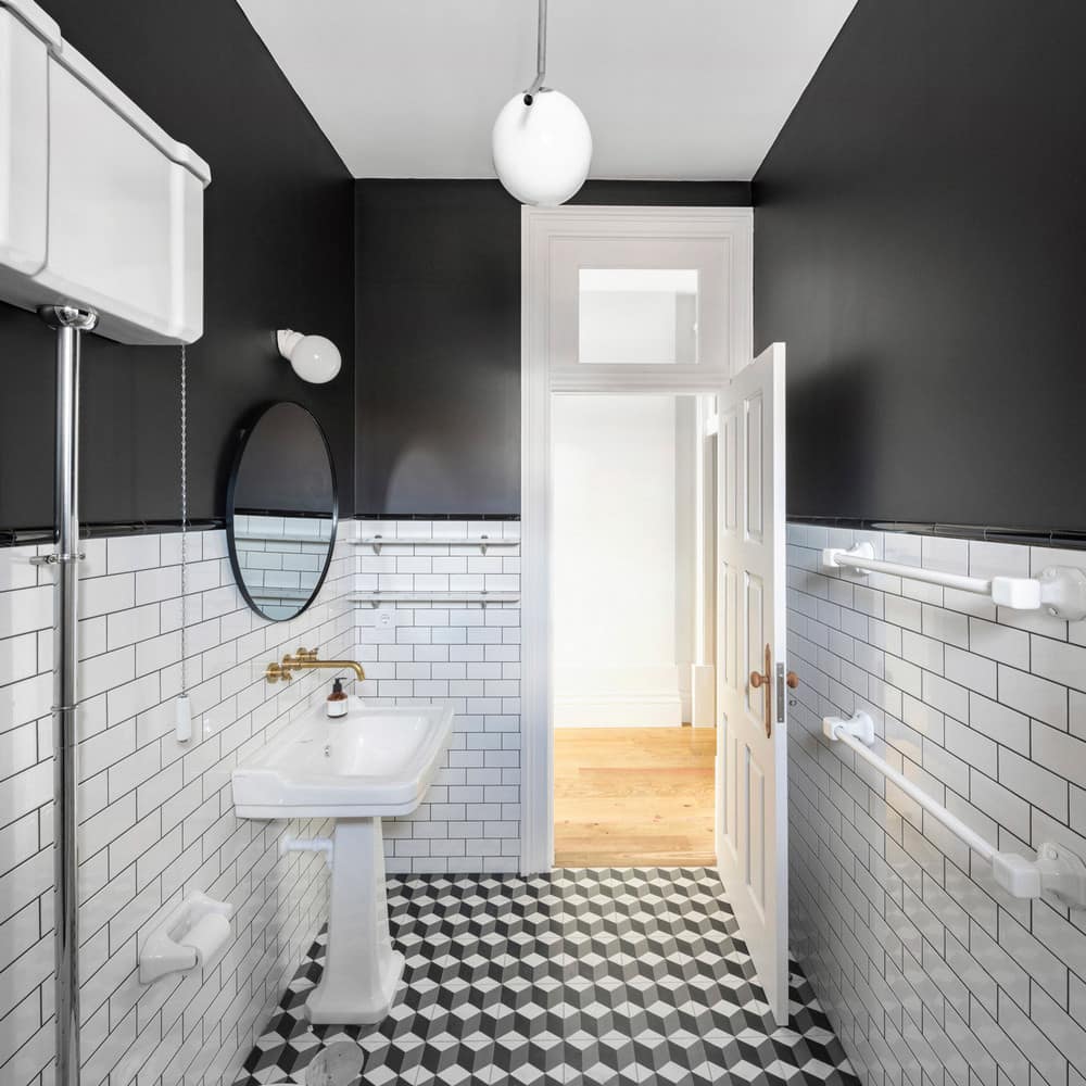
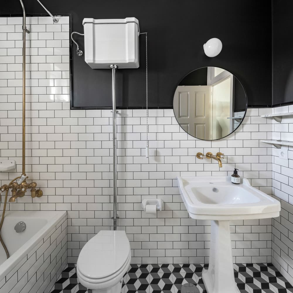
The carpentry details reproduce the existing nineteenth-century design, such as the high skirting boards, wooden doors, and wooden doorknobs, enabling a dialogue with the contemporary expression of the steel black lines of the mezzanine and stairs. The bathroom’s surfaces are covered with geometric patterns, such as the hydraulic mosaic tiles on the floor and the white ceramic tiles on the walls. Also here we worked the black/white contrast, by highlighting the grouts in black and by painting the ceiling and remaining walls in black color as well. The brass faucets, the victorian sanitary ware, as well as the hydraulic tiles refer to the dialogue between the nineteenth-century construction techniques and contemporaneity.

