Project: Melania Caruso Flagship Store
Architects: Puccio Collodoro Architetti
Location: Via Rosolino Pilo, 18/D – 90100 Palermo, Italy
Year 2020
Area: 210 mq
Photo Credits: Puccio Collodoro Architetti
Lighting – Coco Lumo
Plants – Federico Lo Verso Vivaio
Metallic Structures – Manno
Budget – 60.000 €
Melania Caruso Flagship Store is a clothes shop situation inside a 70s building, in the historical city centre in Palermo. Via Rosolino Pilo, where the store is situated, although only a secondary road compared to via Ruggero Settimo, has been affected by a continuous evolution which has resulted in the opening of many commercial activities, making it the new shopping street at the heart of the Sicilian city.
Type of atmosphere requested
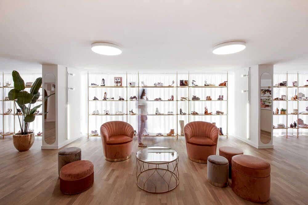
The simple and essential lines combined to a firm use of colour determine the “minimal-pop” character of the project, marked by a balanced mix of geometric austerity and elegant explosion of colour.
The layout of the setting, the lighting, display system and fittings, were all designed to highlight the spaces and the products, emphasized by the scrupulous attention to alignments. Since its inception, the idea has been to develop a space whose interpretation would be purely feminine, without overdoing it. The apparent simplicity of design choices is the product of a laborious and accurate study of every single detail, which has allowed the streamlining and the smoothing of furnishings, in order to obtain a design which is essential but firm in character.
Choice of materials
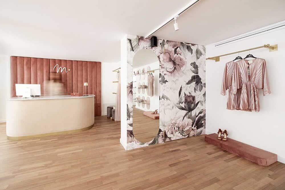
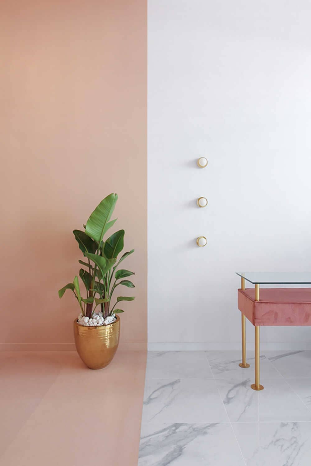
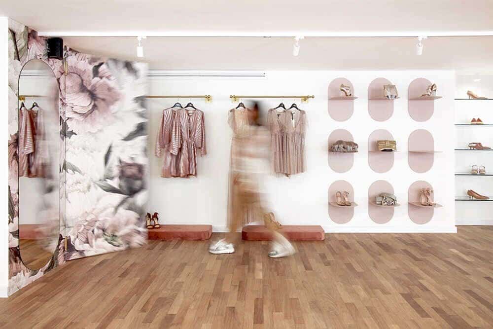
The client’s request was to create a store mainly for female customers, with a contemporary and appealing look, keeping a simple and elegant character at the same time. Therefore, a moodboard with “minimal” lines which would contrast with the “pop” finishing was studied: white marble, resin and powder-pink fabric, golden metal and natural parquet.
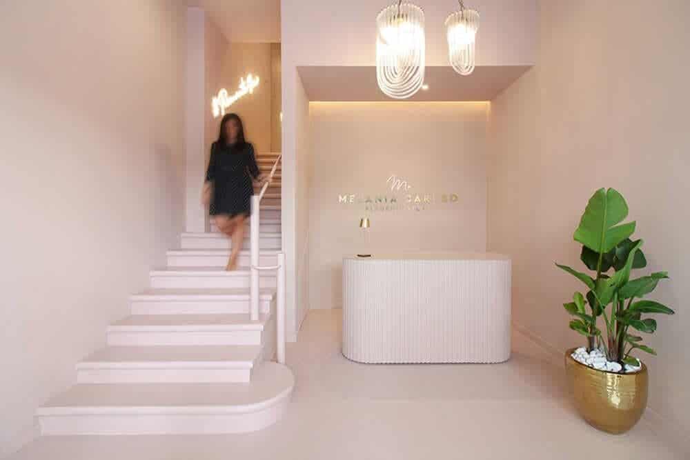
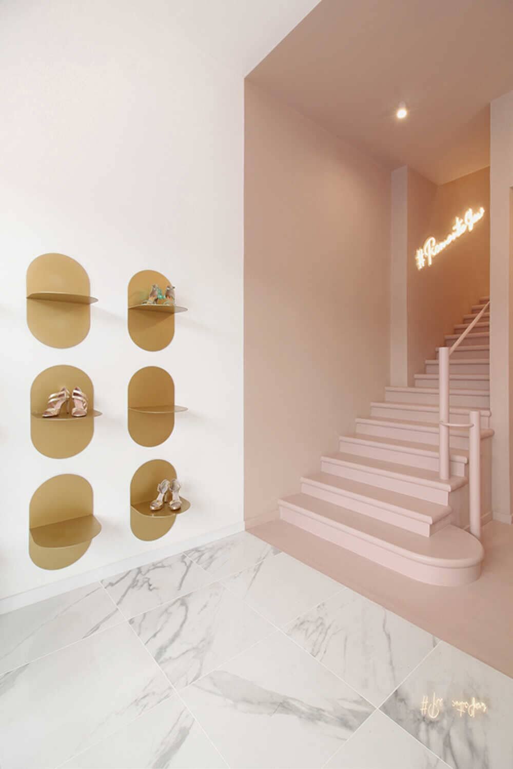
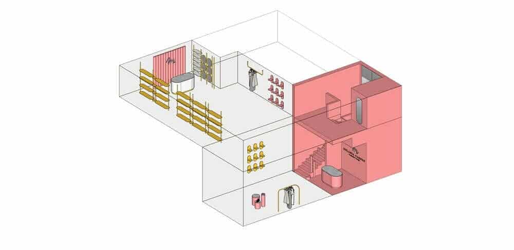
The main access is located by the large shop window on the ground floor; from here, access is gained to an area dedicated to the sale of accessories, characterized by a flooring with marble effect and a wall with display features in golden metal with smooth shapes which recall the design of the entire display system, situated on the next floor. The stark contrast between the pink resin used for the floor and the stairs stands out, and painting of the same tone for the walls and the ceiling; the counter desk was created instead using varnished wooden strips and tops in satin glass.
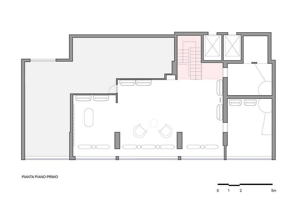
On the upper floor, the “pink volume” is set and contrasted by the flooring in natural parquet which unfolds along the whole space, characterized by light walls; the entrance to the fitting rooms, made in curved metal, contrast and recall all the elements of the display system, enriched by a golden finishing. The element that stands out on the upper floor is the added counter area, positioned on the back, where the counter desk covered in fabric recalls the shape of the one on the lower floor, in front of a storage cabinet covered in velvet.
The project
The building is on two floors, therefore the vertical connection system becomes the heart of the project. A “pink monochrome volume” is implanted between the two levels enclosing inside it the stairs and the reception desk. A simple yet effective concept.
The entrance area is in itself the image which encompasses the entirety of the concept where the white volume of the entrance elegantly contrasts with the “pink monochrome volume”.
Difficulties and solutions
The main difficulty was to summarize the inputs and the design choices in a single image which would have character and would be immediately recognizable. We wanted the brand to be perceived from the shop window, and for this reason we changed our first designs many times, making them lighter until we found the final image.
A few technical difficulties were encountered as well, such as the reduced height of the space on the upper floor, which has limited our design choices like the lighting system, solved by the choice of lighting fixtures positioned primarily on the walls.

