Project: Morrison House
Architecture: Chris Elliott Architects
Location: Sydney, Australia
Project size 190 m2
Building levels 2
Photo Credits: Richard Glover
Text and photos provided by Chris Elliott Architects
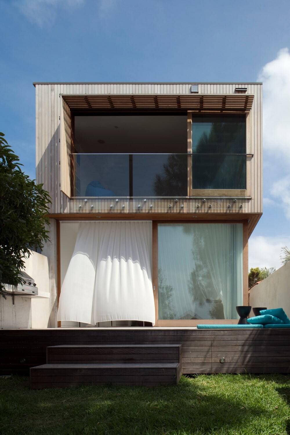
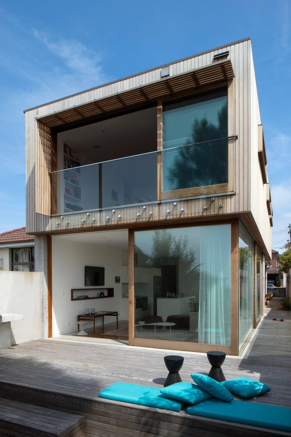
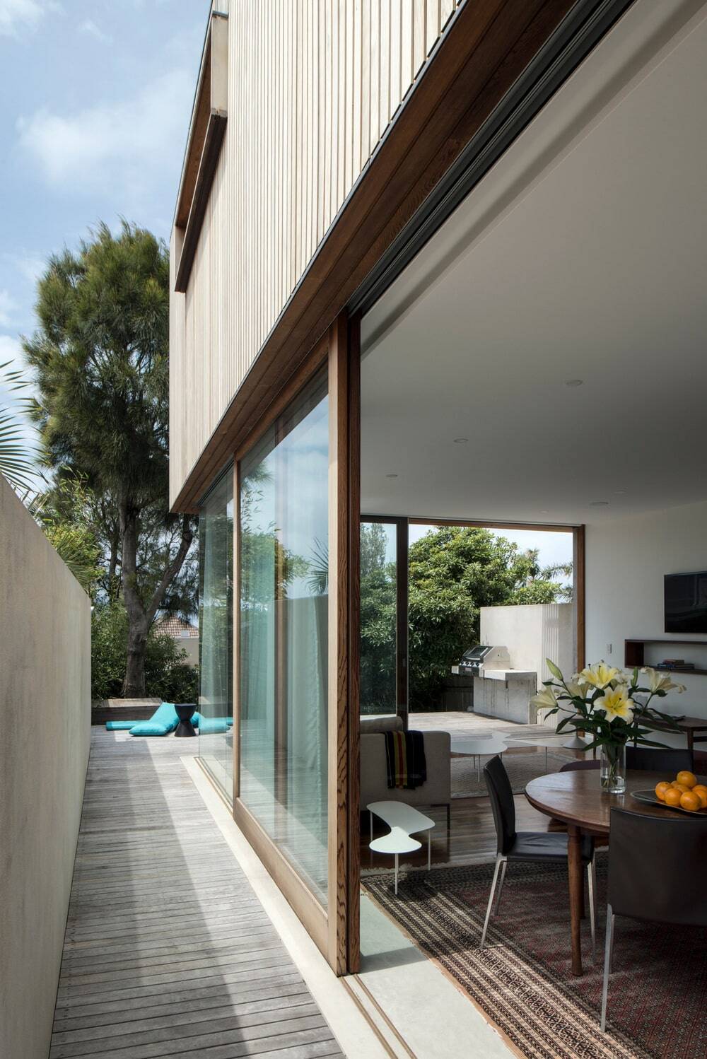
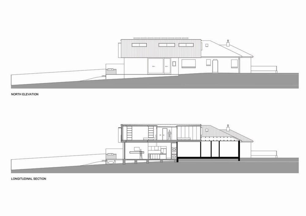
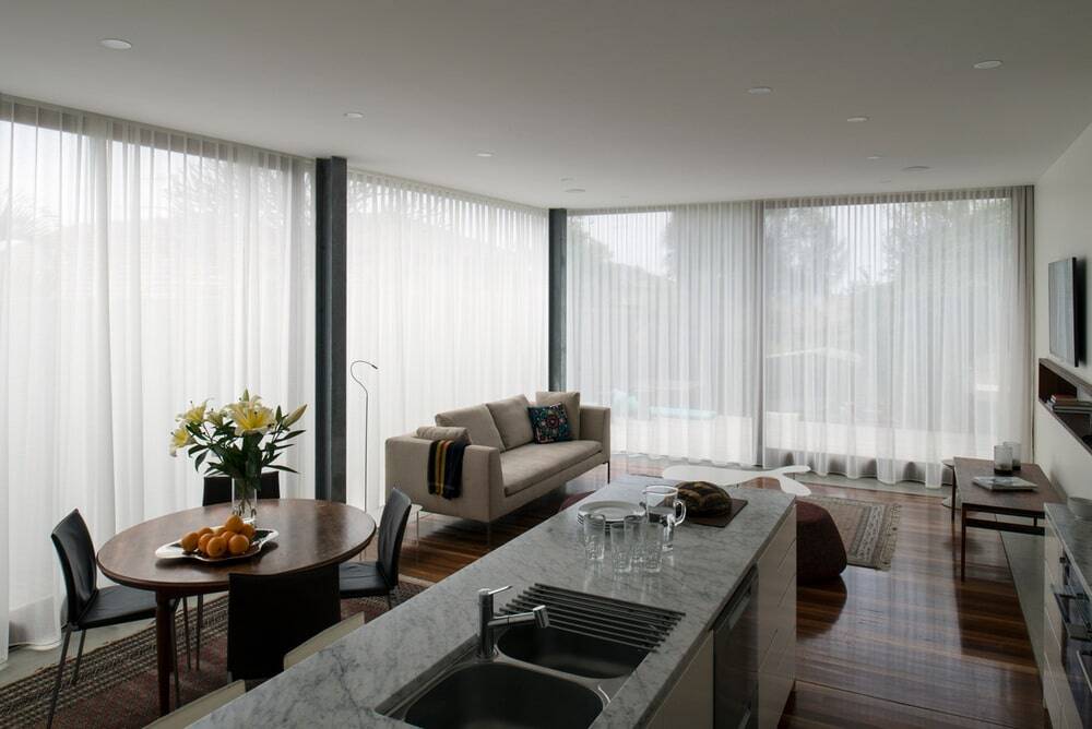
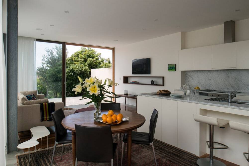
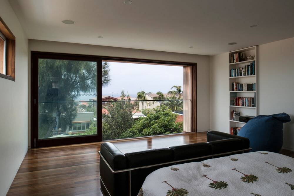
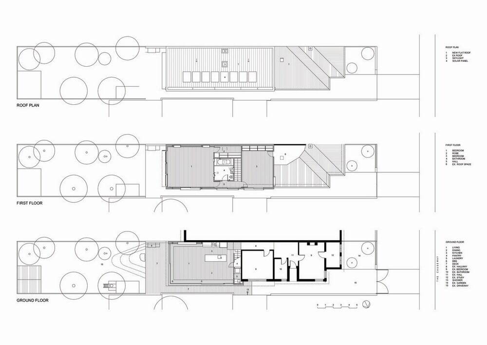
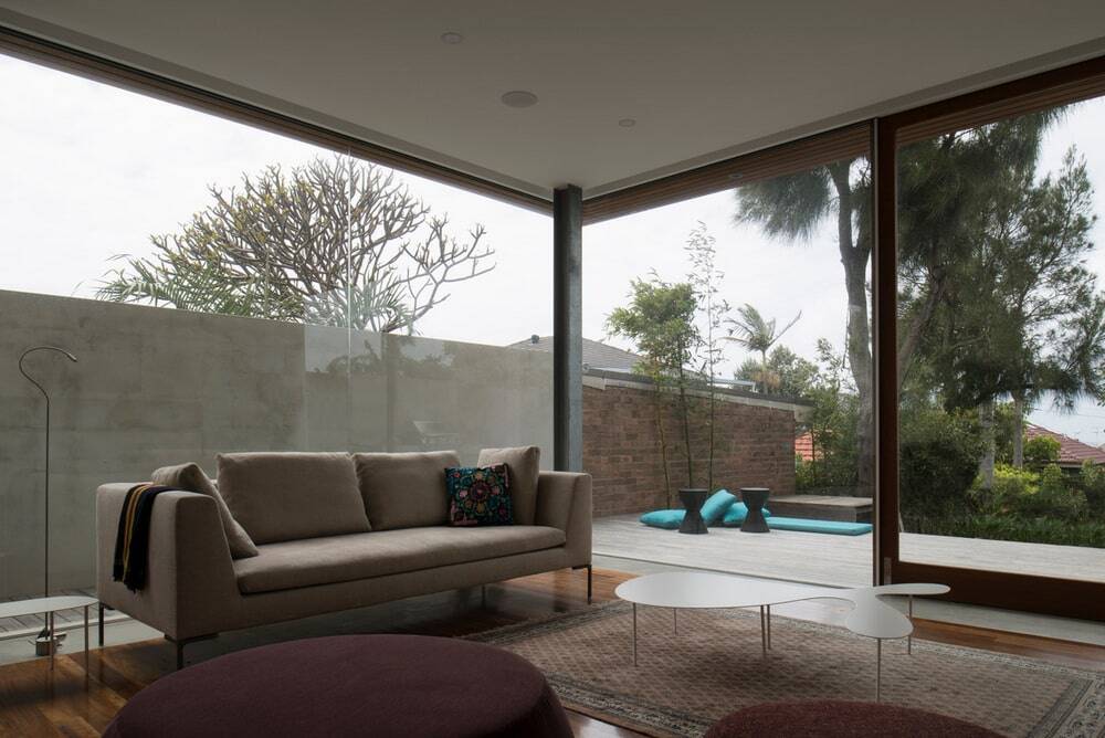
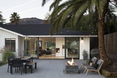
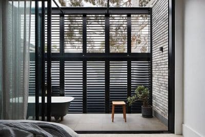
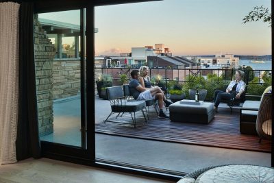
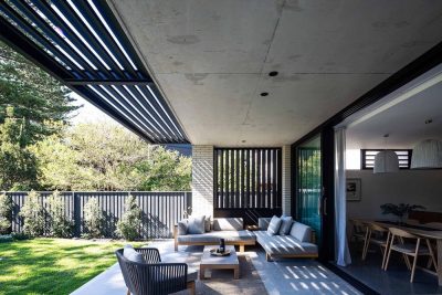
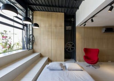
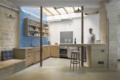
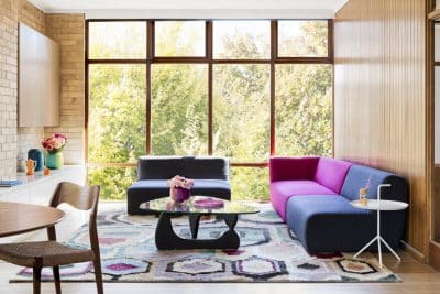
A protected and private timber box sits on top of a glass box in this renovation of a Sydney semi. Small, dark, rear rooms were demolished to make way for a large, airy, light space containing living, dining, and kitchen. Two small steps create a high ceiling and mediate the connection to the rear garden. A staircase across the original space at the entrance level allows an unobstructed lower living area. Large sliding doors open up to a wrap-around timber deck with a built-in barbeque. The cedar-clad second floor has two new large bedrooms, an all-blue tiled bathroom, and a walk-in wardrobe. Sliding doors in the master bedroom create a balcony effect with excellent cross ventilation and ocean views. North facing slot windows bring in winter warmth whilst sun hoods create shade in summer. Sustainability features include passive solar and local materials. By careful spatial configuration, the clients received a unique architect-designed home, double the space within the same footprint, more light, warmth, and breezes, all for less than the price of an ‘off the shelf’ plan.
Interview with owner Melina Morrison
1. What were you looking to achieve? What was your brief to Chris Elliott Architects?
The main thing was an open living space where we could all come together. It’s a 1940s workers semi and had very unlivable spaces; the living room was at the front and separate from the kitchen; a tiny galley kitchen at the back with an eating nook. Spent all our time in the kitchen squashed into the tiny kitchen space. Our daughter’s bedroom was off the kitchen. Lounge room under-utilized, Renovate a worker’s cottage without a total demolition.
Chris came up with the idea of chopping the house in half and creating this living space at the back. In essence, we use the same part of the house now; has ten times the space and faces a lovely garden and view. We knew we had an unrealized view up there, and thought it would be nice to have a view but the main aim was livability.
2. Why did you choose CEA
We weren’t really looking for an architect, we were looking for a draftsperson, we feel really fortunate that CEA wanted to do it – Chris is a family friend and we had seen his incredible house and other renovations he had done. To have Chris agree to do a slightly smaller job was an opportunity we leapt at. If Chris hadn’t have been available or hadn’t wanted to do it we might have ended up with a draftsperson working from our own ideas. It would have been a disaster if we had used a draftsman.
He knows us as people and has a feel for how we might function in a house.
3. What was the worse thing about the old house
The worse thing was the separation of living spaces, the kitchen from lounge room; the small rooms, three bedrooms but two were single. Small partitioned rooms; could not entertain which went against who we were. I had given up on cooking, so disillusioned, disheartened with kitchen no bench space. Had given up
There was only one small spot of sunshine – the back step.
4. What’s the best thing about the new Morrison house?
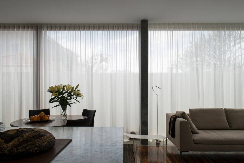
Living spaces all work together; we are a small family of 3 and we spend all our time in the one living space now, the kitchen, dining and living combined and its perfect for us because we have busy lives and when we come together it means no one is shut off from the others.
It’s completely changed our lives. It’s transformed our lives. The way we live is more relaxed we are more relaxed people. It had that much of an effect. It wasn’t possible to function as a family who liked to cook fresh food and entertain. There were lots of things we couldn’t do which went against the grain. We’re an open family. We don’t go down the front of the house anymore.
Invites outside in because of the way Chris has designed it.
The old house had No storage, so it was constantly messy, we were coping with piles of things, nowhere to put things.
This area of Sydney is constantly windy, lots of renovations include balconies but we noticed that people never sit on their balcony as it’s too windy. Chris has designed a solution to that which is a glass room so you feel like you are outside and you can leave a door a little open to bring in the fresh air.
5. Tell us about how you were involved in the design process? e.g. the bathroom tiles
Chris was a very consultative architect, we had long discussions about different products and materials; he is consultative but he does have strong ideas; Chris was a good listener. Usually, we would compromise on prices. Classic example bathroom tiles – he showed me beautiful glass Venetian tiles, which were way out of our budget, so I thought about other things that have glass tiles and I asked if the pool ones are cheaper and have the same effect – by a happy accident I searched on gumtree, and found some excess pool tiles, from an over-order which created the same effect. Because they were so cheap we bought the whole lot, which meant we could do the entire bathroom. A journey with Chris and he found us images of bathrooms where you have the entire room in one tile, a bold look to have the entire walls and floor in the same blue. Those decisions were made in relation to a number of items e.g. marble countertop in kitchen, we’d start with an idea way out of our price range and found something close to it, the marble in the kitchen was cost-effective as we found a large slab.
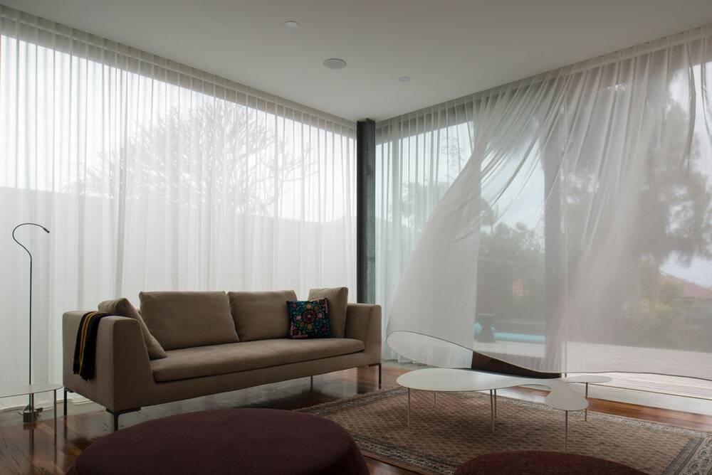
Chris was very generous, letting us looking at his own house to understand his design aesthetic and that influenced many of our choices. So many experiments he worked on there and we asked if it was possible to incorporate the ideas into our design and where possible he came up with something the same or similar. One example of one thing we are really pleased with and Chris’s skill is the space he has created, his understanding of space. We have a high ceiling downstairs, high but not too high, give a feeling of openness and airiness; and Chris also listening to our ideas and then came up with solutions and other ideas. One thing we looked at a lot was in the living area that it would be great to work the room like a machine, no heating or air conditioning, doors open to create a cross breeze. Love the curtains – like a Bedouin tent that blows in the breeze. Very energy effective, a heat box in winter and in summer it’s an open breezy room. Very little heating – trap the sun by closing curtains which hold the heat, see breeze so never need air conditioning.
6. Is this the first time you have used an architect? How was it?
Yes; we have always done our own renovations in the past. It’s our First major renovation but it was definitely worth the added investment of having an architect especially if there is some sort of connection or alignment in your values. Then you know you are going to end up with something. Everything is a compromise due to budget. There were so many things that Chris brought into the process that we would never ever have known if we had embarked on it on our own, his knowledge of materials, his knowledge of space, the sculptural quality of space, how to work with spaces – if you are not trained to look at plans. Don’t know how to read plans. We had to trust Chris on some things like the size of the bathroom for example, and he was right. He said it would be big enough and he was right.
It’s a discreet renovation, not easy to tell there is another storey on the back we feel we have stayed true to original workers semi. Kept in character
Saddens me to see some houses bulldozed and personality-less boxy new houses with no sympathy for the existing built environment. Proud that we have a fantastic renovation that nearly doubled the floor size but it’s not ostentatious or showy.
We’ve had quite a few people knock on the door and tell us they really like it and ask if they can see inside. People driving past see something that is more in keeping with what they’d like to do.
7. Anything else about the Morrison house you’d like to add?
Functioned brilliantly. We recently had a big birthday party for my husband and the room really came into its own. About 60 people, not great weather and couldn’t be outside so everybody was inside. What was amazing was it felt like there was enough space. all were comfortable inside.

