Project: Rattan in Concrete Jungle Apartment
Designer: Absence from Island
Collaborator: Studio Etain Ho
Location: Hong Kong
Type: Residential unit renovation
Area: 40sqm
Budget: HKD $500,000
Completion date: April 2020
Photo Credit: Xue Lan Xin
Hong Kong is famous for its cramped living space and its concrete jungle. Our client is no different to any ordinary HongKongers. He purchased a 40 sqm flat and wished to turn it into a home for his family of three.
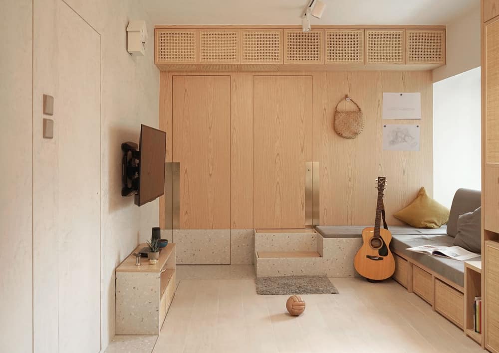
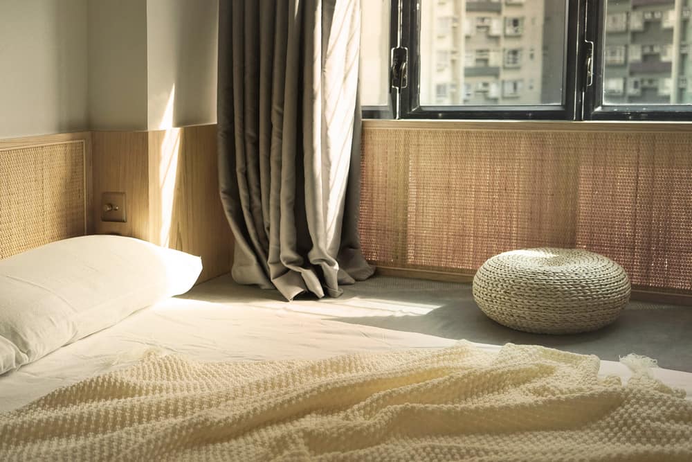
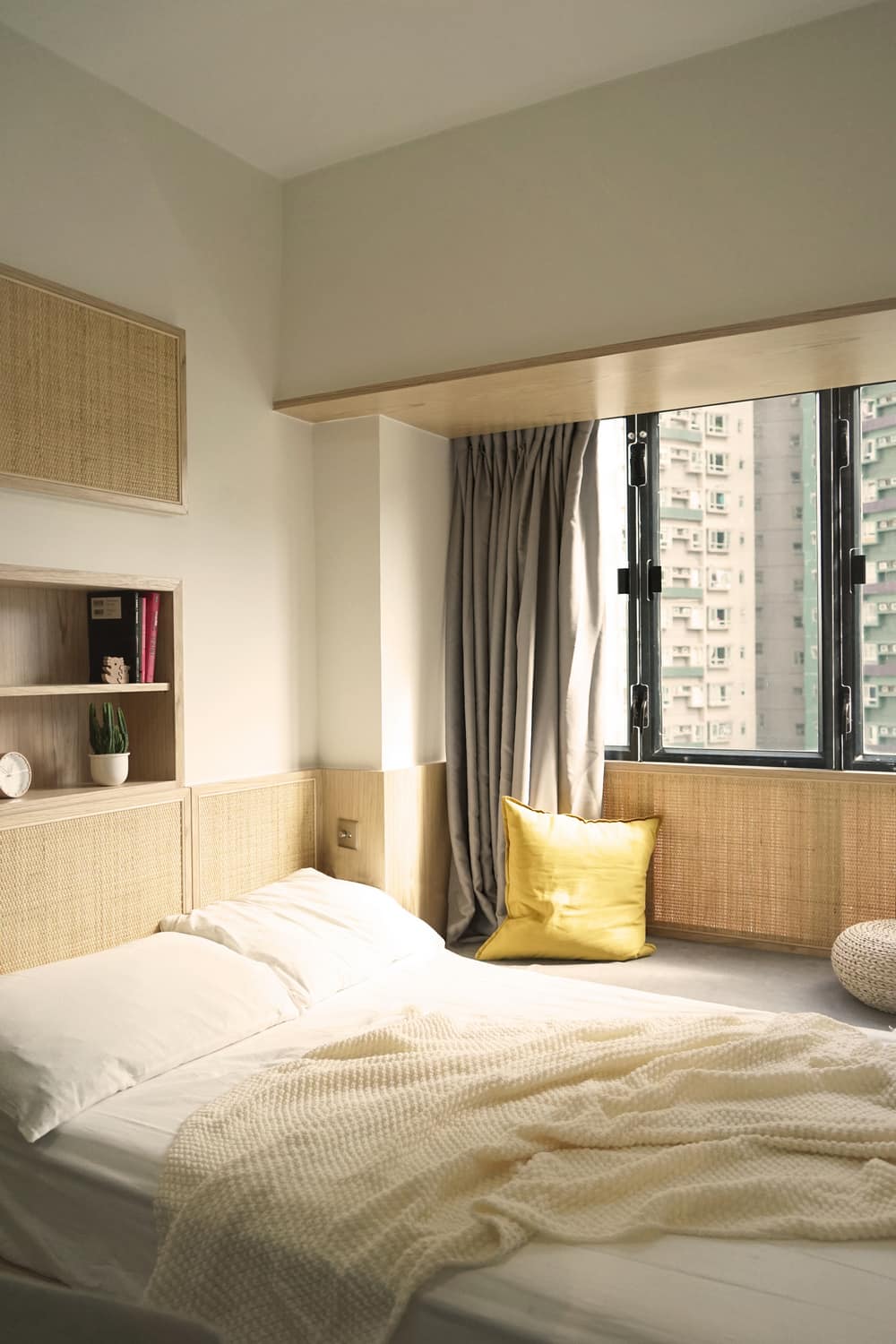
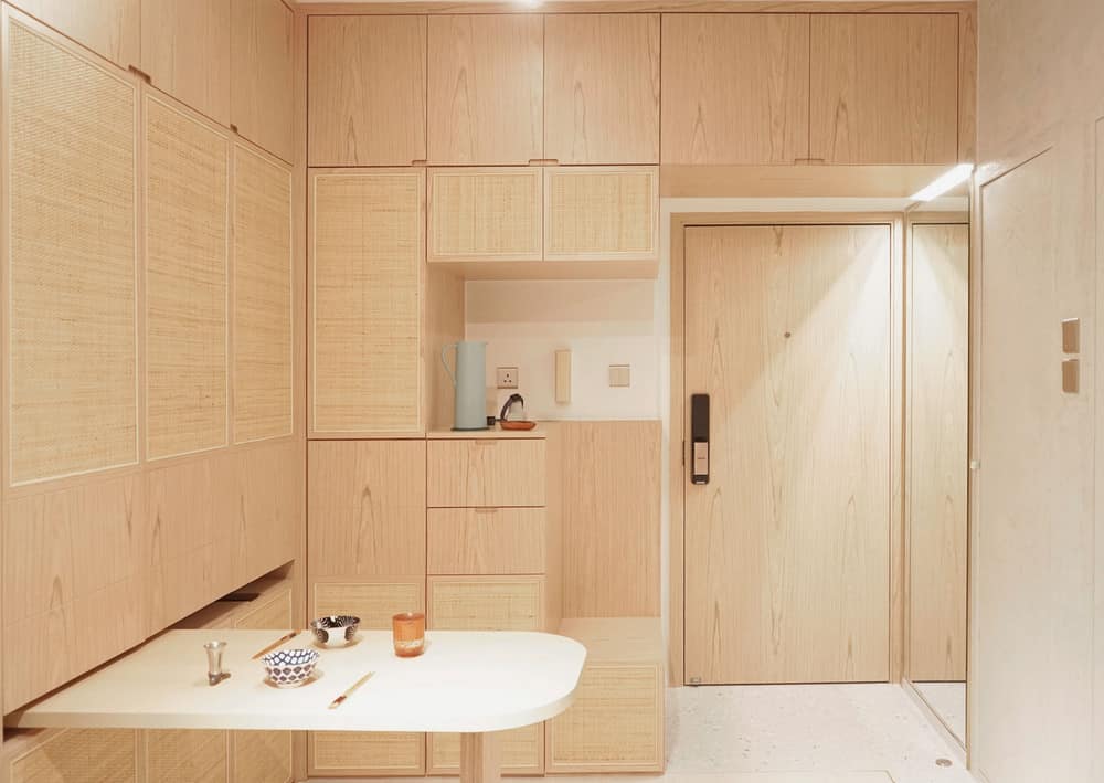
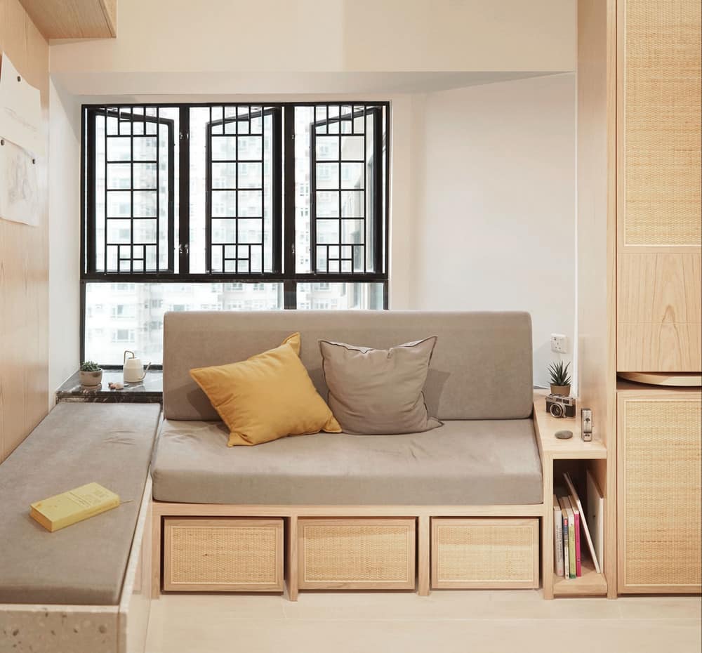
The design aims to keep the living room large and plain while bringing in natural elements to create a relaxed and calm environment. However, the client is not willing to take care of any living plants and therefore we chose rattan, which is a famous product in nearby Guangdong, as the key material for the living room. They are used on cupboard doors where their porosity and light colour help soften the cupboard’s existence. The outcome is simple, airy and comfortable.
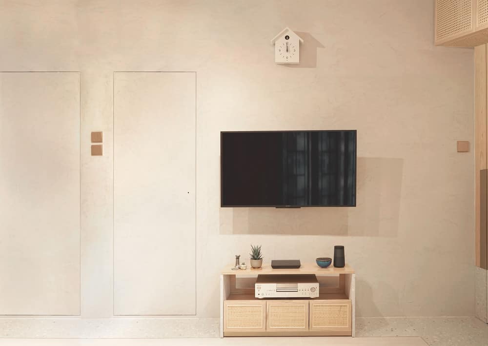
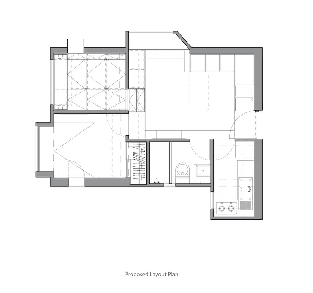
When purchased, the flat had a typical Hong Kong apartment layout of 5 doors facing the small living room which resulted in a lack of wall space. So during the design phrase, we decided to shift the bathroom door towards the kitchen door, hence to provide a bigger piece of wall for the TV. It was a simple move but it greatly improved the layout as shown on the original and proposed plans.
Another common solution to tiny flats in Hong Kong is to turn your home into a crazy transformer. However, in reality you would not be changing your home setting often and indeed it is tiring to do so. Therefore we keep the transformative feature only to the single most obstructive group of items in the living room – dining table and chairs. They are tucked inside a cupboard and are only pulled out when being used. This shall help create one big space for the child to play around.
Storage was one of the major concerns of the client. During the design phrase, the client kept asking for more storage space. The entire child’s room is raised and void below becomes the storage space. And in order to keep a neat interior of the child’s room, steps are placed outside into the living room and double up as additional seating. There is also a set of large cupboards in the living room next to the entrance door. They, at the same time, help create a portal for the main entrance which makes the perfect space for one to wear shoes and check his/her outfit being heading out. We originally thought the client was asking for too much storage space, but in the end, when they moved in, all storage space was taken up!
