Project: Rushmore House / Redesigning the Ground Floor
Architects: Yellow Cloud Studio
Location: Lower Clapton, London, United kingdom
Completed 2021
Answering a brief set by our chef client and his family, that called for a large kitchen area with generous space for people to socialise when hosting pop-up dinners, our studio set out to create a sequence of interconnected spaces that enhance the dining experience.
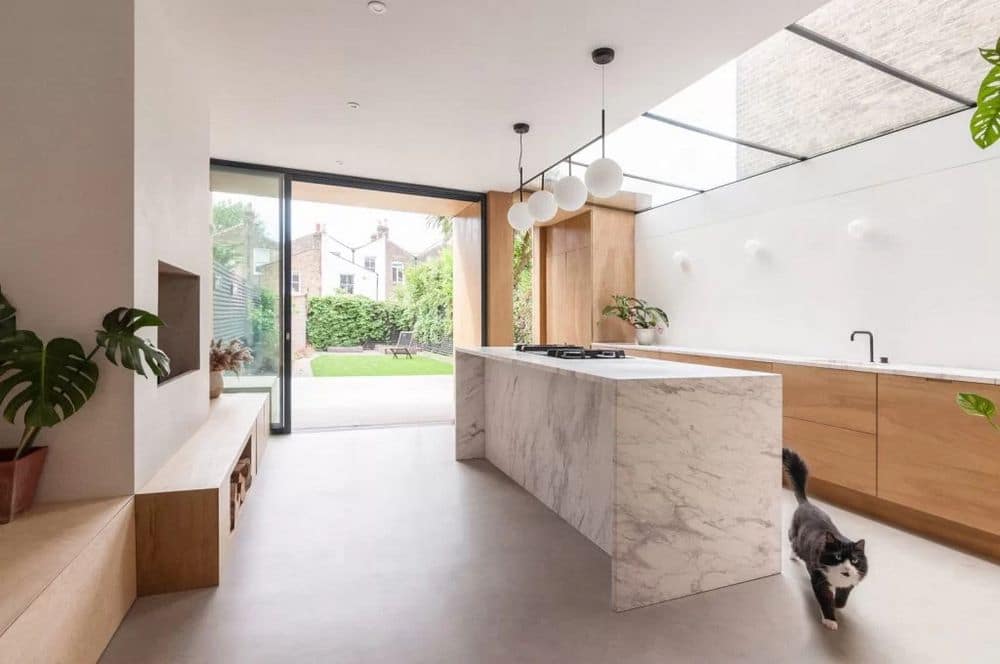
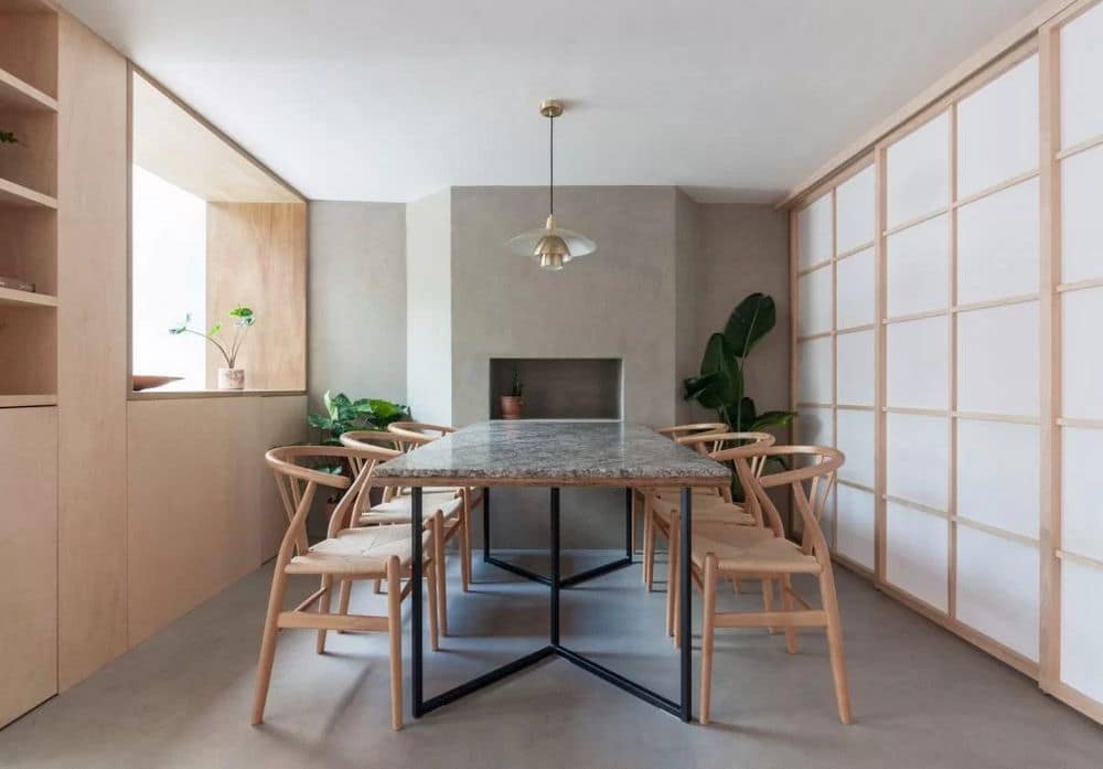
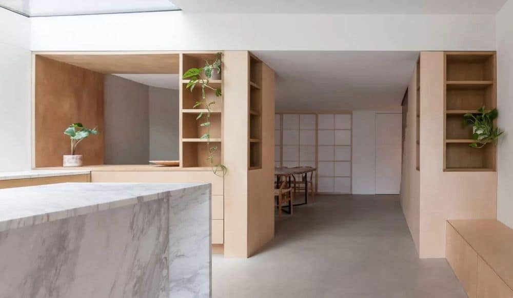
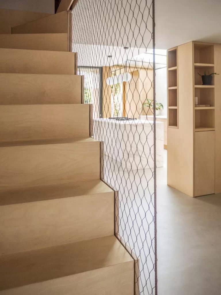
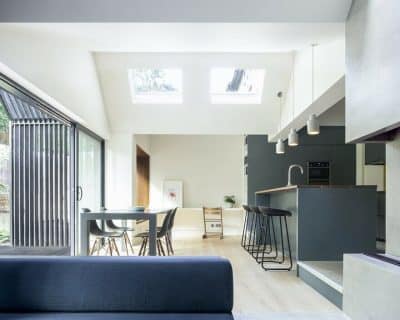
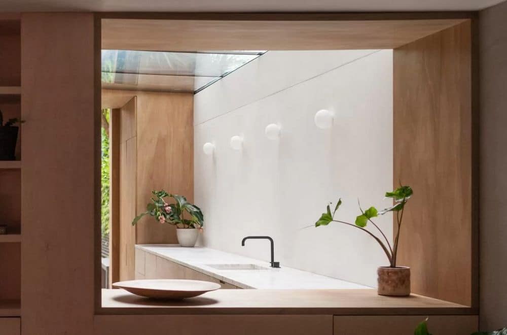
The design proposal rethinks the entire lower ground floor of a terrace property, treating the kitchen as the main focal point with a large skylight directing ample natural light towards the area where the chef would be preparing and cooking the food, referencing the stage light any main protagonist would receive. A visual connection to the chef is kept throughout the space, with openings placed on key locations of the floorplan and with transparent materiality enhancing these visual lines even in the extremes of the building. A discreet wire mesh replaces the traditional staircase balustrade introducing the entirety of the space before even arriving and sliding shoji doors are lined with translucent fabric bringing in light and movement to a room that would otherwise feel isolated.
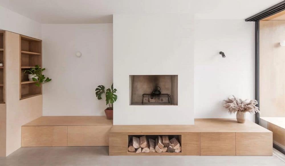
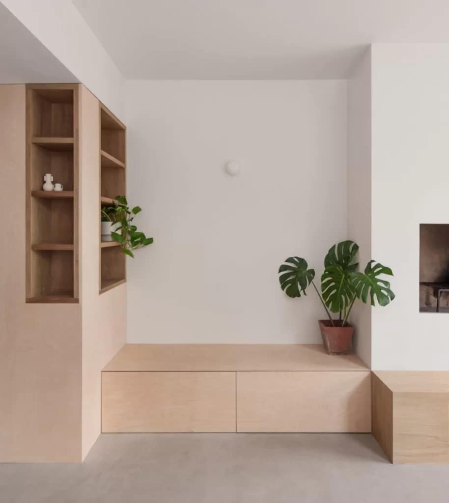
The architecture places emphasis on the experience of the space by the user. Natural light, high ceilings and lighter tones of materiality in the kitchen enhance the ritual of preparation and express hygiene while the lower ceiling and darker tonality of the dining create a more atmospheric space for eating. The front room becomes the final stage of the experience, with the shoji doors sliding open to an additional socializing space that houses a custom made unit for the client’s extensive record collection.
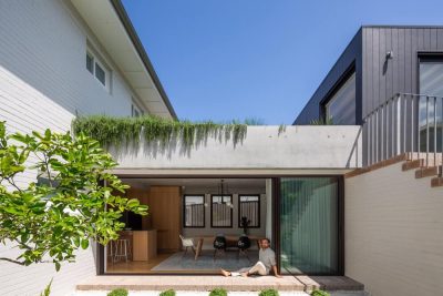
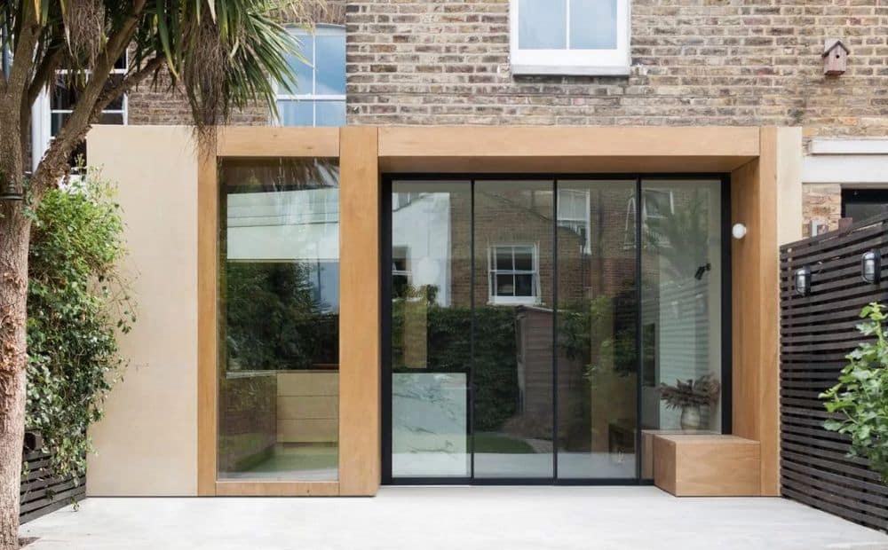
A key element of all interconnected spaces is the relation with the back garden, with the proposal ensuring that long views are enjoyed even from the furthest points in the house. Floor to ceiling sliding panels leading to the garden are designed to allow for the maximum possible opening and their proportion gives reference to an additional fixed window, creating the slim vertical rhythm of the rear facade. A timber canopy projects over the original building and runs vertically to create a box that wraps around the glazed elements, also creating an external seating that visually references the one on the inside. The added weather protection provided by the canopy ensures that the doors can be kept open while materials plays a key role in blurring the line between internal/ external spaces.
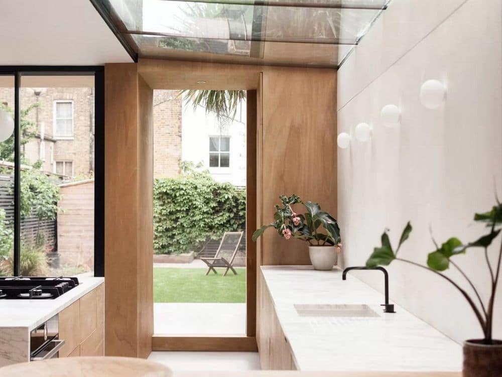
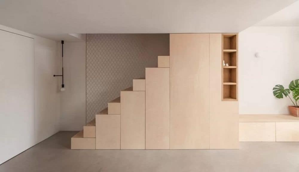
The scheme uses materiality to support and elevate the architectural language, with only a few understated but highly crafted elements. A seamless concrete floor connects all spaces through to the garden and a treated, durable plywood starts at the rear facade and becomes the kitchen’s main material. The birch plywood and white marble provide necessary contrast where dictated by the concept and the steel mesh of the staircase together with the shoji fabric bring elements of transparency.
Taking inspiration from the quiet confidence of our clients’ brief, our proposal strives to achieve a sequence of spaces that can be experienced seamlessly, using natural light and materiality to create a strong yet understated visual language.
