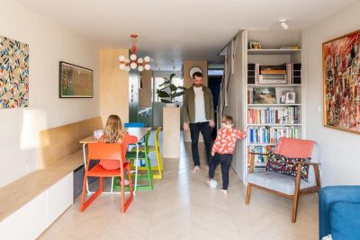
Project: Lagom Hus / Classic Stoke Newington Terrace House
Architects: Bradley Van Der Straeten
Project Architect: Jessica Williamson
Location: Stoke Newington, London, UK
Year: 2022
Photography: French and Tye
Text by Bradley Van Der Straeten
The client
We were approached by Nick and Emilie, with a young and growing family, to transform their traditional Stoke Newington terrace house into a modern family home. With strong Swedish ties, they wanted to bring those ties into their renovated London home. We could immediately see from the way they lived in the existing property that they loved a cool, pared back Scandinavian inspired aesthetic and feel.
The Original House
The existing property is a classic Stoke Newington terrace house with the staircase along one side and two rooms at each level, leading to an ‘outrigger’ room at the end of the plan. The existing outrigger kitchen was a skinny, dark space with an even skinnier unused side passage externally. The ceiling height of the kitchen was particularly compromised, making tall Nick in particular, feel cramped in the main living space where the family spent most of their time.
The existing house was dark throughout. On the ground floor, particularly the middle room and outrigger kitchen were not allowing much daylight in, while on the first floor, only a tiny window over the stair lit the main circulation route through the house.
The Brief
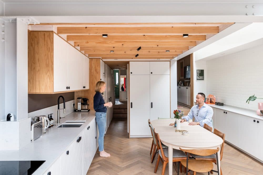
The brief for the transformation was all about daylight and openness. With a distinct focus on the ground floor, Nick and Emilie wanted to improve the living spaces of their home by bringing in as much natural light as possible and keeping the plan as open as possible. Uniquely and quite specifically, their preference was for a kitchen without an island that allowed the dining table to be the centrepiece. They wanted an open space, perfect for entertaining and family activity while also wanting to improve the storage for their growing family.
Nick and Emilie introduced us to the concept of ‘lagom’ very early in the project – they wanted their home to have an essence of modesty and avoidance of extremes. Their preference was for a warm Scandinavian inspired aesthetic and a pared back design ideology where the essentials of the build were seen, celebrated and unadorned.
The Design Solution
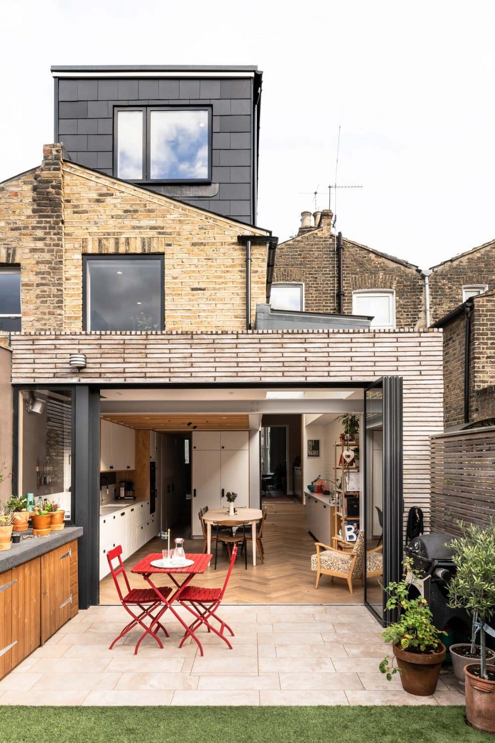
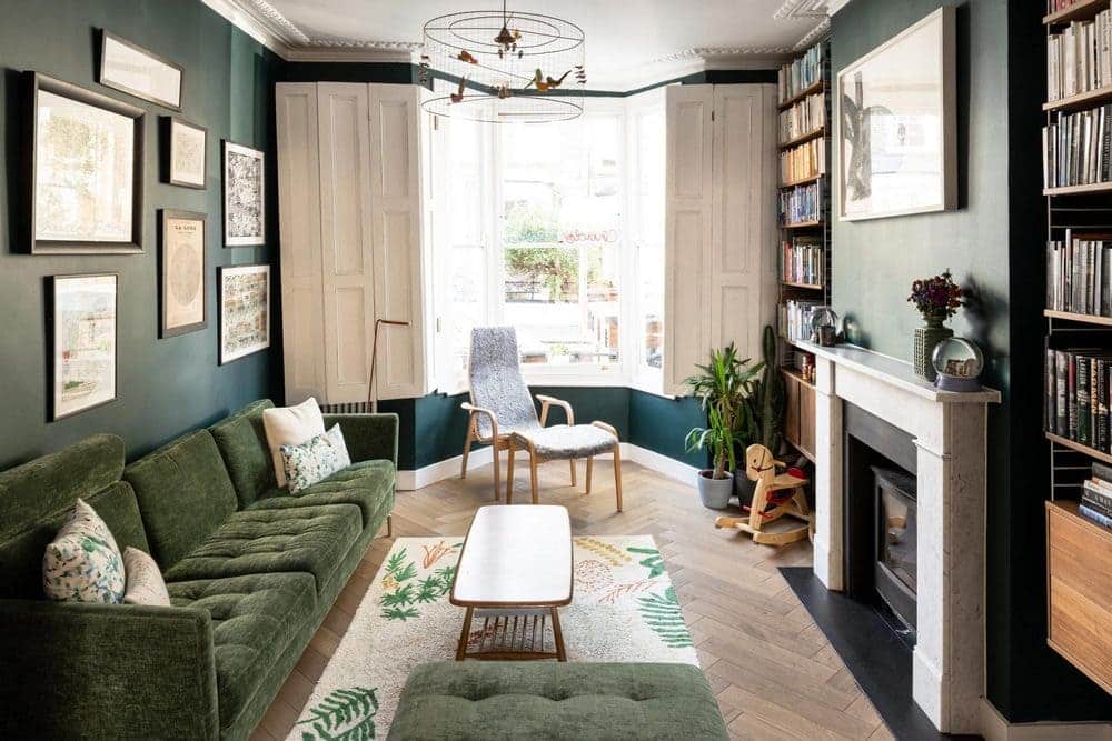
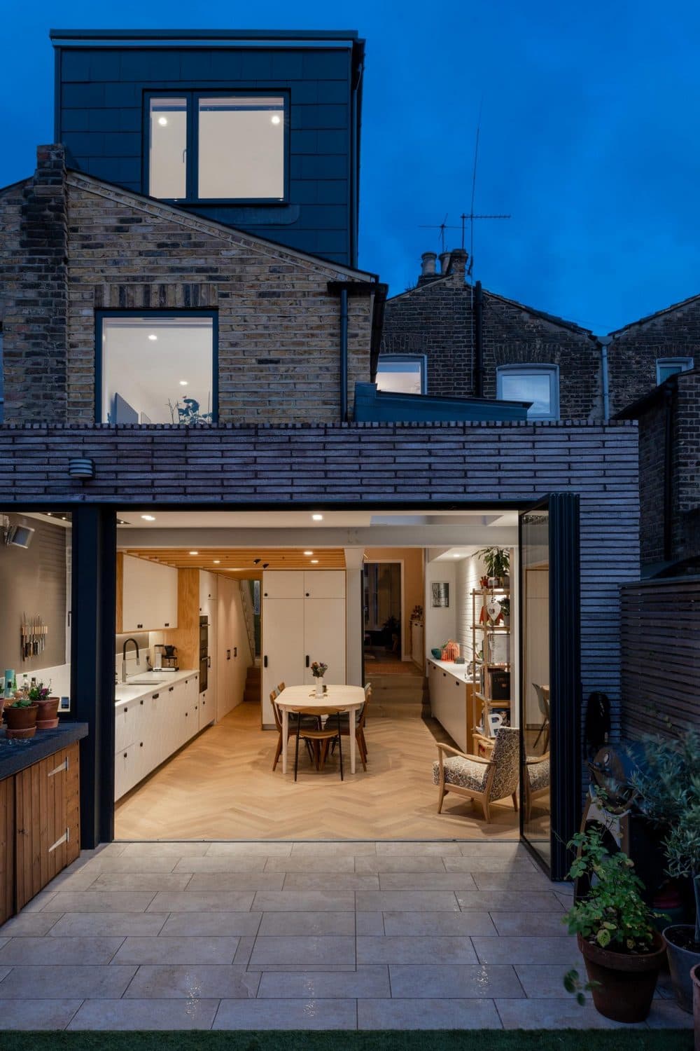
The main design concept for Nick and Emilie’s place came from the practical need for storage. The solution was initially derived as two joinery ‘edges’ that ran along the ground floor external walls – one pushing towards the front of the property into the living room and the other pushing out from the kitchen into the rear garden. This promoted a strong, physical connection between the four spaces on the ground floor, the front lounge, the middle room, the kitchen and the rear garden.
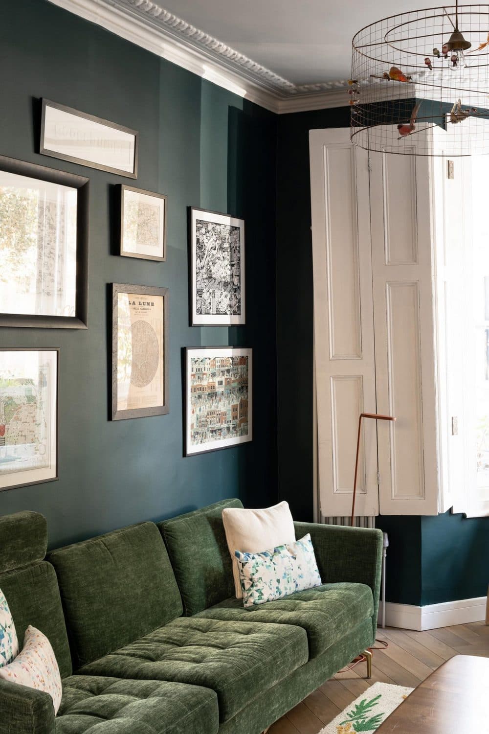
‘The kitchen is airy, feels spacious and the kitchen table becomes the focal point. People love the fact that the three rooms downstairs, which are all open plan, are very different in colour and style but yet feel connected.’ Emilie
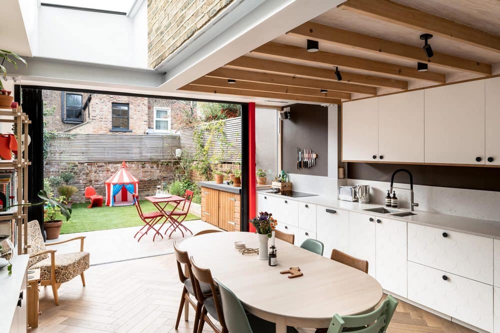
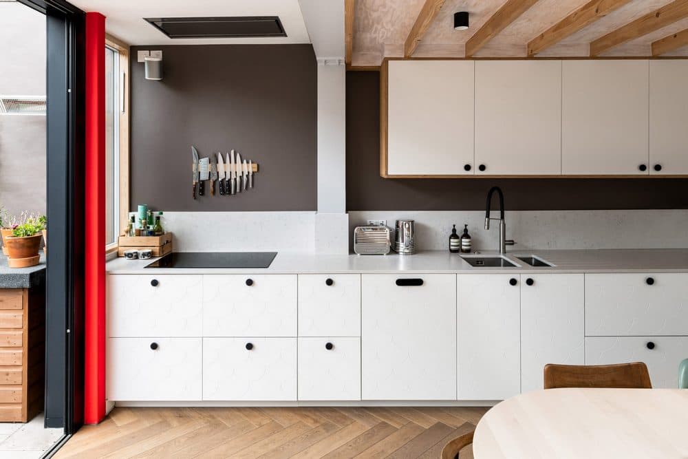
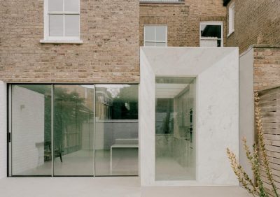
The kitchen became an indoor/outdoor space with the kitchen worktop running right up to a new window with slide and stack doors across the back that allow the whole rear elevation to open up. The large, fixed rooflight opens the extension up to the sky and lets in the ample available daylight. The rooflight positioning allowed extensive height (and therefore light!) at the opening to the traditional and previously dark middle room but also ensures the sensitive boundary with the neighbour is kept considerately low, in line with council requirements, without cramping the kitchen space.
Further back in the ground floor plan, a hidden toilet is incorporated which is separated from the kitchen and sits within the extended traditional entry. A break out space and cloak area was introduced in the skinny Victorian corridor which traditionally suffers from a bit of congestion when a family is getting ready to head out!
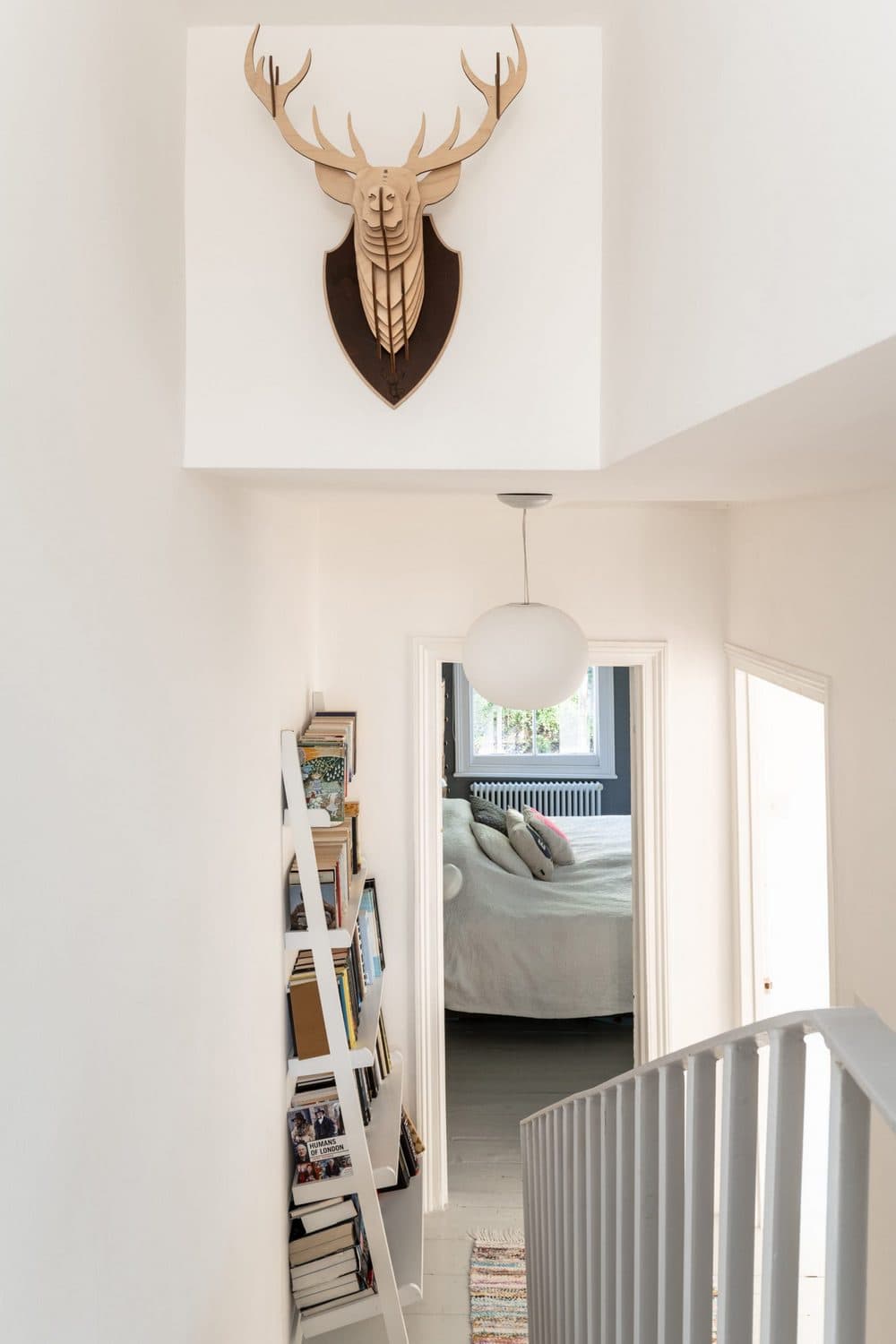
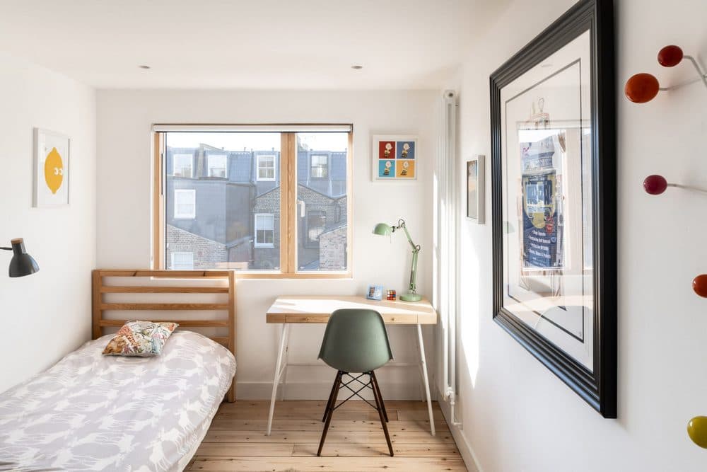
Upstairs, the decision was made to change the existing, broken timber sash windows for a thermally efficient, contemporary timber/aluminium composite with modern opening functions. With the assistance of a new rooflight at the top of the new stairs, these new windows allow unbroken daylight to filter into each level and down through the traditional building plan. The new windows provide a very clean aesthetic, both internally and externally, blending the old external brickwork walls and traditional room sizes with clean, maximised, contemporary openings.
‘The light in the upper part of the house is incredible – one of our favourite spots is to watch the sun go down over Stokey from our son’s top bedroom’ Emilie
A Swedish Aesthetic
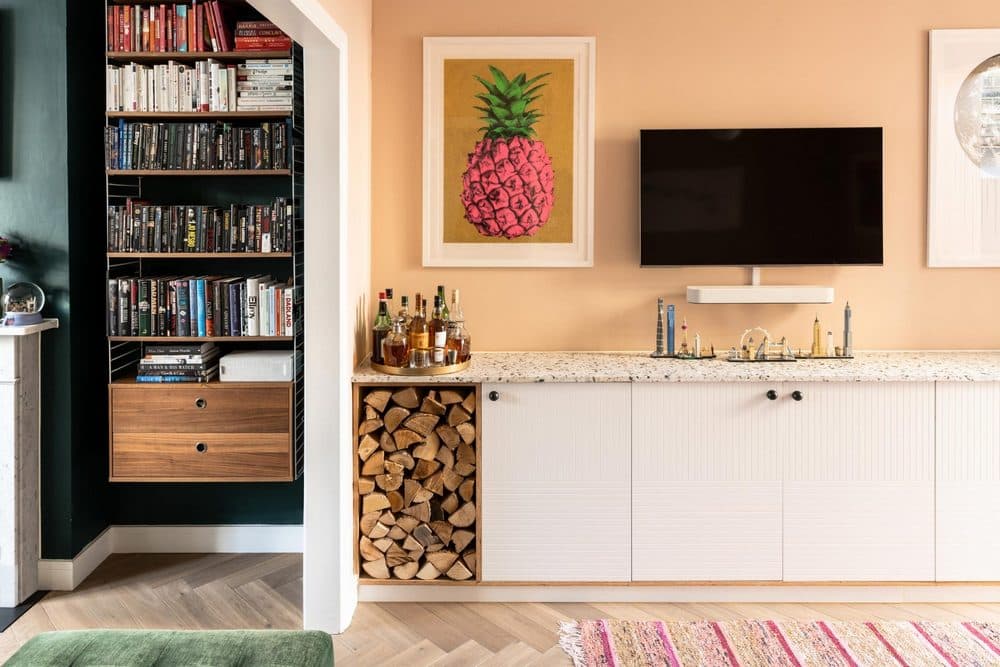
An early design decision, which promotes the Swedish aesthetic of the renovation was that the kitchen would be entirely Scandinavian. Incorporating standard and economical IKEA units, the kitchen and living room buffet joinery is lifted with varying textured fronts and fun kitchen handles that were shipped over by Swedish company ‘Superfront’.
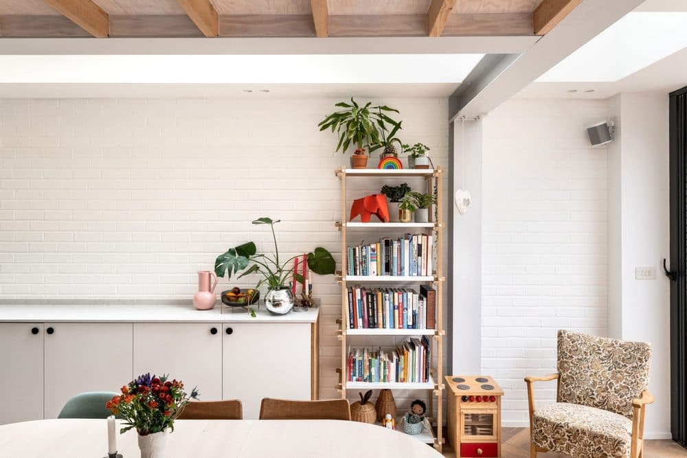
The structure supporting the kitchen extension was kept exposed, in line with the unadorned, modest concept of ‘lagom’. The joists underneath the outrigger were replaced and celebrated allowing the previously low kitchen ceiling to feel open and gain the volume between the timbers. Infilled with plywood – the joists and boards create a warm, textured ceiling.
The essential structural steels were also celebrated, with just a paint coating in ‘feather flock’ light grey – the glazed rooflight sails over the main box frame steels that support the rear of the house showing exactly how the extension is designed and supported.
Continuing the theme of ‘essentials only’ – areas of brickwork were left exposed and unadorned with plaster in the kitchen space. The outrigger wall that extends down into the kitchen space and passes the rooflight was left completely exposed, including its ‘feather flock’ T steel beam, so the whole wall and its support can be seen as you look up at the rooflight. The new party wall was painted white so the texture of the bricks could be appreciated while still reflecting daylight around the space.
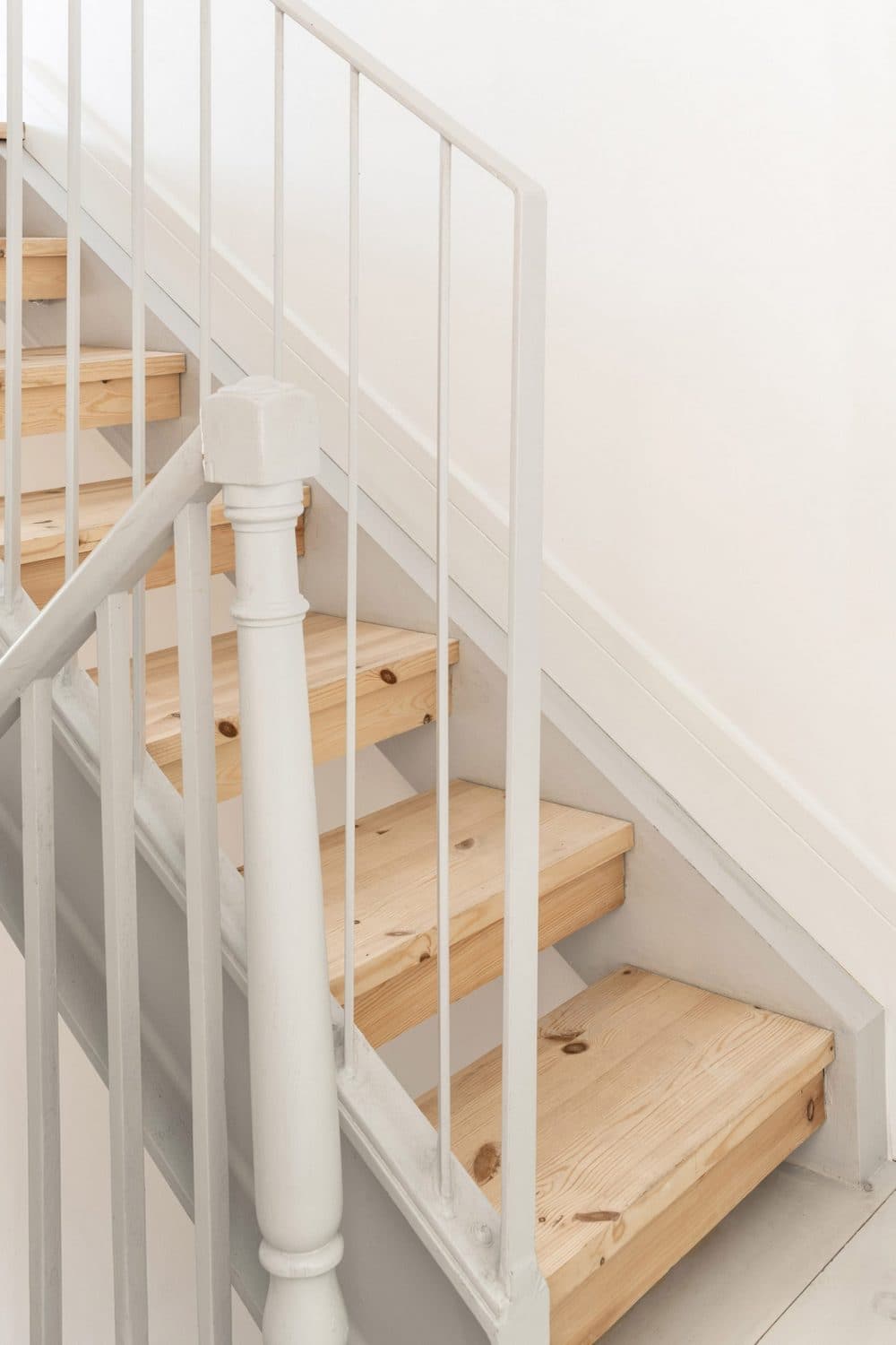
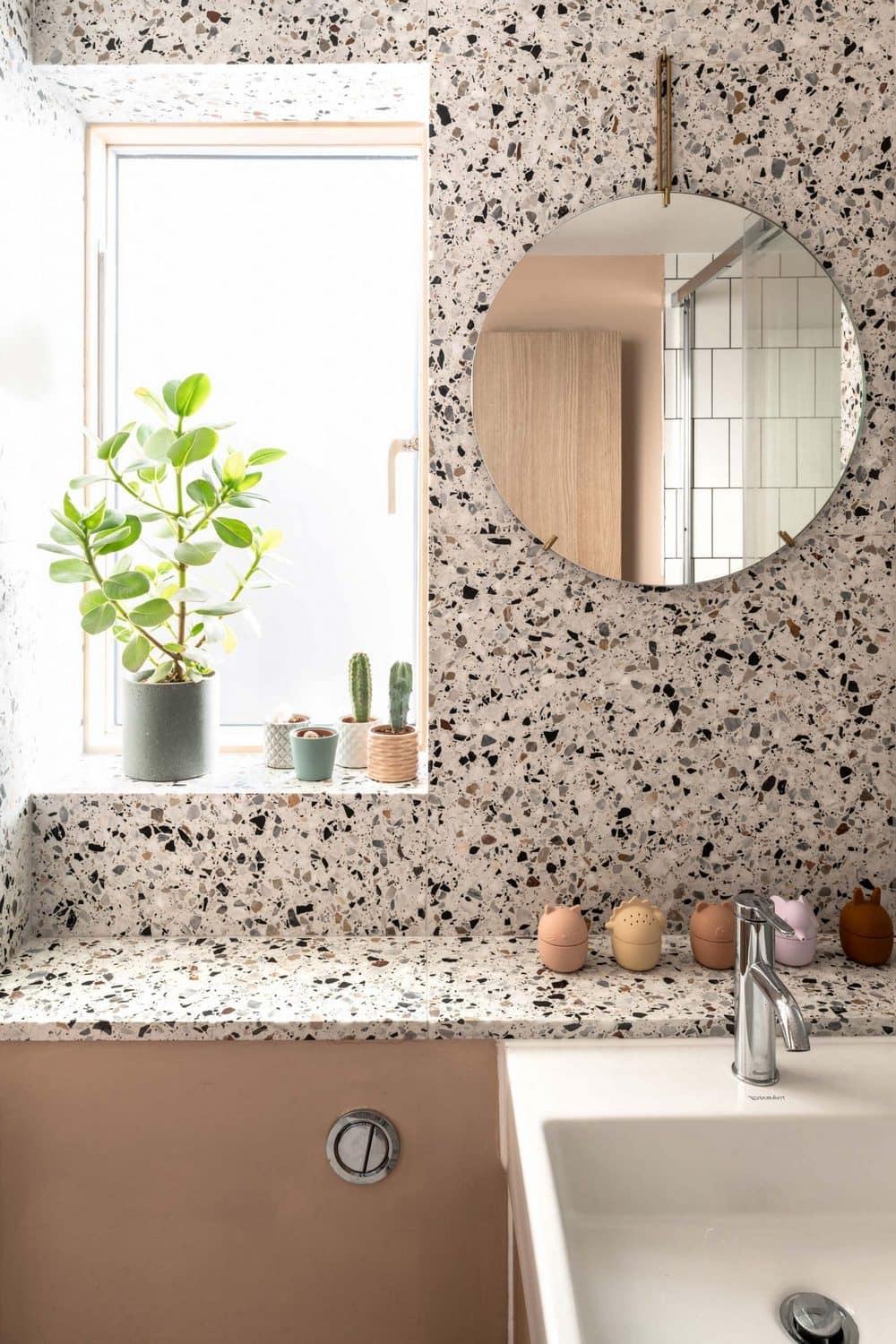
Upstairs, the paired back and modest aesthetic continues with economical pine boards providing the floors to the new outrigger rooms with IKEA/Superfront wardrobes featuring in each bedroom. Surprises of texture and colour appear throughout the house, namely with flecked terrazzo in the wet areas and the ‘hot pink’ pillar.

