Project: Twin Peaks House
Architects: Substance Architecture
Location: San Francisco, California
Year 2018
Photography: Paul Crosby Architectural Photography
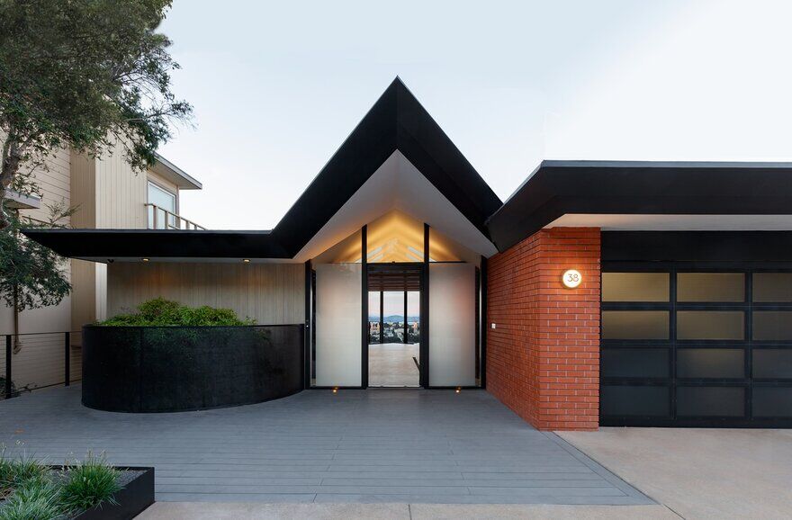
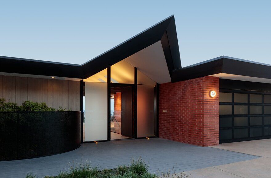
This 2,800 square foot home on the northern face of Twin Peaks in San Francisco was built in the 1950’s and designed by celebrated Frank Lloyd Wright associate, Aaron Green. The Twin Peaks house had a formal underpinning and a strong organizational logic. In short, it was a work of architecture. It had fallen victim to decades of piecemeal renovations, however, that stripped away most of the original rigor. For this renovation, the designers researched the original drawings to understand the generative concepts and worked to reinterpret these ideas to create a 21st century home.
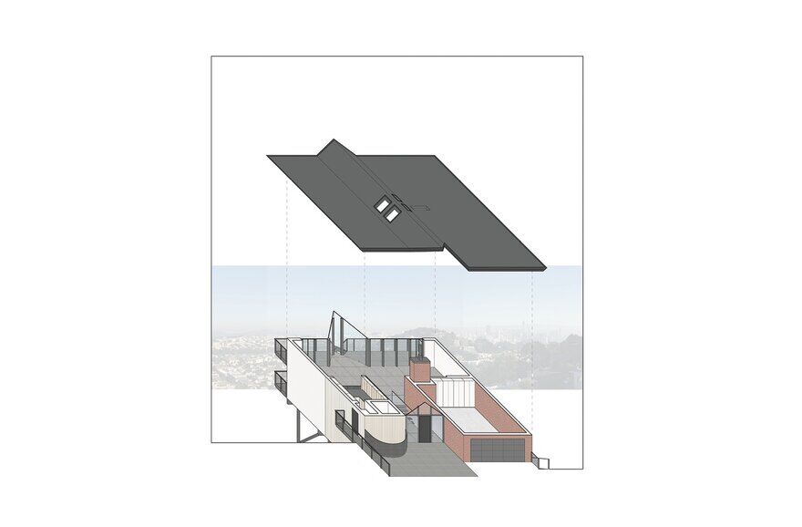
The Twin Peaks house was organized with the upper, entry level containing the “public” spaces, reserving the lower level for “private” bedroom spaces. In turn, each floor is developed with service spaces toward the southern, street side of the home, providing a buffer and affording panoramic views to the served spaces to the north through a floor to ceiling window wall. The home’s massing implied a spatial division as well.
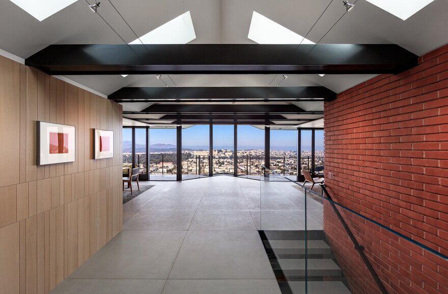
The eastern and western flat-roofed portions of the home were separated by a gabled central hall that runs its length north to south – from the entry to a projected bay at the north. Finally, it was clear that the original design utilized a four-foot planning module. The design team felt that these strategies remained valid, and worked to reinterpret and clarify them in the renovation.
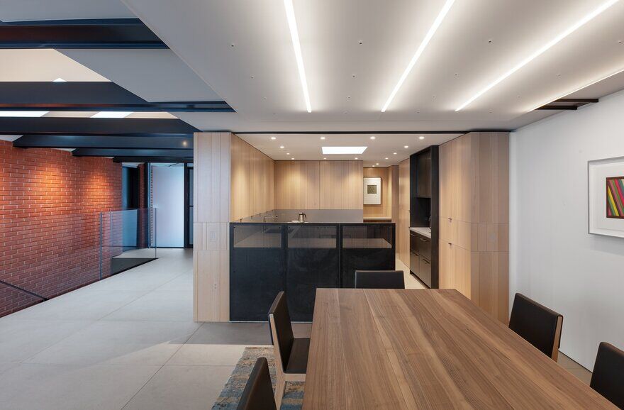
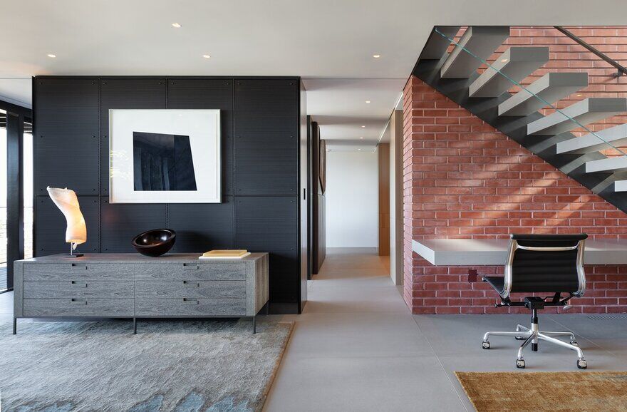
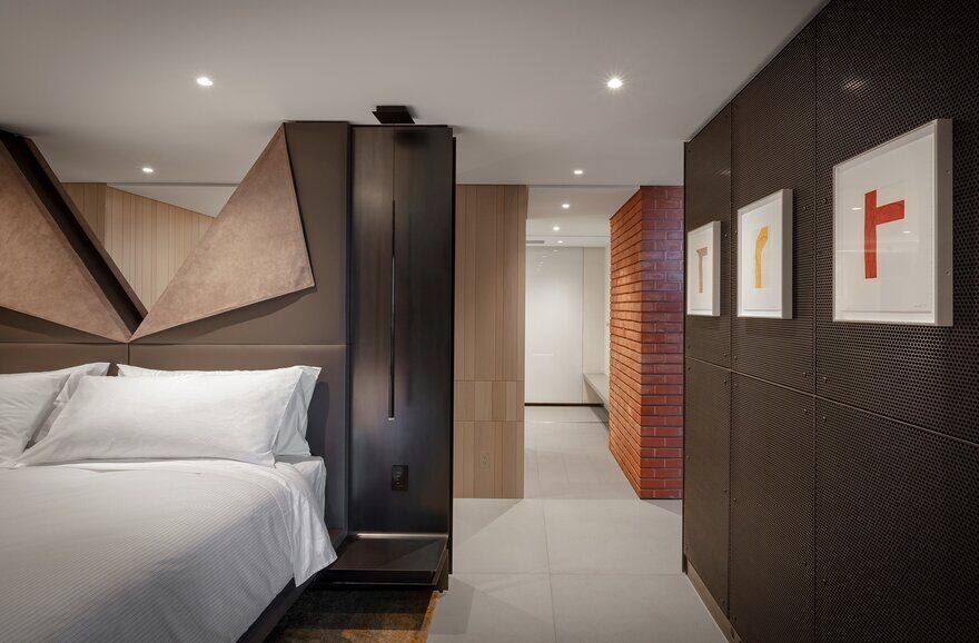
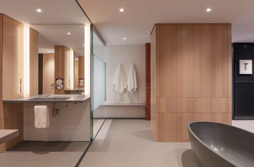
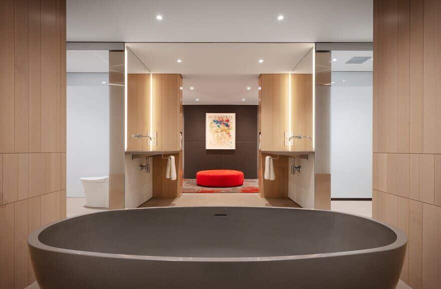
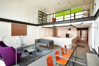
The sixty-year accretion of finishes was stripped from both levels, and a very limited palate of materials was carefully deployed to unify the home’s spaces. Oak paneling was used to clad the southwestern service block that includes the kitchen and powder room on the upper level, and the guest closet, guest bath, and mechanical space on the lower level. Brick was used to clad the southeastern service block.
This includes the garage at the upper level, and the master bath and dressing area at the lower level. This material language was drawn, in part, from the home’s exterior. These two blocks, in concert with the central gabled volume, are the home’s primary spatial boundaries.
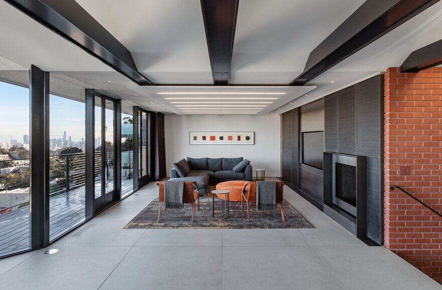
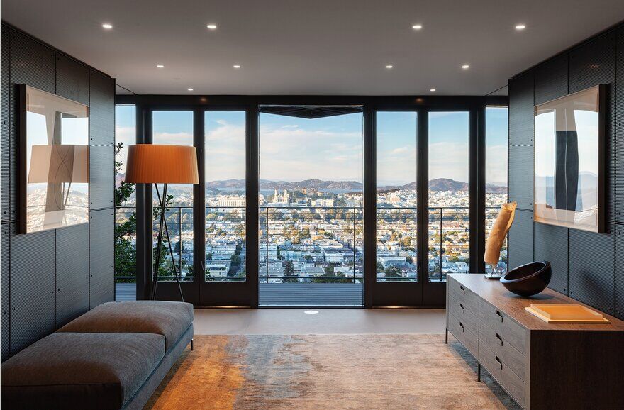
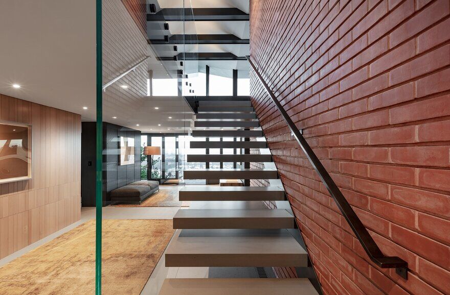
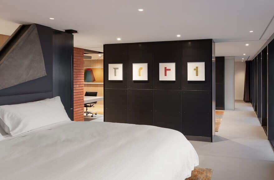
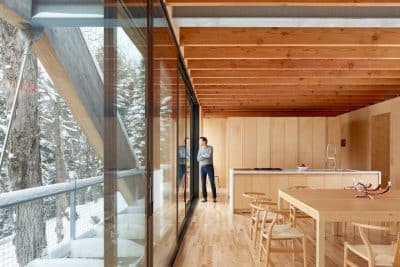
Arranged along the northern width of the home, adjacent to the existing window wall, are the living and dining spaces at the upper level, and the master bedroom, central sitting room/office, and guest bedroom at the lower level – each provided with panoramic views of San Francisco. To further unify the home’s interior, the floor was finished in concrete tile throughout. In addition, the stair that originally blocked the circulation route from the entry, was reoriented and dematerialized to visually expand and open the core of the home.
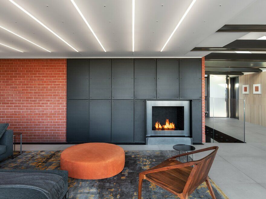
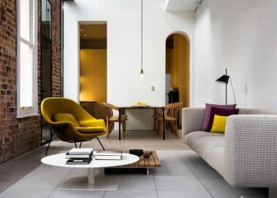
The design team worked with the client to curate their extensive collection of contemporary prints and the select furnishings, rugs, etc. to extend the language of the home. The result is a home that respects its mid-century heritage without imitation. The renovation strips away decades of piecemeal remodeling efforts to reveal the home’s original logic – and then clarifies and extends that logic through contemporary means to create a home that is authentically of our time.

