Project name: Arches and Patterns Apartment
Architect and interior designer: PLUS ULTRA studio
Project team: Alessandra Castelbarco Albani, Marco Di Nallo, Chiara Girolami, Giada Tocco
Contractor: Edildesign by Roberto Saba
Carpentry works: Falegnameria Fratelli Noli
Location: Milan, Italy
Floor area: 130 square meters
Gross floor area: 207 square meters
Floor to ceiling height: 3 meters
Completion and furnishing: January 2023
Photo Credits: Federico Villa
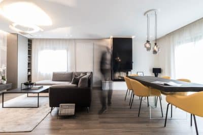
In the apartment created by PLUS ULTRA in the Sant’Ambrogio neighborhood in Milan for a designloving young couple, a layout characterized by contemporary graphic and textural accents enters the composition quietly, only to take on a leading role. The work on distribution, geometries, colors, and textures initially defines a sort of connective fabric that emerges as the true architectural intervention: understated, sophisticated, and determined.
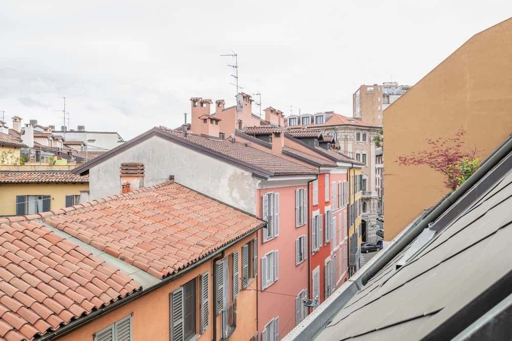
The recently completed apartment overlooking the rooftops of historic Milan, designed by PLUS ULTRA (Alessandra Castelbarco, Marco Di Nallo, and Chiara Girolami) is conveniently located near the Basilica of Sant’Ambrogio, between Via Lanzone and Via Camminadella. The clients are a young couple with a passion for classic design.
Access to the Arches and Patterns apartment, situated on the top floor of a 1950s building, is through the atrium and courtyard of Casa Volonteri, a seventeenthcentury historic palace known for its facade featuring the architectural interventions of Giuseppe Sommaruga, blending elements of Liberty style with a Baroque influence.
A clean layout and a new atmosphere
The project originated from the need to reorganize the spaces of the apartment, which lacked a clear hierarchy in their sequence. The main objective was to restore its functional and spatial order by creating a cleaner layout and defining a new atmosphere through a specific selection of materials and colors. In addition to the clients’ existing collection of design classics, the architects carefully selected and integrated some contemporary pieces.
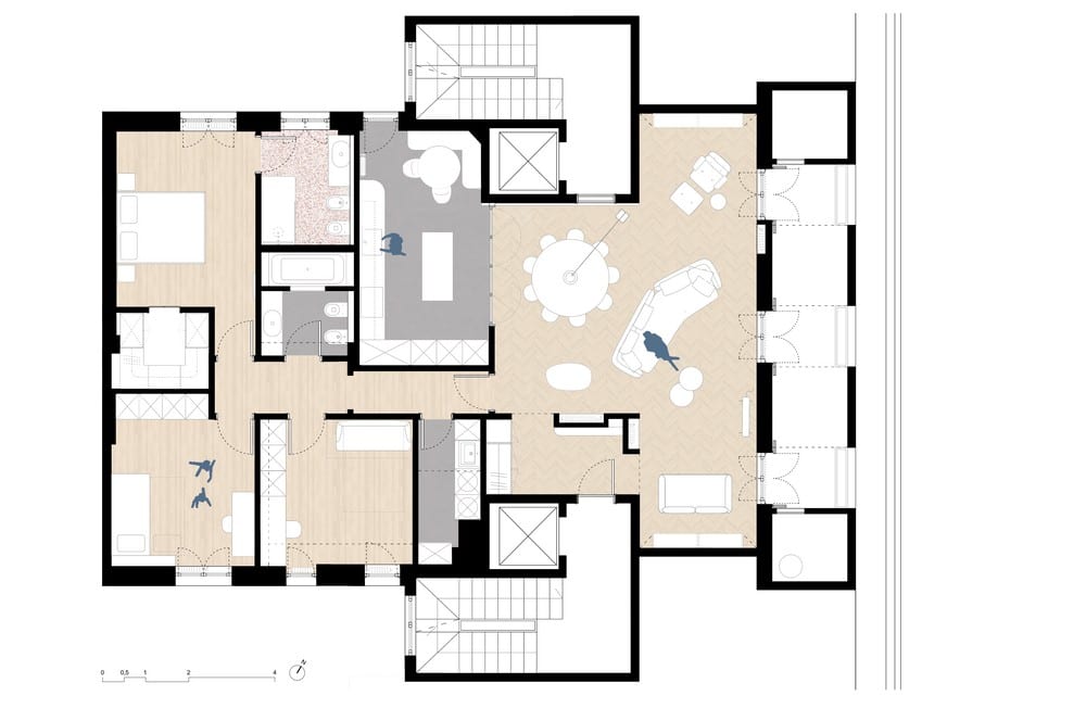
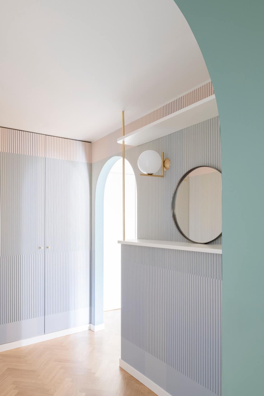
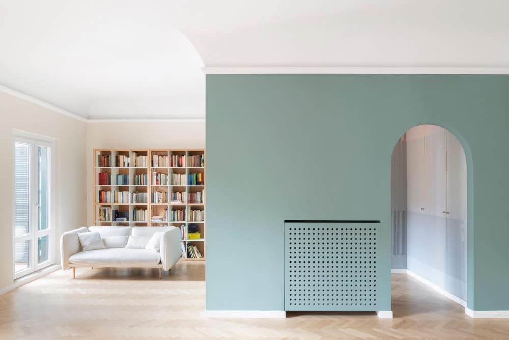
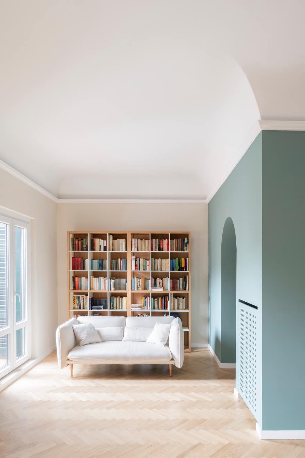
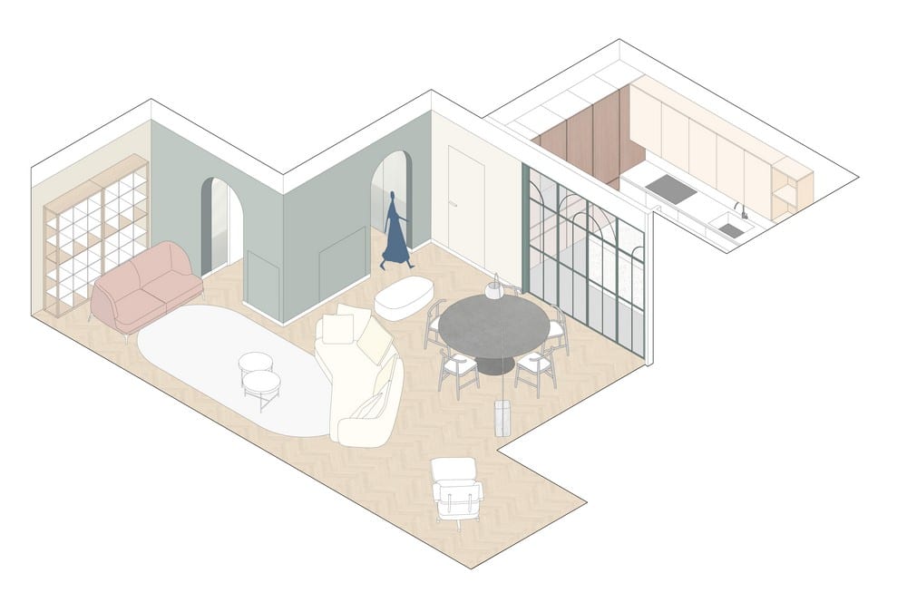
In the original layout, the presence of two opposing entrances turned the living room into a thoroughfare. In the new layout, it was decided to maintain a single entrance, creating a space that serves as a hallway leading to the living area through two arched openings. This choice represents, for the architects — who possess a deep familiarity with historic buildings and the works of great Milanese architects — an interpretation of Luigi Caccia Dominioni’s philosophy. He expressed his dislike for a direct entrance into the living room, stating that it “leaves no room for surprises.”
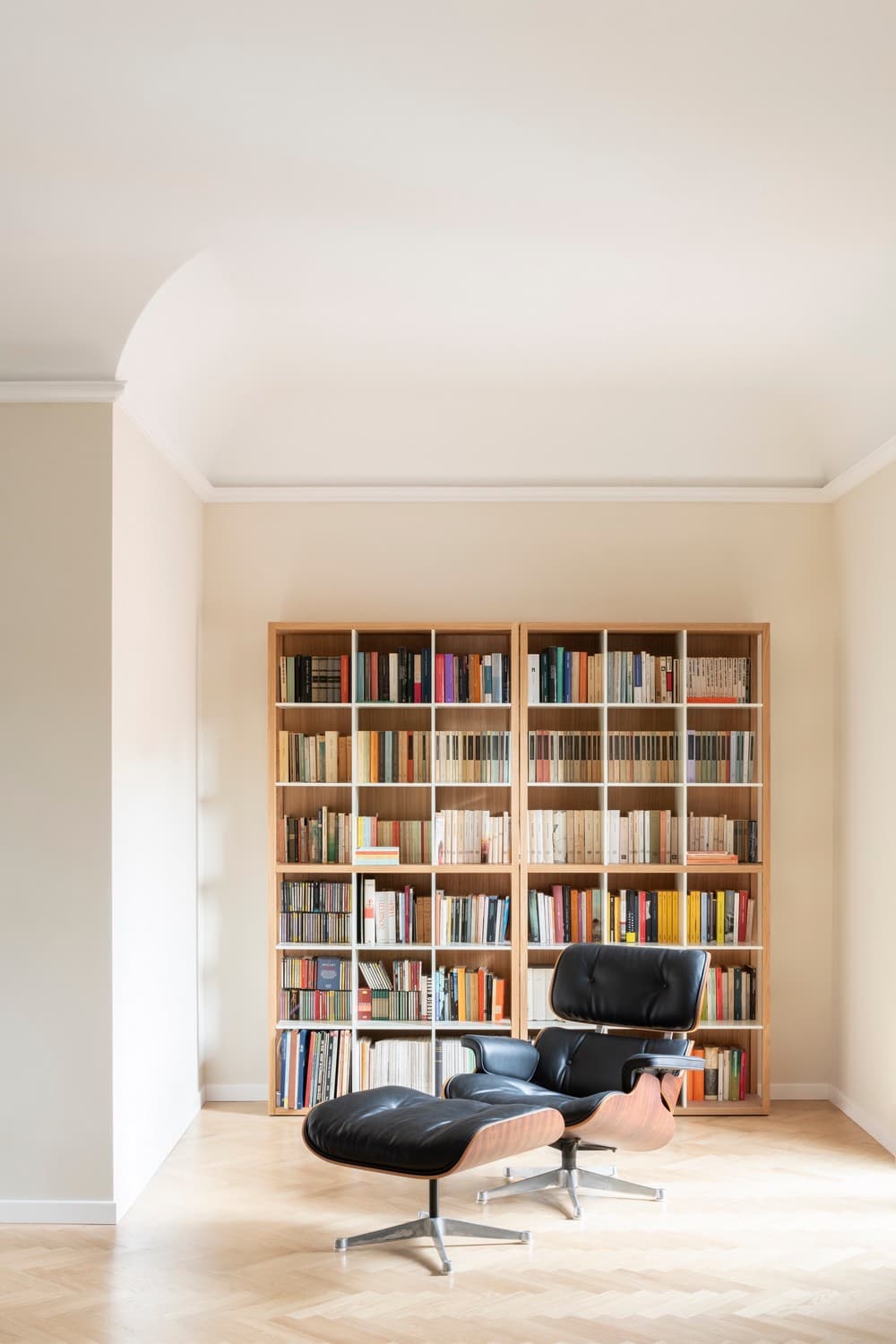
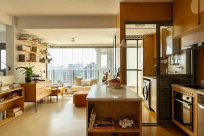
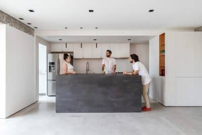
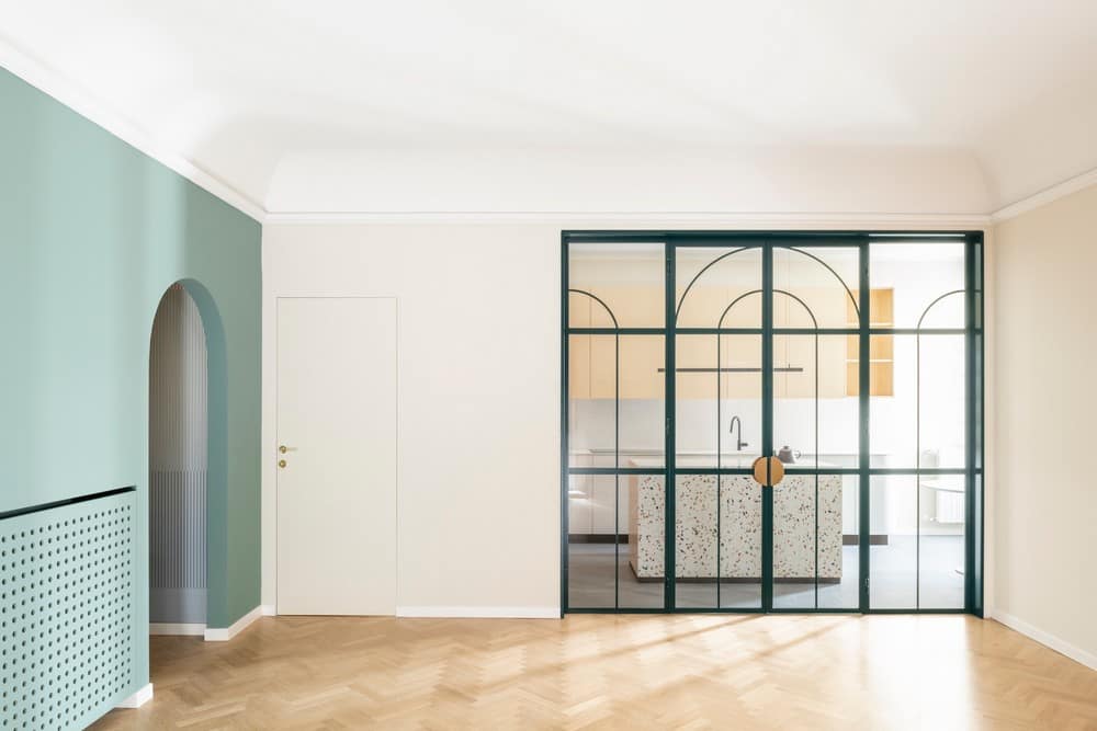
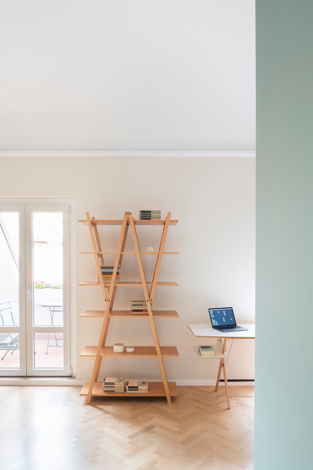
The living area, facing east, has been designed to be spacious and fluid, with dedicated corners for various activities such as dining, conversation, reading, and listening to music (the client has a small collection of records and opera booklets). An integral part of the new living area is the kitchen, which overlooks the living room through a large custom-made painted steel window.
The kitchen has been designed as a seamless extension of the living space, where daily actions such as food preparation and socializing unfold with uninterrupted visual continuity. This fluidity is achieved through a transparent glass partition, which becomes the canvas for presenting a geometric composition of arched designs that create a subtle illusion of depth.
This graphical approach establishes a dialogue with the patterns and hues of the entrance wallpaper, creating a visual harmony between architectural elements.
In balance between history and contemporaneity
The Arches and Patterns apartment was conceived with the aim of finding a balance between two contrasting tensions: on one hand, the desire to evoke history and the essence of objects and the home; on the other hand, the choice to create new geometries using graphic elements and contemporary materials.
Architects Alessandra Castelbarco and Marco Di Nallo have established a connection between the taste and design philosophy of the creators of the selected furniture pieces, aiming to create a dialogue with each object and seamlessly integrate them into the new domestic space. The apartment is not merely a neutral container in which to “display” the furniture pieces; on the contrary, what PLUS ULTRA aimed to create is an environment that not only welcomes them but also serves as their counterpoint, combining their distinctive qualities with a cohesive design vision.
The layout, characterized by contemporary graphic and material accents, subtly enters the composition, only to later assume a prominent role. The work on distribution, geometries, colors, and textures initially defines a sort of connective fabric that emerges as the true architectural intervention: understated, sophisticated, and purposeful.
The color choices, geometric patterns, and environments
The project involves a meticulous selection of elements and colors. The entrance wallpaper, with its vertically shaded lines of green and yellow, recalls the boiserie of the common areas of the condominium, giving this space a role as a mediator between the public and private spheres.
Compared to the living room, the entrance presents itself as a distinctive volume with a specific color scheme, inside of which the wallpaper covers the entire space. This same wallpaper also wraps around the doors of a concealed wardrobe. Brass details, such as the Cono handle designed by Gio Ponti, evoke the style of post-war Milanese architecture. The choice of the lamp, the Flos IC light wall sconce by Michael Anastassiades, recalls the lighting fixtures found in Milanese entrances, but with more essential lines and a touch of familiarity.
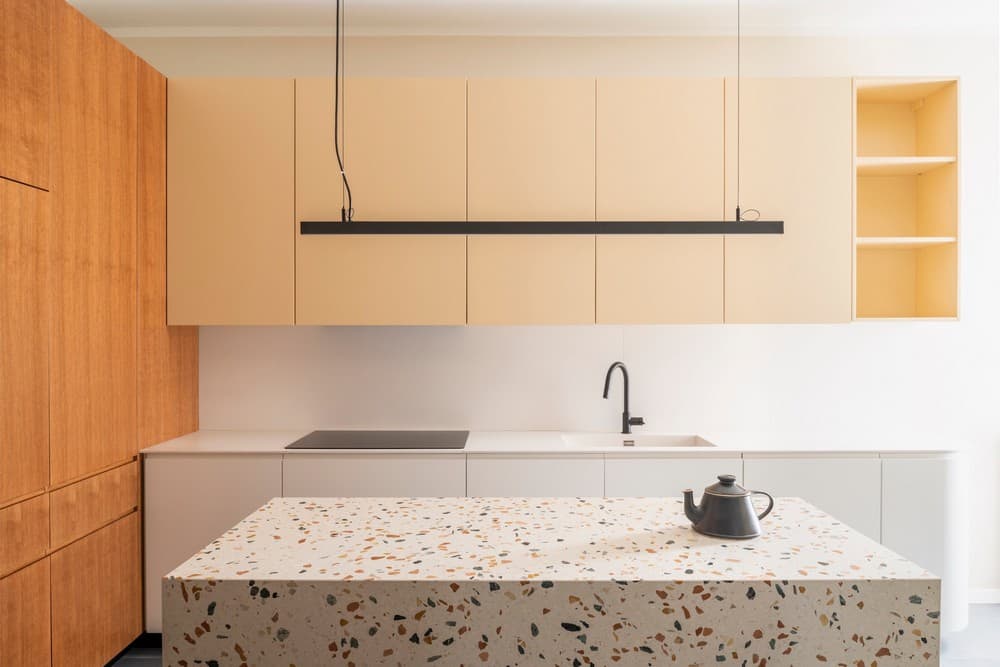
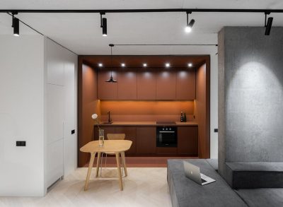
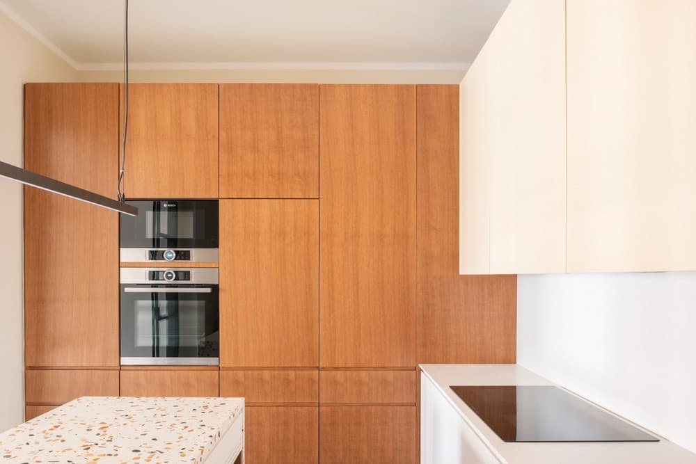
In the kitchen, each component is characterized by a color or pattern that enhances its volumetric identity: the columns are stained oak, the bases are white, and the wall units are in a delicate pale yellow. The central island, designed as a monolithic terrazzo structure, represents the synthesis of this palette. The shades of green present in the aggregates recall the tones of the window and entrance volume, creating subtle connections between the spaces.
In the living room, which overlooks a long and narrow terrace carved into the roof slope, artificial lighting has been carefully designed. The cornices between walls and ceiling, partially existing, have been used as reflective elements to accommodate indirect lighting using LED strips placed on the gypsum frame that runs along the perimeter.
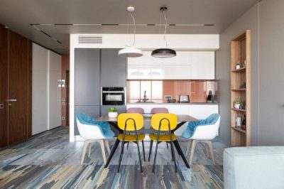
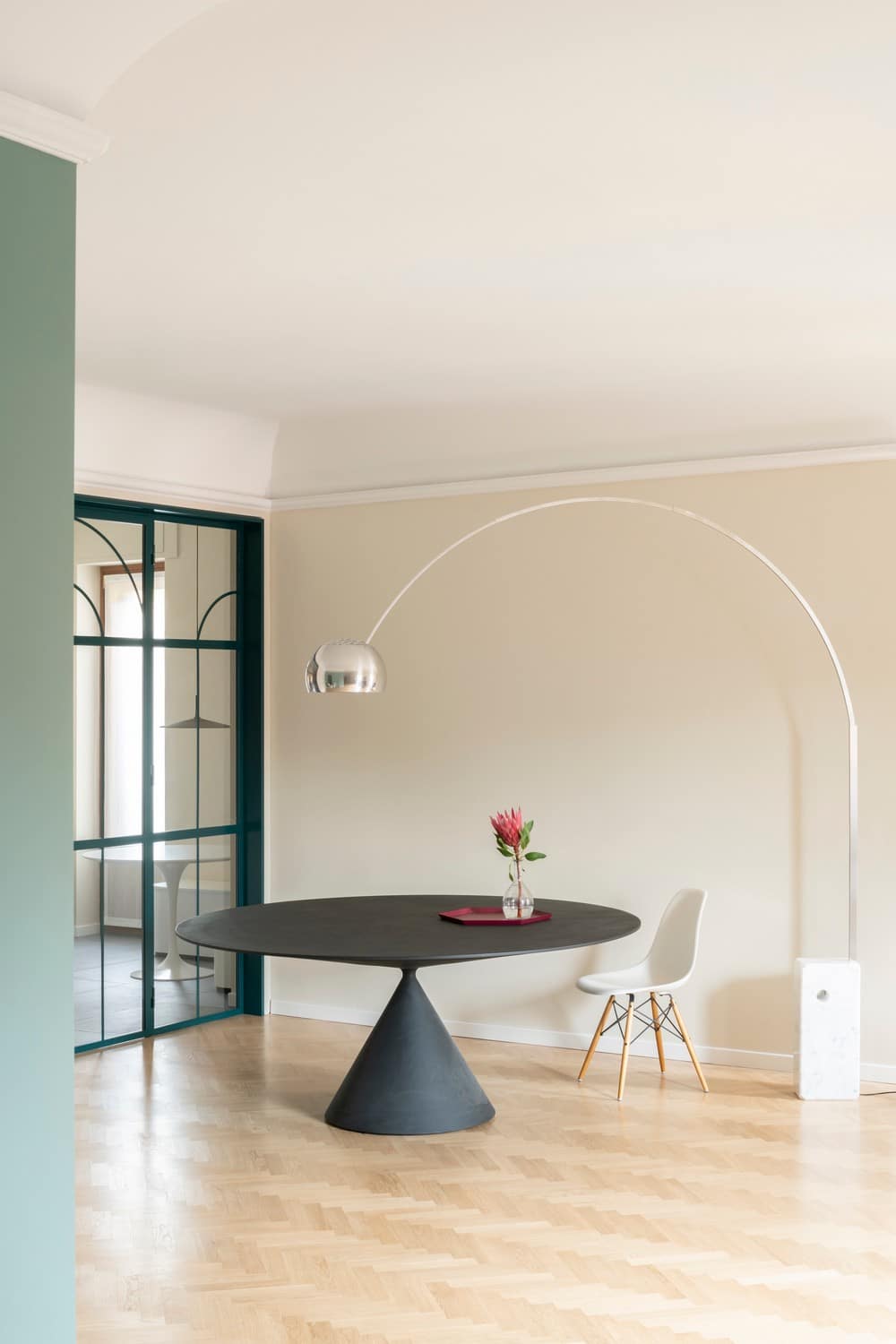
The iconic Arco lamp, used in its original conception, illuminates and furnishes the dining area. In the kitchen as well, indirect lighting placed above the furnishings is complemented by two pendant lamps that echo the geometries of the island and the table.
A hideaway door separates the living room from the more private quarter of the apartment, which consists of two bedrooms, a study, two bathrooms, and a laundry area. These spaces are distributed along a central corridor, punctuated by an arched opening.
The new layout has rationalized and optimized a space that was previously labyrinthine and characterized by multiple transitional areas. Despite the diversity of patterns, materials, and colors, a play of continuous references provides continuity and coherence.
Thus, all the “wet” areas of the house feature a terrazzo motif, with different color variations: more complex in the kitchen (with three aggregate colors) and simpler in the bathrooms (with yellow or red aggregates).
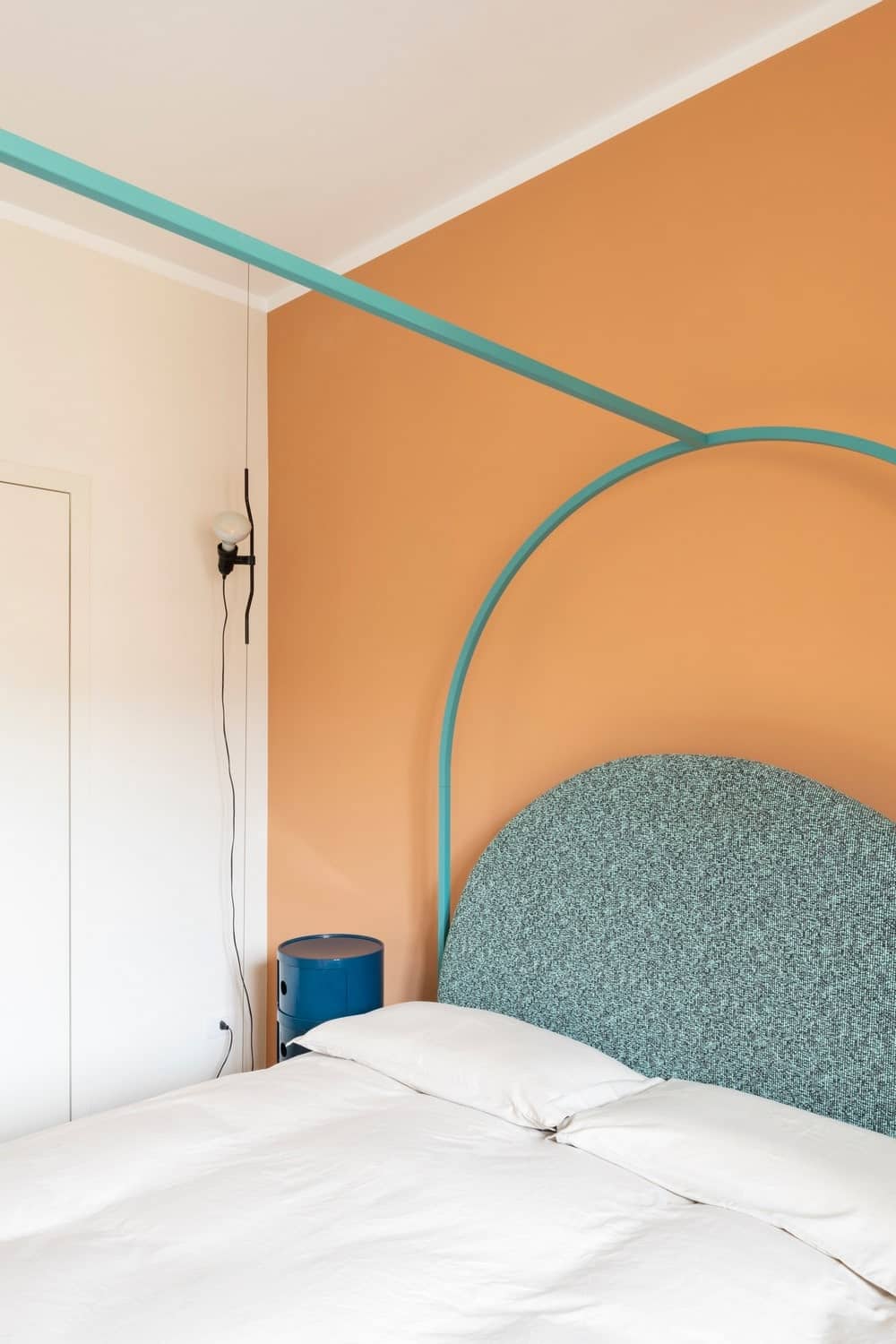
The warm tones of the rooftops in Milan and the colored plasterwork of the windows in the living area are introduced and brought indoors to the bedroom to create a cozy and familiar atmosphere. The master bedroom is designed as a pure volume, characterized solely by color, housing a canopy bed with minimal lines, almost creating a “space within a space.” To emphasize its centrality in the room, the clothing is concealed within a walk-in closet, with its entrance hidden behind a sliding door in the wall.
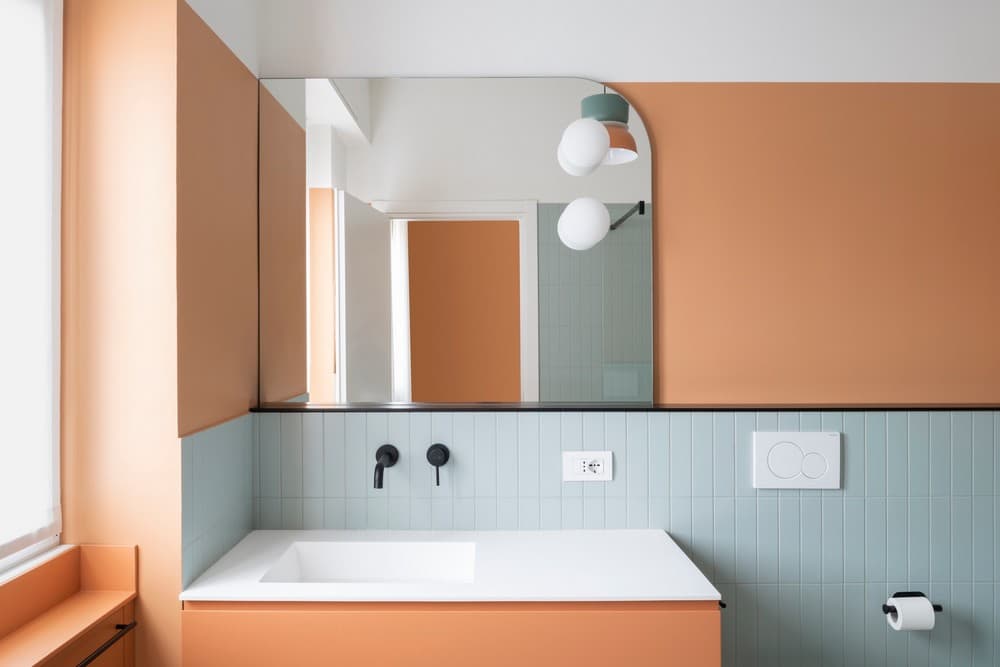
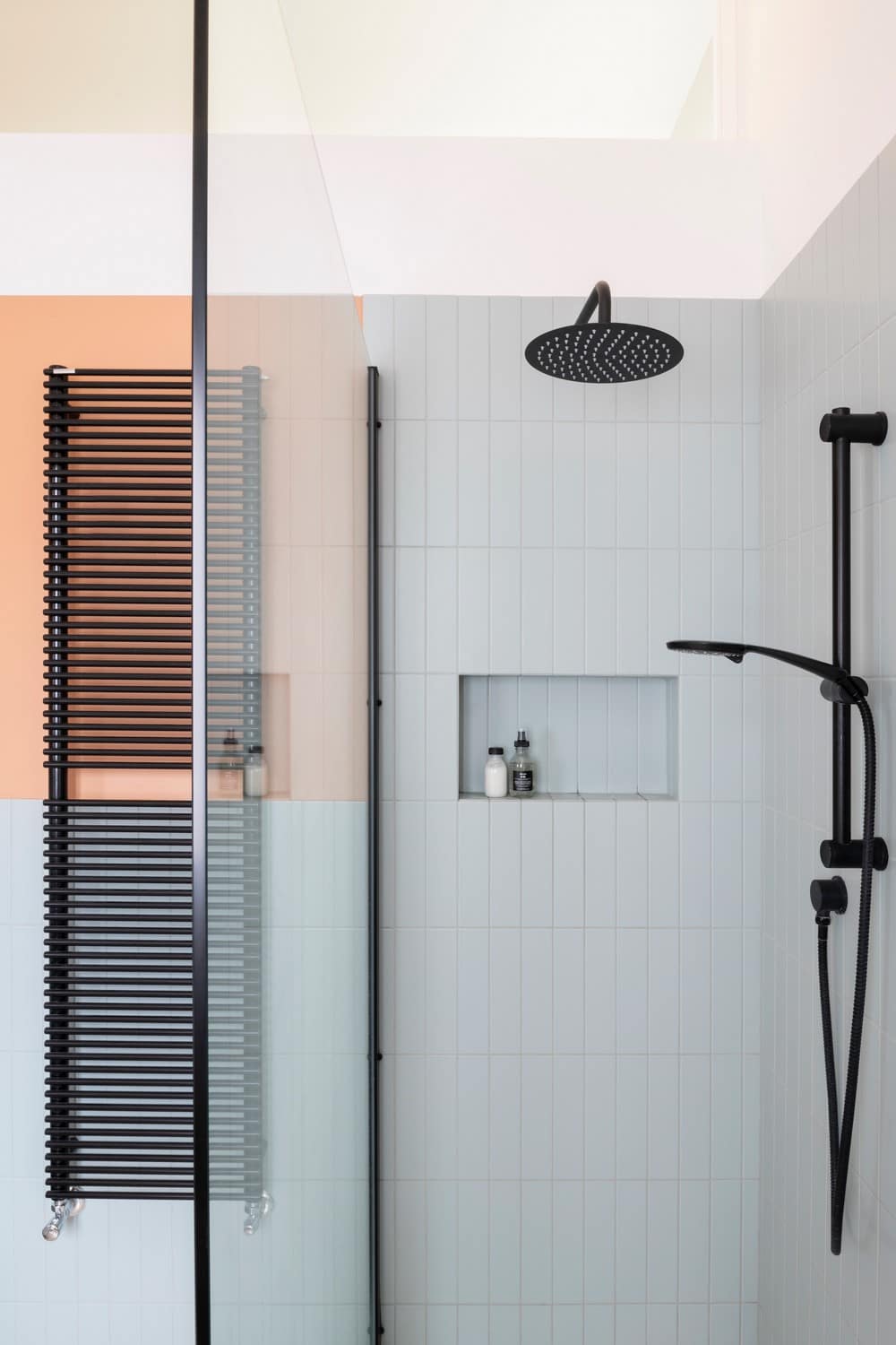
The master bathroom follows the same color palette, but with the addition of a cool tone in the ceramic wall tiles: the flooring is in redterracotta terrazzo, whose shades recall the enamel and color of the fixtures, while the walls feature vertical tiles in pastel green-gray tones. Once again, black graphic details create a contrast with the soft color palette. The large custom-made mirror, integrated with lighting, amplifies the effect of natural light and visually expands the space.
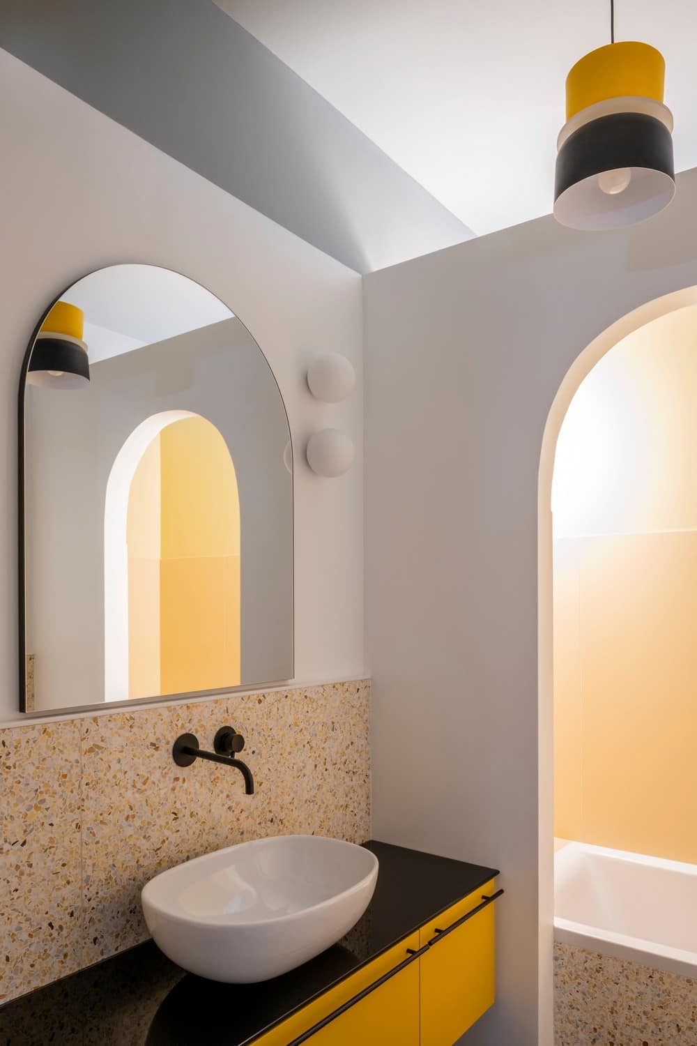
Despite its small size, the other bathroom is designed as a room within a room. The first area features a white perimeter with three arched openings: a nichecontainer that is reflected in the arched mirror, also an illusory opening that expands the space, and a wider third opening that separates an alcove where the bathtub is hidden.
The bathtub area is characterized by an intimate and enveloping yellow color scheme. The blue ceiling extending onto the walls connects the two areas and defines the volume. The flooring features gray-blue tiles, while the walls are covered in yellow terrazzo, with black contrasting elements that graphically emphasize the geometries.
The study and the smaller bedroom were designed to complement the overall aesthetic of the house while allowing for flexibility in their usage over time. These spaces were intended to accommodate the needs of the growing family, including the arrival of a newborn. They were designed to easily accommodate changes in furniture arrangement and adapt to the evolving requirements of the family.
The narrative of Arches and Patterns apartment, the name given to this house, seamlessly unfolds as one moves from one space to another, guided by interconnected design elements. On one hand, we find soft and curved geometries, developed volumetrically in the openings and graphically in the furnishings. On the other hand, the harmonious interplay of colors and patterns defines distinct functions while maintaining an underlying thread that accompanies the exploration of each unique area.
With this new interior design project, PLUS ULTRA, which has been conducting research on contemporary living in historical contexts for years, from experiments at the Villa Imperiale in Pesaro to interventions in the redevelopment of pathways at the Rocca di Gradara, once again demonstrates its ability to develop thoughtful reflections on architectural space.
