Project: Boro Hotel
Architects: Grzywinski+Pons
Location: Queens, New York, United States
Area: 48000 ft²
Photographs: Floto + Warner
Grzywinski + Pons, a New York City based practice principals led by Matthew Grzywinski and Amador Pons, has designed Boro Hotel in Long Island City, New York.
The Boro is a 108 room hotel in the rapidly evolving neighborhood of Dutch Kills in New York City’s borough of Queens. While there are several existing flagged hotels in the area, the Boro is the first design-led bespoke offering that we hope will both further catalyze and respond to the exciting changes that are already evident.
When Grzywinski+Pons were commissioned to design the Boro Hotel, we (and our clients) inherited an already complete superstructure to define a massing and accept a building envelope that were not of our design. We had a small window of time and modest means within which we could make some minor changes before we focused on the interior so we concentrated those efforts on the glazing which would have the most impact on the interior architecture that was within our scope.
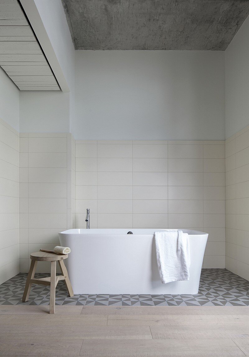
The building’s interiors were not so restrictive. By treating the unfinished structure like a found object, we approached the program almost as though we were converting a disused industrial space to a new use.
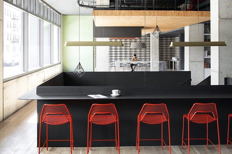
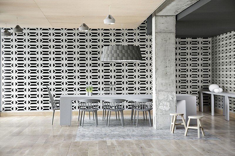
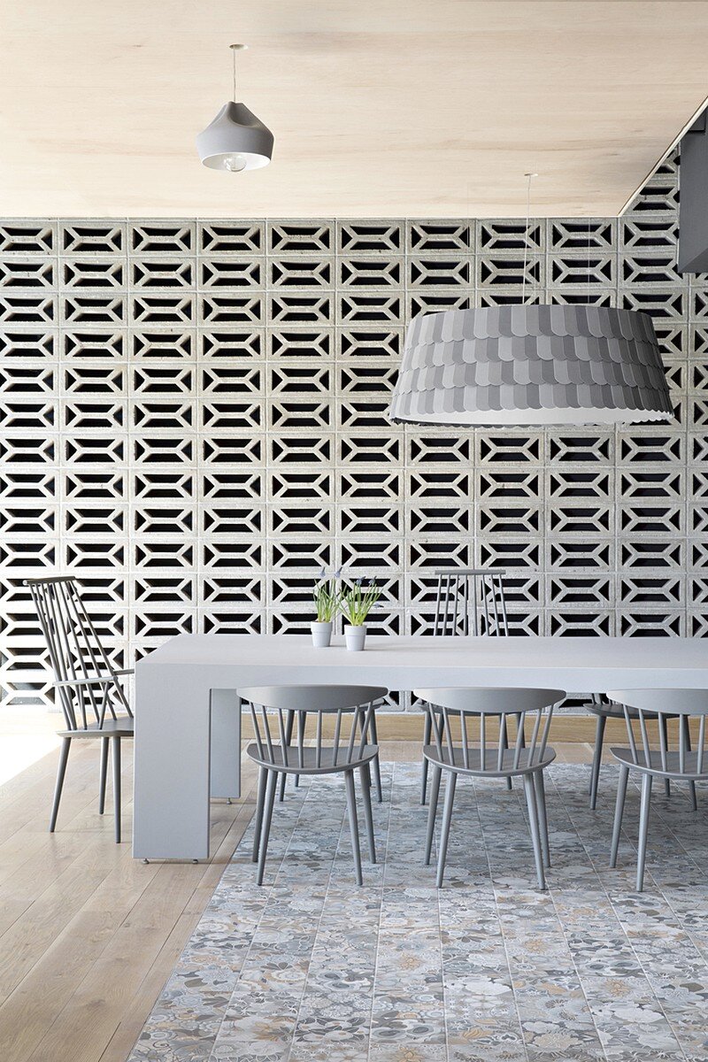
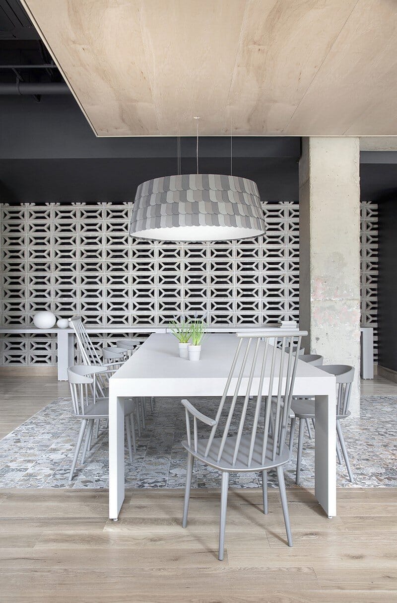
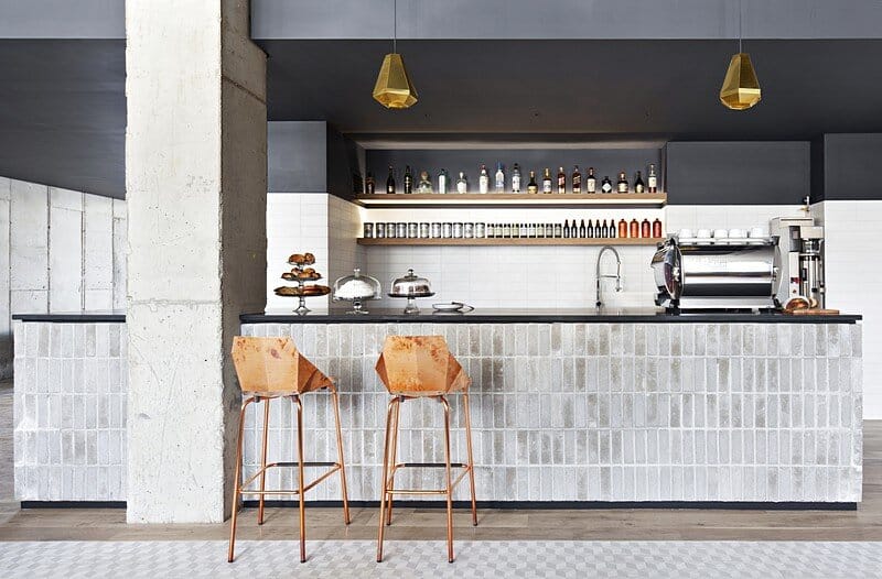
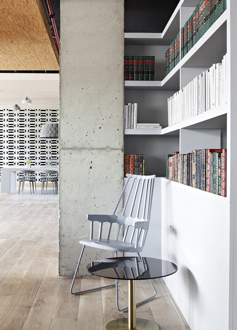
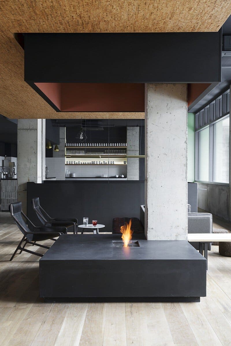
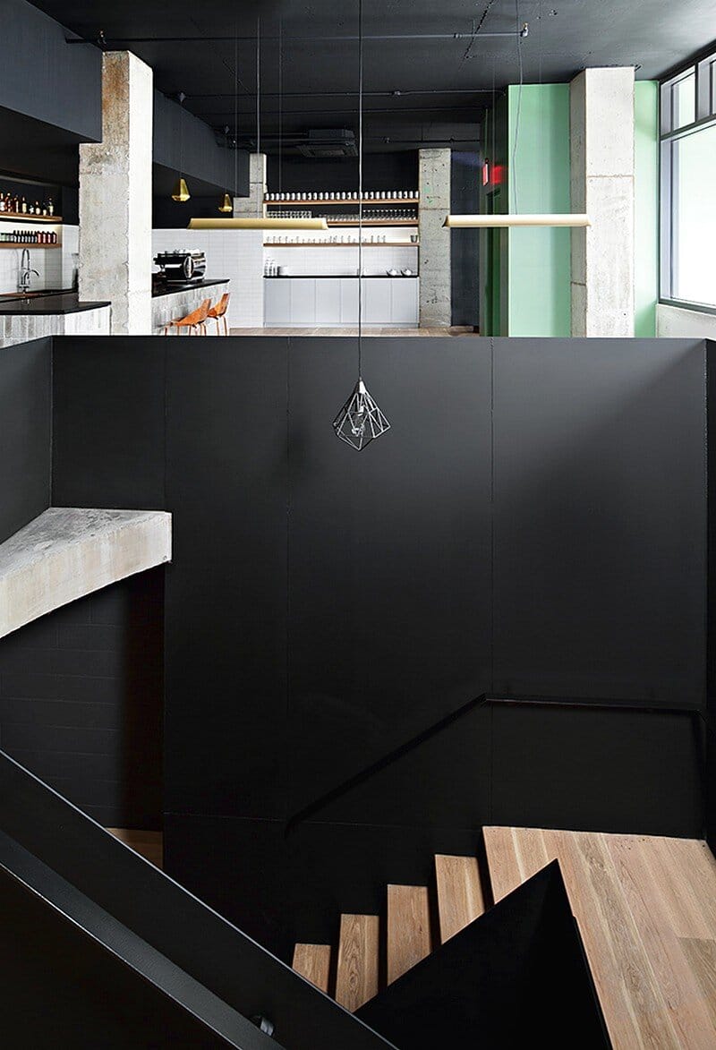
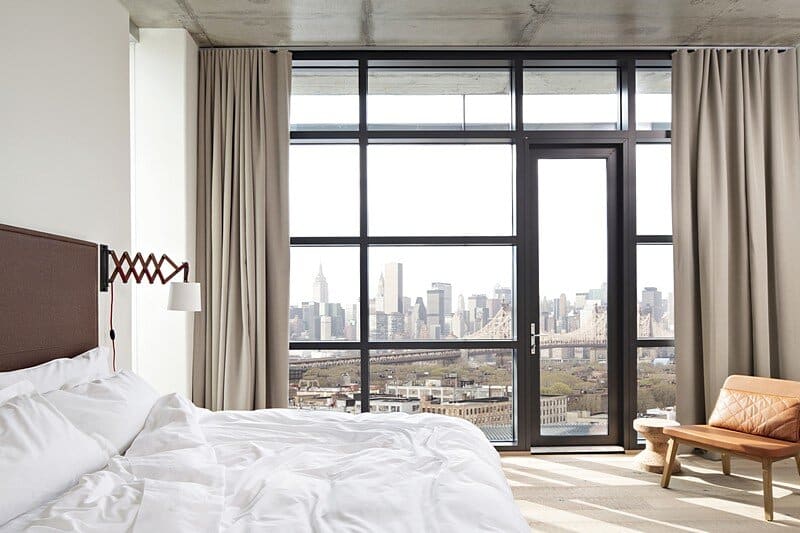
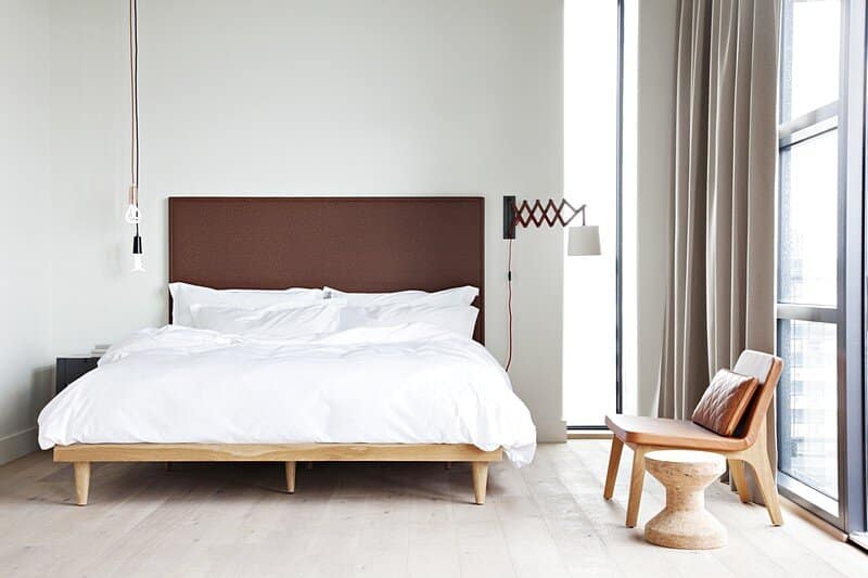
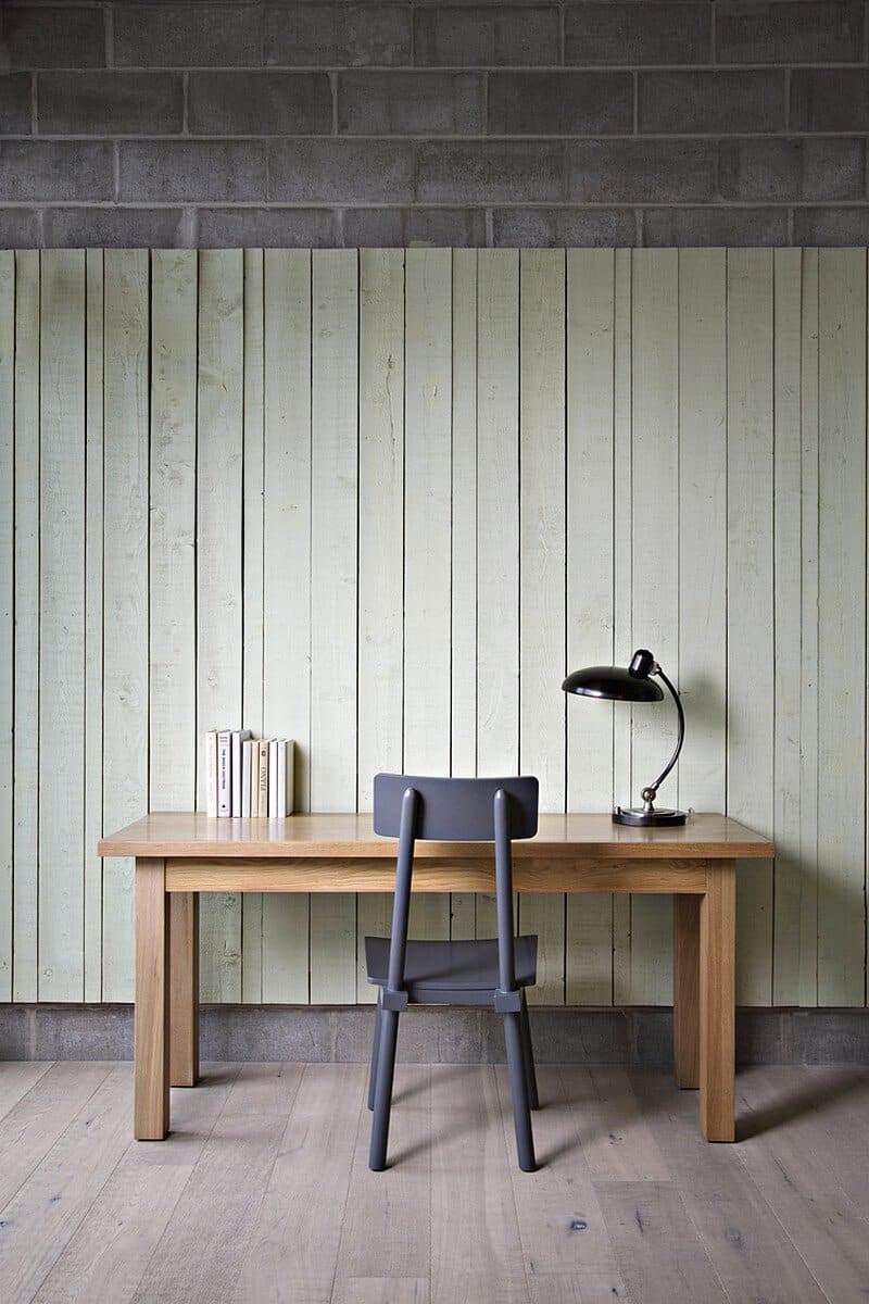
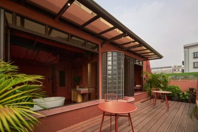
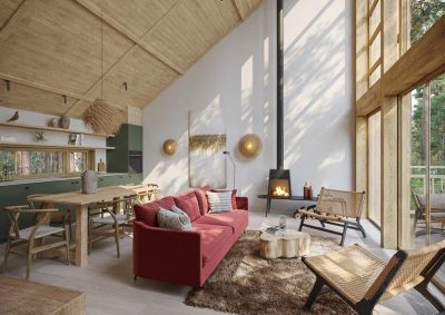
In both the public spaces and the guest rooms we embraced the rawness of the project’s bones: principally cast in place concrete and cinder block. Upon this mantle we layered our palette of materials while extolling the virtues of the site and frame — light, soaring ceilings and unrivaled views of Manhattan. We were very conscious of using finishes that would yield a warm and happy environment even while acquiring a rich patina through time and use: hand scraped oak floors, painted pallet wood wainscoting and soffits, leather, cork and sisal to name a few.
We also designed a bespoke range of furnishings to accompany some specified pieces. Expansive fenestration in the rooms celebrate the tableau that is New York City but we positioned muntins and mullions to add scale and evoke the proportions of the neighborhood’s industrial roots.
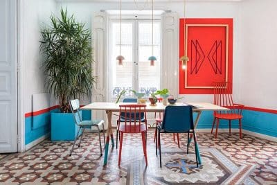
On the ground floor we tried to erase the division and the hierarchy implied by the traditional reception desk. A large table is populated by staff and guests alike and the check-in process capitalizes on mobile technology to liberate that service from any particular piece of furniture.
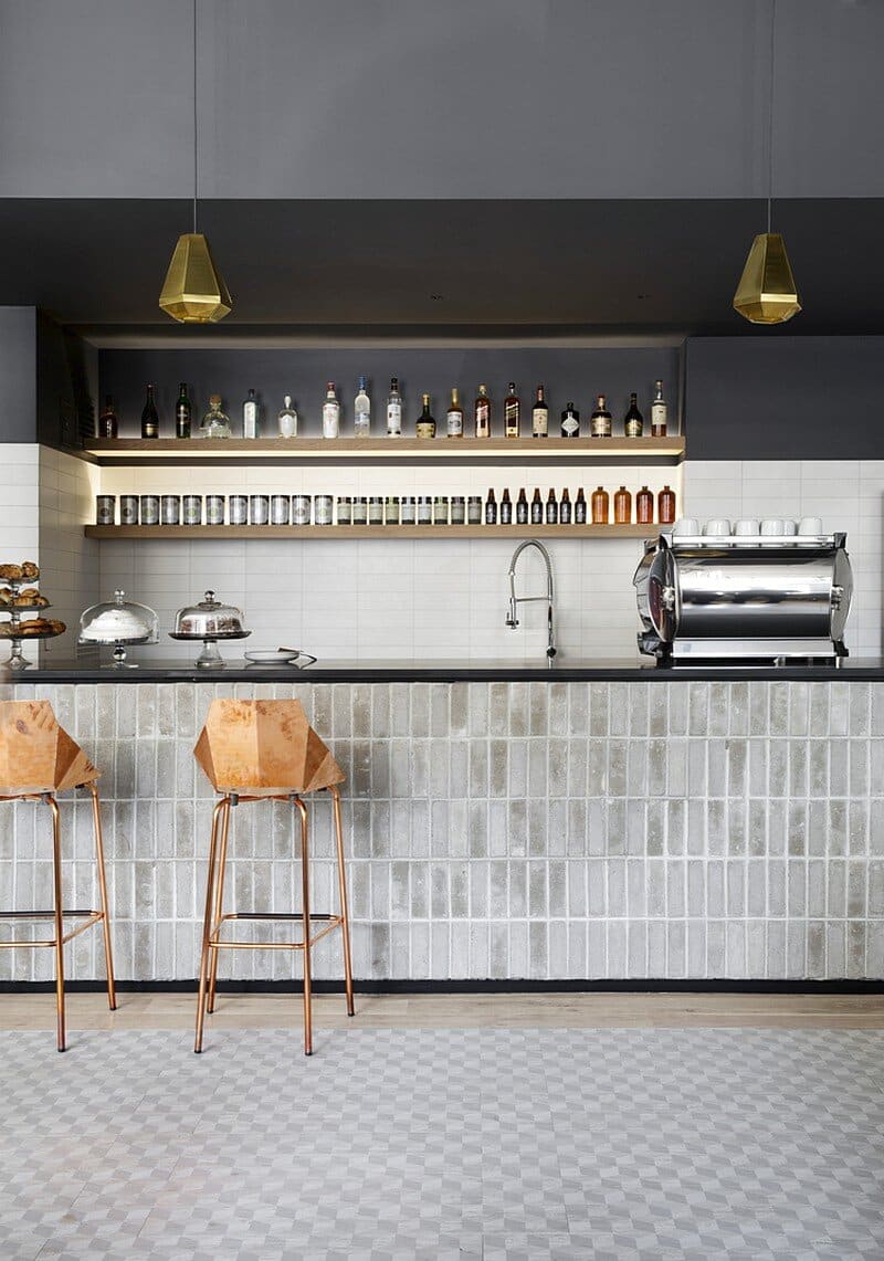
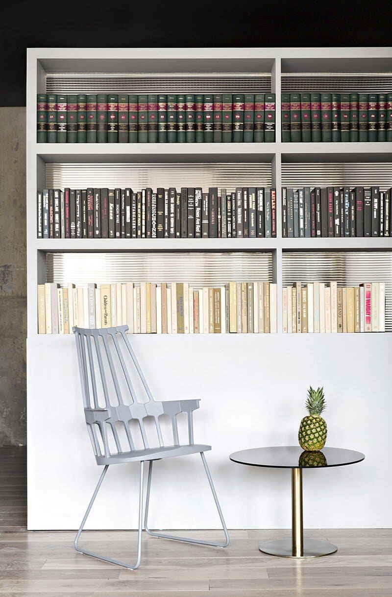
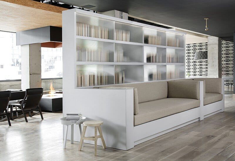
A bar cum cafe also serves guests and customers and the lobby is replete with comfortable seating for all comers. In an attempt to balance the expansive conviviality of the space and its potential intimacy, we utilized program elements to yield semiprivate divisions within the contiguous volume. All of the spaces, while divergent in function, were appointed to evoke the same mood and temperature throughout the hotel. Whether one is in the corridor, guest room, or any of the public spaces, the dialogue between the structure, services, light, texture and colors is consistent.
It was our goal to create a setting from which to explore New York that was unpretentiously sophisticated and as warm and cheerful as it is urban.
Thank you for reading this article!

