Project: Elora House
Architects: Atelier Bertiga
Design Team: Dhidhot Bima, Andrea Daniswara, Azhar Rahman, Firman R. Faza, Aldana A Z
Location: Bekasi, Indonesia
Area: 165 m²
Year: 2020
Photo Credits: Ernest Theofilus
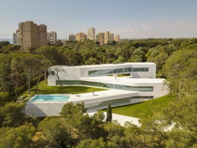
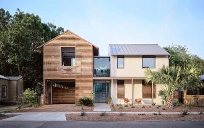
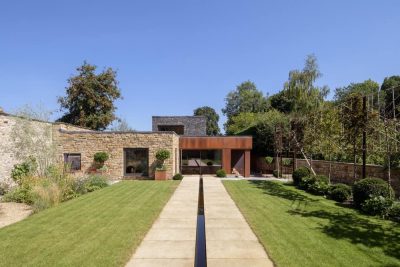
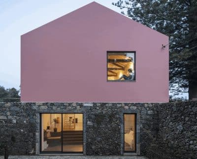
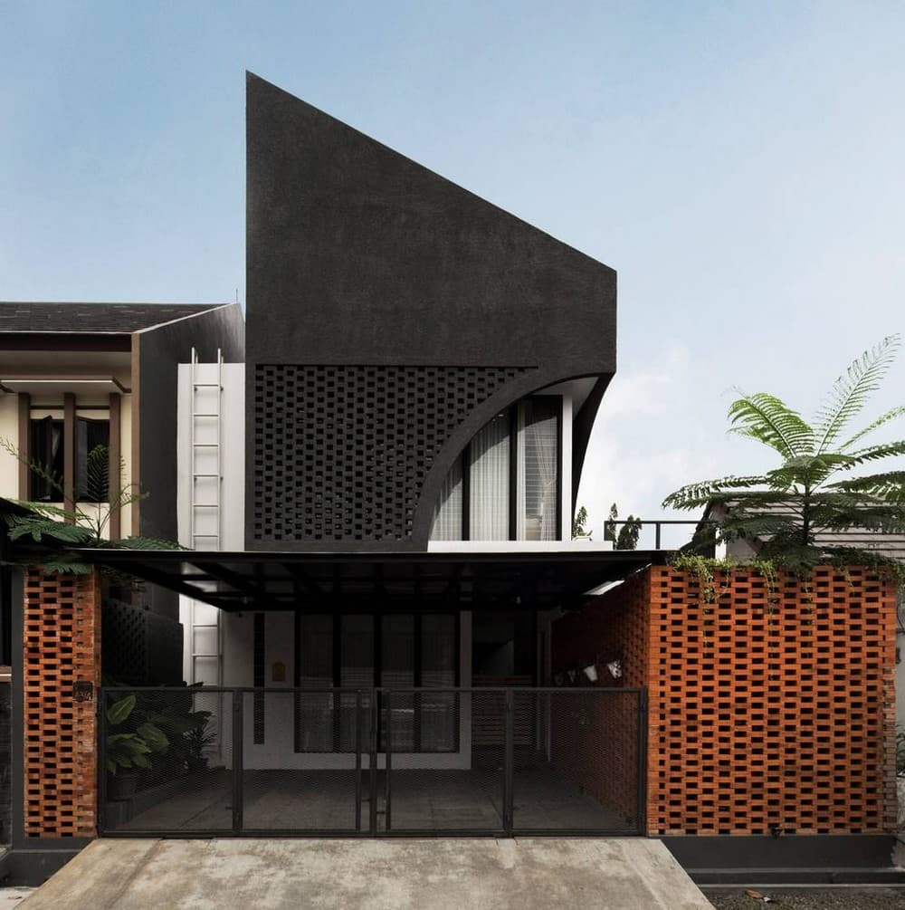
Starting from a housing complex located in North Bekasi, Indonesia, an existing house that is occupied by four member family wants a designed house that is unique and different from the neighborhood house template. The Elora house which stands on an area of 130m2 is designed with a new concept that prioritizes space requirements, healthy air circulation, natural lighting, and catchy expression yet warm impression that can be seen from the main façade. Taking advantage of the site area, the building mass divided into two zones.
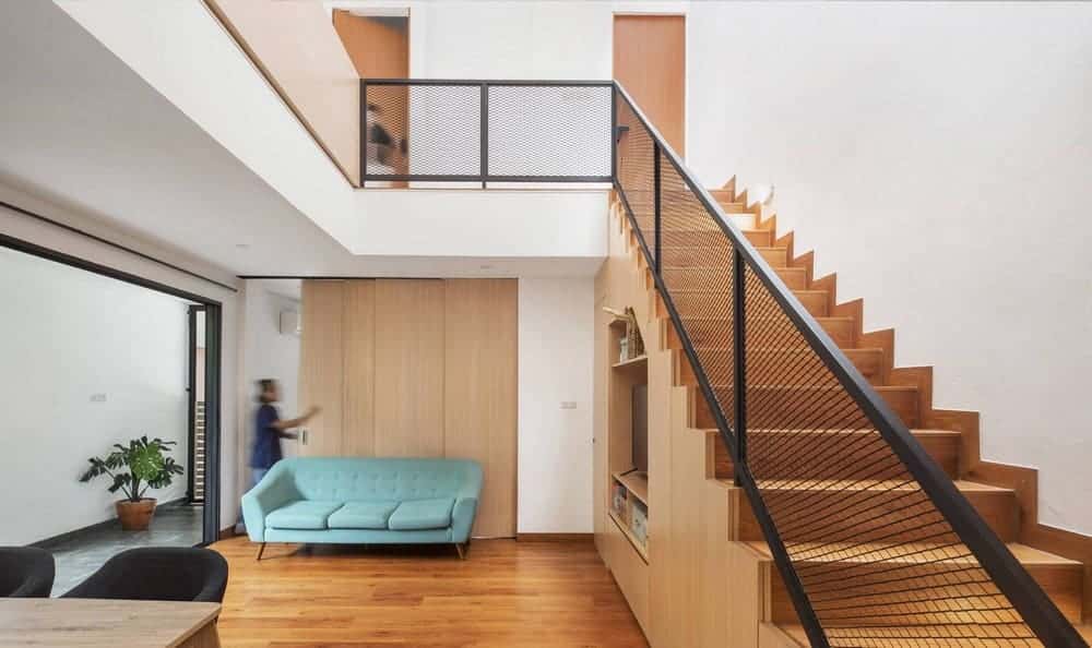
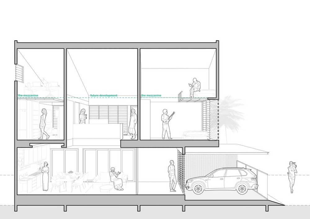
The first mass is placed on the west side of the land to cover the sun’s heat from the west, and the second mass is placed on the south east. This zone separation aims to separate the service and garden from the main function on the west so it can maximize land use. With this configuration, the main mass in the west can receive more natural light from the east and south.
Skylights are also used to allow natural light from the roof, but not excessive because it is only for the staircase area (which is located) in the west (zone). Besides, the arrangement of solid void brick material as a second skin is also applied throughout house facades to reduce the heat entering from the east during the day.
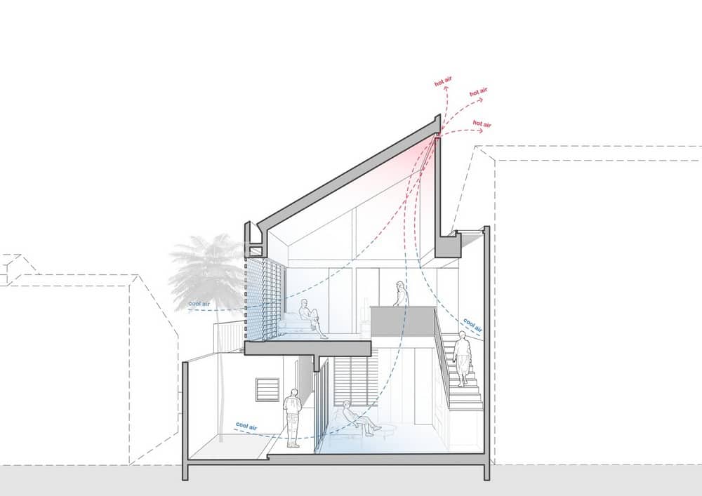
This brick arrangement is also equipped with a louver glass (jalousie window) behind it to circulate natural air into the Elora house. By using the chimney effect, the incoming natural airflow is forwarded through the void in the middle, then hot air will exit through the wall gap in the roof to maintain the room temperature into cooler state.
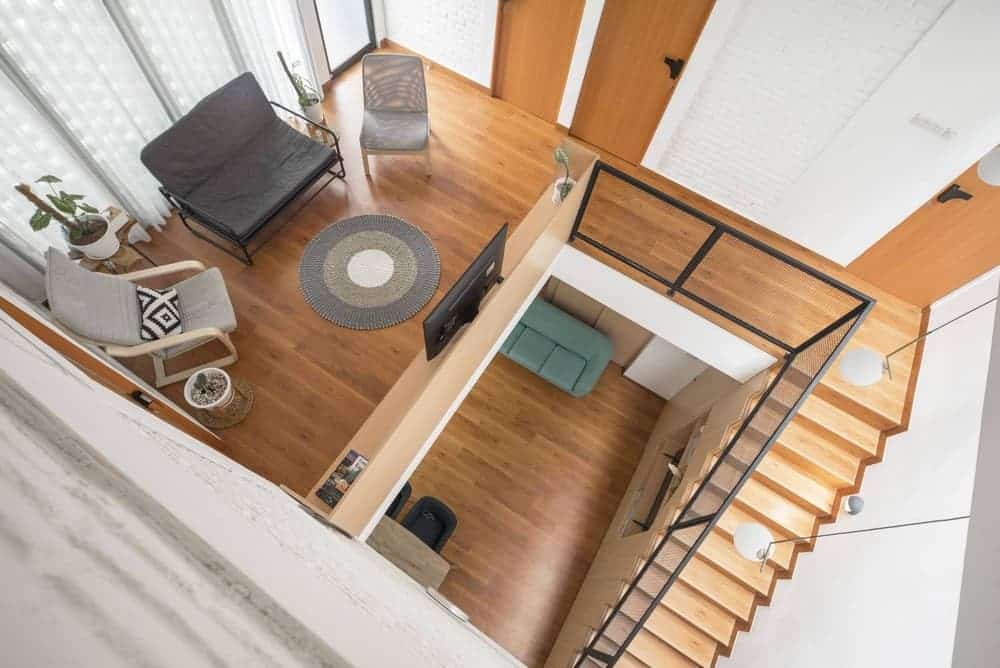
The existence of a high void in the middle of the house is not only used for airing and lighting but can be a vertical addition of space-related to future needs.
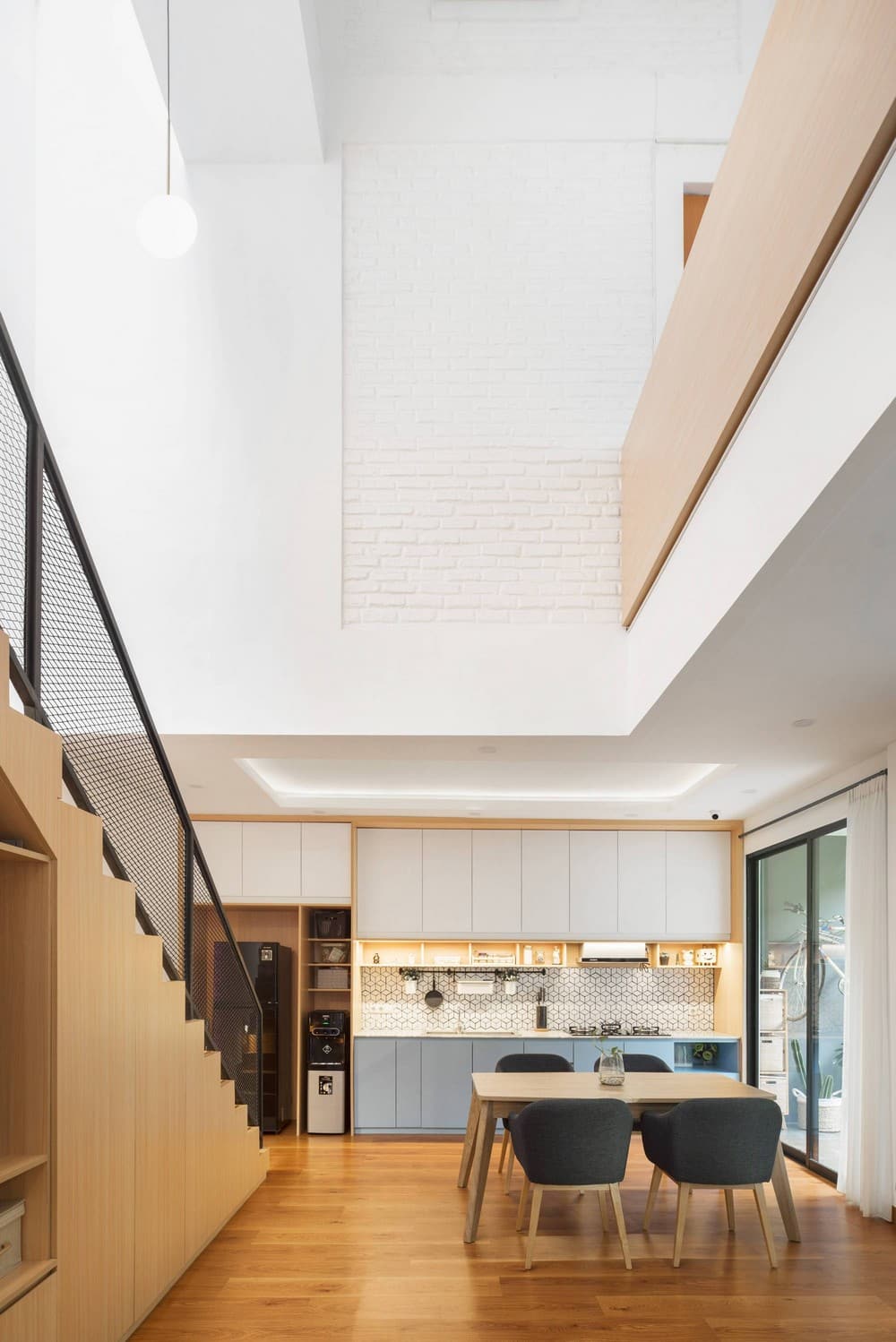
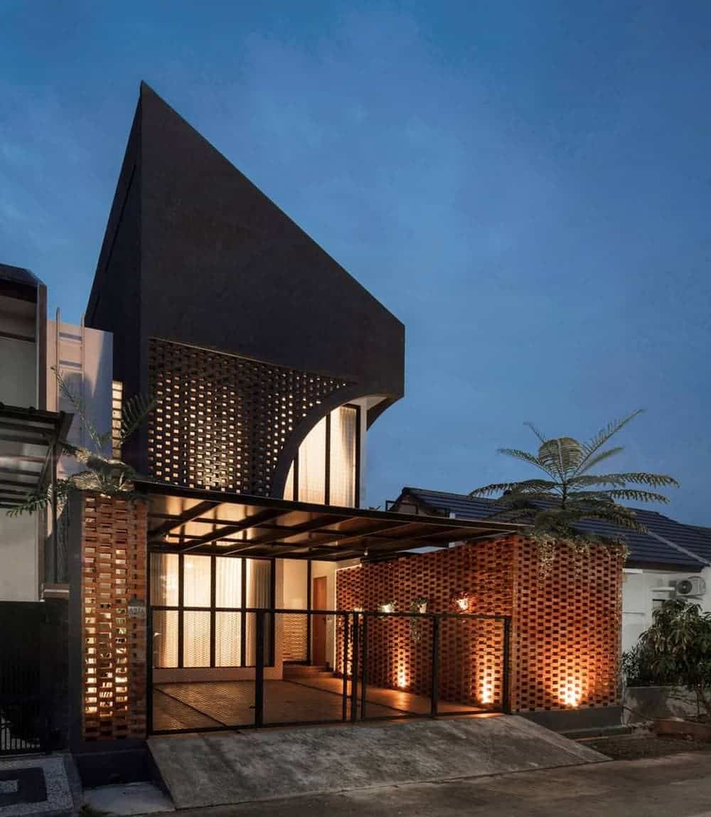
An example is a presence of a mezzanine in the master bedroom which functions as a work area. The triple tone concept is also applied to this house by using natural colors, like dark gray, terracotta, and white. Dark gray color dominates the main façade of the building on the second floor not only defining a straight masculine looks, but also can minimize dust for maintenance purposes, considering that the house site is located near an industrial area.
The dark gray color is also combined with a series of solid void bricks starting from the south to the north then ending with an arch to soften the appearance of the pointed main façade.
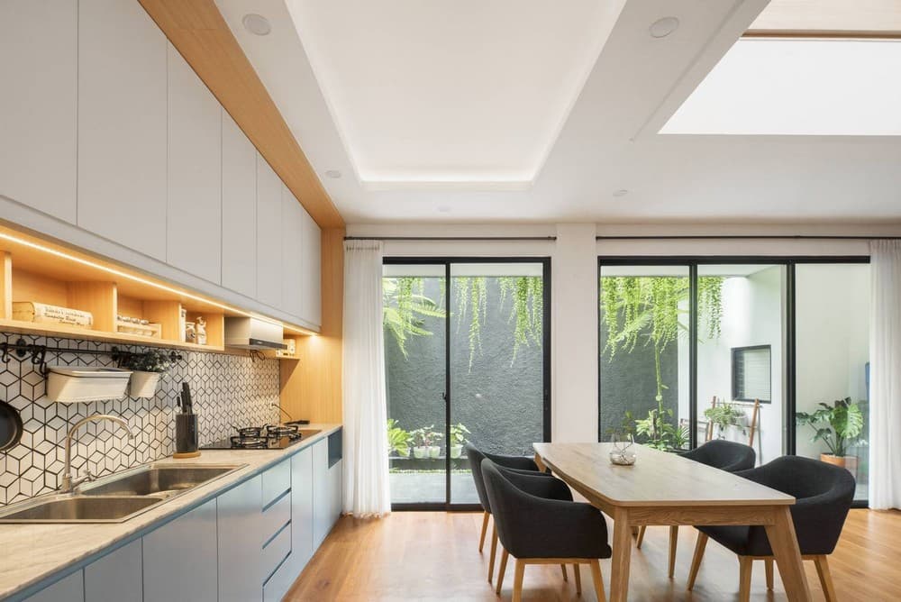
The brighter and contrasting terracotta color is placed on the first floor, while still using the arrangement of solid void bricks so that they have the same language. Meanwhile, white color is applied more thoroughly into the interior to present a bright and natural impression that reflects the family.
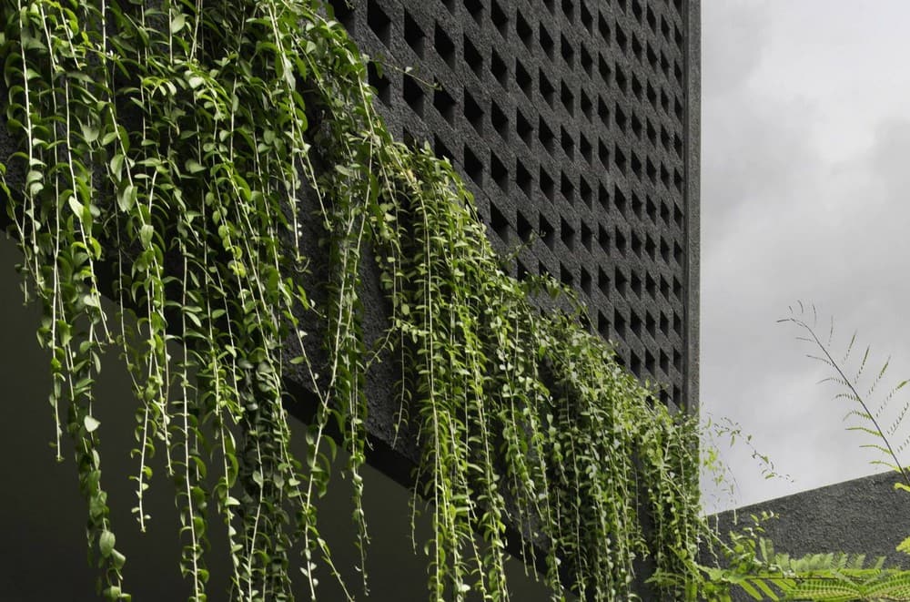
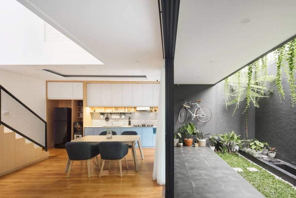
The placement of the core spaces such as the family room, dining room, and kitchen are placed on a line on the first floor to facilitate activities that are related to one another. Also, these three rooms are deliberately exposed to a garden shaded by lee kwan yeu vines to show the connection between the outside and the heartwarming interior.
