Project: Hyde Park House
Interior Designer: Daniel Hopwood
Location: London, United Kingdom
Photographs: Andrew Beasley
Description by designer: You’ve worked hard, taken a few risks, and earned a bit of money that has gone into buying a decent home. Now, naturally, you want to make it your own, tailored around you. The dream is the easy part, getting it right is another thing.
In the case of this Hyde Park property, the client enjoys great success in the entertainment world. Whilst showcasing the intelligence and sophistication behind the exuberance, I was compelled to reflect his stage personality in his home. With Elle Decoration describing this interior as ‘high octane,’ it is clear the approach worked. But do take another look – this is no wow-factor palace. Every detail is considered, discussed in-depth and built by dedicated craftsmen. We’ve tinkered with tradition, toyed with the present, experimented and invented. Why? Because we could.
From being commissioned to handing the keys back, the house was completely shelled and rebuilt, with the basement lowered for more head height. The process took one year, and we are thrilled with the result.
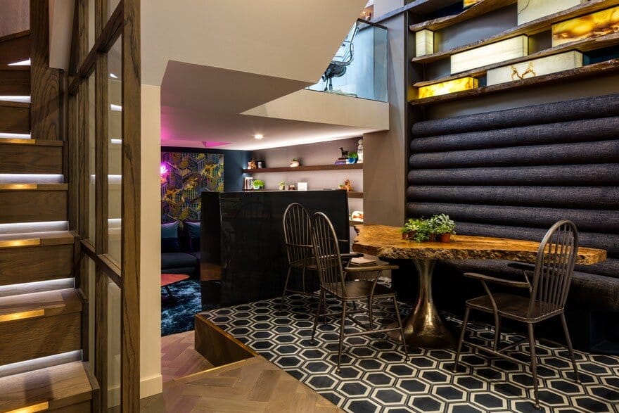
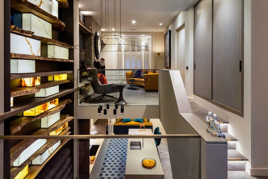
The light installation hovers over the dining area with a high backed banquette, which again is designed to link the two floors.
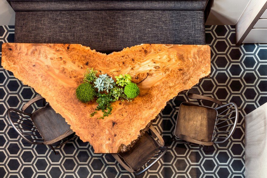
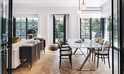
The dining table is two pieces of sliced tree joined together, the idea linking with the wall panel as seen from the floor above.
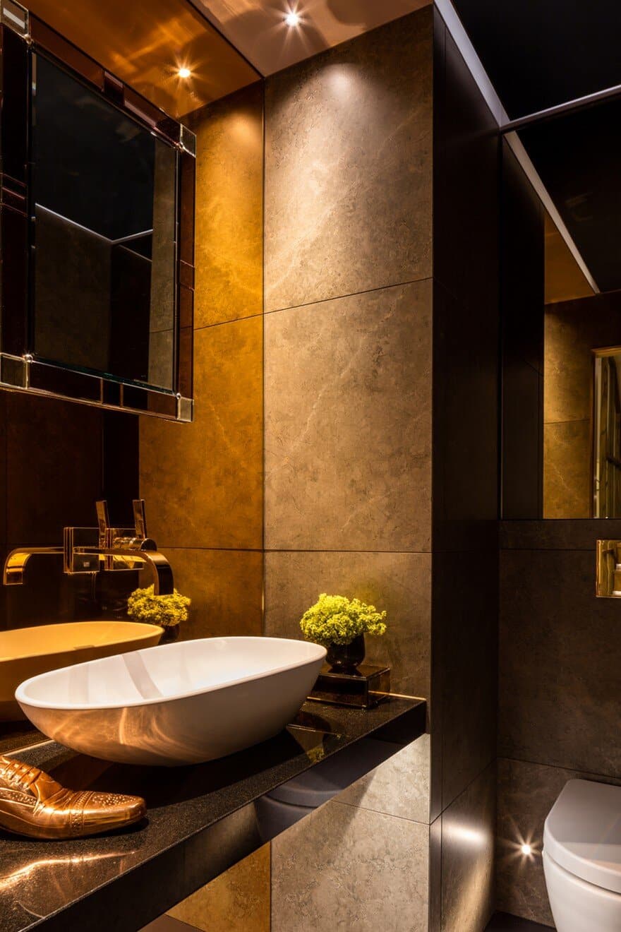
A fuss was made of the guest loo, an air of opulence created by hanging the mirror and taps from a copper coloured mirror. It is designed with parties in mind.
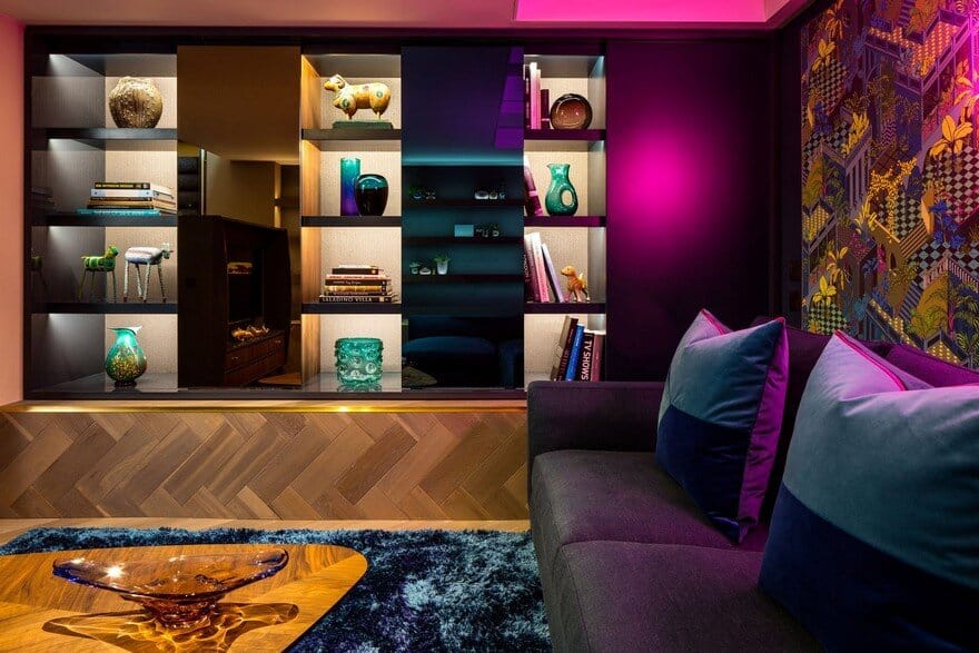
The TV unit is designed to look like a 50’s radiogram, with horse hair panels hiding the speakers – the idea being that not everything should be taken too seriously.
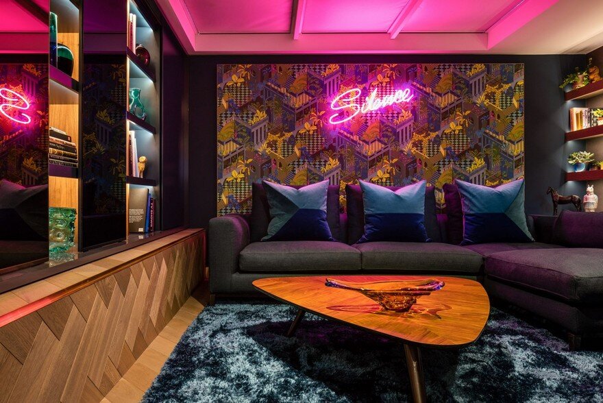
The script reading room boasts a display unit with moving panels, designed so the display is ever changing.
The footprint of each floor is relatively small, but by opening the space up we create a flow between each.
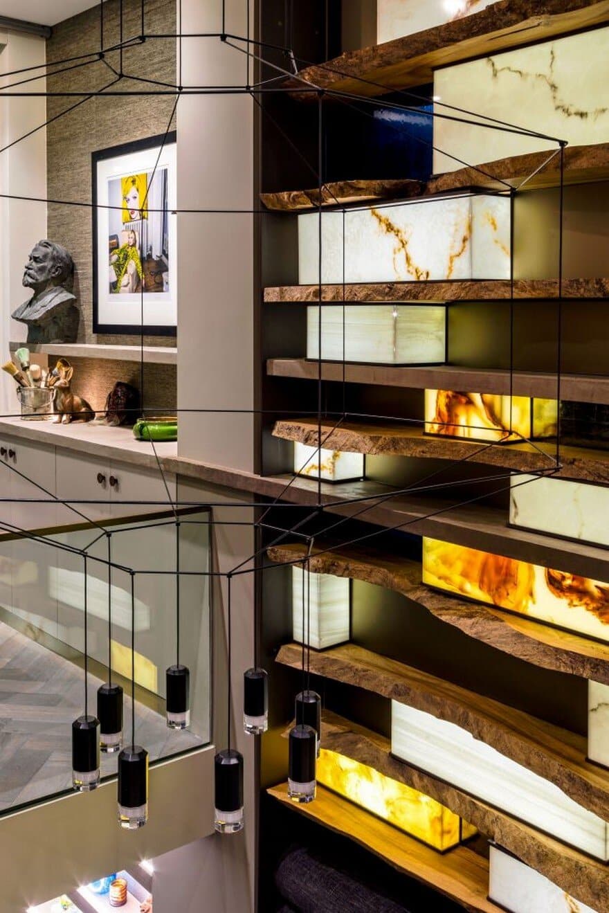
Working with Whetstone Oak we created this light installation between the ground floor and basement in order to connect the two floors visually. The shelves are made from raw kiln dried wood, with marble lanterns that are computer controlled to individually dim the lights up and down. It was quite a feat as neither of us had done anything like this before.
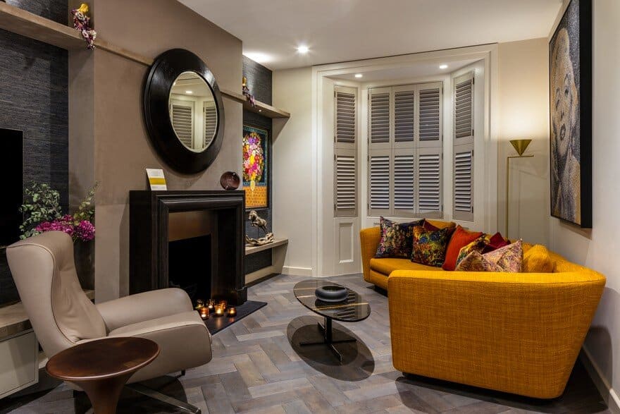
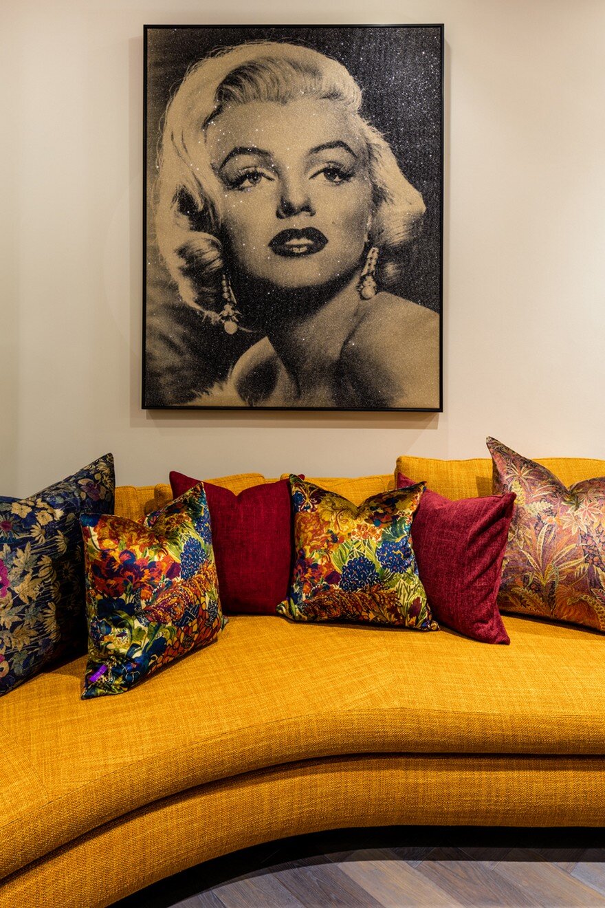
In order to maximise space in the living room a curved sofa by Minotti London was used. The décor is textured and earthy in tone, but spiced up with bright orange as inspired by the owner’s art.
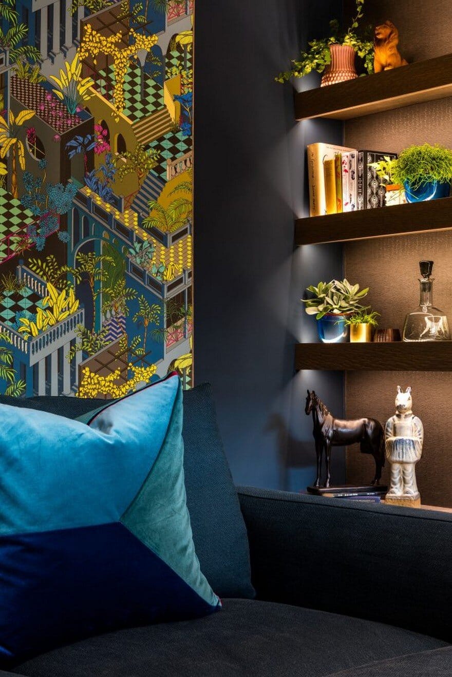
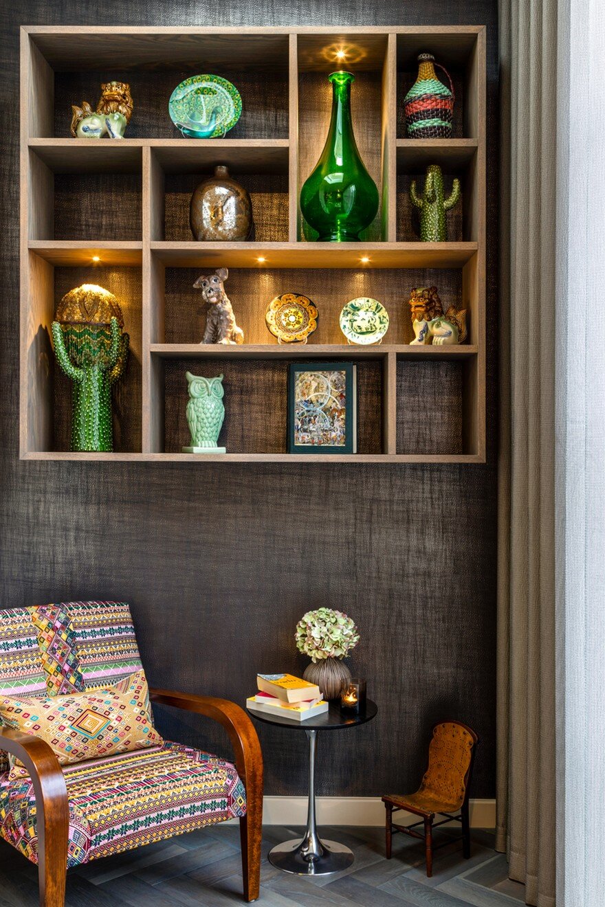
The shelving is designed to create a display for the owner’s collection.
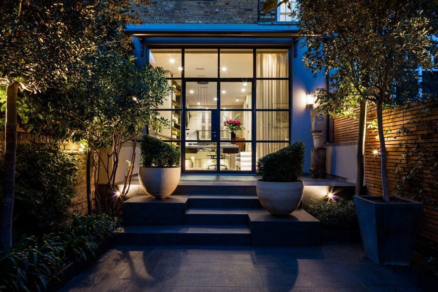
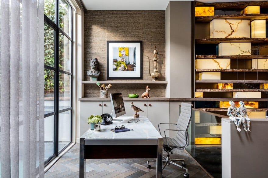
A view of the desk facing the garden, with a wall finish that links the interior with the exterior. Inside, the cupboards are linked with the concrete top wall installation, which stretches right along the entire length of this floor.
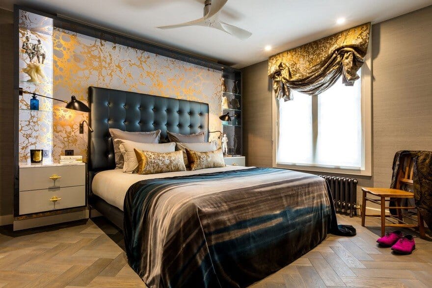
Unable to hang long curtains because of the radiator, but wanting a bit of grandeur, London blinds were used. They are a tad old fashioned too.
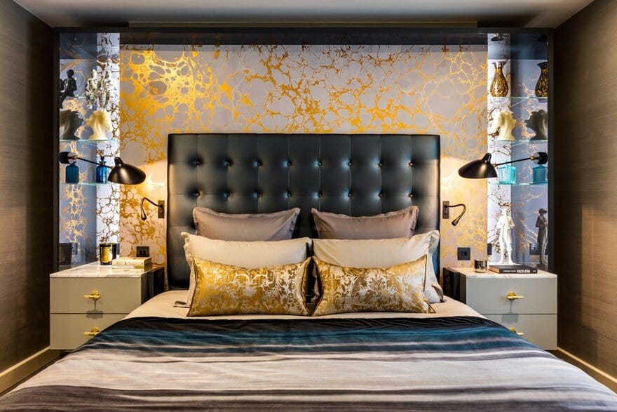
It may be a bedroom but it is better described as the throne room and it just glows. It also hides the chimney breast.
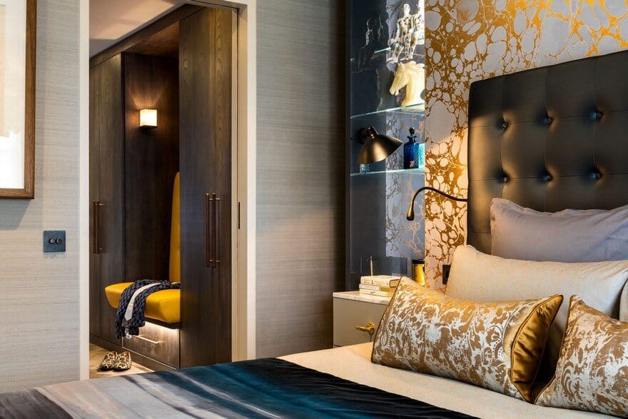
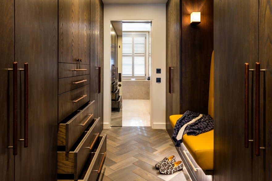
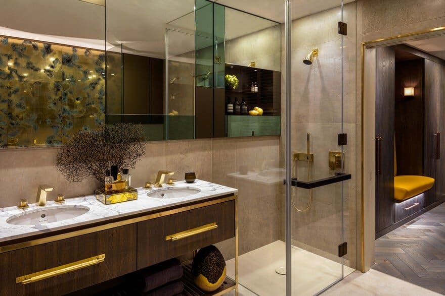
A peek into the moody dressing room lifted by the yellow leather banquette. The handles are made by saddler Matthew Payne. The cushions were made by Frankie, our soft furnishing expert, and were nicknamed McDonald’s apple pie cushions.
I don’t think we’ve ever had a client who doesn’t have a lot of clothes, ensuring there is a place for everything is our job.
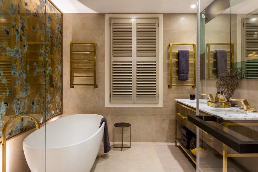
Bathrooms are becoming more sophisticated these days; here the aim was to inject personality and individuality.
The panel above the bath is made by Emma Peascod. The mood gold gilding behind glass creates a soft warm feeling in a room that often can look too clinical.
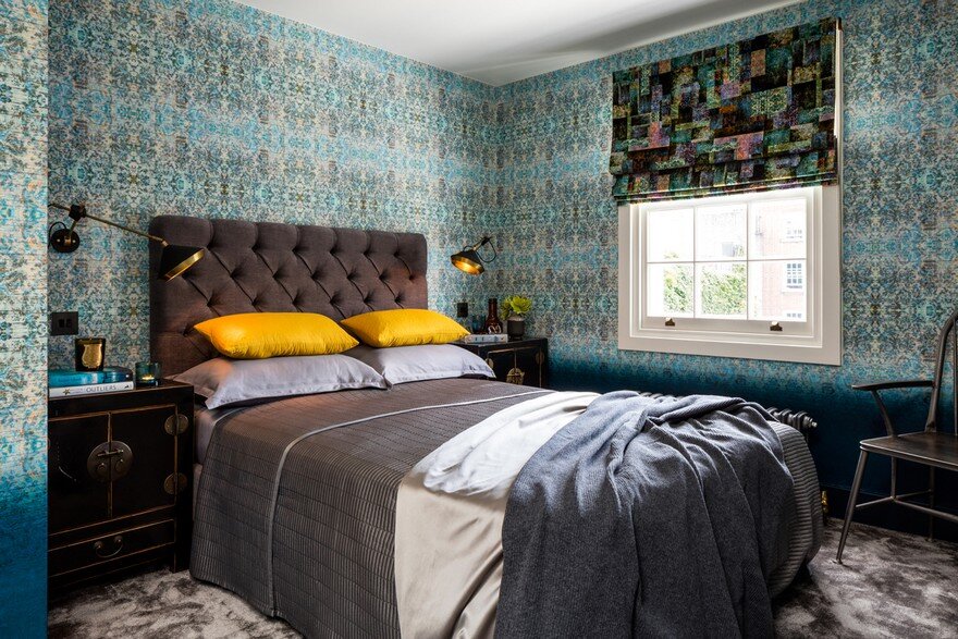
A guest room should be a best room. We certainly made a fuss of this one using ombre wallpaper and fabrics from Blackpop.

