Architect: Bogdan Ciocodeica Studio
Project Team: Bogdan Ciocodeica, Diana Rosu
Location: Bucharest, Romania
Photography: Andrei Margulescu
This stylish apartment was completed in 2016 by Bogdan Ciocodeica in collaboration with Diana Rosu, two young architects from Bucharest, Romania.
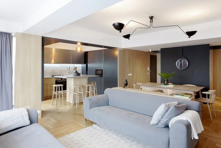
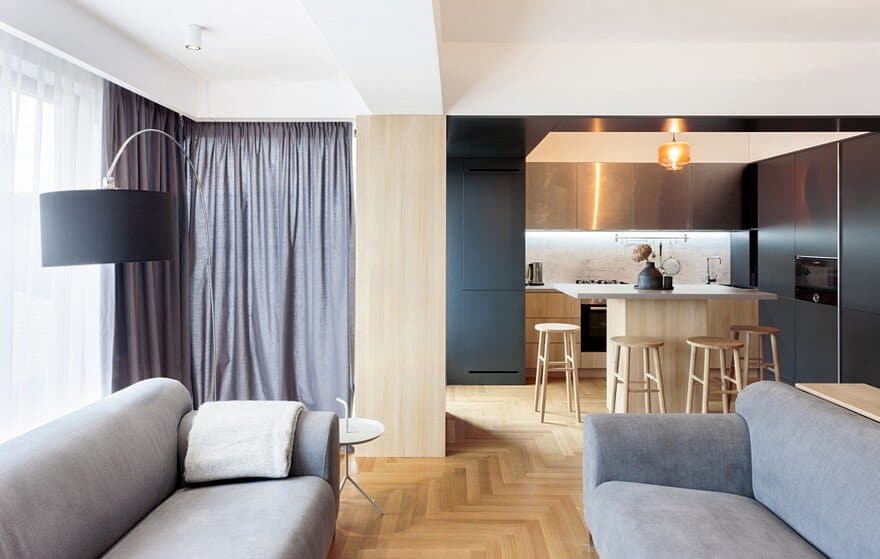
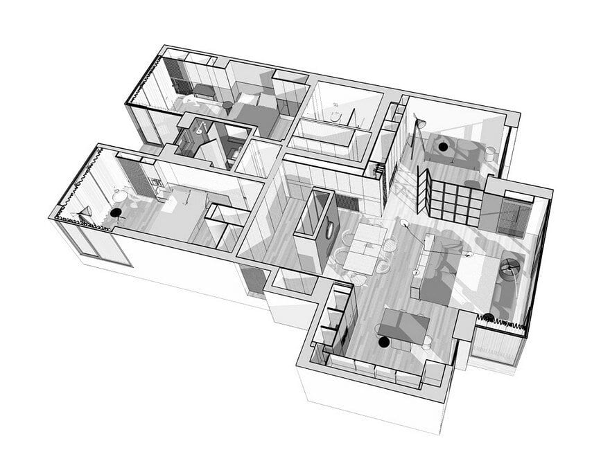
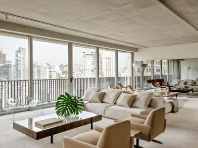
The apartment, located in the heart of Bucharest, offers a panoramic view towards the urban landscape. The family’s way of life is similar to the context, being communicative, flexible and dynamic. These aspects were the main elements that lead to the definition of the new functional and spatial scheme: the opening of the daytime spaces, but without giving up the possibility of separating them if needed, and the separation of the night time area, that offers a high level of intimacy for each family member.
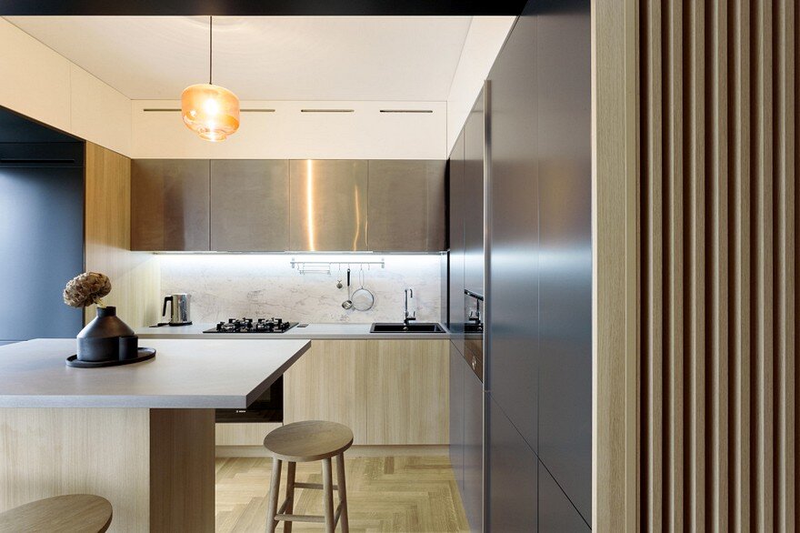
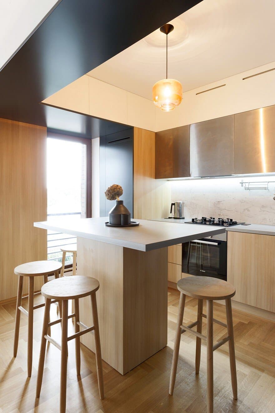
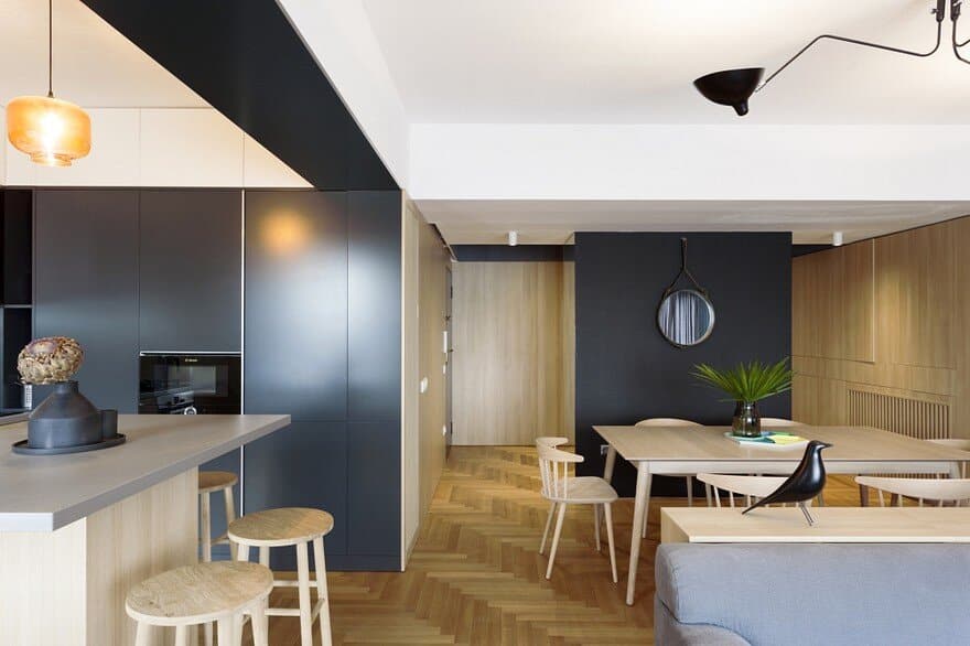
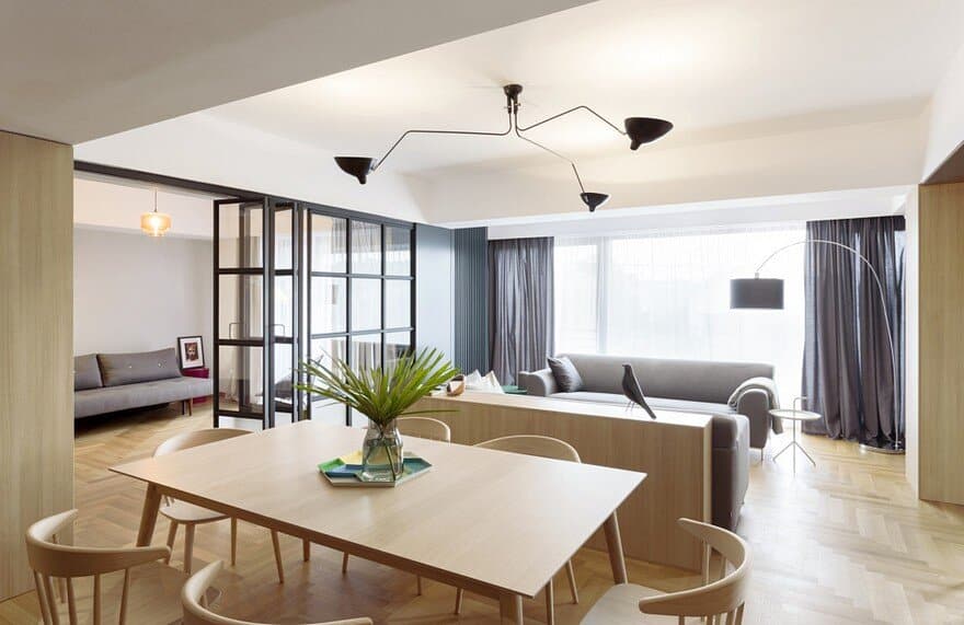
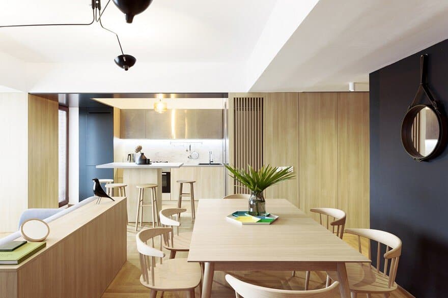
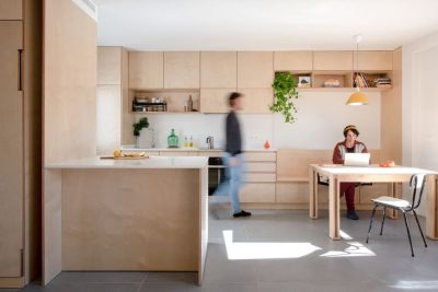
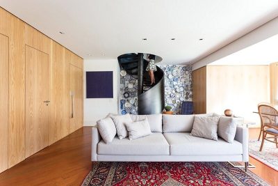
The end result integrates the kitchen and the office to the existing generous living room as an intersection of two rectangular volumes, with the dining area, right in the center of this intersection, becoming a “hot spot ” of the house. Thus, functions merge into a common image , where wood, both horizontally and vertically disposed, covering storage area, provides fluidity and unity of the space, creating a neutral background at the same time.
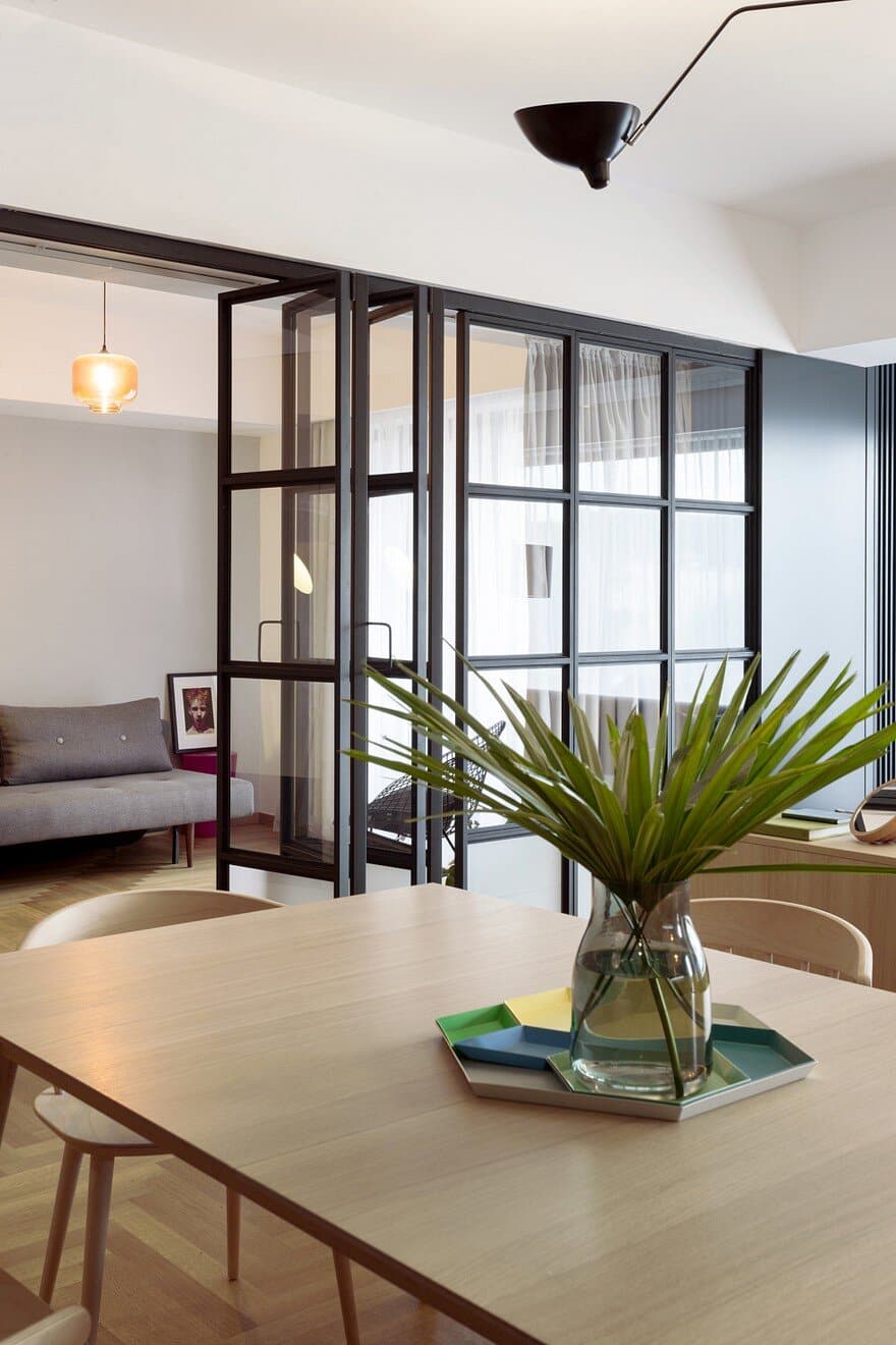
Dark grey metal elements, contrasting and cold, become highlights of the interior, but also divide different areas and create differentiated spots: the entrance hall, the kitchen area, the glass doors and the black lamp above the living room. However they create an unique picture, the several functional areas keep their identity required by the specific activities.
When necessary, metallic and glass wall can create a capsule, separated from the rest of the house. It was designed as a multifunctional room, which can be used either as an office or as guest bedroom.
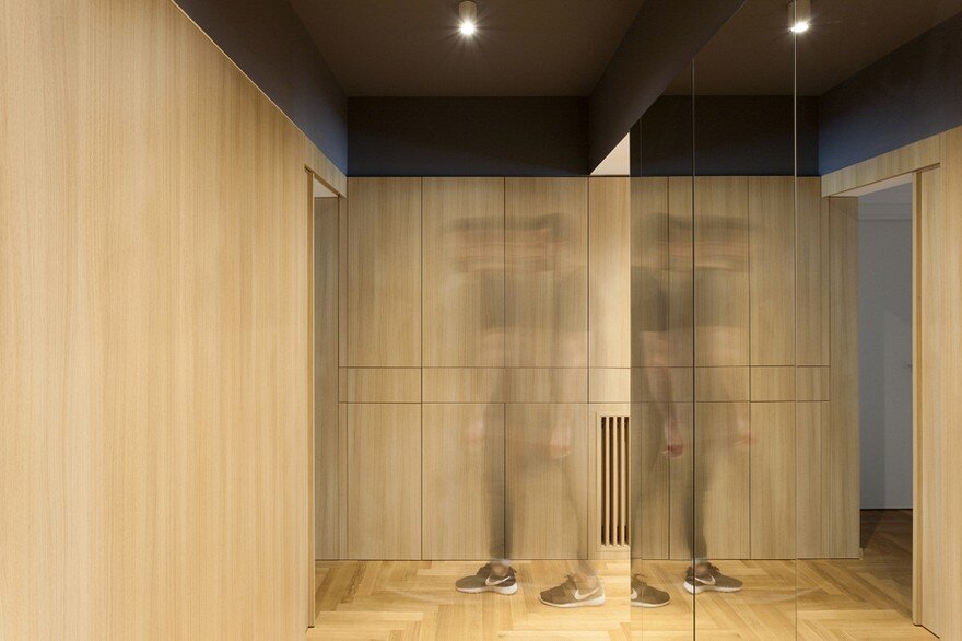
Another important element is the almost invisible wardrobe placed in the hallway, that is covered in mirrors on three sides and appearing as a very thin black panel towards the living room, becoming a strong and contrasting background for the dining area. Similar colors and patterns can be observed inside the entrance hall, where the wooden wall panels “hide” the access to the night area, the more private part of the apartment.
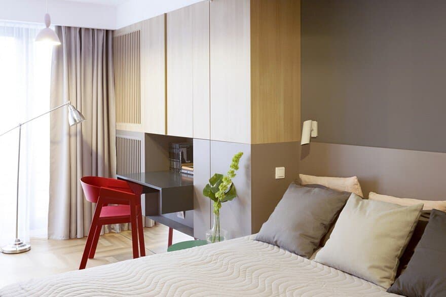
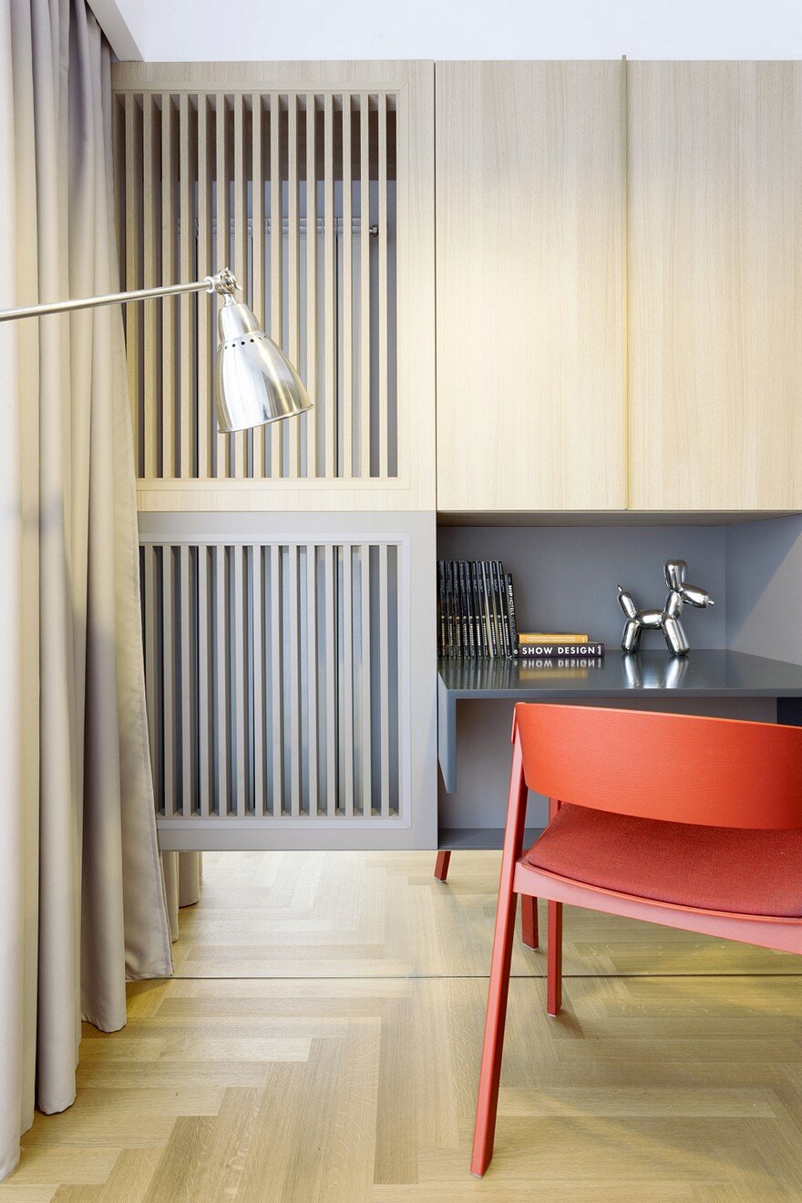
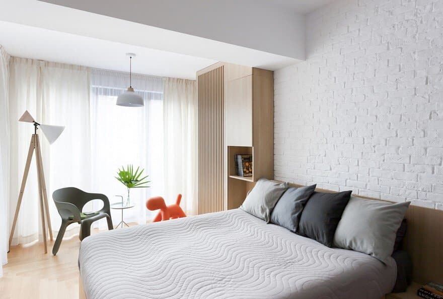
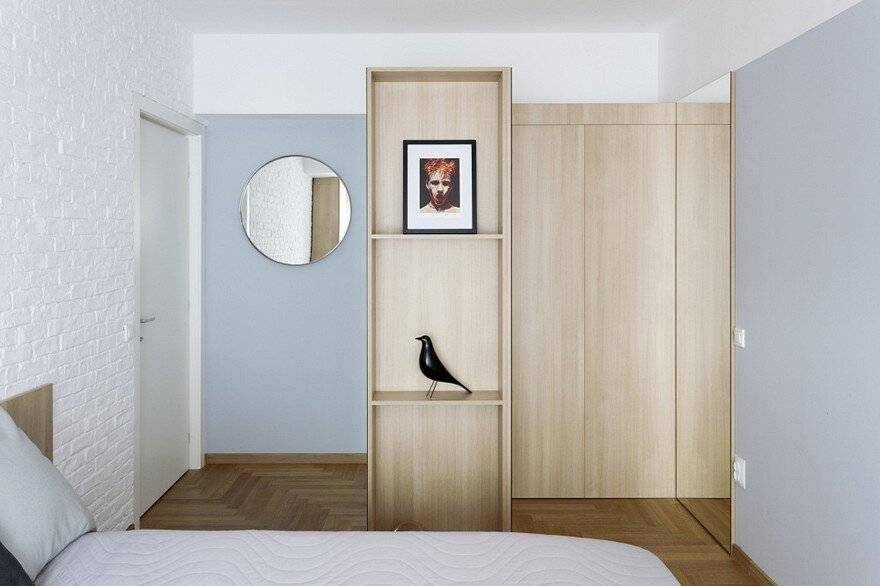
The night area follows the same color palette of the whole interior, that is the main frame of the overall design and offers a neutral background for the small interventions and personal objects, that come to personalize each private space.

